Motown Records - A Legacy Rebrand
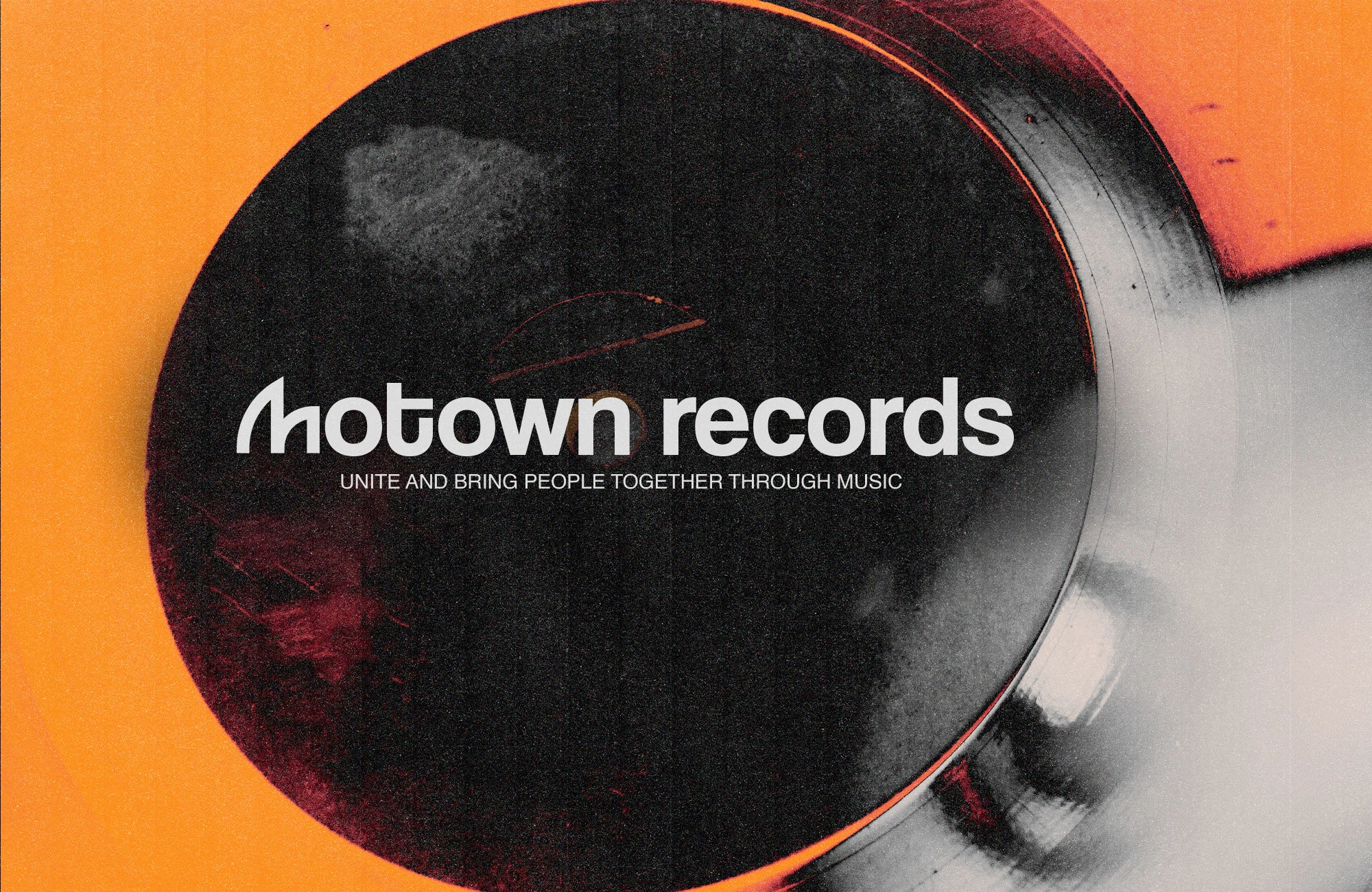
Motown Records
A modern rebrand concept by Vizualogy Studio
The Vision
Motown Records has always been more than a label. It is the heartbeat of soul, rhythm, and cultural change. Our vision was to reimagine its iconic identity for today’s creative landscape, where heritage meets innovation.
The Challenge
The challenge was clear: how do you refresh a legacy brand without losing its essence? We needed to honor Motown’s history while creating a design language that feels timeless, relevant, and adaptable across digital and physical worlds.
The Solution
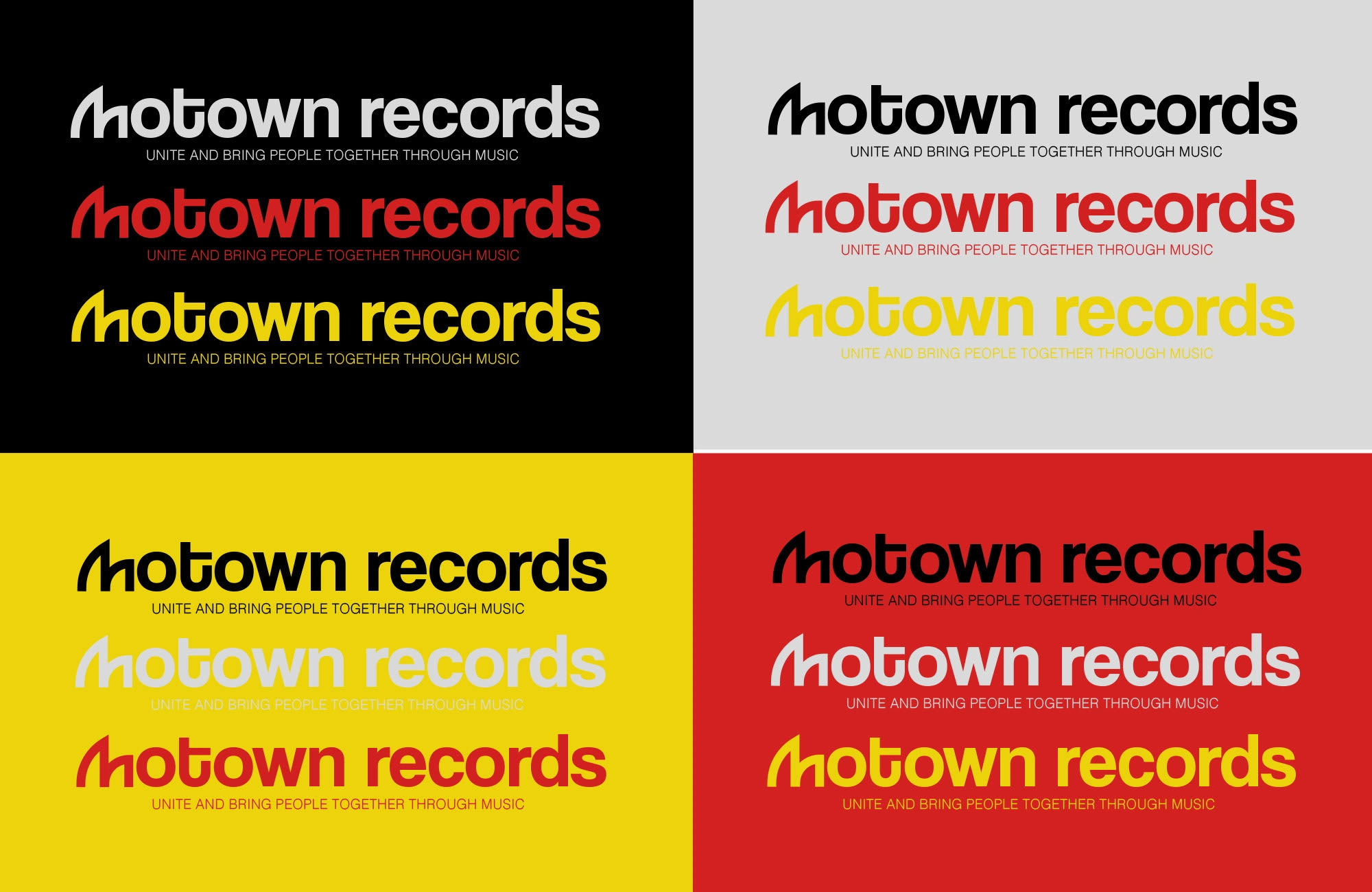
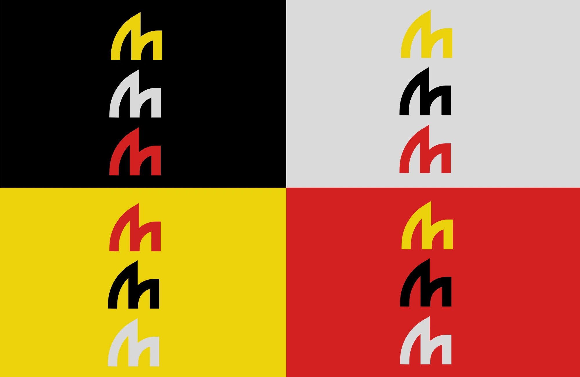
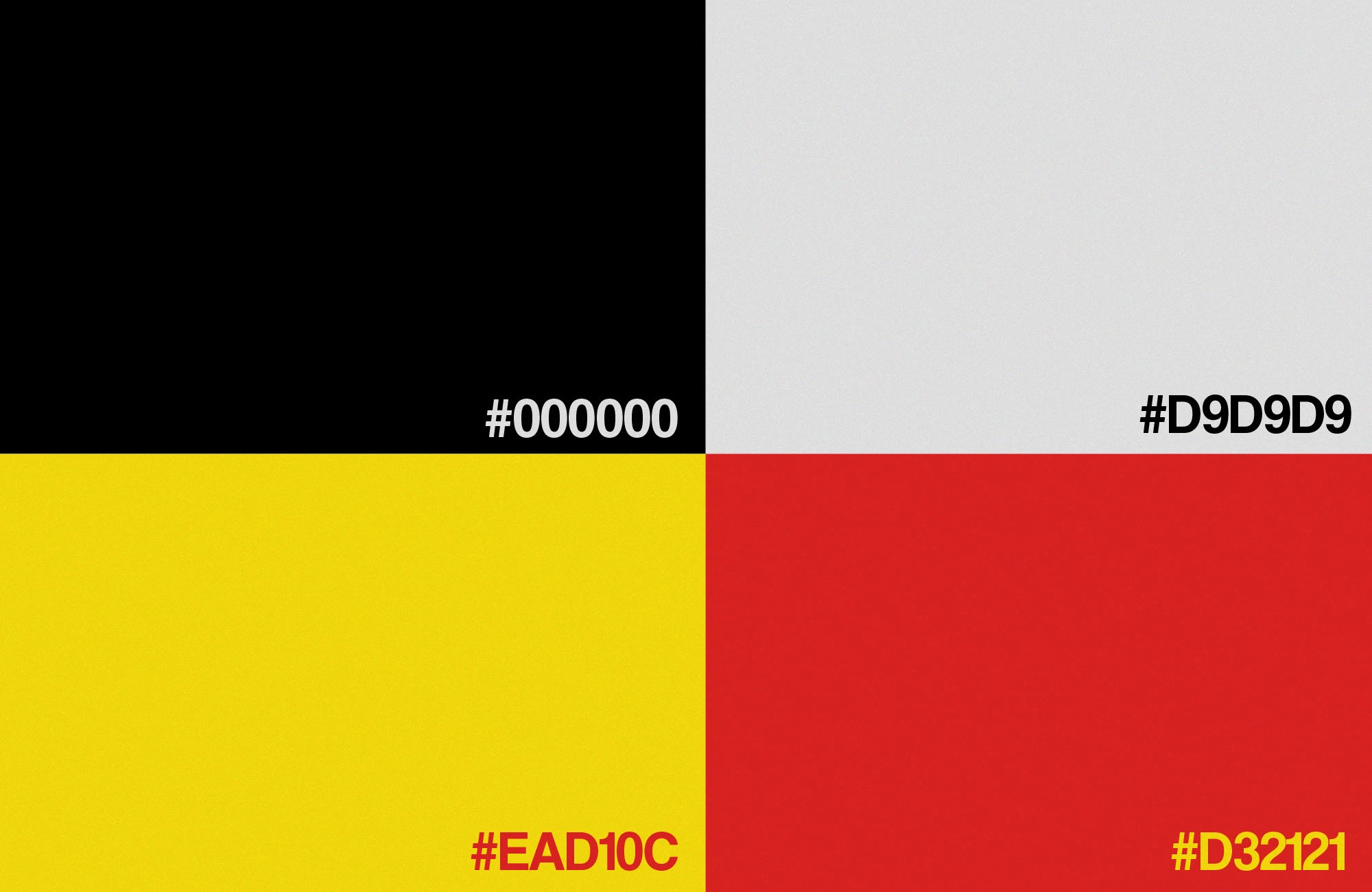
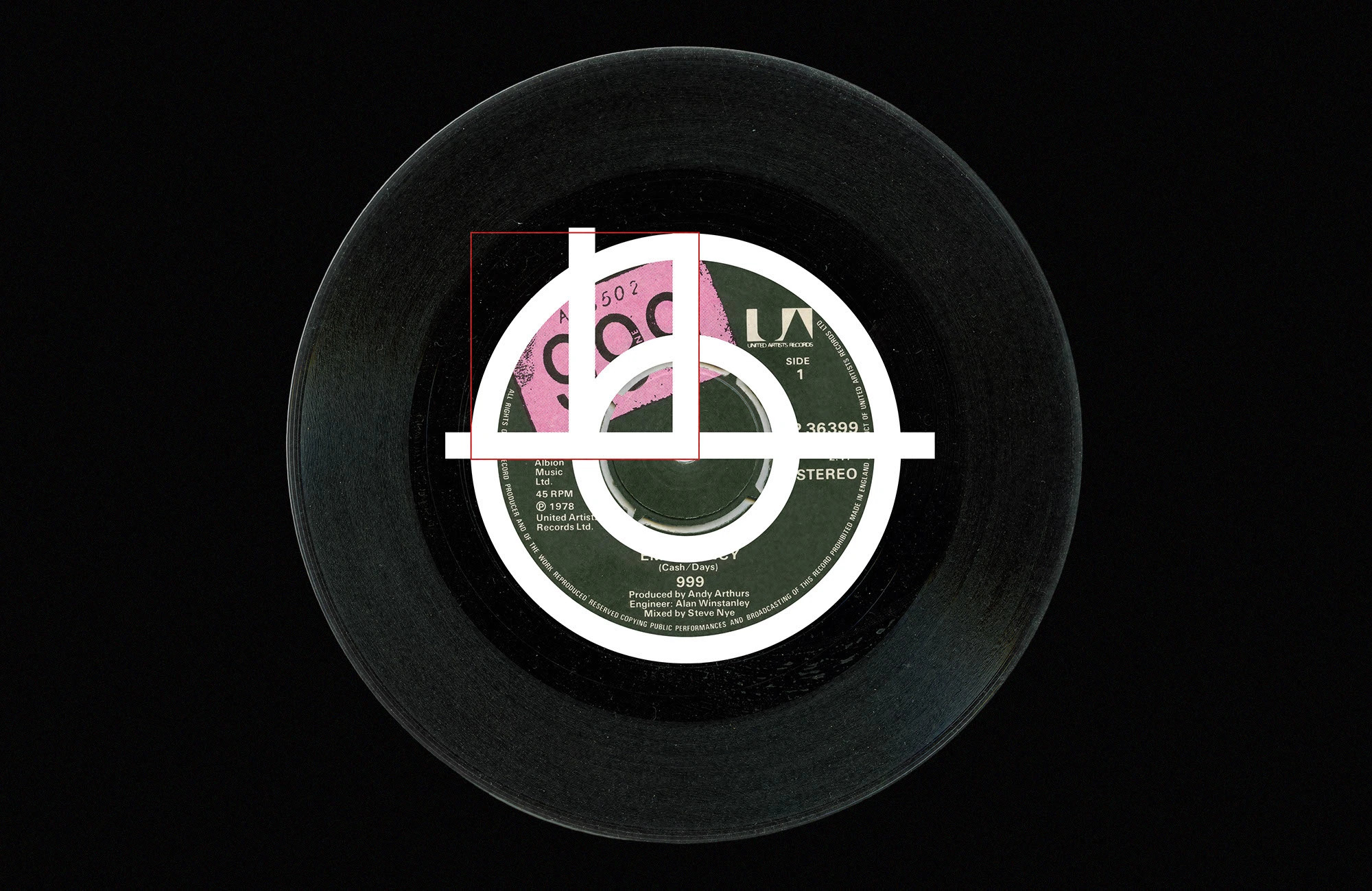
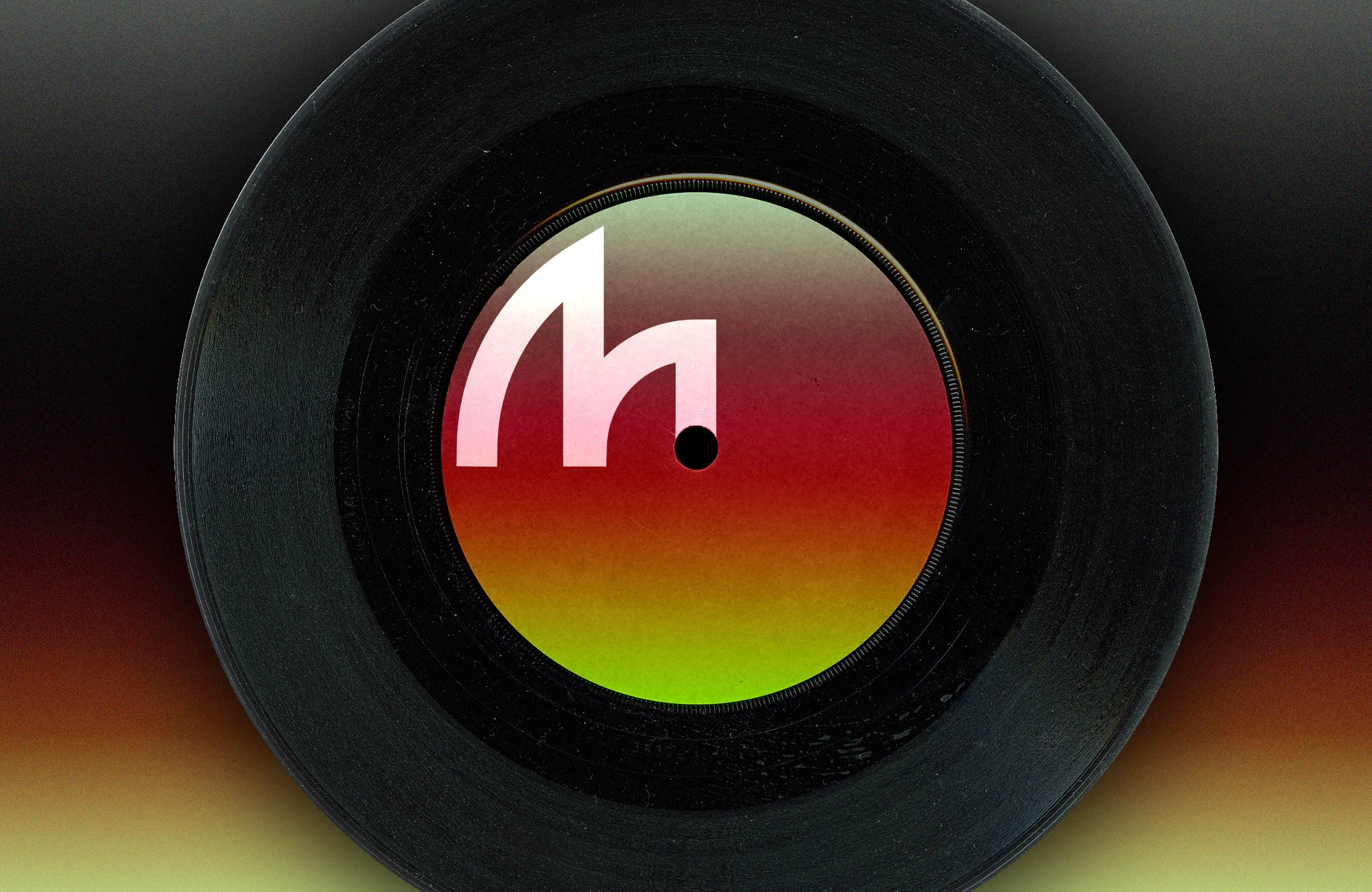
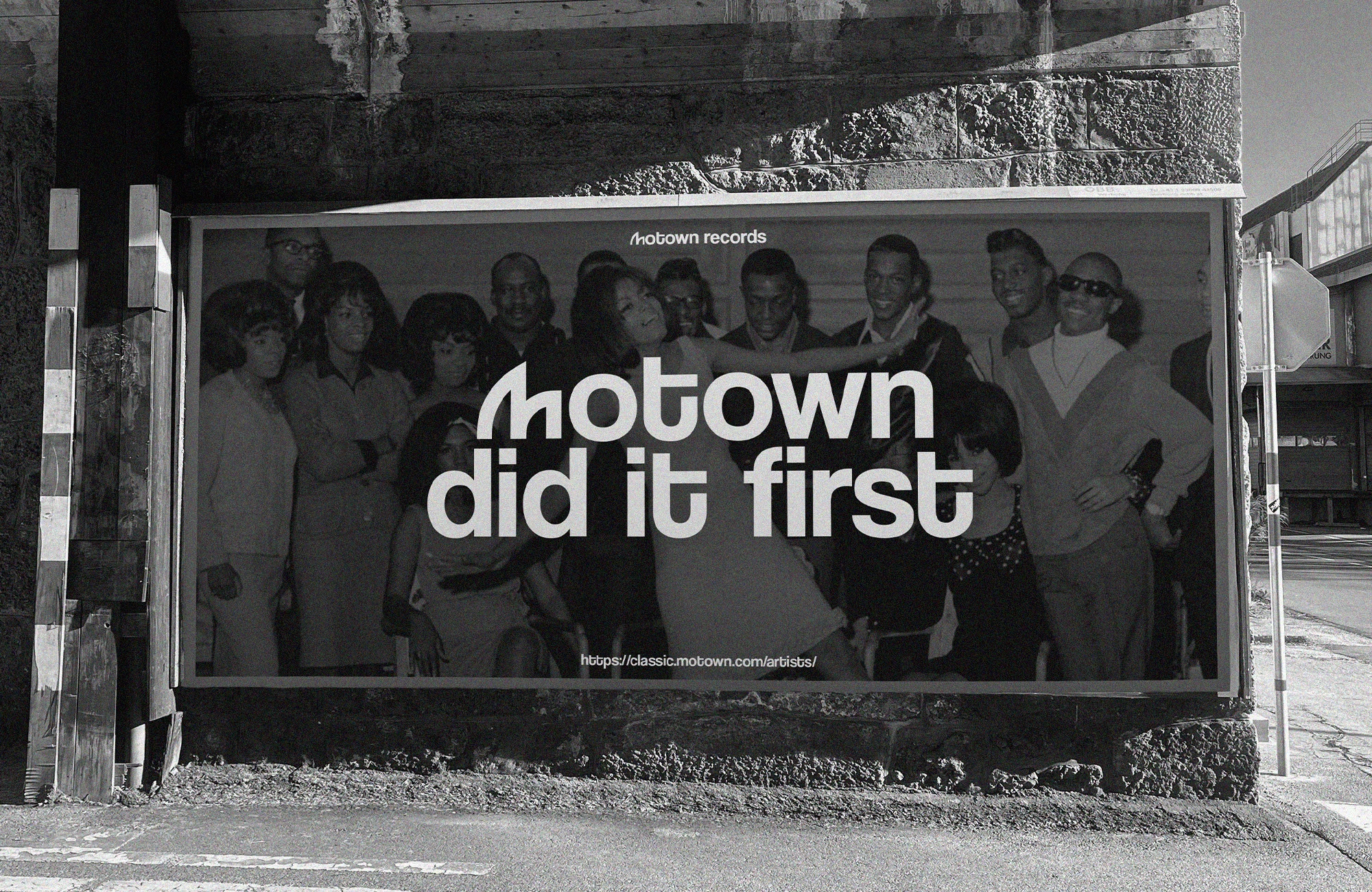
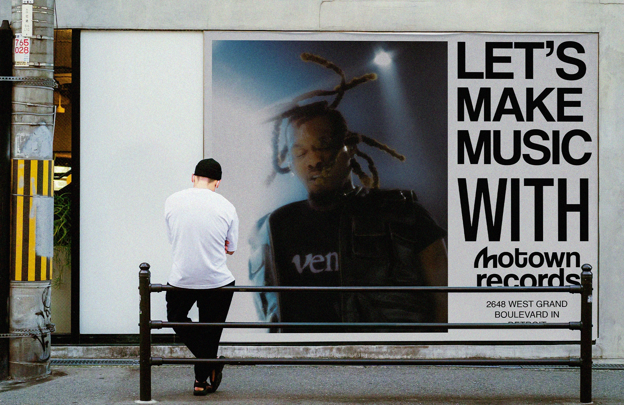
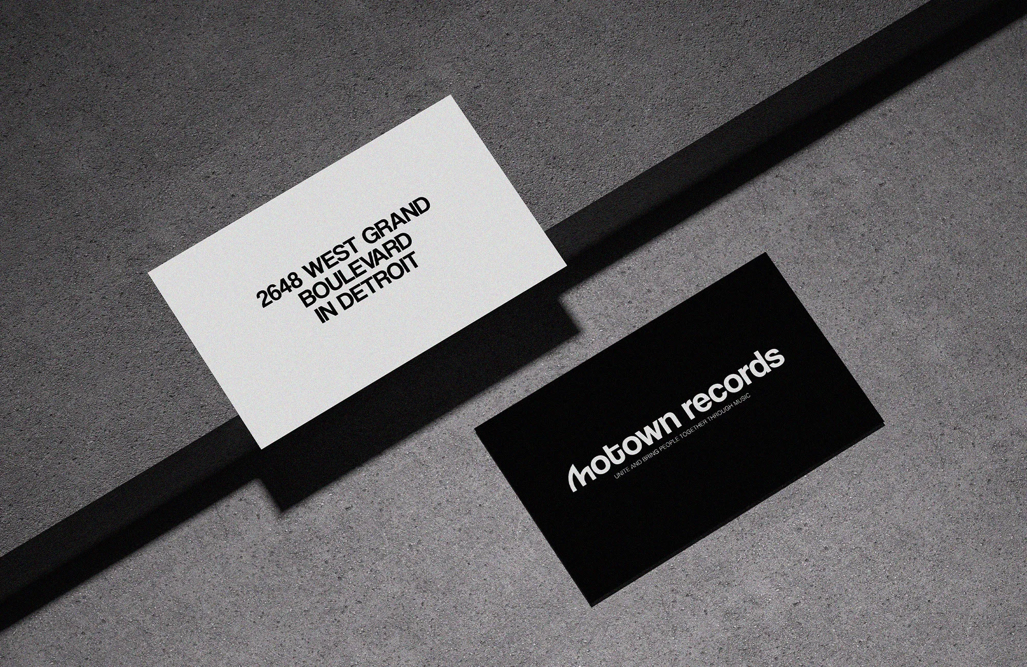
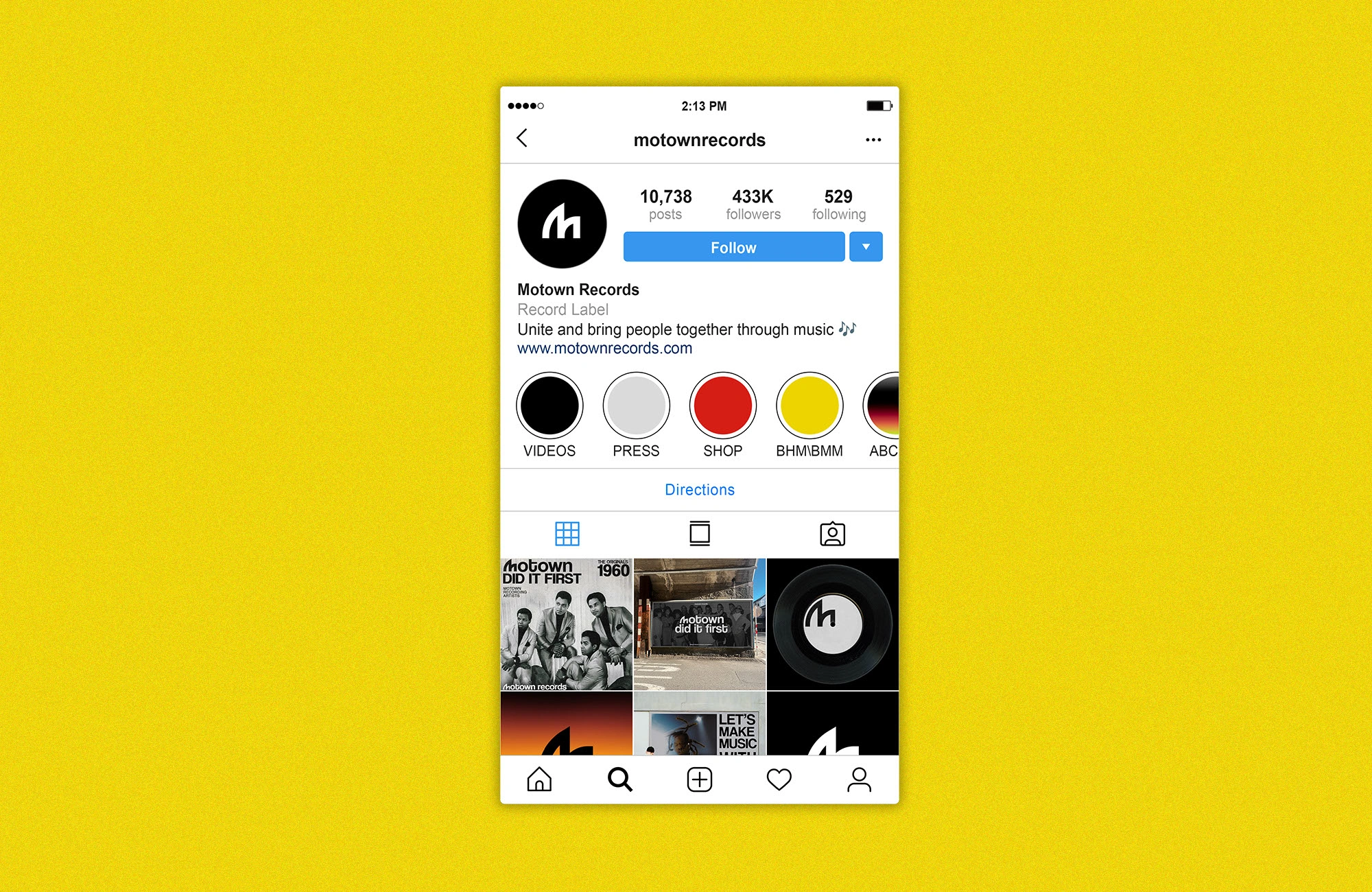
We refined the typography to bring strength and clarity while keeping the familiar spirit of the original. The new palette blends rhythm and elegance, striking a balance between classic and contemporary. Visual elements were designed to scale effortlessly across touchpoints, from album covers and merchandise to digital platforms, ensuring a cohesive and versatile brand identity.
The Impact
This rebrand concept for Motown Records shows that evolution does not mean erasing the past. It means building upon it with respect, precision, and creativity. At Vizualogy, we believe that great design carries stories forward, and this project proves how a cultural icon can remain true to its roots while stepping confidently into the future.
Experience the Identity
Scroll down and explore the full brand identity reveal. Here’s what to pay attention to:
The modernized logo that nods to Motown’s roots
A refined color palette balancing rhythm and elegance
Visual elements designed to work seamlessly across digital and print
A reimagined vibe that preserves the soul while feeling fresh and contemporary
Take a moment to immerse yourself in the details and let the visuals tell the story.



Discover More on Our Website
Want to see how this identity comes to life in context?
Visit our website and explore the full brand presentation with all its details, crafted in a seamless digital experience.
Like this project
Posted Feb 17, 2025
Reimagining Motown Records with a modern identity that honors its soul and legacy while creating a timeless, versatile brand for today.

