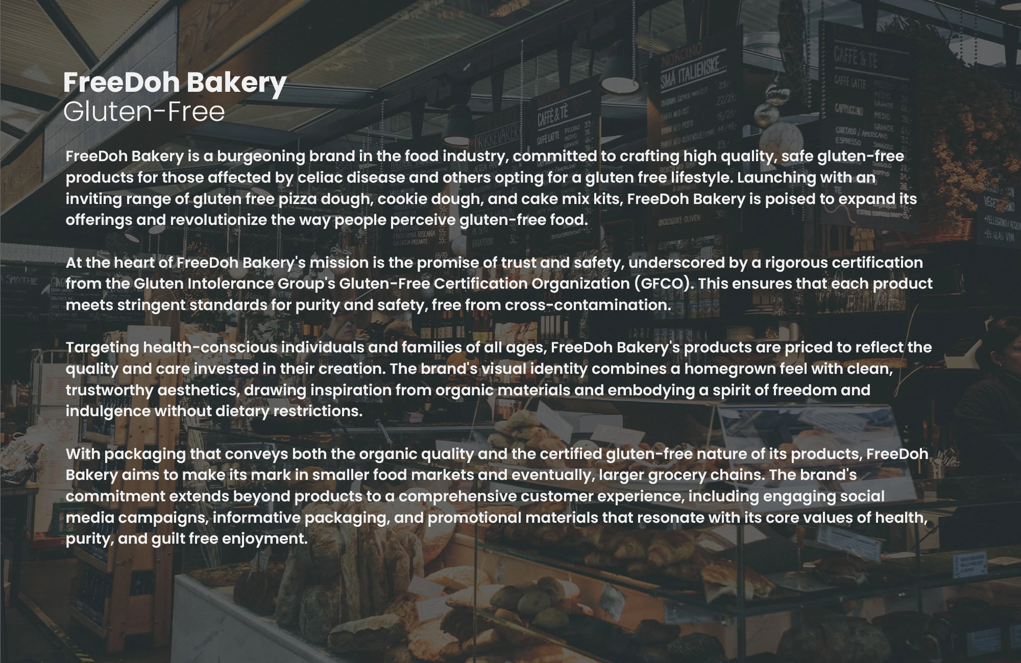
FreeDoh Bakery - A Warm and Inclusive Gluten-Free Identity

Vizualogy Studio


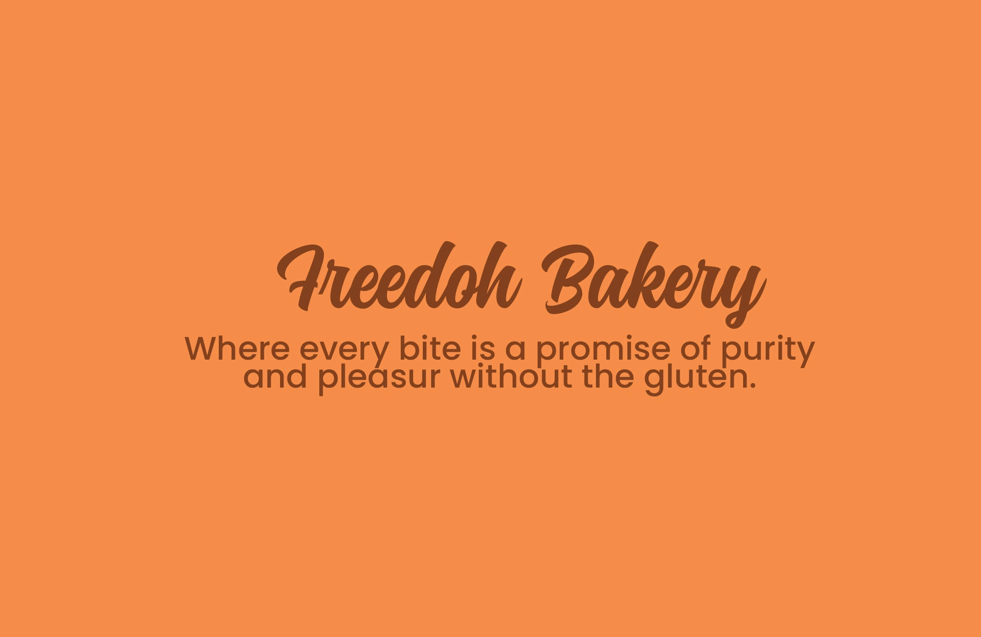
FreeDoh Bakery
Redefining Gluten-Free with Warmth and Authenticity
FreeDoh Bakery was imagined to show that gluten-free can be wholesome, stylish, and inviting for everyone. With earthy browns, warm apricot orange, and clean neutrals, the brand identity balances inclusivity with a premium modern feel.
Description
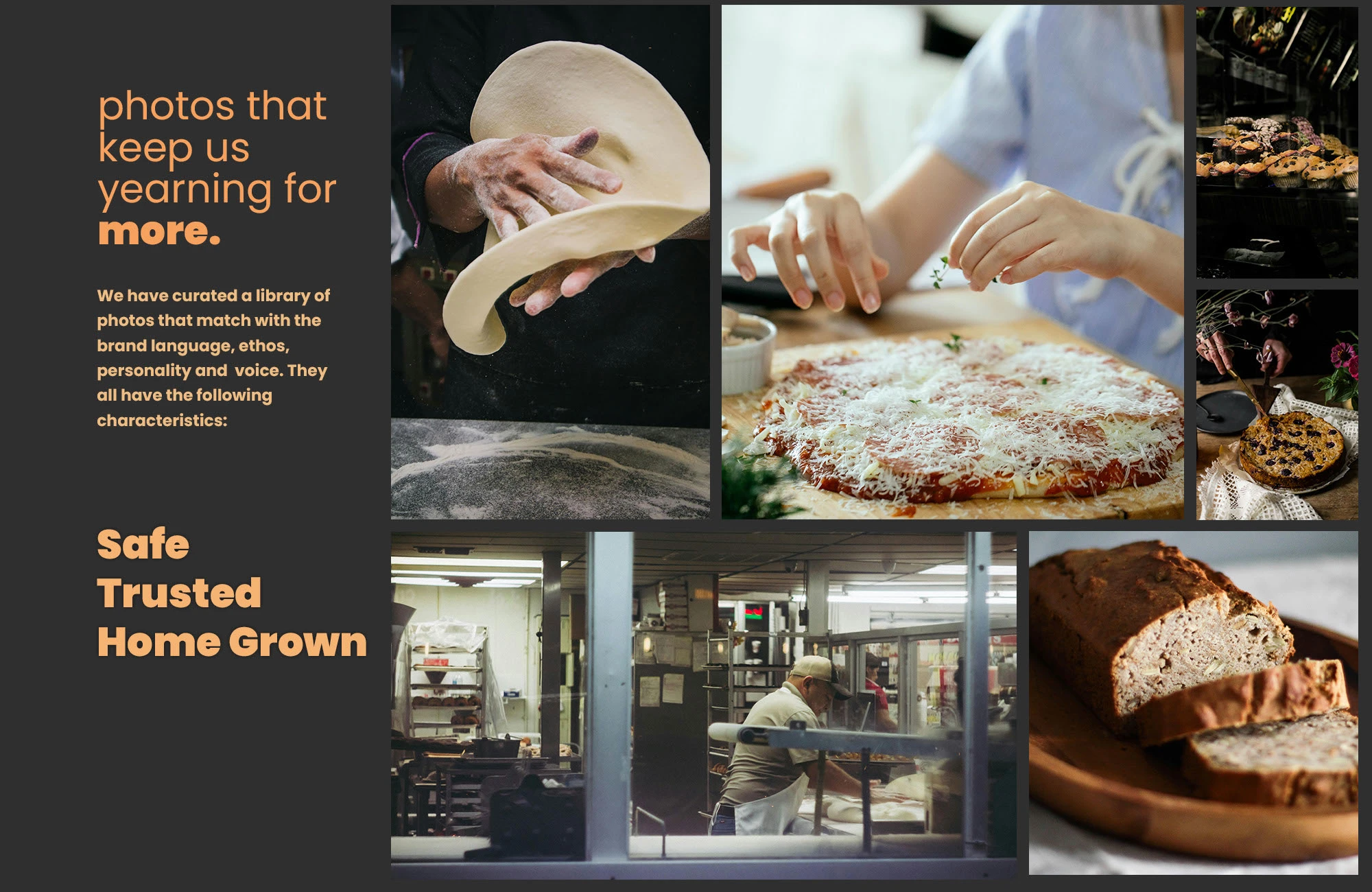
FreeDoh Bakery is a fictional gluten-free bakery brand created as part of a branding masterclass. The project focused on crafting a warm, approachable visual identity that makes gluten-free feel modern and universal.
Challenge
The challenge was designing an identity that reflects the authenticity of gluten-free baking while appealing to a broad, lifestyle-focused audience. It needed to be timeless, scalable, and able to carry across packaging, in-store, and digital touchpoints.
Solution
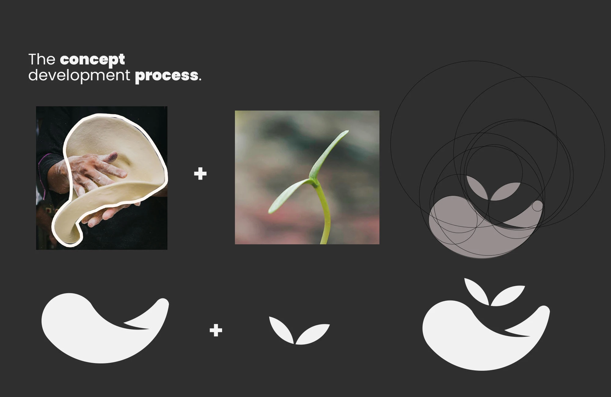
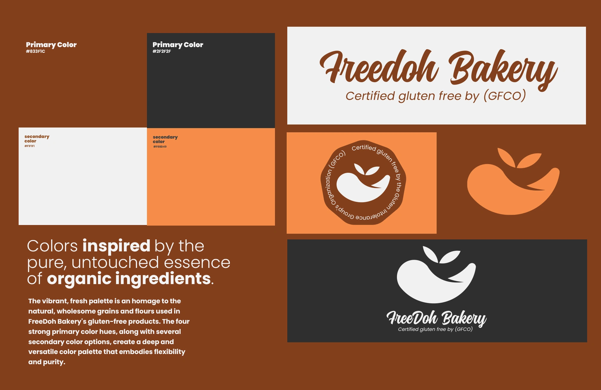
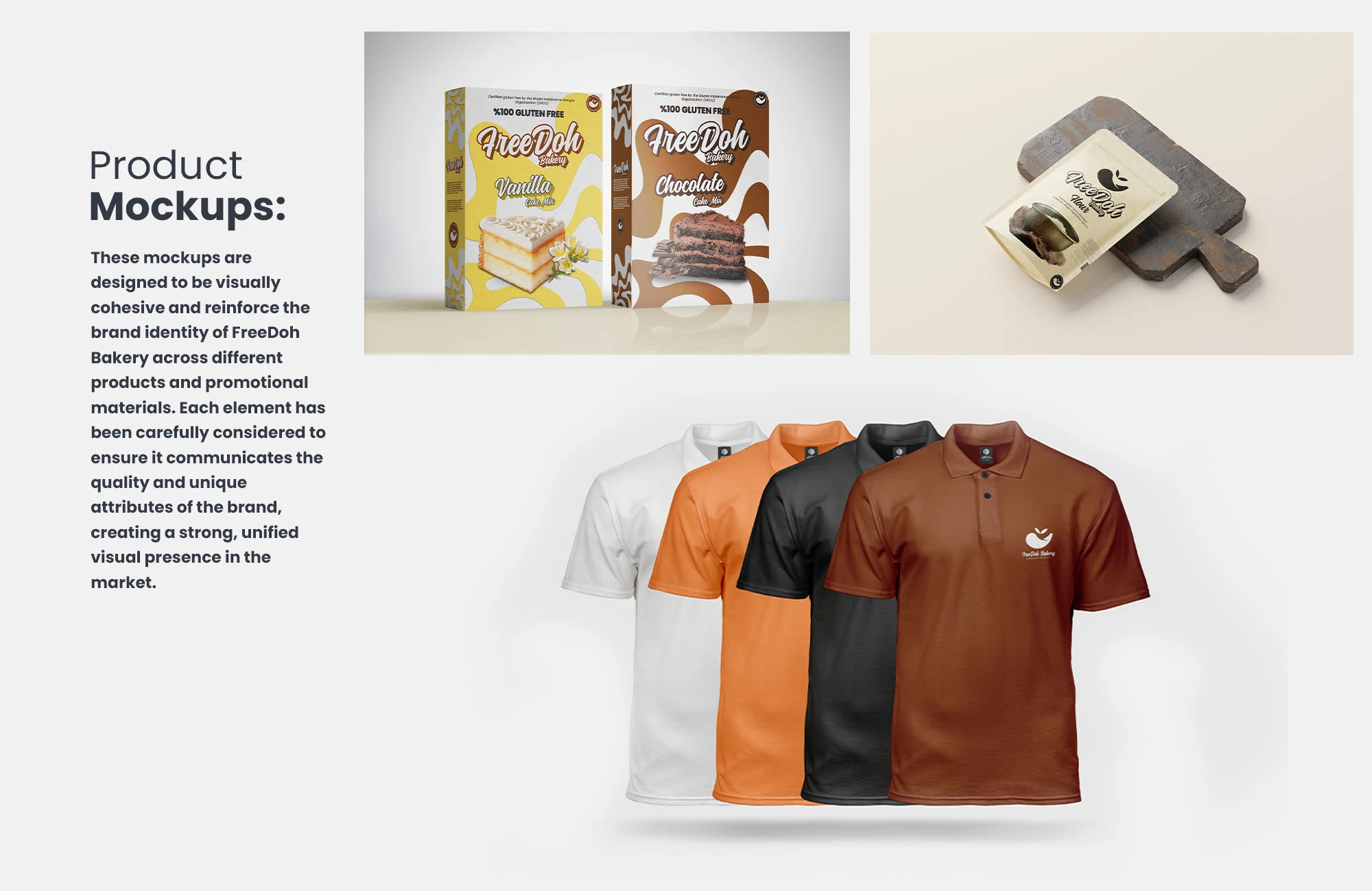
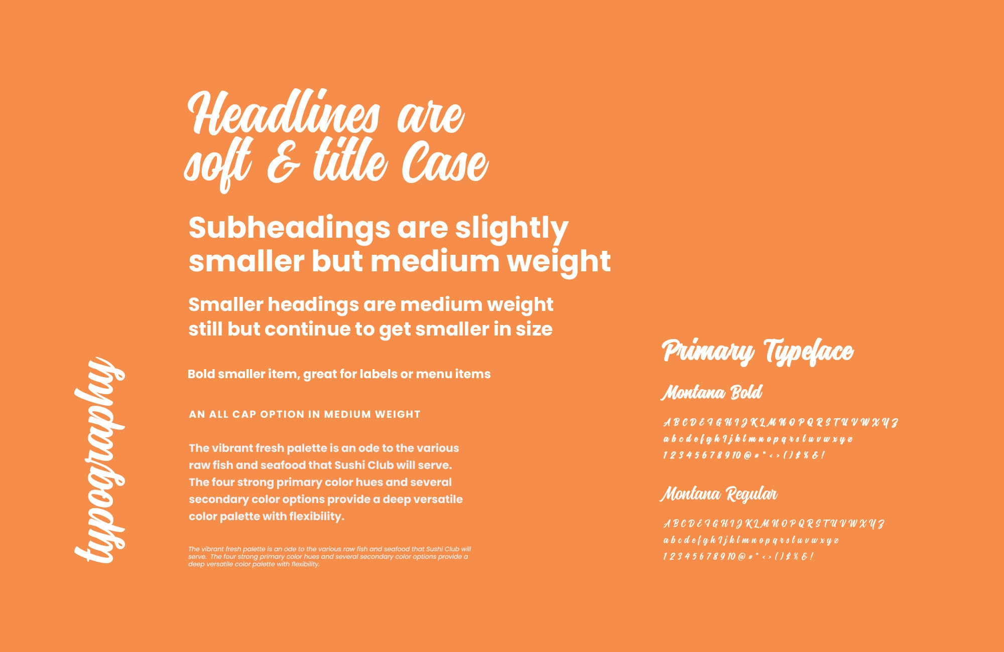
We designed a clean typographic logo anchored in Rich Earth Brown and Dark Charcoal Gray, paired with accents of Warm Apricot Orange and Soft Off-White. This palette conveys honesty, warmth, and premium quality. A geometric pattern based on the brand’s initials (FDB) extends the system, adding recognition and texture across packaging and collateral.
Impact
FreeDoh demonstrates how thoughtful design can transform a niche market into a lifestyle choice. The identity communicates trust, inclusivity, and sophistication, proving gluten-free can be both stylish and inviting.
Explore the Identity
Rich earth tones that root the brand in honesty and quality
Warm apricot orange accents for energy and approachability
A custom FDB pattern that unifies the brand across mediums
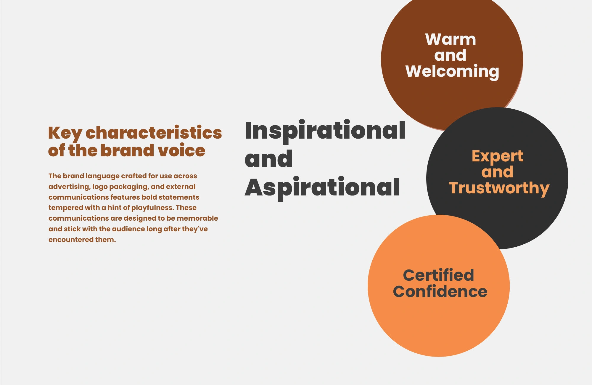
A balance between inclusivity and premium appeal
Like this project
Posted Feb 17, 2025
FreeDoh Bakery reimagines gluten-free branding with earthy tones, modern typography, and a warm identity that feels premium yet welcoming.