Built with Framer
ERGs.io SaaS Marketing Site Design & Development
Vizualogy Studio
$2K+ earned
1 collaborator
Project Overview
Client: ERGS.io
Role: Design & Development (Framer)
Timeline: 3 Weeks
When the team behind ERGS.io approached us, they had a powerful platform in the works but lacked the digital storefront to sell it. They needed a high-converting marketing site that would explain a complex product in seconds.
The goal wasn't just to make it "look good", it was to build a sales engine. We were tasked with designing and developing the Homepage and the Vendor Directory landing page to serve as the primary entry points for new users.
The Mission
ERGS.io is the first platform dedicated to streamlining the workflow of Employee Resource Group (ERG) leaders. Our mission for the website was clear:
Clarify the Value: visually demonstrate how the SaaS works without forcing users to read walls of text.
Showcase the Ecosystem: Use the Vendor Page as a "teaser" to prove the platform's value immediately.
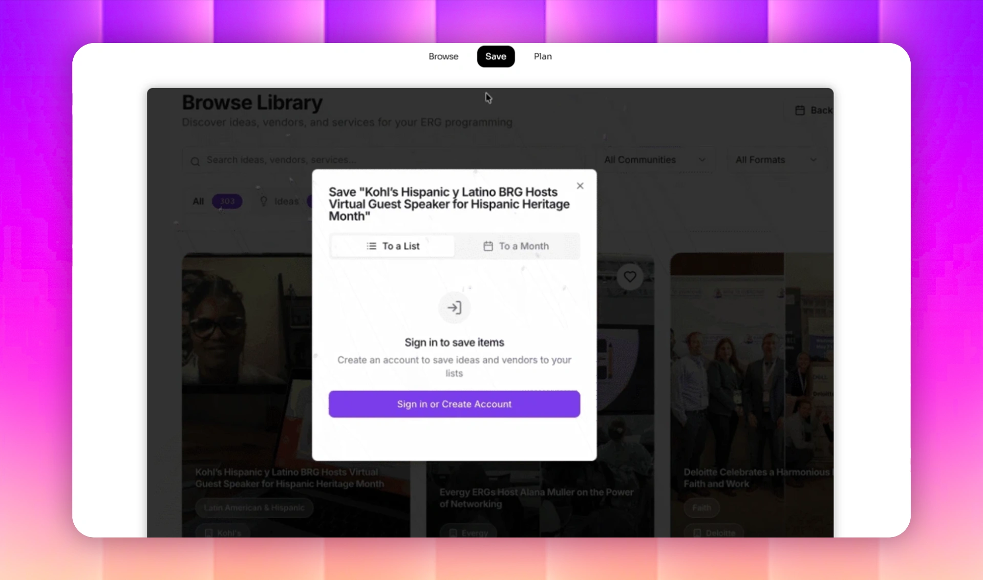
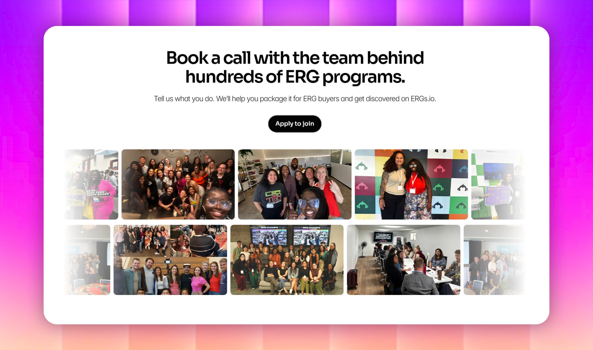
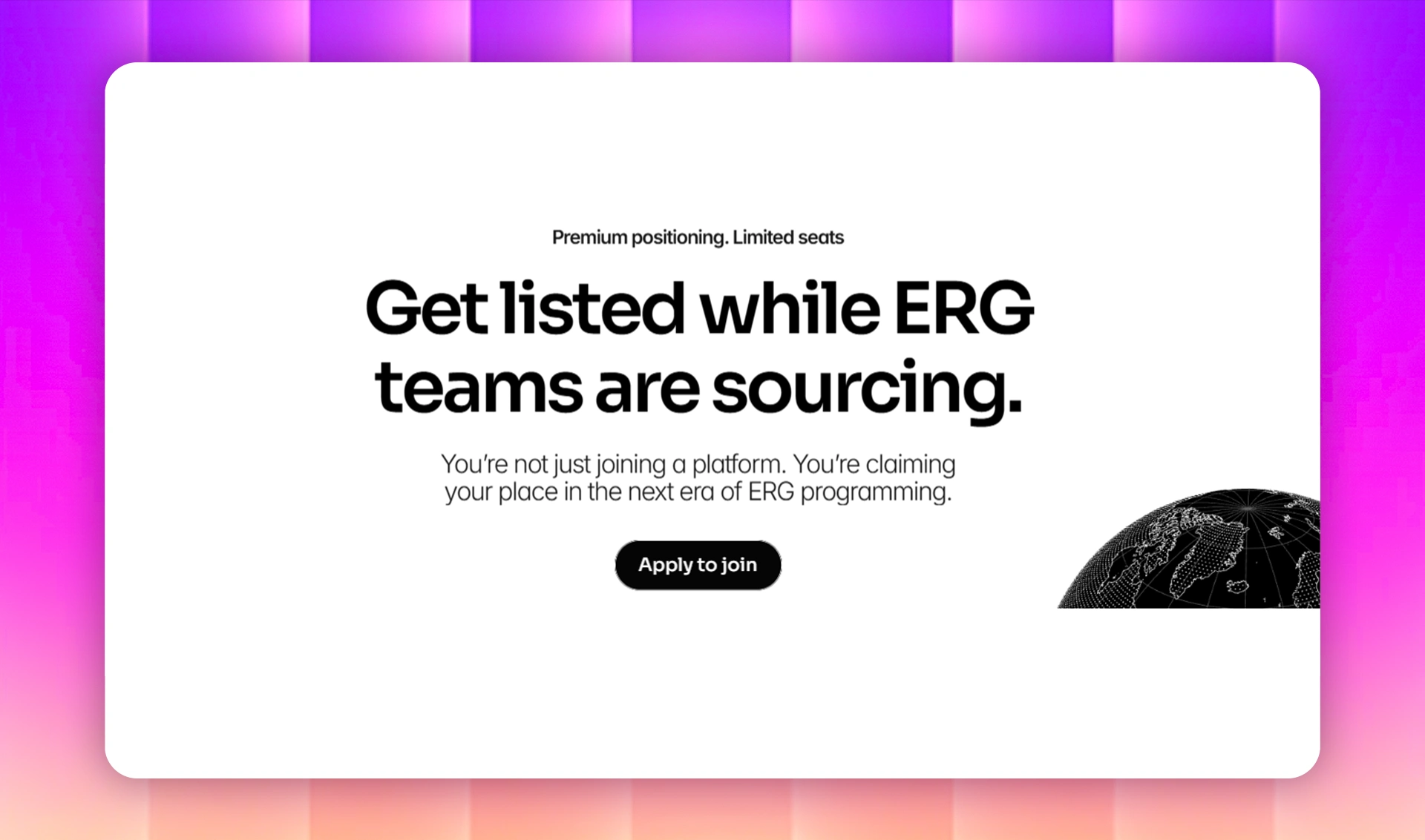
Drive Sign-ups: Funnel traffic from browsing to account creation with strategic CTAs.
The Process
We needed to strike a balance between "Corporate Trust" and "Community Energy." Since the target audience is HR leaders and Community Managers, the site couldn't feel stiff, but it had to look enterprise-ready.
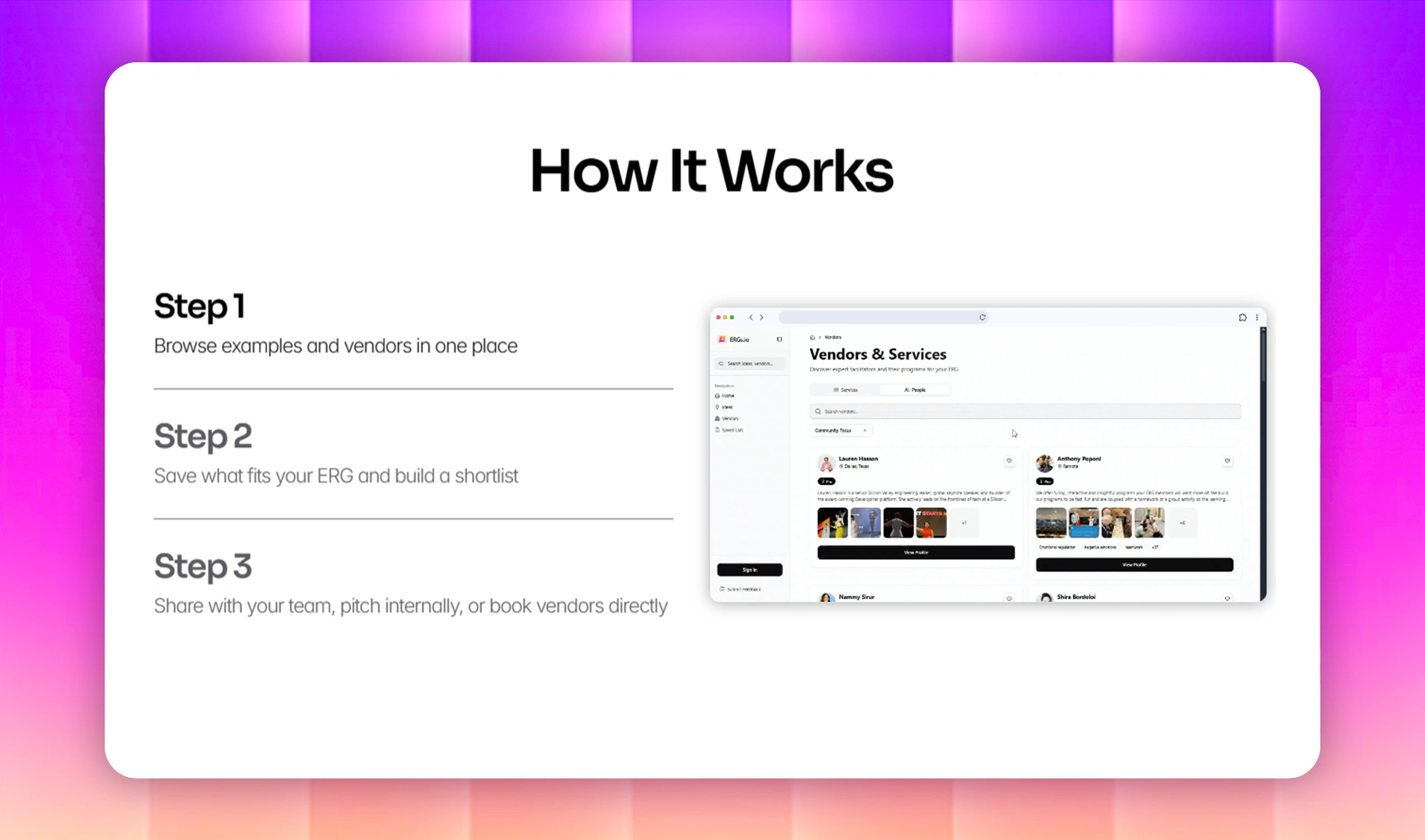
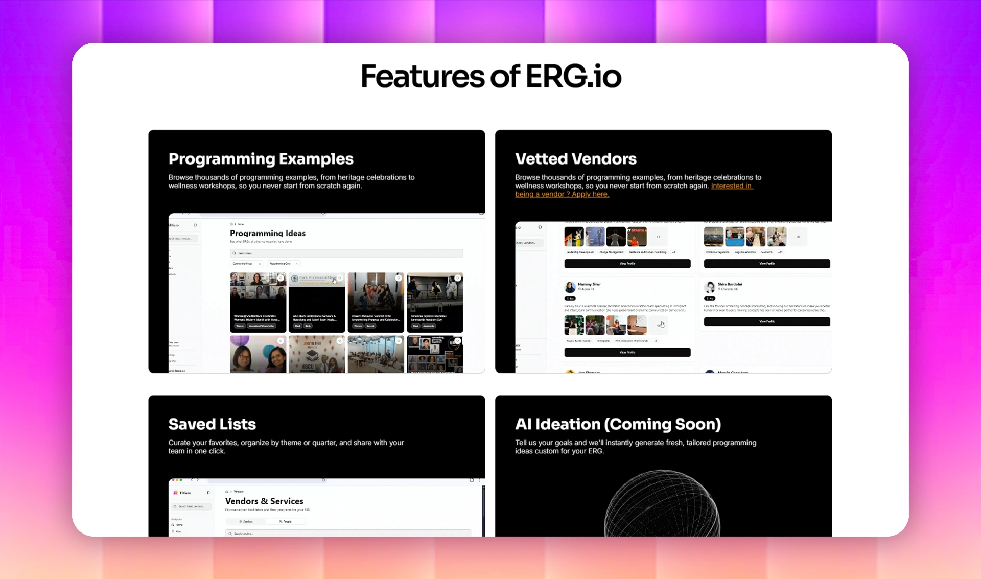
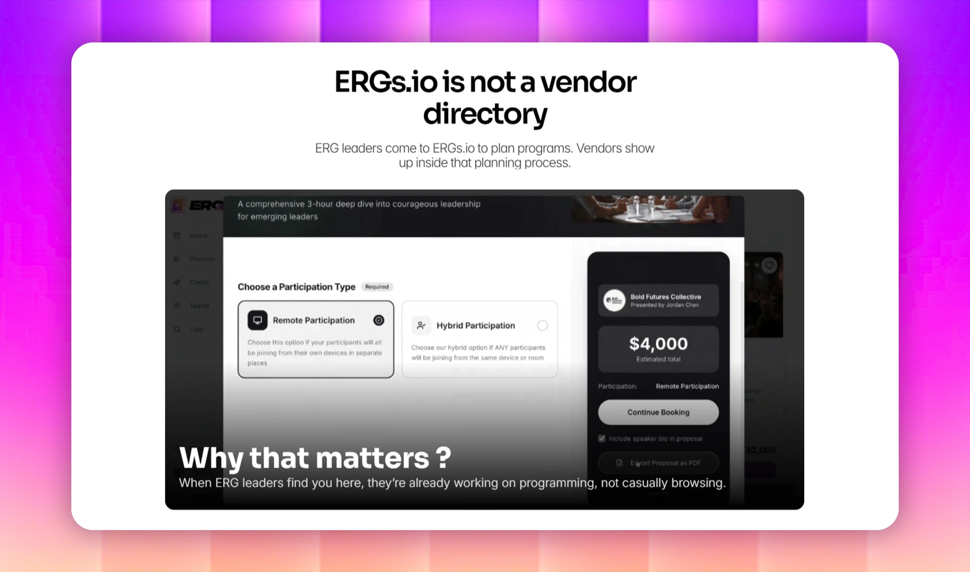
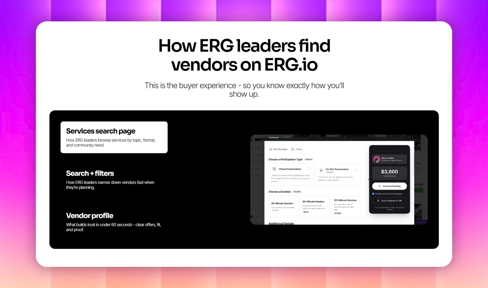
We focused heavily on Product Visualization. Since we weren't building the SaaS itself, we had to show it. We created high-fidelity mockups of the app interface (dashboards, vendors, ideas, etc..) and placed them strategically on the homepage to help visitors visualize the solution.
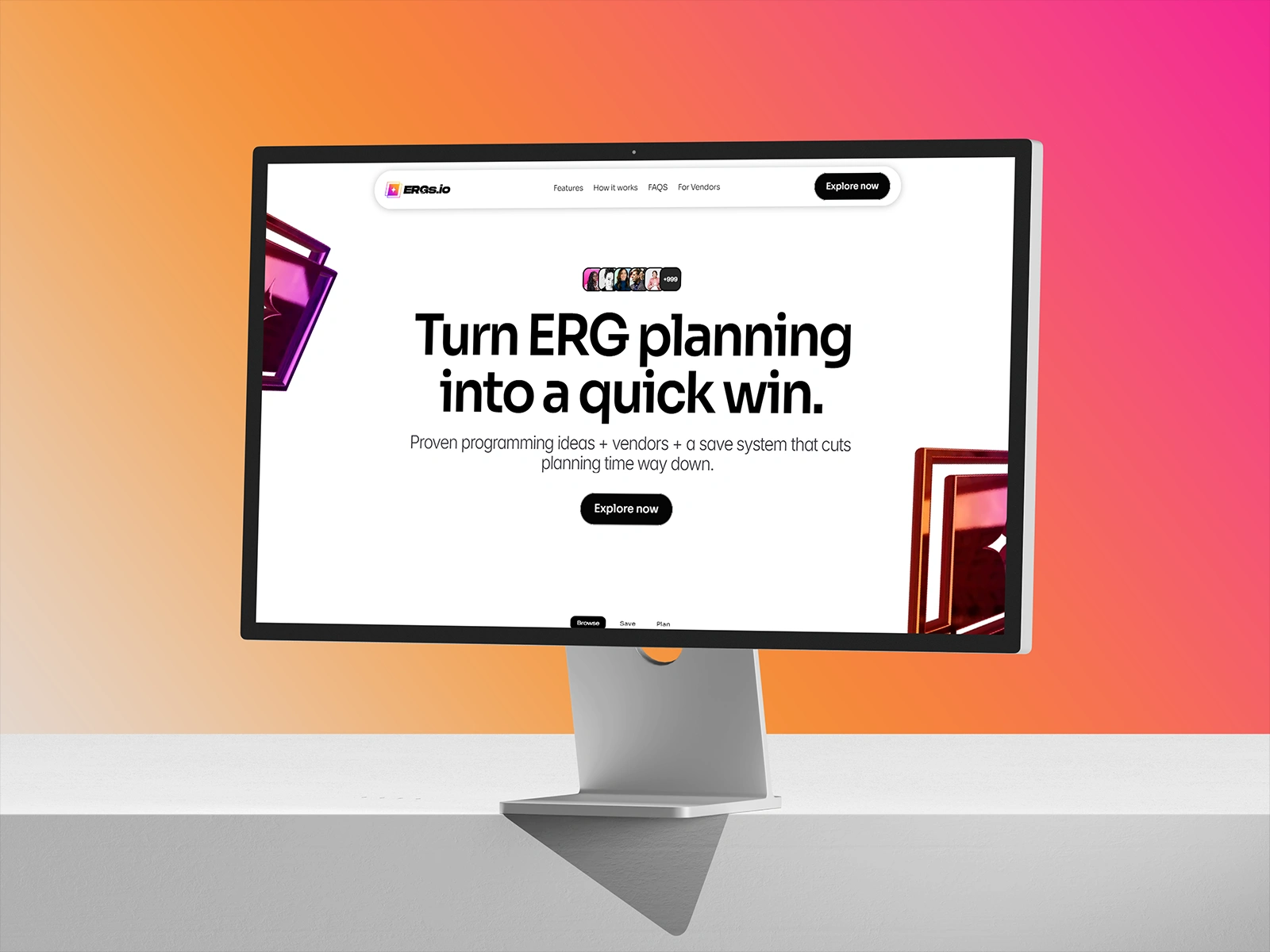
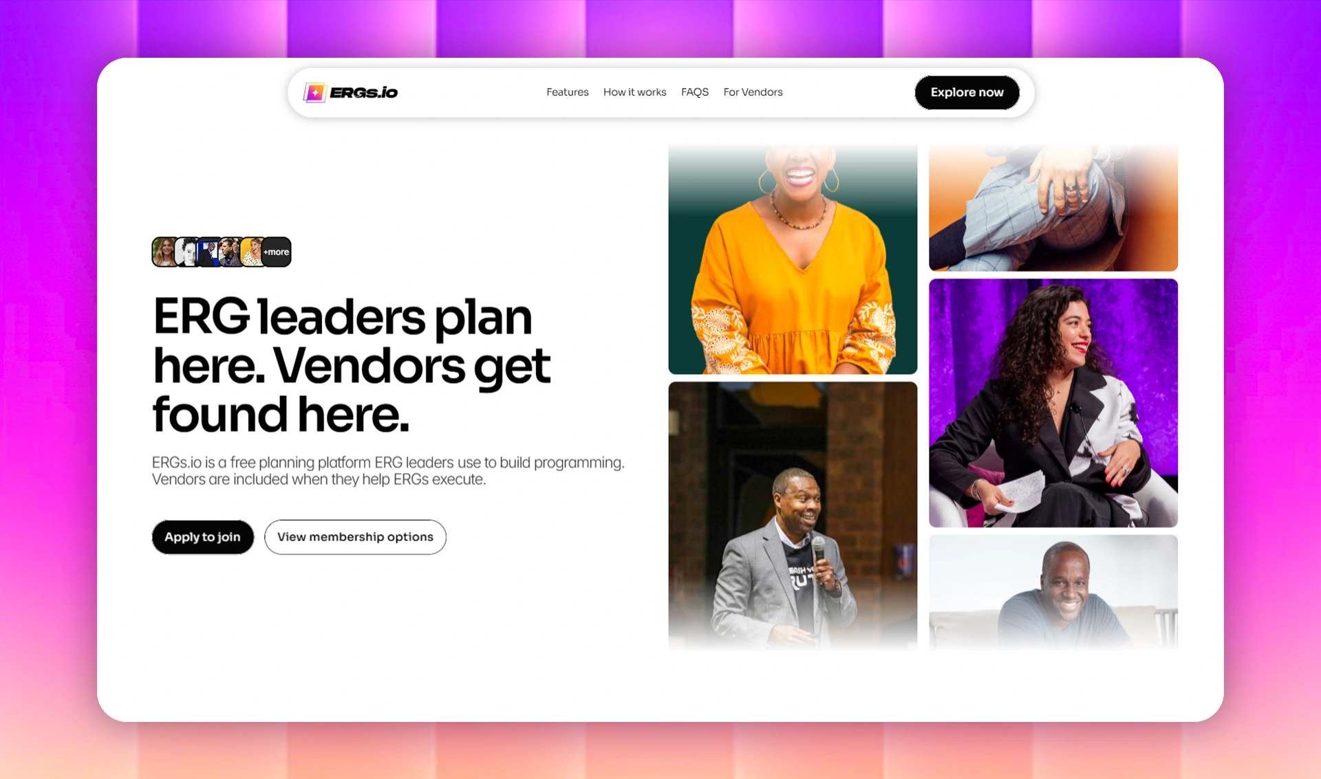
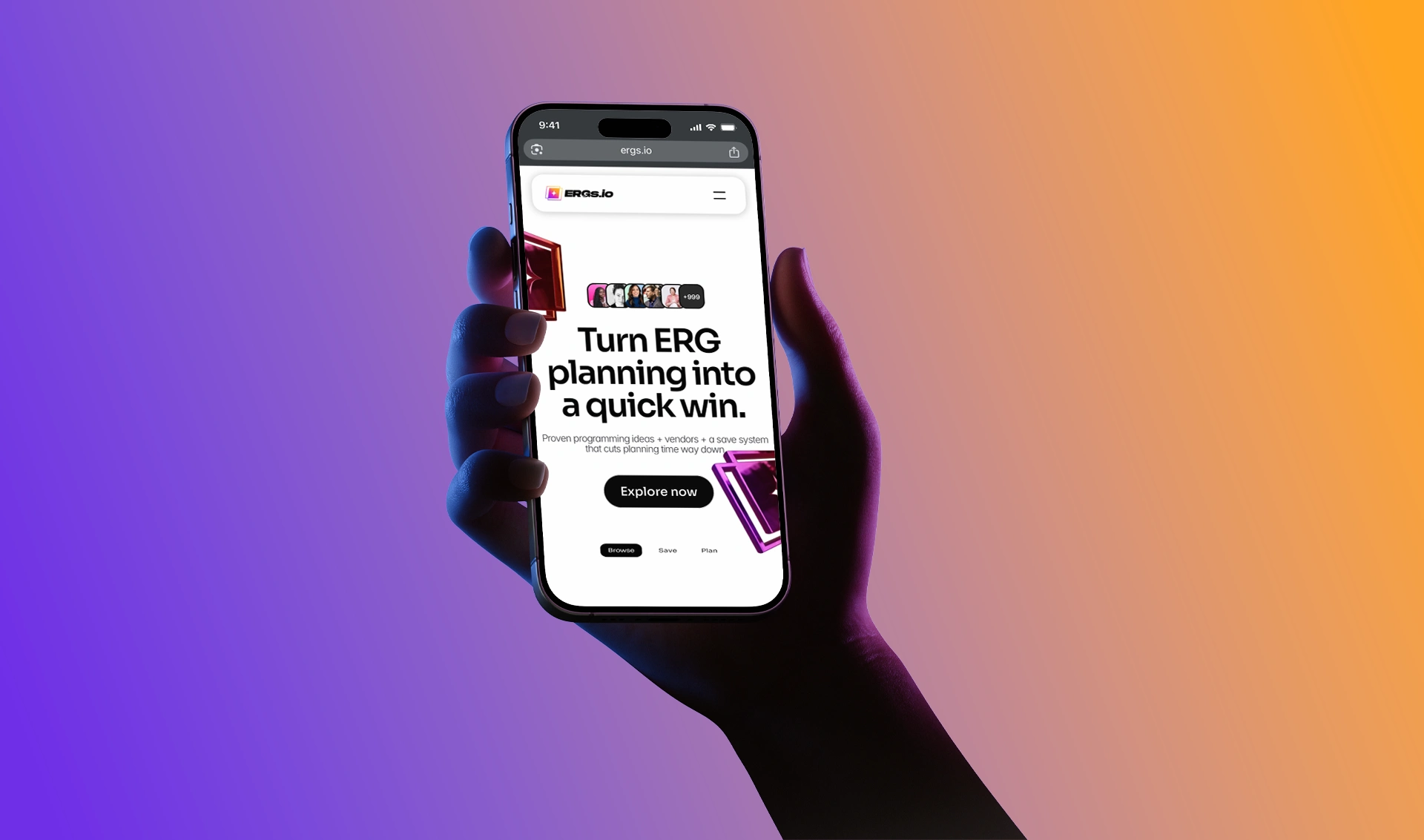
The new Homepage, designed to convert visitors into platform users.
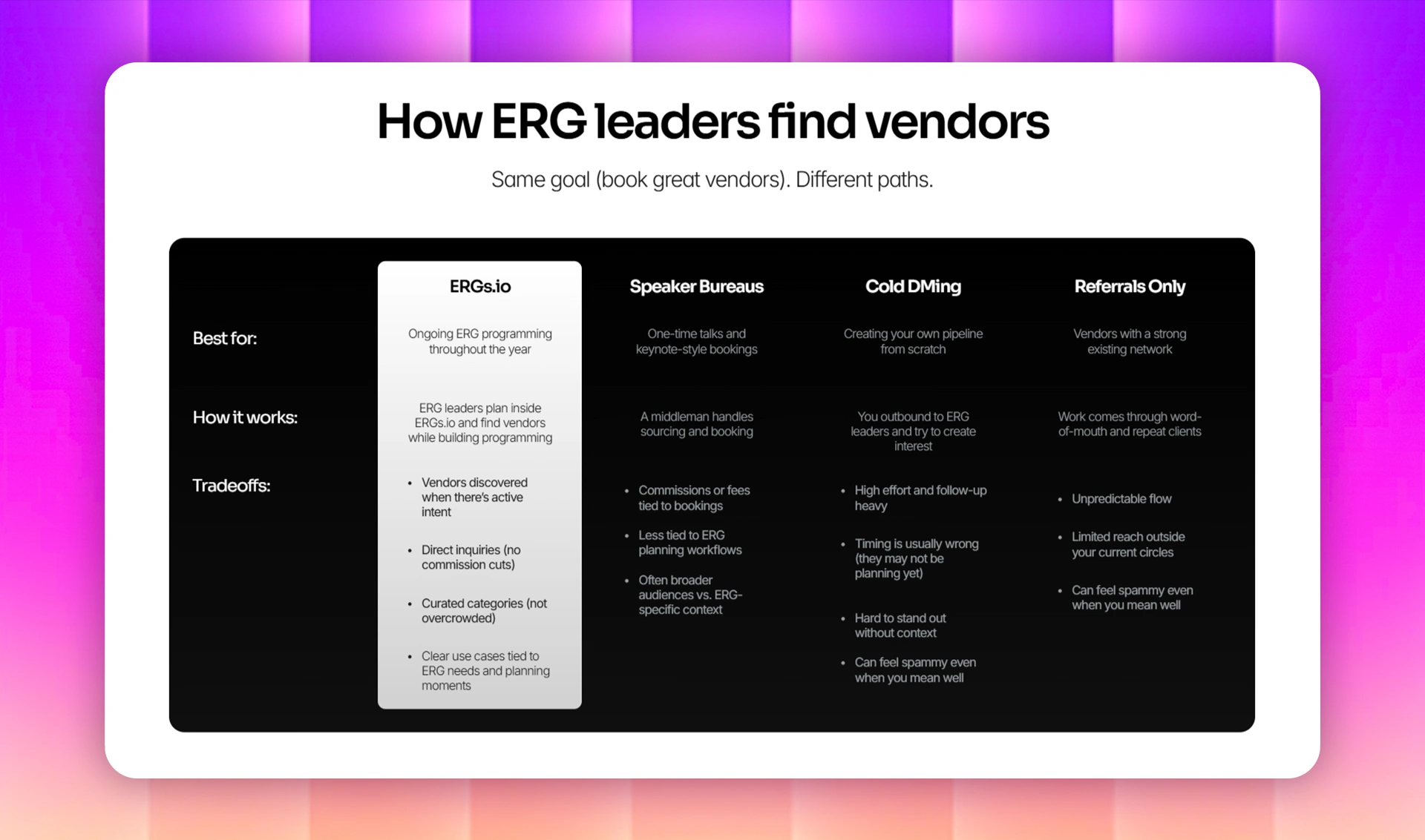
The Vendor Landing Page, organized to show the depth of the ERGS.io network.
Design & Build
We designed and developed the landing pages in Framer, focusing on speed and scalability.
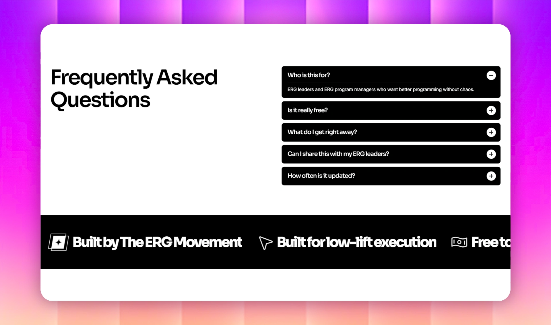
The Homepage: The Pitch
We structured the homepage to answer three questions: "What is it?", "Who is it for?", and "Why do I need it?". We used clear typography and bold product shots to break down the features (Management, Events, Analytics) into digestible sections.
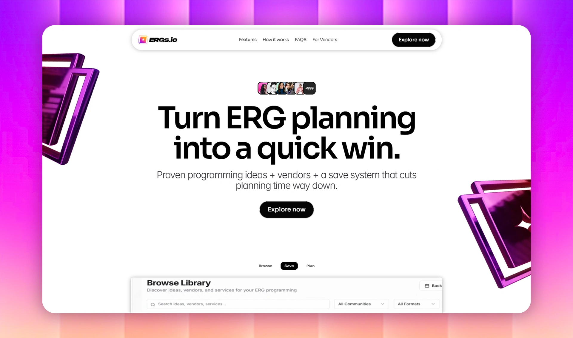
The Vendor Page: The Hook
The Vendor Page isn't just a list, it's a lead magnet. We built it to look like a bustling marketplace. By showcasing real categories and high-quality vendor cards publicly, we create "FOMO" (Fear Of Missing Out), encouraging users to sign up to access the full details.
Key Deliverables:
High-converting Homepage
Public Vendor Directory / Discovery Page
Responsive Mobile Design
CMS Setup for easy content updates
Features
Product Visualization We used a "Dark Mode" aesthetic for the product showcase sections. This creates a beautiful contrast against the white marketing sections, drawing the eye immediately to the software screens and making the product look premium and tech-forward.
Responsive & Fluid Marketing happens everywhere. We ensured the complex layouts, especially the vendor grids and feature lists, stack perfectly on mobile devices. The site retains its premium feel whether viewed on a desktop monitor or a phone during a commute.
Strategic Typography We established a modern, highly readable hierarchy by pairing Sora for bold, geometric headlines with Inter for UI elements and body text. This combination creates a clean, sans-serif look that makes skimming easy while keeping the "ERG Leader" and "Vendor" content visually distinct and organized.
Results
The launch of the new marketing site gave ERGS.io the credibility they needed to approach enterprise clients.
Instant Clarity: Users now understand the product offering within seconds of landing on the page.
Visual Authority: The high-quality finish of the landing pages positions ERGS.io as a market leader, not an early-stage startup.
Scalable Marketing: The Framer build allows the marketing team to spin up new vendor categories and update feature highlights instantly as the SaaS evolves.
Like this project
Posted Jan 27, 2026
We built the high-impact landing pages for ERGS.io in Framer. A fully responsive, static build designed to demonstrate value and convert leads.
Likes
3
Views
48
Earned
$2K+
Timeline
Dec 20, 2025 - Dec 25, 2025
Clients
The ERG Movement
Collaborators