eToolsHub - Digital Tools, Designed with Precision
Vizualogy Studio
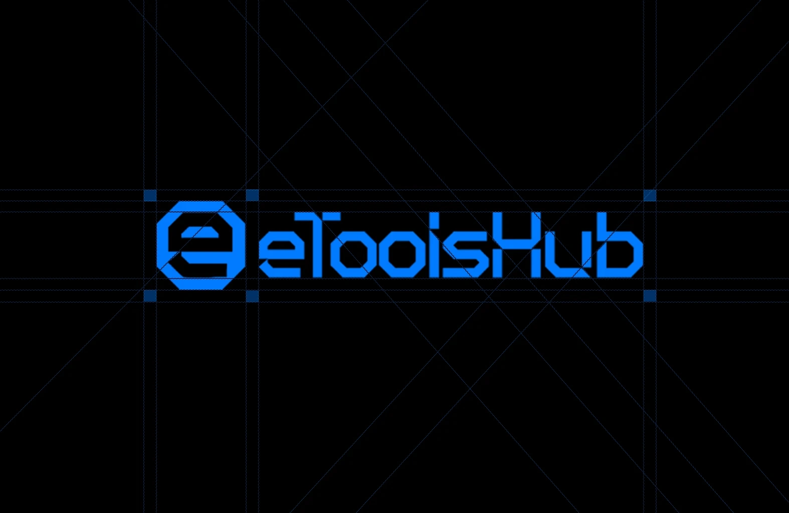
eToolsHub
A Digital Ecosystem Built for Clarity and Speed
eToolsHub is more than a collection of tools — it’s a philosophy of efficiency, precision, and seamless interaction.
Engineered for professionals, students, and anyone who values time, clarity, and performance.
Why This Brand Stands Out
Minimalist Design Language – Clean, uncluttered interfaces that prioritize function over flair
Performance First – Fast loading, zero lag, optimized for every device
Universal Utility – Converters, calculators, text tools — all in one place, no sign-up required
Responsive by Design – Works flawlessly on mobile, tablet, and desktop
Built for the Future – Scalable architecture ready for expansion and innovation
This isn’t just a toolset.
It’s a new standard for digital simplicity.
Precision in every line. Purpose in every pixel.
The Language of Structure
Design as Engineering
The eToolsHub brand isn’t built on trends — it’s built on principles.
Every element is guided by a strict grid, clean typography, and a color system engineered for readability, trust, and scalability.
This is not decorative branding.
It’s functional architecture.
Core Principles
Geometric Integrity – A custom-modified sans-serif font with sharp edges and high legibility at all scales
Color System – Electric blue (
#0066FF) for clarity and innovation; dark gray (#1A1A1A) for depth and contrastGrid-Based Layout – Ensures perfect alignment across all applications, from app icons to full-page interfaces
Minimalist Aesthetic – No unnecessary elements — only what serves function and user experience
The same precision that defines the logo lives in every tool, every interaction, every line of code.
Geometry as grammar. Every line has meaning.
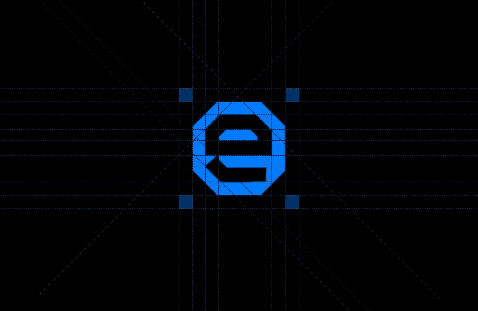
The Anatomy of a Logo
Where Form Meets Function
The eToolsHub icon isn’t just a symbol — it’s a blueprint.
Built on a strict geometric foundation, it reflects the same precision found in every tool, interface, and interaction.
This is not decorative design.
It’s digital architecture.
Design Philosophy
Hexagonal Structure – A shape of balance, stability, and efficiency — mirroring the platform’s core values
Negative Space as Intent – The "e" formed through absence — a nod to minimalism and clarity
Color Choice – Electric blue (
#0066FF) for trust, innovation, and technological presenceScalability – Designed to remain legible and impactful at any size — from favicon to billboard
The icon doesn’t just represent the brand.
It is the brand — engineered for clarity, consistency, and timelessness.
From icon to interface. One brand. Infinite trust.
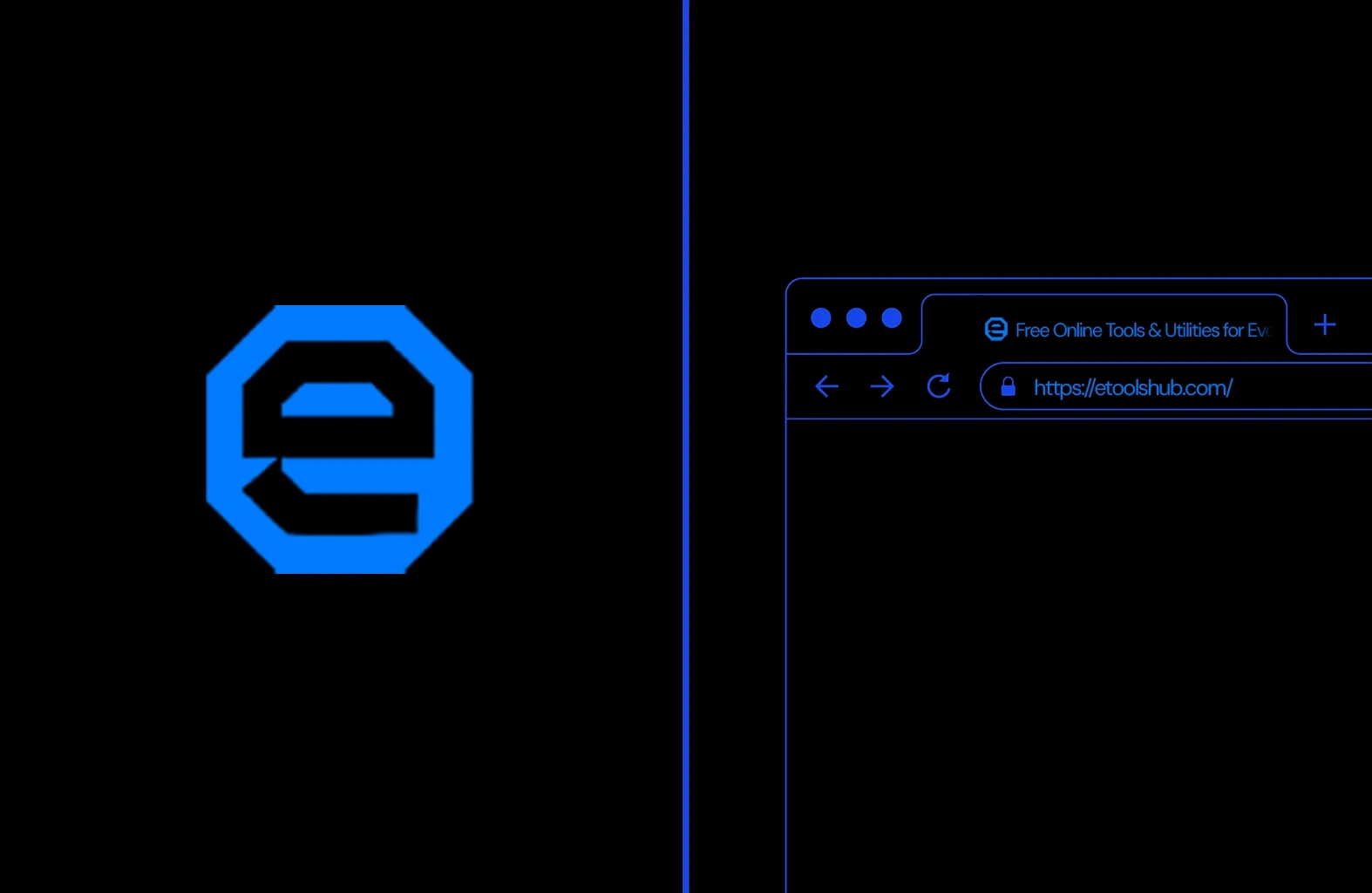
Brand in Context
Where Identity Meets Experience
The eToolsHub logo isn’t just seen — it’s recognized.
From the favicon in the browser to the icon in the app bar, every appearance reinforces clarity, reliability, and speed.
This is not just branding.
It’s presence.
Digital Integration
Favicon Design – A compact, high-contrast version of the logo for instant recognition in tabs
Browser Tab Display – Clean, legible text and secure HTTPS protocol for trust
Consistent Color Language – Electric blue (
#0066FF) used across UI elements for brand continuityMinimalist Interface – No clutter. Just the tools you need, loaded fast and ready to use
The brand doesn’t just live in the logo.
It lives in every interaction — from first click to last.
The language of clarity. Built for every screen.
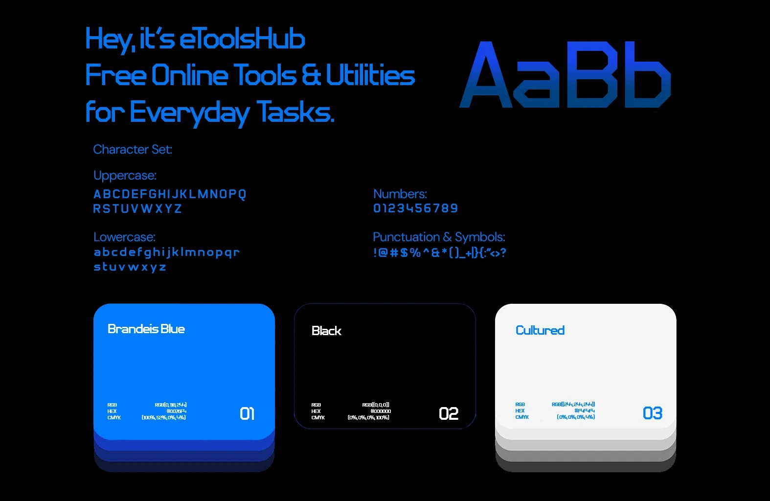
The Brand System
Where Design Meets Function
Every element of the eToolsHub identity was engineered for clarity, consistency, and scalability.
From typography to color, this is not just branding — it’s a foundation for digital experience.
Visual Language
Typography – A custom-modified sans-serif with sharp edges and high legibility at all sizes — ideal for UIs, mobile, and fast reading
Color Palette –
Brandeis Blue (
#0066FF) – Trust, innovation, and digital presenceBlack (
#000000) – Depth, contrast, and professionalismCultured (
#F4F4F4) – Cleanness, simplicity, and readabilityCharacter Set – Full support for uppercase, lowercase, numbers, and symbols — ensuring universal compatibility
Consistency – Applied across all touchpoints: web, app, favicon, and social media
This isn’t just a style guide.
It’s a standard for digital clarity.
Where design meets every surface.
Brand in Motion
From Screen to Street
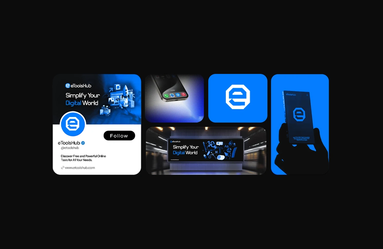
The eToolsHub identity isn’t confined to one platform — it flows seamlessly across all environments.
From social media to mobile, from digital ads to physical cards, the brand remains consistent, recognizable, and powerful.
This is not just branding.
It’s presence.
Cross-Platform Application
Social Media Profile – A clean, high-contrast design with clear messaging and call-to-action
Mobile App Icon – A compact, legible version of the logo for instant recognition
Digital Signage – Bold typography and dynamic visuals for maximum impact in public spaces
Physical Card – A tactile extension of the brand, designed for sharing and trust
The brand doesn’t just exist in pixels.
It exists in every interaction — from first glance to lasting impression.
One tap. Infinite utility.
The App Experience
Where Simplicity Meets Utility
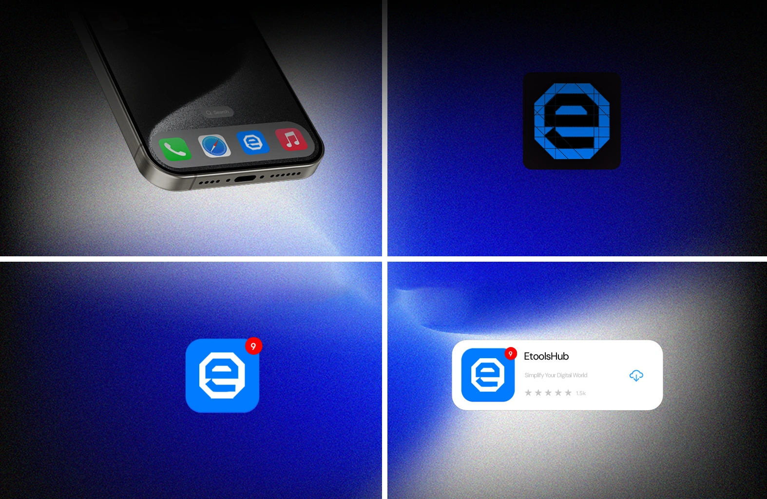
The eToolsHub app isn’t just an icon — it’s a gateway to instant solutions.
From the home screen to the notification center, every interaction is designed for speed, clarity, and trust.
This is not just branding.
It’s usability.
Mobile Presence
Home Screen Icon – A compact, high-contrast version of the logo for instant recognition
Dark Mode Support – Seamlessly adapts to system settings for visual comfort
Notification Badge – Real-time updates with a subtle red dot for urgency without clutter
App Store Preview – Clean, professional listing with clear messaging and user ratings
The app doesn’t just exist on the screen.
It exists in the user’s workflow — ready when they are.
From wrist to world. One brand. Infinite access.
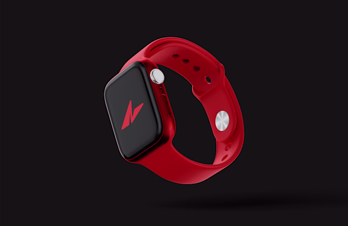
Beyond the Screen
Where Technology Meets Everyday Life
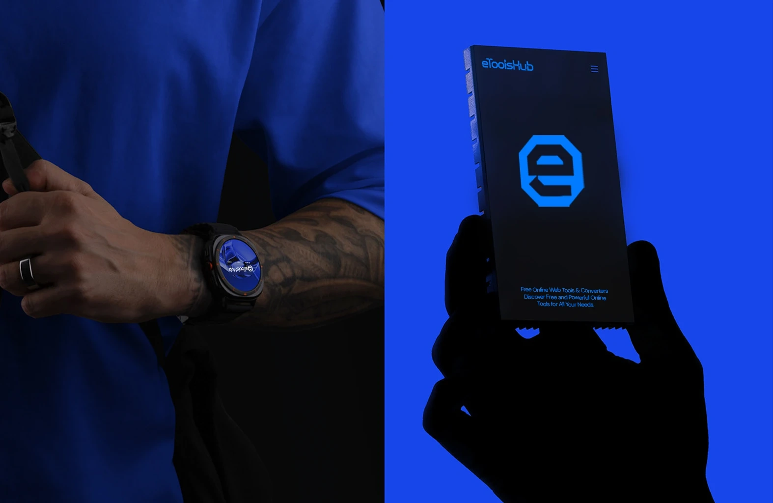
The eToolsHub experience isn’t limited to apps or websites, it lives in the tools you carry, wear, and trust.
From the smartwatch on your wrist to the card in your pocket, the brand becomes part of your workflow, always ready, always accessible.
This is not just branding.
It’s integration.
Future-Ready Applications
Smartwatch Integration – A compact, high-contrast display for quick access to tools on the go
Physical Card Design – A tactile extension of the brand, designed for sharing and trust
Consistent Visual Language – The same electric blue (
#0066FF) and geometric logo across all formatsSeamless Experience – No friction between digital and physical — only clarity and speed
The brand doesn’t just exist in pixels.
It exists in every moment - from first glance to lasting impact.
Seen in the city. Built for the world.
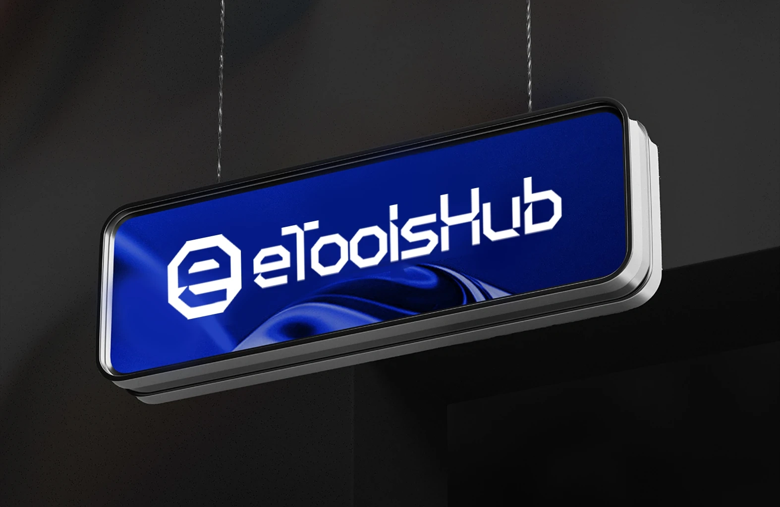
The Public Statement
Where Brand Meets Movement
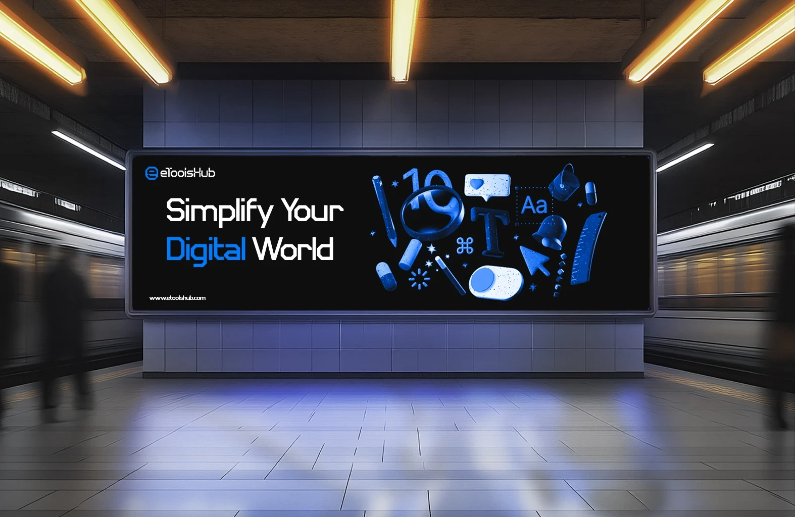
The eToolsHub message isn’t just seen on screens — it’s seen in the streets.
From subway stations to digital billboards, the brand speaks to the rhythm of modern life: fast, clear, and purposeful.
This is not just advertising.
It’s communication.
Mass Impact
Public Display – A bold, high-contrast billboard designed for maximum visibility in busy environments
Tagline Clarity – "Simplify Your Digital World" — a promise of ease, speed, and clarity
Iconography – Floating digital tools (magnifier, text, ruler, etc.) symbolize utility and function
Color Language – Electric blue (
#0066FF) against black — trust, innovation, and contrastThe brand doesn’t just exist in pixels.
It exists in every moment — from first glance to lasting impact.
A destination in the digital world.
The Final Statement
Where Brand Becomes Destination
The eToolsHub identity isn’t just seen on screens — it’s seen in spaces.
From subway stations to physical signage, the brand becomes a landmark in the digital world: clear, consistent, and trustworthy.
This is not just branding.
It’s legacy.
Institutional Presence
Physical Signage – A sleek, illuminated display designed for maximum visibility and impact
Brand Continuity – The same electric blue (
#0066FF) and geometric logo across all formatsDesign Language – Clean lines, high contrast, and reflective surfaces for modern appeal
Emotional Resonance – A sense of arrival, purpose, and clarity
The brand doesn’t just exist in pixels.
It exists in every moment — from first glance to lasting impact.
Seen in the feed. Trusted in the world.
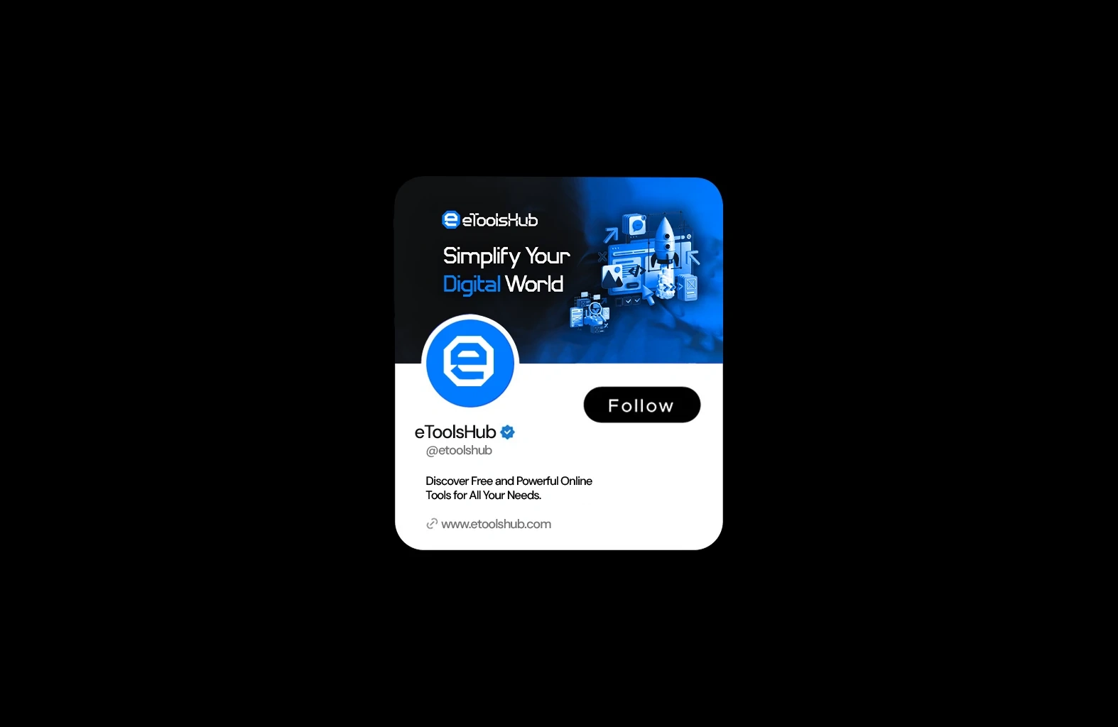
The Digital Voice
Where Brand Meets Community
The eToolsHub presence isn’t just seen on screens — it’s seen in feeds, followed by users, and trusted by professionals.
From social profiles to real-time engagement, the brand becomes part of the digital conversation — clear, consistent, and purposeful.
This is not just branding.
It’s connection.
Social Presence
Profile Design – A clean, high-contrast layout with clear messaging and call-to-action
Tagline Clarity – "Simplify Your Digital World" — a promise of ease, speed, and clarity
Visual Language – Electric blue (
#0066FF) against black — trust, innovation, and contrastEngagement Ready – Designed for discovery, follow, and interaction
The brand doesn’t just exist in pixels.
It exists in every moment — from first glance to lasting impact.
Trusted by professionals. Followed by giants.
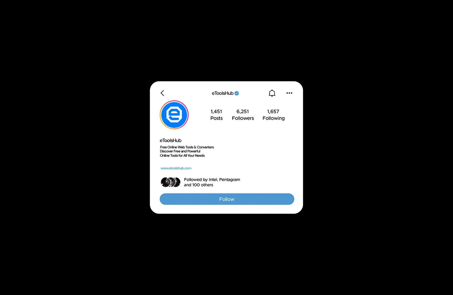
The Final Proof
Where Trust Meets Impact
The eToolsHub presence isn’t just seen on screens — it’s seen in numbers, followed by leaders, and trusted by professionals.
From 6,251 followers to recognition from Intel and Pentagram, the brand has earned its place in the digital world.
This is not just branding.
It’s validation.
Social Credibility
Verified Profile – A blue checkmark symbolizing authenticity and trust
Industry Recognition – Followed by Intel, Pentagram, and 100+ others — a sign of real-world impact
Engagement Metrics – 1,451 posts, 6,251 followers, and growing — consistent presence and value
Clear Messaging – “Free Online Web Tools & Converters” — direct, useful, and user-focused
The brand doesn’t just exist in pixels.
It exists in every moment — from first glance to lasting impact.
Like this project
Posted Sep 5, 2025
All-in-one platform for converters, calculators & text tools. Fast, free, responsive. Built to simplify your workflow - no sign-up, no clutter.
Likes
1
Views
29
Timeline
Feb 19, 2025 - Ongoing