Apex Gear - Branding Strength and Motion
Vizualogy Studio
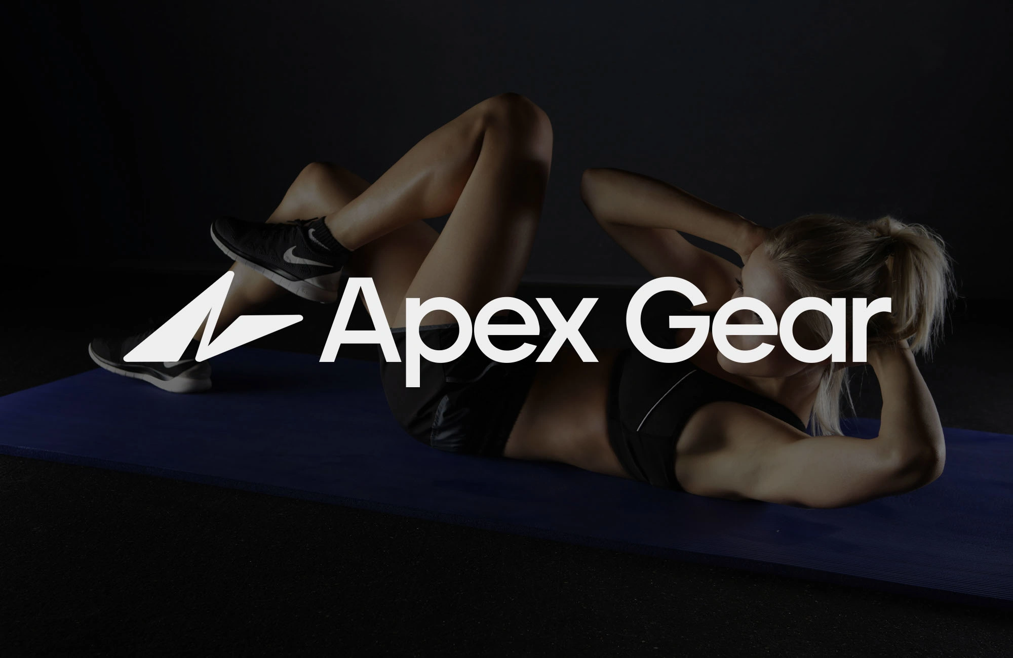
Apex Gear - Designed for Motion
The Idea
Apex Gear started as a vision: what if a sports and fitness brand could feel as powerful as the athletes it represents? Not just another tech label, but an identity built to channel energy, discipline, and ambition into every detail.
The Challenge
How do you design a brand that feels bold and premium, without slipping into clichés? Apex Gear had to stand out in the competitive world of wearable fitness technology, it needed a symbol of motion and a system of trust.
The Design Story
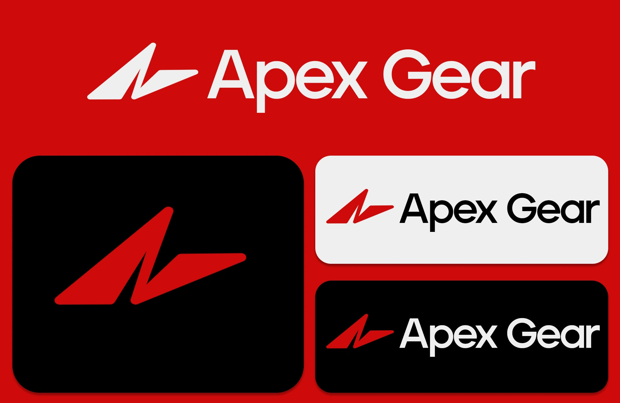
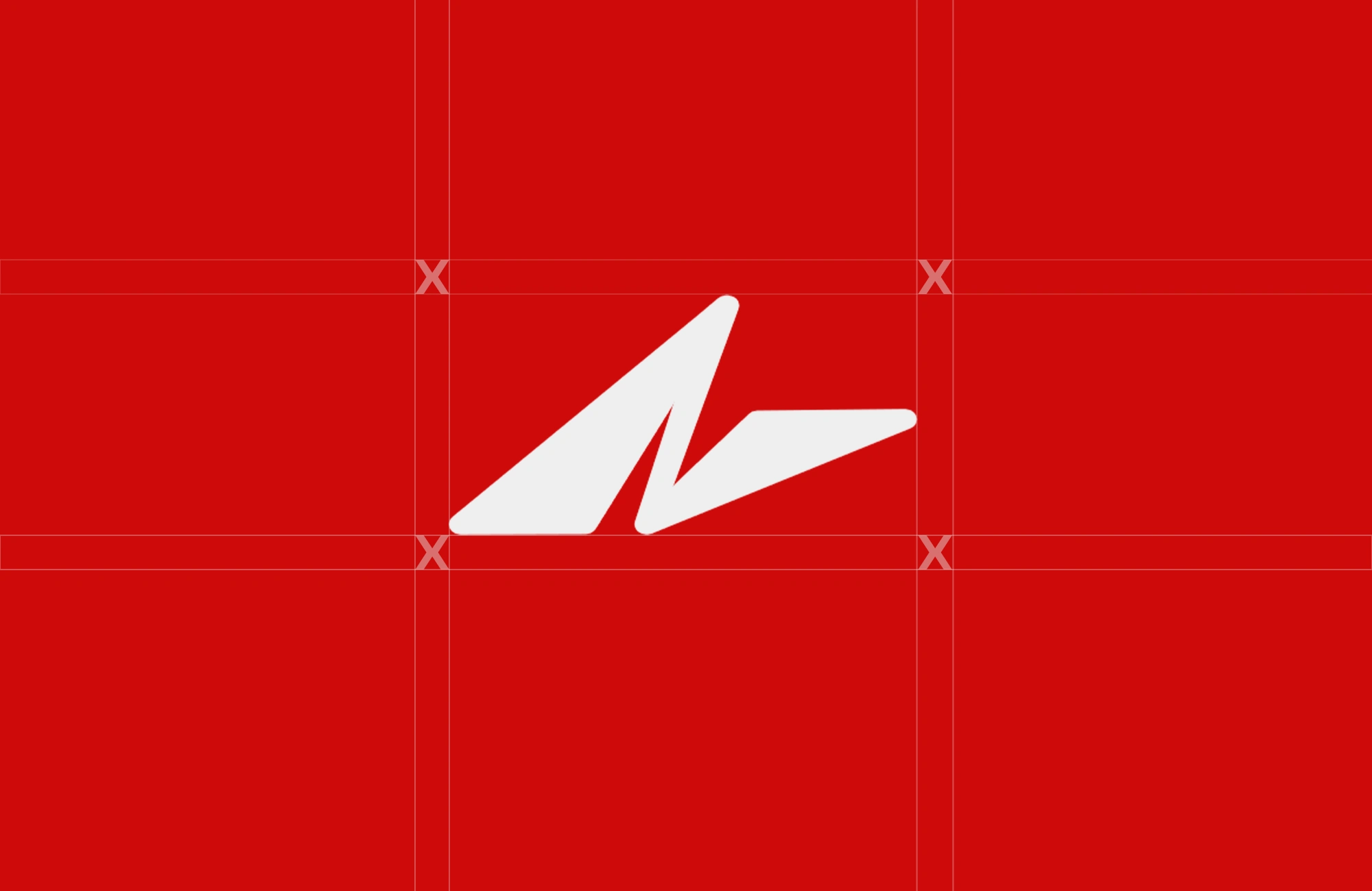
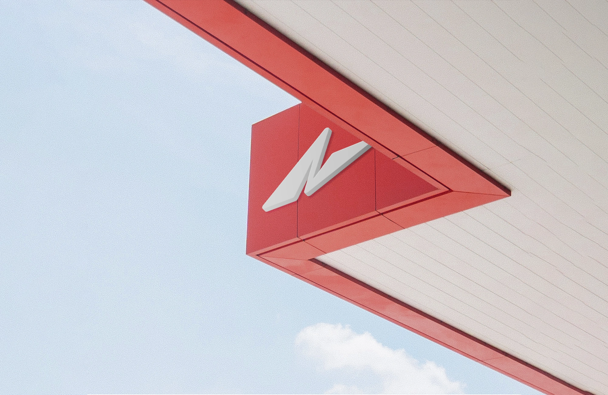
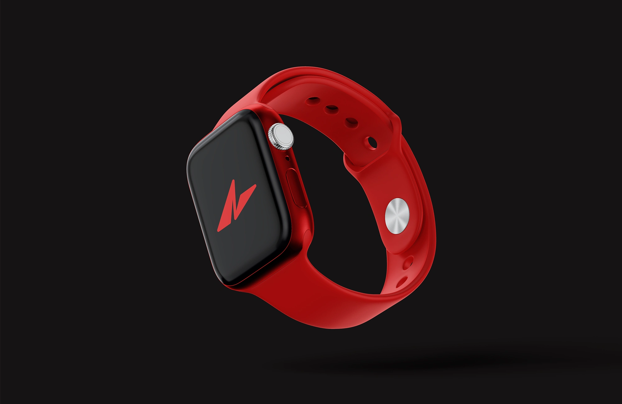
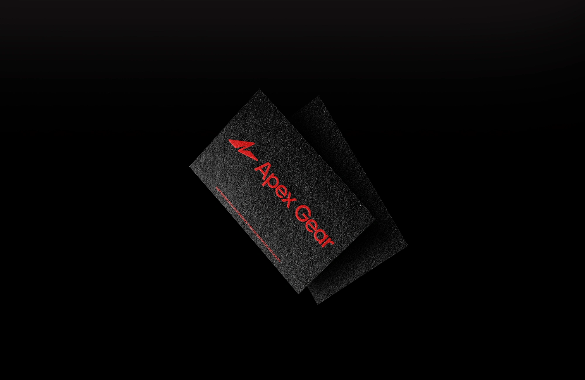
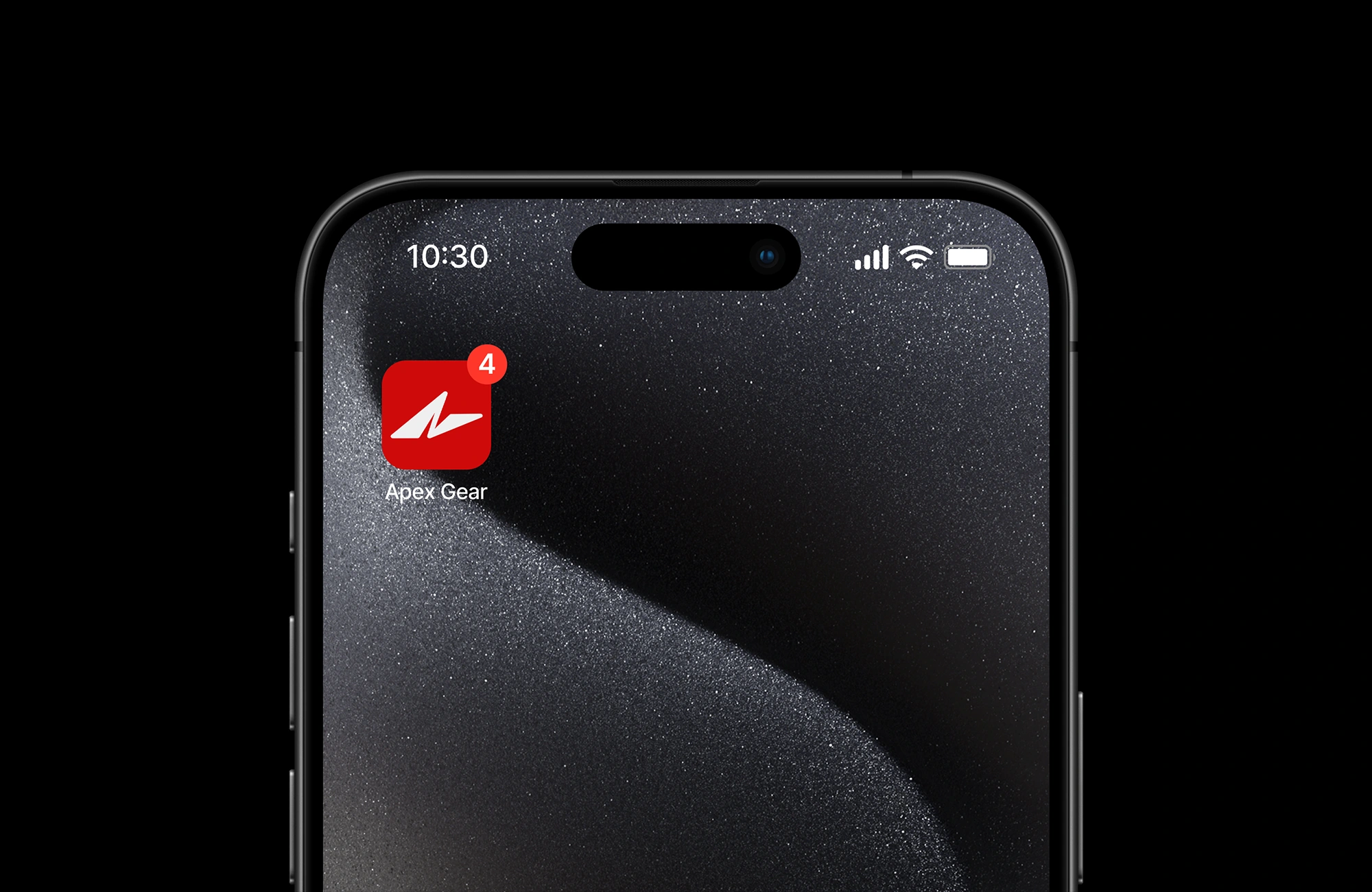
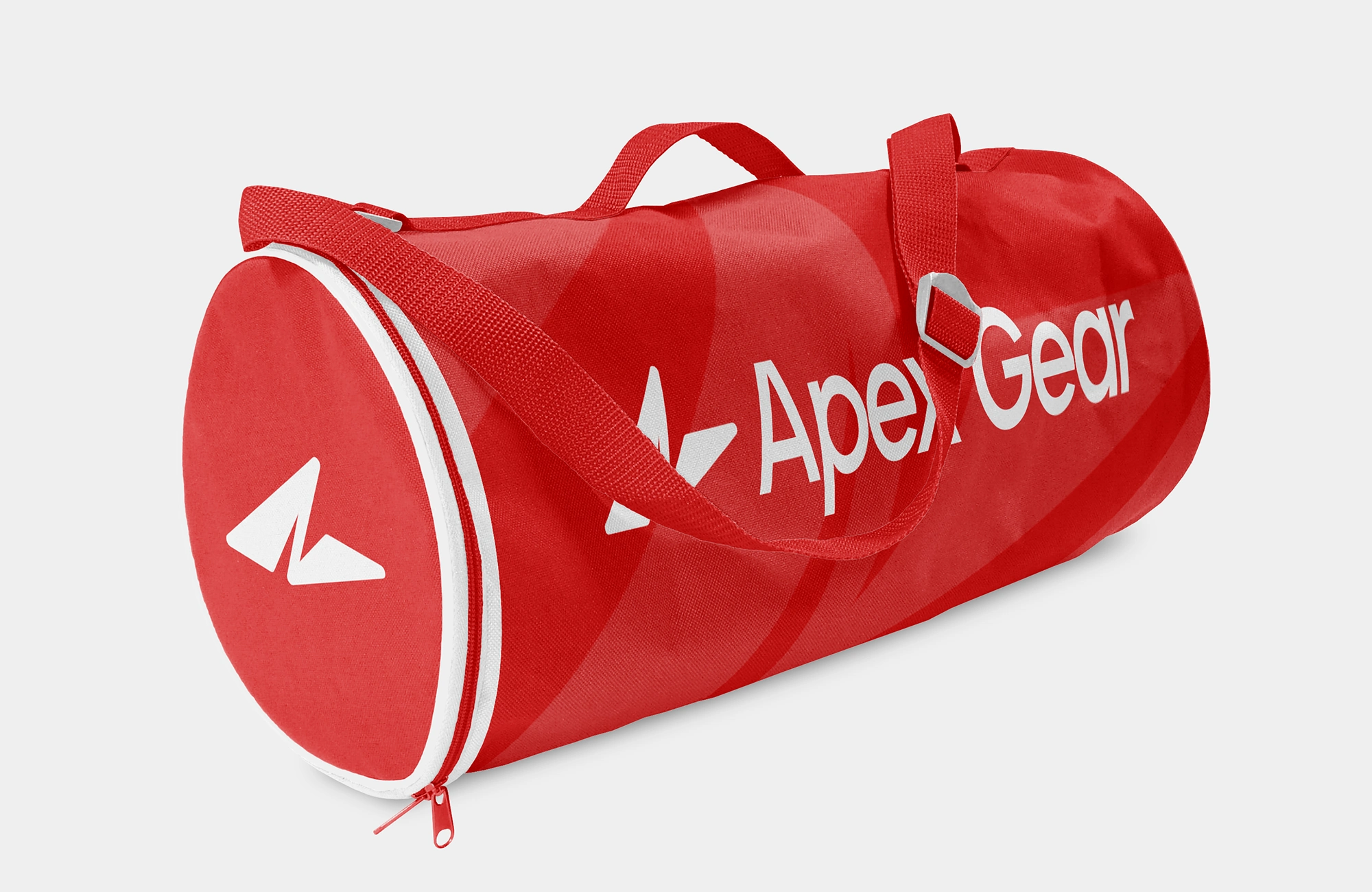
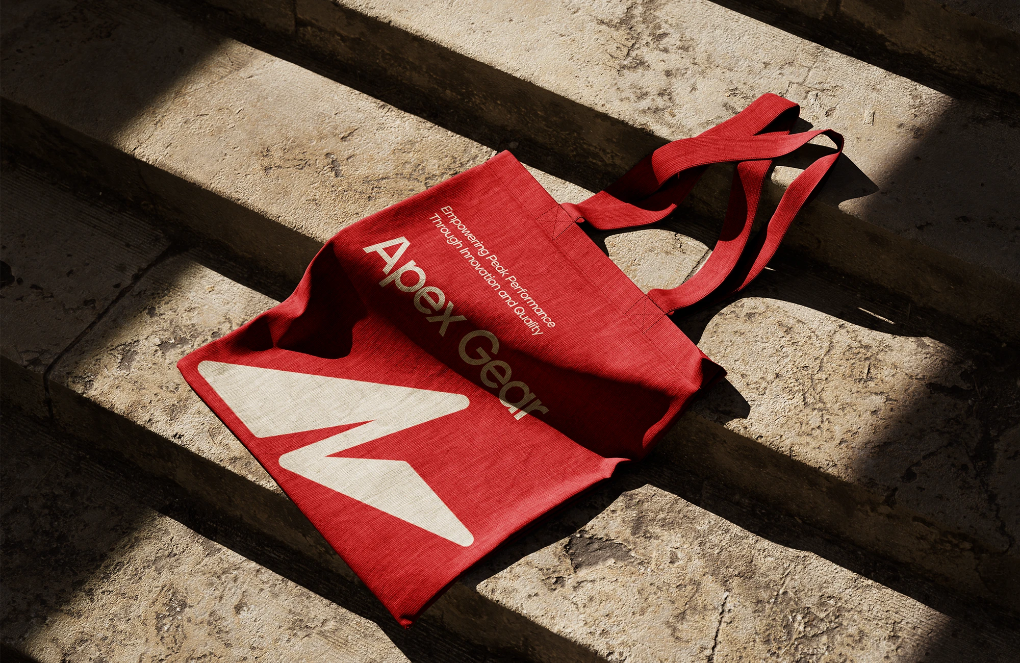
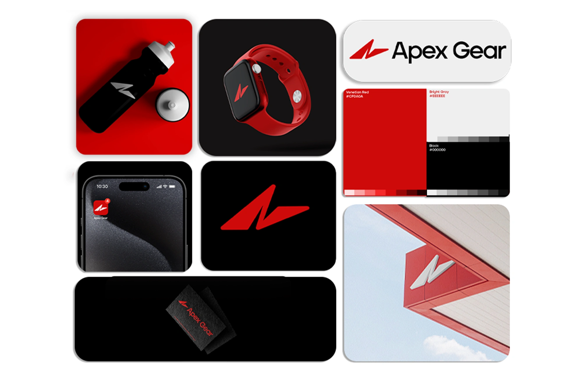
The Mark: A sharp angular “A” became the cornerstone, dynamic, forward-moving, and instantly recognizable.
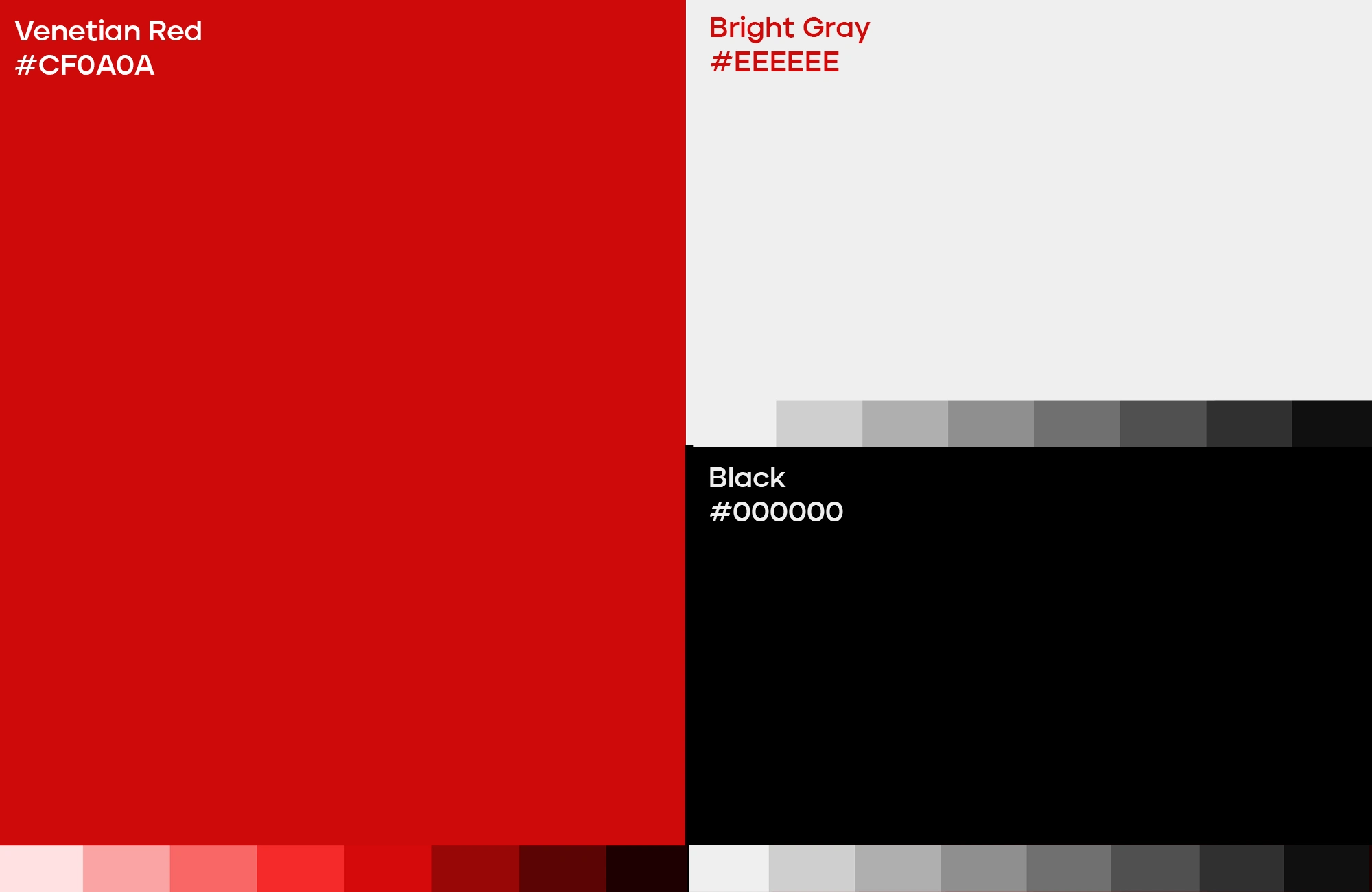
The Palette: Venetian Red for raw energy, Black for sophistication, and subtle Gray tones to keep the system versatile.
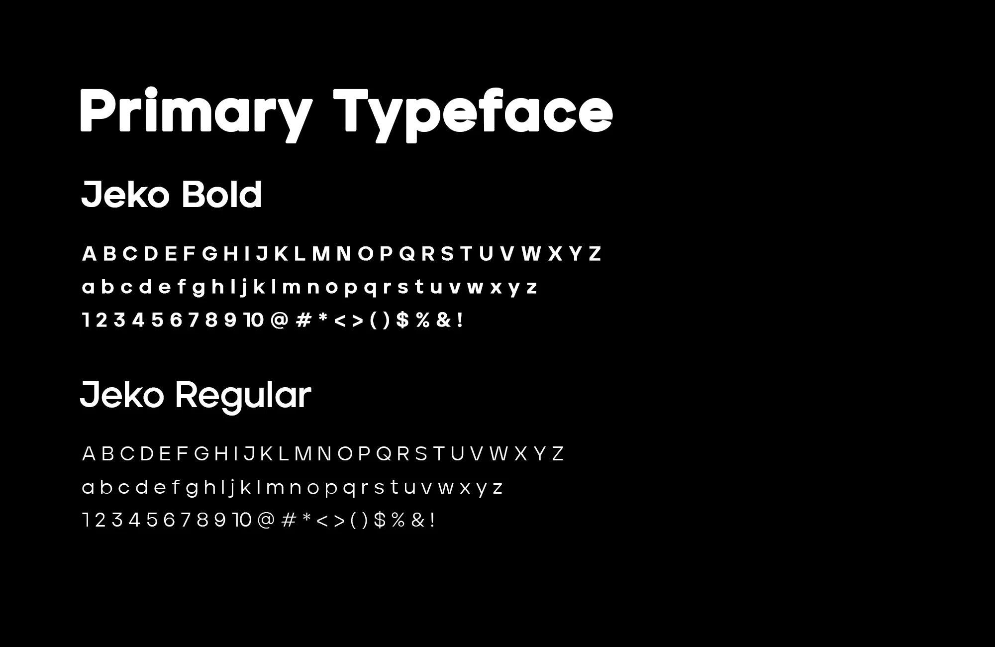
The Voice: Clean modern typography, striking yet approachable, echoing the balance between strength and clarity.
The Result
Apex Gear now embodies performance and innovation through a visual identity that moves as fast as the athletes it represents. It’s bold. It’s sharp. It’s designed to last.
Why It Works
Because great brands don’t just look good. They inspire. Apex Gear’s angular mark, bold red accents, and modern typography work together to project motion, energy, and trust. The identity feels premium yet accessible, adaptable across packaging, digital, and product applications.
It’s more than a logo - it’s a system that speaks the language of performance and pushes the brand forward in every interaction.

See more of our work and discover how we craft standout identities !
Like this project
Posted Feb 17, 2025
Apex Gear is a bold sports and fitness brand concept, built to inspire performance with dynamic visuals and versatile brand identity.