Radiant - Designing the Future of Solar Energy
Vizualogy Studio
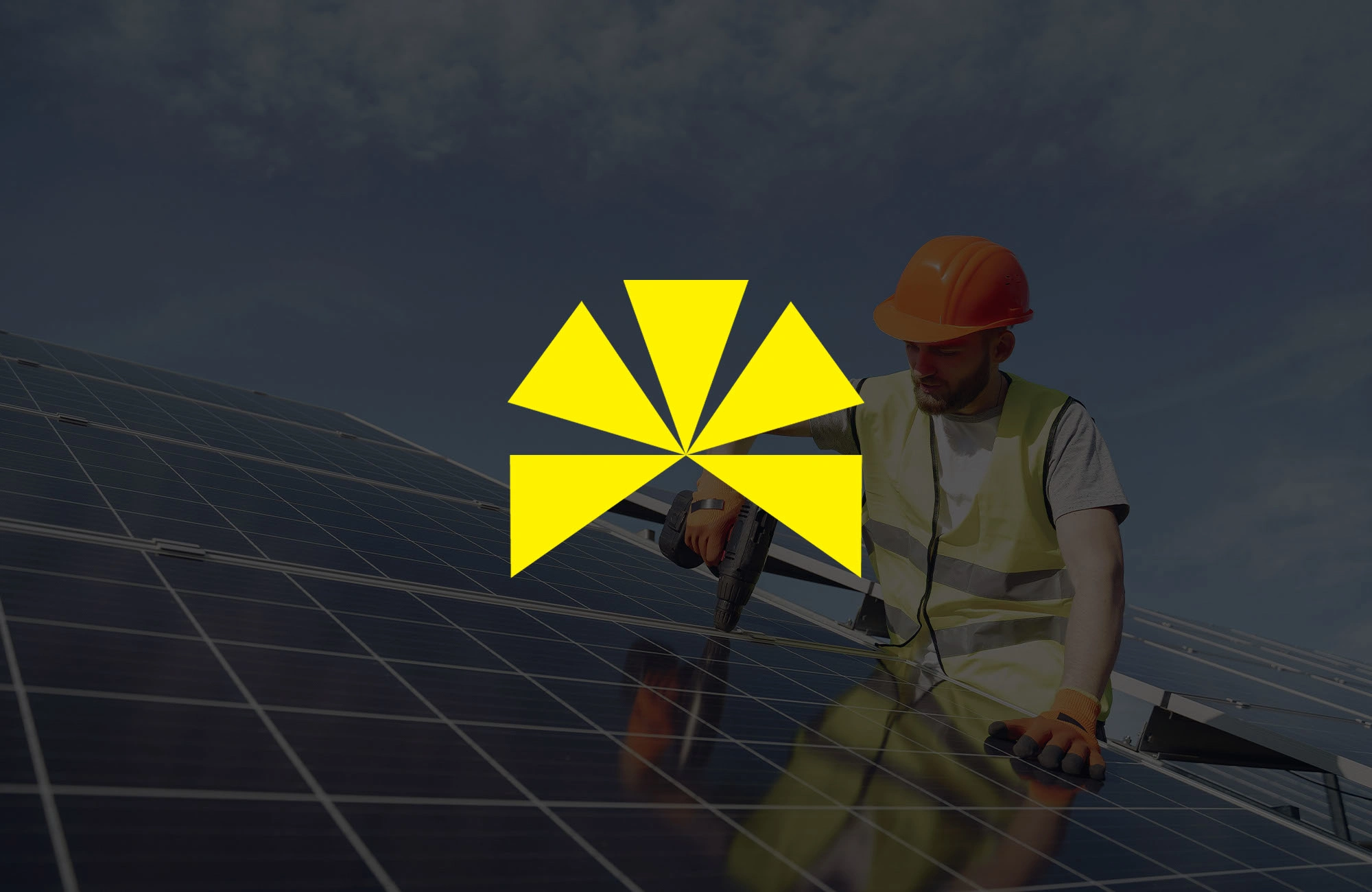
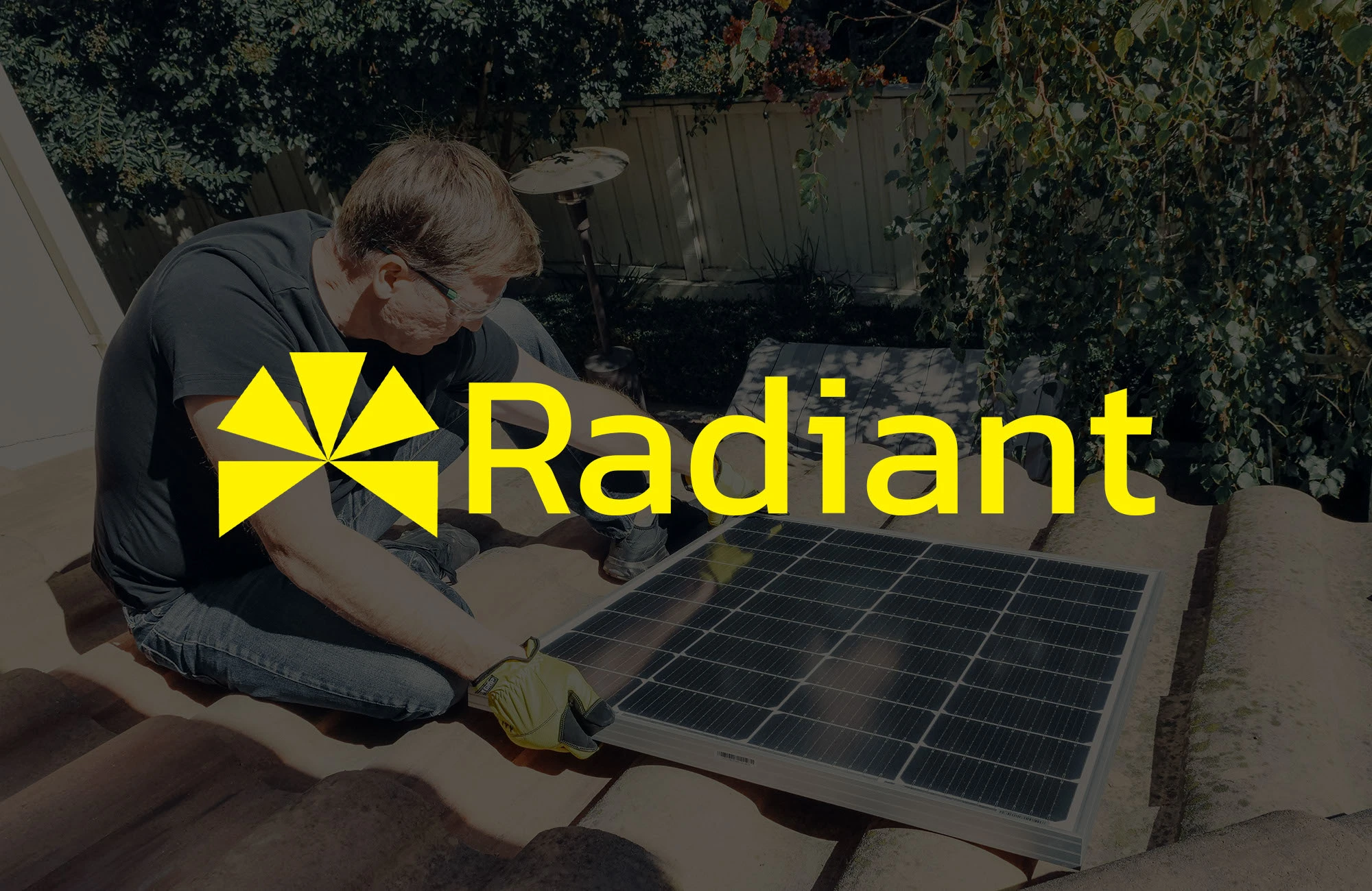
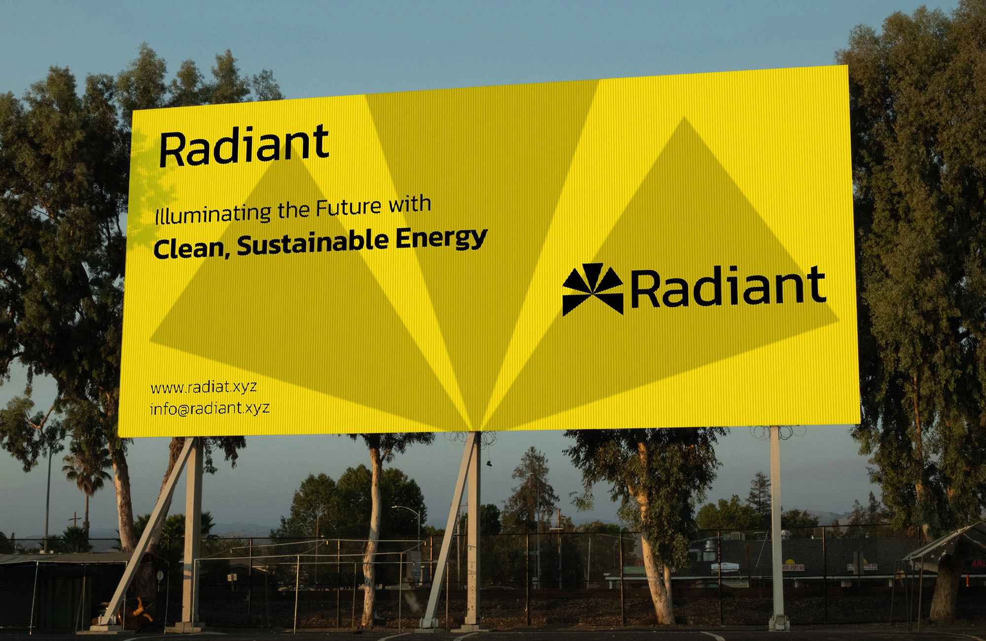
Radiant
A Brand Identity for a Brighter Future
Description
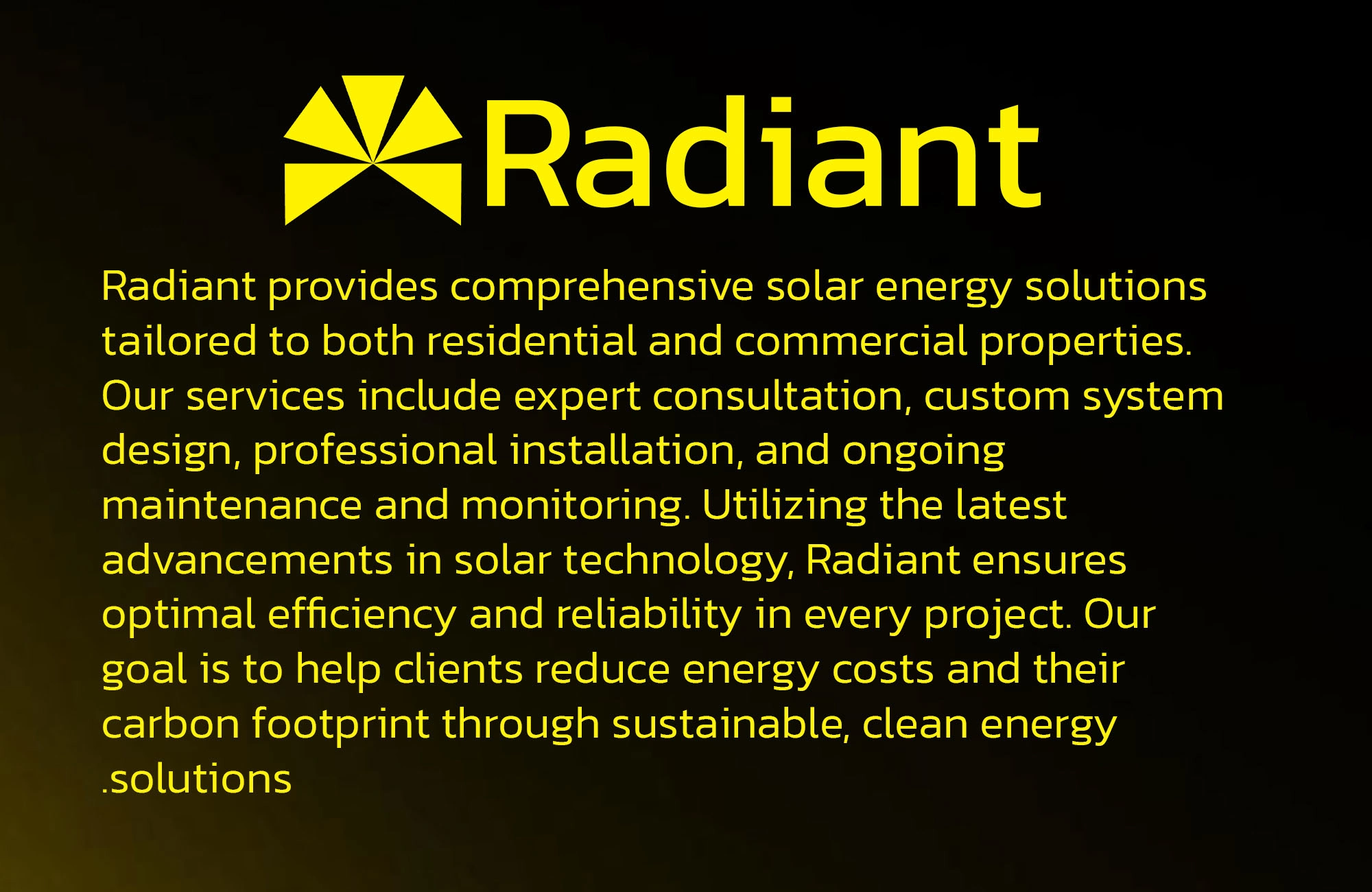
Radiant is a conceptual renewable energy brand crafted to showcase Vizualogy’s approach to clean, modern, and purposeful design. This identity reflects the spirit of solar energy while positioning the brand as innovative, reliable, and impactful for both residential and commercial markets.
Challenge
The challenge was to design an identity that captures the essence of sustainability and progress without falling back on the overused clichés of solar panels and sun rays. We needed something fresh, trustworthy, and versatile, able to live across packaging, digital platforms, and large-scale signage.
Solution
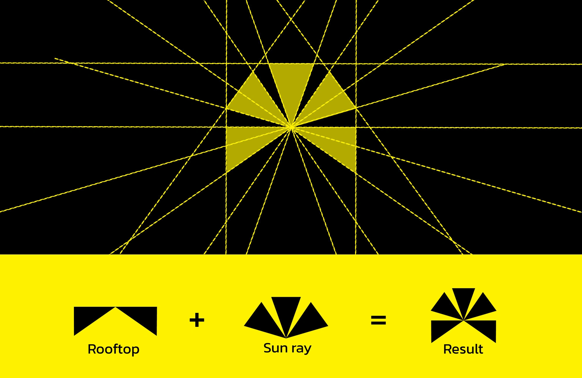
We created a visual system that balances innovation with clarity:
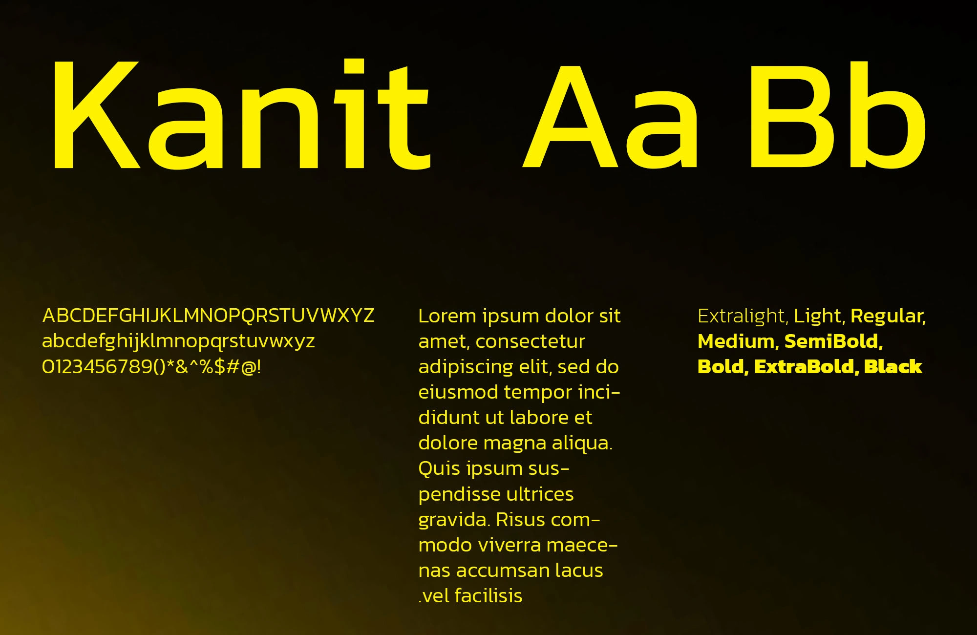
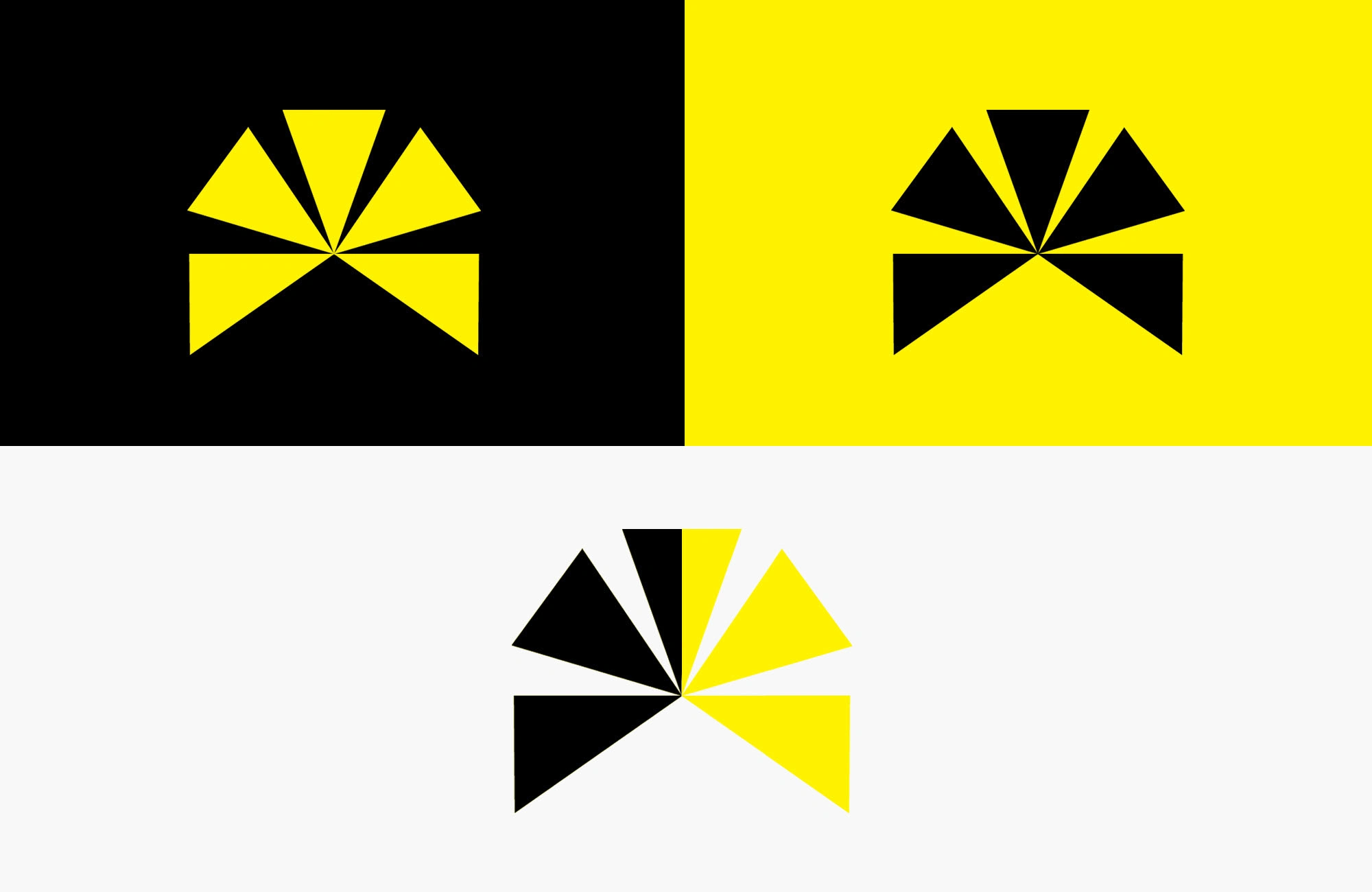
A logo inspired by solar geometry, blending abstract sun motifs with precise, modern forms.
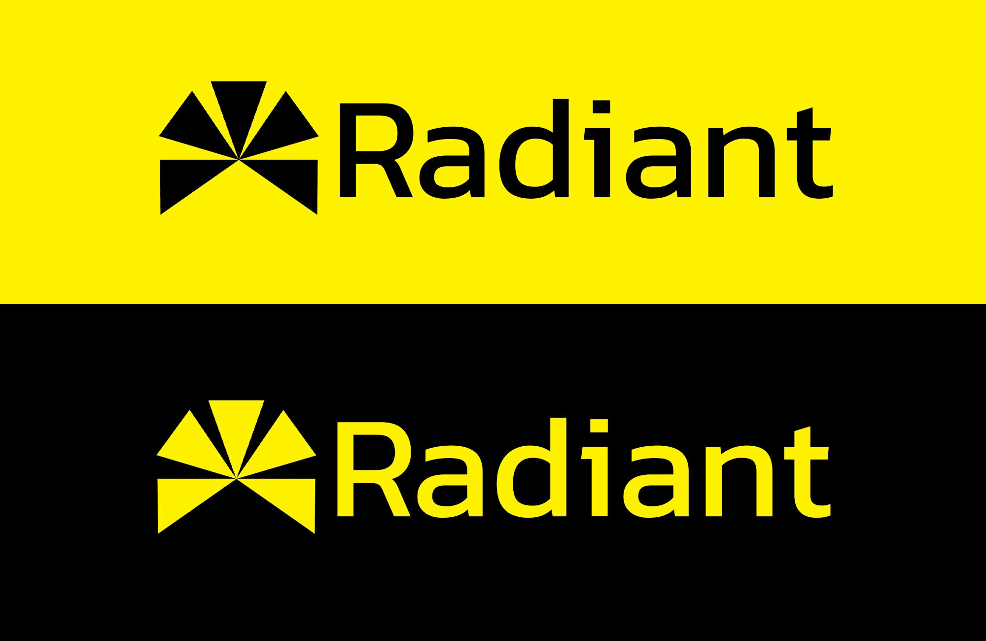
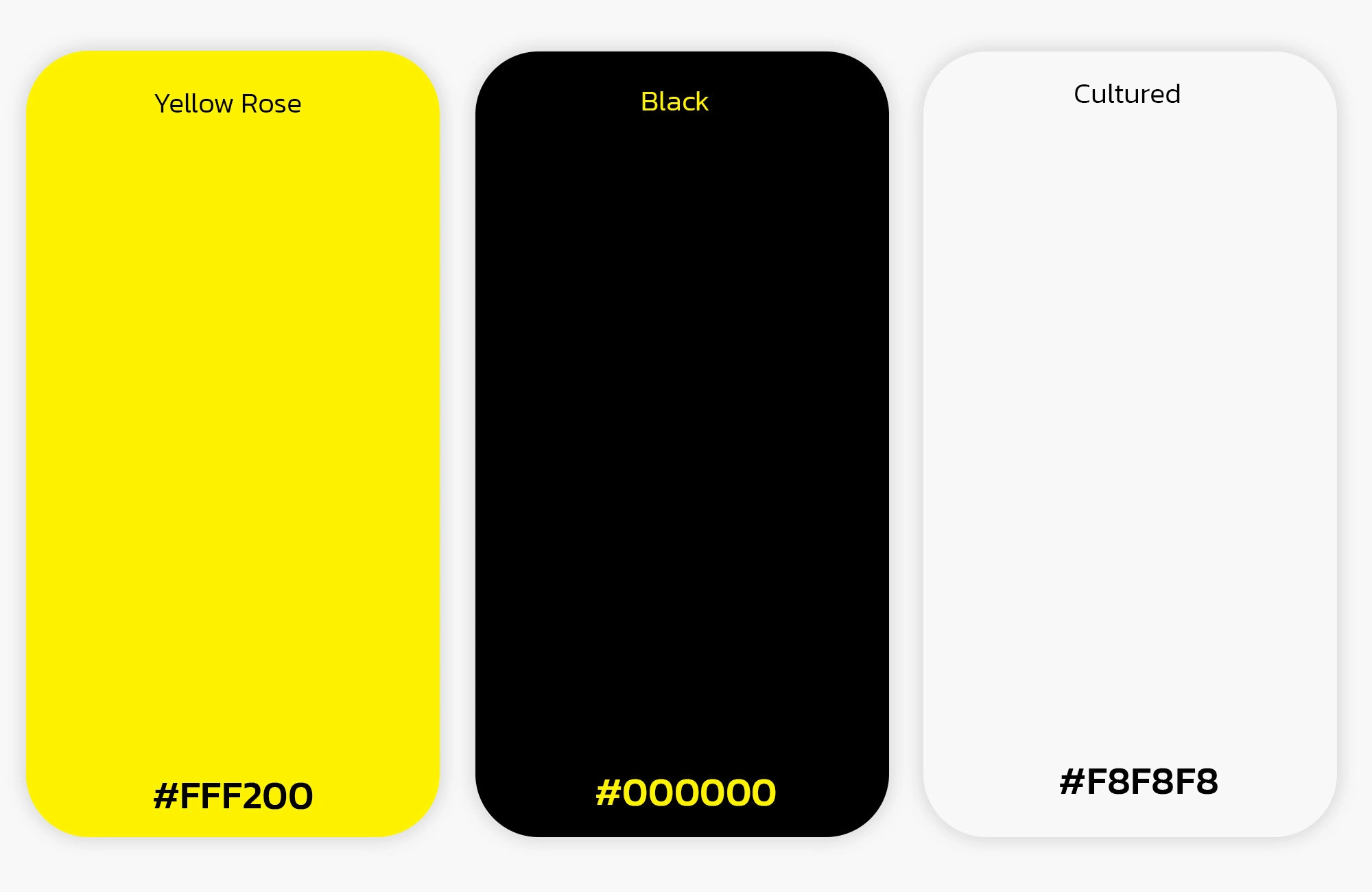
A bright and energizing yellow paired with a calming blue, symbolizing both energy and trust.
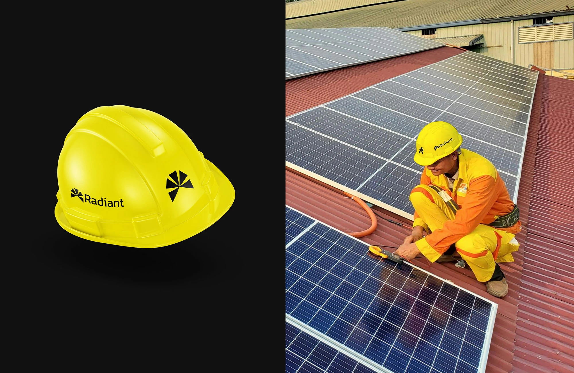
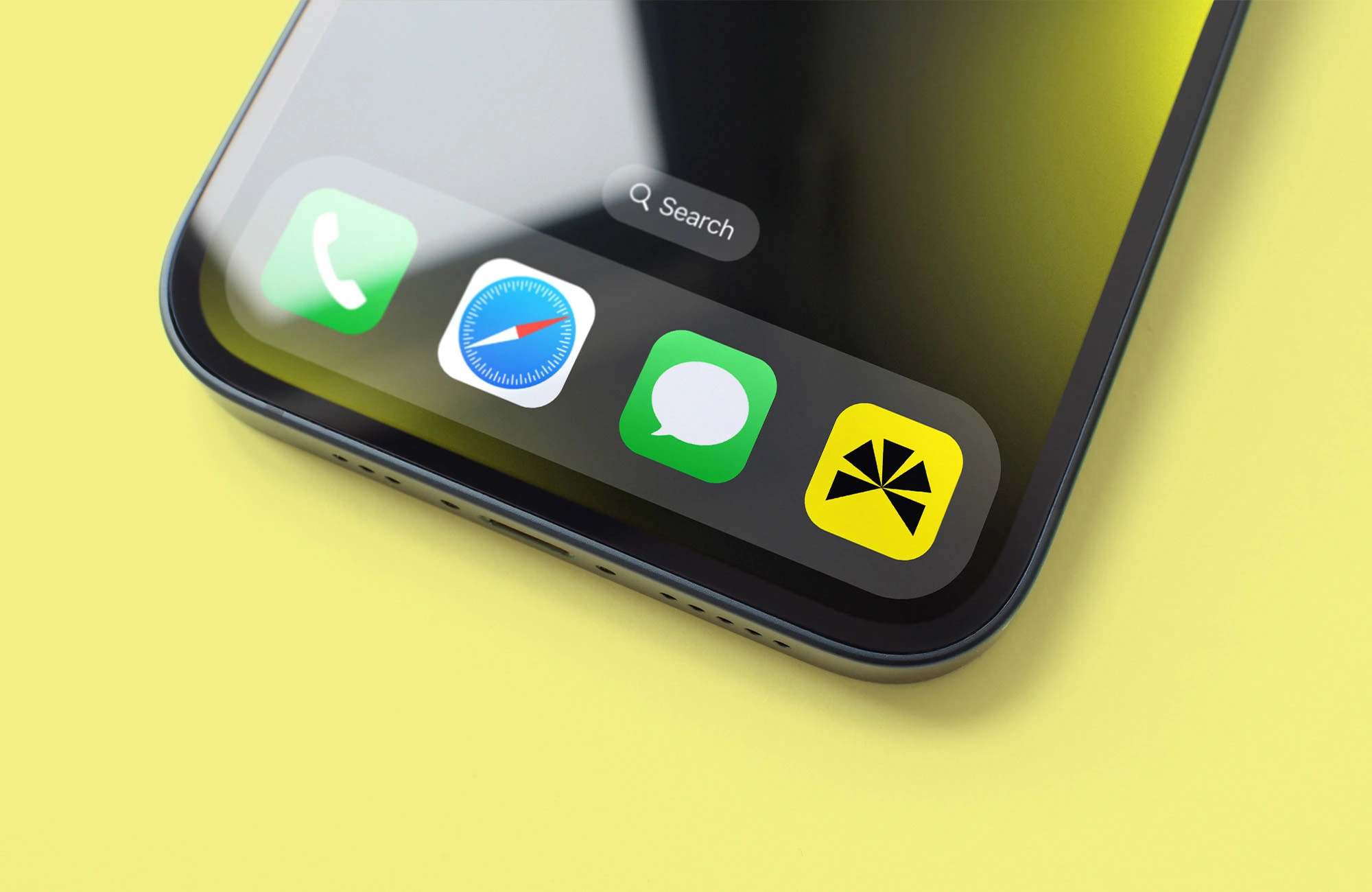
Scalable brand elements designed to move effortlessly between digital and physical touchpoints.
This system makes Radiant adaptable, recognizable, and ready to inspire confidence wherever it appears.
Impact
Radiant demonstrates how design can do more than just look good. It shows how a thoughtful identity can embody innovation, sustainability, and purpose in a way that resonates with audiences. For Vizualogy, this project is proof of our ability to create brands that don’t just communicate, they actually inspire!
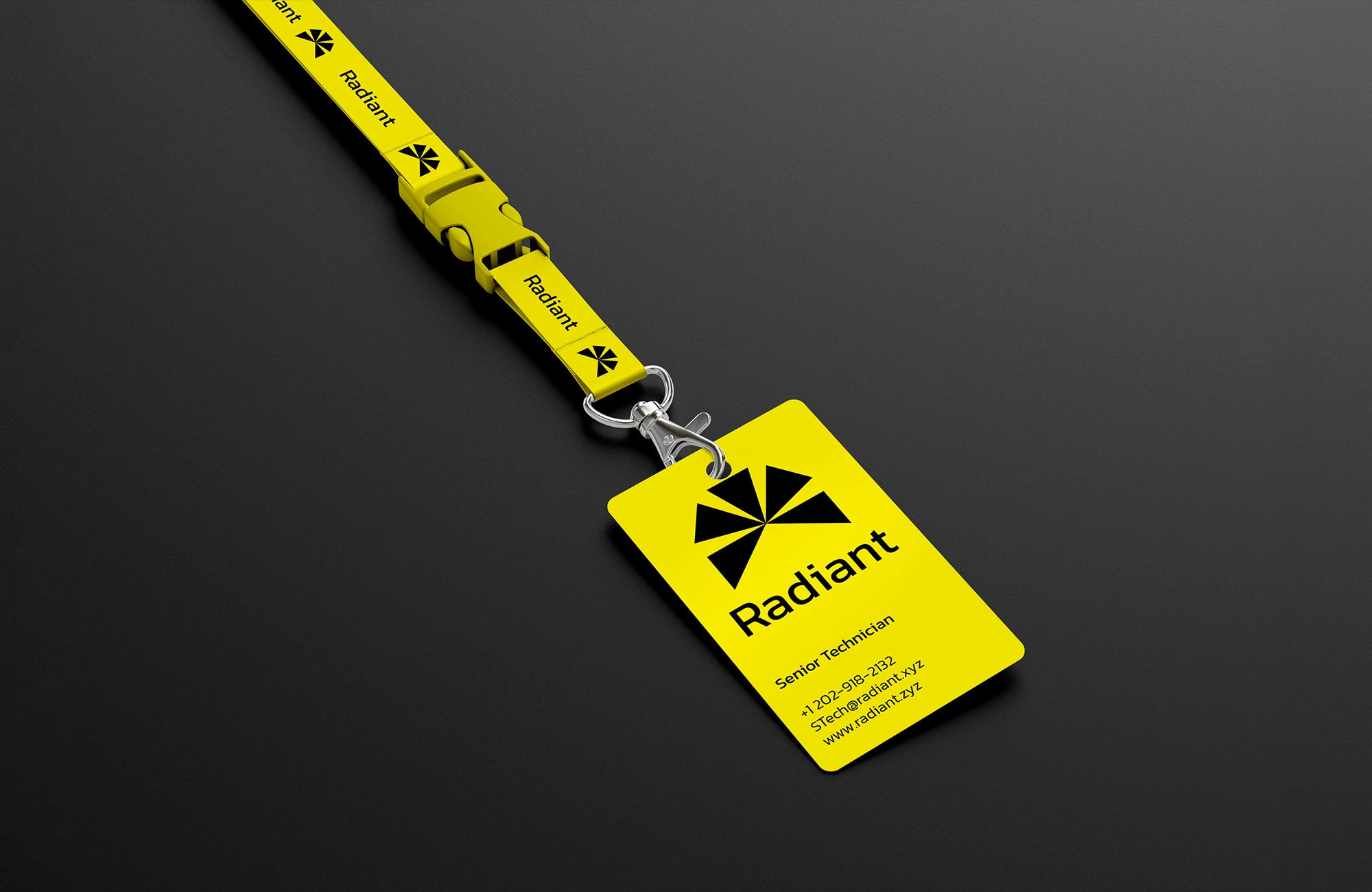
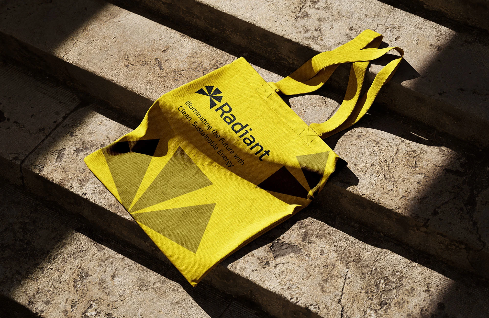
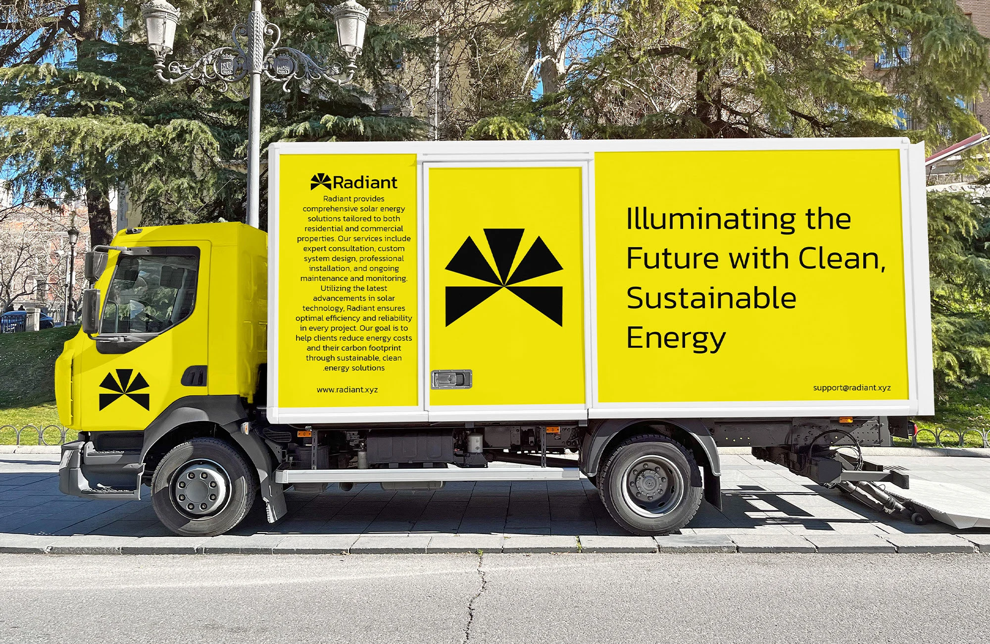
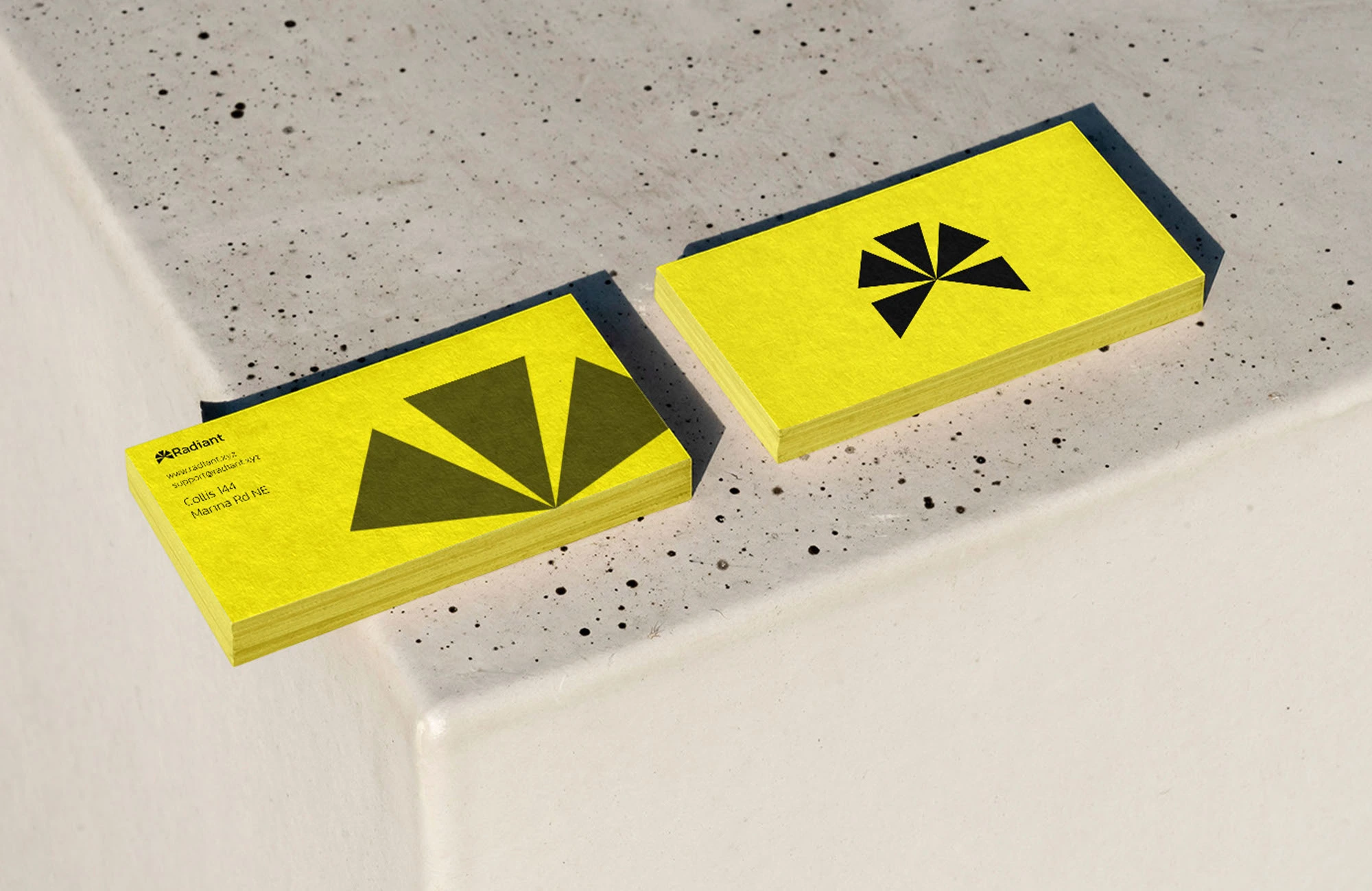
Enjoy the Brand Identity
Take a closer look at the Radiant identity below:
Explore the vibrant color story that reflects energy and trust
See how the geometric forms convey modernity and innovation
Notice how the system adapts seamlessly across every format
See More on Our Website
Curious to see Radiant in action? Visit our website to experience the full brand identity and discover more projects where design meets strategy.
Like this project
Posted Oct 2, 2025
A clean, modern brand identity for a fictional renewable energy company, blending innovation, trust, and sustainability into one visual system.