How We Transformed a Legacy Bank Into a Cutting-edge Neo-bank
Elias Mas
How We Transformed a Legacy Bank Into a Cutting-edge Neo-bank
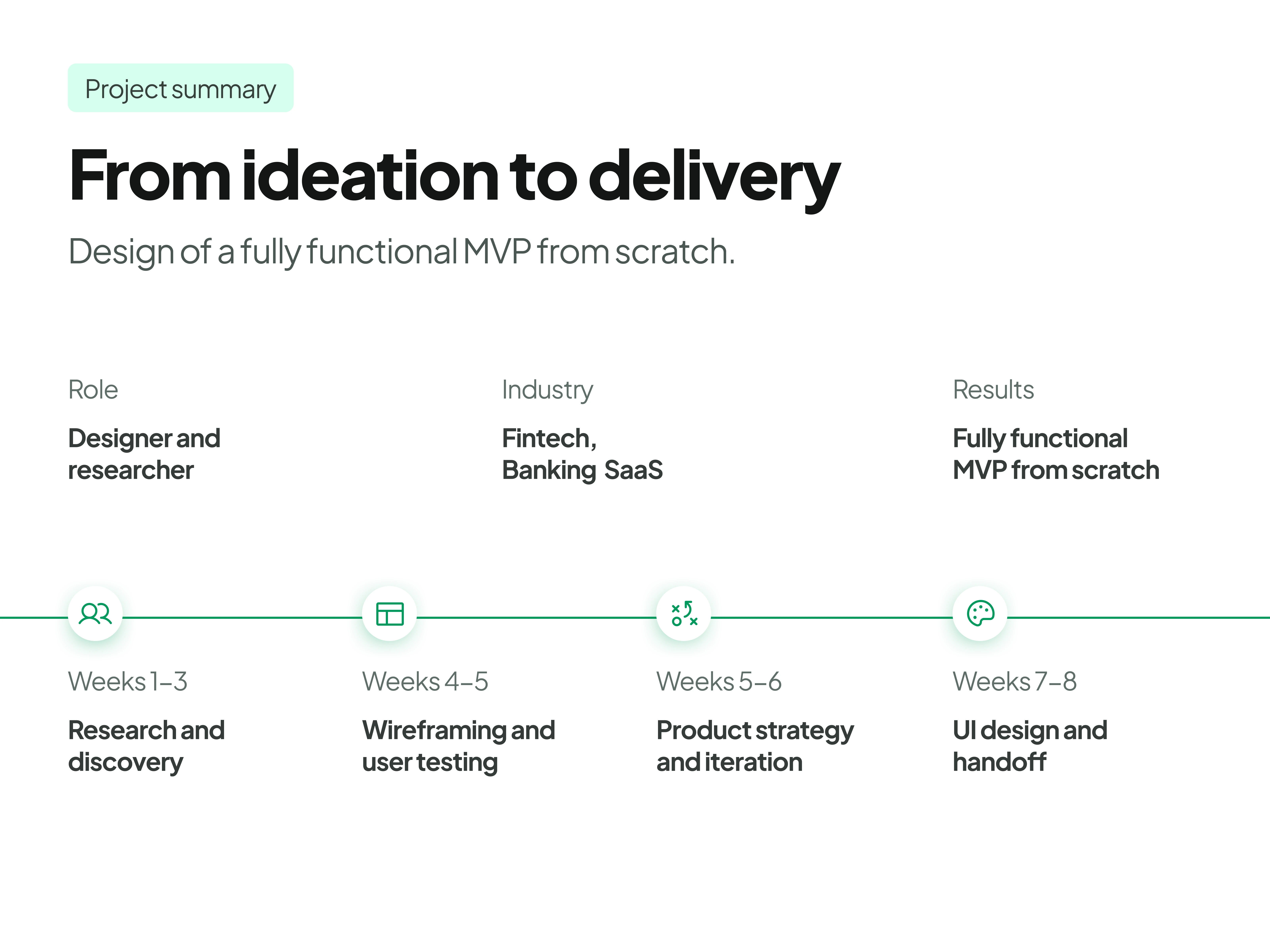
Project timeline
When Liberbank was acquired by a larger financial firm, it faced a turning point:
Evolve or risk becoming an obsolete relic.
The bank’s existing web app was outdated. It was plagued by:
• High churn
• Low engagement
• Overall lack of user-friendliness
This led to frustration, drop-offs, and lost upselling opportunities.
This meant rethinking everything—from navigation to user flows to visual aesthetics to create an engaging experience that kept customers coming back, embracing the speed and agility of a true neo-bank
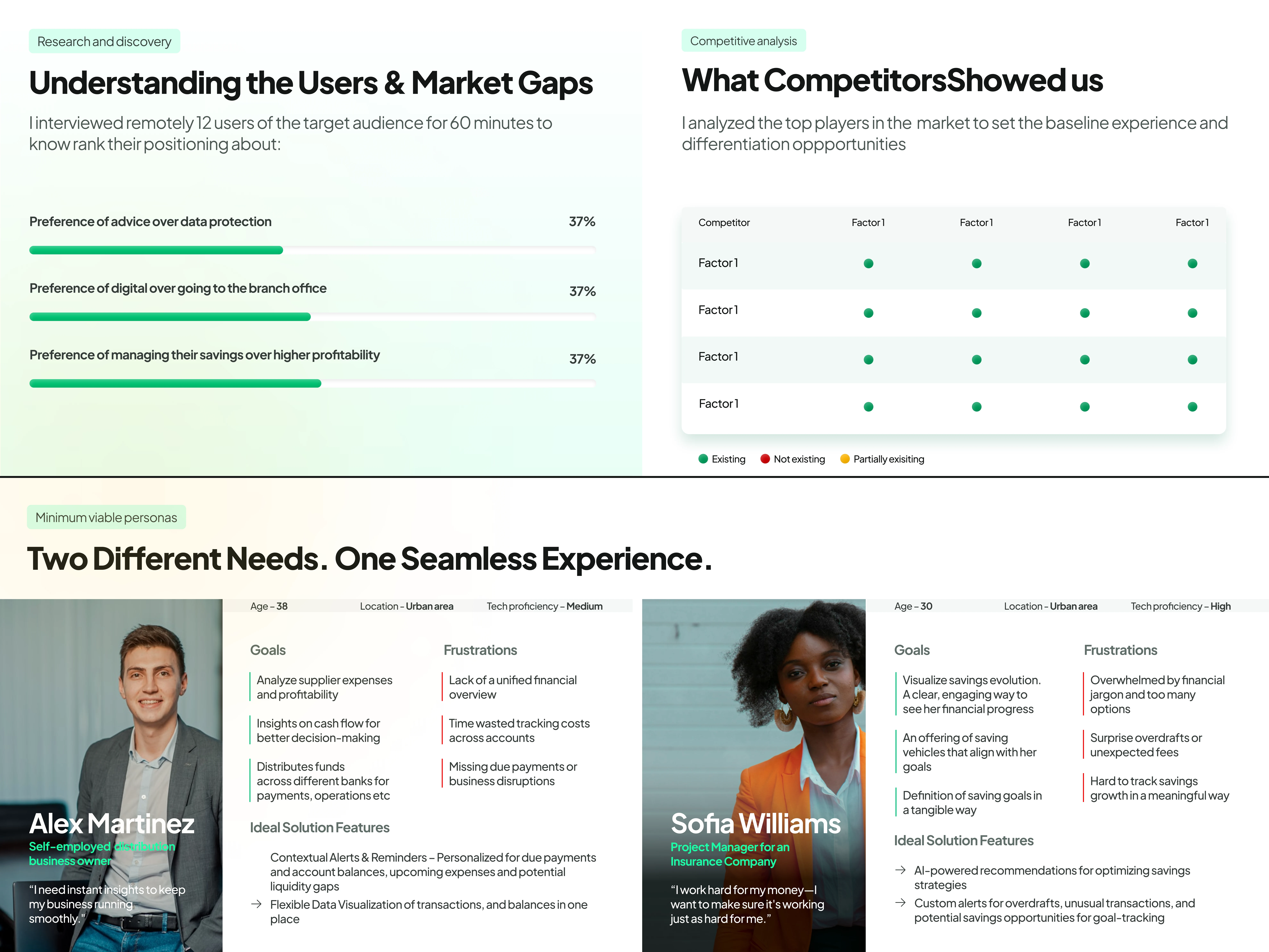
To make sure we were solving for actual needs, we defined our Minimum Viable Personas through user research and competitive analysis:
• Self-employed Users → Need flexible budgeting, easy tax categorization, and a clear way to track irregular income
• Employees → Want automated savings, simplified budgeting, and smart nudges to stay financially healthy
By focusing on these two key groups, we ensured that every design decision addressed real-world pain points and built-in differentiation from competitors.
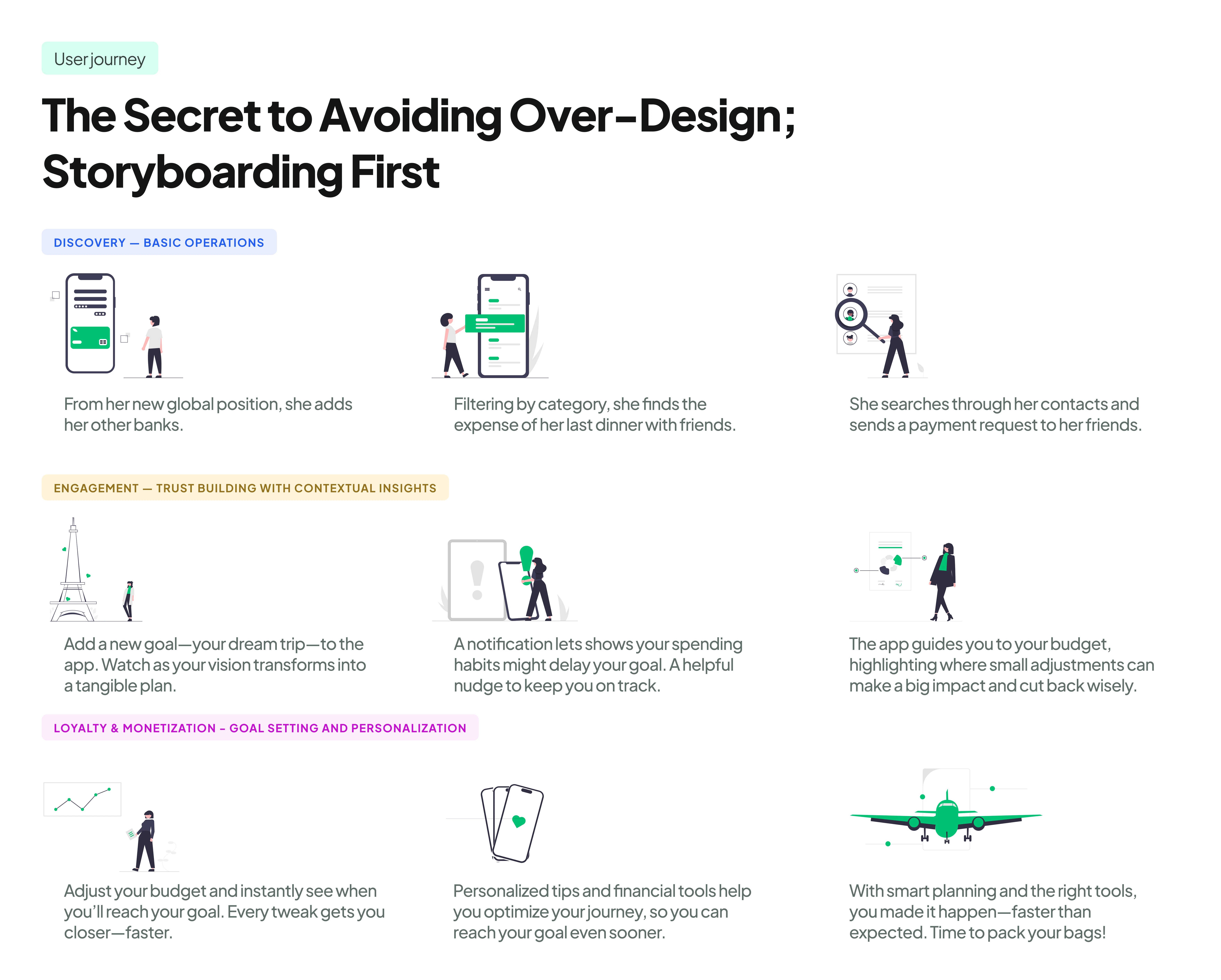
User journey
Instead of jumping straight into design, we took a step back.
We storyboarded an inspirational user journey to define the scope of the project and align on:
📌 Key MVP features that mattered most
📌 The essential final screens to deliver a focused, high-impact experience
This approach kept our process lean, purposeful, and aligned with business goals to ensure we avoided over-designing or adding unnecessary complexity.
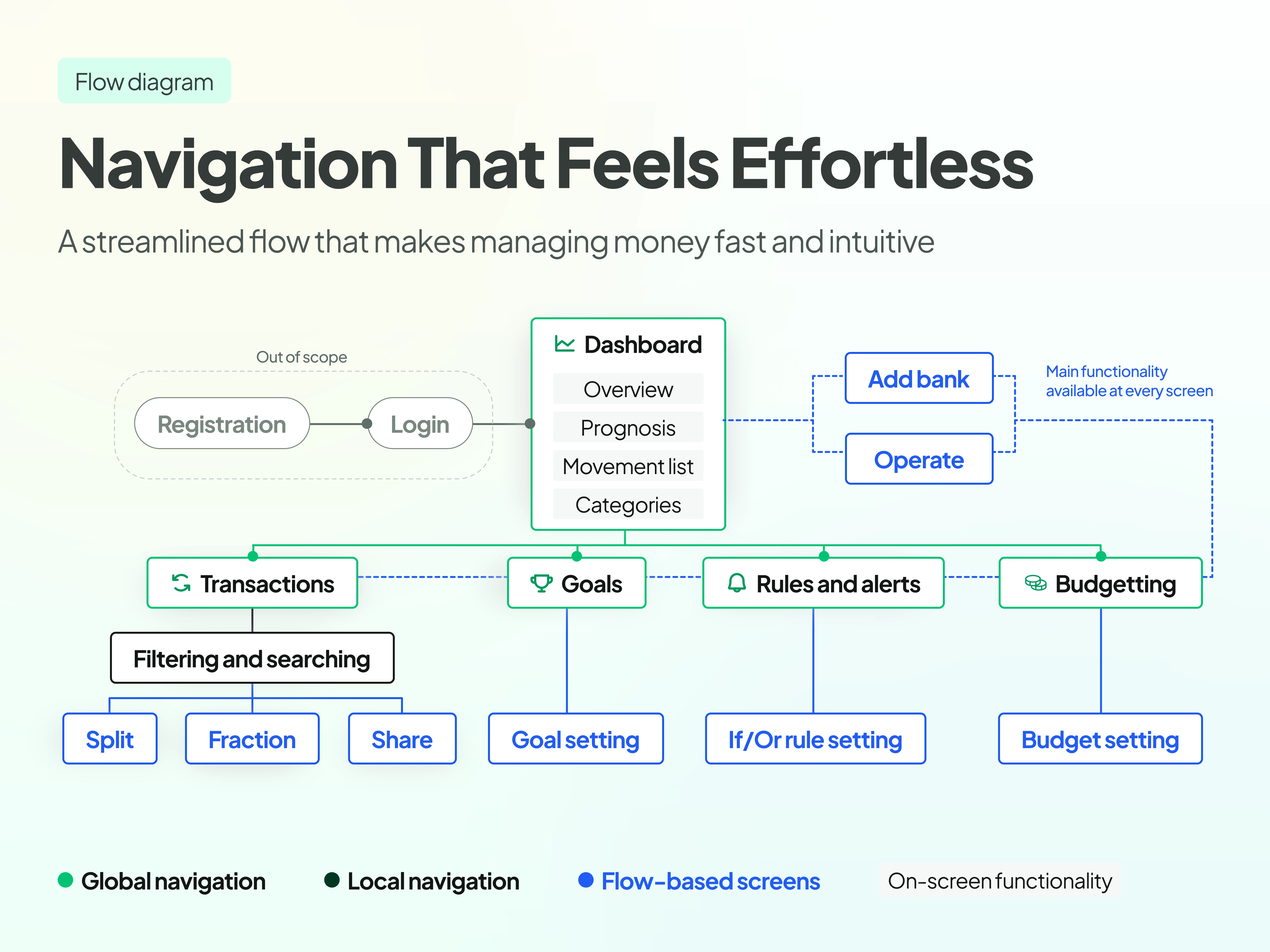
Navigation
We restructured the navigation flow to make every interaction intuitive, effortless, and streamlined:
📈 Dashboard – A one-glance overview of financial health.
💵 Transactions – Clear, categorized, and searchable.
🏆 Goals – Set, track, and achieve financial milestones.
💲 Budgets –Smarter spending management.
🔔 Rules and Alerts – Proactive, helpful, and personalized notifications.
This structure made banking faster, frictionless, and tailored to how users actually think about money.
Wireframing the experience
With the foundation set, we moved into wireframing.
Mapping out each screen with a focus on:
Clarity – Every element needs a reason to exist
Guided notifications – no dead ends
Layered navigation – to avoid disorientation and drop-offs
We tested these wireframes with real users to validate our assumptions, refine interactions, and ensure the final UI was built on real behavior, not just best guesses.
By staying wireframe-first and iterating based on feedback, we avoided the common pitfall of getting lost in aesthetics before validating functionality.
Look and feel
A complete visual overhaul could have confused users.
Instead, we took the existing brand guidelines—scarce as they were—and modernized them subtly, keeping:
• Brand recognition intact, but refreshing the UI for a sleek, digital-first feel
• A familiar color palette but sharper contrasts for accessibility
• Consistent typography and iconography to maintain cohesion across platforms
This allowed the redesign to feel fresh but not foreign—a crucial balance for existing customers adapting to the change.
Mobile-first UI
We designed a mobile-first experience to manage finances on the go.
Key innovations included:
Goal-setting and pots → Users could set financial goals and allocate funds into separate “pots” for saving and budgeting.
Contextual notifications → Smart nudges providing real-time financial guidance.
Split payments → Making shared expenses effortless.
By focusing on high-value mobile interactions, we made digital banking feel fluid, responsive, and frictionless.
Desktop version
For desktop users, we focused on power and more granular control.
Key highlights:
Comprehensive dashboard → A real-time financial overview.
Custom tags and categories → Making transaction management effortless.
Budgeting by category → Users could set, adjust, and monitor their spending in a granular way.
This ensured that the larger-screen experience wasn’t just a scaled-up mobile UI, but a powerful toolset for deeper financial control.
Like this project
Posted May 27, 2025
Redesigned Liberbank's web app to enhance user experience and engagement.
Likes
0
Views
3
Timeline
Jan 27, 2024 - Mar 27, 2024
Clients
Liberbank