Redesigning a Landing Page for Burned-out CSMs
Elias Mas
How I Redesigned a Landing Page That Speaks to Burned-out CSMs
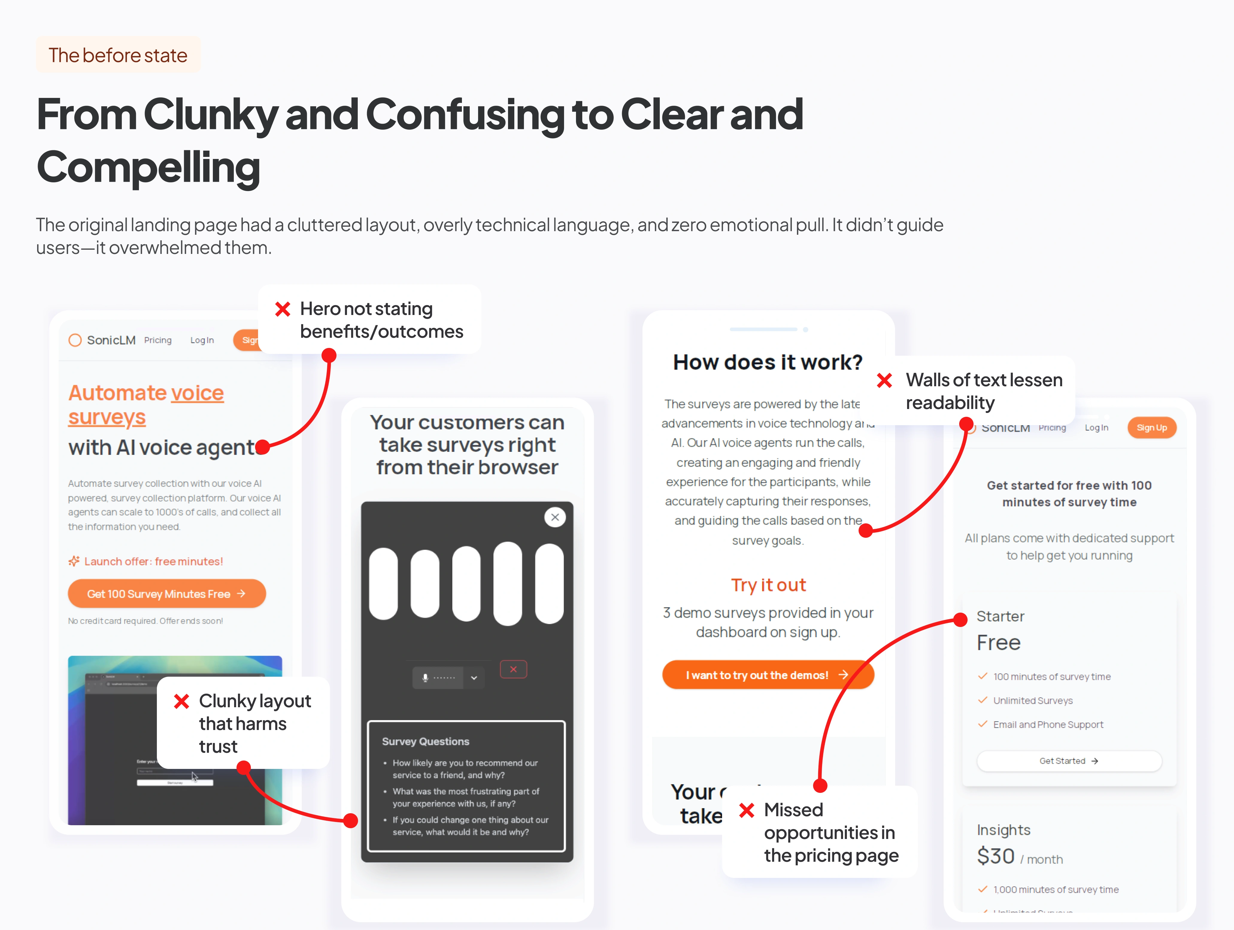
The old page was working against the product
Before the redesign, the landing page had a clunky layout, dry copy, and an overly technical tone, making it hard for users to quickly understand the value.
The messaging spoke to the user, not them, and the visual design didn’t create any emotional resonance.
Most importantly, it didn’t connect the product to the user’s pain or desired transformation, so it failed to convert.
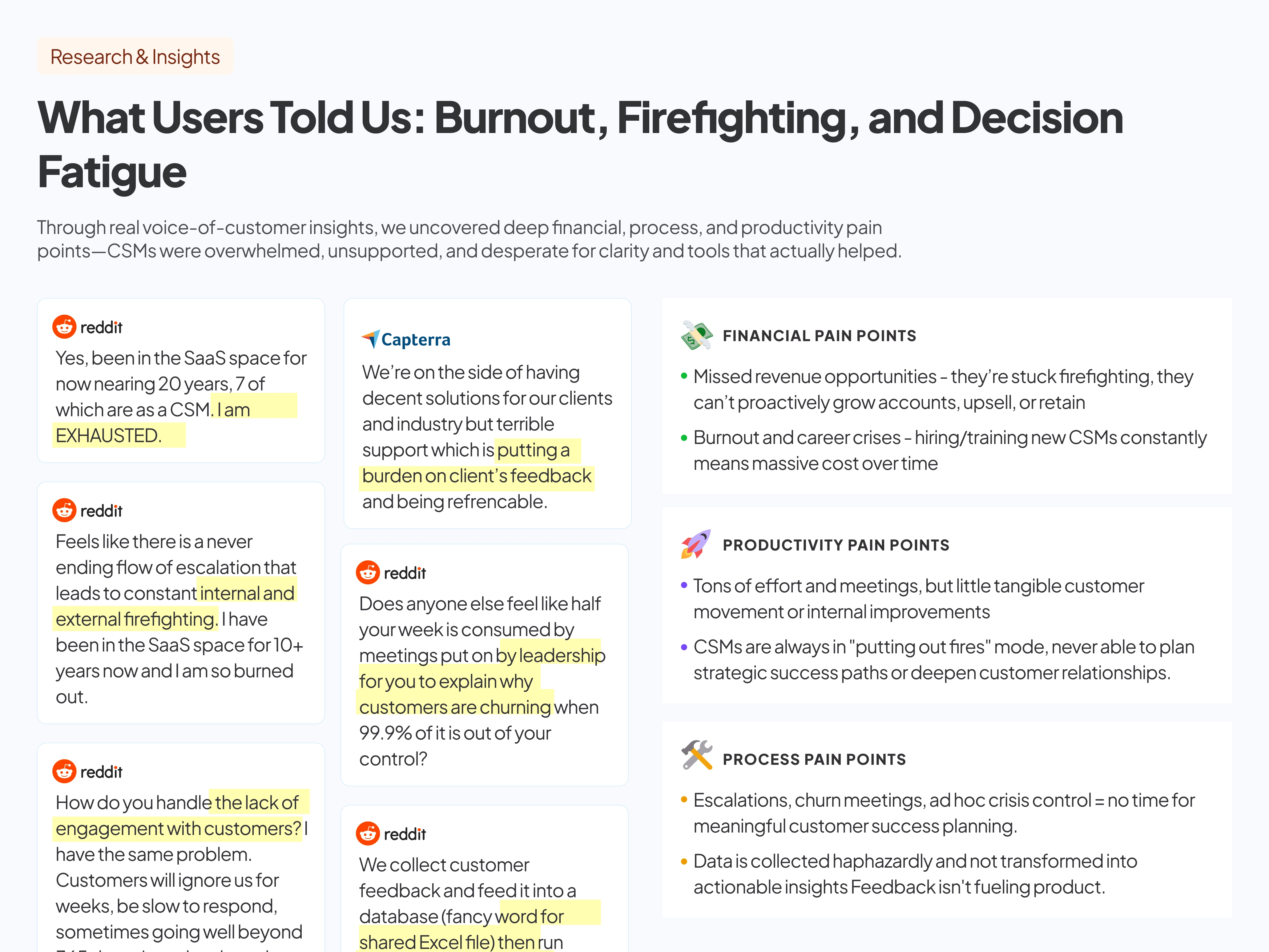
We let real customer voices guide the way
To redesign effectively, we had to understand what users were struggling with—not just on the page but also in their work.
We uncovered three key types of pain: financial (like churn and missed upsell opportunities), process (like endless firefighting and no clear KPIs), and productivity (time spent defending their role instead of helping customers).
These insights shaped both the message and the structure of the new page—we weren’t just fixing design issues, we were solving emotional ones too.
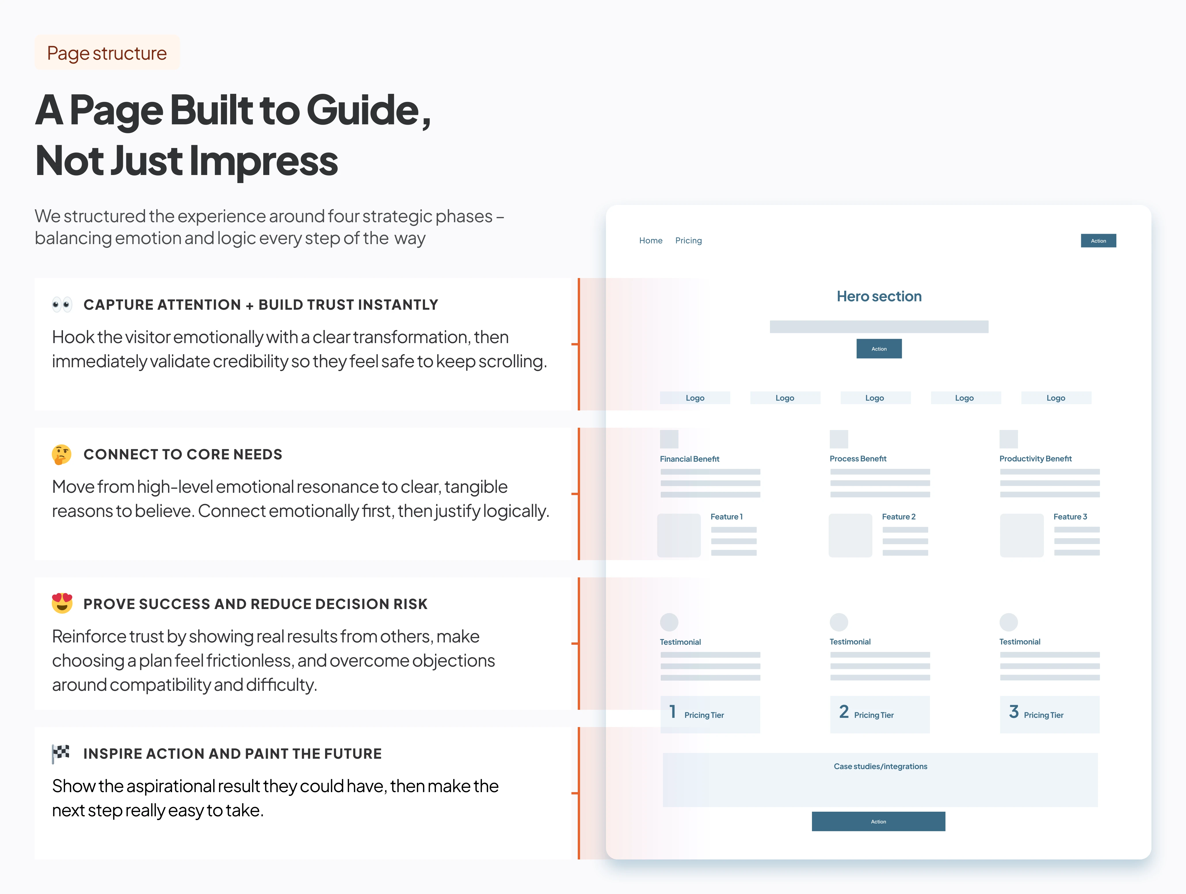
A conversion journey that mirrors the customer journey
We structured the page around four strategic goals:
• Capture Attention with a clear transformation.
• Connect to Core Needs with relevant benefits and features.
• Reduce Decision Risk through social proof and clarity.
• Inspire Action with a compelling story and low-friction CTA.
This framework helped us design a narrative-driven flow that built trust and momentum with every scroll.
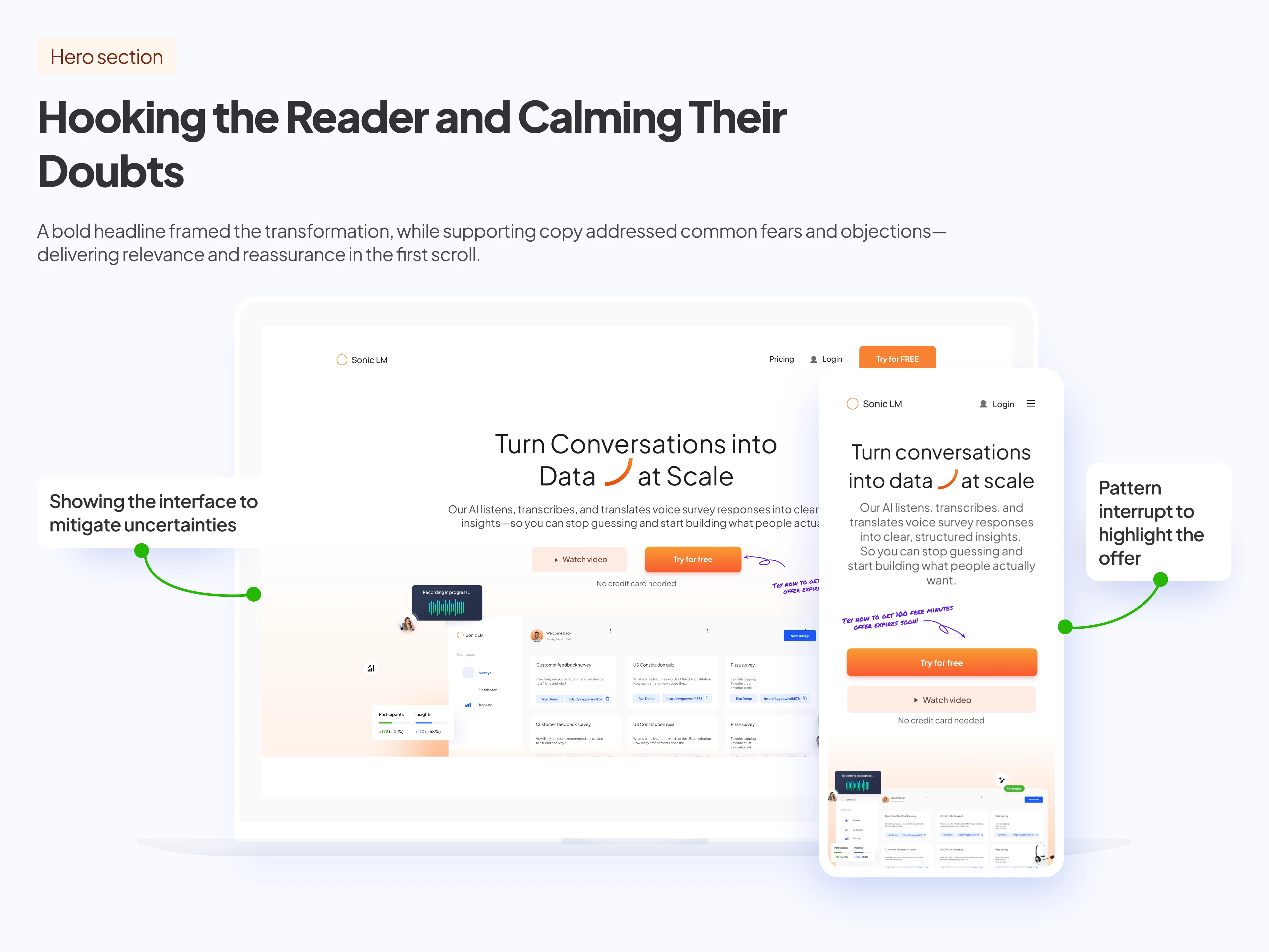
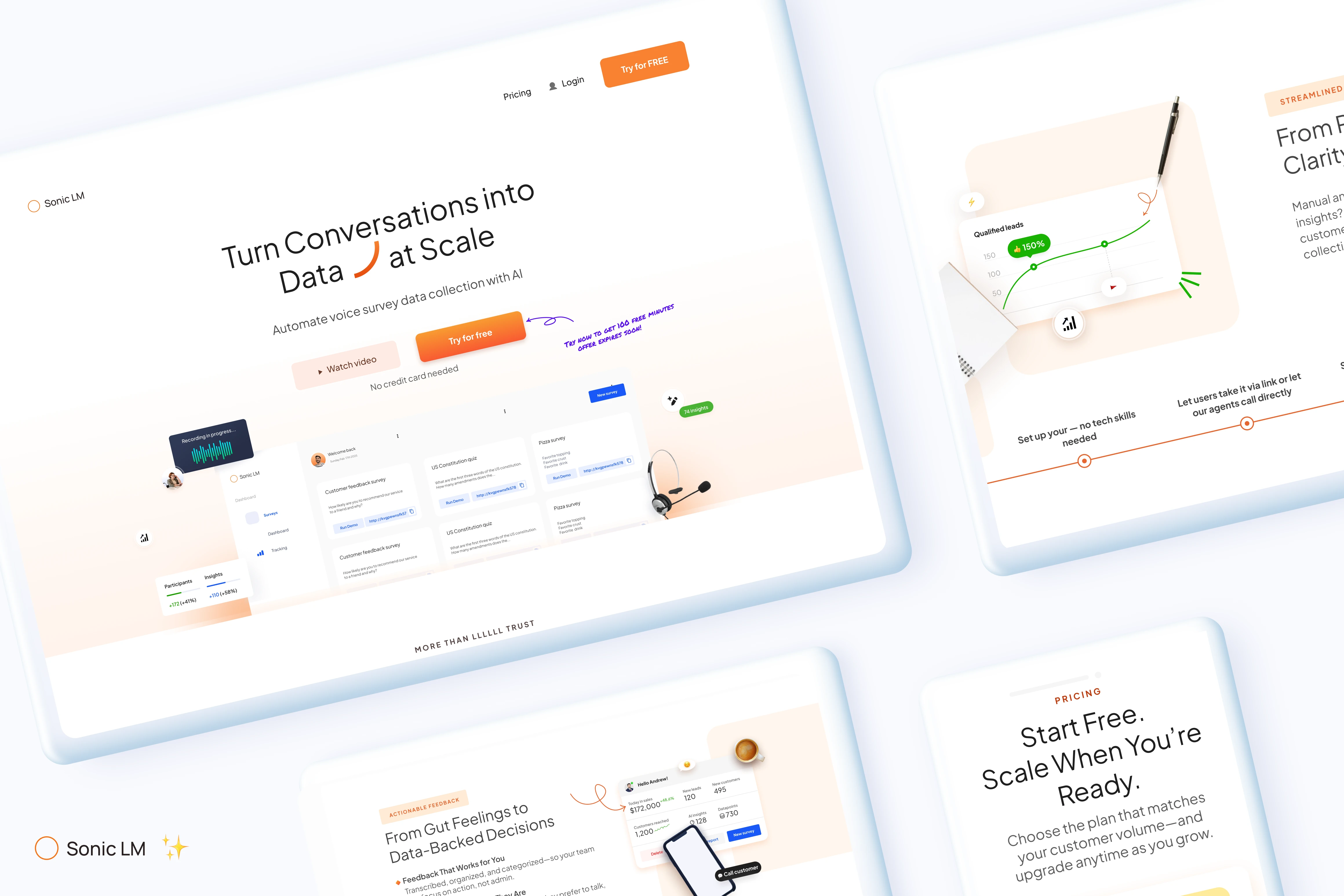
Leading with relevance
The hero section was redesigned to do two things fast: show the transformation and lower the emotional barriers to action.
We shifted from a dry headline to one that framed the product as the bridge from pain to clarity—"From voice feedback to actionable insights."
The supporting copy addressed uncertainty head-on, and the CTA felt safe and accessible, even to skeptical, overwhelmed users.
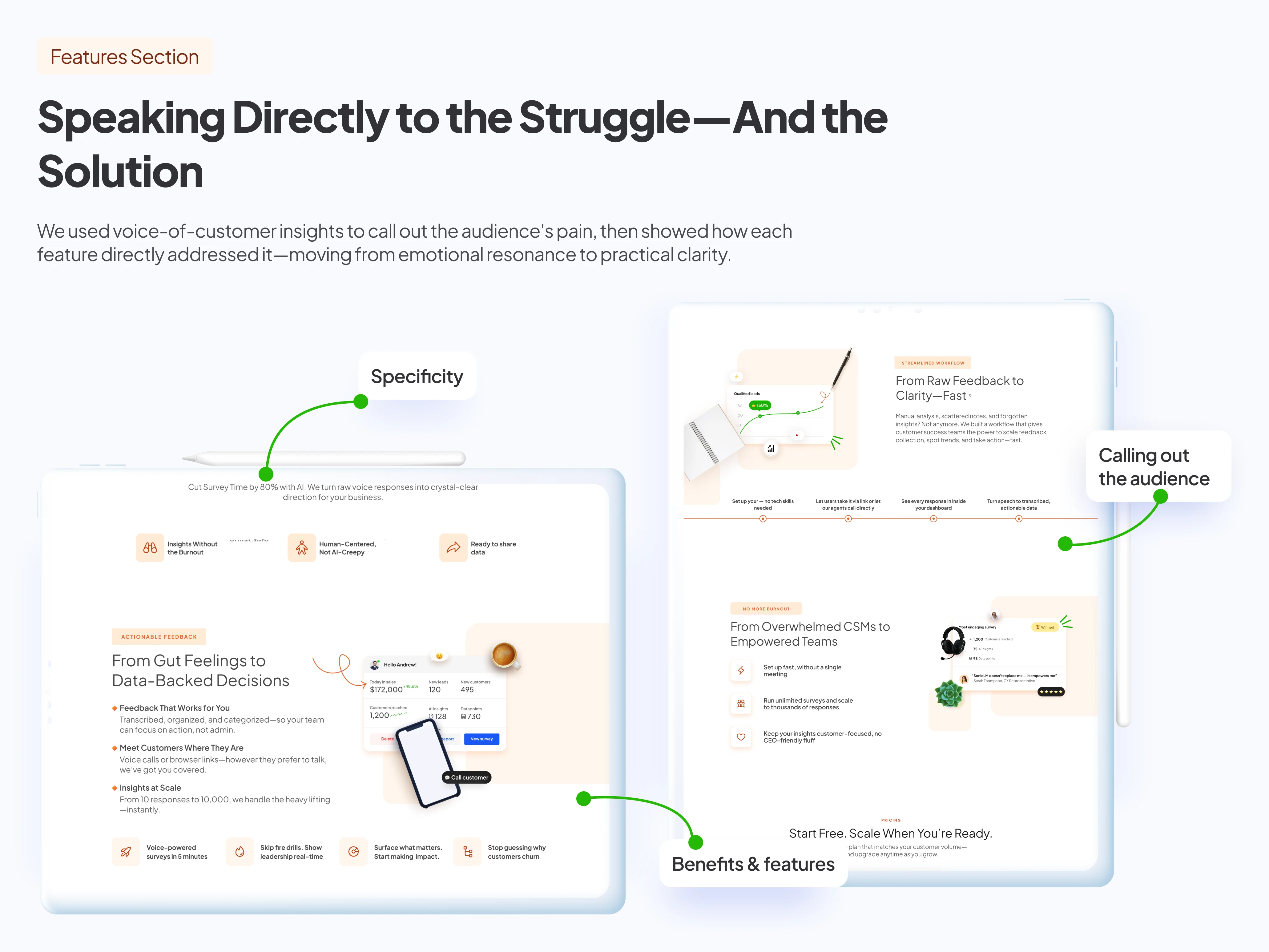
Turning product functionality into personal goals
Instead of listing features, we reframed them using voice-of-customer language and real user frustrations.
Each feature was positioned as a direct answer to a pain point:
“Too many churn meetings?” ➝ Here’s your dashboard.
“Feedback in spreadsheets?” ➝ Here’s automatic analysis.
This helped us move users from “this looks interesting” to “this was built for me.”
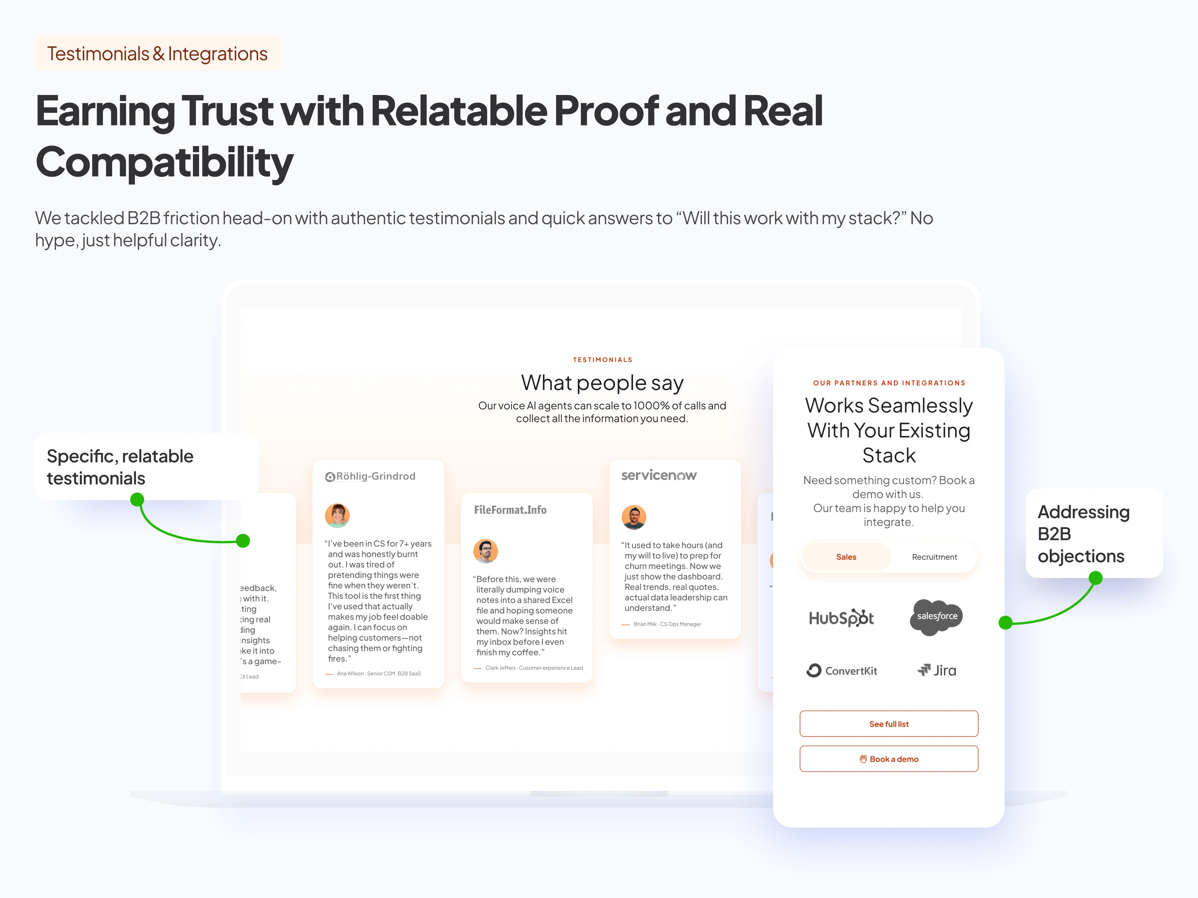
Testimonials and compatibility
To reduce decision risk, we pulled in testimonials that mirrored our audience’s real struggles, burnout, chaos, and no time to waste.
The testimonials showed transformation.
We also addressed a key B2B blocker:“Will this work with our stack?” by showing integrations right up front.
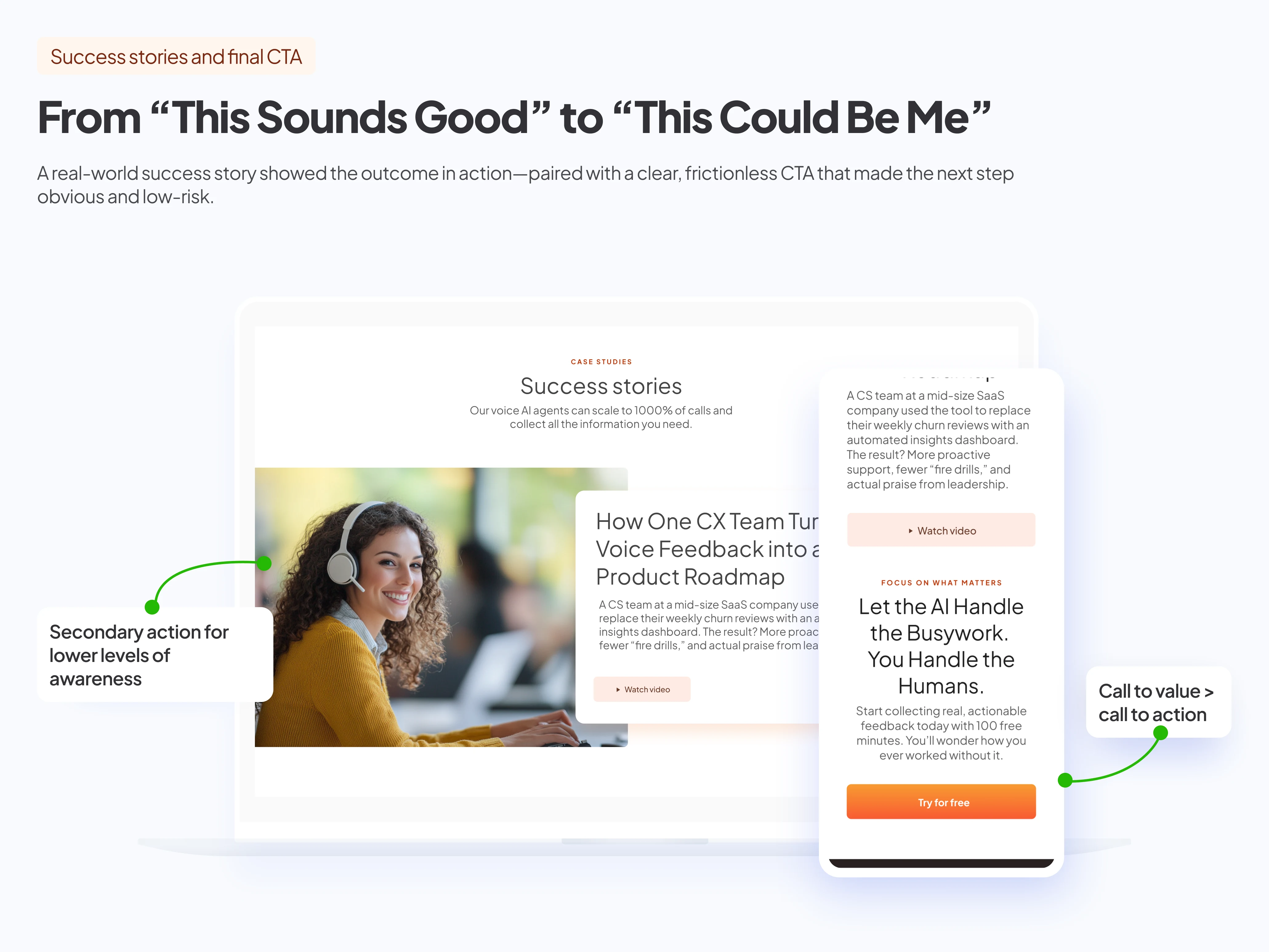
Success cases and final CTA
To inspire action, we highlighted a real success story that showed how the tool drove measurable impact.
It helped users see themselves in the result, even if they were still early in their journey.
The final CTA was framed as a no-risk step forward, reinforcing the emotional payoff and making it easy to say yes.
Like this project
Posted May 27, 2025
Redesigned a landing page to improve user engagement and conversion by addressing user pain points.
Likes
1
Views
5
Timeline
Feb 3, 2025 - Feb 20, 2025