SaaS Landing Page Conversion Optimization
Elias Mas
How I 7.5x This SaaS Website's Conversion Rates
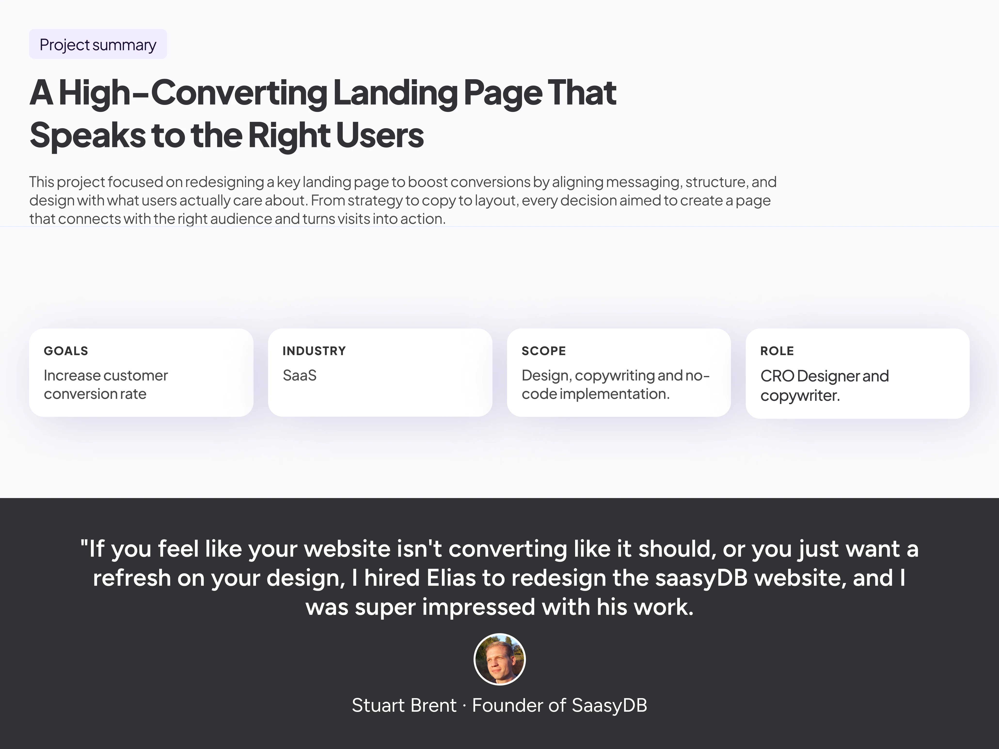
This project involved designing a landing page for a SaaS tool with a tiered pricing model. The existing site looked polished, but lacked a conversion strategy. There was no clear journey, no urgency, and no emotion.
The goal was to design a page that didn't just look good, but sold well. Using a strategic structure based on the AIDA framework and content that spoke directly to user priorities, we created a high-performing page that converts browsers into buyers.
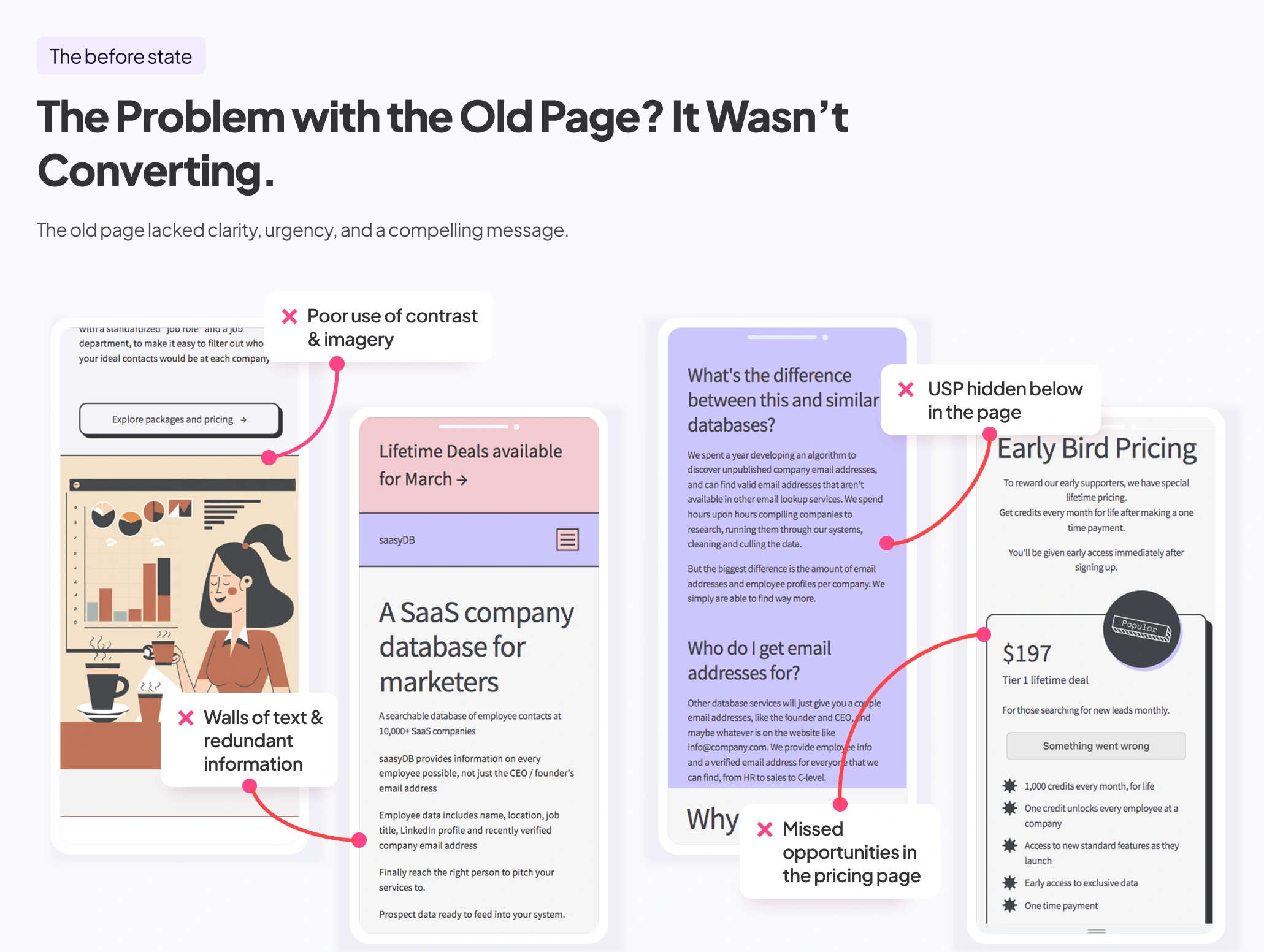
The before state
Despite clean visuals, the original page lacked focus. The message was bland, and the structure didn’t guide the user toward a decision.
The challenge was to build a page that combined emotional relevance, logical flow, and proof, so users could stop skimming and start taking action.
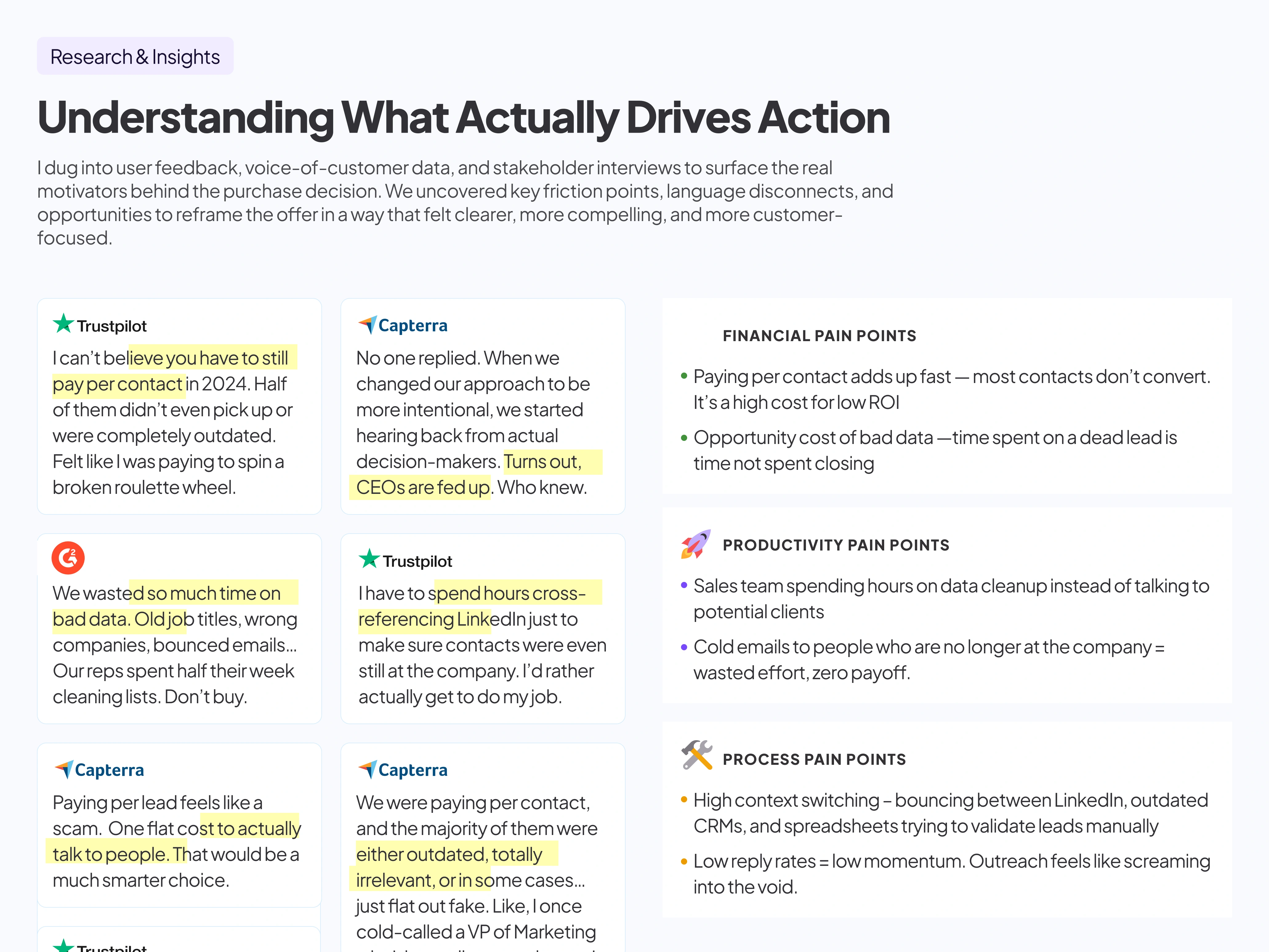
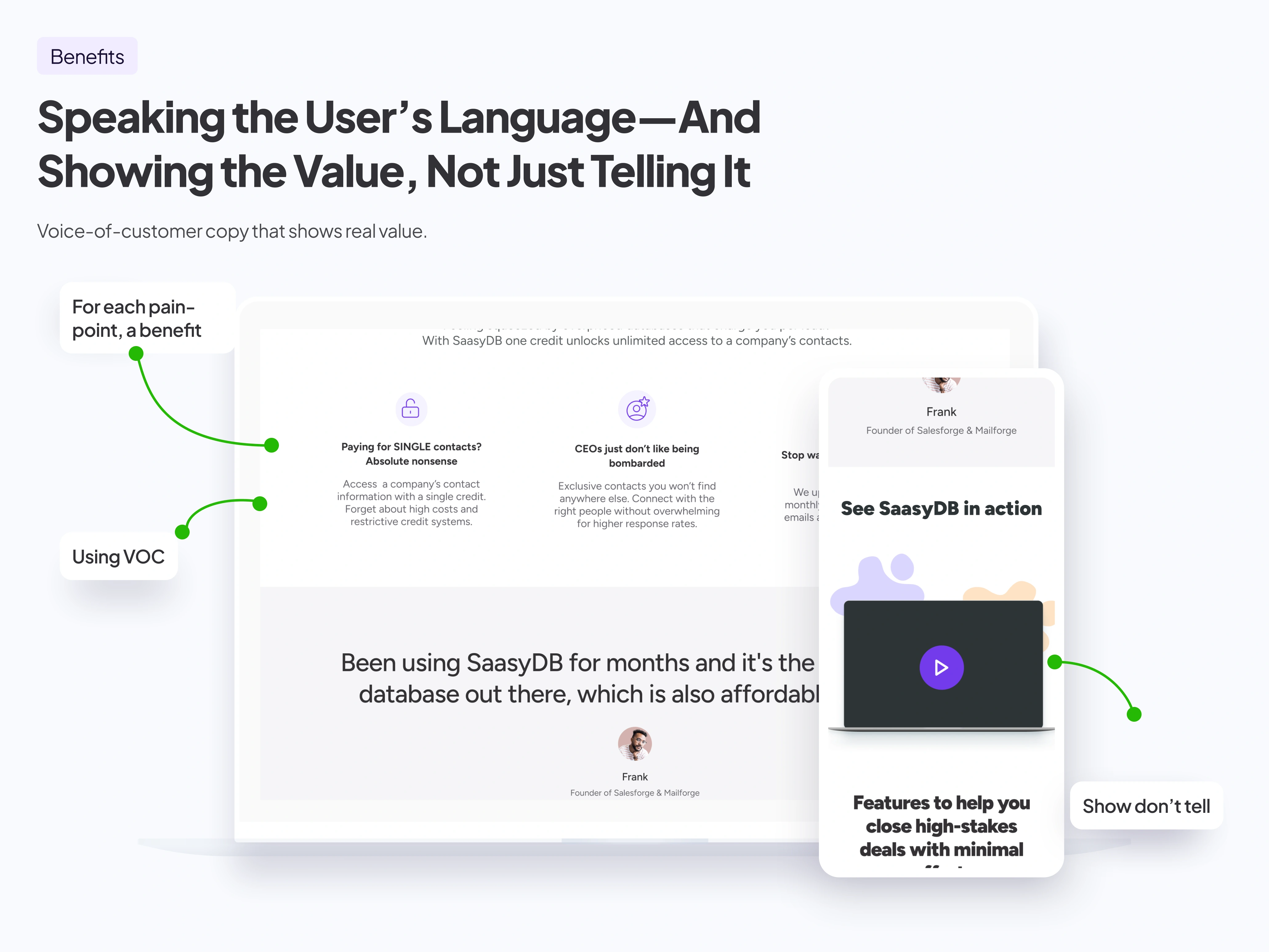
Insights from real people
I leaned into research and feedback to understand what mattered, and I clustered these insights into Financial productivity and process pain points.
Everything from pricing friction to skepticism about value informed the final copy and layout strategy.
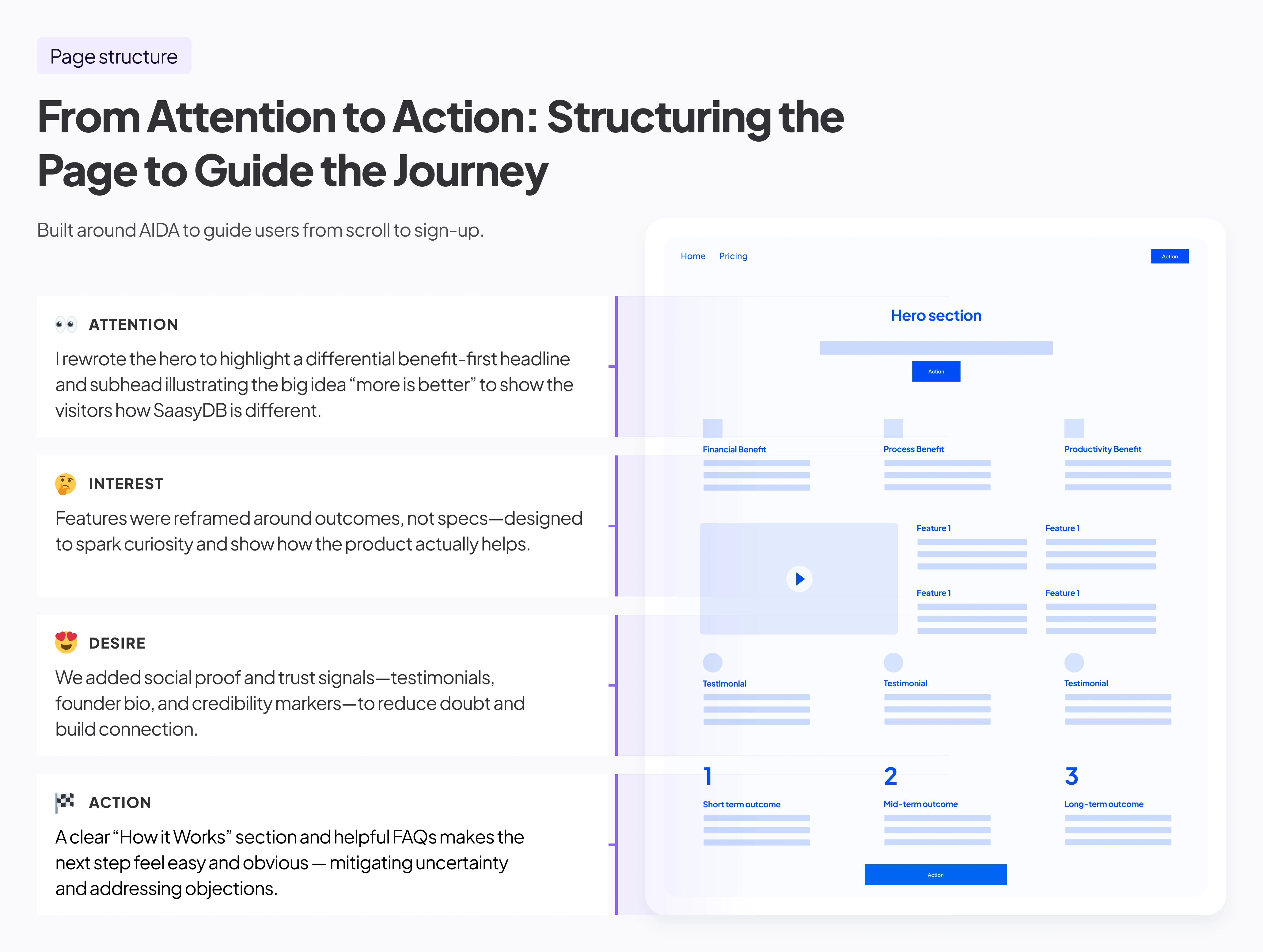
Built to guide the user toward a yes
I followed a conversion-tested structure:
• Grab attention
• Show value quickly
• Prove credibility
• Remove doubt
• Make the next step easy
The page structure creates a sense of momentum that makes clicking the CTA feel like the logical next move.
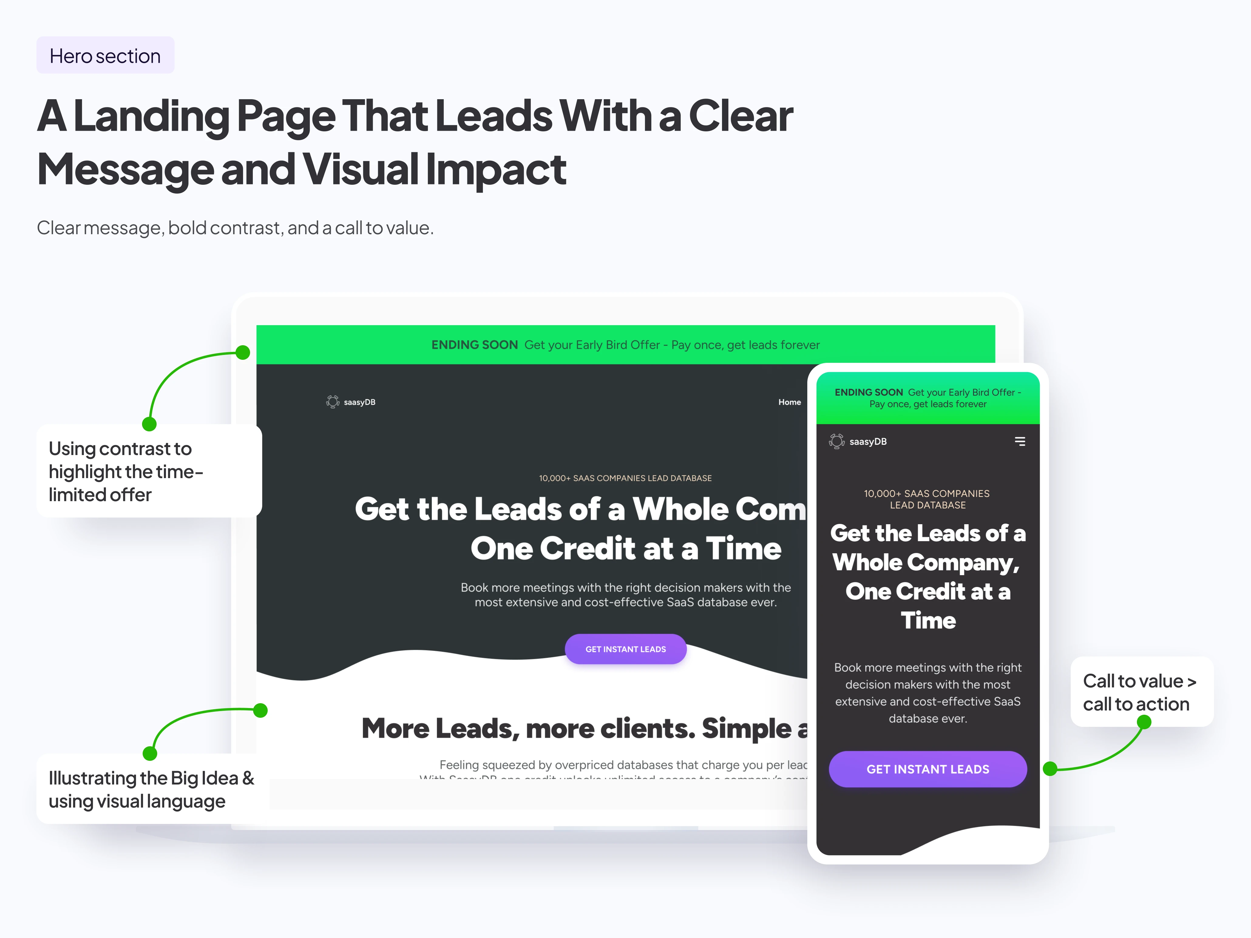
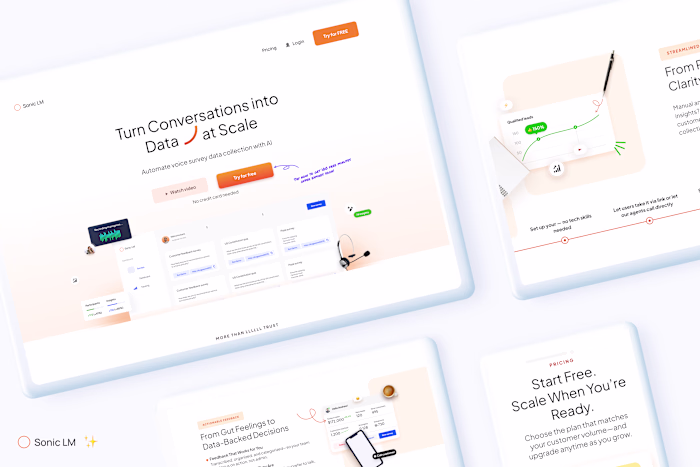
Lead with clarity. Back it with confidence.
I repositioned the hero to center around the big idea - "more is better".
I removed any vague tech-speak—the headline made a promise, the subhead made it personal, and the CTA offered a clear win.
Turn pain points into motivators
I reframed each pain point as a meaningful outcome.
I answered the silent “so what?” with every sentence, highlighting the impact on infrastructure.
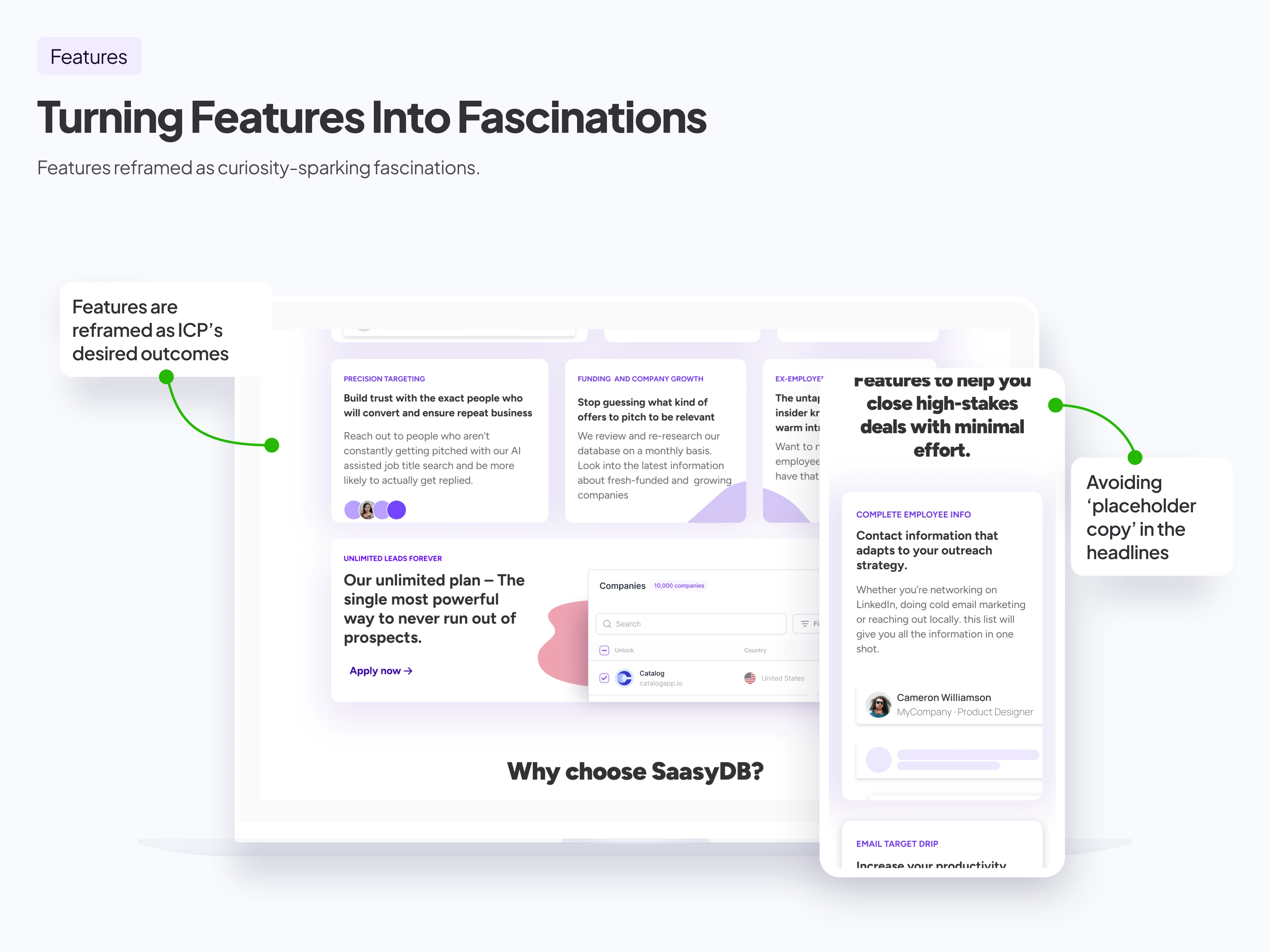
From feature list to fascinations
I used a bento grid to break the page layout and make scrollers stop.
Every key point was written to answer the user’s question: “How does this help me win?”
I called out friction-killers like instant setup, built-in integrations, and customizable modules that adapt to different team sizes.
By embedding benefits into the feature language, we made technical specs feel empowering, not intimidating.
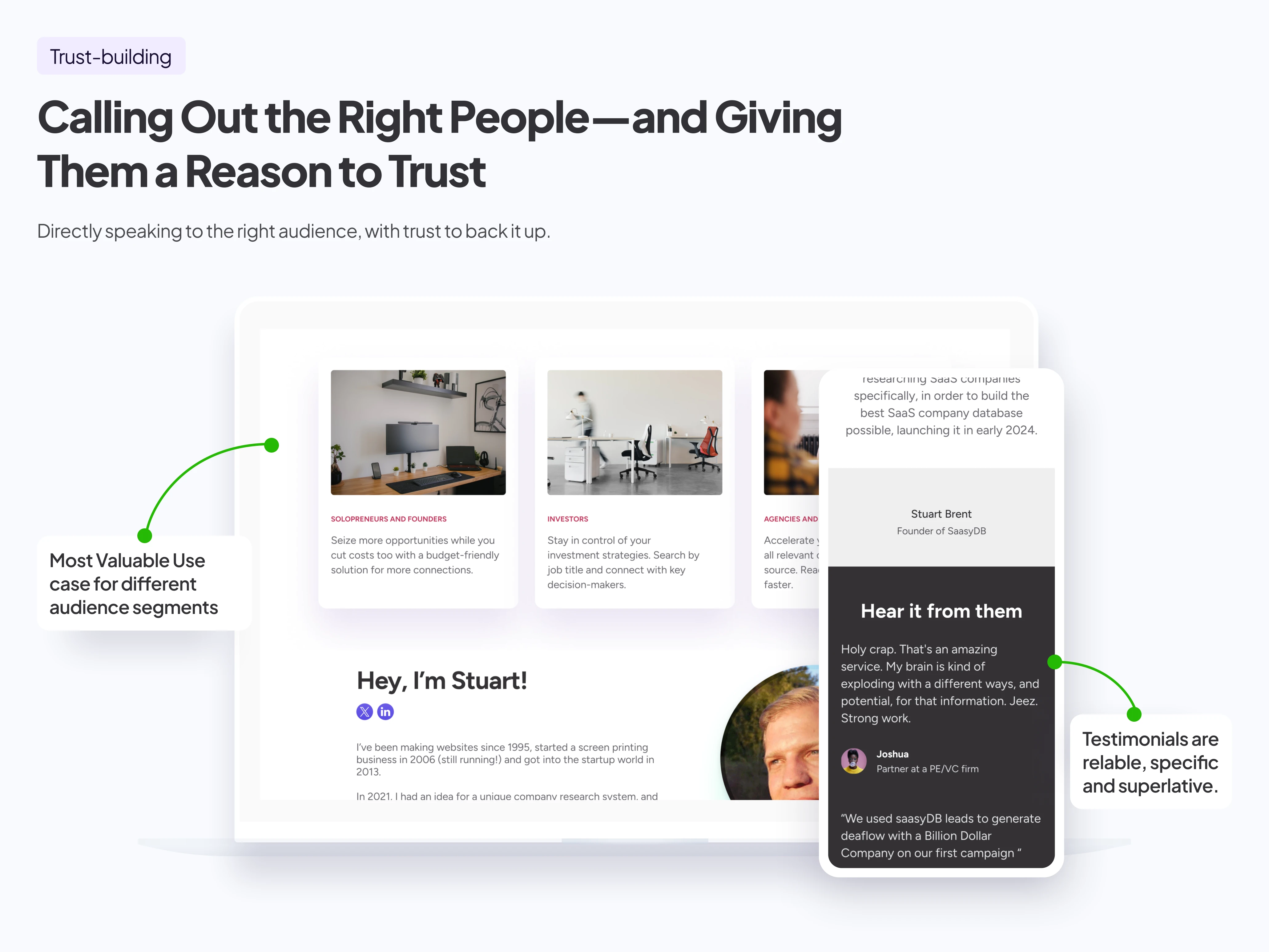
Speak to the right people. Show them you’re one of them.
Generic "for everyone" messaging doesn't build trust.
On this landing page, I explicitly mentioned the audience, showing that we understood their daily workflow, pain points, and goals.
We reinforced that message with a short founder bio that shared the product's origin story—why it exists, who it's built for, and the values behind it.
This transparency built authority and approachability, especially for lower-awareness users who needed more emotional safety before taking action.
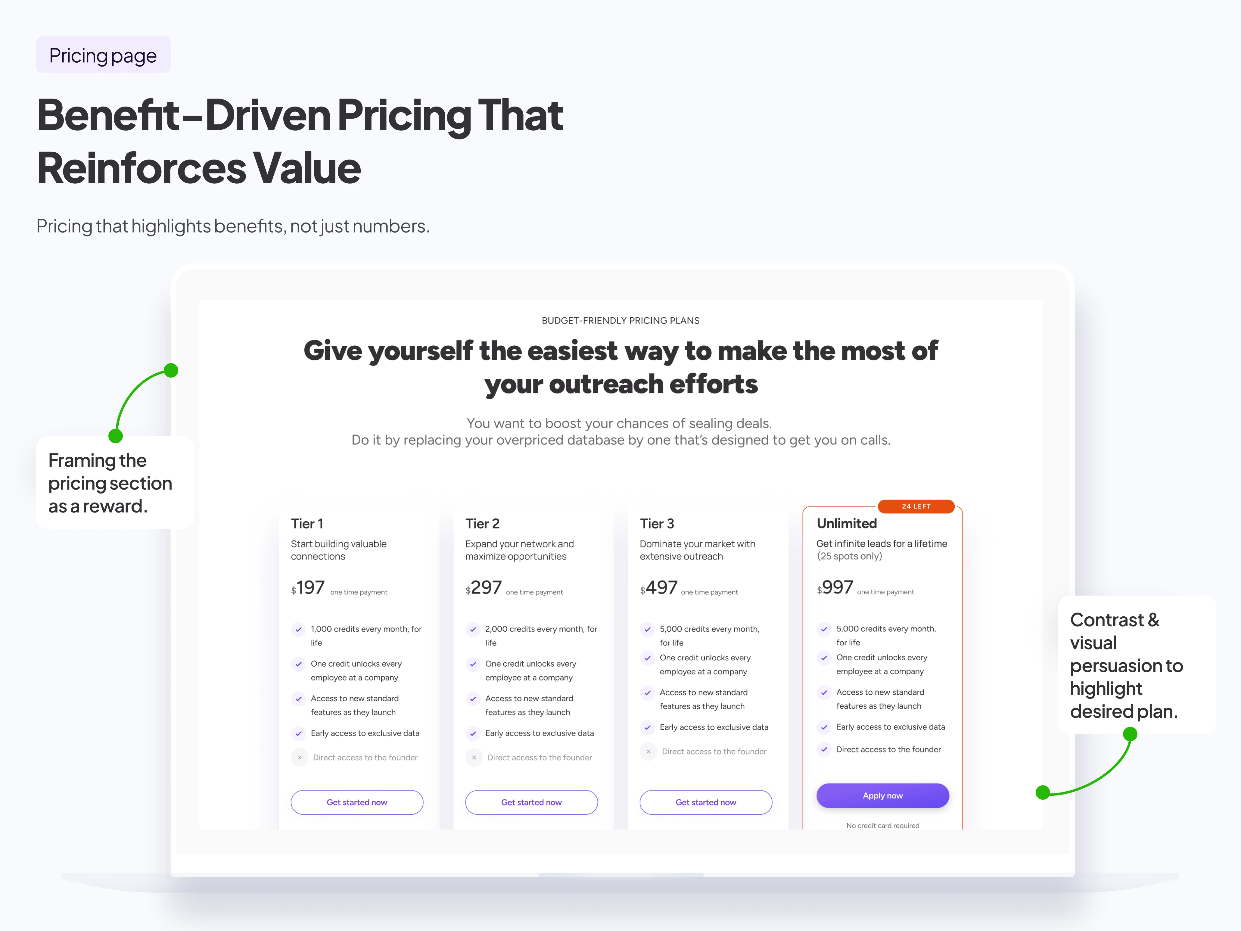
Clear tiers. Clear value. Low risk.
Pricing was simplified and framed around use cases, not just minutes or limits. Testimonials and trust markers were positioned nearby to reduce anxiety and increase conversion readiness.
Like this project
Posted May 27, 2025
Designed a high-converting landing page for a SaaS tool using AIDA framework.
Likes
0
Views
4
Timeline
Jun 24, 2024 - Jul 1, 2024