Zero Team AI Governance Single-Page Site

Andrew J


Zero Team is Australia's practitioner-led AI capability and governance partner, a social enterprise based in Melbourne that helps organisations and professionals use AI confidently, safely and in ways that genuinely work: training, consulting, a membership community and a job board.
Live site: https://zero-trust-architect.lovable.app/
Zero Team was pre-launch with no existing site, and needed to establish credibility in one shot. The brand's whole pitch is that trust has to be structural, not declared, so the site itself had to prove that idea rather than just state it, while speaking to two very different audiences: risk-averse organisations (NFP, healthcare, professional services, education) and career-focused individuals.
I designed and built a single-page, scroll-driven site that turns Zero Team's governance philosophy into something the reader sees and feels, with a focus on holding a board-level reader's attention through the full narrative and converting interest into qualified enquiries.
Challenges:
📌 Stand Out
Avoid the purple-gradient, glowing-brain, circuit-board look every AI competitor uses, while still reading as credible to a board.
📌 Speak to Two Audiences at Once
Differentiate NFP, healthcare, professional services and individual readers inside one page without diluting any of them.
📌 Hold Attention
Keep a cautious, trust-sensitive reader engaged through roughly 20,000px of scroll without it feeling like a gimmick.
📌 Convert Without Overselling
Give a nervous, risk-averse audience one clear path to enquire, not a scattering of competing CTAs.
📌 Accessible by Default
NFP, healthcare and education all carry accessibility obligations, so WCAG 2.1 AA needed to be built in from the start, not patched on later.
Stage 1 - Reference gathering and visual direction
Rather than a single moodboard, I pulled references and interrogated each one for the single property worth keeping (a font pairing, a motion behaviour, a contrast strategy) rather than copying it wholesale.
✅ Typography direction
Locked in the core idea early: a warm literary serif paired against a hard pixel/monospace face, the tension that makes AI-adjacent work feel human rather than corporate.
✅ Colour strategy
A single acid-lime accent against near-black, used sparingly and reserved for CTAs and one highlighted word per idea, with the palette shifting across the scroll rather than sitting static.
✅ Motion references
Pulled three patterns to build from: pinned full-bleed art that reacts to scroll, sticky cards that stack on top of each other, and a horizontal pin-scroll for the founders.
Motion Inspiration
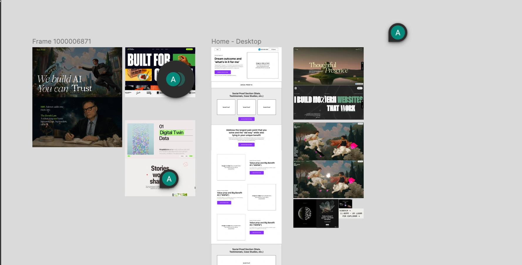
Moodboard and brainstorming with wireframes
Stage 2 - Design and development
✅ Motion-led hero
Built the hero as an 87-frame image sequence drawn to canvas and scrubbed to scroll position, so the reader sets the pace instead of watching a looping video.
Motion-led hero
✅ Real-time governance diagram
The five-layer governance framework runs as a live WebGL particle system, about 3,500 instanced pieces that breathe, disperse on scroll and ripple under the cursor. Rebuilt twice before it read as "AI" without a line of copy.
WebGL particle system
✅ Scroll-driven colour system
The whole page shifts through dark, light and lime zones as you scroll, rather than switching between static sections. Went through five iterations to get the pacing right.
✅ A dedicated moment per audience
Built a pinned scrollytelling section that steps through NFP, healthcare, professional services and individuals one at a time, so each reader finds themselves quickly instead of wading through language aimed at someone else.
Stage 3 - Technical foundations
✅ Built for performance
All animation renders client-side only, imagery is served from CDN rather than bundled, and the particle system writes colours and matrices in a single pass per frame to hold 60fps on a laptop.
✅ Accessible colour system
Foreground and contrast are derived automatically from each active theme, so WCAG 2.1 AA contrast held across three colour states without a manual audit at the end.
✅ One conversion path
A single enquiry form, placed once, with no competing CTAs anywhere else on the page.
Result:
✅ A nine-section, single-page scroll experience that runs at 60fps and holds attention through the full narrative
✅ A governance model the reader can actually see, not a policy document they're asked to trust
✅ One clear, low-friction path to enquire
✅ Colour and contrast built to WCAG 2.1 AA from the ground up
✅ A visual identity that steps outside the generic "AI company" template entirely
Like this project
Posted Aug 19, 2026
Designed a unique, engaging single-page site for Zero Team's AI governance philosophy.