Manifest: I AM - Gamified Goal Tracking App
Andrew J
Manifest: I AM
Re-engineering manifestation through habit science and gamified design
Goal trackers feel like a chore. I wanted to build one that felt like a game you actually want to keep playing.
Every December 31st, millions write down goals, and quit by February. Linear checklists have zero psychological structure, they sap motivation instead of building it. Manifest: I am treats mindset work like a fitness practice, not a vision-board hobby, grounded in real behavior-change research and wrapped in a reward loop that makes showing up feel good.
Built solo: design, code, ship, and market, including AI-generated UGC video ads to drive top-of-funnel growth.
The Problem
Goal trackers turn self-improvement into a transactional checklist that drains motivation instead of building it. The real issue isn't a lack of ambition, it's a cognitive design problem. I built Manifest as a personal challenge to upskill from design into full-stack mobile development and AI, and to build a premium "digital sanctuary" that treats mindset as a trackable, high-performance practice rather than magical thinking.
Grounding It in Behavioral Science
I didn't want this to trade on "manifestation" as magical thinking, so the core mechanics borrow from real habit and behavior-change research. A note on rigor: this is product inspiration from popular psychology and secondary sources, not a clinical claim, design grounding, not peer-reviewed proof.
Attention & noticing — Repeated attention on a goal is thought to help you notice relevant opportunities you'd otherwise miss. The rationale for the app's daily "evidence log."
WOOP / Mental Contrasting (MCII) — Dr. Gabriele Oettingen's research on pairing a vivid desired outcome with a clear-eyed obstacle, then an if-then plan, is the most evidence-backed piece here. The backbone of the goal-creation flow.
Future-self continuity — Hal Hershfield's research on how people relate to their "future self" as a near-stranger inspired the app's present-tense, future-self journaling prompts.
Spaced repetition — The app nudges reflection three times a day rather than once a year, on the theory that distributed repetition beats cramming.
Market Gap
I mapped the self-improvement and wellbeing category along two axes: scientific rigor and visual/aesthetic quality. Most competitors clustered at one extreme or the other , high polish with little substance, or clinical rigor with little design appeal.
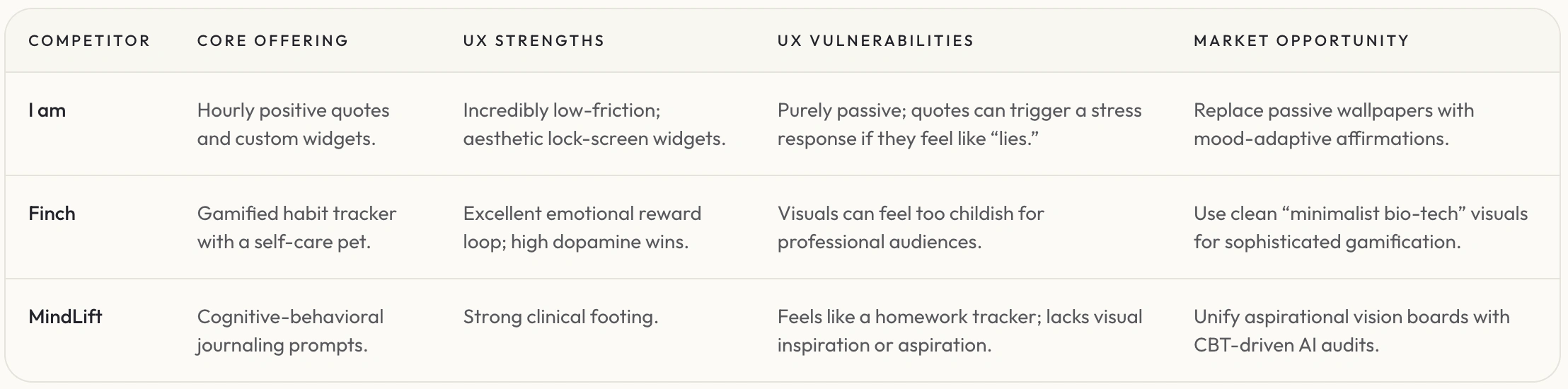
Competitors and market gap
Who It's For
We interviewed users from digital wellbeing communities and compiled their frustrations to build our empathy maps and primary user personas
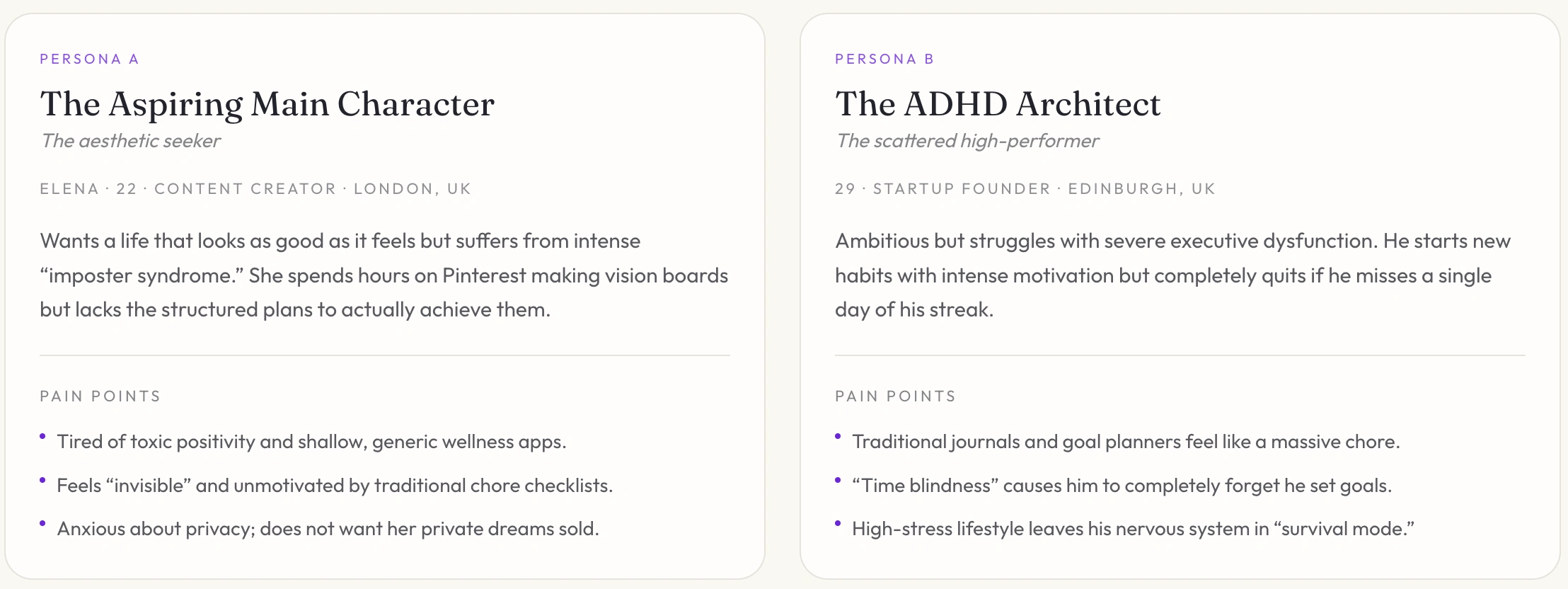
Two targeted personas
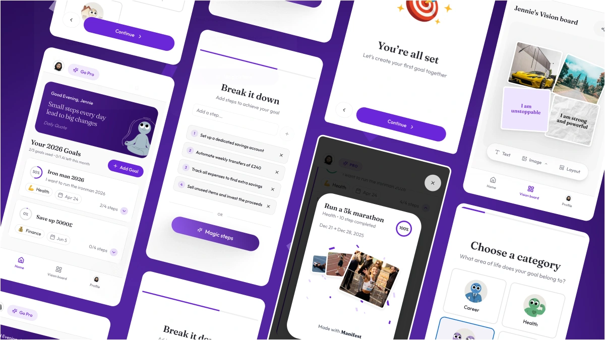
Key UI Flows
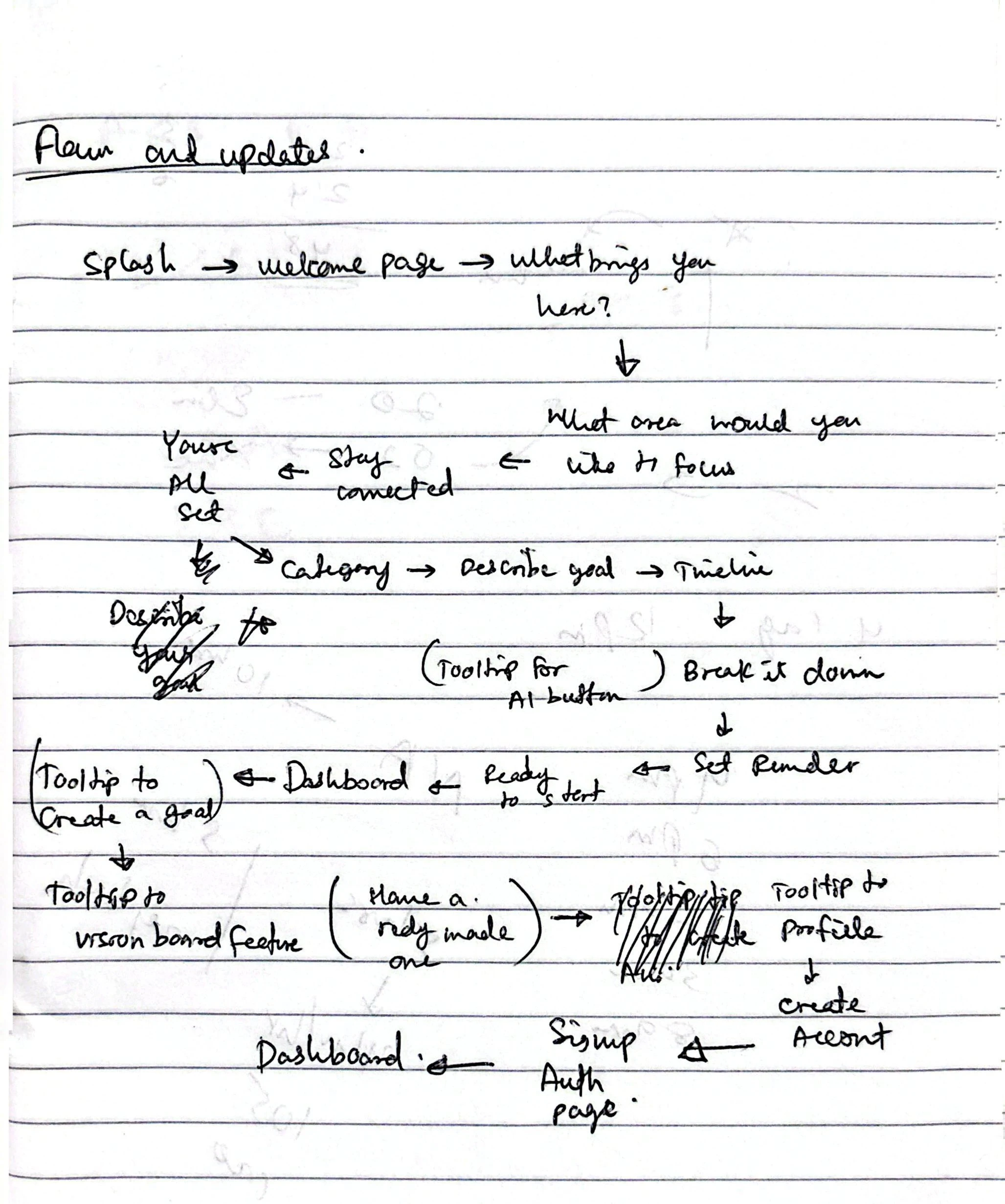
I initially sketched my solution on paper
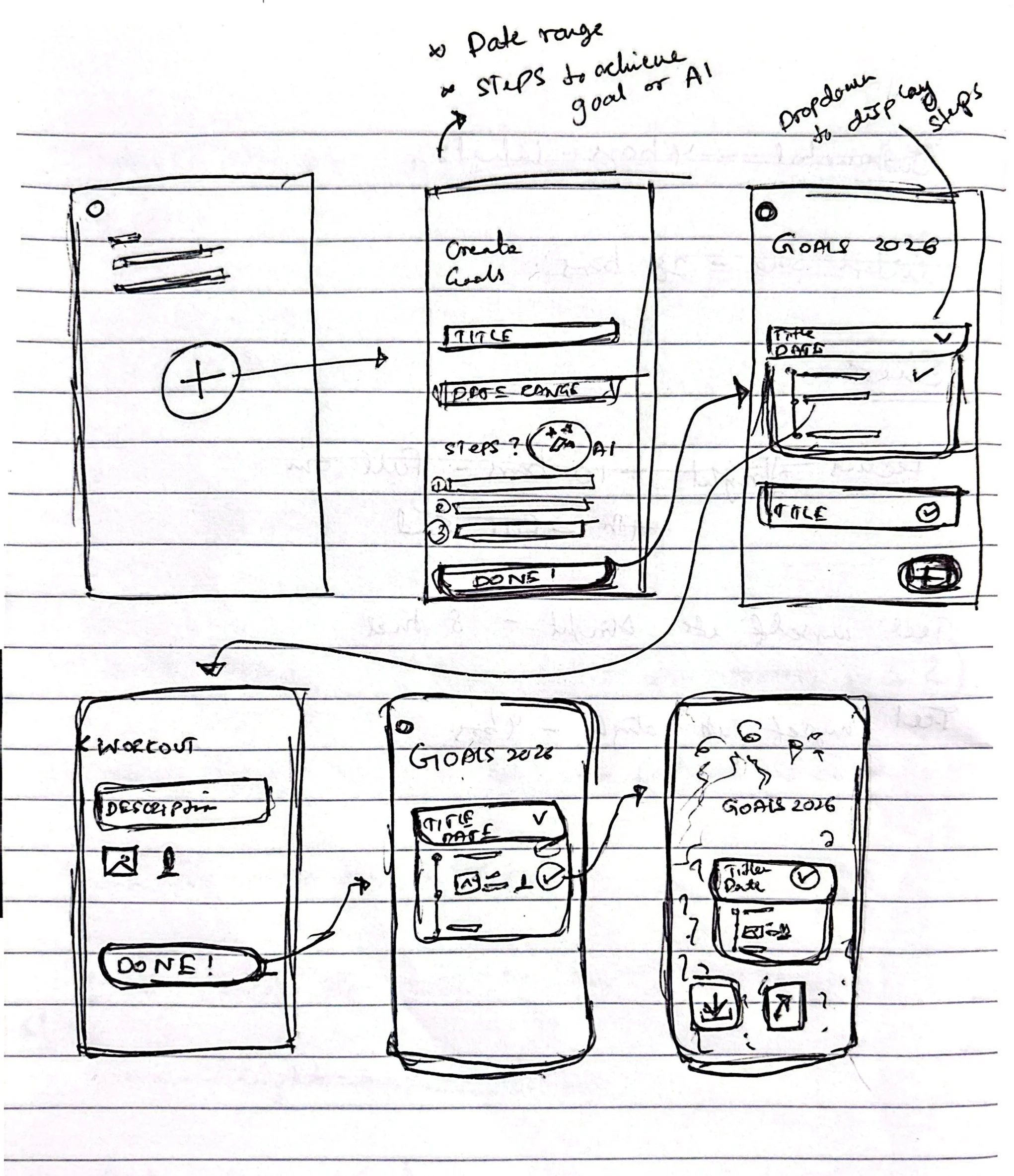
paper wireframes
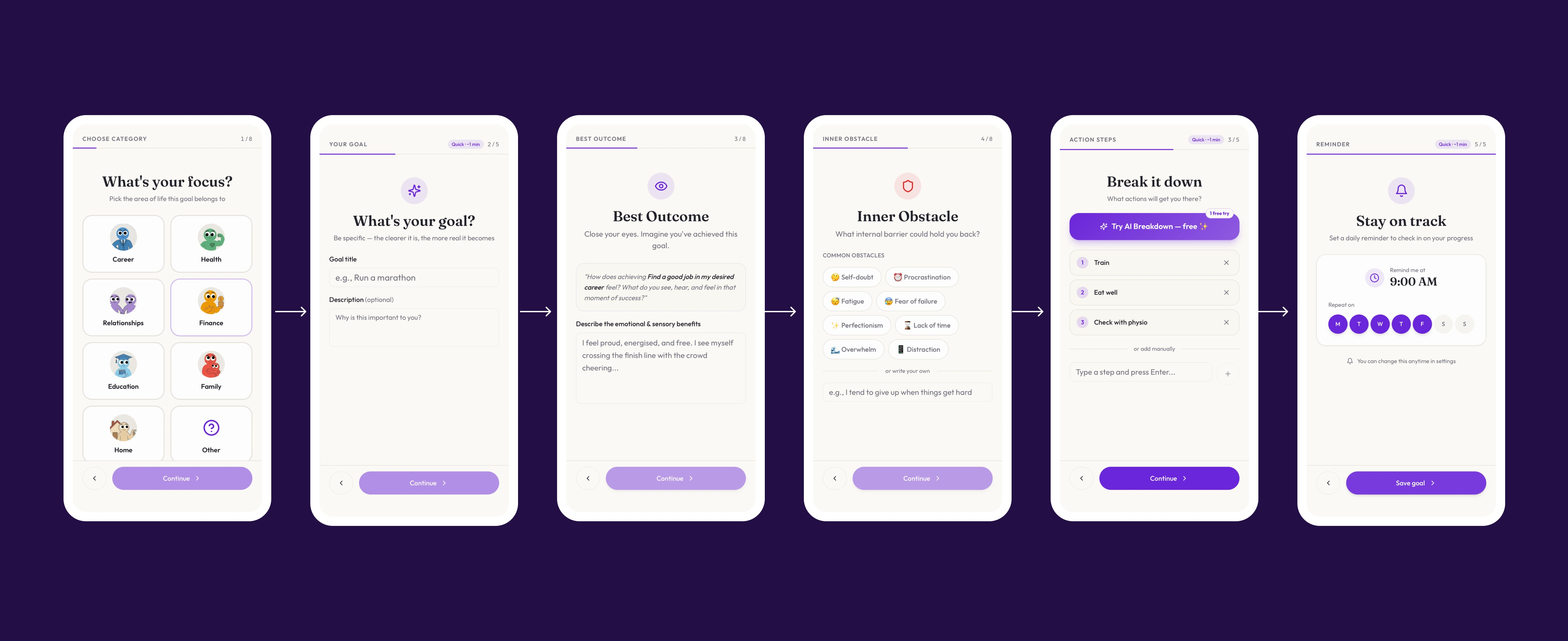
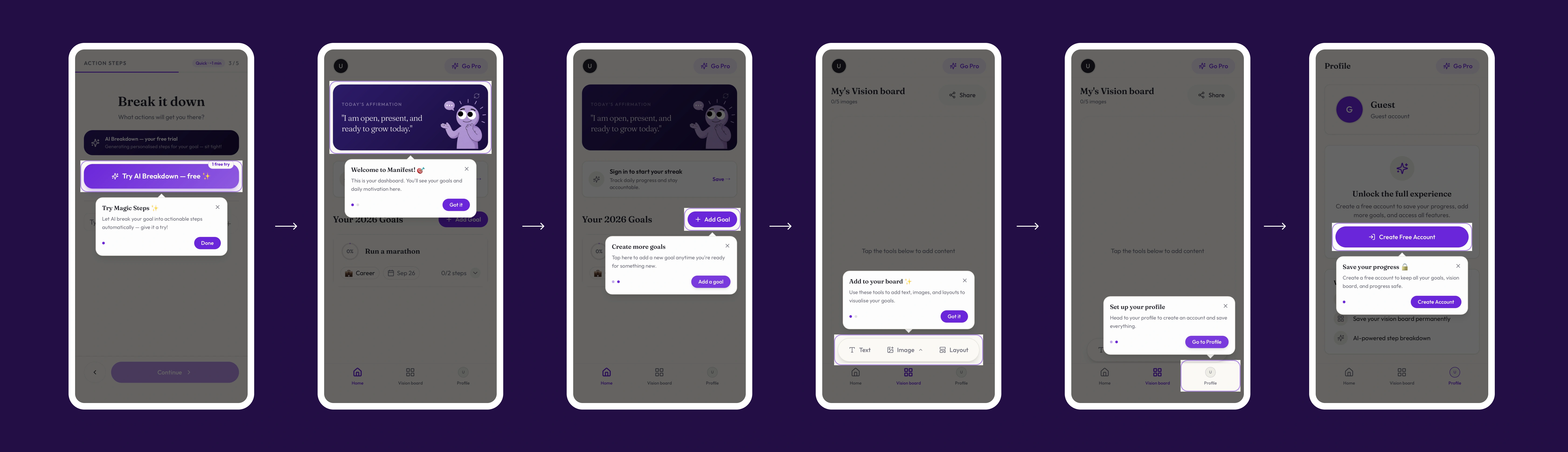
UI Flow A - Onboarding Before the Ask
I analyzed the onboarding of competing apps like Headspace, Alan mind, Ahead and Tiimo, to design my UI's to match the users mental model.
emotional intent → focus area → first goal, all before any sign-up screen appears. The goal was to get users invested before asking anything of them.
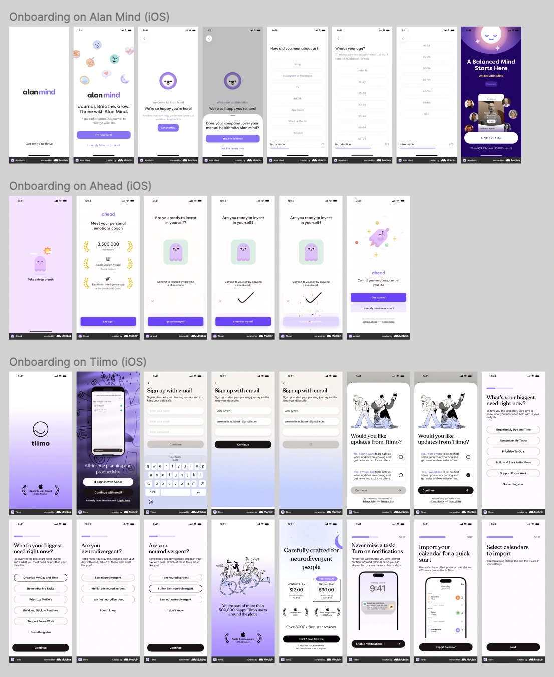
Competing apps onboarding
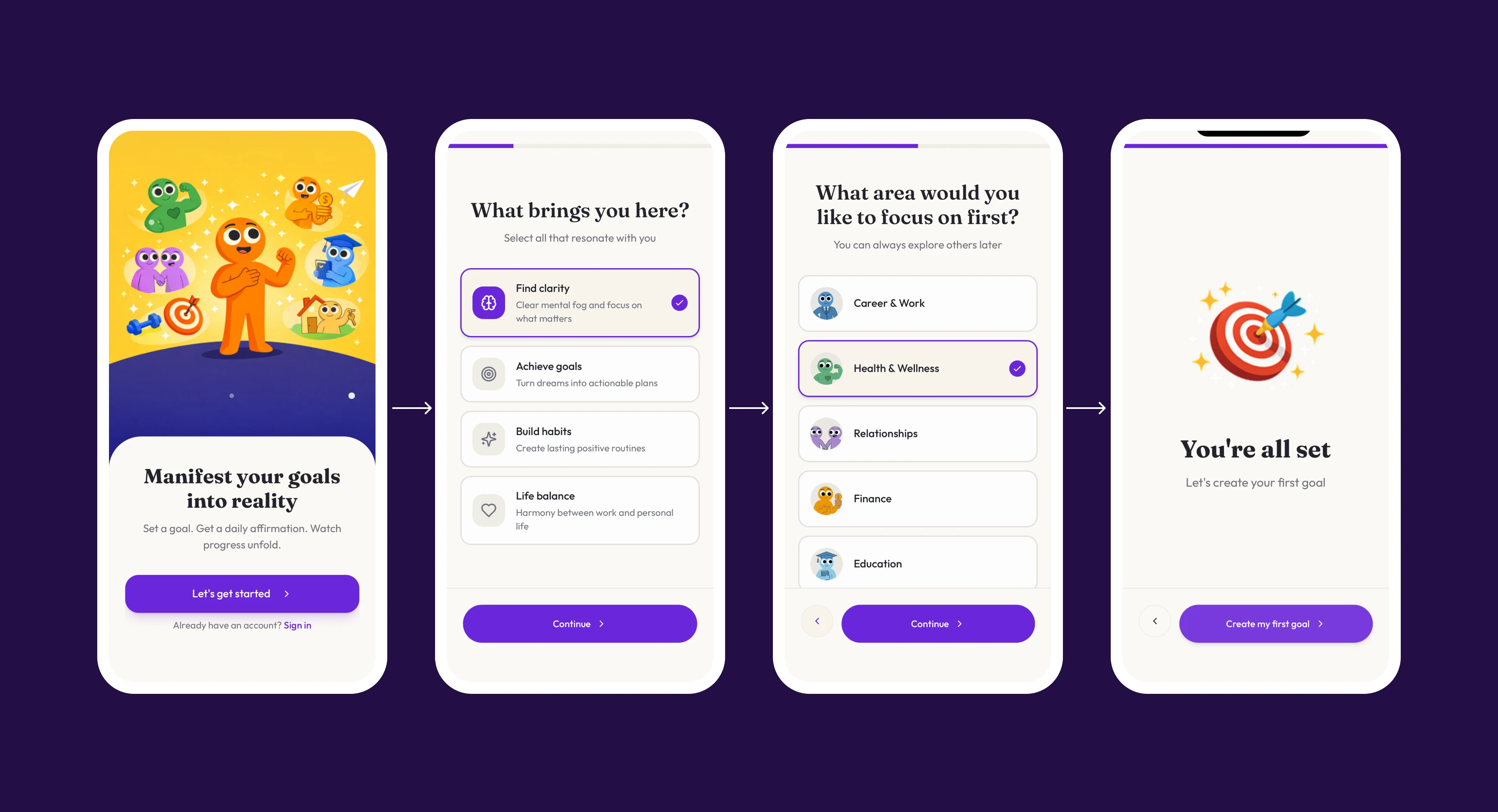
UI flow A
Flow B — The WOOP Goal Engine
Guides users through Oettingen's Mental Contrasting framework: Wish → Outcome → Obstacle → If-then plan.
Wish: identity-based goal statement ("I am an Athlete")
Outcome: vivid sensory/emotional detail ("I will feel proud and recognised")
Obstacle: the internal block, named honestly ("Fear of failure happens")
If-then plan: "If fear of failure happens, then I will work hard and focus on improving."
UI Flow B
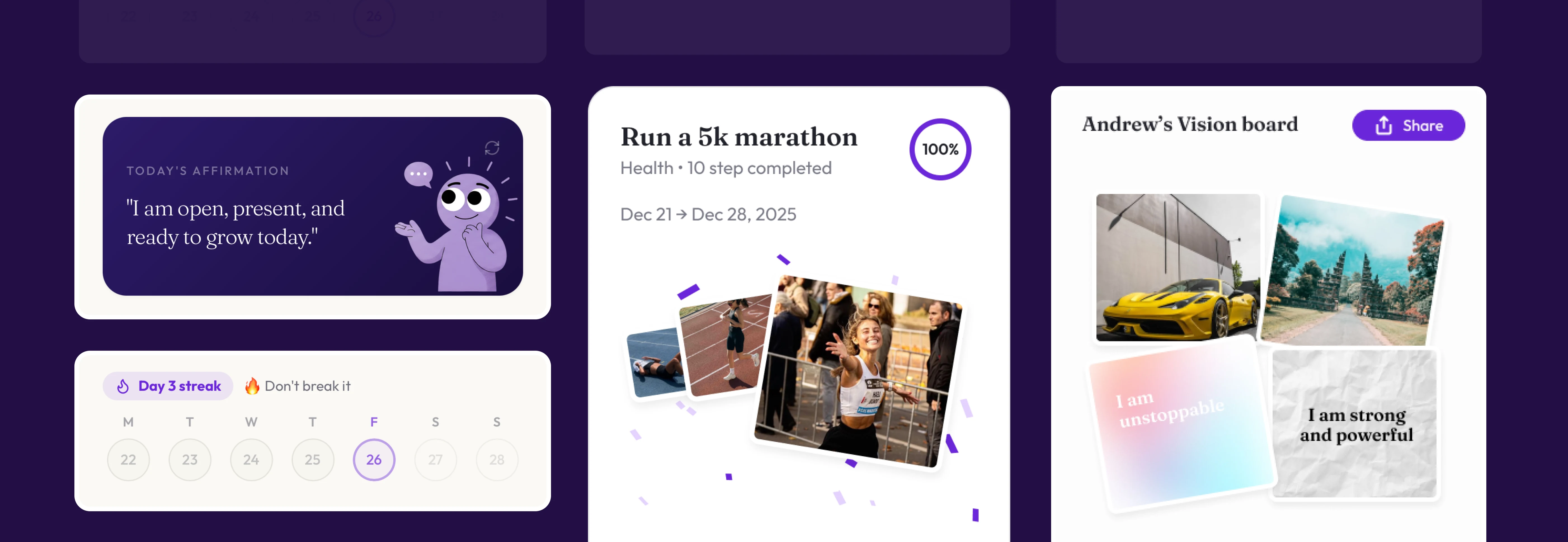
Flow C — Dashboard & Vision Board
The daily hub: a streak calendar, a daily affirmation card, active goal progress with its if-then plan surfaced inline, and a drag-and-drop vision board for collaging reference images and affirmations tied to each goal , closer to the Pinterest-style moodboarding Persona A already does, but linked back to a concrete plan.
Key Gamified elements
Qualitative Feedback → UX Fixes
After initial launch, I ran a feedback loop and mapped real complaints into concrete redesign
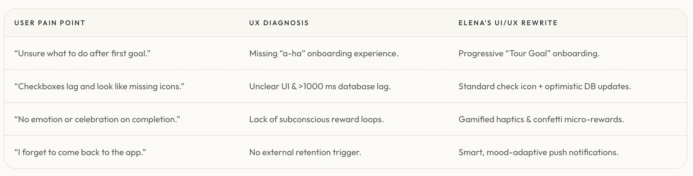
User pain points and fixes
Did It Work? The Data
Four development phases, each validated against real signup, activation, and engagement telemetry.
Phase 1 — MVP Launch (Dec 2025)
Email-only auth, blank-state goals. 49 signups, 0 goals created , high friction killed activation before it started.
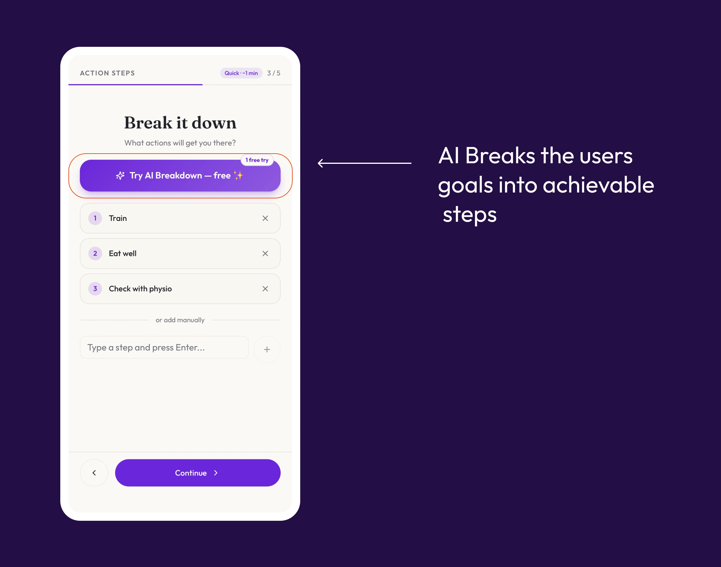
Phase 2 — AI Step Decomposition + WOOP (Jan 2026)
I added Gemini-powered goal breakdowns and vision boards.
Goals/week: 9 → 30 (+233%)
AI steps generated/week: 31 → 105 (+239%)
Vision boards created: 2 → 7 (+250%)
Weekly signups: 32 → 50 (+56%)
AI breakdown
Phase 3 — Native Apple Sign-In (Feb 2026)
I replaced email-only signup with one-tap Capacitor-based Apple auth and Google Auth
Signups/week: 1.7 → 2.3 avg (+35%)
Apple Sign-In captured 50% of new signups
Goals/week: 2.0 → 7.2 avg (+260%)
AI steps/week: 9.0 → 33.2 avg (+269%)
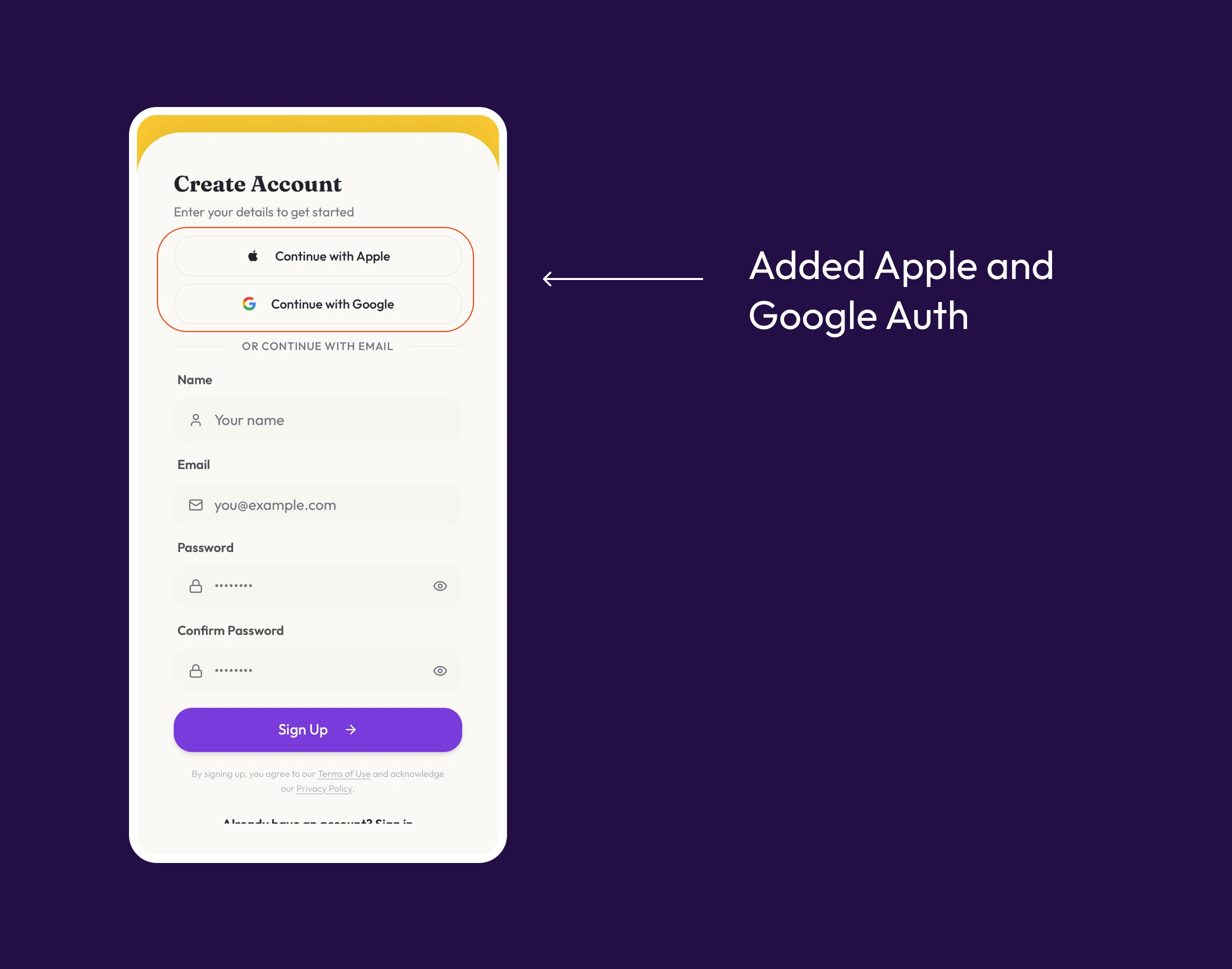
IOS and Google Auth
Phase 4 — Security Overhaul (Apr 2026)
Row-level security, private storage buckets, signed-URL media access.
Public-role RLS policies: 18 → 0
Public storage buckets: 1 → 0
Server-side validation triggers: 0 → 3
Onboarding Cohort Analysis (12 onboarded users vs. 70 non-onboarded, 82 total)
Goal creation rate: 100% vs 50% (+100 pts)
Goals per user: 3.7 vs 1.1 (+236%)
AI steps per user: 16.0 vs 3.9 (+310%)
Vision board adoption: 42% vs 11% (+3.6x)
Paper planned flow
Guided onboarding
Validating the Storefront
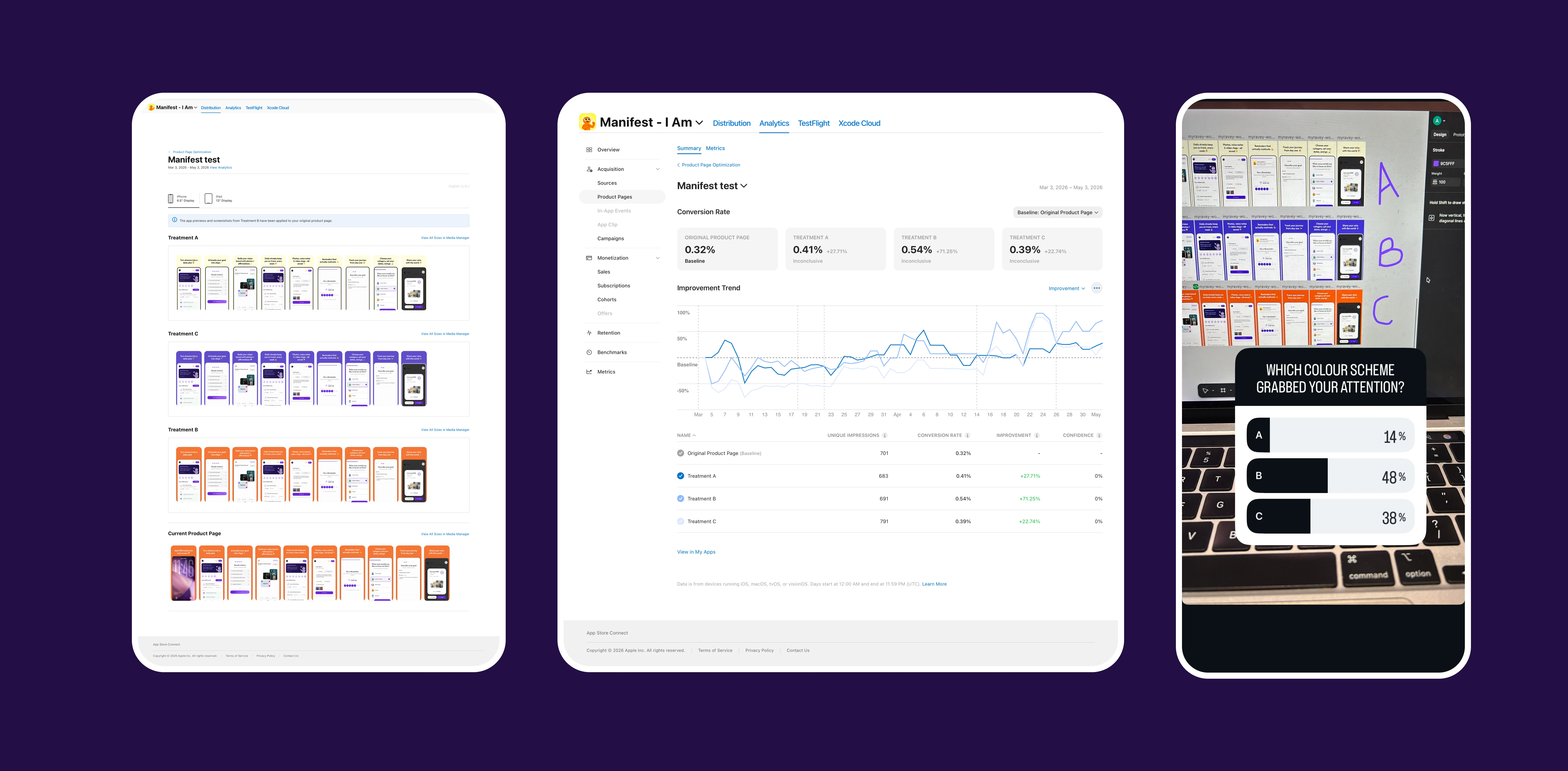
Getting someone to download the app matters as much as what happens after they do, so I ran the same testing discipline on the App Store listing itself.
I tested three screenshot treatments against the original product page over a two-month window:
Original: 0.32% conversion (baseline)
Treatment A: 0.41% (+27.71%)
Treatment B: 0.54% (+71.25%)
Treatment C: 0.39% (+22.74%)
Treatment B, a warmer orange-toned set, won clearly, so I rolled it out to the live page. Before the test even finished, I ran a quick social poll on the same three options as a faster gut-check. It landed on the same answer: B at 48%, C at 38%, A at 14%. Two independent methods, one slow and statistical, one fast and informal, agreeing was enough to ship with confidence early.
Worth noting: the in-app brand stayed on the deep violet system below. The storefront tested better in warmer tones, so I let it optimize on its own terms, a product's front door doesn't need the same palette as the product, it just needs to get the tap.
A/B Testing
Visual Design System
I went with a deep violet primary on a warm cream canvas, clinical enough to feel credible, warm enough to not feel sterile. Color choices were informed by auditing competing apps in the category and deliberately picking a lane none of them owned.
Design Playbook
Palette: Deep Violet (primary), Warm Cream (background), plus supporting Success, Destructive, and Foreground tones for state and contrast.
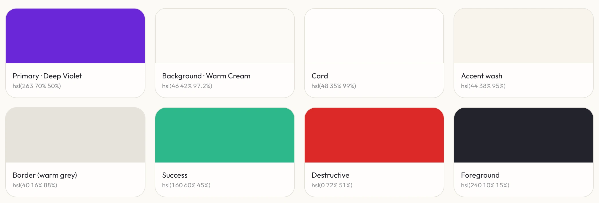
Color Palette
Typography: Fraunces for display, an editorial serif with optical sizing turned on for every heading, giving the app a premium, slightly literary feel against all the gamified UI underneath. Outfit for body and UI, a geometric sans tuned for high density at small mobile sizes.
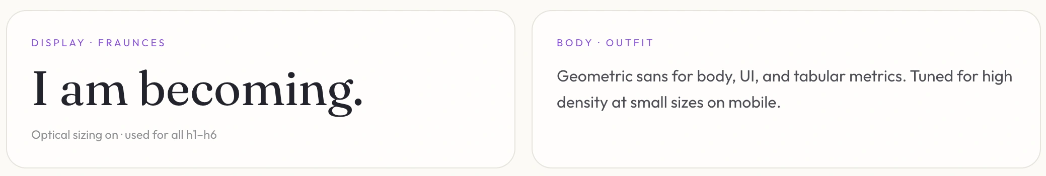
Typography
Illustrations: All the characters, icons, and SVGs were inspired by Headspace's illustration style: soft, rounded, a little emotionally expressive, adapted into Manifest's own mascot and iconography.
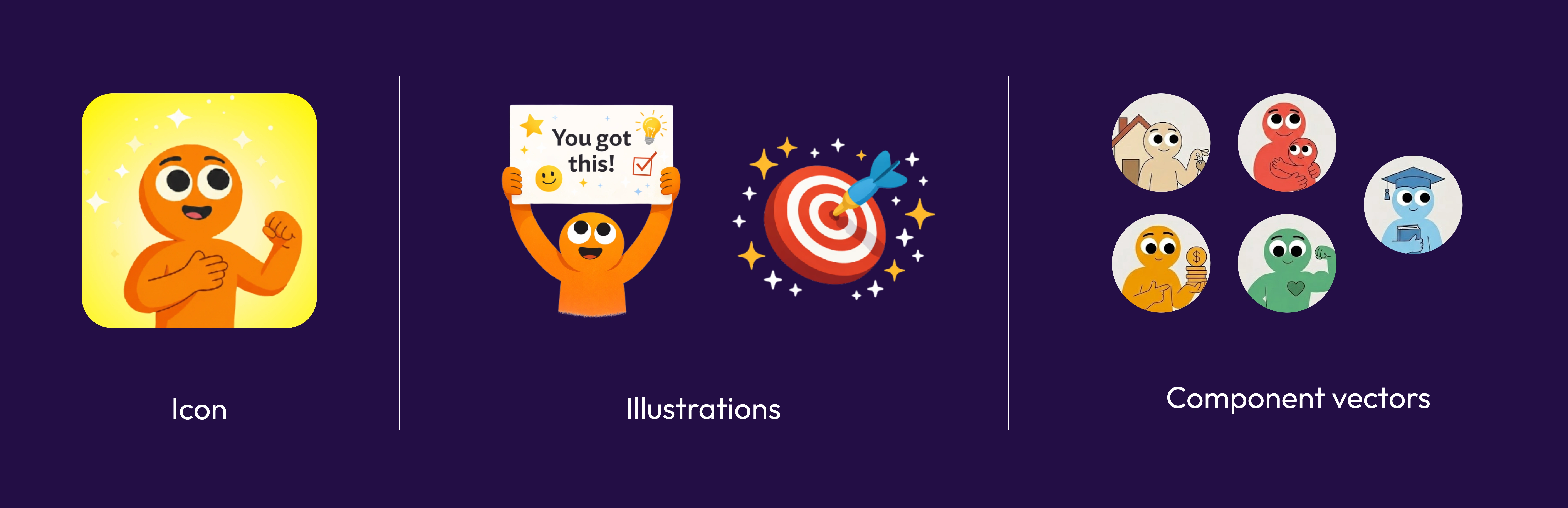
Illustrations
Motion & interactions: Animations were generated using Veo3 and other AI tools, then adapted into the product. Haptic feedback on every progress log, glassmorphism sheets for depth, sub-50ms optimistic UI on primary actions, and confetti micro-rewards on step completion, building up to a full-screen "Supercharged" celebration on goal completion to keep the experience gamified end to end.
Motion
Picking Up Marketing Along the Way
Shipping solo meant the job didn't stop at design and code. I taught myself AI image and video generation, Weavy, Veo3, Higgsfield, and others, to create hyper-realistic AI actors for UGC-style ads, and picked up the marketing fundamentals that go with it: what actually grabs attention in the first second, keyword research, hook-writing, and retention mechanics for video content.
None of that replaces design instinct, but it sharpened it. Thinking about what makes someone stop scrolling is the same muscle as thinking about what makes someone tap a button, both are about earning attention honestly, then following through.
AI UGC for marketing
Key Takeaways
Friction has compounding cost. A small auth tweak, swapping email signup for native Apple Sign-In, changed how many people ever reached the core habit loop.
Reward loops are engineering, not animation. Confetti and haptics only work if they fire in milliseconds. Delight is downstream of fixing latency first.
Onboarding can be a quality filter. A small, engaged onboarded cohort outbeat a much larger non-onboarded one on every metric, changing how I think about "completion rate" as a success metric.
Trust is a UX feature. People won't log honest input into a product they don't trust. Closing security gaps changed what people were willing to put in.
Gamification only works if it's earned. Streaks and celebrations landed because they were tied to real progress, not handed out for free.
The storefront is part of the product. Testing App Store screenshots mattered as much as testing in-app flows, getting the tap is its own design problem.
Like this project
Posted Jun 26, 2026
Developed a gamified goal tracking app grounded in behavior-change science, enhancing user engagement and retention.
Likes
0
Views
10
Timeline
Dec 1, 2025 - Apr 30, 2026