Redesign of Damiano David's Landing Page
Andrew J
Recreating Damiano David's website - landing page
Background
I fell in love with Damiano's music after listening to his previous band, Måneskin. This August, I was lucky enough to go to one of his shows in the UK, which was one of the best experiences in my life. The energy was crazy!
While I had some free time on my hands, I decided to give Damiano's website -Landing page a new look, which was also to brush up and improve my own UX skills.

Damiano live concert - Roundhouse, UK
Key Goals for the site
Make the experience more fun and engaging.
Improve the UX content
More clarity to the main CTA's of the page
Components and UI Elements
The Vinyl, Colour palette, and doodles were inspired by the album art for Damiano's album - Funny Little Fears.
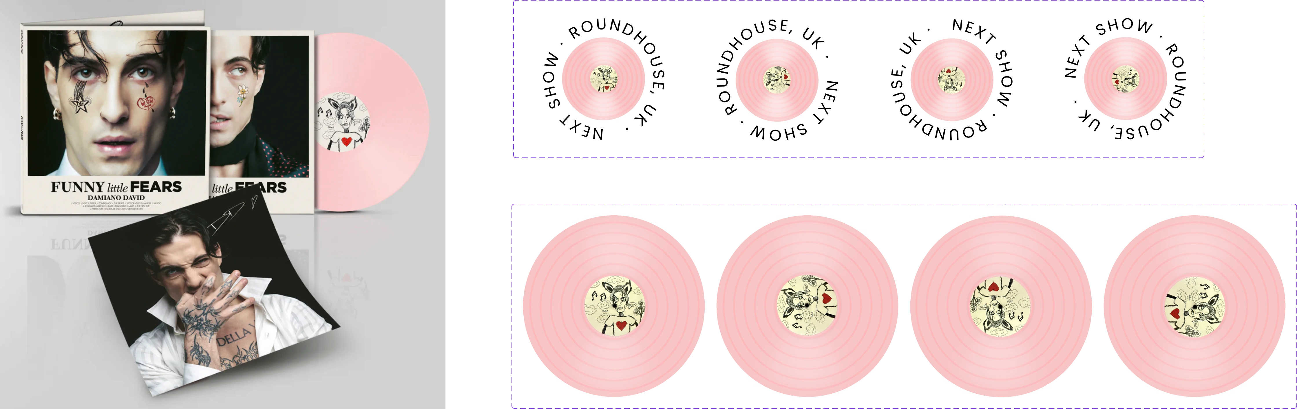
Funny Little Fears album art (Right) and Designed Vinyl Component (Left)
Doodles
The UI doodles were generated by ChatGPT when prompted to extract the doodles from Damiano's album art, though GPT didn't give me the exact hand-drawn doodles. I was happy to move on with these, as they added a unique touch.
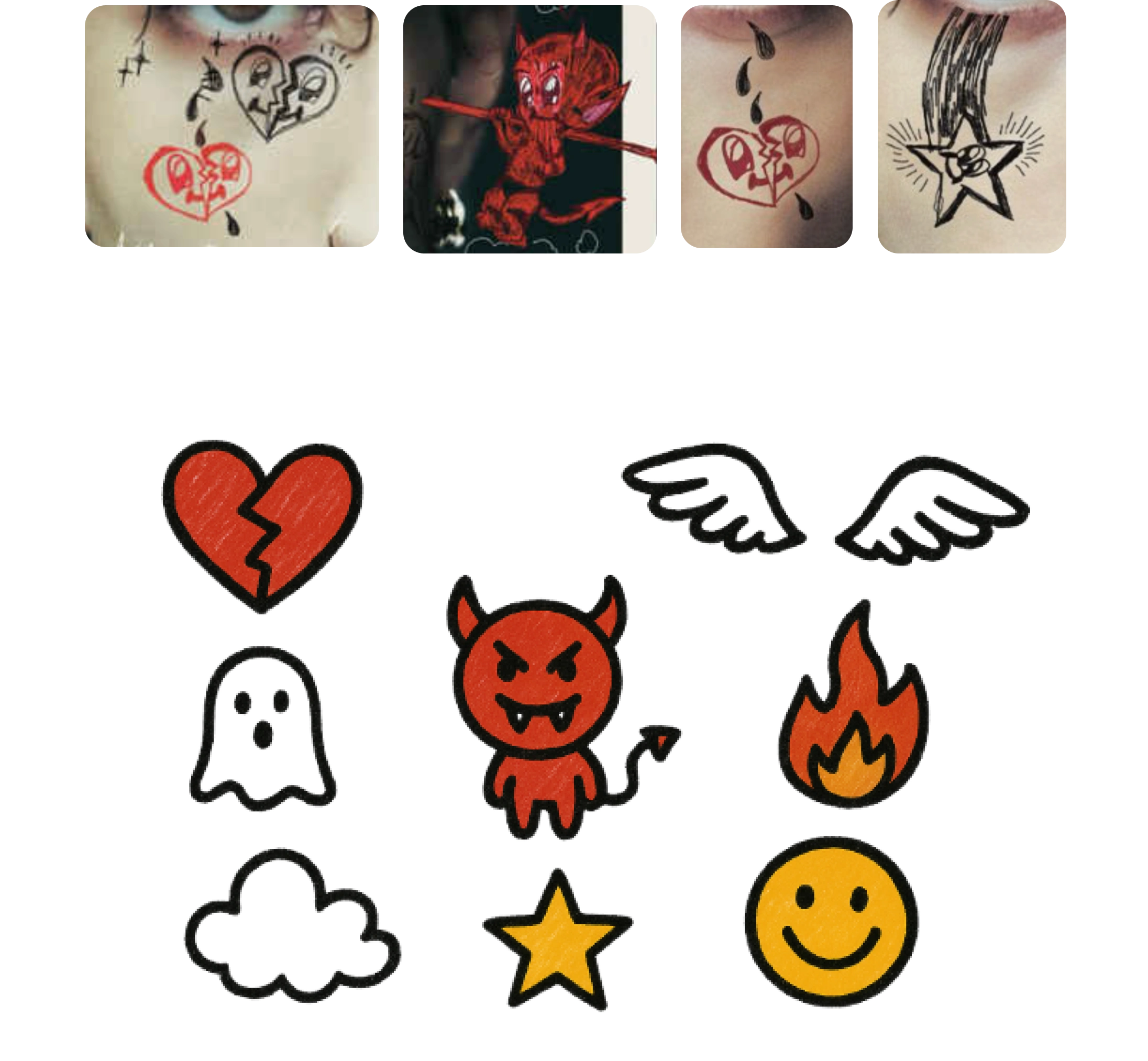
Funny Little Fears Album artist doodles(Top) and GPT generated doodles(Bottom)
Animations
One of the key animation inspirations was from Lando Norris' site. "Steal like an artist," that's exactly what I did!
Lando Norris Website Animation(Top), Mine (Bottom)
Testing my design with the current landing page using attention insight
Both landing pages were tested on attention insight, based on a user's Attention, Focus, Originality, and Contrast checks.
Attention
The new design got 21.6% as a score for attention to the landing pages CTA( 4% is the benchmark), which shows a user's attention is well aimed at the primary action, i.e, to book a show. The current page does not include a CTA!
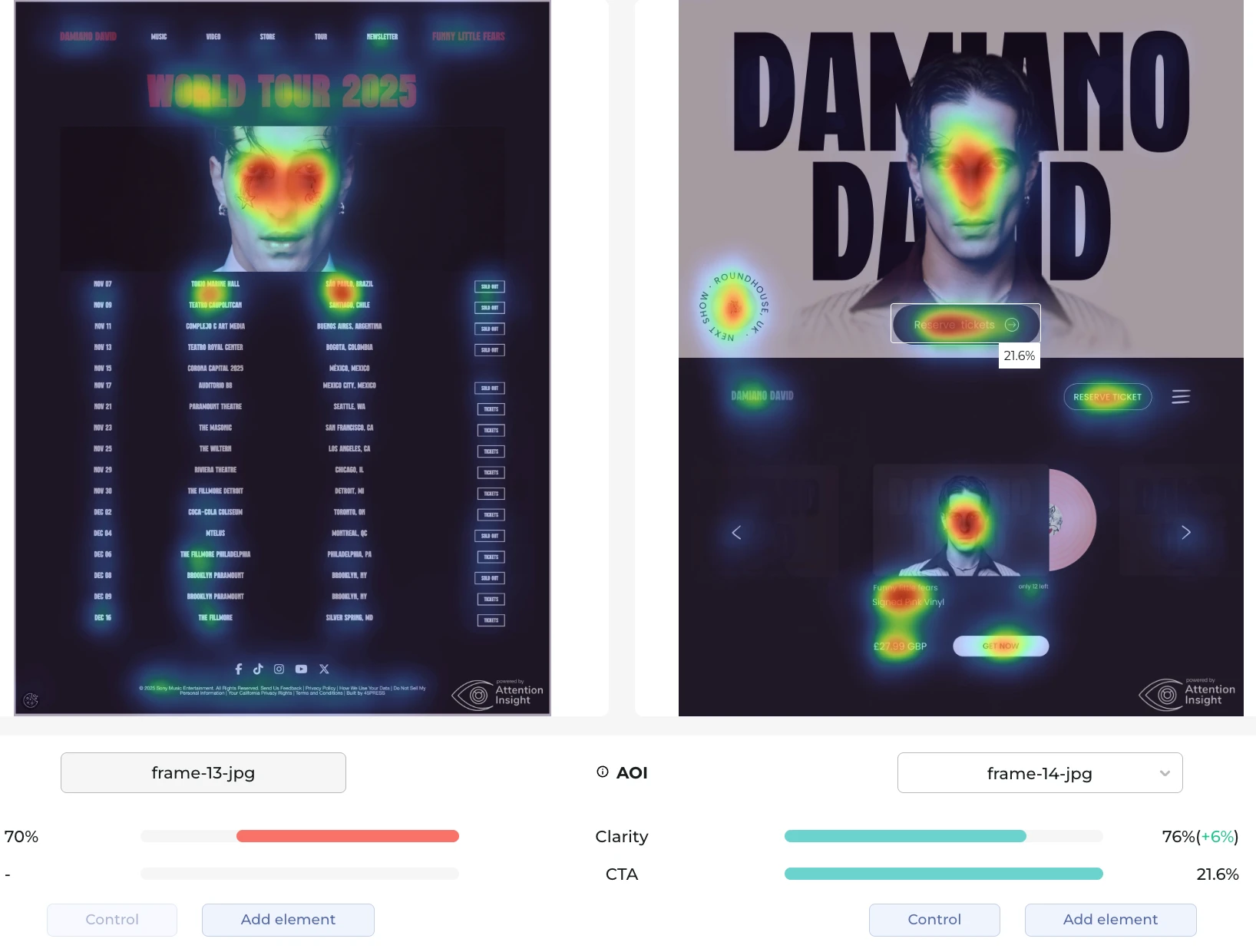
Attention insight results for Attention. Current page (left), updated design (Right)
Focus and Originality
Again, the new design scored better than the current site in both Focus and Originality aspects. The right amount of the user's focus goes to the right elements. And the approach was novel in the Second.
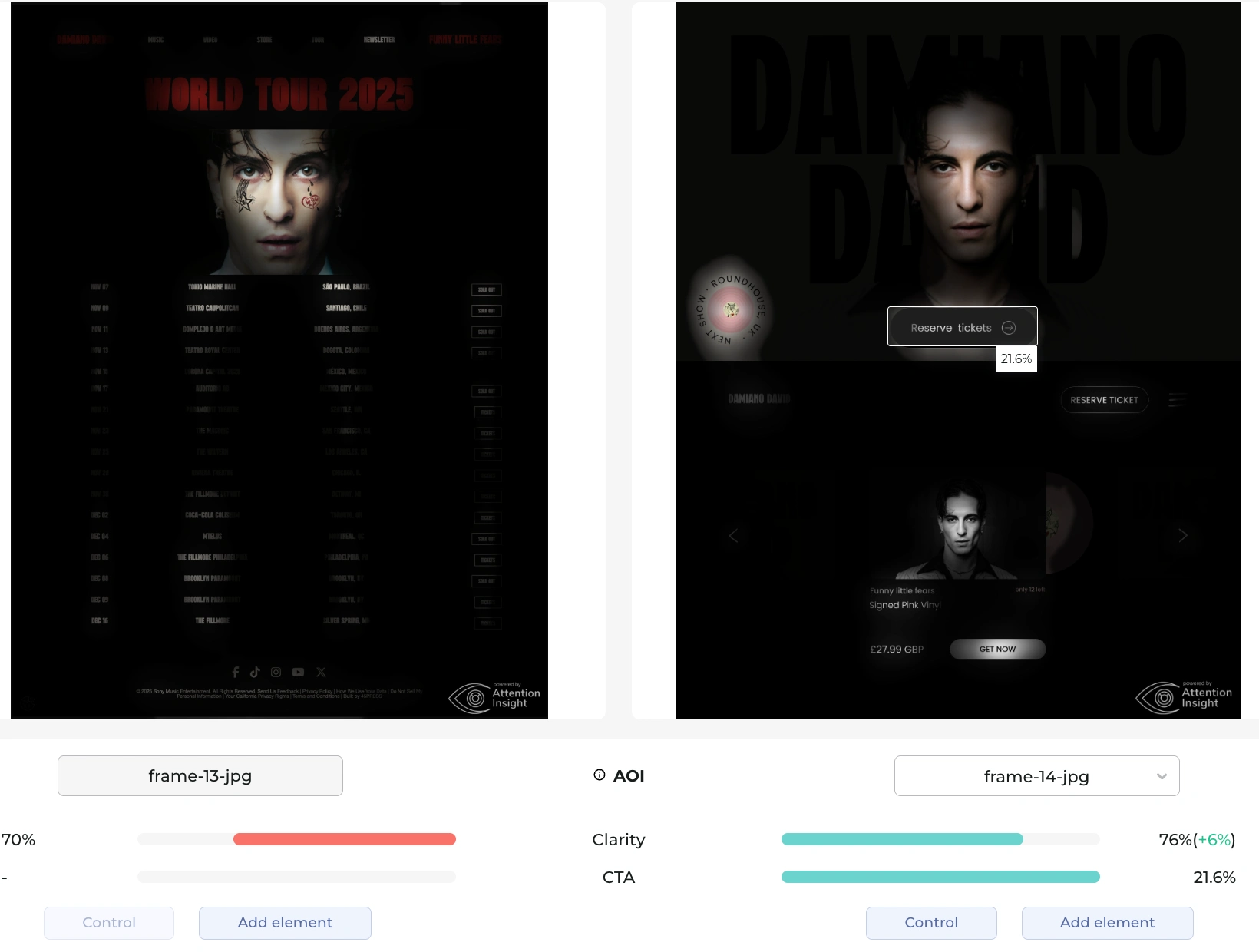
Attention insight results for Focus. Current page (left), updated design (Right)
Contrast checks
While I focused heavily on the interactivity and visual aesthetics of the design, the contrast between elements was also carefully considered when designing each element on the page. This is very important as accessibility is an important factor in good UX. The current design had some sections with a poor contrast score, while mine maintained a consistently good score.
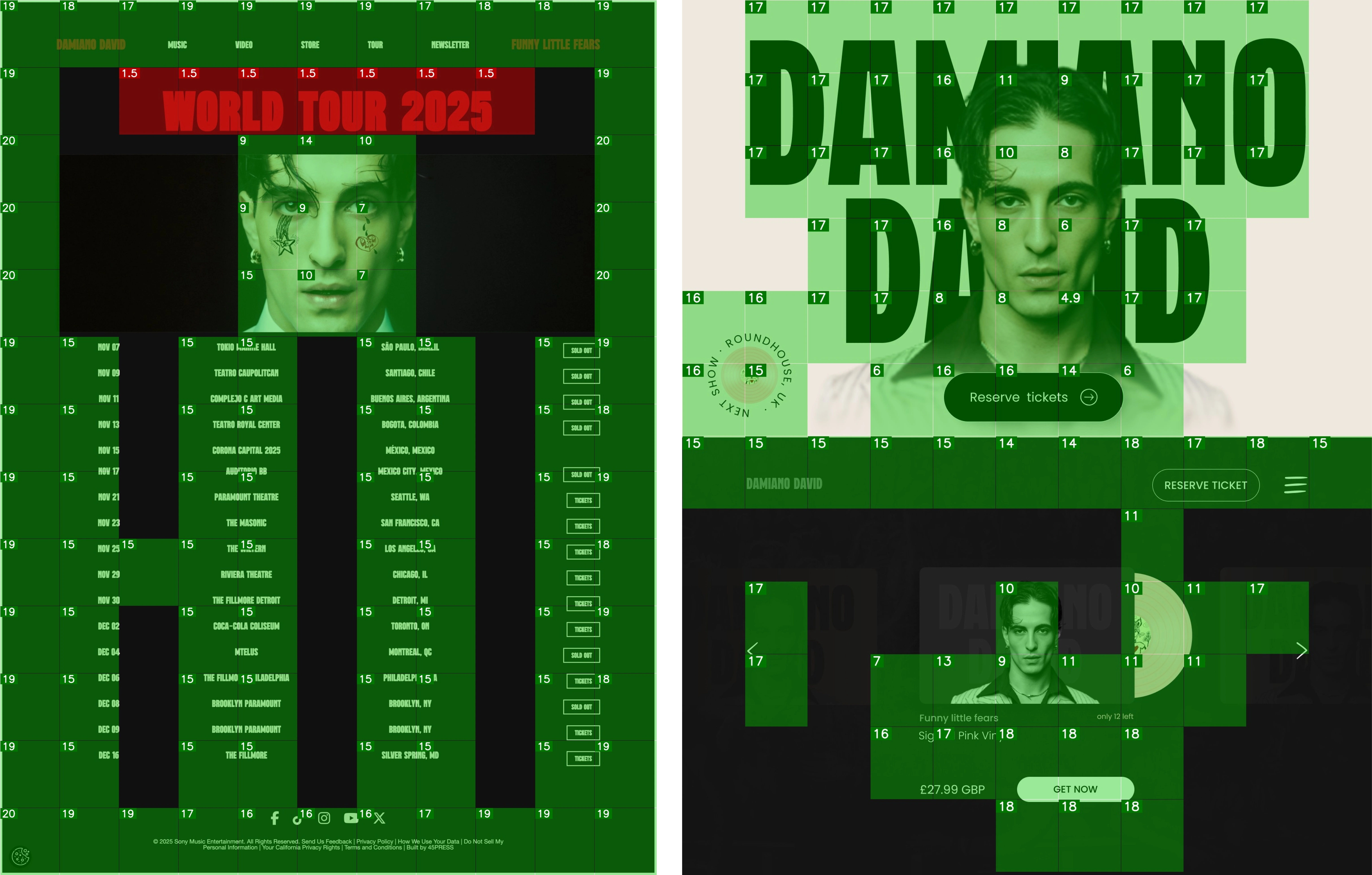
Attention insight results for Contrast. Current page (left), updated design (Right)
Results
Try the interactive prototype below!🎉
Like this project
Posted Nov 2, 2025
Just gave Damiano David’s landing page a complete UX glow-up! ✨ Sleeker design, smoother flow, and built to keep fans engaged 🔥