HomeSync | Smart Home App Interface Design
Srikar Suresh

Introduction
This project focuses on designing a smart home application that gives users complete control over their household devices through a clean and intuitive interface. The goal was to create a unified system where users can monitor who is home, manage lighting, climate, entertainment, and security devices, and stay aware of activity around their property. The app brings these functions together in a way that feels simple, accessible, and dependable for everyday use. From quick room-level actions to detailed device settings and security oversight, the experience is built to make home automation more seamless and efficient for users.
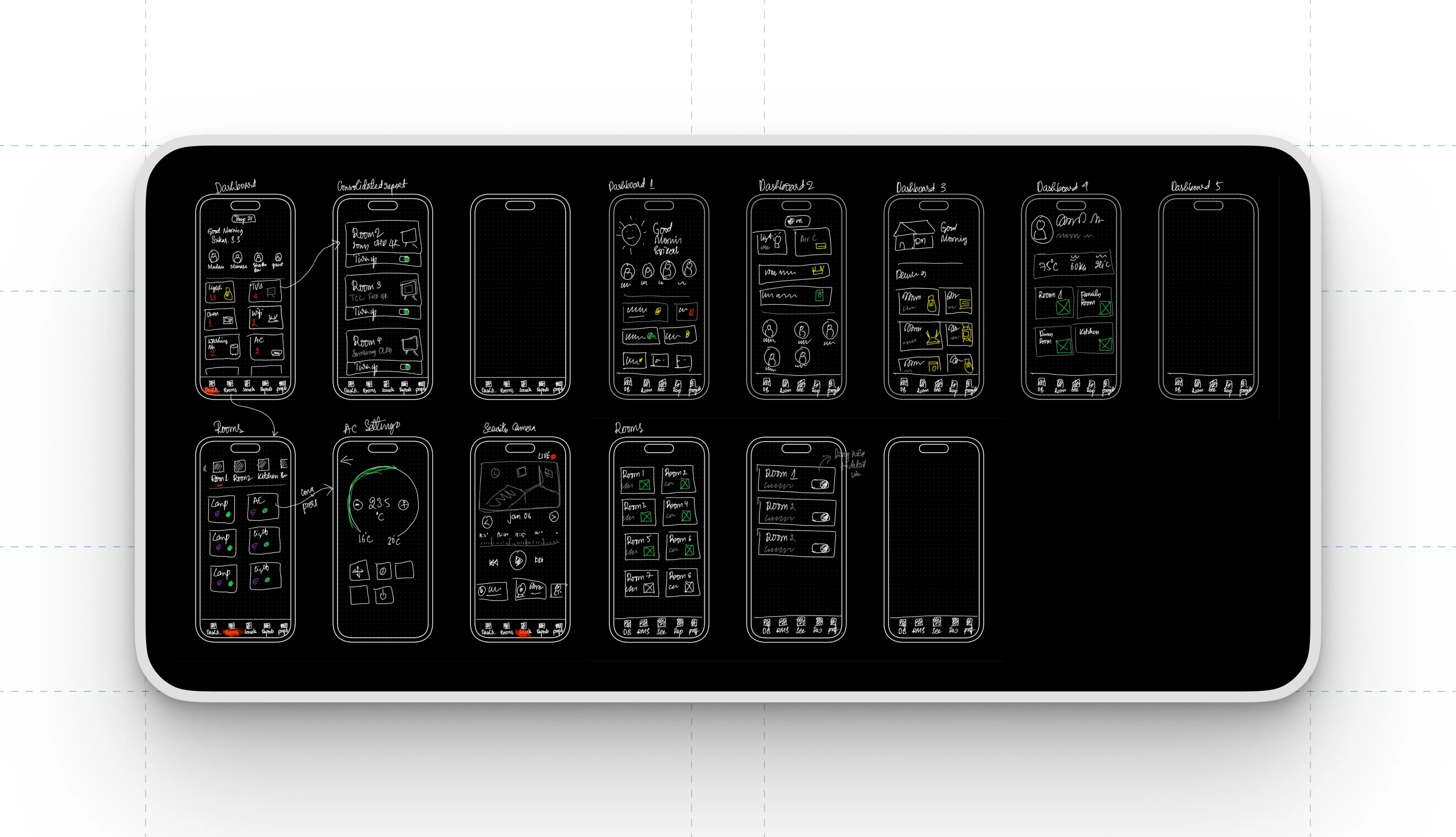
Fast Wireframing for Early Validation
I begin most projects by sketching quick wireframes, and this smart home app was no different. Rapid wireframing helped me explore multiple layout options, refine user flows, and experiment with different dashboard structures without getting slowed down by visual details. These low-fidelity sketches made it easy to communicate ideas clearly and iterate quickly based on feedback. Presenting wireframes early also helped the client understand the direction of the product, align on key interactions, and approve the overall structure before moving into polished design work.
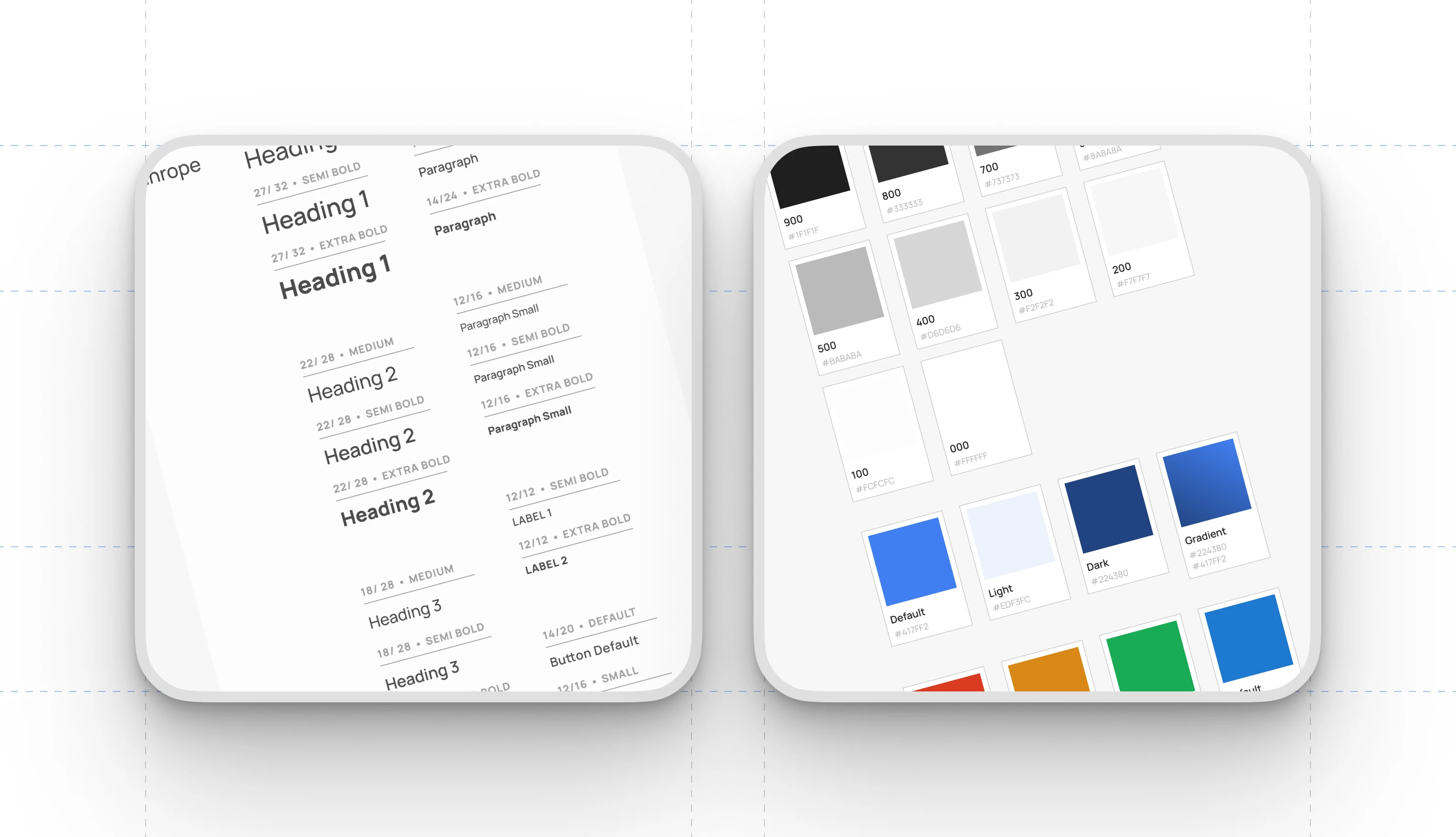
Typography and Color System
Before moving into interface design, I establish a structured typography and color system for every project, and this one followed the same approach. Defining consistent heading levels, paragraph styles, and label treatments ensures clarity and hierarchy across all screens. Alongside this, a refined color palette was created, covering neutrals, functional tones, and primary accents used throughout the app. This foundation keeps the visual language cohesive, improves readability, and speeds up design iteration by providing a dependable framework for all components and layouts.
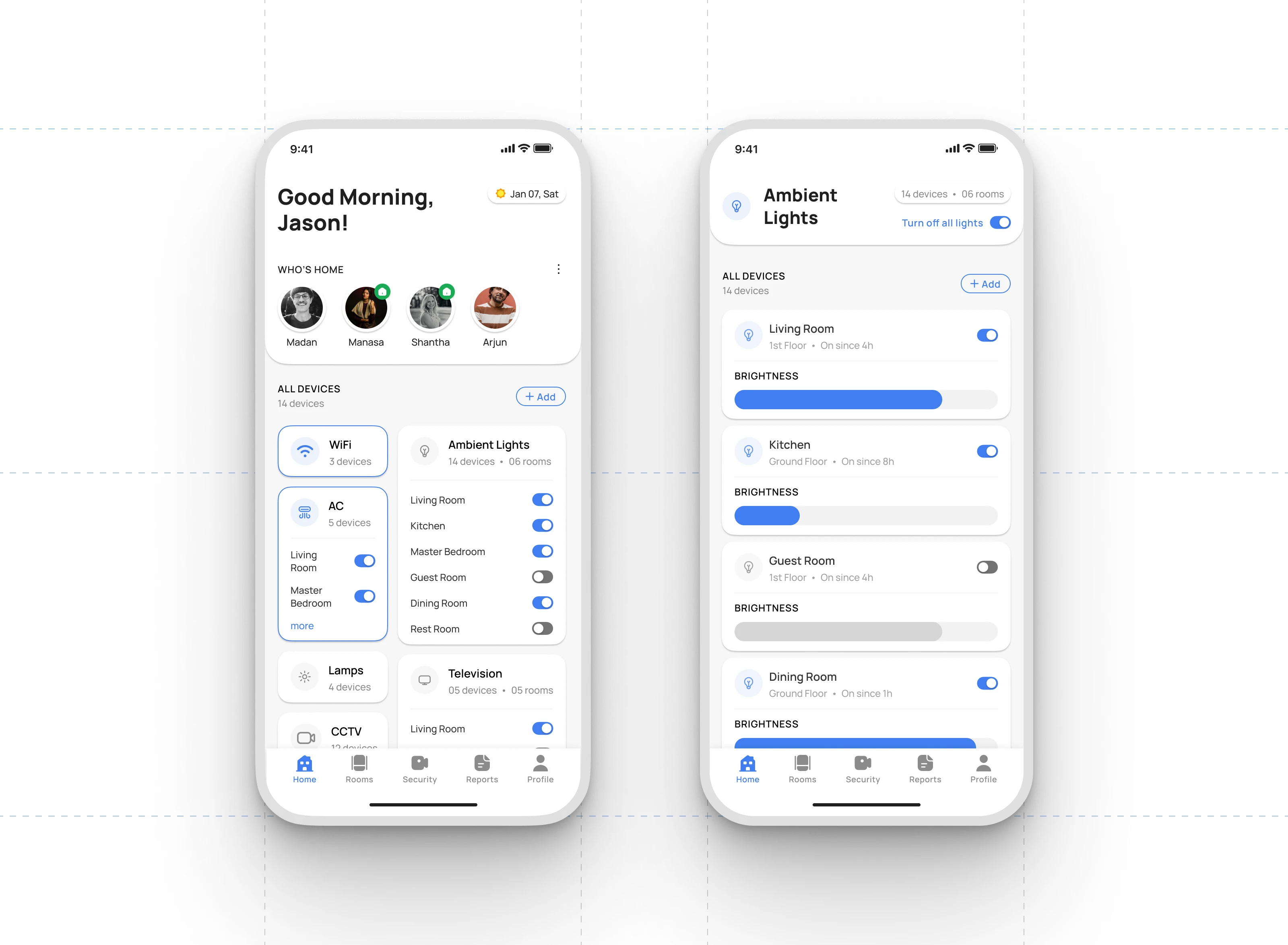
Home Dashboard Overview
The home dashboard gives users a clear snapshot of their household status and connected devices. The “Who’s Home” section highlights real-time presence for each family member, making it easy to see who is currently at home. Below that, major device categories such as WiFi, AC units, ambient lighting, TVs, lamps, and CCTV are organized into clean, tappable cards. Each card shows the number of devices and offers quick room-level controls so users can toggle appliances without navigating into additional menus.
Device Category Interactions
Each device group provides immediate access to essential functions. Users can turn devices on or off at the category level, view how many devices are active in each room, and expand any category for deeper control. This structure keeps daily actions efficient while maintaining a sense of overall system status.
Ambient Lighting Controls
The Ambient Lights detail screen adds more precise interactions. Users can turn individual room lights on or off, see how long each light has been active, and fine-tune brightness levels through intuitive sliders. This balance of quick global actions and granular room-based control helps users manage their home environment with both speed and accuracy.
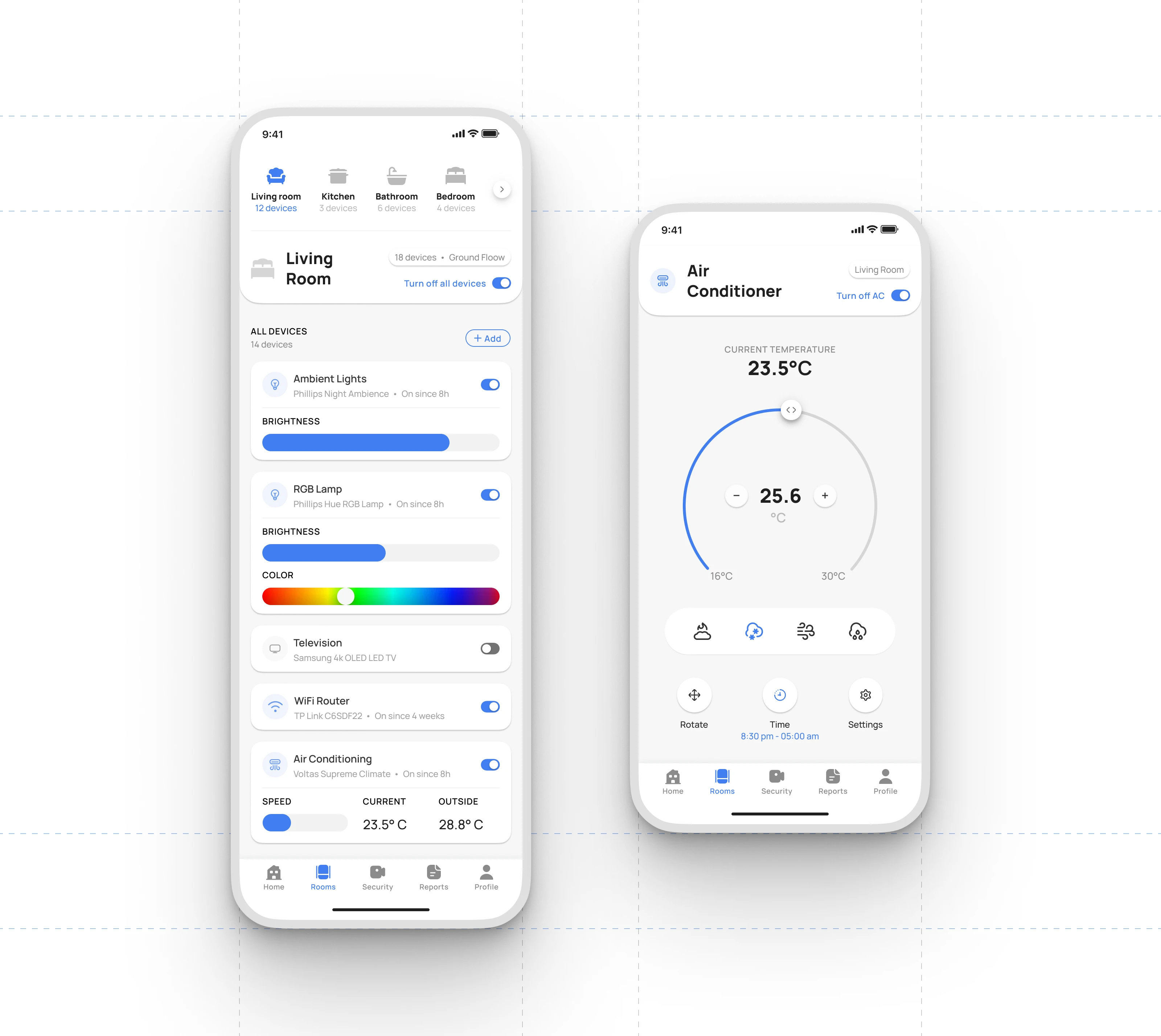
Room Level Device Management
The room screen centralizes all smart devices within a selected space, giving users a unified control hub. Each device card presents the device type, model, and active duration, along with essential controls such as power toggles, brightness sliders, color selection for RGB lighting, network status for routers, and speed and temperature indicators for AC units. This layout allows users to manage an entire room at a glance without navigating through multiple layers of the interface. Global actions, such as turning off all devices in the room, help streamline routine tasks.
Air Conditioner Controls
The dedicated air conditioner screen provides a focused environment for precise climate management. Users can view the current room temperature and adjust the target temperature through a circular slider paired with plus and minus controls for fine tuning. The interface also offers mode selection, including cooling, heating, and fan settings, alongside additional options like swing control, scheduling, and general AC settings. By separating detailed adjustments from the broader room view, the design supports both quick access and deeper control when needed.
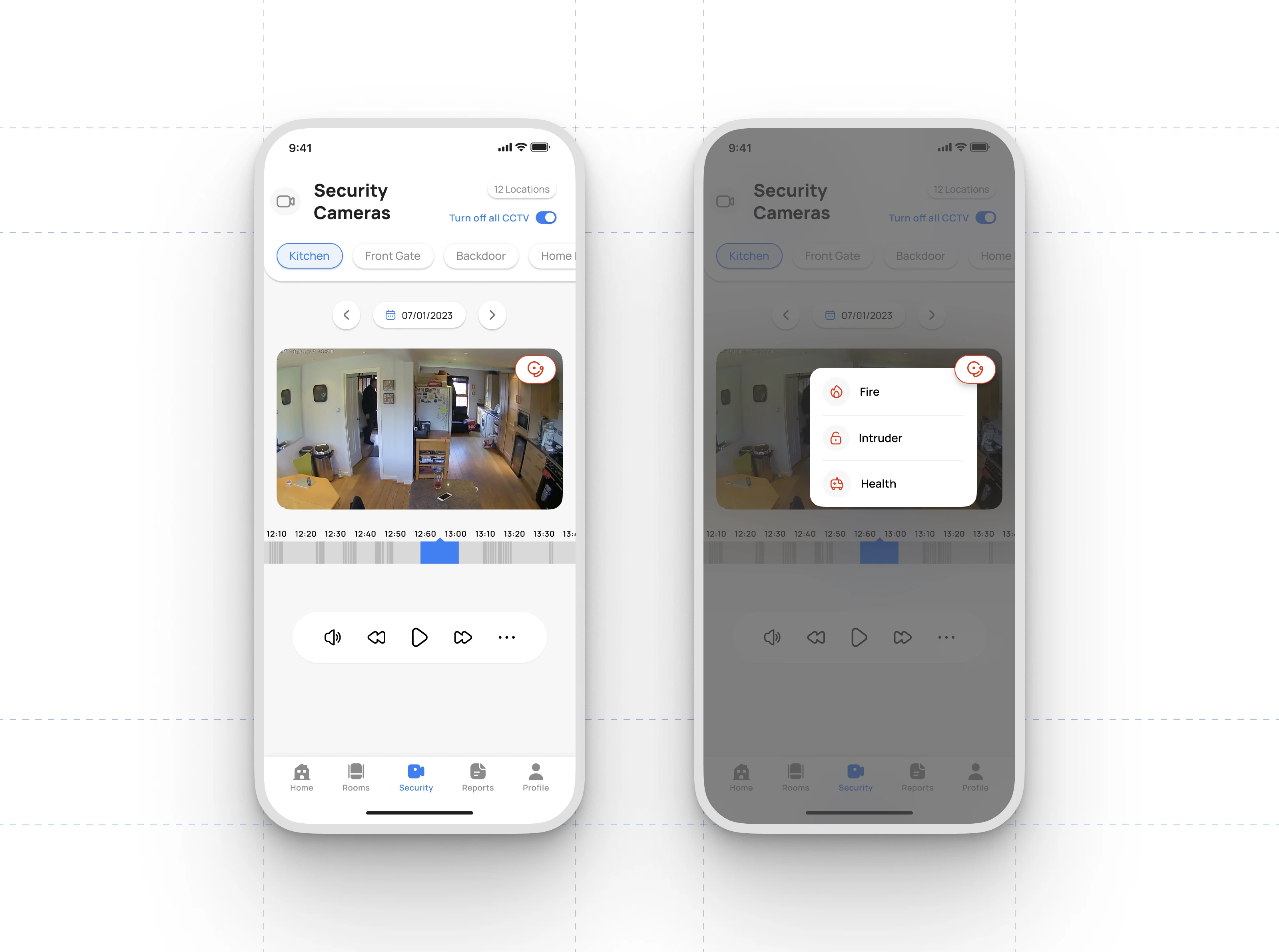
Security Camera Monitoring
The security module allows users to view live and recorded footage from multiple camera locations throughout the property. Each camera feed can be selected through simple location tabs such as Kitchen, Front Gate, or Backdoor. A built-in timeline lets users scrub through recorded events and control playback with familiar actions like rewind, play, and fast-forward. Users can also mute or enable audio directly from the viewer. This setup gives a clear overview of activity in and around the home without requiring separate hardware interfaces.
Manual and Automatic Alarm Triggers
For added protection when the user is away, the interface provides a dedicated alarm button within each camera view. Activating it opens a quick-access menu where the user can raise alerts for fire, intruders, or health emergencies. This feature supports both manual activation and automation through preset conditions, helping the system respond quickly to unusual activity and improving overall home safety.
Like this project
Posted Dec 5, 2025
Designed a smart home app with intuitive UI to effortlessly control every device, secure your home, and simplify daily living with seamless smart automation.
Likes
1
Views
3