Explore and roam
Charlie Asplund
Explore & Roam
A travel guide agency that likes to explore more than just locations. Read how Explore and Roam takes in all considerations of traveling.
Introduction
We offer a variety of authentic destinations. We can provide authentic local guides because of our easy-to-use app. Our target audience is people who live alone. We want to convey a sense of eagerness, while at the same time being approachable.
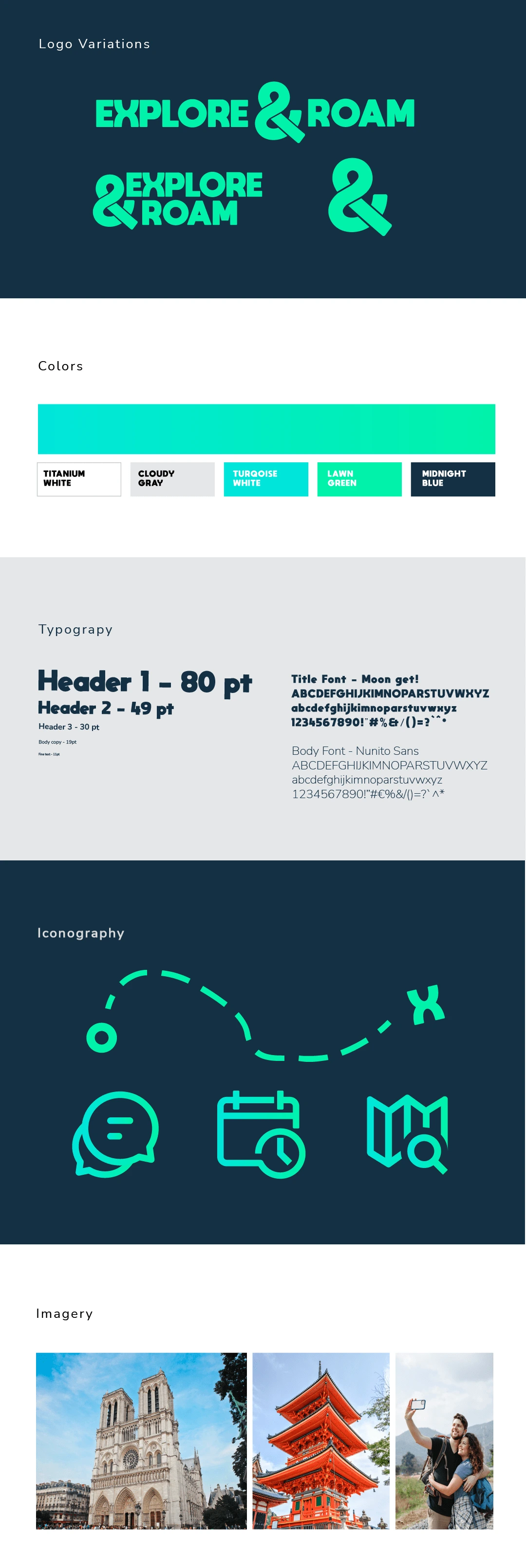
Branding elements
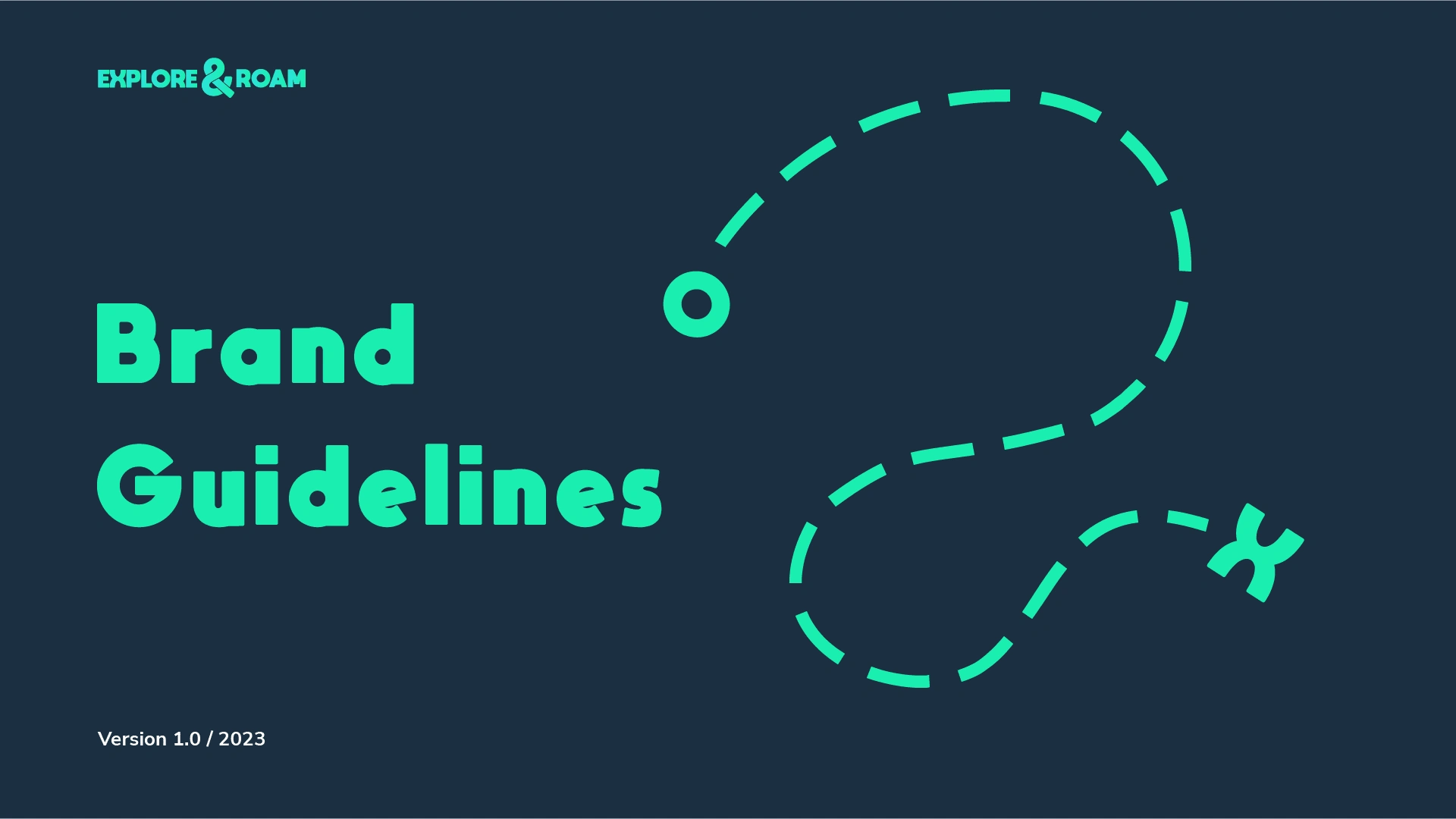
Our logo mark symbolizes the purpose of traveling with Explore and Roam. With a set destination, path, and start. With references to other visual cues for traveling, such as a set point and X for showcasing an old map. And having a resemblance to a roundabout highway
We set the & Symbol as our logo to showcase that guided tours are more than exploring. It takes in culture, appreciates architecture, and has an educating good time.
The colors are a representation of modern maps. Referring to blue seas and green lands. Our competitors use a variety of single or dual-color schemes. But we saw an opportunity to implement a 2-color gradient system.
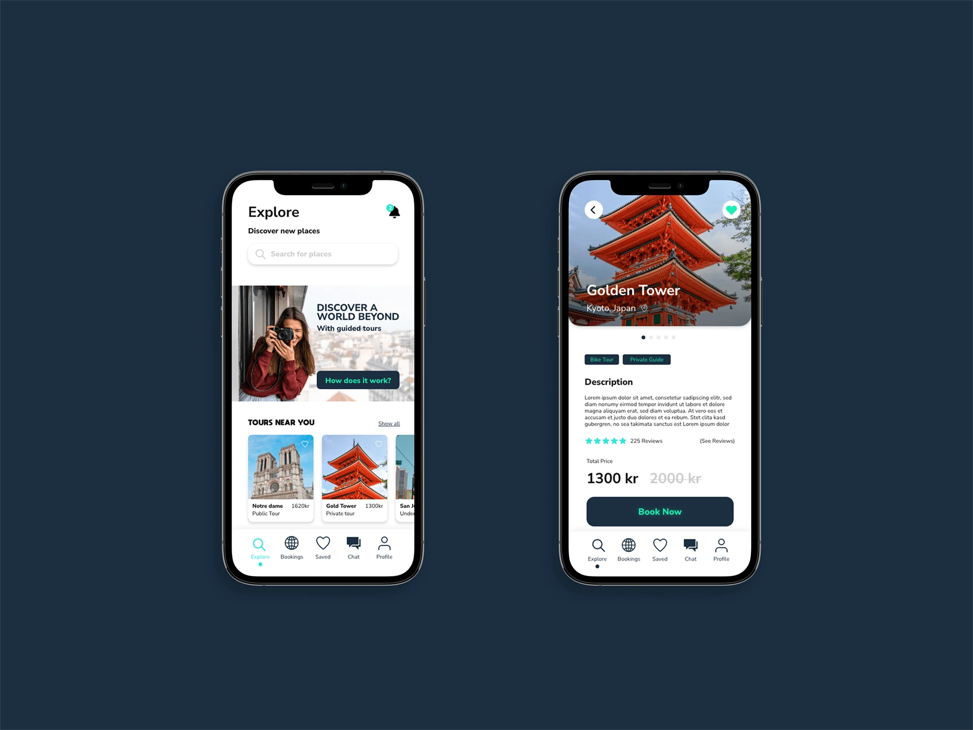
UX and app design
Common Pain points in other apps:
Not being able to book private tours or group tours
Tour guides not being professional
Cancelation time policy
Not authentic
Language Barriers
Tour guides canceling
Satisfaction Points;
Storytelling
Local treasures
App Features:
Choosing private or group guiding.
Night or day guide
Bicycle, walking, or bus tour
Like this project
Posted Feb 27, 2025
A travel guide agency that likes to explore more than just locations. Read how Explore and Roam takes in all considerations of traveling.