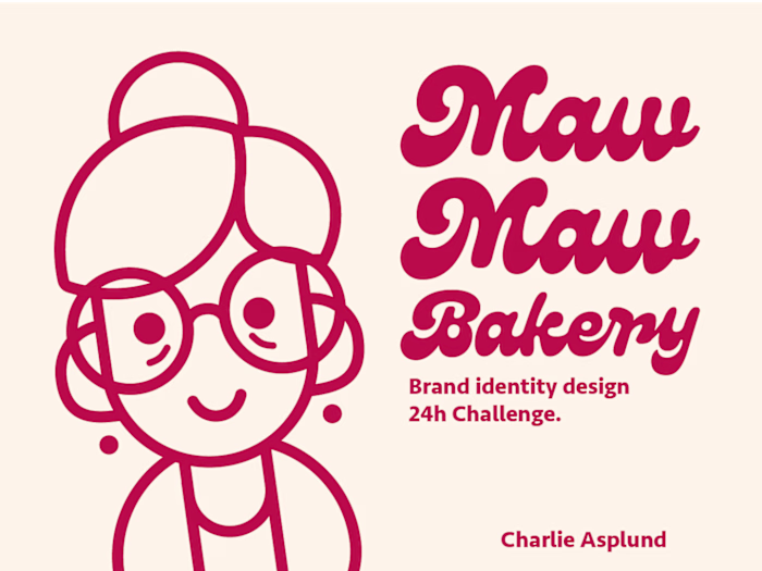
Nattassja - Freelancer branding identity
Charlie Asplund
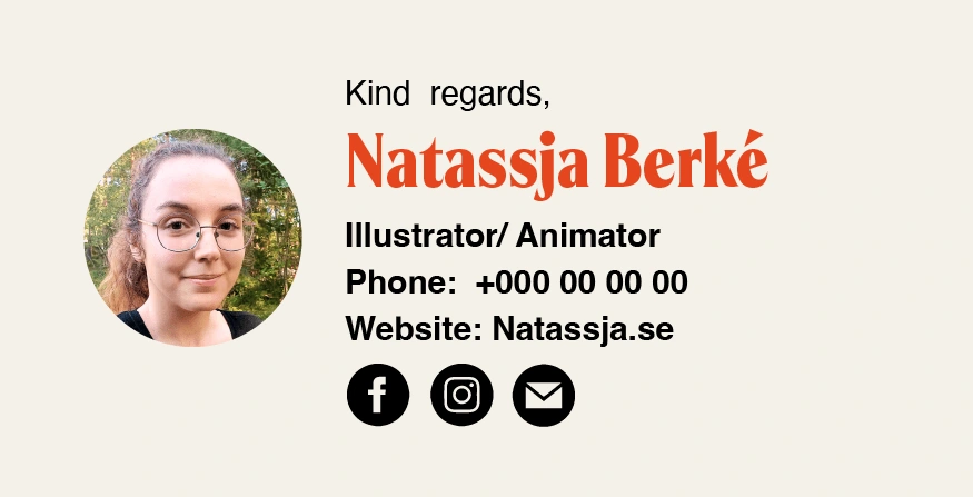
Nattassja
A kids book artist who is trying to make her break into the world of freelancing.
Introduction
Nattassja is a Swedish children’s book Illustrator and animator. She wants to break into the world of freelancing. She offers personalized illustrations and animations to private people and companies.
Problems and solutions
In a field where 90% of getting brand recognition is the uniqueness of your style, standing out is a hard task when there is no clear blueprint as there is in regular branding
Concept development
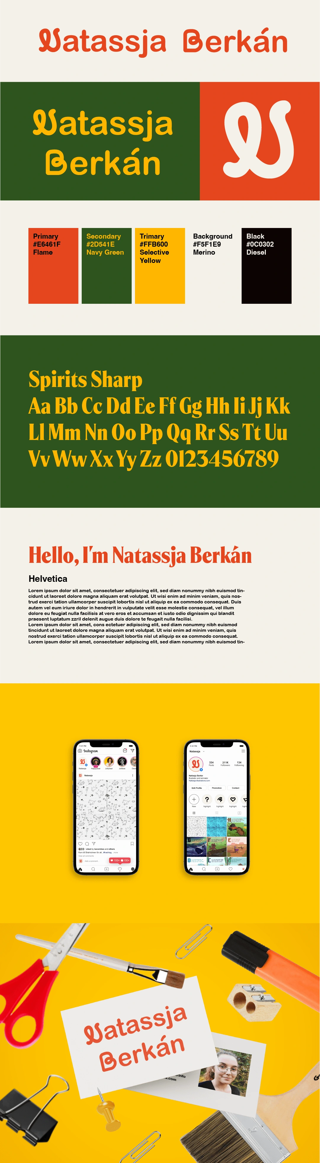
After interviews and some soul-searching, we found a way to incorporate different aspects of her identity into all corners of the design.
Keywords: Fun, Inviting, and Whimsical but not obnoxious.
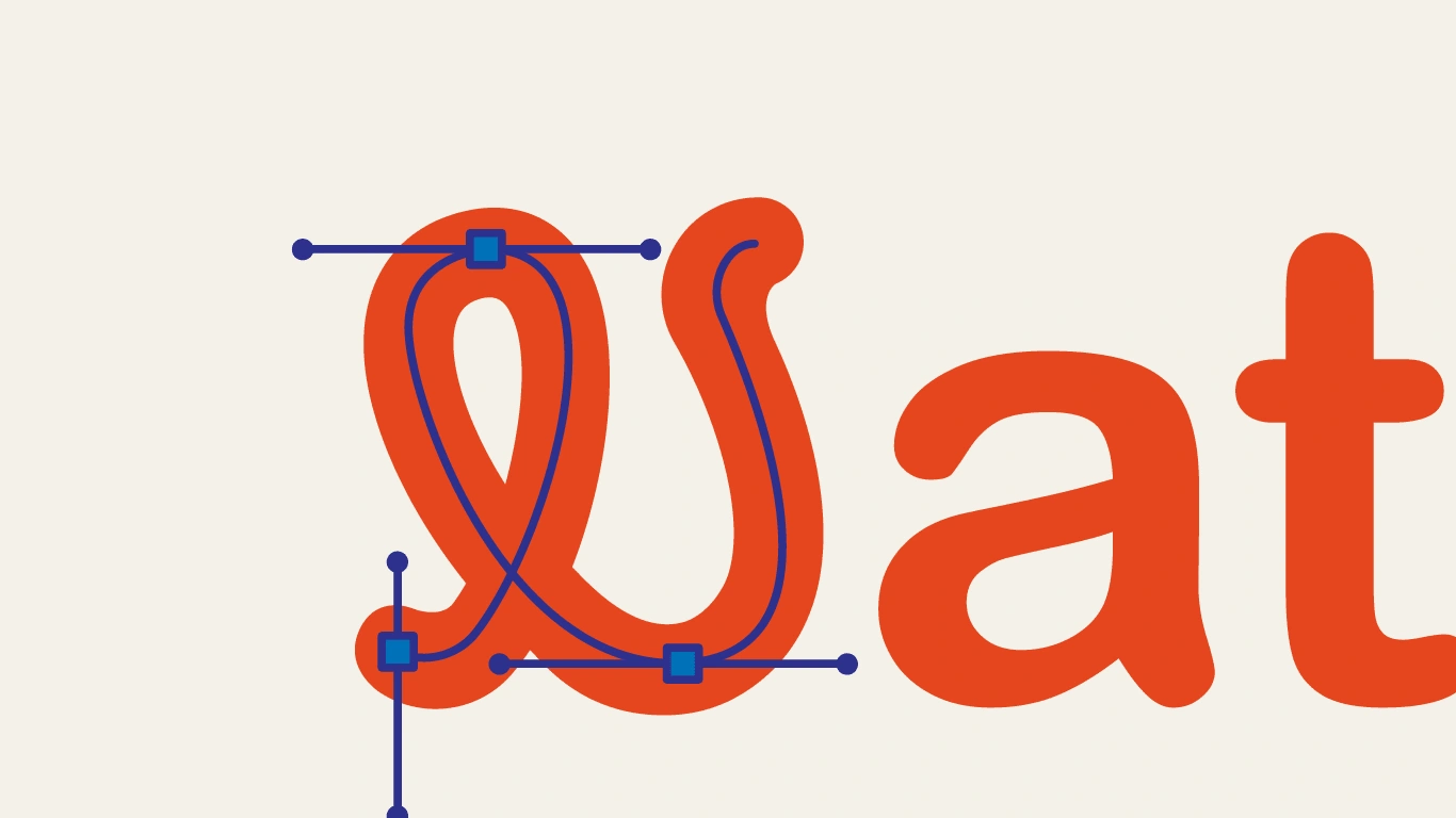
Branding elements
We decided to go for a letter mark logo, that can be scaled to different appropriations. A cursive bold N gives a feeling of silliness and cunning. Primary colors inspire the color palette. Something artists always have access to. This also gives a childish and friendly approach to the brand.
Like this project
Posted Feb 27, 2025
Creating a personal brand for a new freelancer. Client was very happy with the design
Likes
0
Views
5