Maw Maw Bakery
Charlie Asplund
Maw Maw Bakery
A bakery run by elderly women
Introduction
This is a 24-hour challenge to create a brand from scratch. It had to include all the brand elements and some mock ups. The idea of the project came from eating your granny’s cookies as a child.
Problems and goals
With limited time I wanted an element that could be reused in different contexts.
Concept development
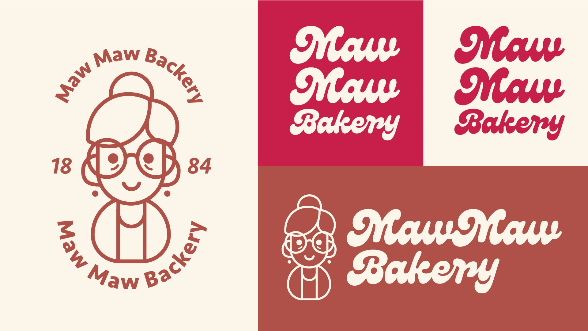
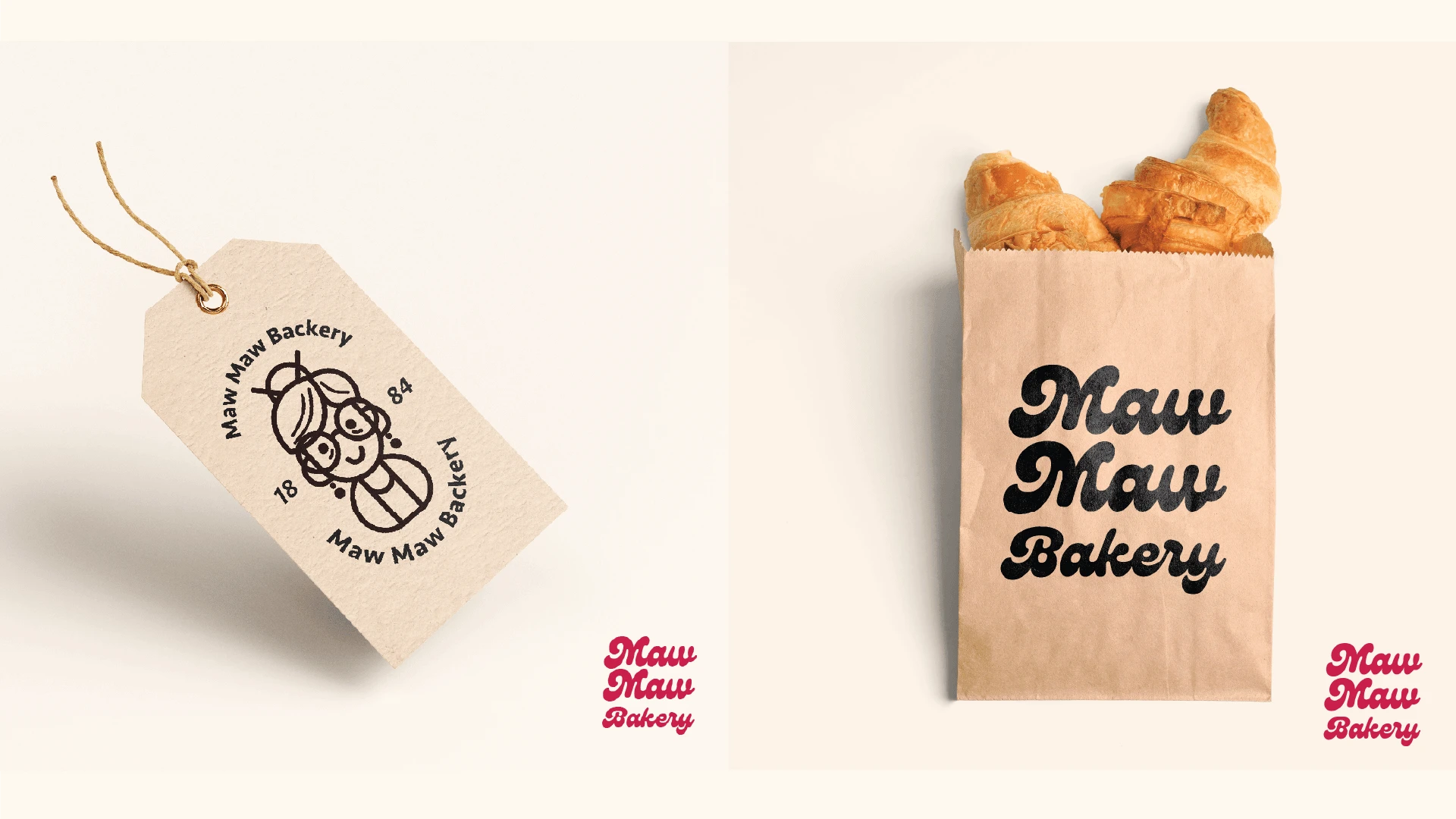
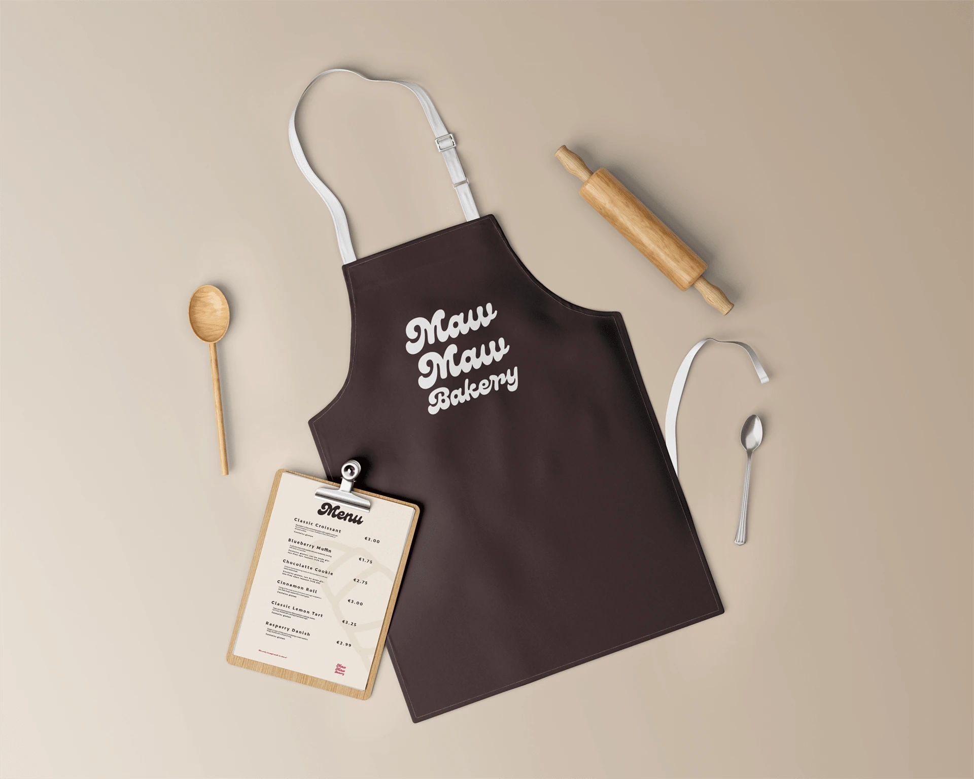
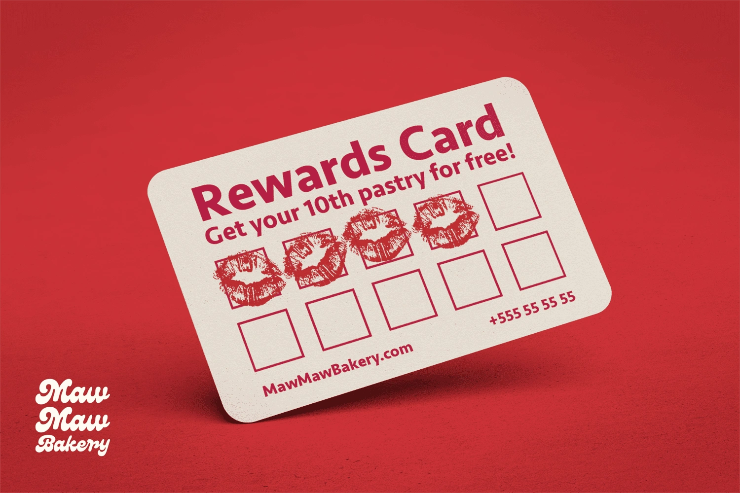
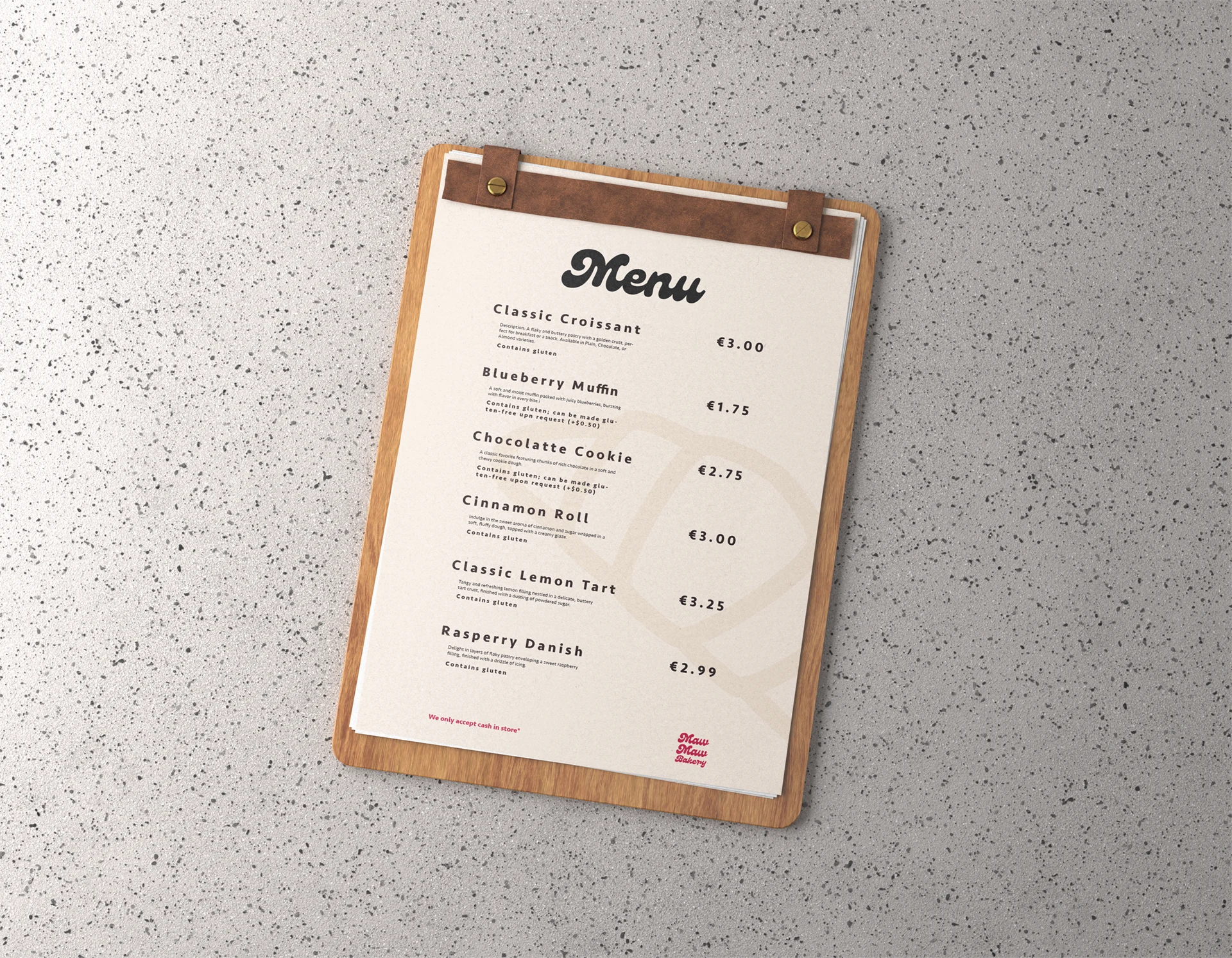
The first design aspect to come out of this project is the color scheme. Beige and brown are similar to baked bread, with red being a complementary color because it invokes a feeling of hunger. I took the colors from an image of a cherry pie!
Branding elements
The illustrated logo depicts a small old lady. Something that you can feel familiar and comfortable with. A face that you can trust.
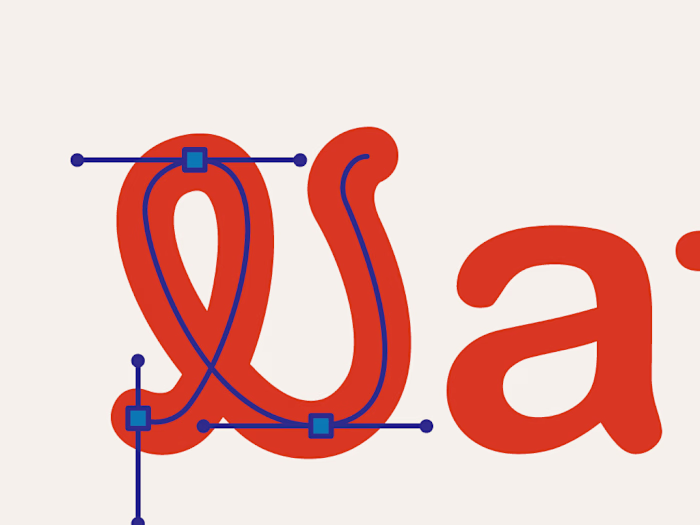
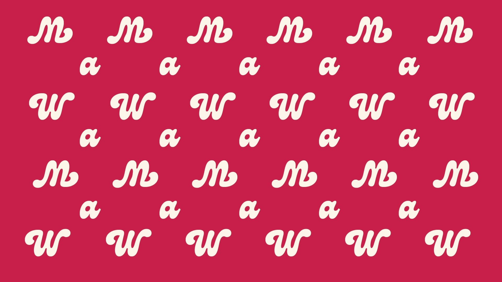
The wild and new typography shows that we can have fun. With M and W being so similar I wanted it to look good being turned upside down. This is great when making pattern designs for wrapping paper.
Thank your for reading!
Like this project
Posted Feb 27, 2025
24 hour brand identity design challenge
Likes
0
Views
4