"The Range Presents" Series | Poster Design
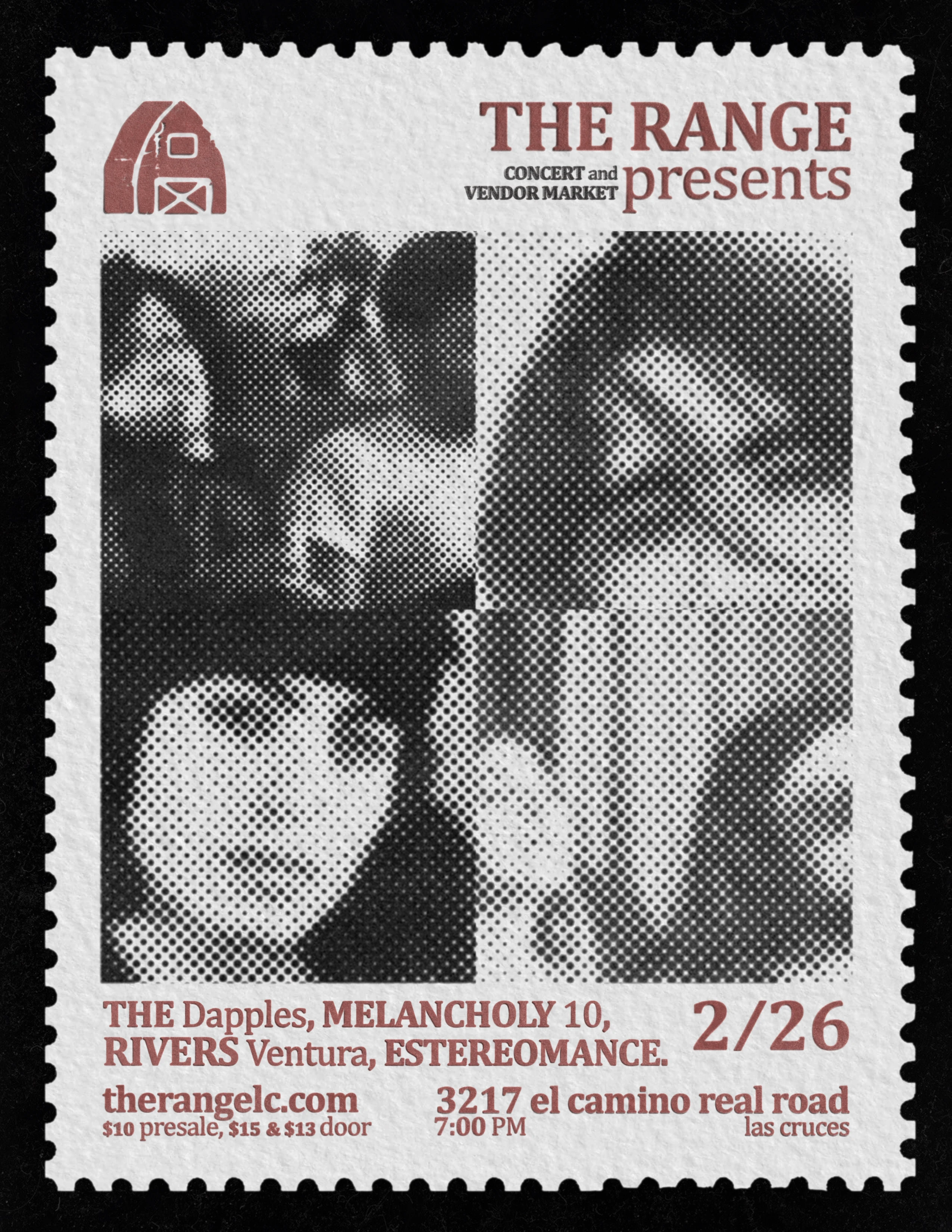
Final Poster
Process
Working for The Range on a poster to announce our Concert and Vendor Market on February 26th, I already had an idea in my head of what I wanted the poster to look like. Over the years working on these concert posters, I've come to enjoy treating it as any other kind of art I make. I like art that makes you go "I want that poster hanging in my room."
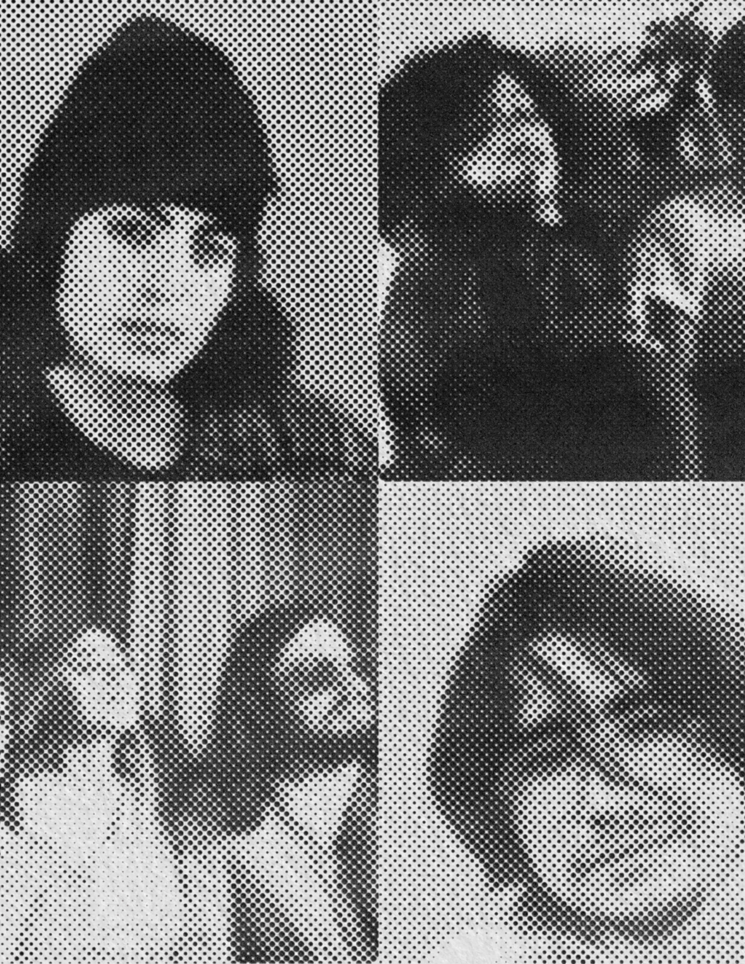
Halftones of the Show Lineup
I love designing something that feels tangible, like you could feel the texture of the paper, of the imprints from the text pressed on to the paper, etc. When I decided I wanted to do halftones for the band lineup, I wanted to make them look like they were physically "stamped in" on the paper, with the shadows from the indentations still being visible. I mirrored the images of each band to give the piece as a whole more structure.
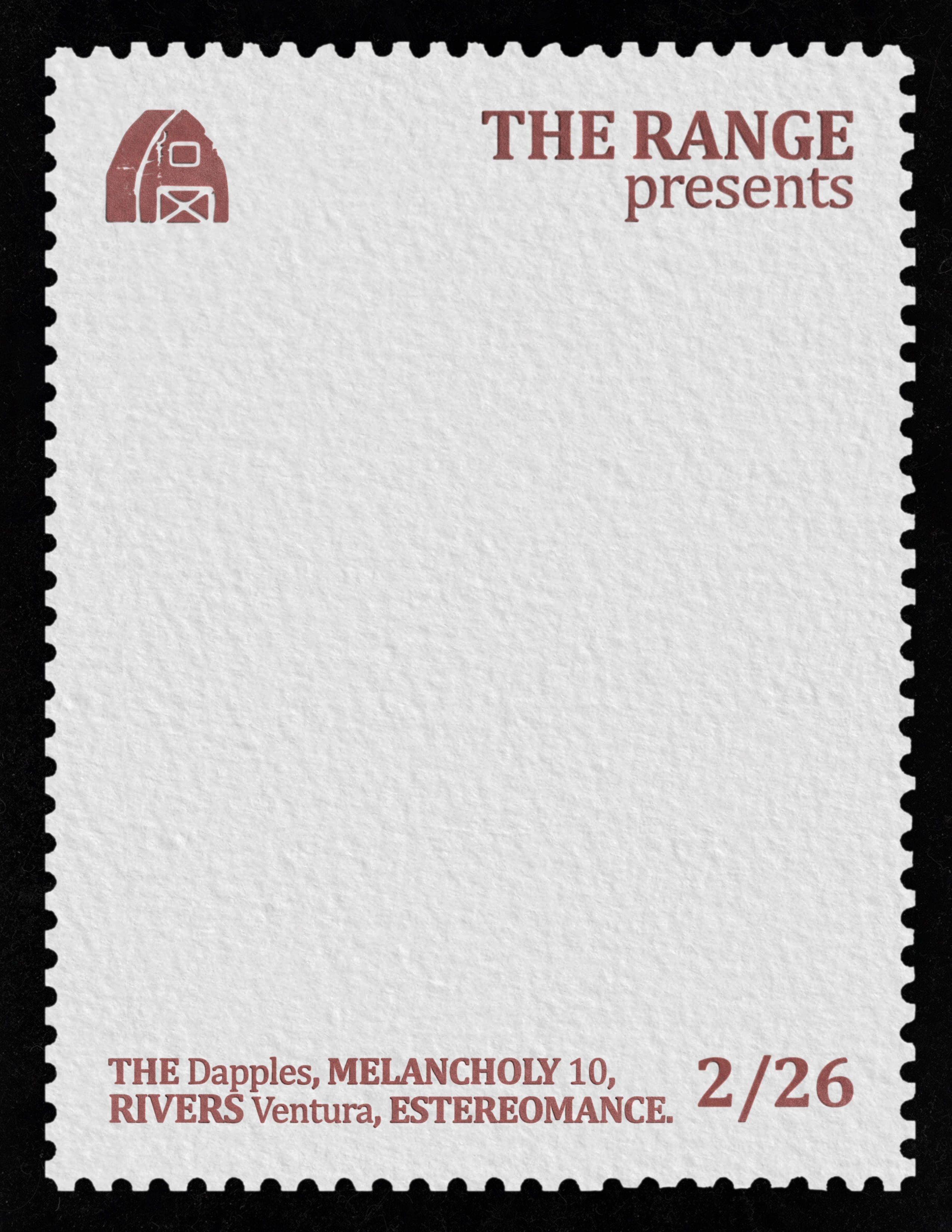
Personally, I love the simplicity of this alternate poster.
I'm always in awe of things with texture. Up until recently, I didn't know that could include things like stamps. Going in, I knew I wanted to try and recreate a "retro stamp" for the poster.
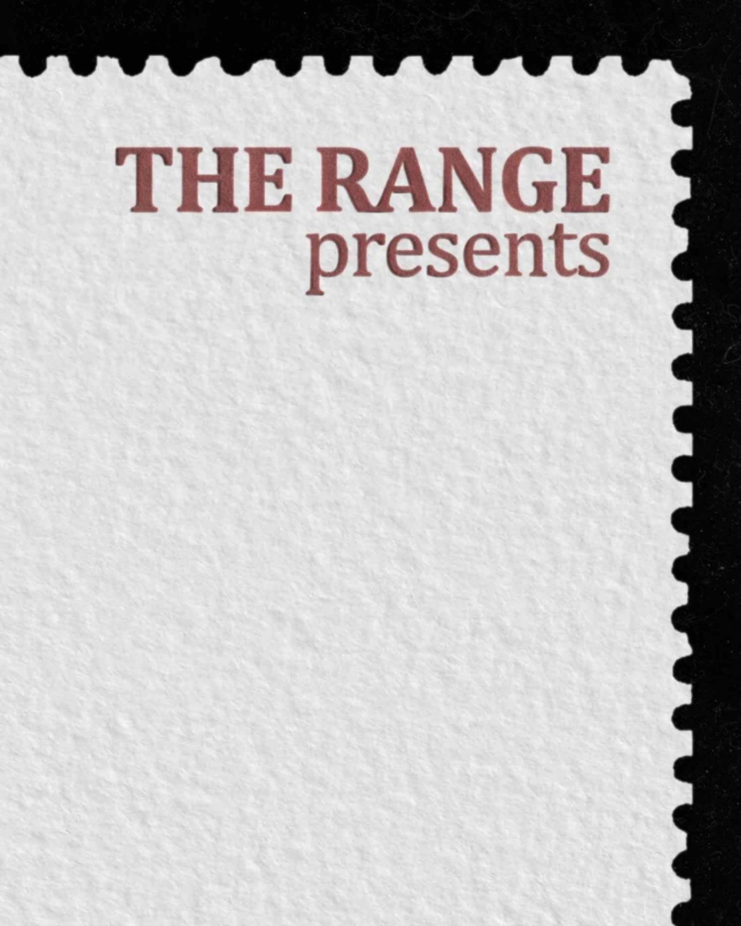
Poster Details
The most meticulous part of the things I design are the shadows. With my love of texture, shadows are one of my best friends. My goal going into every piece is to make you think you can reach out and feel the bumps from each letter on the paper.
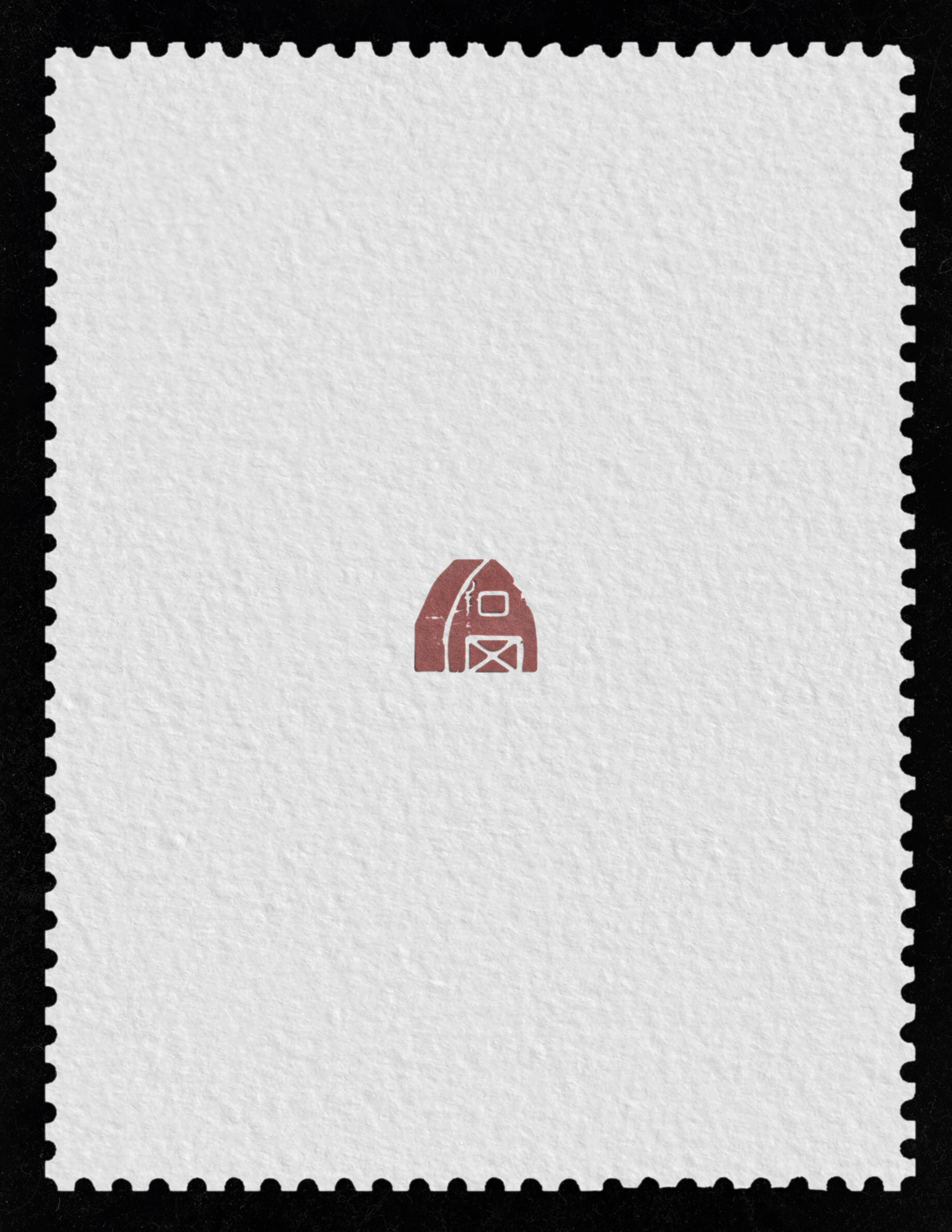
The Range Branding
Since I had to include the logo in the final poster, I thought I would give it center stage.
You can find out more about The Range and our work HERE.
Like this project
Posted Feb 15, 2022
Poster art created to promote The Range's Concert and Vendor Market.
