JOIA — Artisanal Luxury Handbags

Leticia Padilla


Fashion Brand Identity
JOIA - is an artisanal handbag brand focused on color, craftsmanship, and expressive handmade beadwork.
Challenge
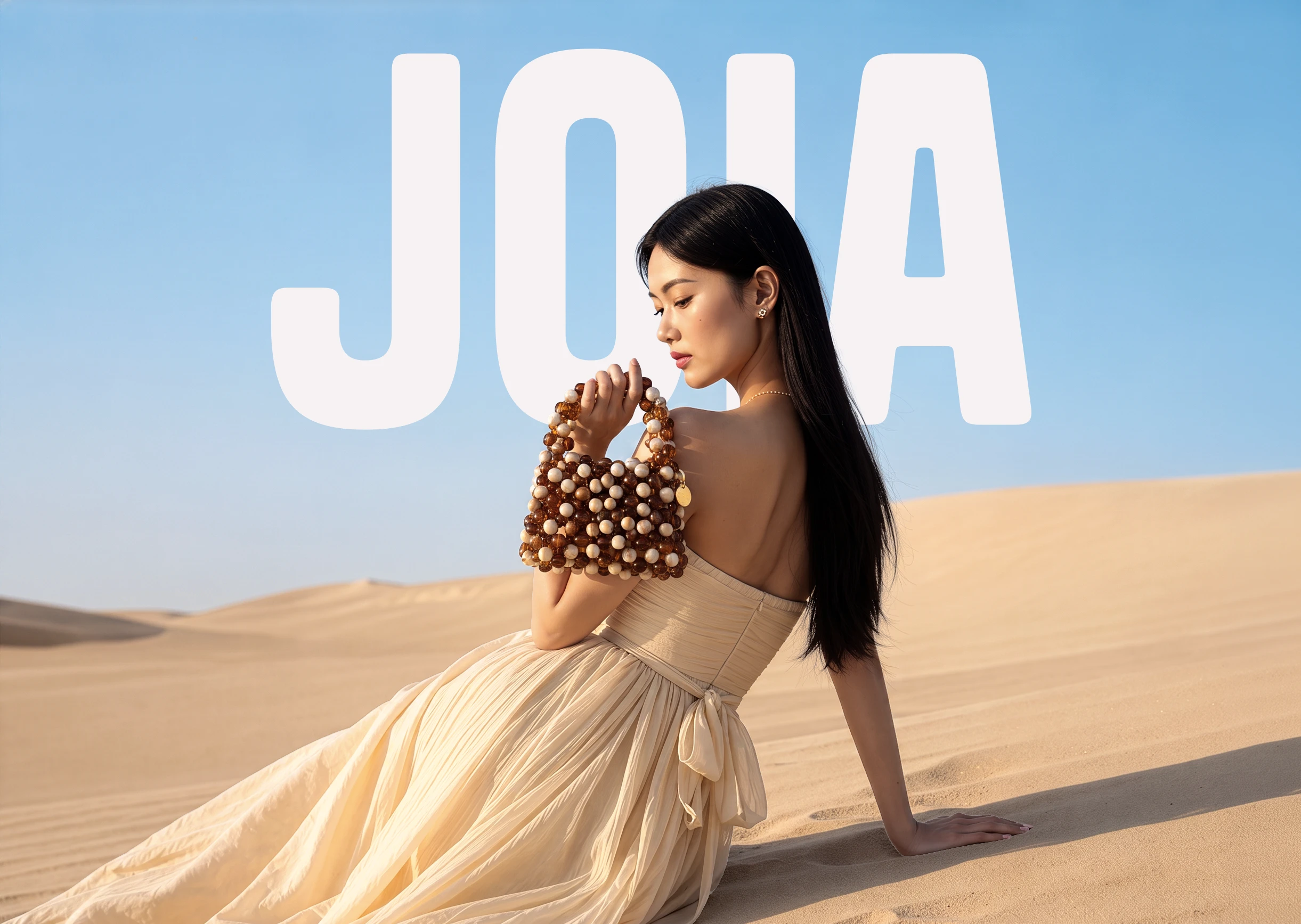
Joia came to the project without an established brand identity. The handbags were already being crafted by hand, but the brand needed a clear and sophisticated image to enter the market and communicate the value behind each piece.
The challenge was to build a personality that felt refined, colorful, and expressive, while staying connected to its handmade origin.

Solution
I developed a complete brand identity based on the qualities that make Joia unique: craftsmanship, color, geometry, and self-expression.
After researching the market, competitors, and the artisan process behind the handbags, I identified the bead as a key visual element.
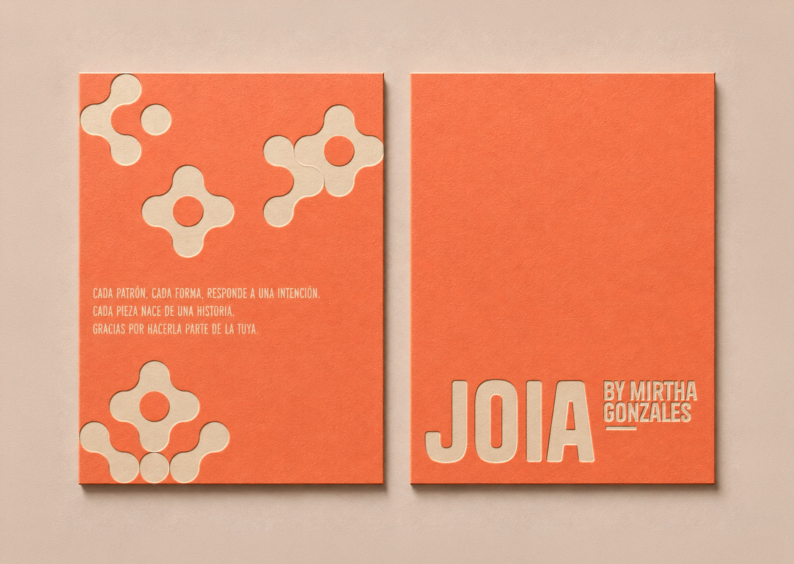
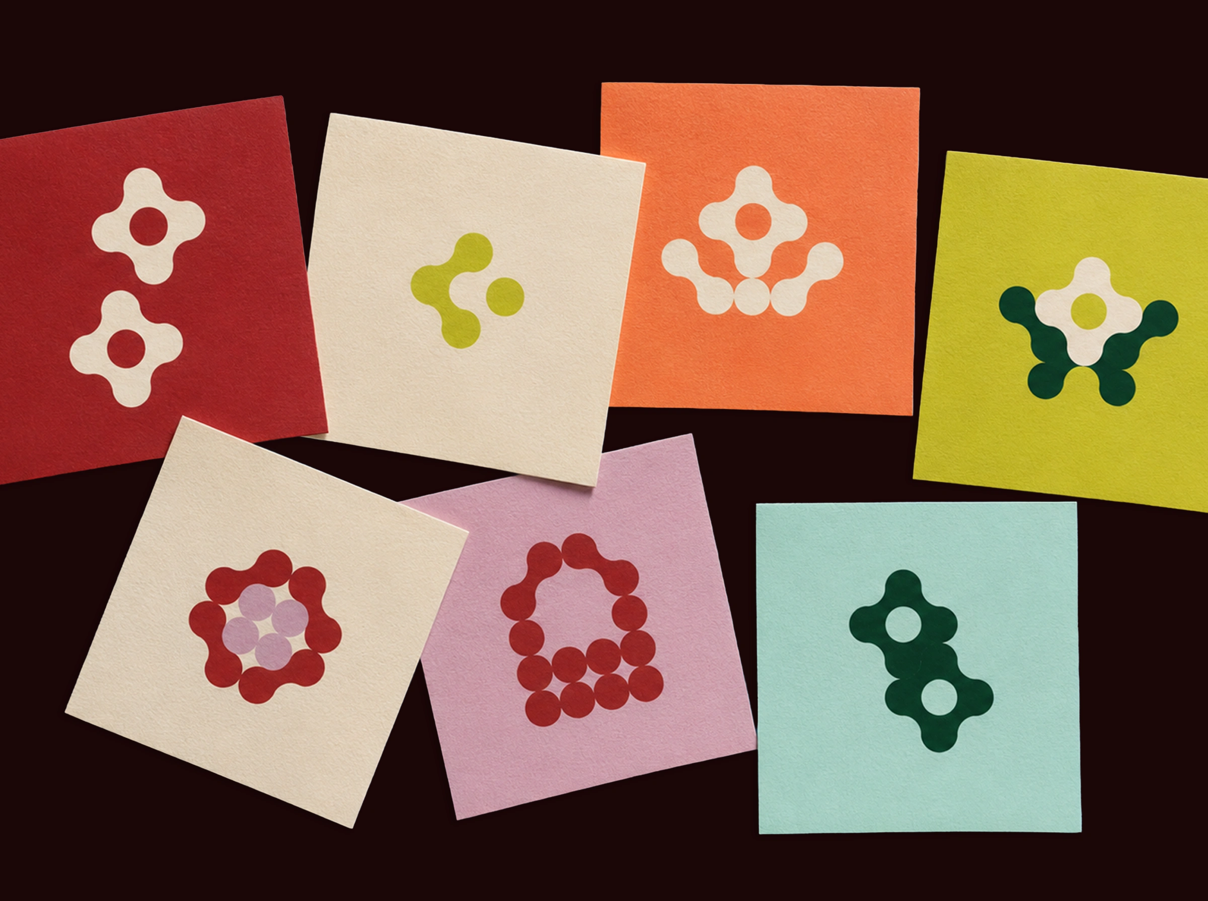
Its circular shape became the starting point for a modular graphic system, while a versatile color palette, typography, photography, and art direction built the rest of the brand world.
Bead → Circle → Module → Pattern
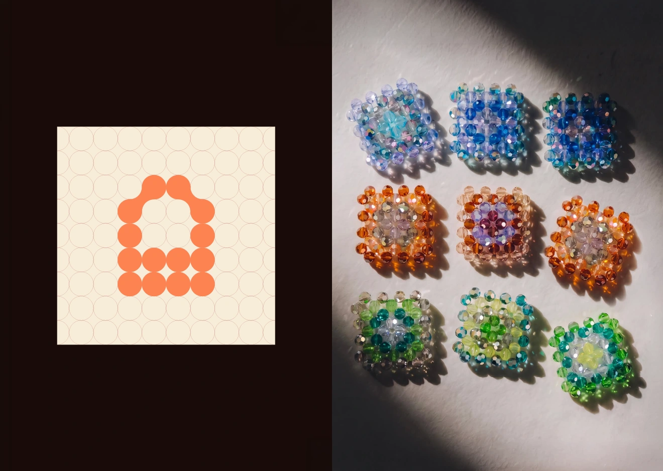
The system allows Joia to create different visual expressions while maintaining a consistent connection to the brand
Brand Values
Craftsmanship
Handmade work and attention to detail are at the heart of the brand.
Expression
Color, shape, and composition give Joia its personality.
Sophistication
A refined visual direction elevates the perception of the handmade pieces.
Authenticity
The identity grows from the real process, materials, and references behind the brand.
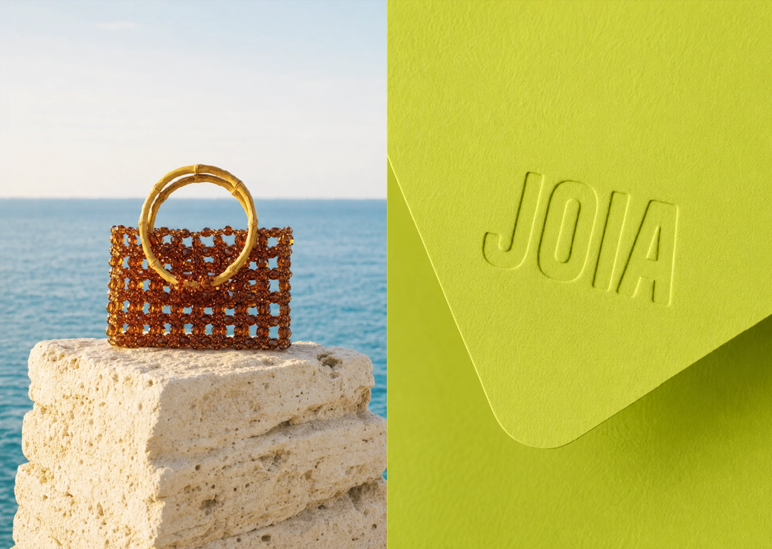
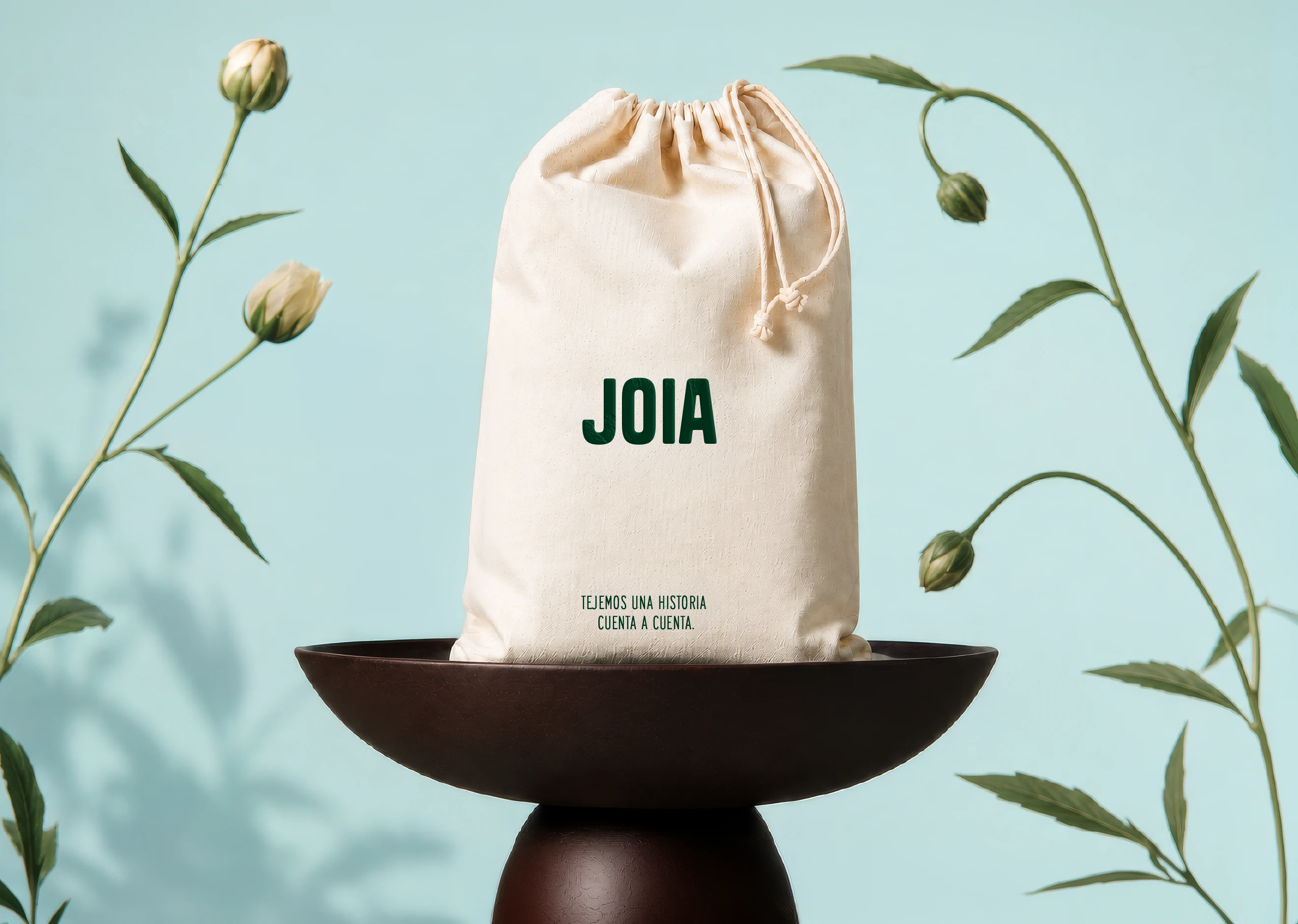
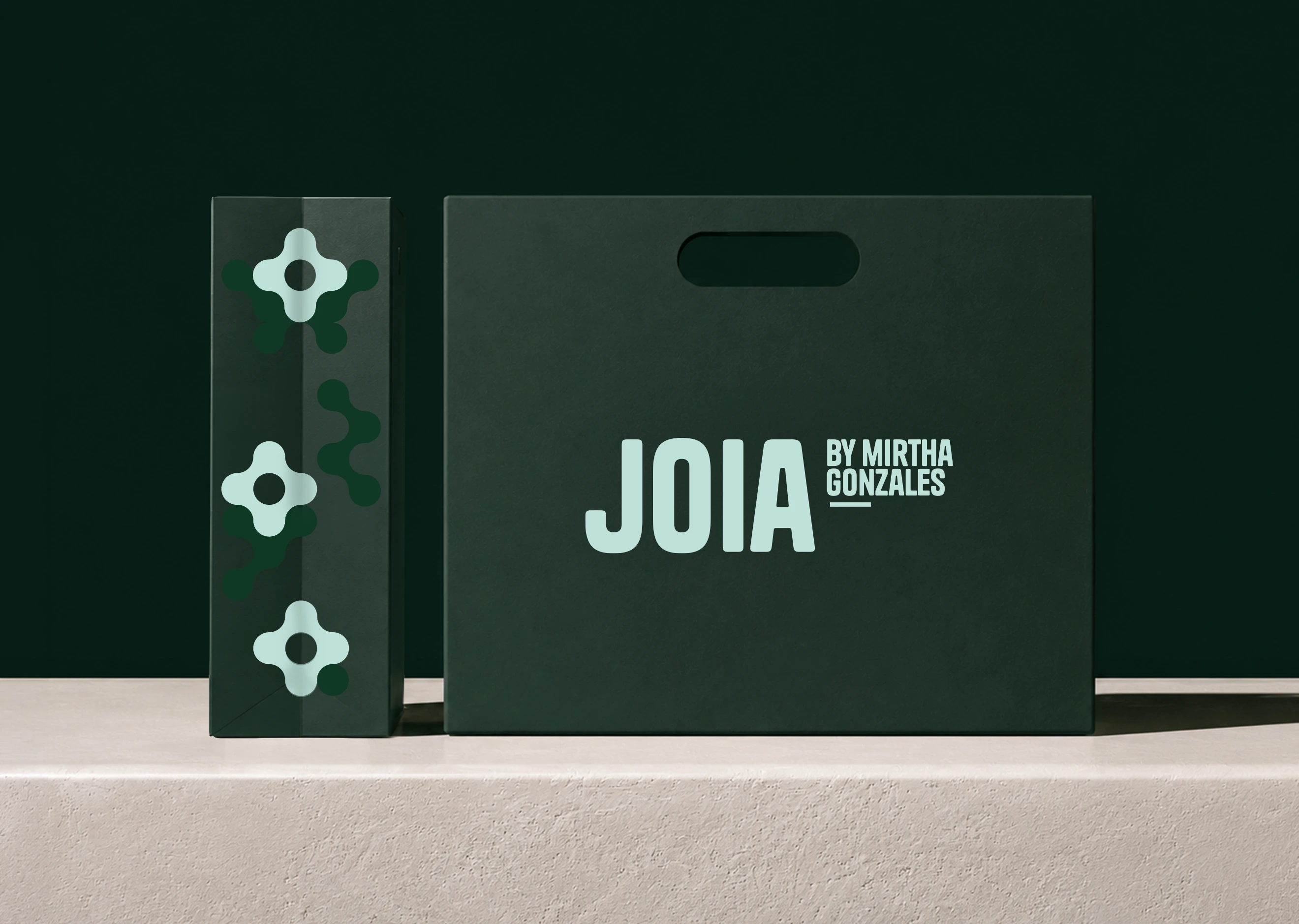
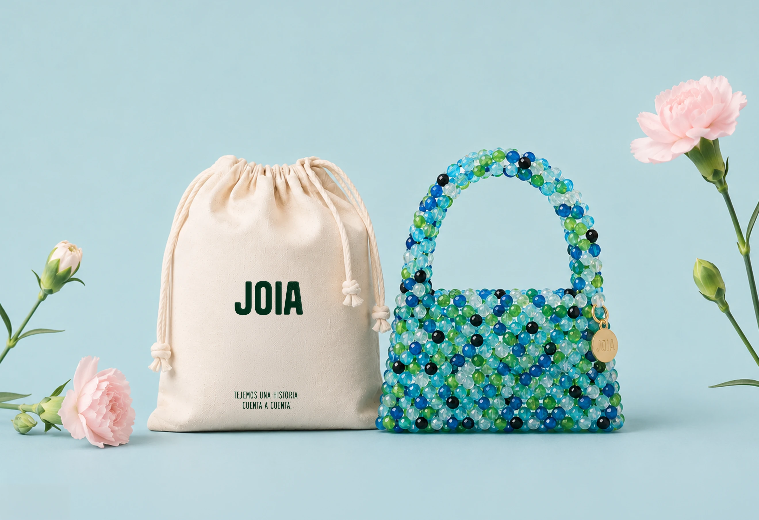
The Visual System
Modularity: A circular grid creates the foundation for the graphic language.
Patterns: Repeated modules generate distinctive shapes and compositions.
Color: A versatile palette inspired by nature, art, and the colorful world surrounding Joia. Different combinations create different moods while remaining part of the same brand universe.
Typography: Bold, confident typography reinforces Joia's expressive personality.
Art Direction: Photography, styling, and graphic elements work together to build a recognizable brand universe.
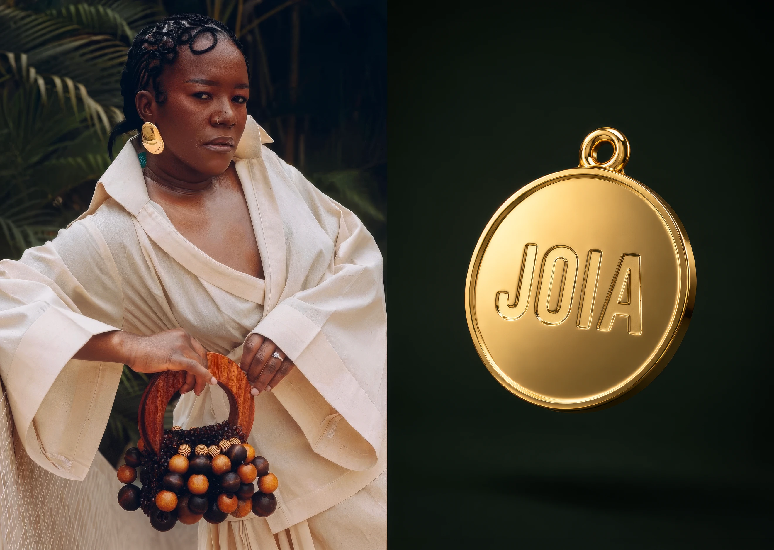
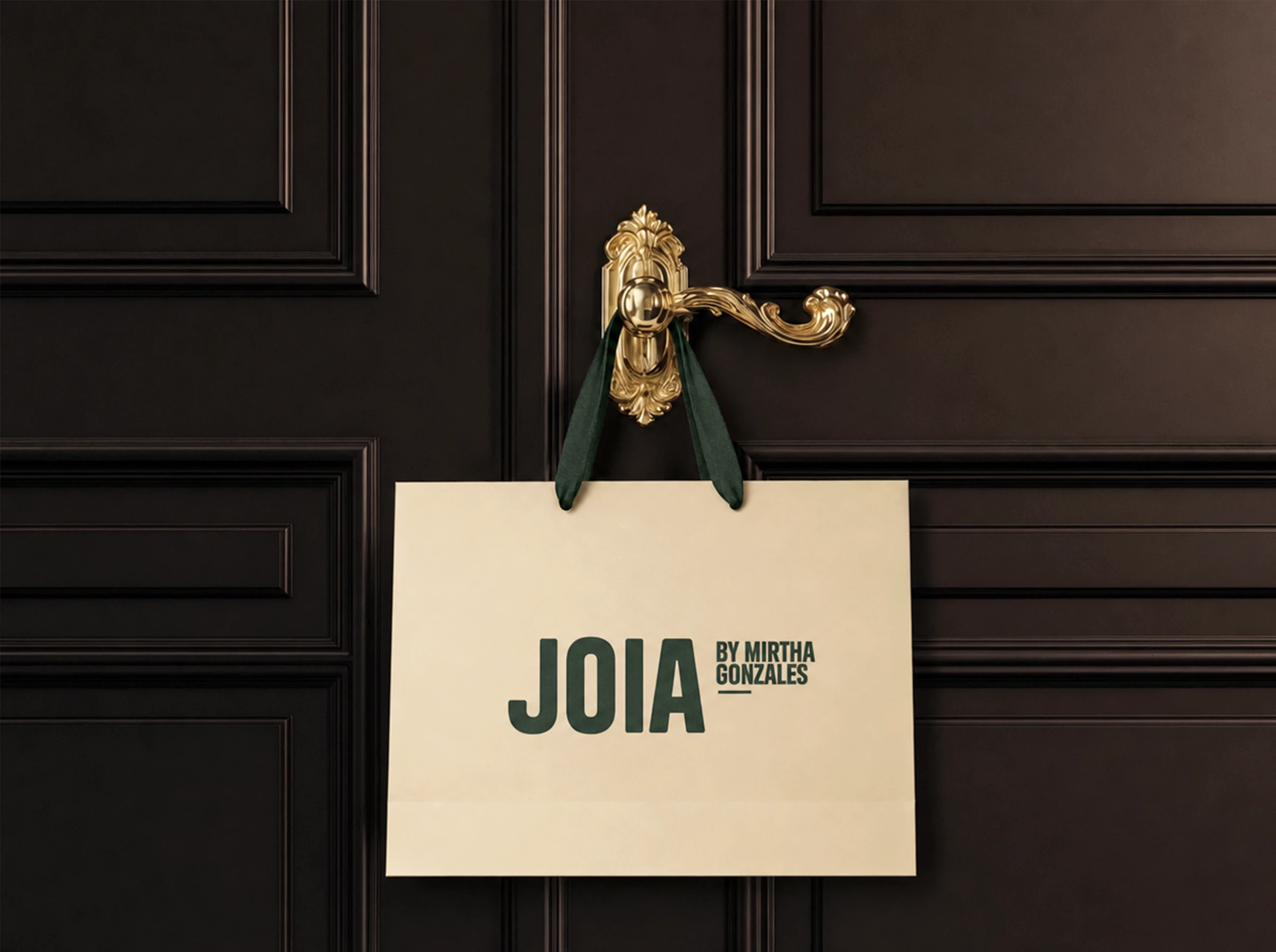
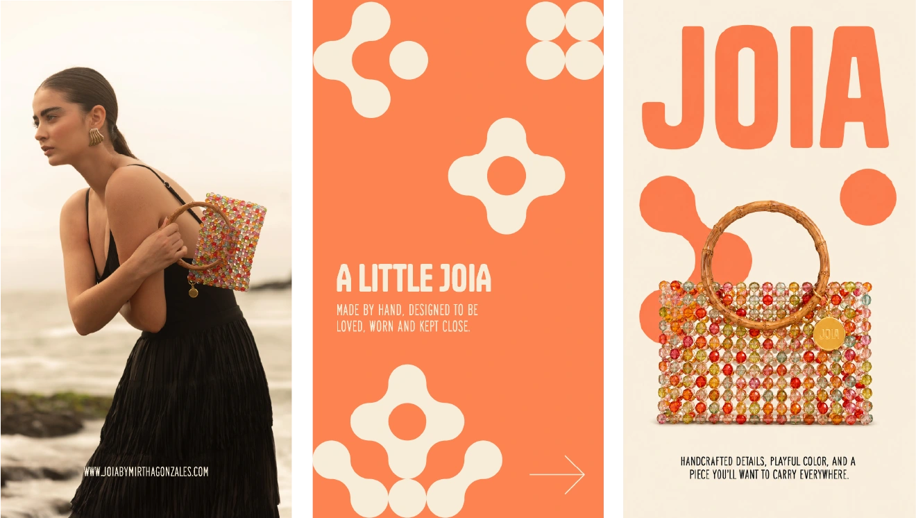
Different expressions. One Joia.
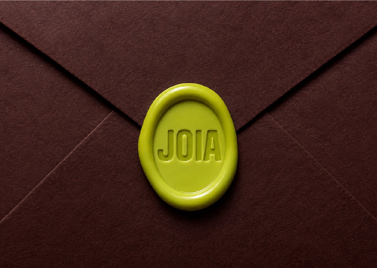
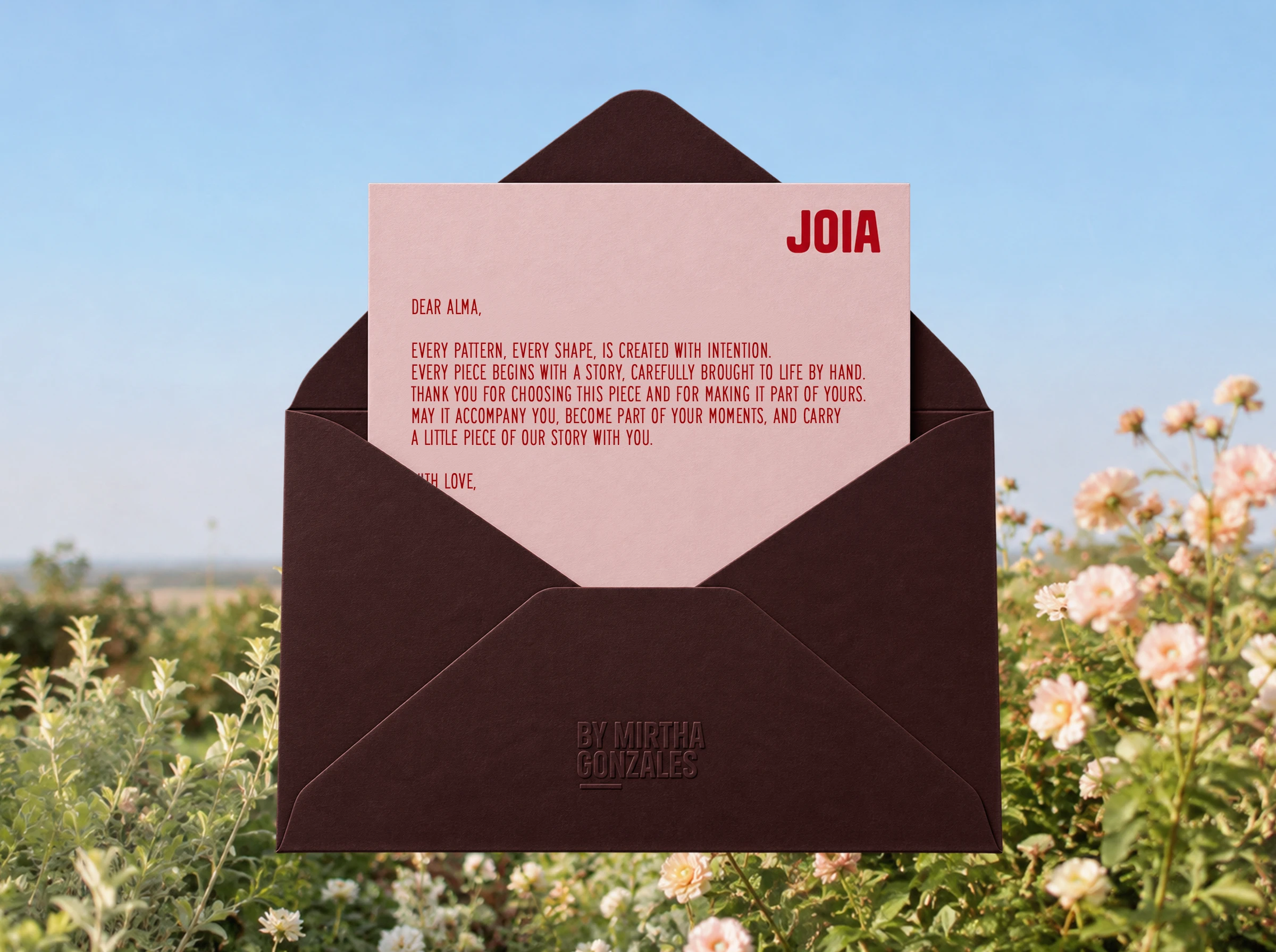
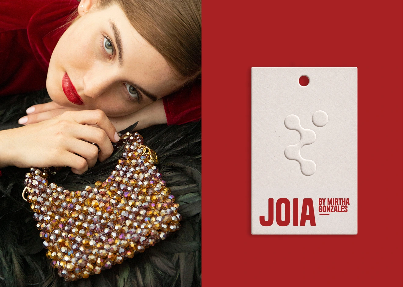
Joia was designed with a consistent visual foundation that can adapt to different collections, campaigns, products, and brand touchpoints. The colors, patterns, photography, and graphic elements can change depending on the context while remaining connected through the same visual language.
Result
A complete identity that gives Joia a distinctive and sophisticated presence, while leaving room for color, craftsmanship, and experimentation.
The system extends across digital content, packaging, printed materials, campaigns, and brand experiences, creating a cohesive world for the brand as it grows.
LET LIFE VIBRATE.
LET COLOR VIBRATE.
Created in collaboration with Conjunto Estudio.
My Role
Brand Identity · Visual System · Art Direction
Like this project
Posted Aug 11, 2026
JOIA is an artisanal handbag brand built around craftsmanship, color, and expressive handmade beadwork. As Brand Designer and Brand Strategist, I developed a visual identity system that translates the brand’s handmade character into a cohesive, expressive presence.