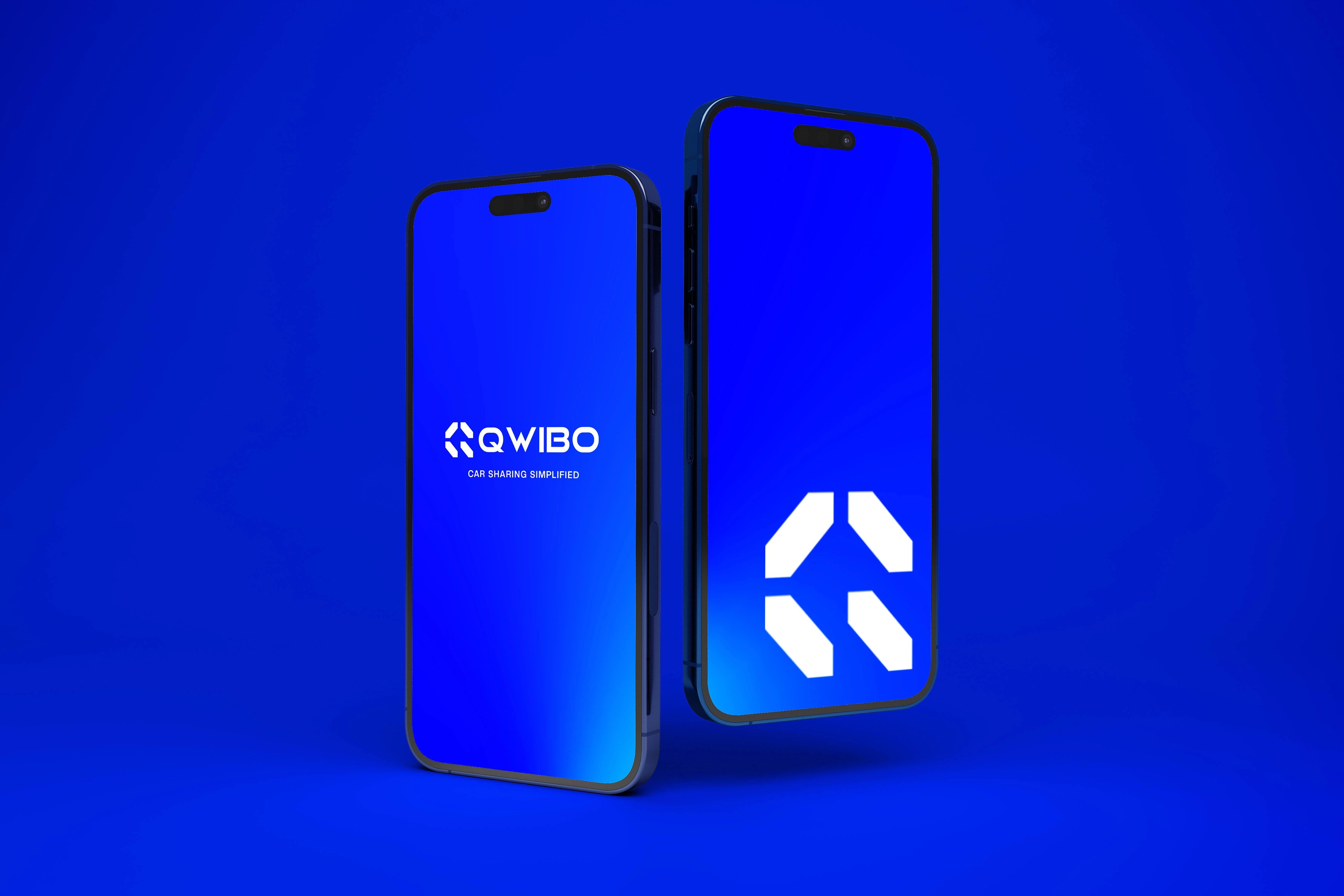
Qwibo : Qwikly Book Rental Cars
Alden Zambrano
Project Overview
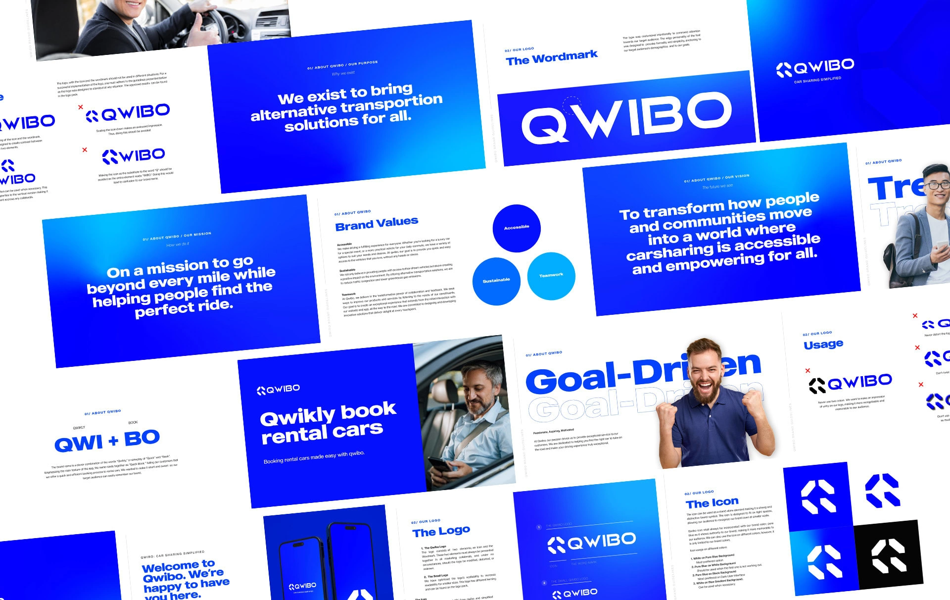
Qwibo is a new company that helps people share cars with each other. It's for car rental businesses and people who want to make money from their cars. The project was to make a brand that shows what Qwibo is about and reaches the right people.
Challenges
Qwibo needed a full brand that really gets who they are aiming for. The goal was to make a brand that shows what Qwibo believes in and talks to its customers. It was tricky to make something that fits the company and what customers expect. Qwibo wanted a brand that feels fresh, trustworthy, and connects with people who care about honesty.
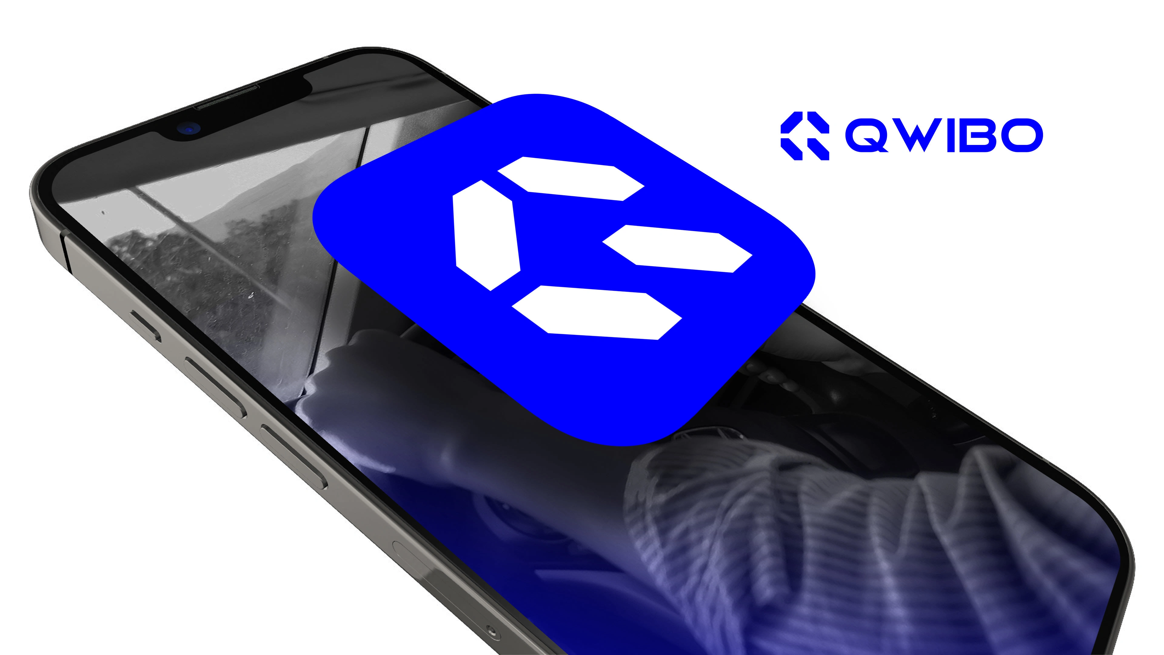
Concept Developement
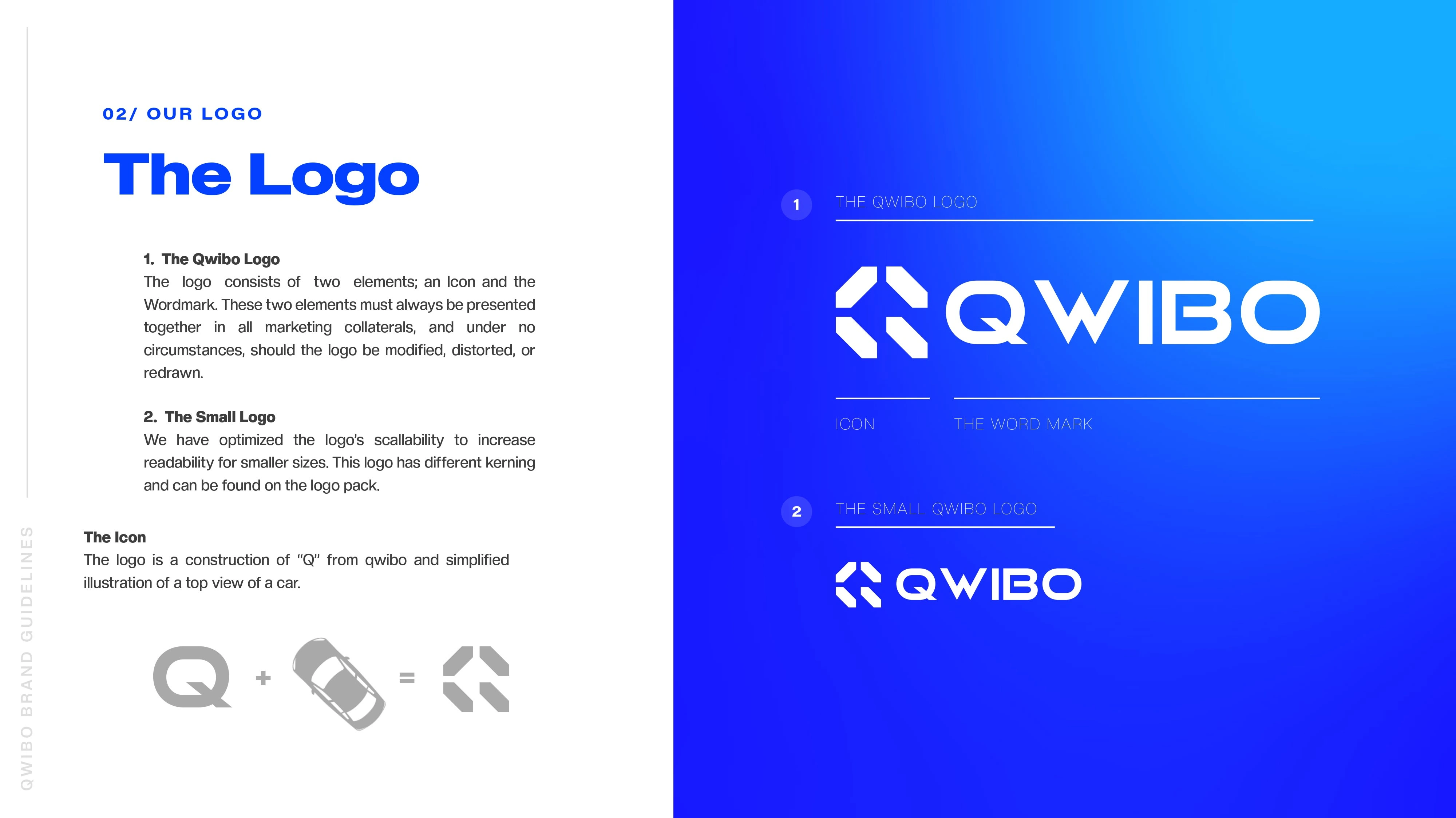
The idea started with Qwibo's "Q." This turned into a symbol that looks like a car from above. This symbol shows what Qwibo does and its name. A special font was made to go well with this symbol, making a strong and clear brand look.
Solutions
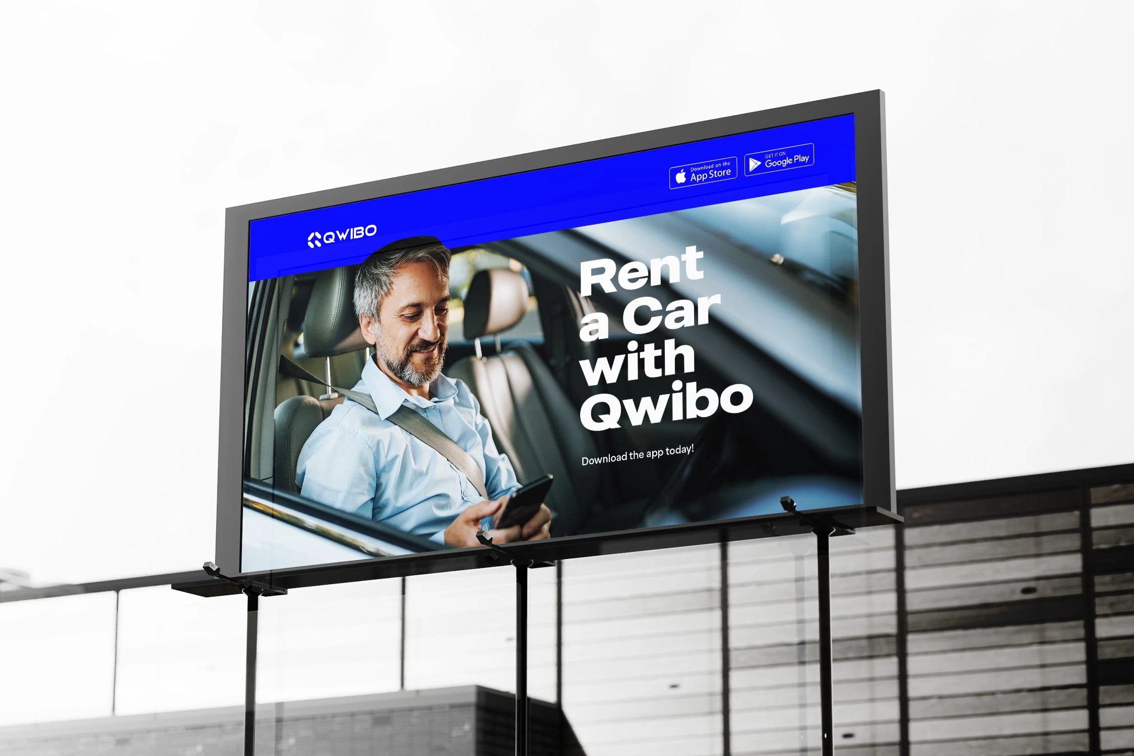
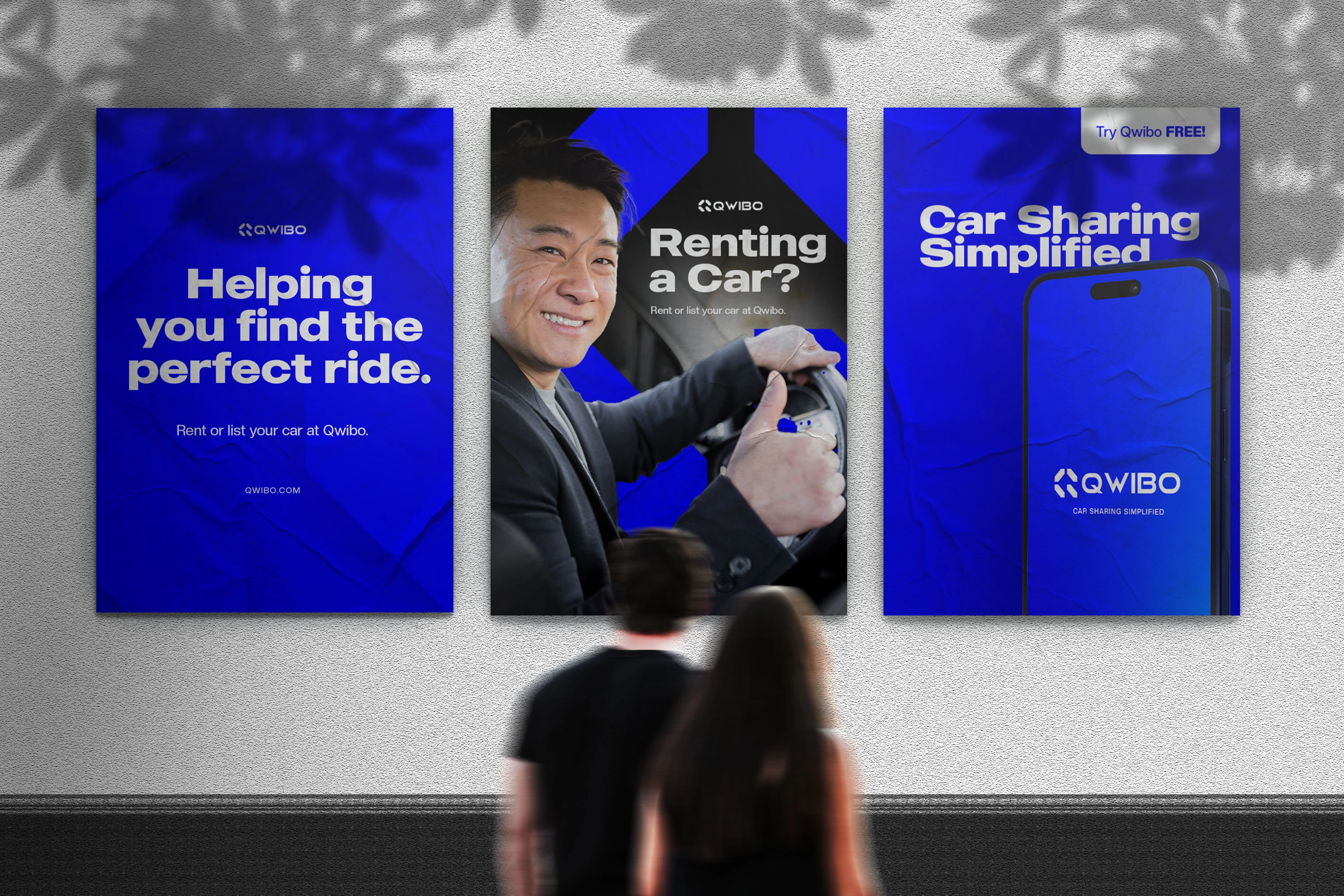
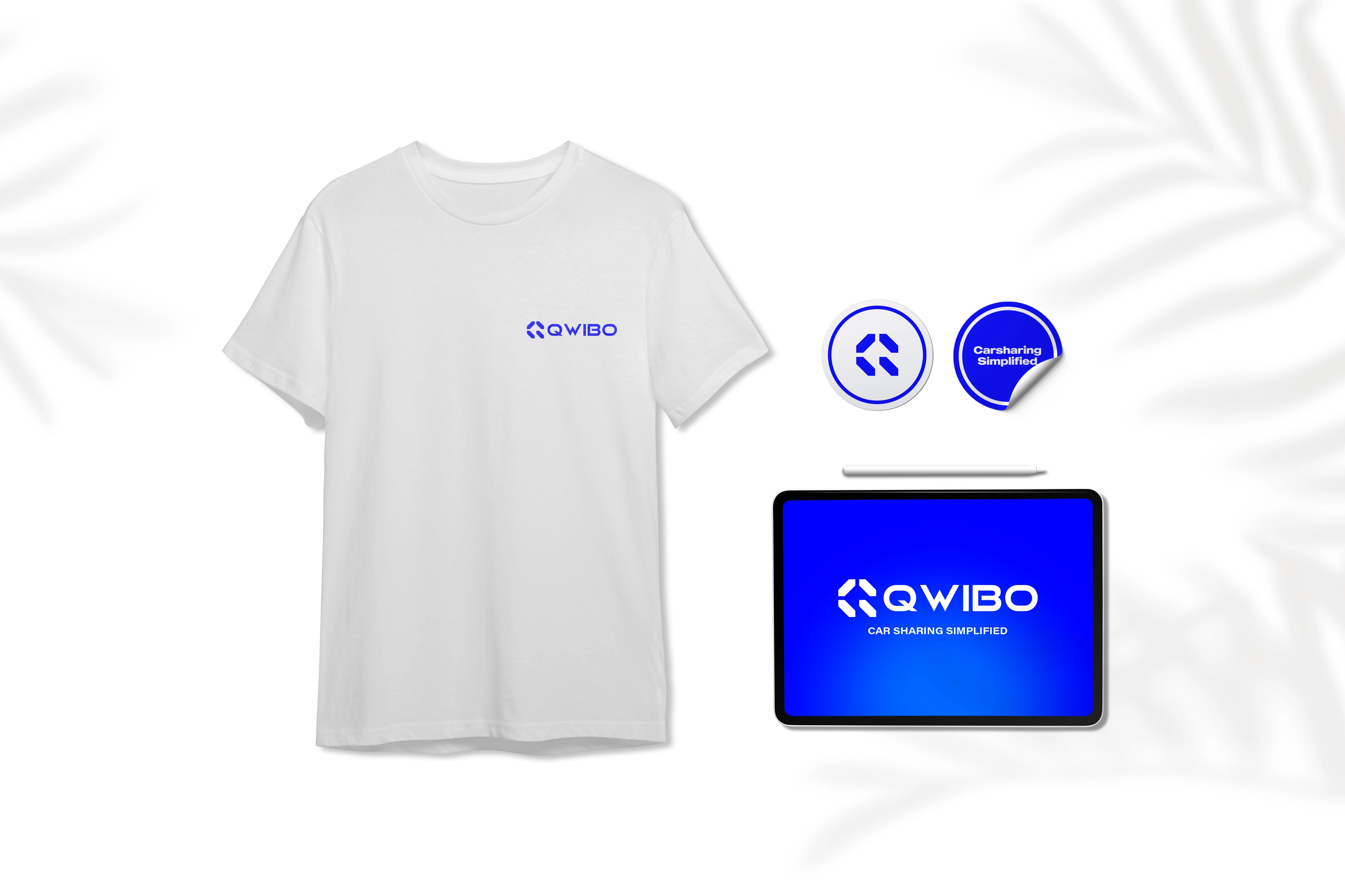
The brand had to be motivating and active. The color blue was picked because it means trust and honesty. This matches what Qwibo wants and appeals to young professional customers. Choosing blue was not just for looks but to make people feel they can trust Qwibo.
Results
The brand had to be motivating and active. The color blue was picked because it means trust and honesty. This matches what Qwibo wants and appeals to young professional customers. Choosing blue was not just for looks but to make people feel they can trust Qwibo.
Like this project
Posted Jan 26, 2024
Qwibo is a car-sharing app with an ambitious mission to make car renting and sharing more accessible. This project is about reaching the right audience.