Aquarey Water Refilling Station
Project Overview
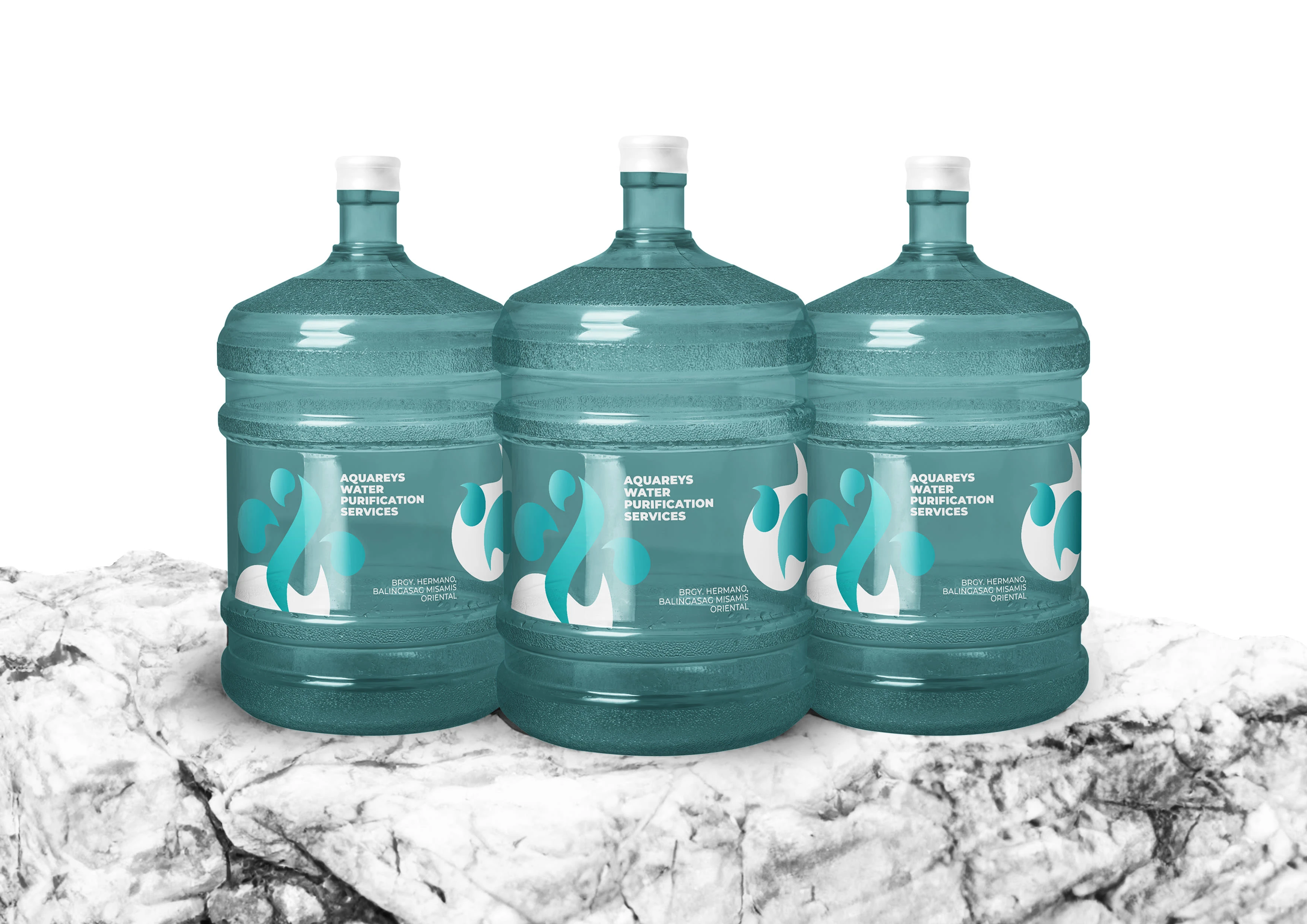
Aquarey is a water refilling business in Balingasag, Misamis Oriental Philippines. The goal of this project was to create a distinct brand identity that would capture the brand's unique value proposition in the local setting.
The design process focused on capturing Aquarey's commitment to providing clean, accessible water, resulting in a visually appealing logo that strengthens the brand's position in the competitive market.

Challenges
The notable challenge was a highly similar brand identity among local competitors. This uniformity prompted concerns in our team because audiences might already associate the style with a leading brand, potentially hindering Aquarey's ability to distinguish itself.
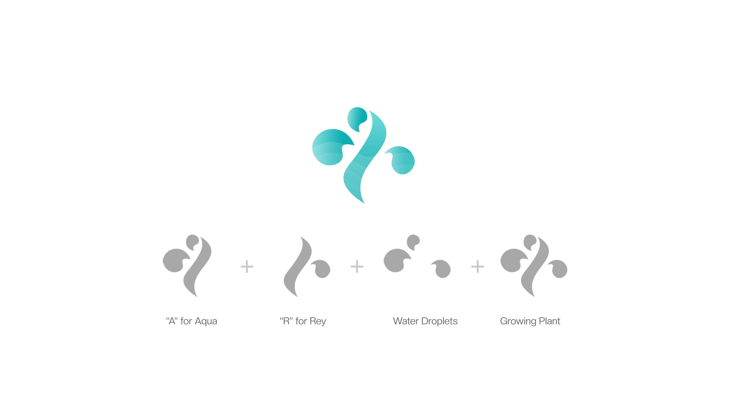
Another challenge encountered during the project stemmed from the client's personal request to incorporate the letters A and R into the logo, as Aquarey was derived from "Aqua" and the owner's name, "Rey."
Concept Development
As we delved into the concept development process, we ingeniously incorporated a straightforward yet powerful element—a droplet of water—and playfully experimented by adding a stem in the middle.
This creative exploration led to the emergence of a growing plant-like structure within the design, which served as a potent symbol of life and vitality, qualities intrinsically linked to the life-giving nature of water.
This discovery not only reinforced Aquarey's core service but also imbued the design with a deeper meaning that resonated with the brand's environmentally-conscious values.
Creative Solutions
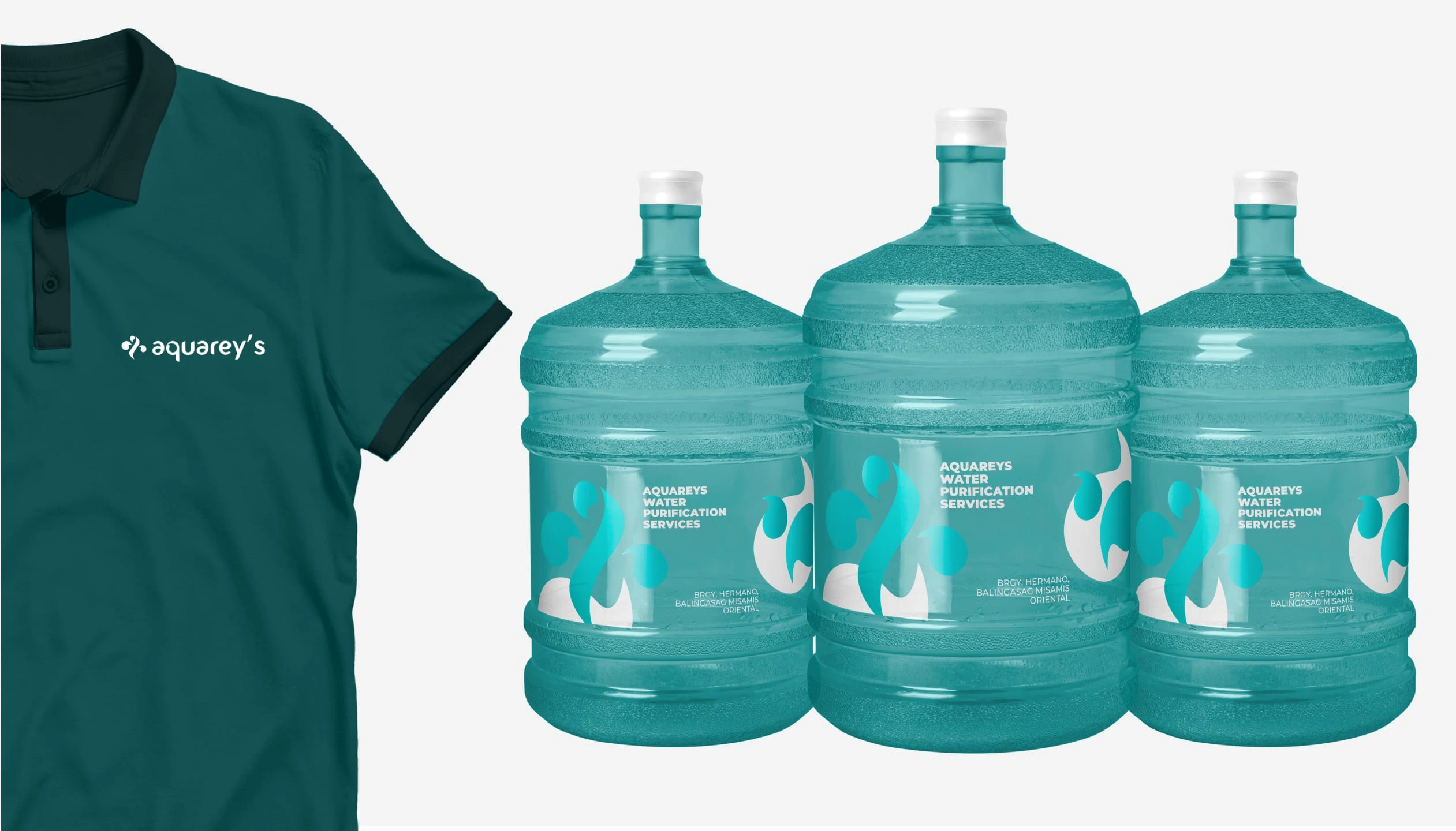
In order to infuse the logo with a distinctive personality, we selected the Fontastique font as a means of conveying a friendly and fun brand image. This sans-serif typeface embodies not only a modern and minimalist aesthetic but also possesses a unique character that resonates deeply with the target audience.
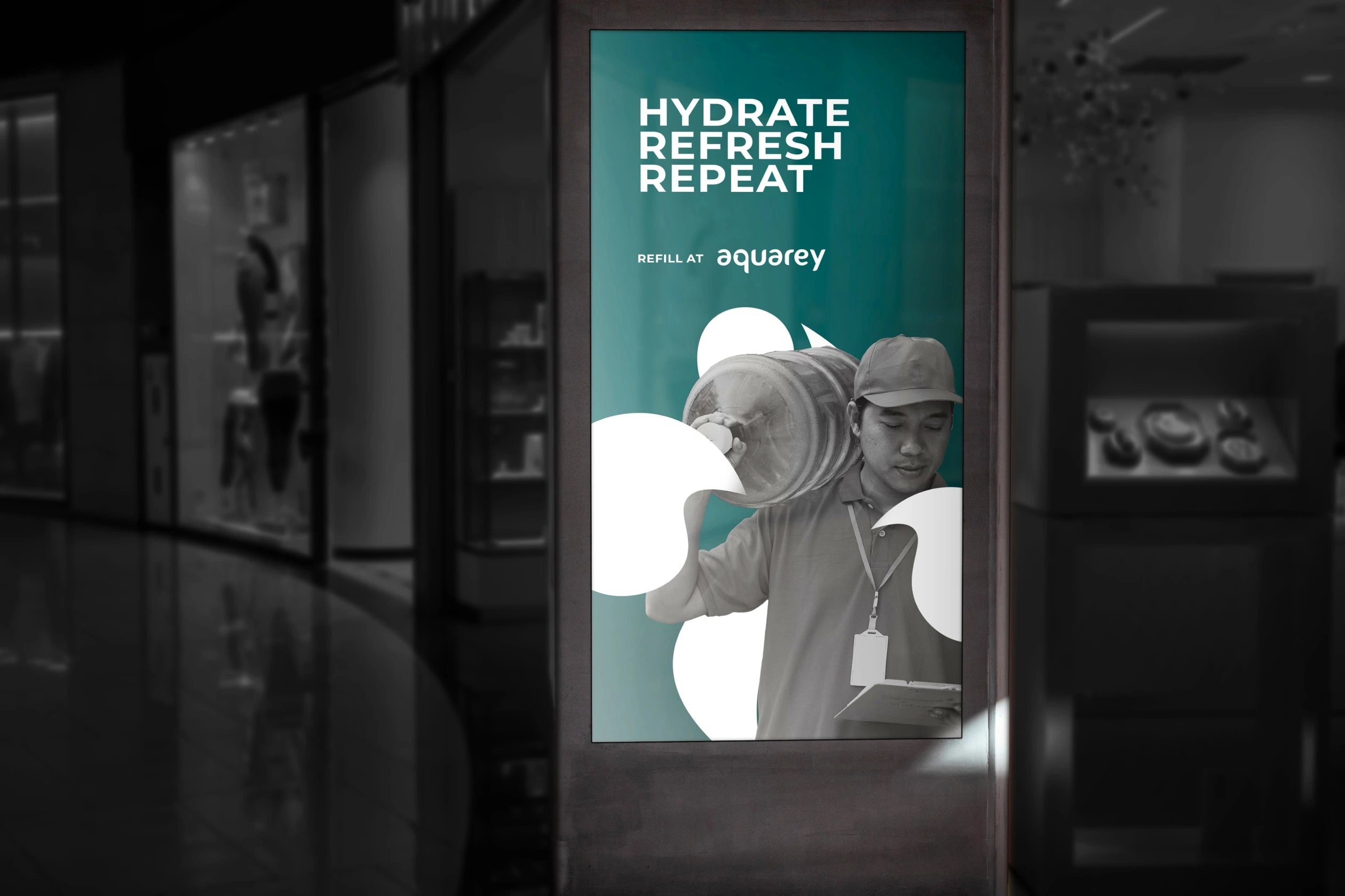
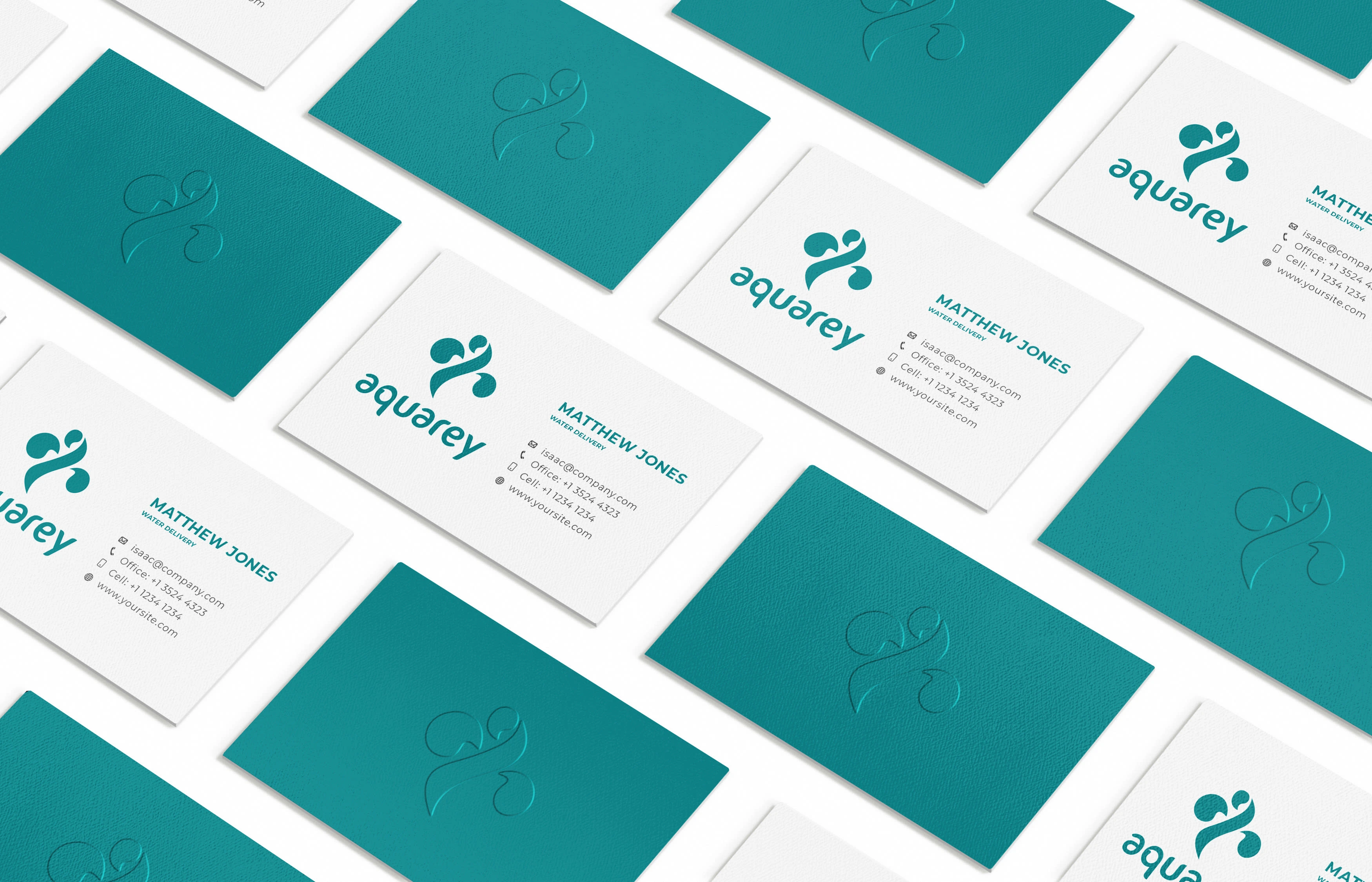
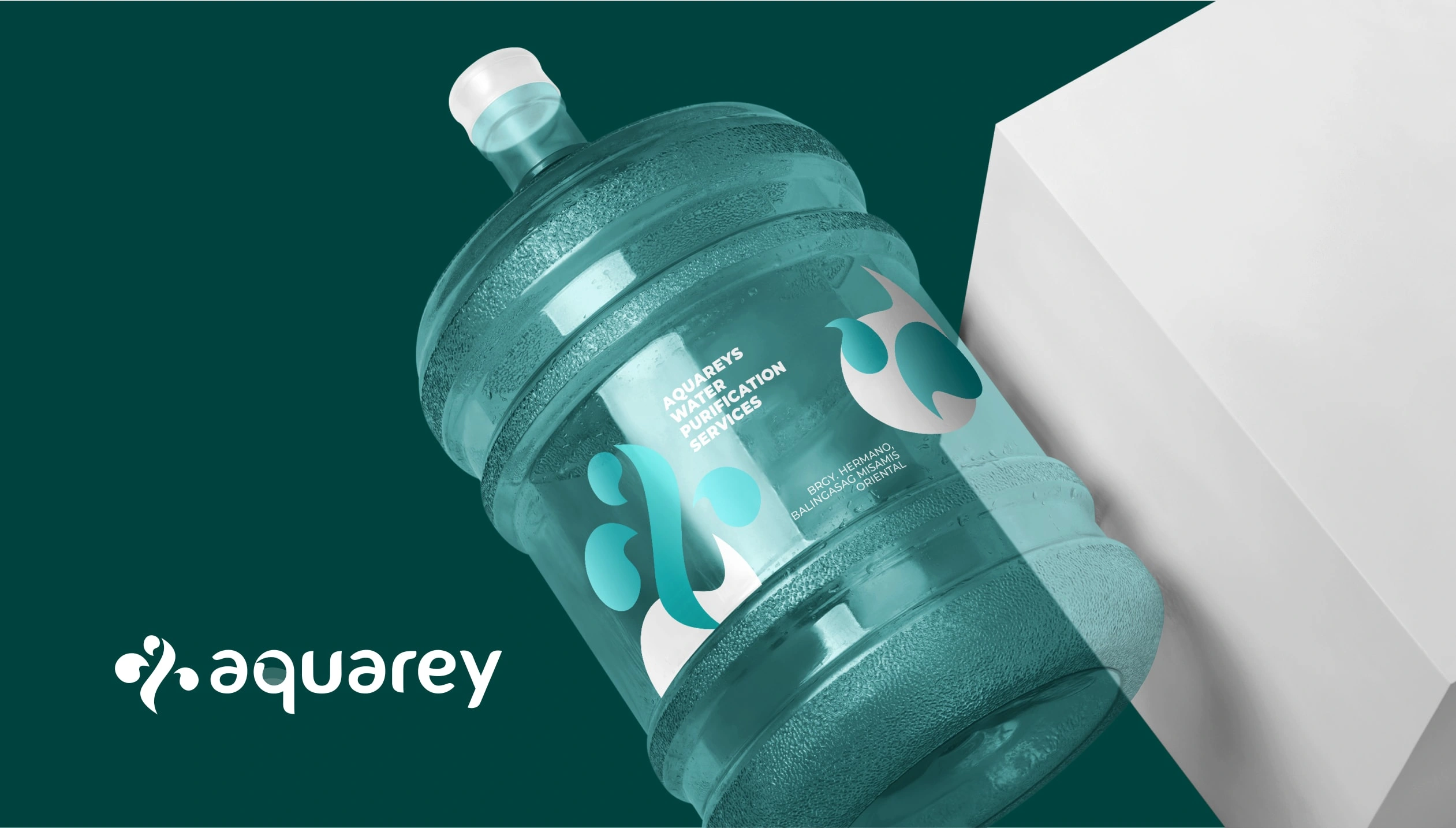
The approach to selecting the ideal color for the Aquarey brand was both strategic and straightforward—we chose to embrace the color suggested by the brand name itself: Aqua. By incorporating this hue into the brand identity, it aimed to create a more memorable and cohesive brand experience, connecting the brand name and color directly in the minds of the audience.
This seamless integration of color and name reinforces Aquarey's brand recall, solidifying its position within the market and fostering a strong connection with its target audience.
Results
This branding exploration has increased brand recognition, making Aquarey as a stand-out water refilling brand in the local setting. The strategic messaging woven into the logo's iconography has made the identity interesting while keeping the design simple. Furthermore, the direct and straightforward approach to color selection strengthened the brand's visual impact, creating a cohesive and lasting impression.
Like this project
Posted Jan 26, 2024
Aquarey is a water refilling business in the Philippines. The goal of this project was to create a distinct brand identity that would capture the local setting.


