Vinta Yearbook: A Decade of Rebrand
Alden Zambrano
Project Overview
Vinta Yearbook is the official collegiate yearbook of the University of Mindanao. Vinta's primary role in the school's community is to capture the memories and accomplishments of students, faculty, and staff for the past several years. This document outlines the rebranding of the Vinta Yearbook, which has not undergone a significant update in many years. The goal of this project is to create a simple and aligned brand design for the university.

Challenges:
The major challenge we faced was the logo's complexity and details. This made it difficult to reproduce accurately across various platforms and mediums, leading to inconsistencies in the brand's visual identity.
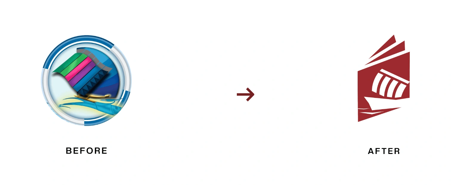
A ten-year-old outdated logo vs. the new logo.
Concept Development
The Vinta, also known as lepa-lepa or sakayan, is a traditional boat native to the southern Philippines, particularly the Sulu Archipelago and Mindanao region.
These boats hold a significant cultural value, serving not only as a means of making the Vinta boat the primary element of the brand representing the school's cultural pride in honoring the rich heritage and values of Mindanao shared by the University. We ran through two logo design explorations. The first concept highlight's the Vinta boat enclosed in a square, representing a book. On the other hand, concept two highlights the Vinta Boat only.
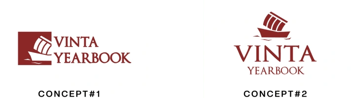
We head on choosing concept one as it speaks primarily to the yearbook's function in the university. However, a square may be perceived as something else by the audience. After exploring various concepts, we crafted an abstract illustration of a book.
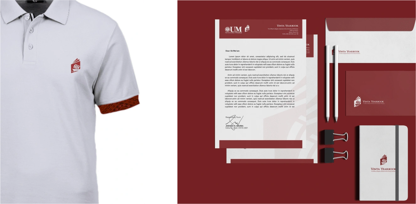
Reinforcing Alignment to the University: The Brand Colors
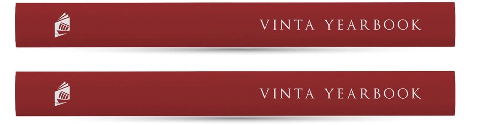
During the rebranding process, we addressed the misalignment of the old brand colors with the university's official colors. Aligning the yearbook's colors with those of the university fosters a sense of cohesion and unity within the school community while reinforcing the yearbook's role as an extension of the university's brand. However, to ensure that the Vinta Yearbook maintained a sense of individuality and was not perceived solely as an extension of the university, we opted for a slightly darker shade of red. This subtle variation allows the Vinta brand to retain its unique identity while still aligning with the university's color
Results
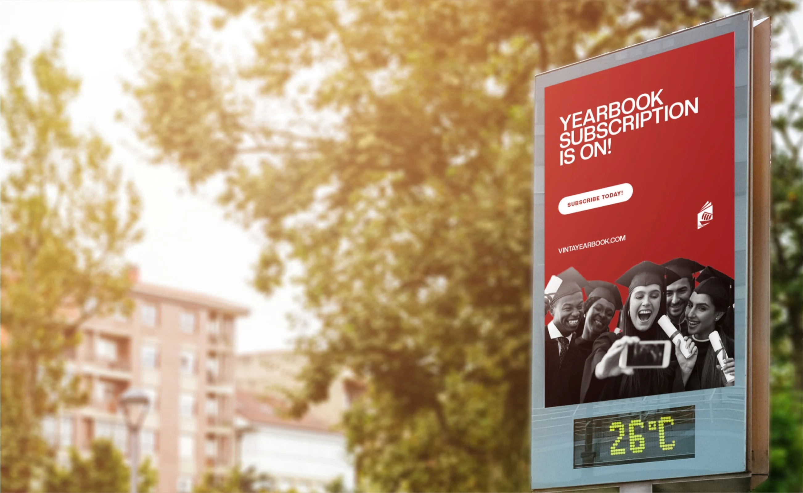
The rebranding of the Vinta Yearbook yielded significant results that enhanced the brand's overall impact and effectiveness. The simplified, scalable logo design allows for versatility in different sizes and formats, while being direct and straightforward in capturing the essential elements of the brand in a powerful and impactful way. Additionally, aligning the brand colors with the University of Mindanao fosters a sense of cohesion and unity within the school community.
Overall, the rebranding of the Vinta Yearbook created a modern, memorable, and relevant visual identity that honors the rich cultural heritage of Mindanao while maintaining a modern execution of the identity.
Like this project
Posted May 24, 2024
A ten year journey of clarity revitalized in a new indentity.