Hatod PH Food Delivery App
Project Overview
Hatod PH is a startup that specializes in providing efficient food delivery services to rural areas in Misamis Oriental, Philippines. The objective of this project is to rebrand Hatod PH in a way that not only communicates their aspirations but also resonates with their target customers.
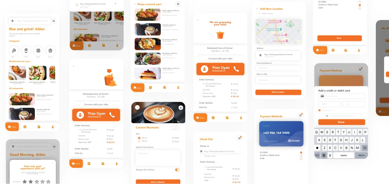
Hatod also requires both creative and technical solutions to streamline the ordering process and improve the overall customer experience.

Challenges
We encountered two significant challenges during this project. The first was the infrastructural limitations in the target audience's geographical location, as rural areas in the Philippines still lack adequate cell tower coverage. This raised concerns about the potential impact on user experience for Hatod's Merchants, Riders, Customers, and Admin.
The second challenge involved developing an identity system that would resonate with and attract the target audience, as the existing identity system contained numerous elements that diminished its recognizability as a brand.

Hatod's logo before and after they worked with me.
Concept Development
In the process of developing logo concepts for Hatod PH, we placed significant emphasis on celebrating the riders. By featuring the riders as the central element in the logo, we aimed to champion the hardworking individuals who are instrumental in bringing Hatod's services to life.
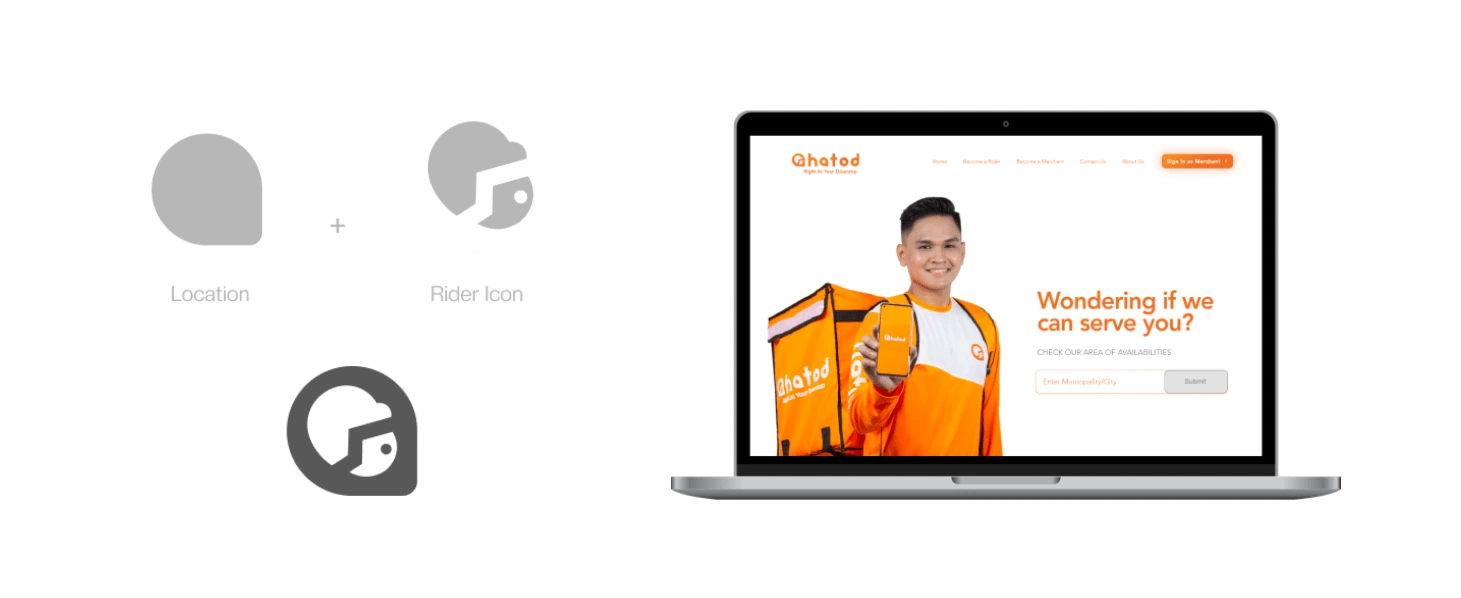
Delving into the anatomy of the logo, we employed a pixel-perfect approach by incorporating the principles of the Golden Ratio. This imbued the design with a sense of balance and timelessness. Designs that adhere to the Golden Ratio have been admired for centuries across various forms of art and design. As a result, Hatod's logo is poised to stand the test of time, remaining both relevant and engaging for years to come.
The Rule of Golden Ratio is applied to Hatod's logo resulting in a timelessness of the mark.
Brand Application
The project placed significant emphasis on intentionality, where each foundational element was not created purely for decorative purposes, but rather meticulously planned to have a cascading effect on the rest of its applications, enabling them to grow and evolve

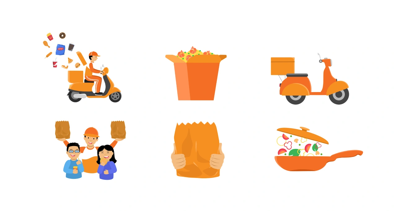
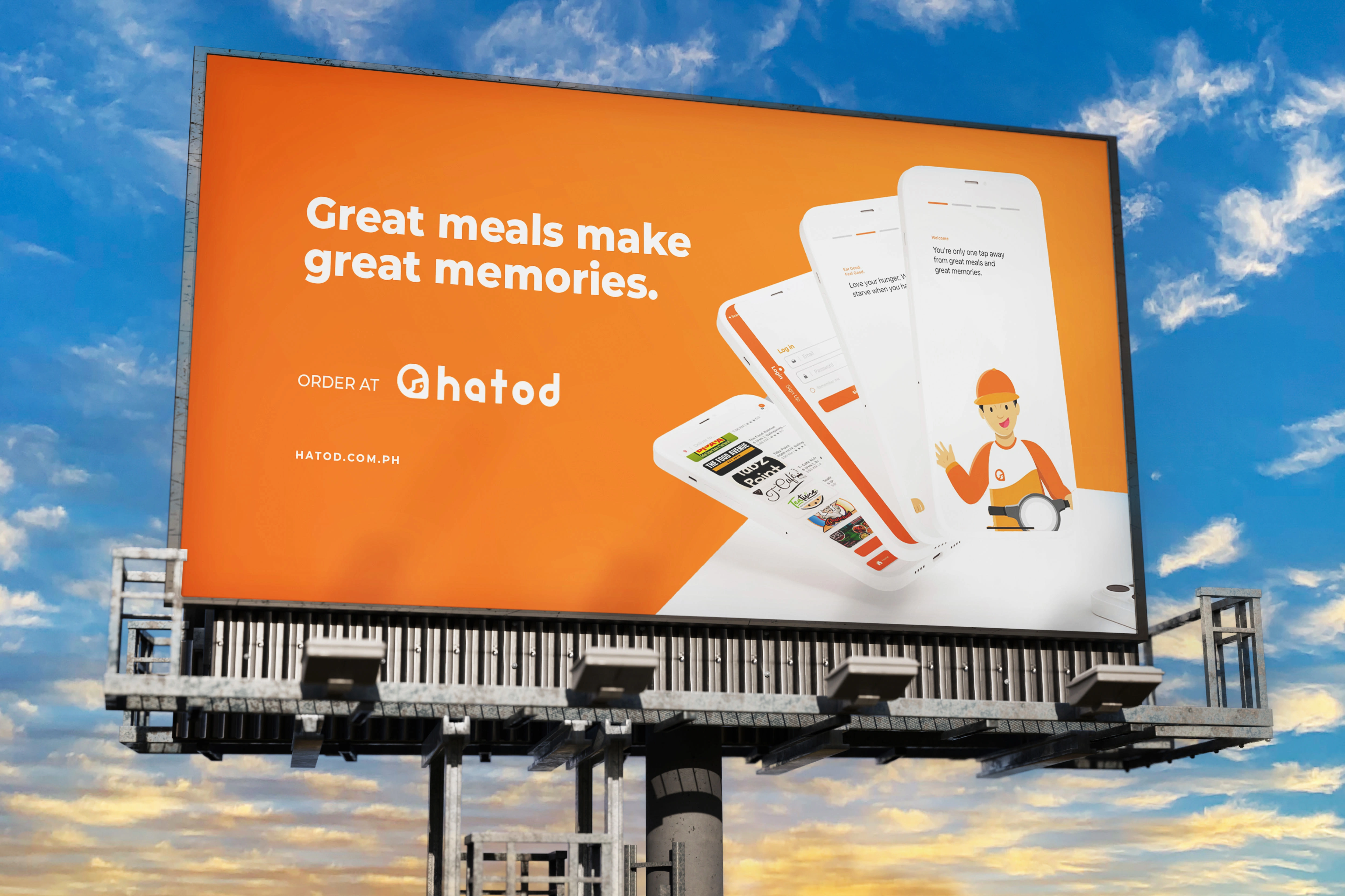
To enhance the Hatod brand's personality and user experience, custom illustrations was created to capture the brand's target audience. These illustrations showcase the vibrant and diverse community that Hatod serves and emphasize the importance of coming together to share food and build connections.
Animations were made to not only enhance the user experience but also bring an element of delight and excitement to the users, making each interaction truly memorable.


Results
The redesign of Hatod PH's brand identity yielded significant positive results. The simplification of the logo made it more recognizable and memorable, resonating with the company's mission to serve rural communities in Misamis Oriental.
In addition, the emphasis on featuring riders in the logo helped establish a brand personality that deeply connects with the target audience. This strategic focus not only strengthened the brand's emotional appeal but also made it more relatable to the rural communities it serves. Overall, these changes in brand identity have successfully strengthened the connection between Hatod PH and its target audience. The new brand identity has thus laid a strong foundation for fostering customer loyalty and driving future growth.
Like this project
Posted Jan 23, 2024
Hatod PH is a food delivery startup. The Goal of this project is to create a full branding for the startup targeting young adults and professionals.

