St. Roch Pet Shop
Project Overview
St. Roch Pet Shop is a startup pet store dedicated to providing high-quality pet products and services to pet owners. The company aims to create a strong brand identity that resonates with its target audience, positioning itself as a reliable, compassionate, and professional pet care provider in the market. This case study outlines the process and approach taken to develop St. Roch Pet Shop's brand identity, with the primary goal of attracting and retaining customers.
Challenges
The striking challenge of this project was to incorporate St. Roch into the brand while maintaining a fun and playful identity, as St. Roch is a Catholic figure that may not immediately evoke such a personality. The goal was to find a creative solution that balanced the history and significance of the name with the playful nature of the pet shop.

Concept Development
St. Roch, also known as Saint Rocco, was a Catholic saint who lived in the 14th century and was venerated as a patron saint of dogs and dog owners, as well as of several other causes. He was known for his piety and charitable works, and was said to have miraculously cured people of the bubonic plague. In art, he is often depicted with a dog.Taking into consideration the association of St. Roch with dogs, we strategically decided to use a dog as the primary representation of the saint in the logo.
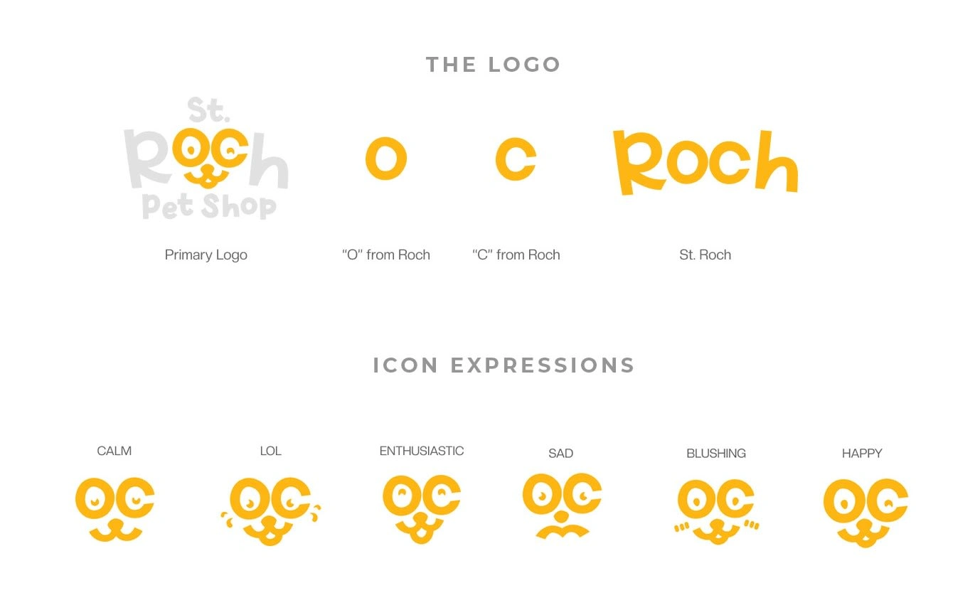
To add a playful twist, we wrapped the dog's eye in the letters "O" and "C" of St. Roch, creating a strong connection between the saint and the dog, while also making the logo fun and memorable.
Creative Solution
In selecting the right font for the brand, Playfulist was chosen, a fun sans-serif font that perfectly matches the overall aesthetics of the brand and the desired impressions.
The playful nature of the font conveys the fun and lighthearted personality of the pet shop. The use of Playfulist reinforces the brand's playful and approachable personality, making it appealing and accessible to the target audience of pet owners and pet lovers.
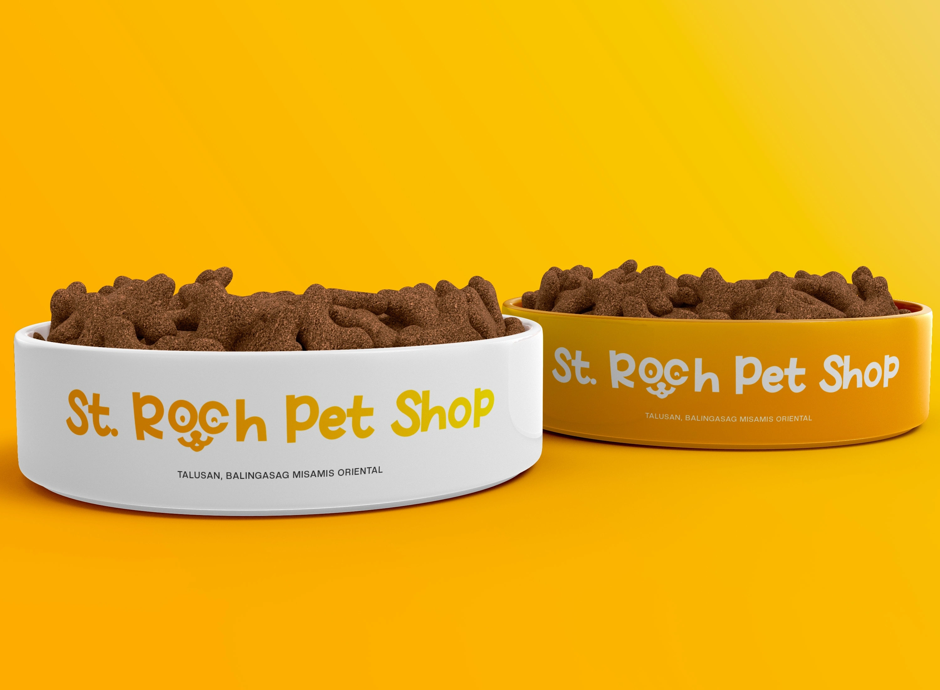
The vibrant hue of yellow orage represents happiness, warmth, and excitement, capturing the brand's playful essence and ensuring easy recognition and memorability among the target audience.
Results
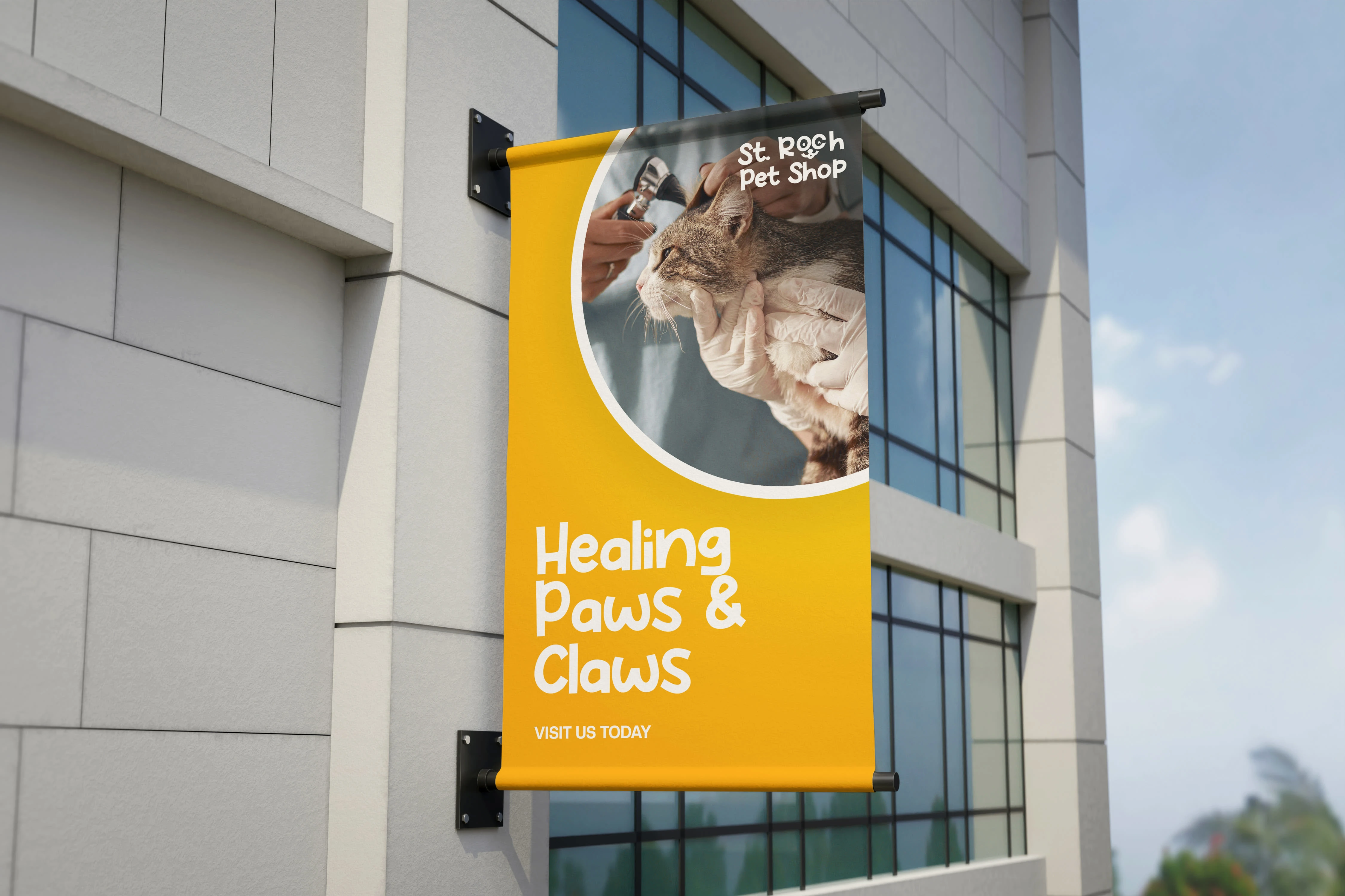
The outcome of this project was a successful implementation of the brand's desired mood and personality while maintaining a strong link to St. Roch. The brand identity, with its fun and playful elements, including the bright yellow-orange color and playful font, gained attraction from customers in the local setting. The clever incorporation of St. Roch in the logo, through the use of the dog's eye, also helped to reinforce the brand's history and significance.
Like this project
Posted Jan 26, 2024
St. Roch Pet Shop is a startup pet store dedicated to providing high-quality pet products and services to pet owners.
Likes
0
Views
15

