
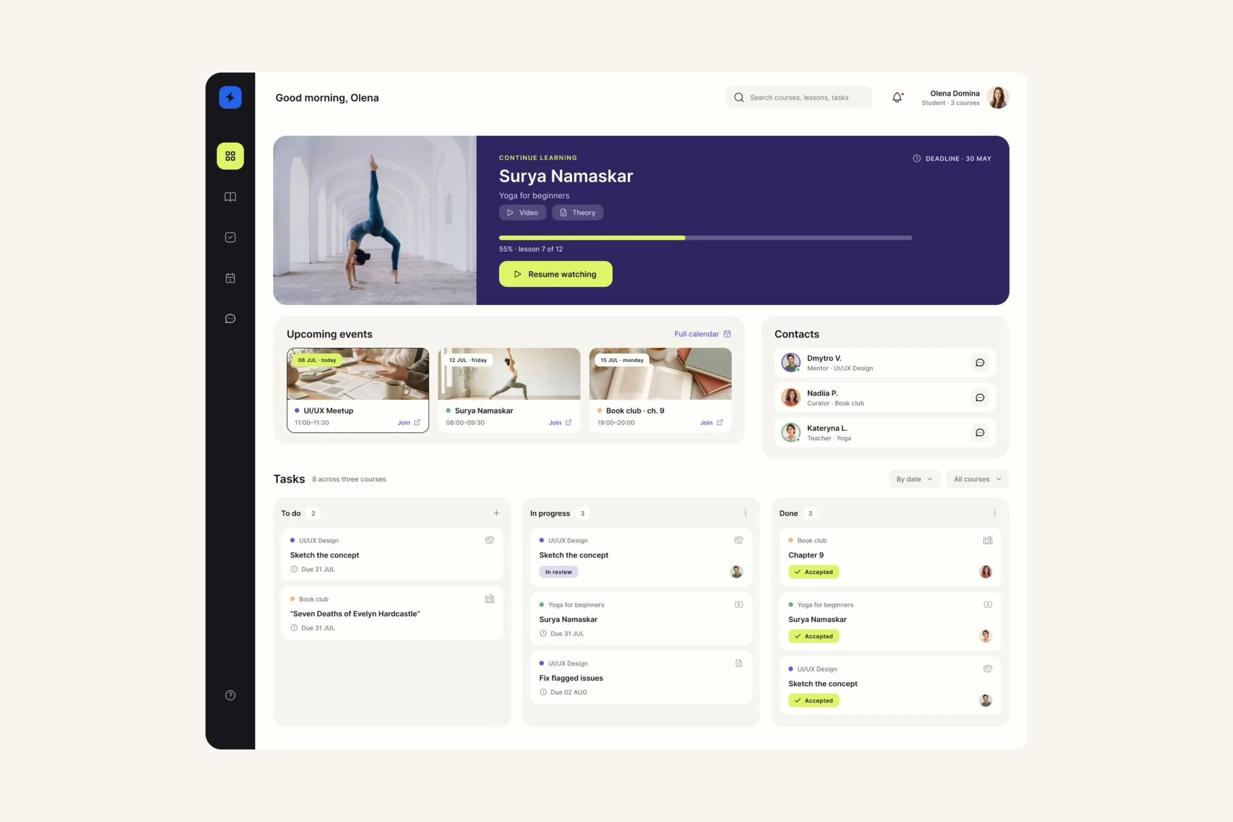
Context
Scale brings lessons, deadlines, homework and mentor feedback into one student workspace. It replaces the split between course material in Notion and learning support in Telegram, where students had to switch tools to follow the course, submit homework and get feedback.
Role: Product Designer — research, IA, flows, design system and Figma prototype
Team: other designers and the product owner
Platform: desktop web app
Timeline: February to August 2024, ending at a tested Figma prototype with no engineering handoff
Research
I interviewed 1 stakeholder and 1 student, surveyed 1 course cohort and reviewed 9 platforms. The survey sample size was not recorded, so its percentages are directional. The clearest gap was feedback and deadlines, not course content.
“Everything was in different places—so many chats to scroll through. It was chaos.” — Student interview
“There was no video feedback. We uploaded work as a PDF and received comments.” — Student interview
73% linked progress tracking to motivation; 67% needed visible deadlines. Both belong on the first screen, not inside a course.
Only 10% objected to peers seeing their homework, supporting a shared “Students’ work” tab.
When a technical problem occurs, 47% contact their mentor before support, so the mentor and group chat remain available on every screen.
Skillshare, Teachable, Canva Design School and Squarespace were the clearest student-side comparisons: all delivered lessons; none kept an assignment, recorded mentor critique, revision and resubmission in one loop.
Structure
19 frames: 4 dashboards, 2 catalogue passes, 5 course pages and 8 lesson variants. The lesson needed the most work because it combines video, brief, submission and mentor feedback on 1 page.
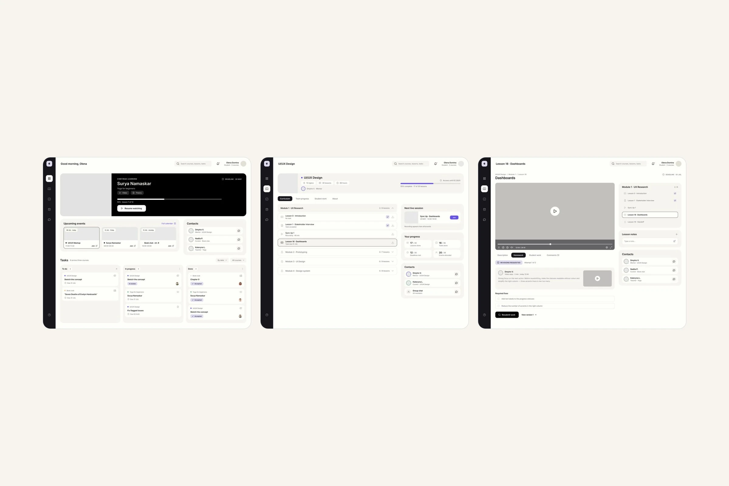
3 of 19 — dashboard, course and lesson review
Visual design
The references point to soft greys and white, rounded corners and generous spacing — a reading surface rather than a dense control panel, so attention stays on the content and the next action.
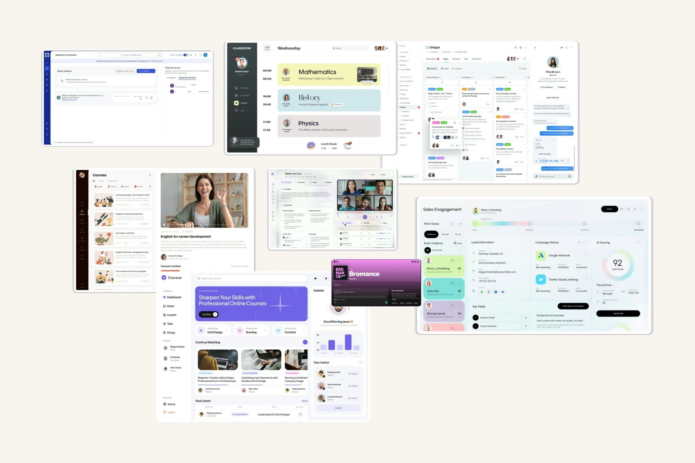
Moodboard — a reading surface, not a control panel
Each course carries its own hue, applied to the progress bar on its card, the dots down the curriculum, the mentor’s avatar and the outline on the active lesson. Every hue is taken from the state ramps, so the coding does not become a second palette.
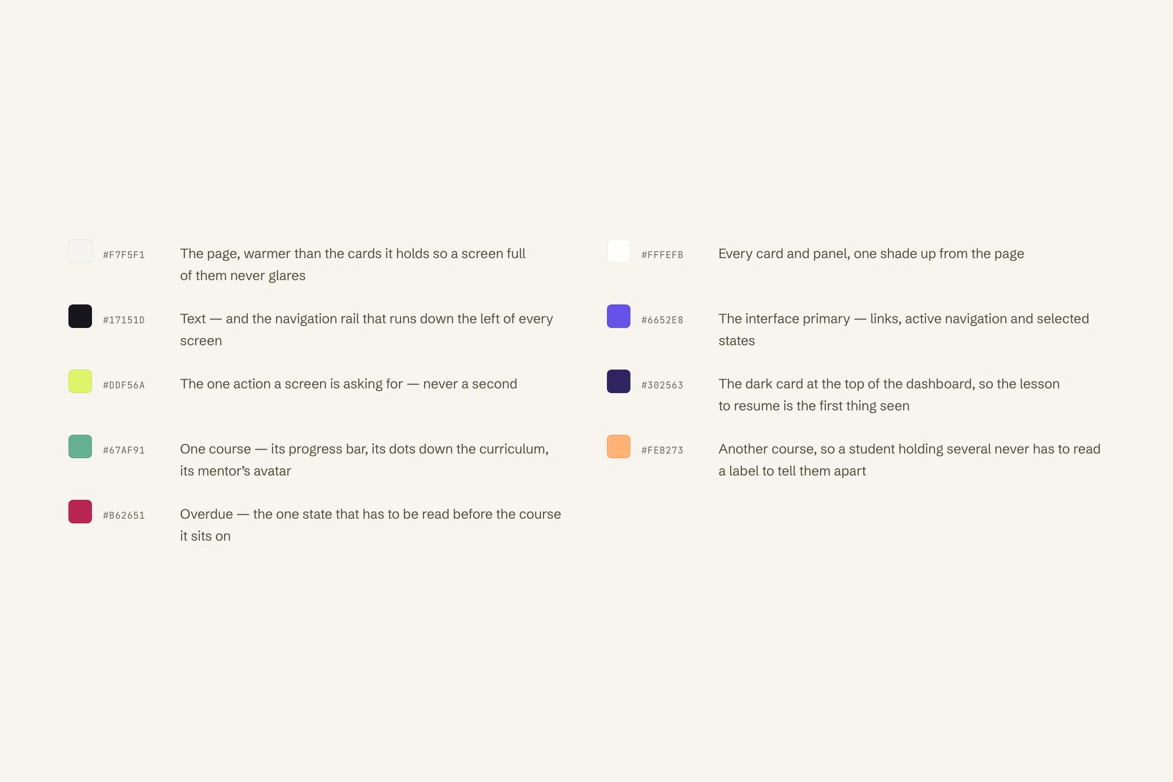
Page, cards, text, the interface primary, the one action, course hues and overdue
A 5019 × 6145 component frame with buttons in 3 sizes, inputs, dropdowns, avatars in 7 sizes, switches, statuses and 2 sidebar states; about 80 icons on a 24px grid; 7 colour ramps with 6 steps each.
Testing
A Maze study ran over 2 core paths with 13 participants. After the dashboard, every screen recorded 0% misclicks. Only the dashboard struggled: 41.7% misclicks on the direct route and 83.8% on the indirect one. Heatmaps placed those clicks on the navigation rail, not the content.
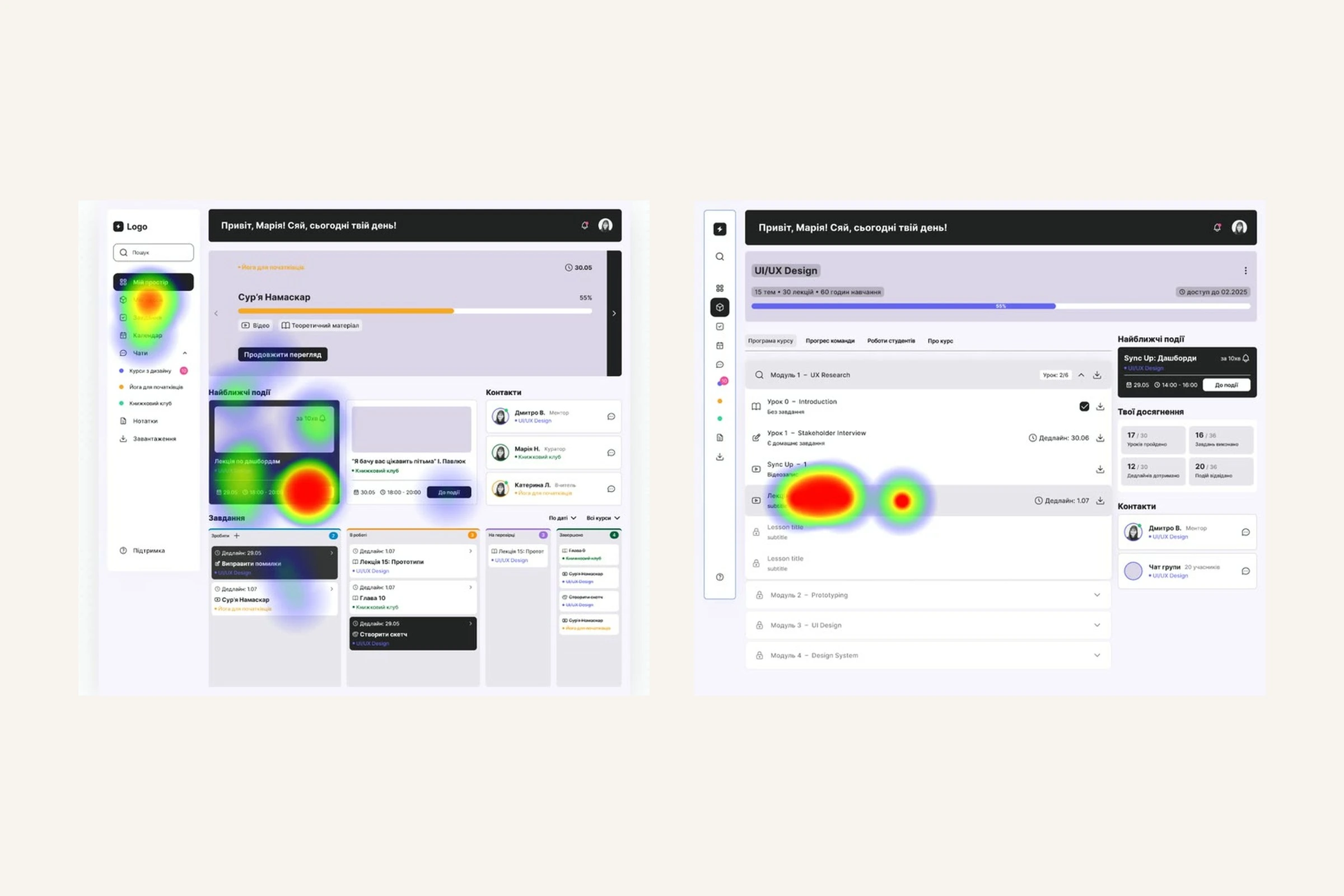
The same screen, 2 paths — 41.7% and 83.8%
The redesign gave the dashboard one primary action and reduced the rail to icons. A later review against Canva Design School, Squarespace and Teachable found a gap the test missed: there was no way to mark a lesson complete, so the progress bar could not move.
1 page for the full review loop
The weekly flow keeps the lesson, submission, recorded mentor feedback, revisions and resubmission on one page.
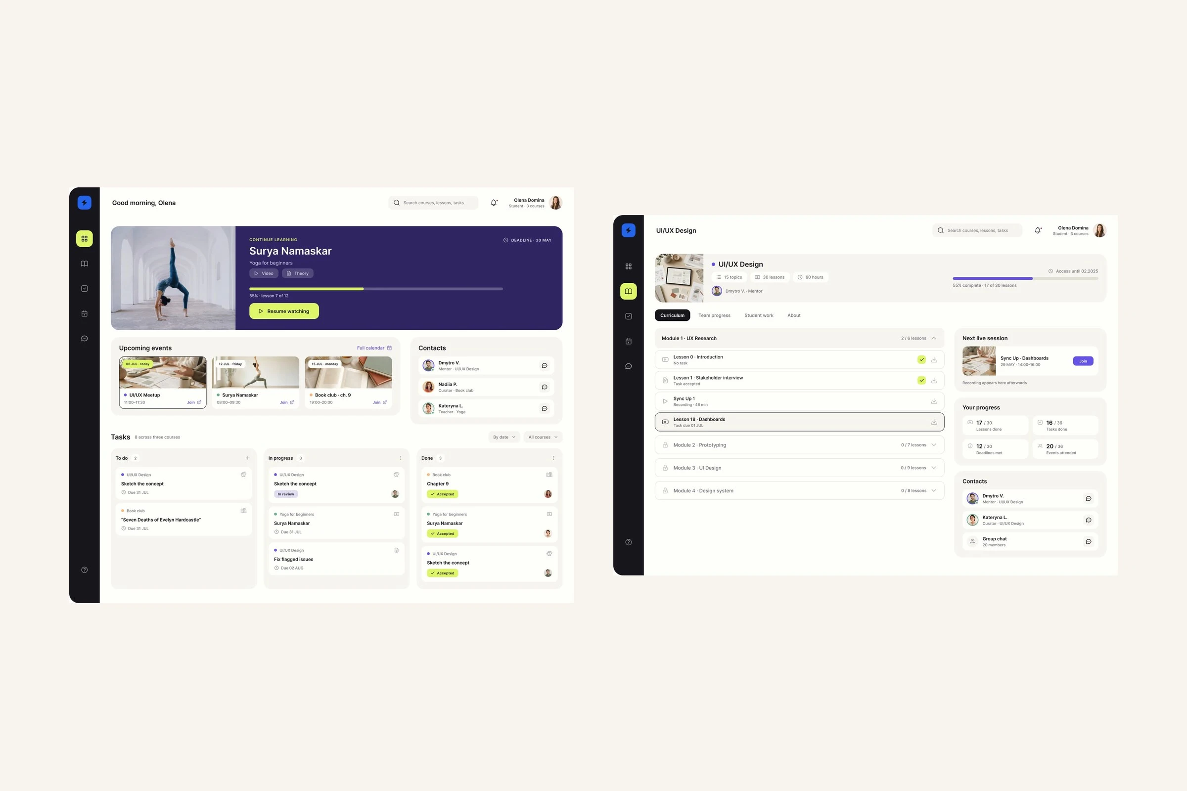
Open my space → open the course
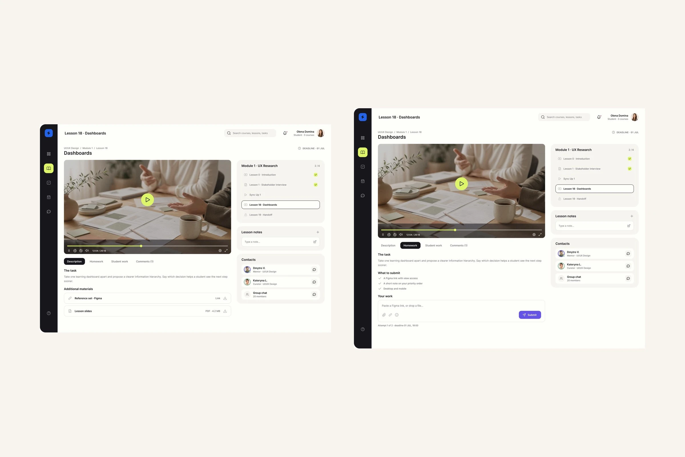
Enter the lesson → submit the work
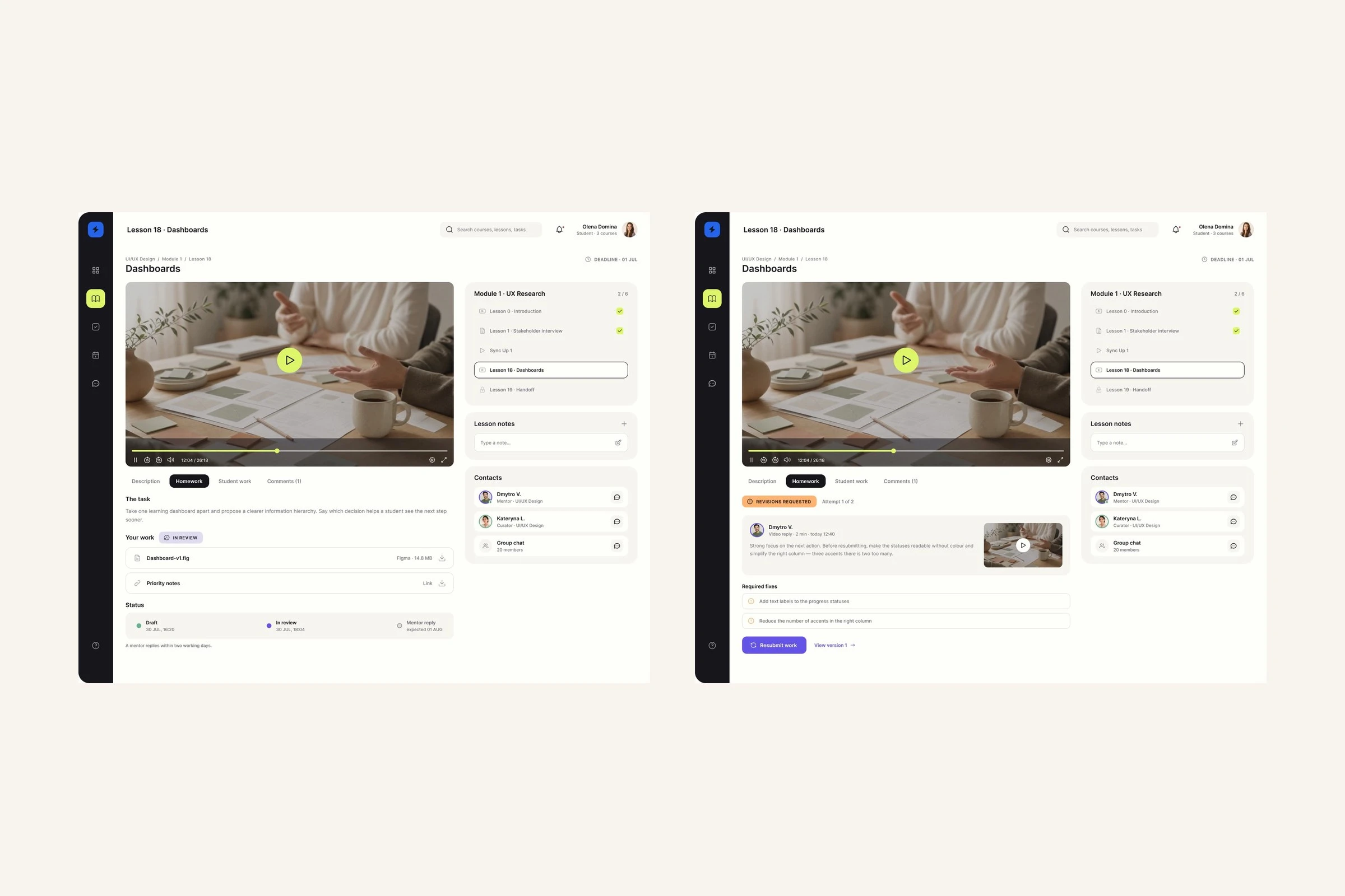
Mentor’s critique → fix it and resubmit
Keep completed courses useful
Students can reopen a completed course, review its details, compare group progress and browse work from one lesson.
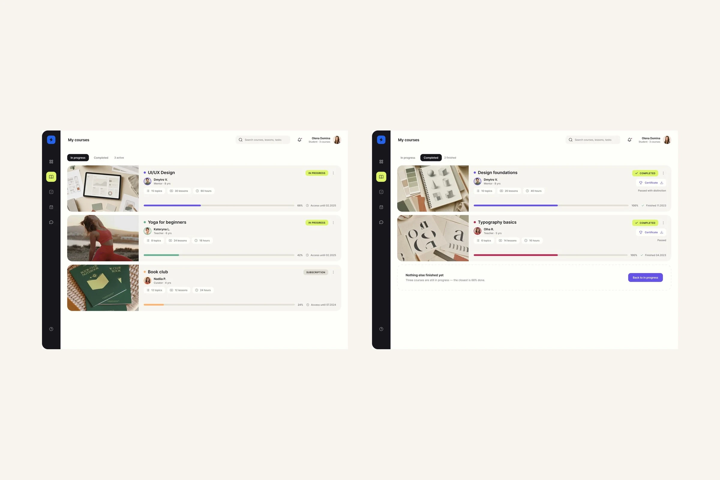
Open my courses → switch to completed
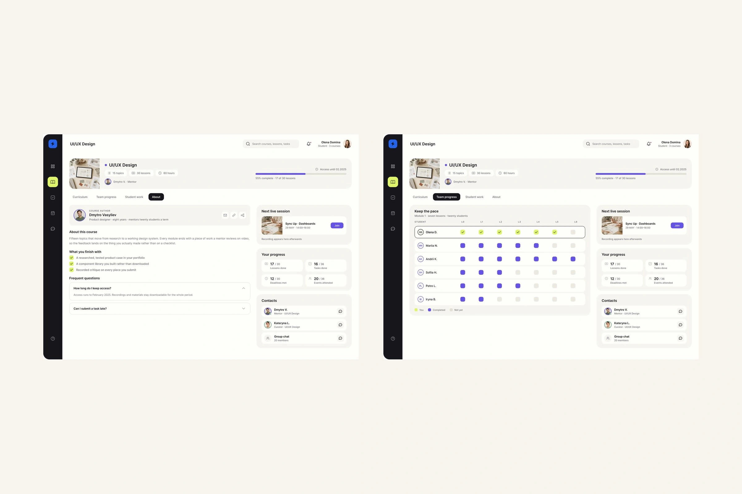
Recover the context → check team progress
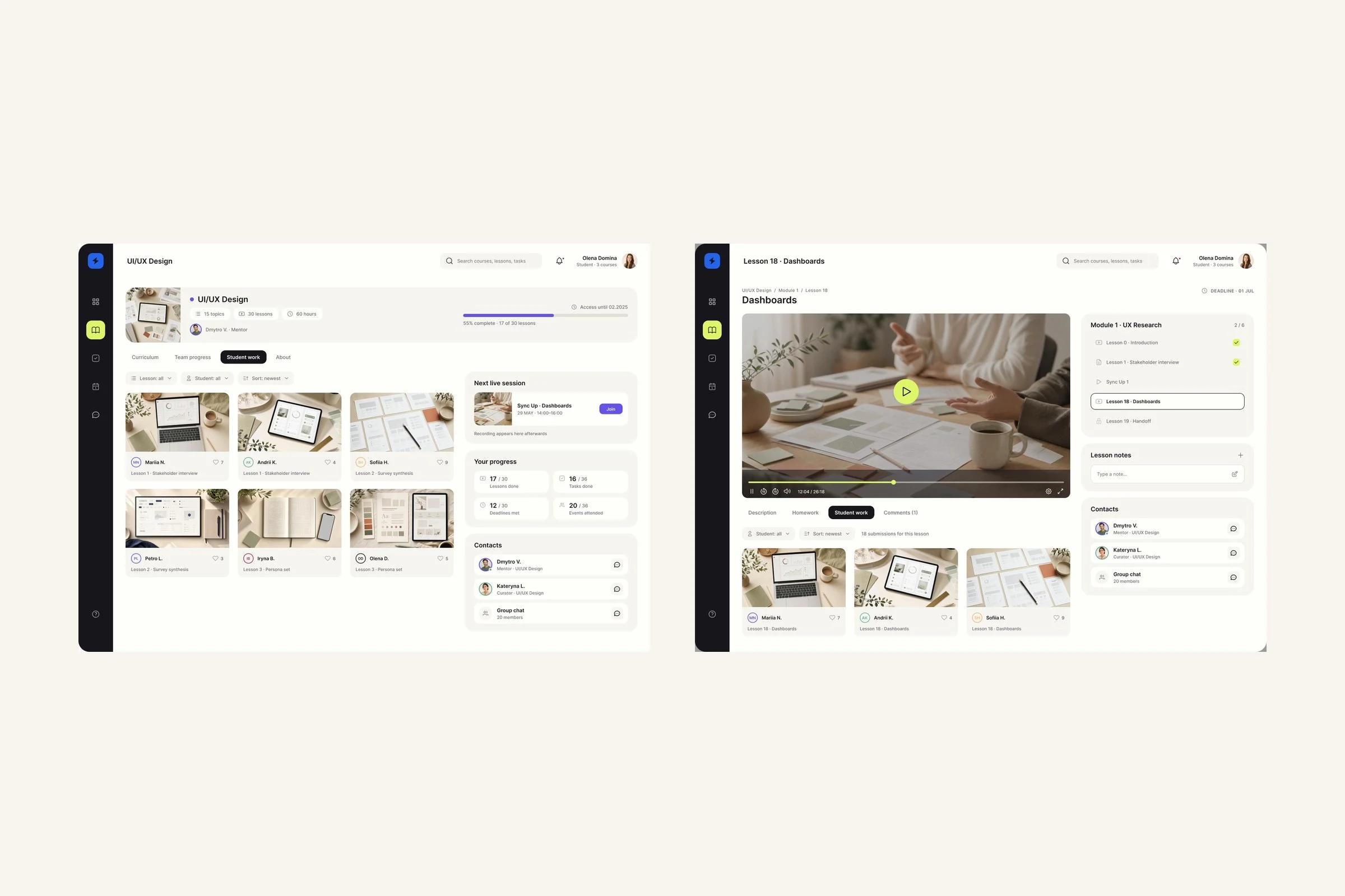
Browse student work → open 1 lesson’s answers
Outcome
The concept brings material, deadlines, submissions and mentor critique into 1 environment instead of 2 tools. None of the benchmarked platforms carried the full lesson → homework → recorded critique → revision → resubmission loop.
6 months, from February to August 2024, took the project from a stakeholder interview to a tested prototype. This concept ended at a tested Figma prototype; there was no engineering handoff.
0 likes · 0 views · Nov 9, 2026
A learning platform that keeps lessons, homework and mentor feedback in one place. A Maze usability test led to a dashboard built around 1 primary action.
Timeline
Feb 1, 2024 - Aug 31, 2024

