iOS App Lauch
Overview
Snug was an idea I had back in 2015. Because I love cohesion and and particular aesthetics, I was frustrated that I couldn't plan how my Instagram feed would look before I posted my pictures. I took the idea to my business partner and developer, Lewis, and we set about coming up with an app that would pull in your existing Instagram feed and allow you to add, move and delete new posts to see how they would look before you committed to sharing them.
App Design
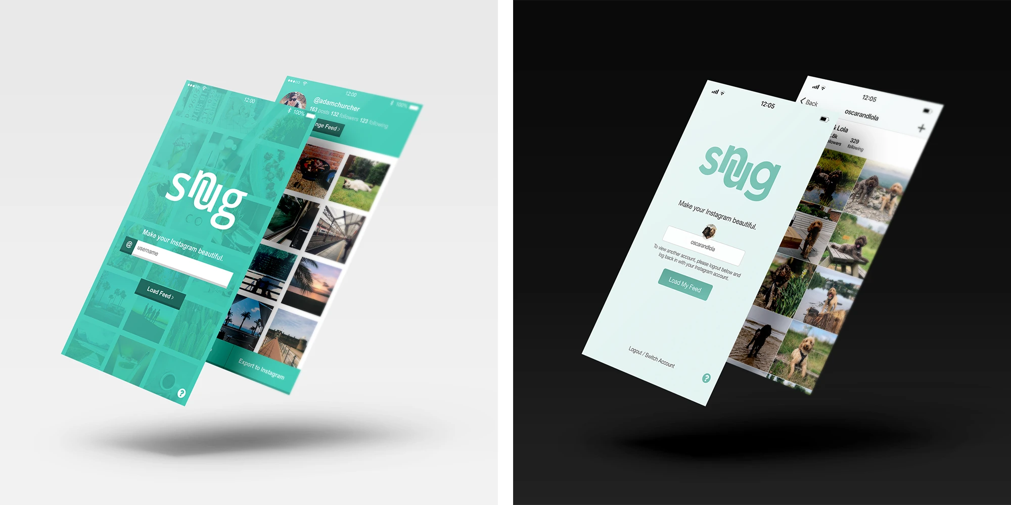
The app is incredibly simple, comprising of just a few screens. The design was intended to be user-friendly, simple and to-the-point. We originally developed Snug with its own brand identity taking the forefront, including a mint green palette. Over time, the app began to assimilate with the direction Instagram were taking, with a move to white space and focus on the user's content itself.
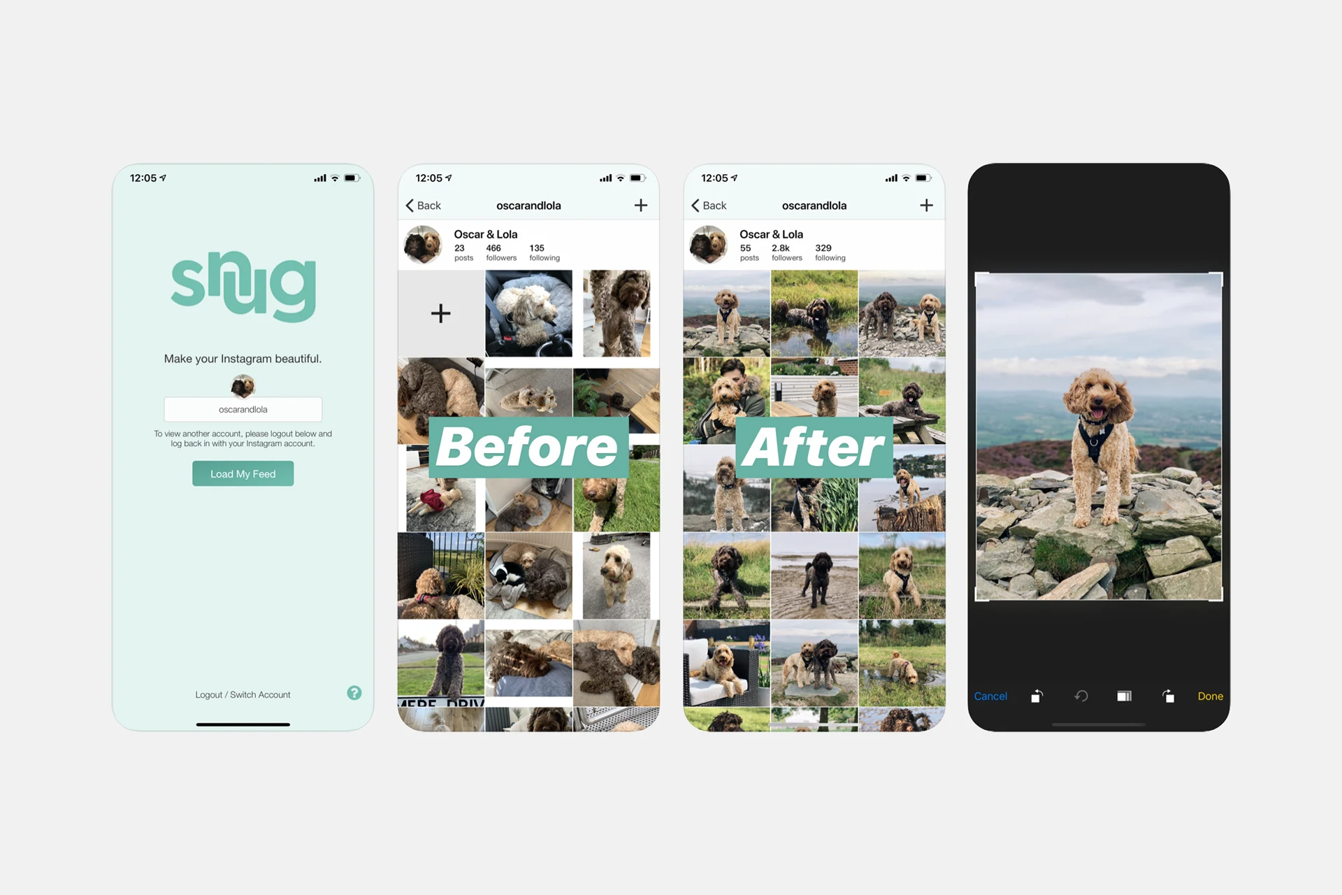
Snug was the first app of its kind, dedicated solely to organising your feed. It wasn't a hashtag generator, post scheduler or editing app. It gained traction slowly over the course of a year and the app started getting picked up by YouTubers and the first wave of "influencers."
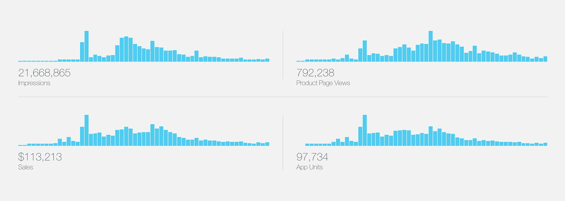
By October 2016, Snug hit 1.5 million impressions a month and we landed in the Top 20 of the Photo and Video category on the US iTunes store.
Sales & Performance
Snug has passed $100,000 in sales on the App Store, a huge milestone for an idea that was created purely to fulfil a personal need. We also have huge influencers and celebrities using the app to curate their own feeds, including Christina Aguilera, Usher, Demi Lovato and Zayn Malik.
We've made a number of incremental updates over the years, with the app resting in its current form after Instagram's own redesign. Lewis continues to maintain the app, and we continue to push out relevant updates to ensure that Snug runs smoothly.
Like this project
Posted Feb 24, 2021
Likes
0
Views
34


