SaaS Visual Commerce Platform
Overview
Fetch was a business-facing SaaS product that aimed to empower brands to utilise and monetise user-generated content (UGC) posted by their customers on various social media platforms.
The SaaS Concept
Fetch came to fruition over a number of years. The product itself had a number of facets that we conceptualised and eventually developed to serve brands, not only in using images of their products and services posted on social media, but gaining permission from the content creators and eventually monetising that media.
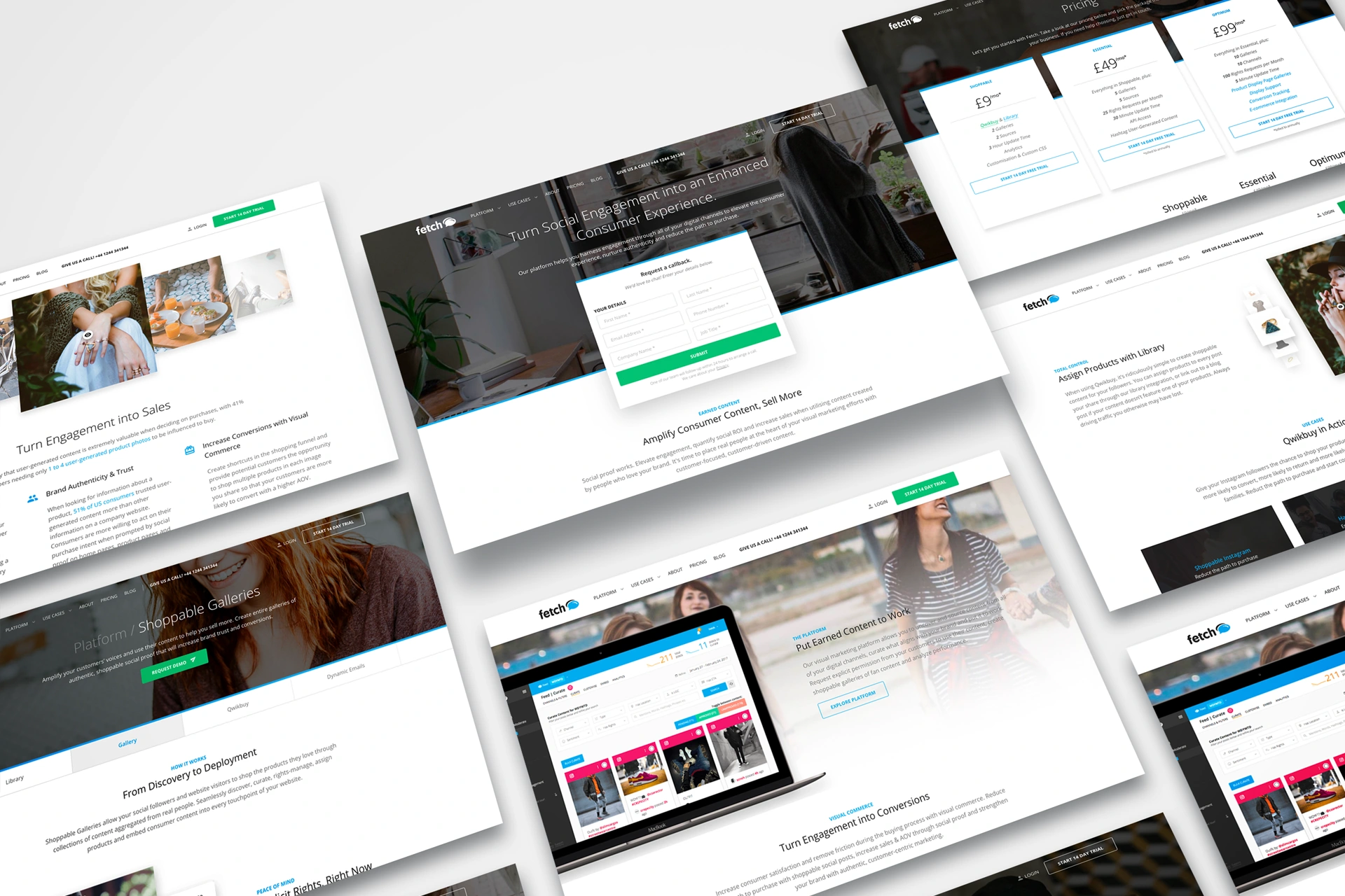
The Fetch web-application contained a number of features that had to link together to create an overall seamless experience for the end-user. Some of those features included content curation, rights management, shoppable galleries and dynamic emails. All designed and developed from the ground up, in-house.
I was responsible for not only the UX and UI of the app itself, but the website, press kit, marketing and content collateral, social media management, client procurement, account management and overseeing day-to-day operations.
Brand Development
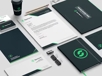
Part of the challenge to bring Fetch to life was to create a brand identity that encapsulated what we were trying to achieve. Everything from the logo, to the typography and colour palette was explored in detail to ensure a well-rounded end-to-end experience for the users we were targeting and the industries they frequented.

The Fetch brand went through an overhaul early on in its development, pivoting from the purple and event-focussed identity we developed initially, to a clean, blue and software-centred outlook. The rebrand kept the logo itself, but we transitioned the colour scheme, typography, iconography and marketing collateral to fall in line with the latest version of the product itself.
Product & UI Design
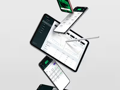
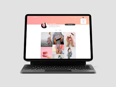
I designed both the Fetch product and website. The product had to be a consumer-focussed, user-friendly SaaS experience that executed the functionality of what we were trying to achieve with minimal-to-no disruption to the user, despite the complexity of what we were trying to achieve.

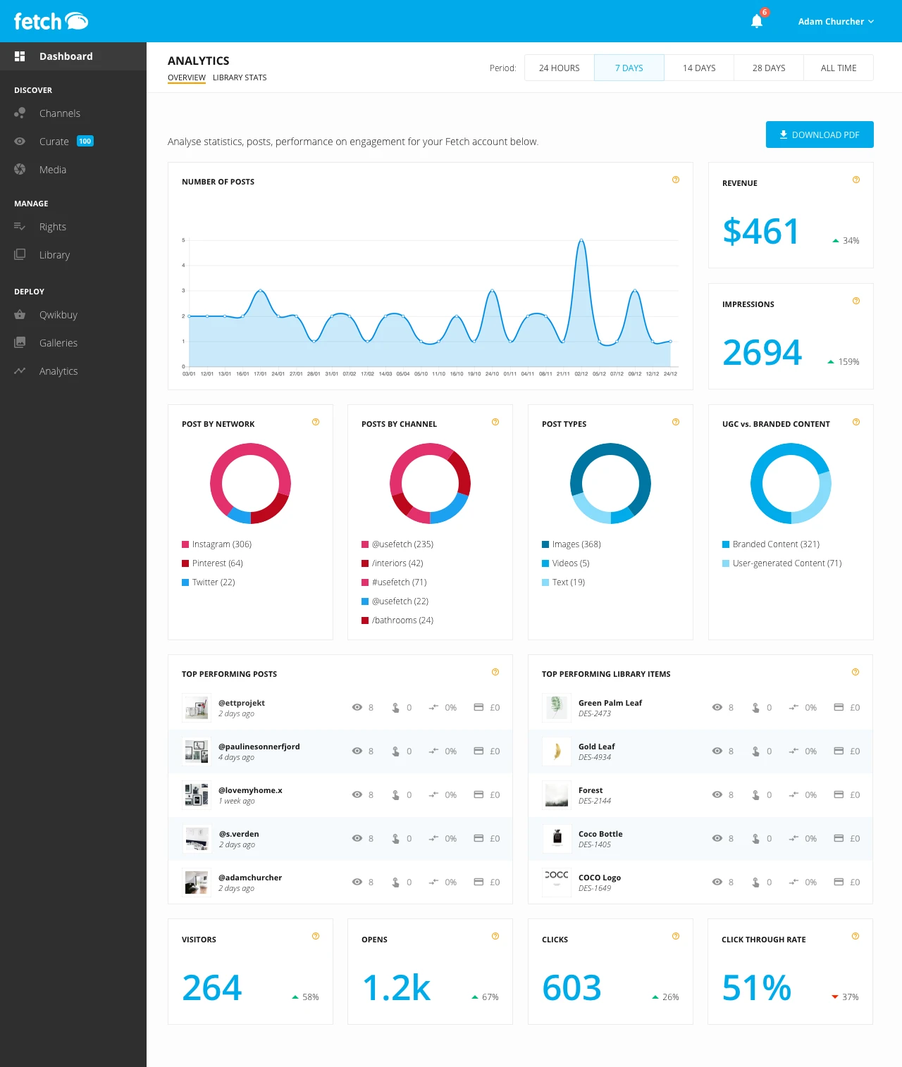

As with any project, we came up against all sorts of issues during the design and development of the service, particularly within the user-experience and how we translated the functions and features we needed into a robust, user-friendly design. We were successful in overcoming these challenges through discussion and research, leading us to develop a multi-version, multi-design application used by a number of successful clients.
Noteable Clients
Fetch has powered a number of UGC-focussed campaigns for clients, including Photobox's Gifty Grotto. The Gifty Grotto pop-up shop opened for a special 1-day only event on November 4 and gave visitors the chance create and wrap their very own personalised presents for free.
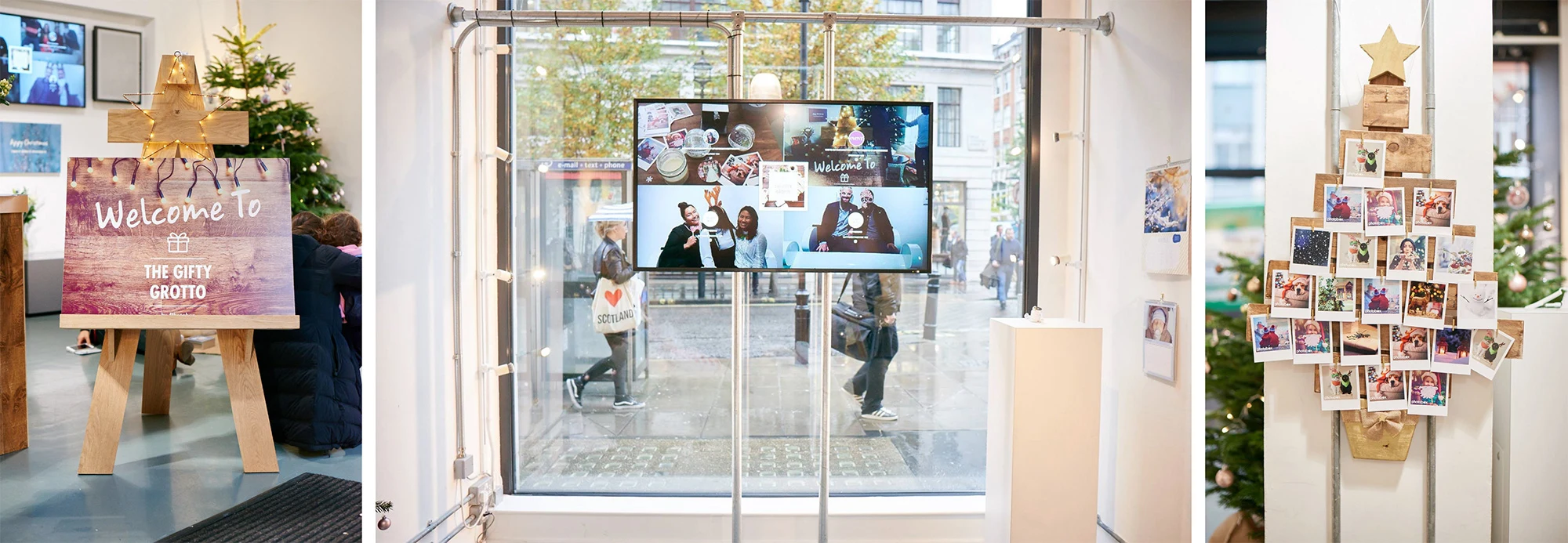
As part of the campaign, shoppers who shared photos of their visit on Facebook, Twitter & Instagram with the hashtag #GiftyGrotto were entered into a competition with the chance to win special Photobox prizes.
Like this project
Posted Feb 23, 2021


