Logo & Brand Identity Design - Health & Wellness | Supplements
The US-Based natural supplement brand requested for a bold, energised brand identity with the use of bold colours to move away from the stereotypical, more clinical look and feel of majority of supplements that we encounter on a daily basis.
I 'stackt' different molecule types to represent the multi-purpose aspect of the brand - being a one stop shop for immunity supplements, as opposed to taking multiple supplements in pill form. I used a luminous Goldenrod yellow tone contrasted with a dark black shade, and utilised the icon as a window into the brand and its ingredients.
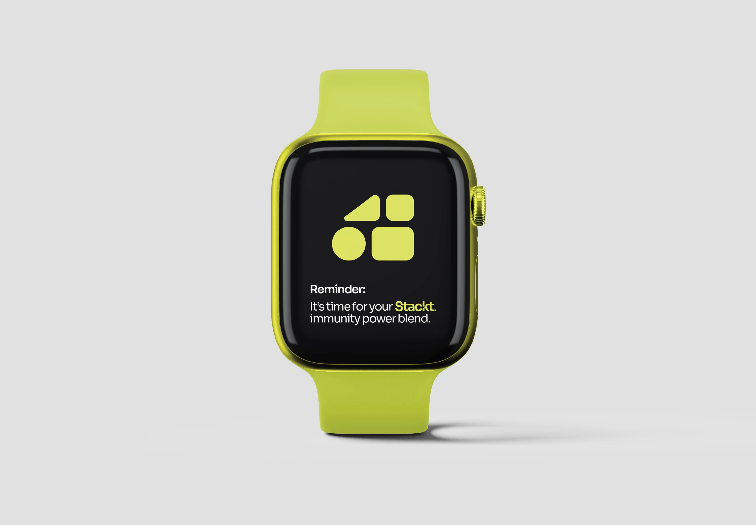
3D Branded Mockup - Fitness, Health & Wellness brand
Horizontal Logo Design - Fitness, Health & Wellness brand
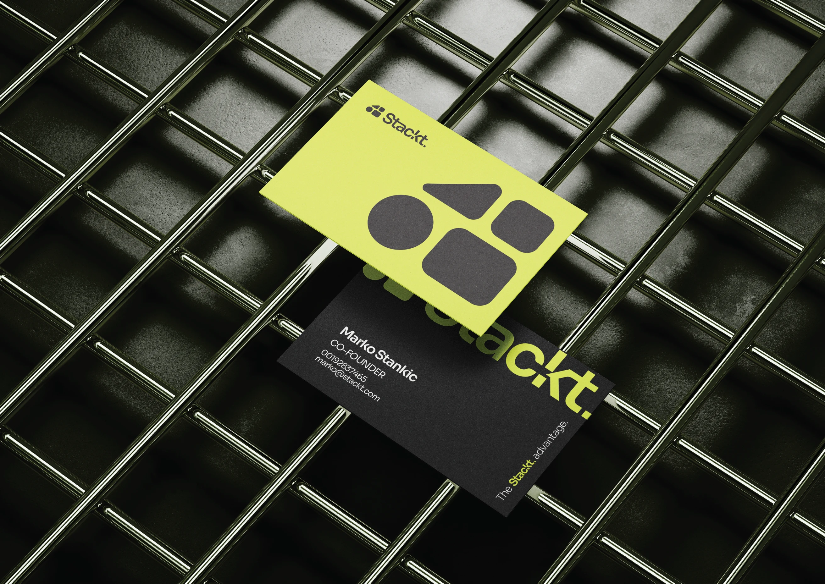
Branded 3D mockup - - Fitness, Health & Wellness brand
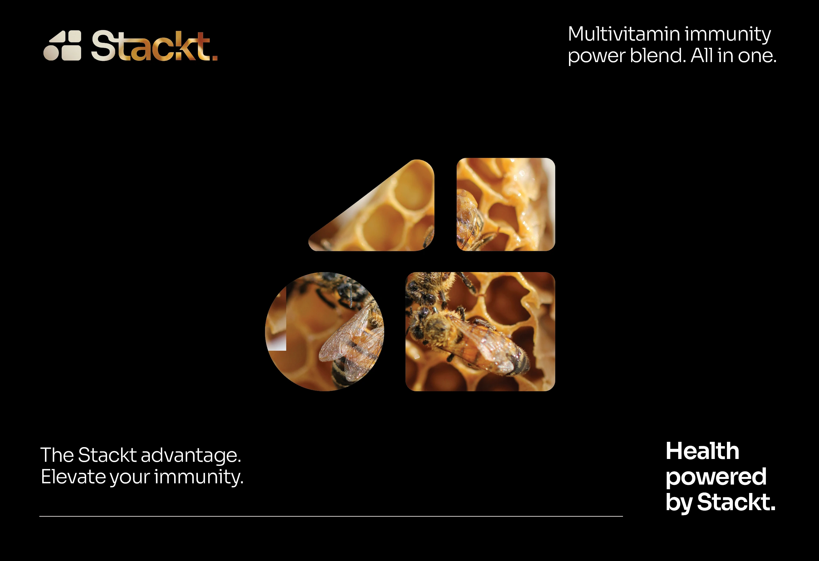
Marketing image - Fitness, Health & Wellness brand
Stacked/ Vertical Logo Design - - Fitness, Health & Wellness brand
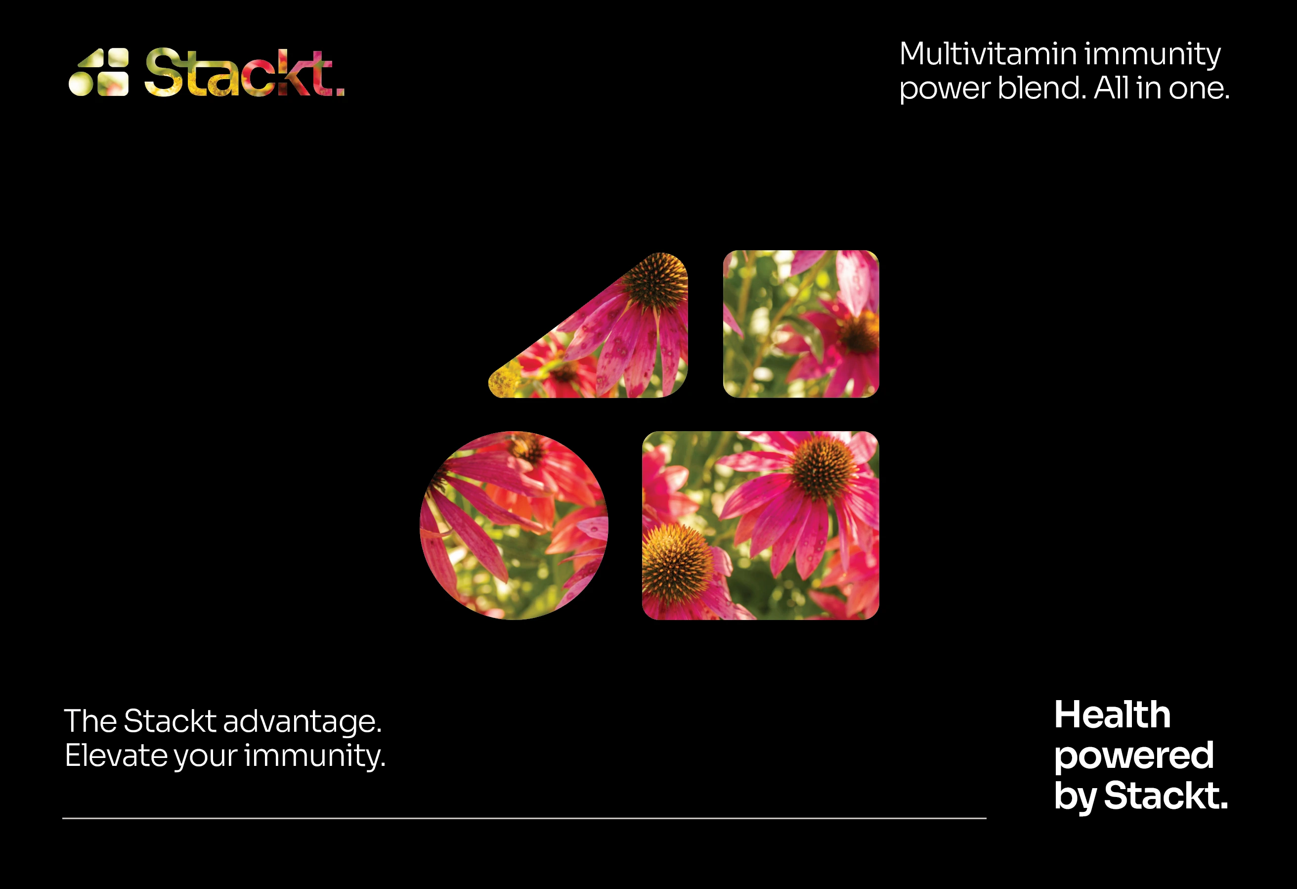
Marketing Image - Fitness, Health & Wellness brand
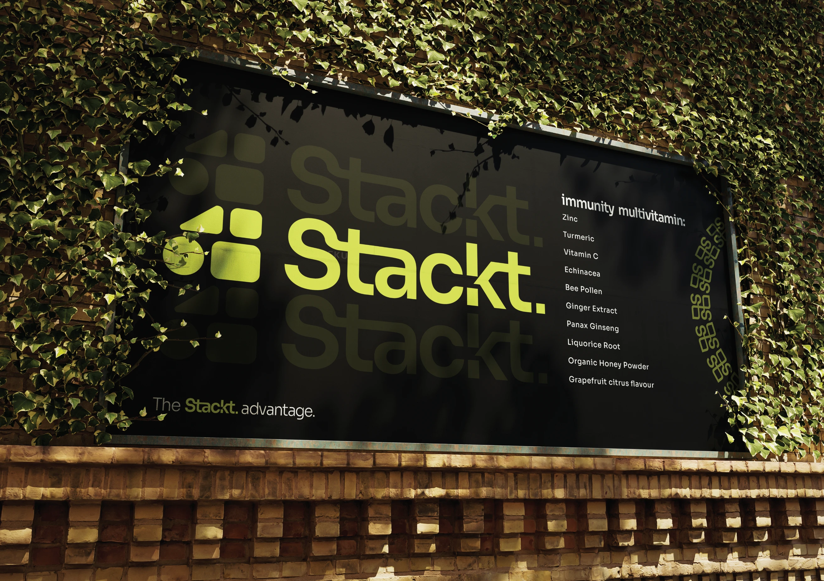
Branded 3D Mockup - Fitness, Health & Wellness brand
Marketing Image - Fitness, Health & Wellness brand
Marketing Image - Fitness, Health & Wellness brand
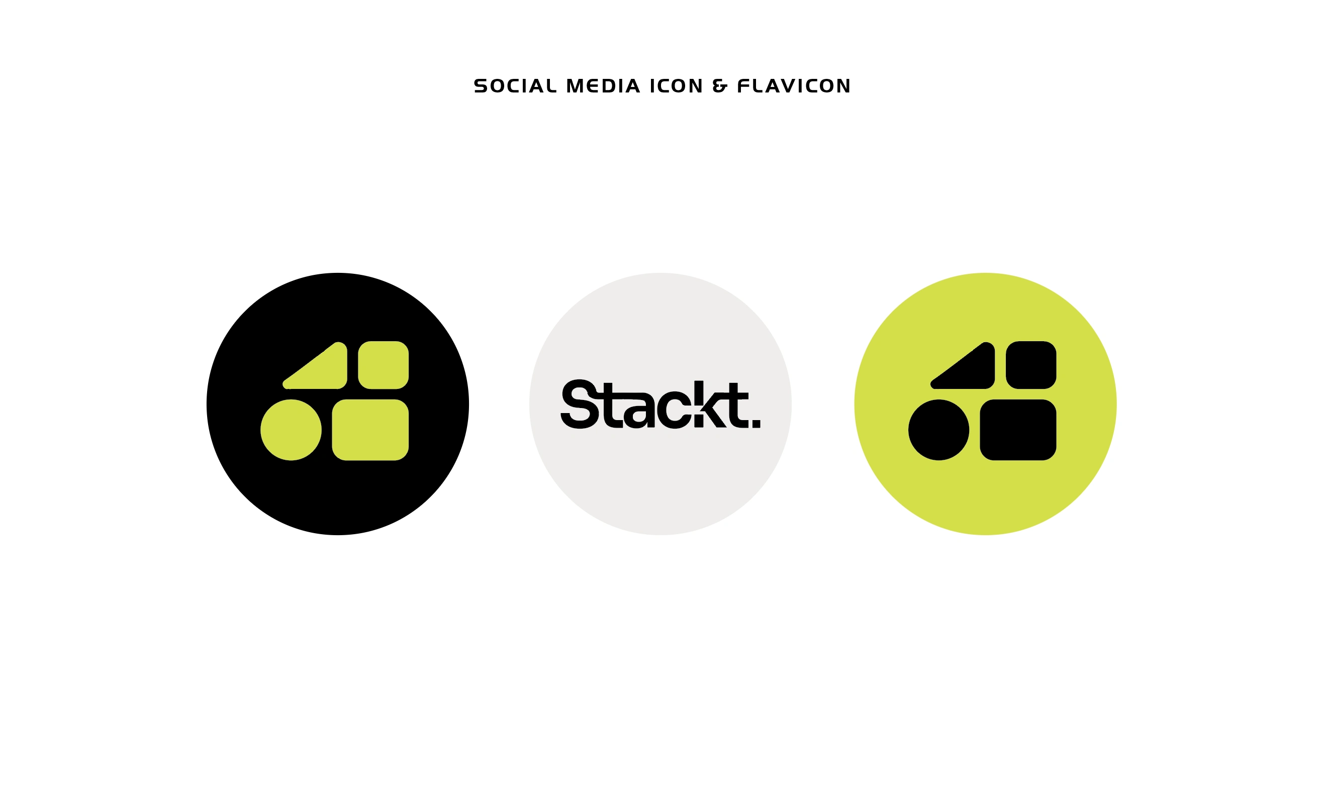
Social Media Icon and Favicon - Fitness, Health & Wellness brand
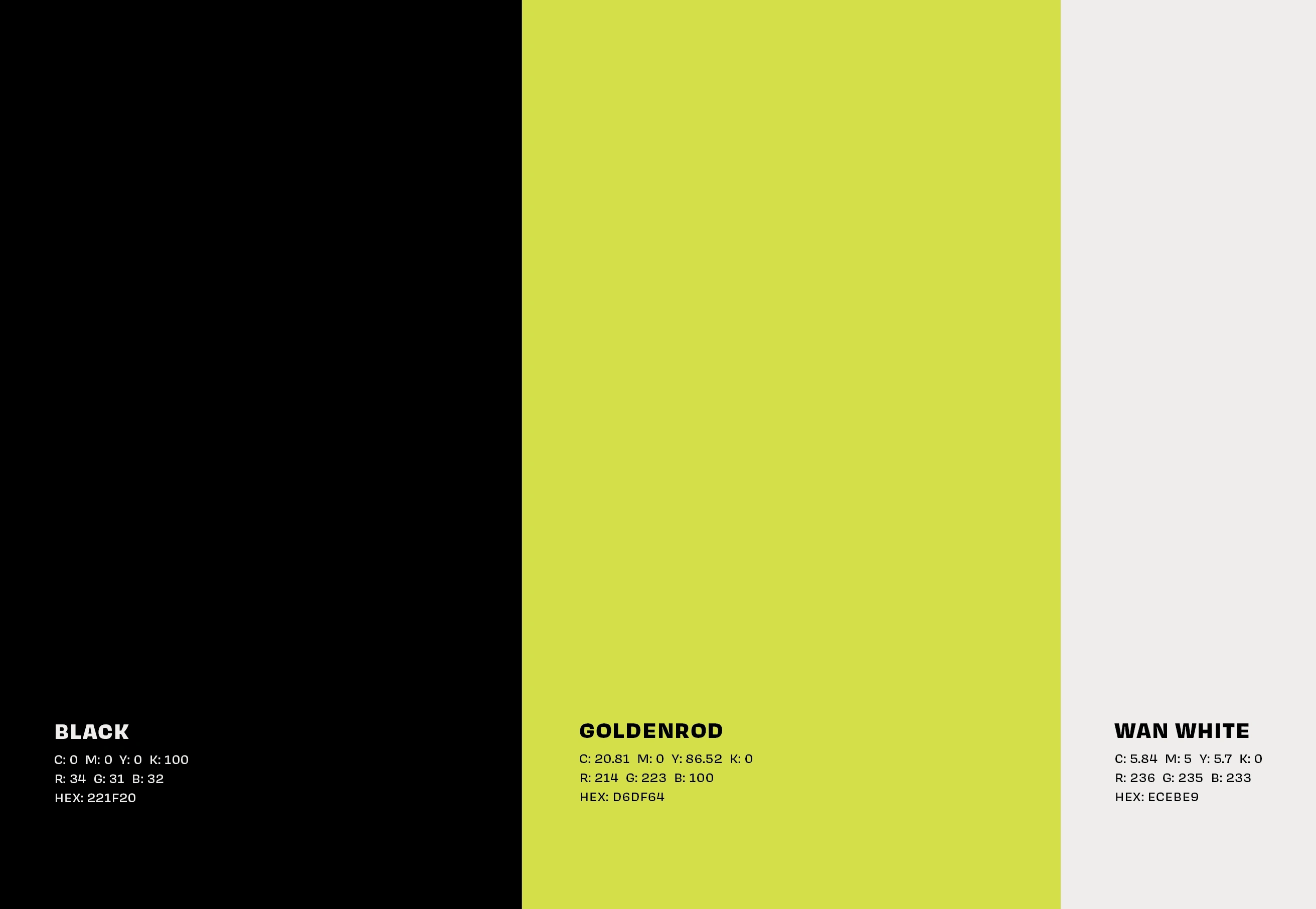
Bespoke Colour Palette - Fitness, Health & Wellness brand
The US-Based natural supplement brand requested for a bold, energised brand identity with the use of bold colours to move away from the stereotypical, more clinical look and feel of majority of supplements that we encounter on a daily basis.
I 'stackt' varying molecule types to represent the multi-purpose aspect of the brand and its unique value proposition - being a one-stop-shop for immunity supplements, as opposed to taking multiple supplements in pill form. I used a luminous Goldenrod yellow tone contrasted with bold black and white shades, and utilised the icon as a window into the brand and its ingredients.
Like this project
Posted Sep 14, 2024
As a step away from the stereotypical, clinical look of most supplements brand, I used bright tones and 'stackt' molecules for the brand's multi-purpose USP.
Likes
0
Views
39
Clients
Graphic Grid

