Logo Design, Brand Identity Brand Design - Luxury Skincare Brand

Naomi Heyes


Logo Design, Logo Designer, Visual Designer, Brand Identity, Brand Identity Design, Branding, , Brand Design, Brand Strategist, Creative Strategist, Brand Guidelines, Graphic Designer, Adobe Illustrator, Adobe Photoshop - RaerEssence, skincare brand, health and wellness
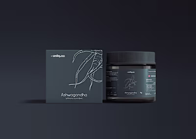
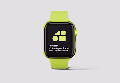
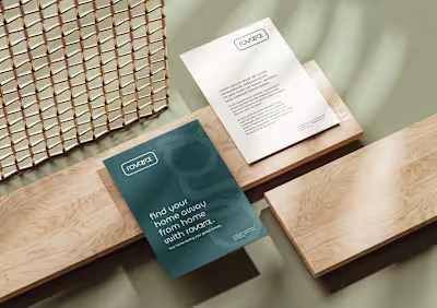
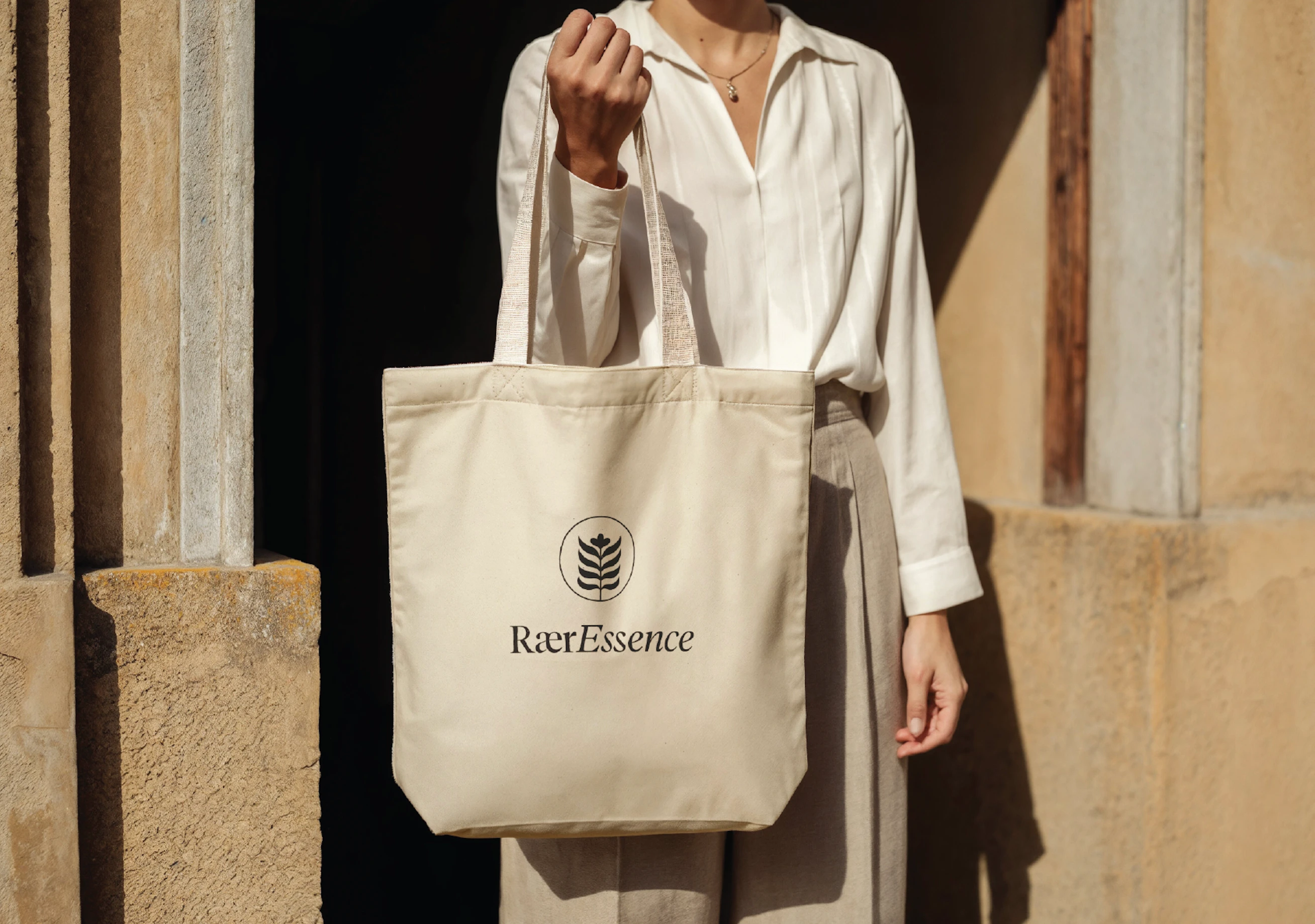
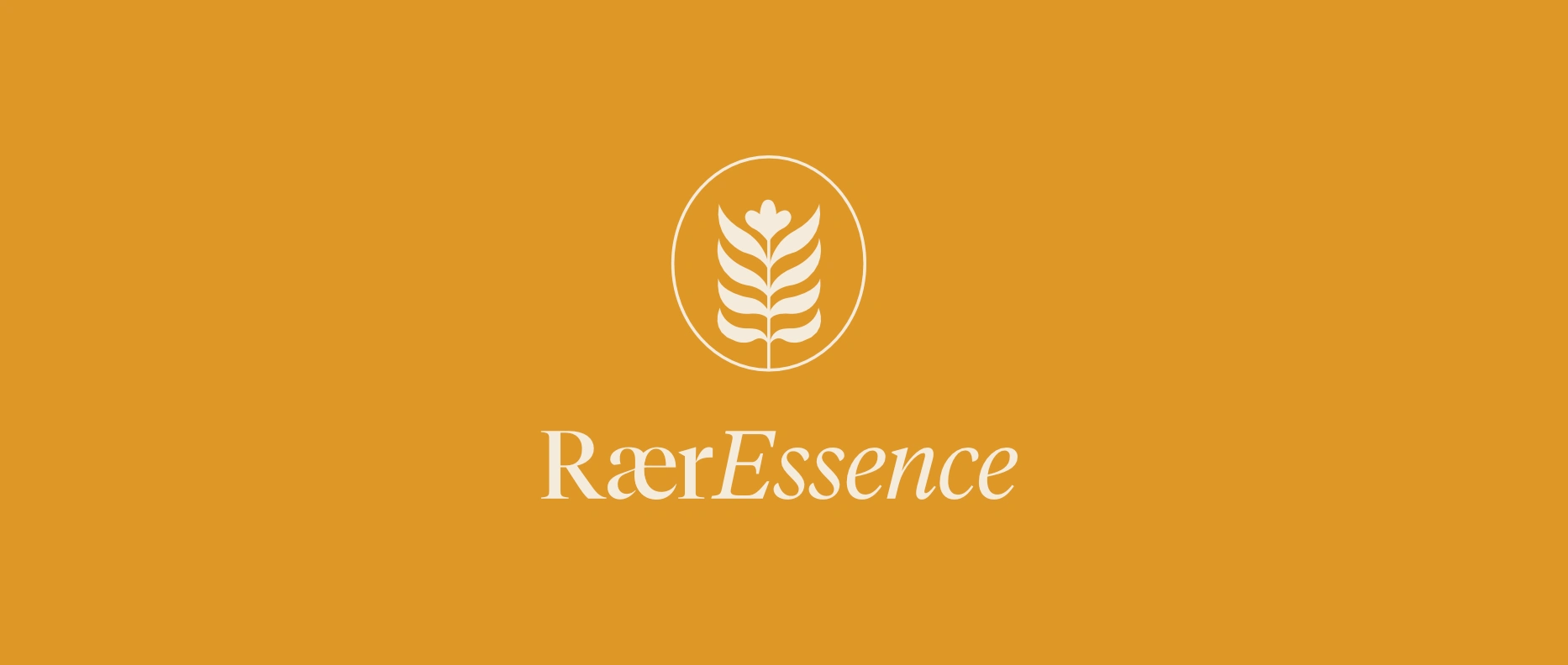
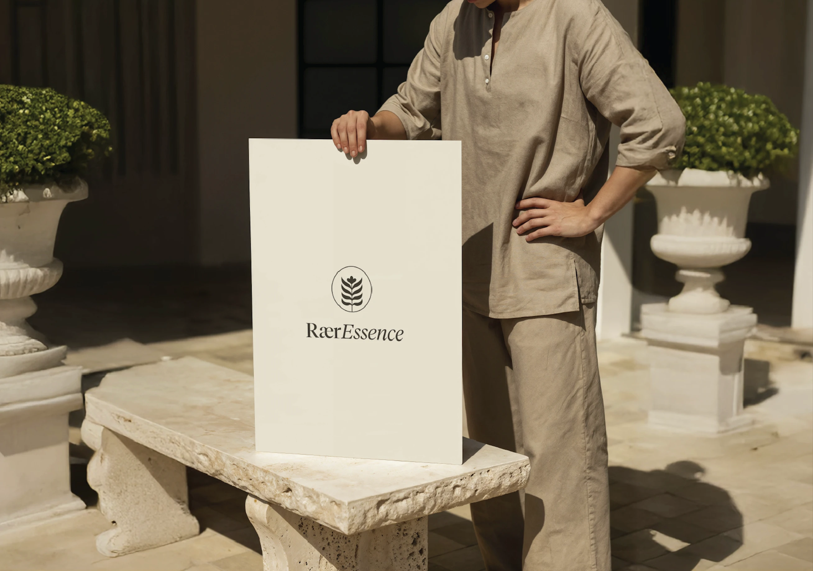
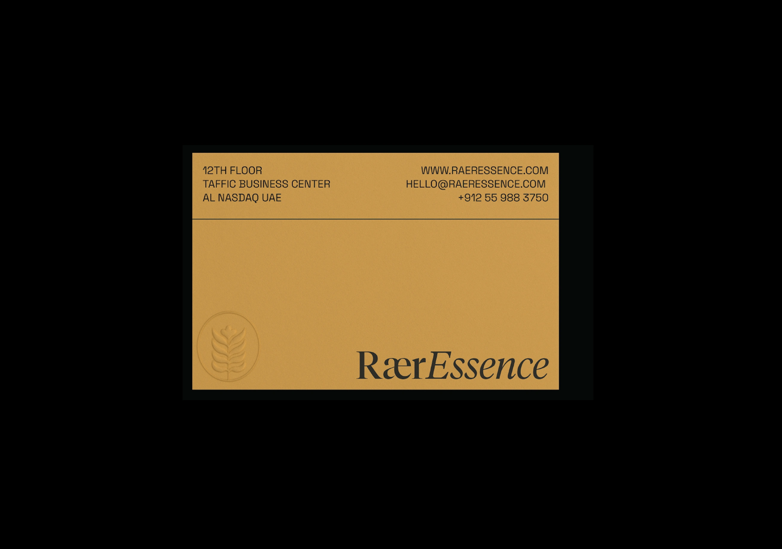
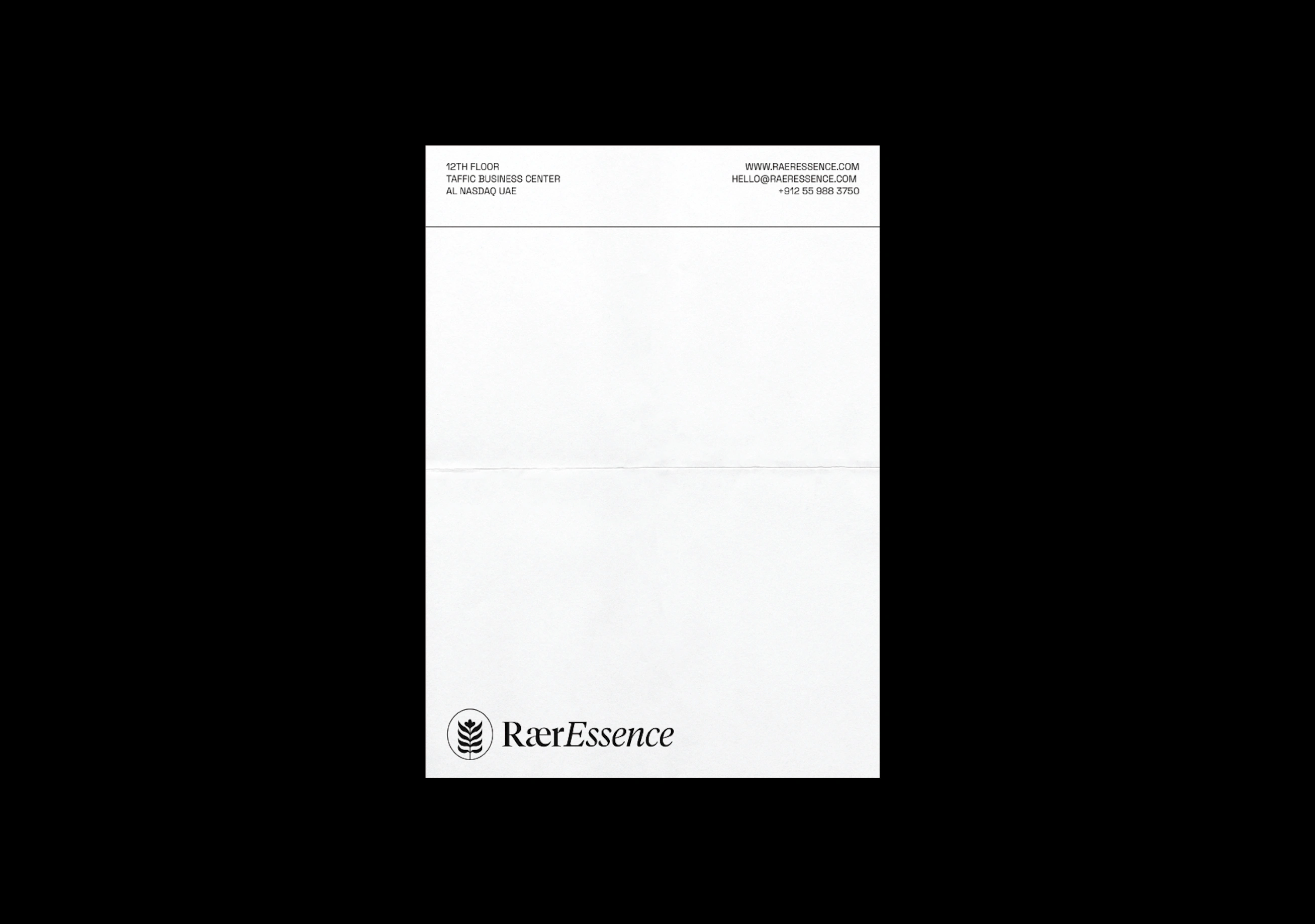
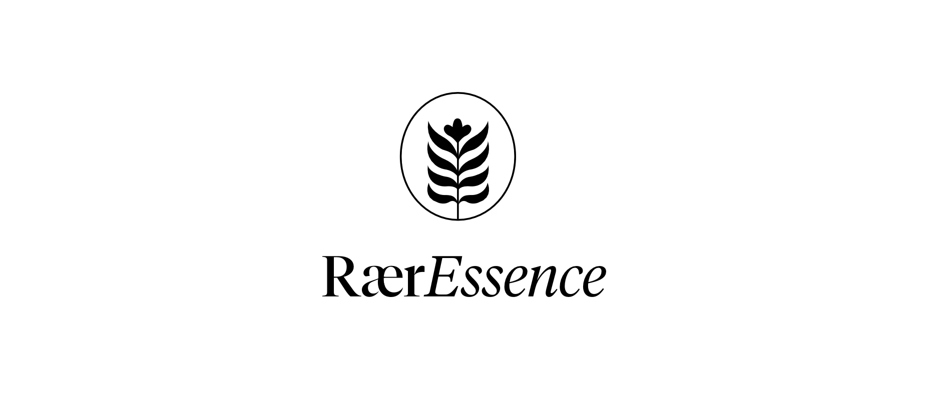
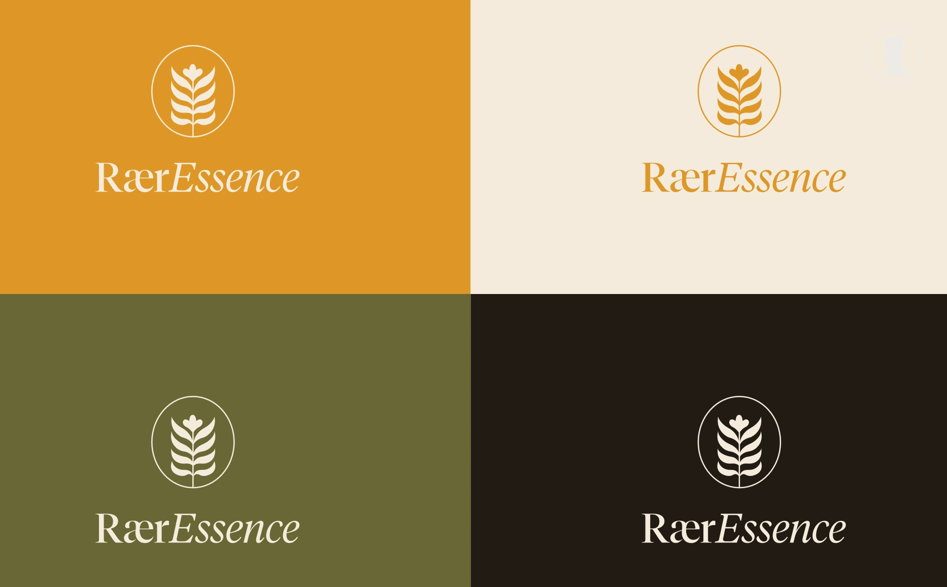
For RÆRESSENCE, I developed a logo design and brand identity that transformed a visionary startup into a confident, premium wellness brand ready to launch.
The challenge was to capture the brand’s duality - scientific integrity and sensory luxury - in a way that felt elevated yet approachable in its branding. Through strategic positioning, refined typography and a restrained, sophisticated colour system inspired by natural minerals and light diffusion, I built a robust brand identity that communicates purity, depth and quiet confidence in the premium space.
The result is a cohesive, distinctive visual language and brand identity that empowers the founder to enter the luxury skincare market with clarity, consistency and branding presence that feels at home among global leaders in the competitive global skincare market.
Logo Design, Logo Designer, Visual Designer, Brand Identity, Brand Identity Design, Branding, , Brand Design, Brand Strategist, Creative Strategist, Brand Guidelines, Graphic Designer, Adobe Illustrator, Adobe Photoshop - RaerEssence, skincare brand, health and wellness
Logo Design, Logo Designer, Visual Designer, Brand Identity, Brand Identity Design, Branding, , Brand Design, Brand Strategist, Creative Strategist, Brand Guidelines, Graphic Designer, Adobe Illustrator, Adobe Photoshop - RaerEssence, skincare brand, health and wellness

Logo Design, Logo Designer, Visual Designer, Brand Identity, Brand Identity Design, Branding, , Brand Design, Brand Strategist, Creative Strategist, Brand Guidelines, Graphic Designer, Adobe Illustrator, Adobe Photoshop - RaerEssence, skincare brand, health and wellness
Logo Design, Logo Designer, Visual Designer, Brand Identity, Brand Identity Design, Branding, , Brand Design, Brand Strategist, Creative Strategist, Brand Guidelines, Graphic Designer, Adobe Illustrator, Adobe Photoshop - RaerEssence, skincare brand, health and wellness
Logo Design, Logo Designer, Visual Designer, Brand Identity, Brand Identity Design, Branding, , Brand Design, Brand Strategist, Creative Strategist, Brand Guidelines, Graphic Designer, Adobe Illustrator, Adobe Photoshop - RaerEssence, skincare brand, health and wellness
Logo Design, Logo Designer, Visual Designer, Brand Identity, Brand Identity Design, Branding, , Brand Design, Brand Strategist, Creative Strategist, Brand Guidelines, Graphic Designer, Adobe Illustrator, Adobe Photoshop - RaerEssence, skincare brand, health and wellness
Logo Design, Logo Designer, Visual Designer, Brand Identity, Brand Identity Design, Branding, , Brand Design, Brand Strategist, Creative Strategist, Brand Guidelines, Graphic Designer, Adobe Illustrator, Adobe Photoshop - RaerEssence, skincare brand, health and wellness
Logo Design, Logo Designer, Visual Designer, Brand Identity, Brand Identity Design, Branding, , Brand Design, Brand Strategist, Creative Strategist, Brand Guidelines, Graphic Designer, Adobe Illustrator, Adobe Photoshop - RaerEssence, skincare brand, health and wellness
Logo Design, Logo Designer, Visual Designer, Brand Identity, Brand Identity Design, Branding, , Brand Design, Brand Strategist, Creative Strategist, Brand Guidelines, Graphic Designer, Adobe Illustrator, Adobe Photoshop - RaerEssence, skincare brand, health and wellness
Like this project
Posted Sep 14, 2024
I designed RÆRESSENCE's logo design & brand identity that transformed their startup into a confident, premium brand ready to launch in the luxe skincare market.
Likes
0
Views
24
Timeline
Oct 16, 2025 - Nov 1, 2025
Clients
Graphic Grid