BASALQ Logo & Brand Identity Design

Muhammad Abdullah


BASALQ Logo & Brand Identity | Infrastructure Branding
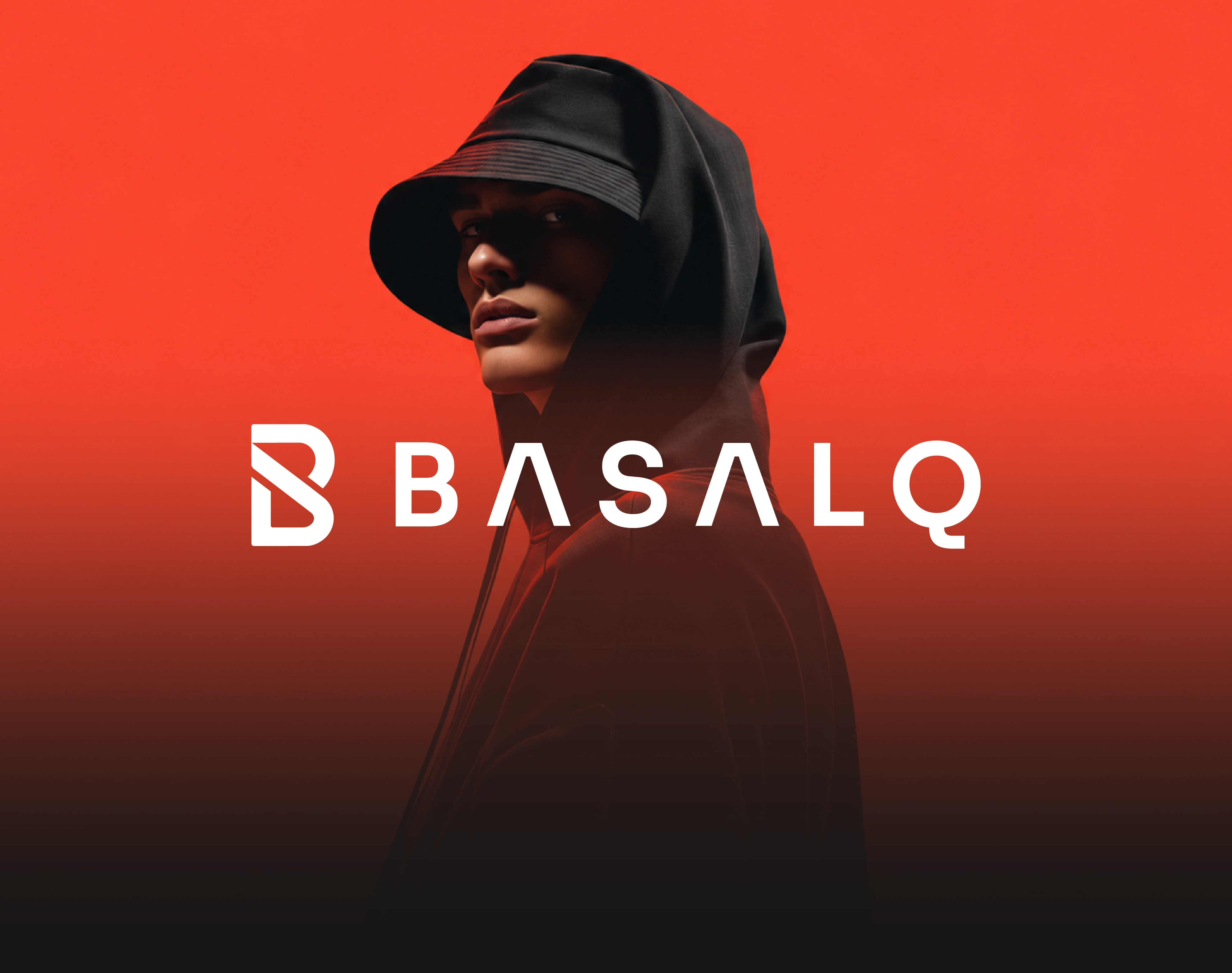
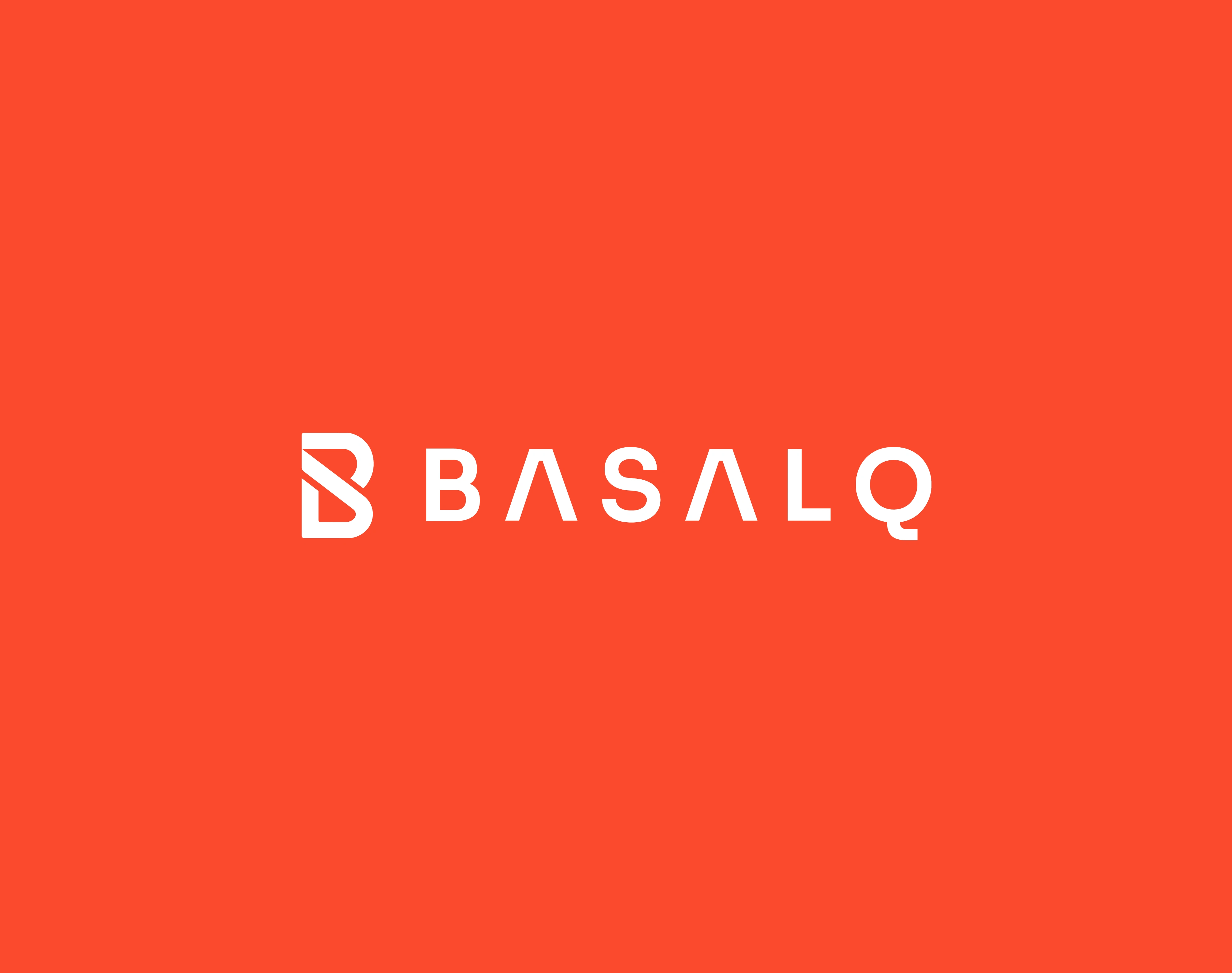
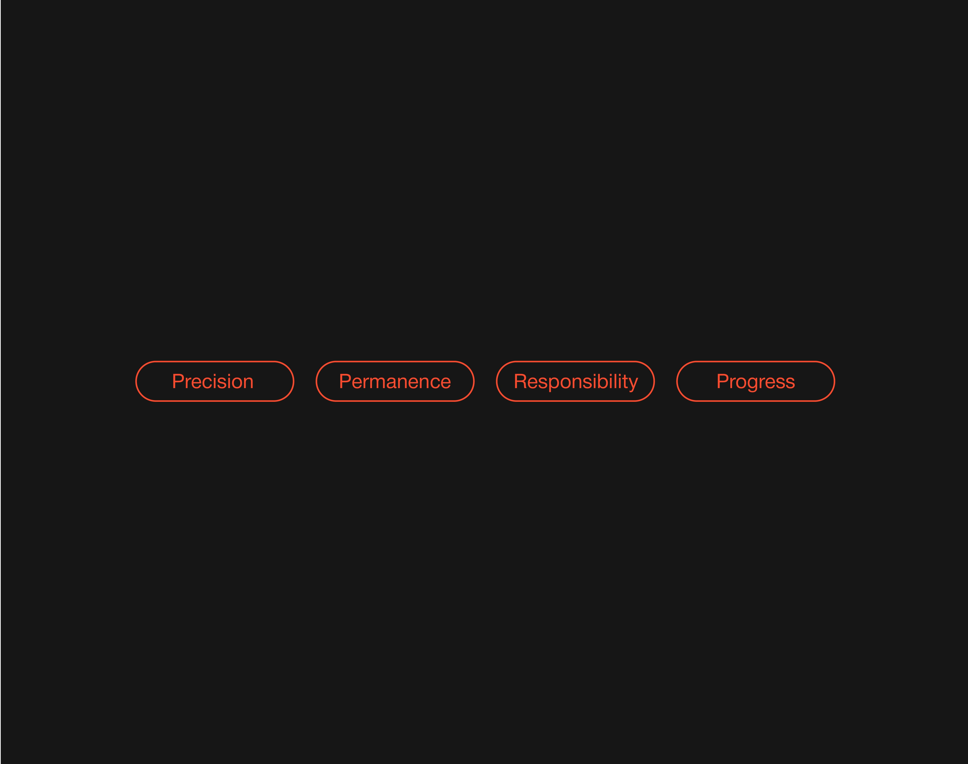
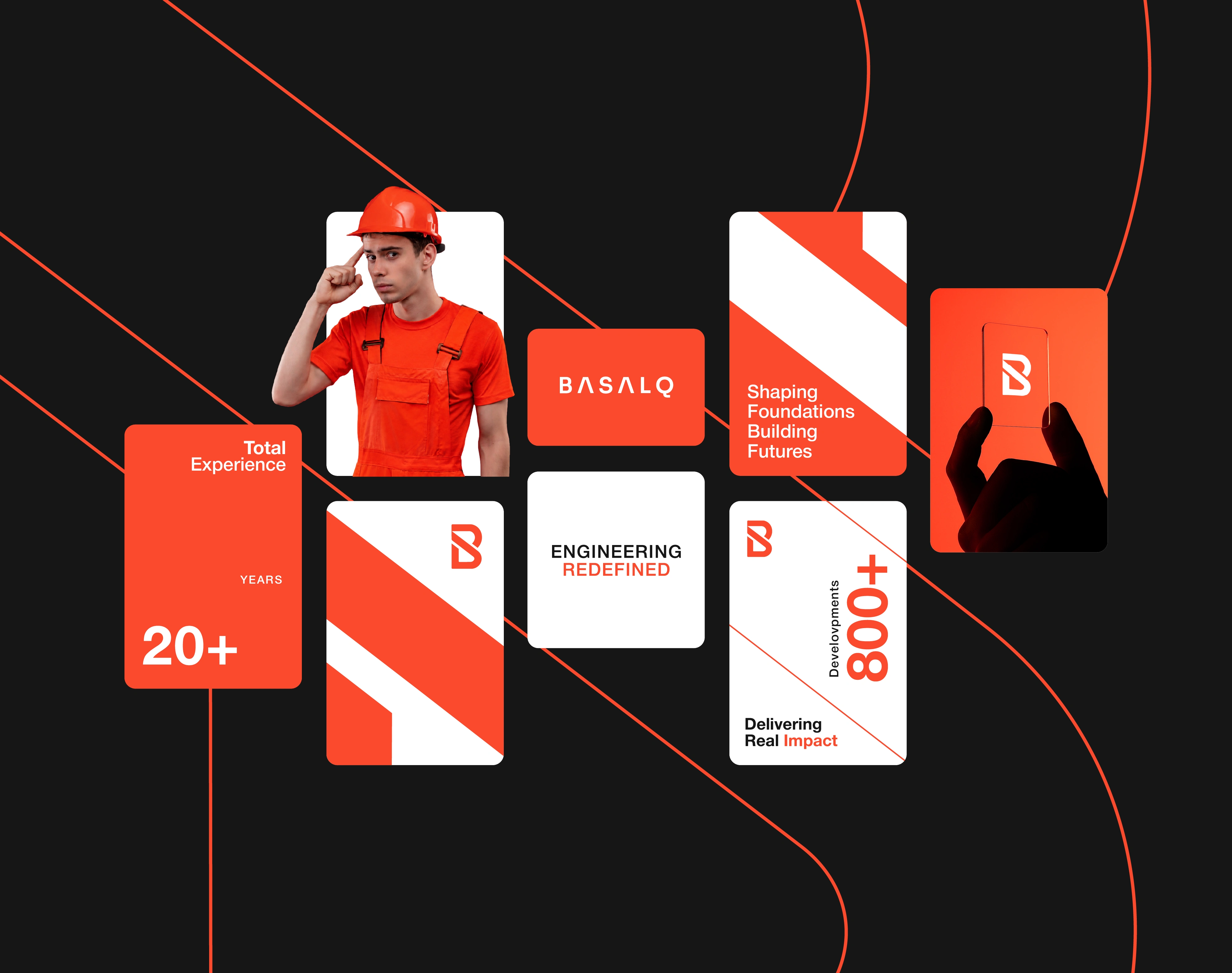
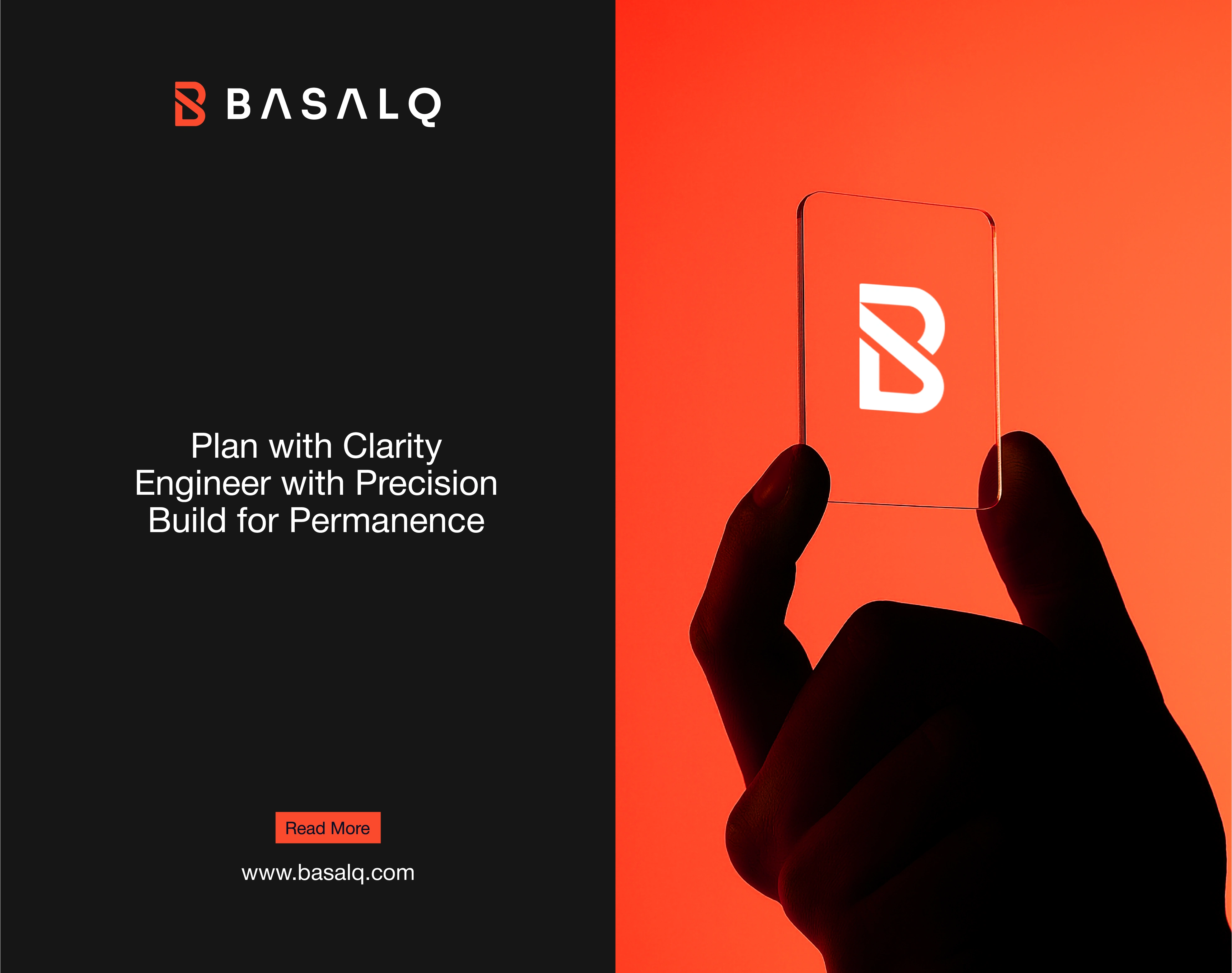
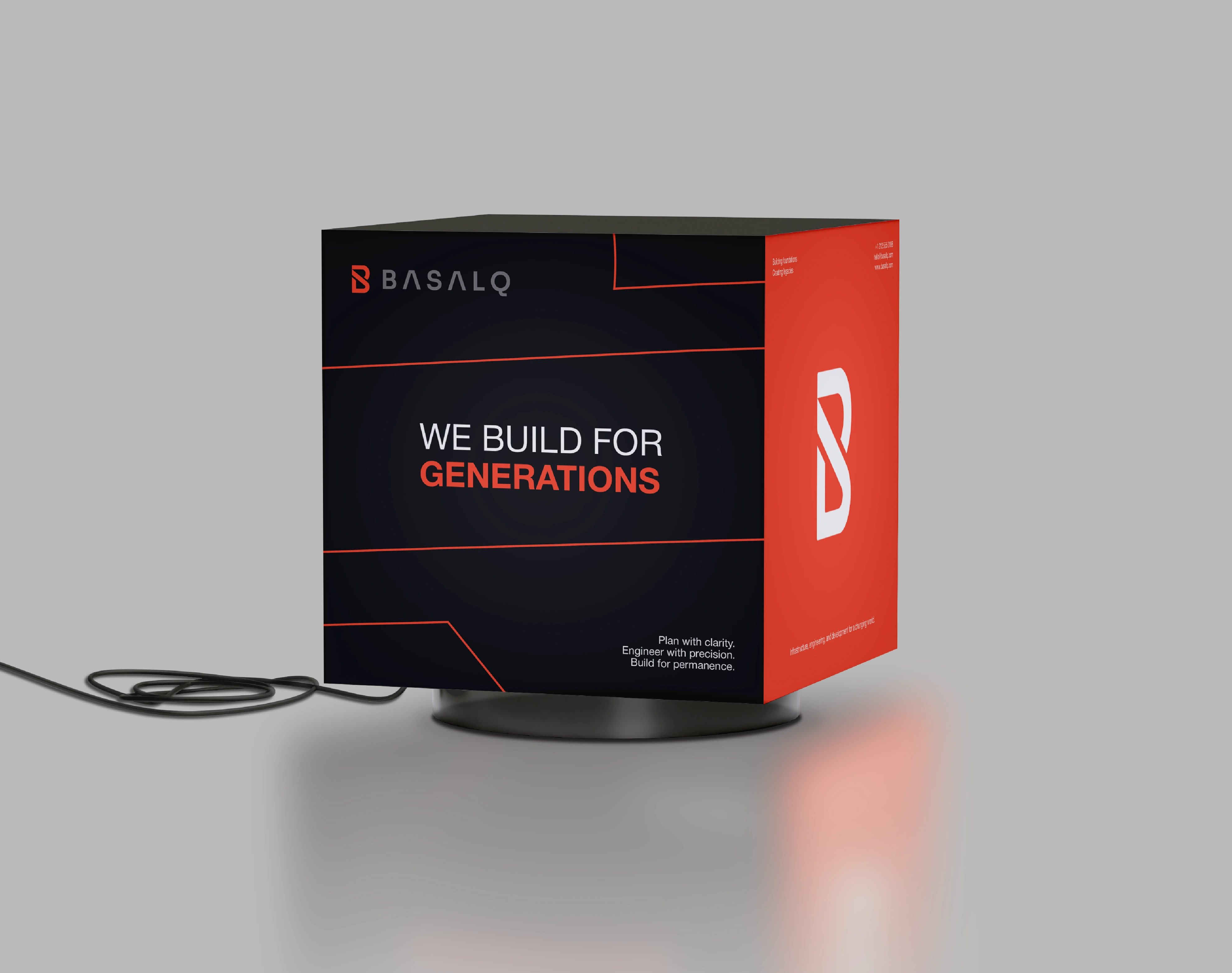
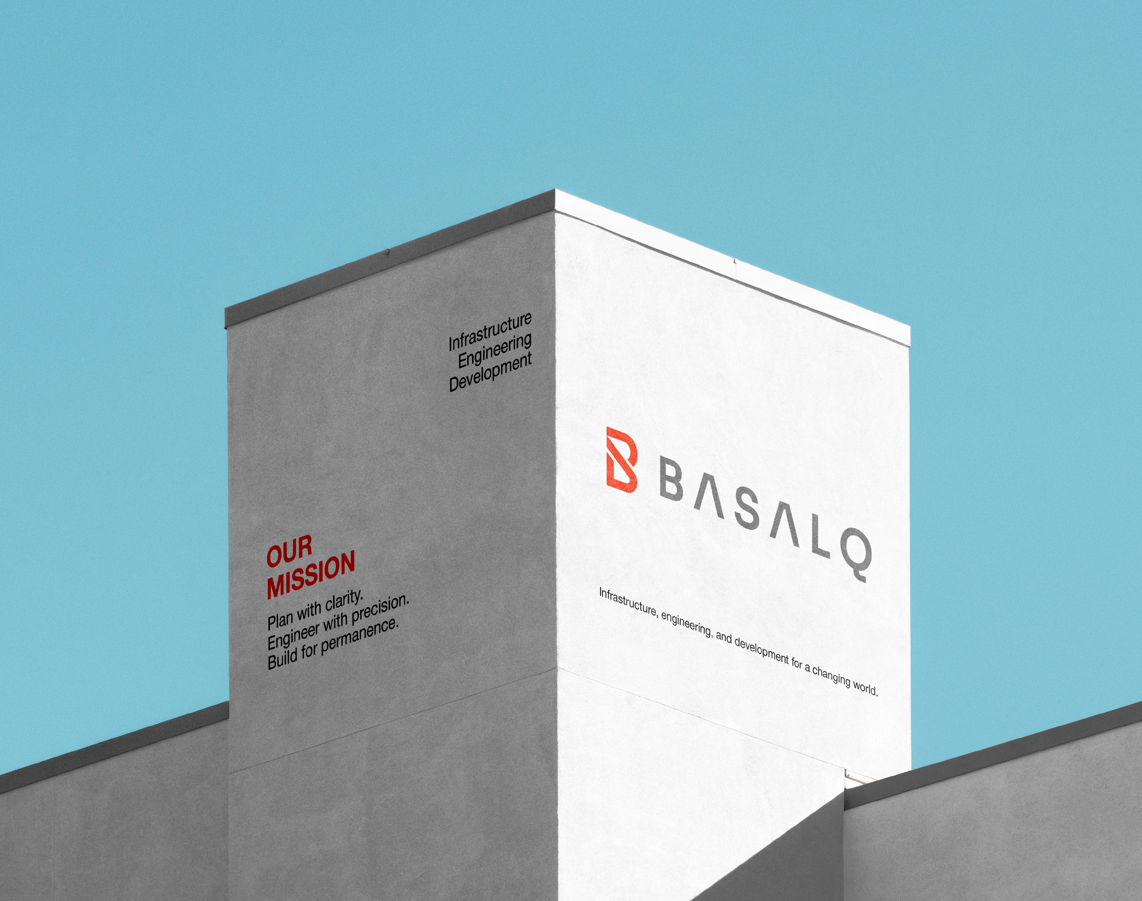
BASALQ Branding is a modern brand identity design project for an infrastructure, engineering, and development company built around strength, precision, resilience, and long-term value. Inspired by the permanence of basalt and the discipline of architectural systems, the BASALQ visual identity was created to feel structural, intelligent, global, and built for what lasts.
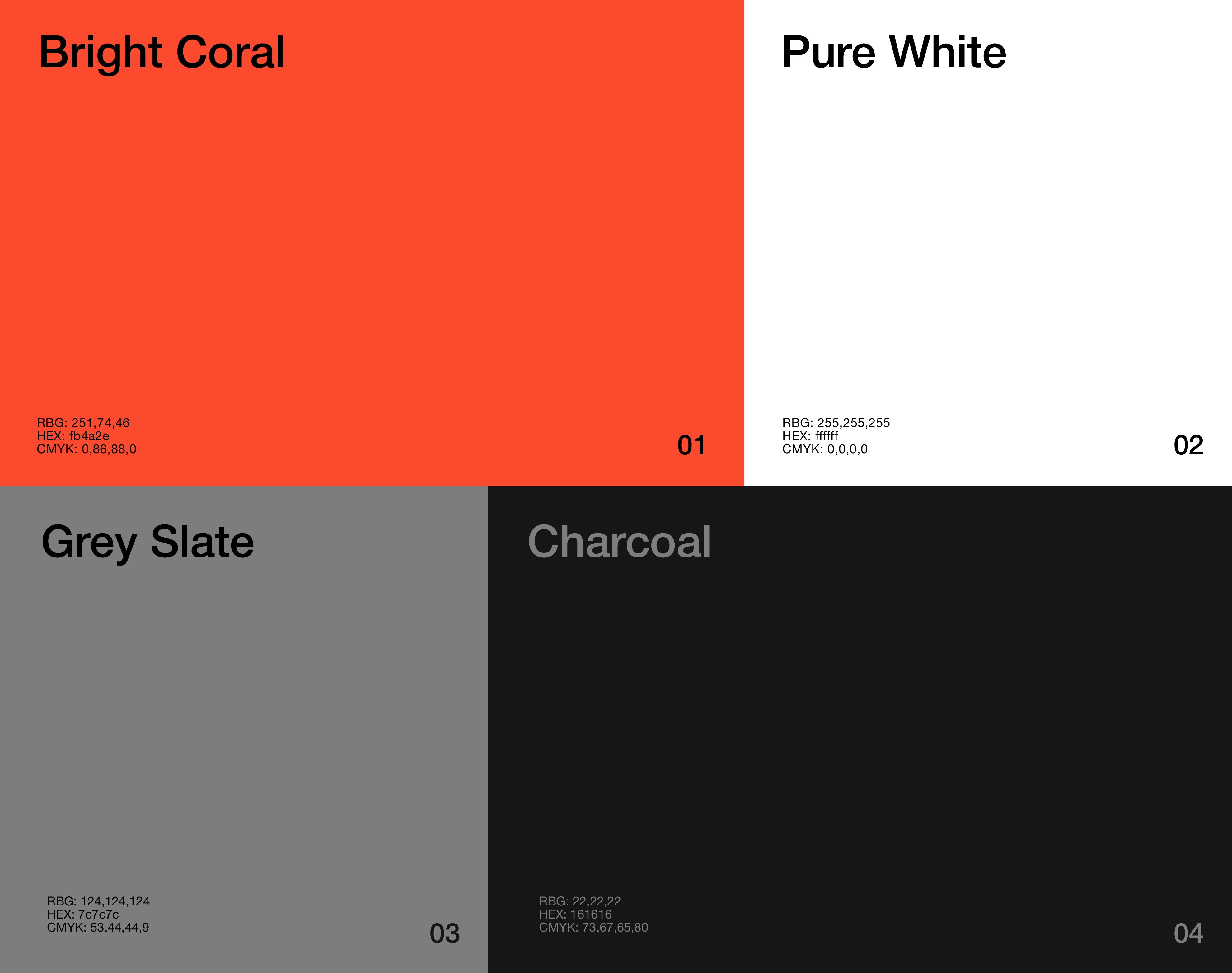
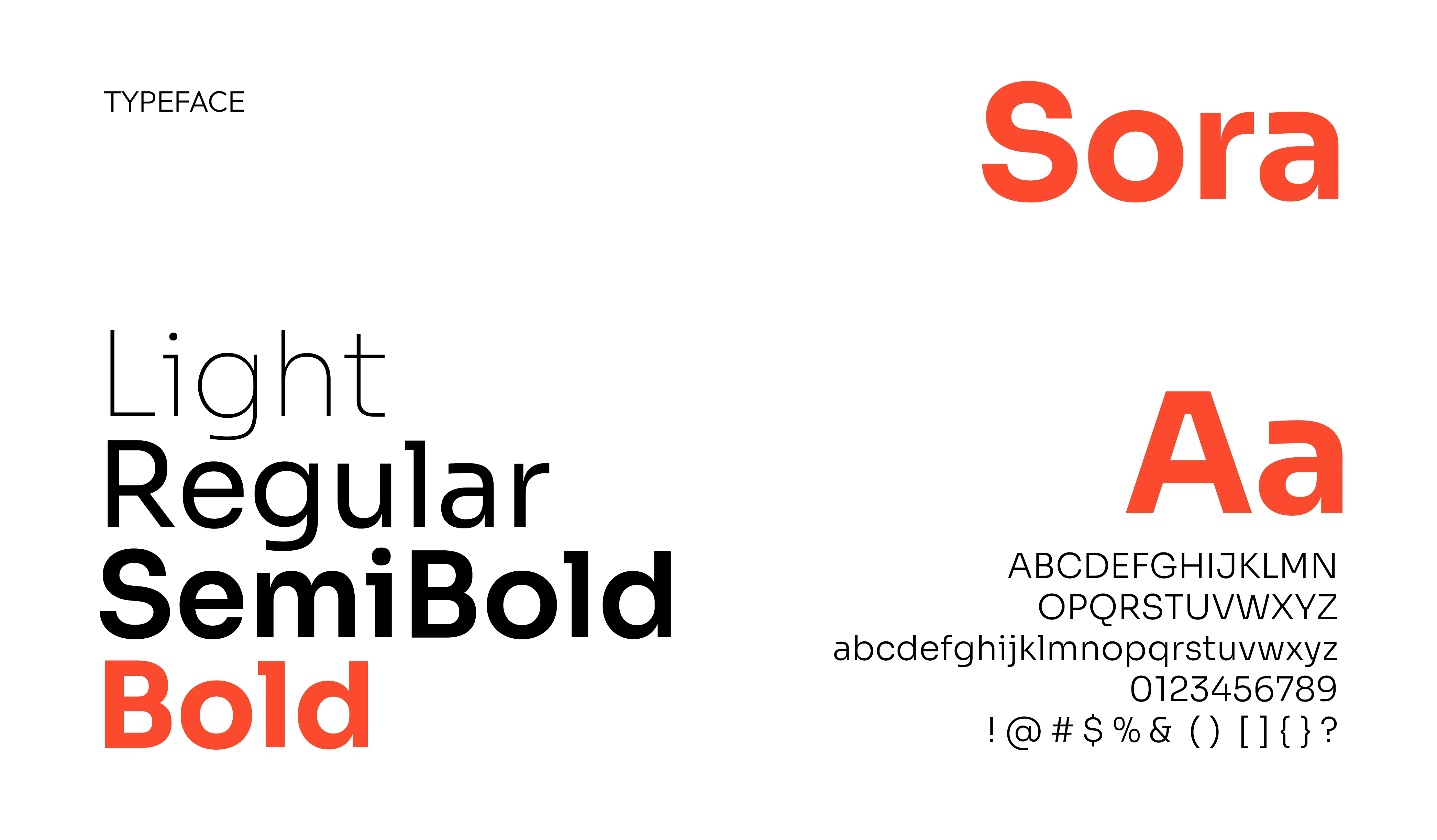
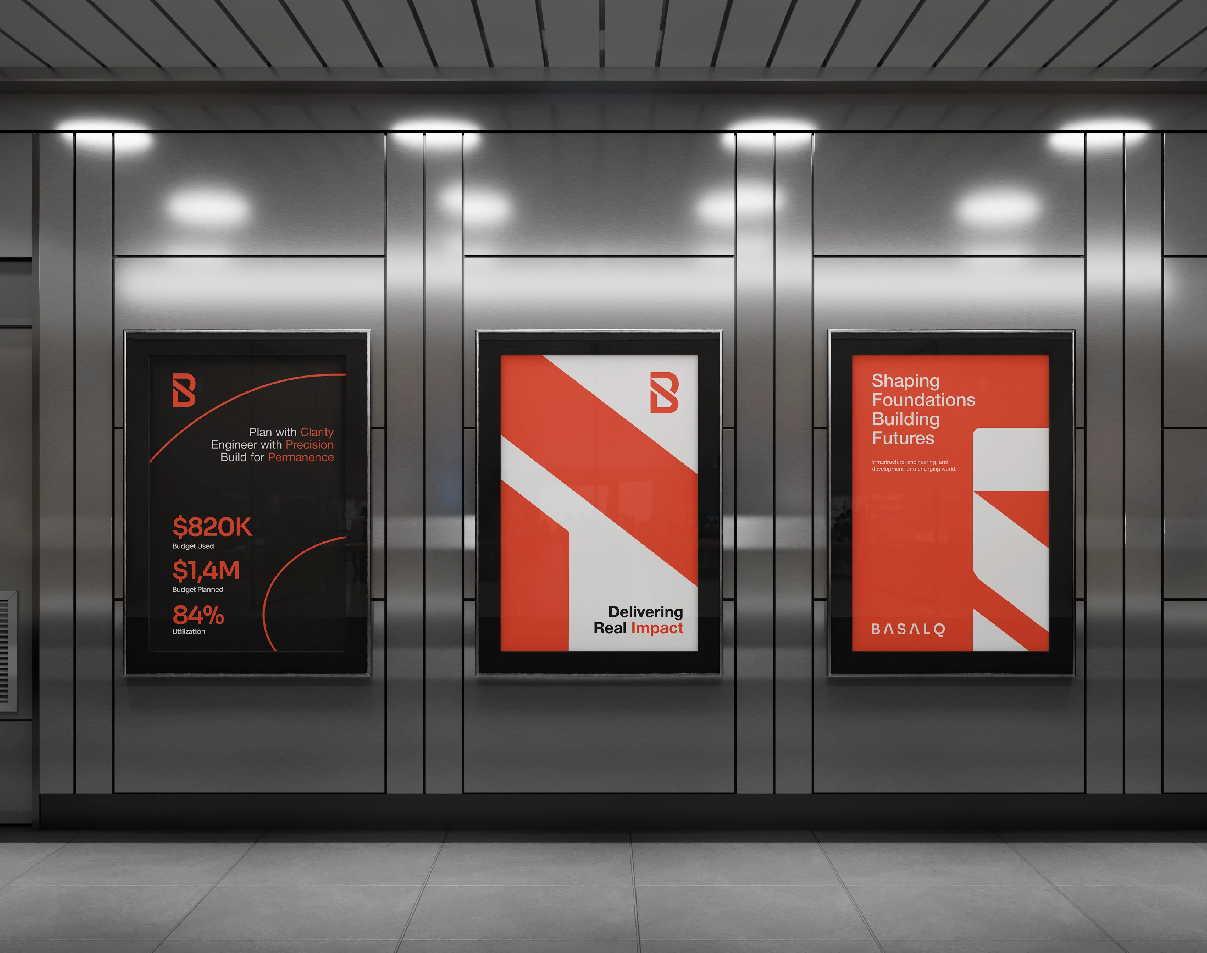
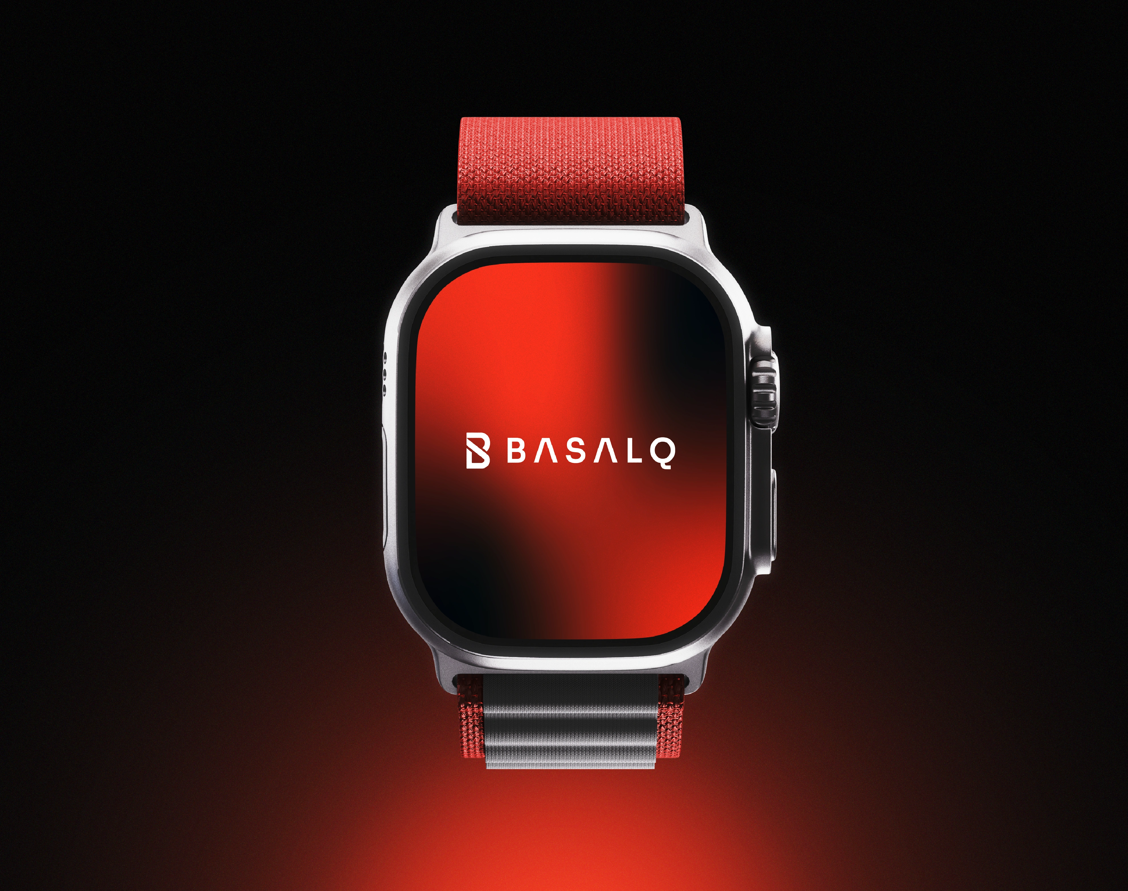
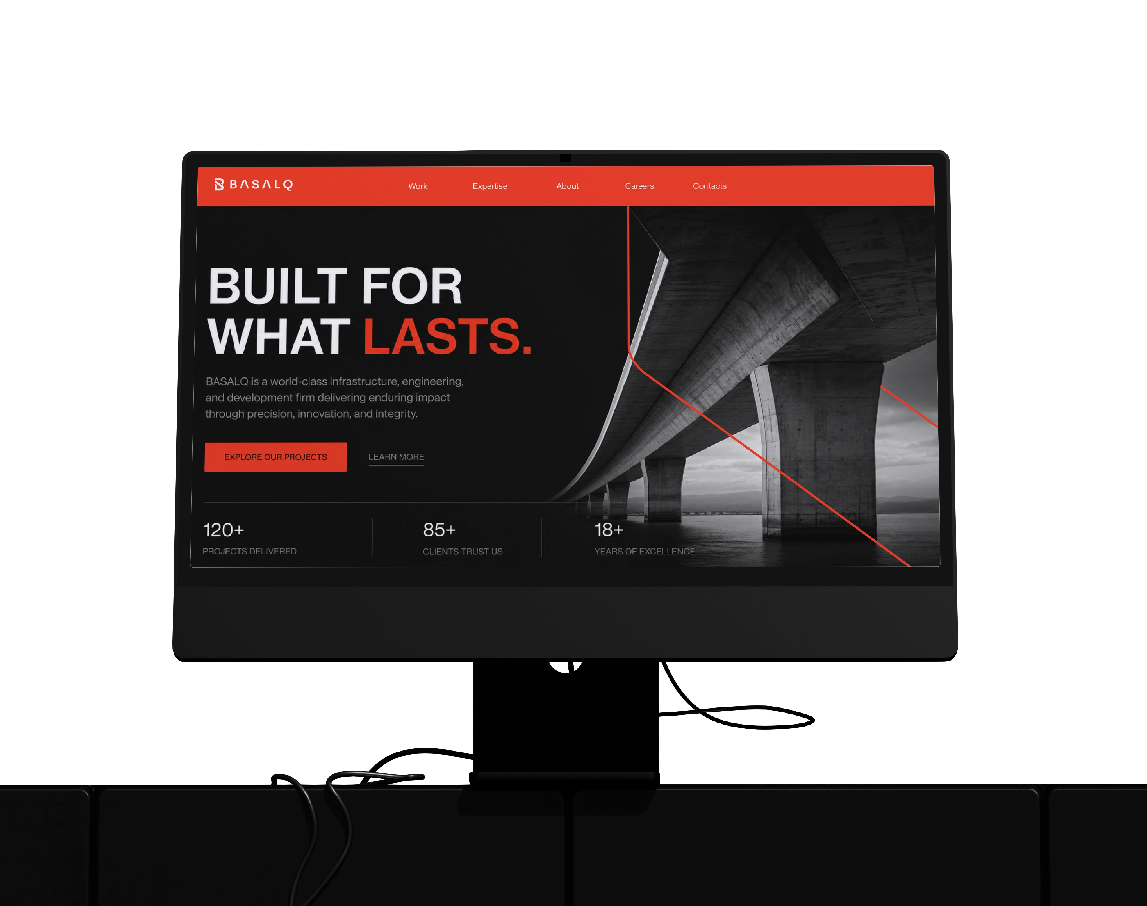
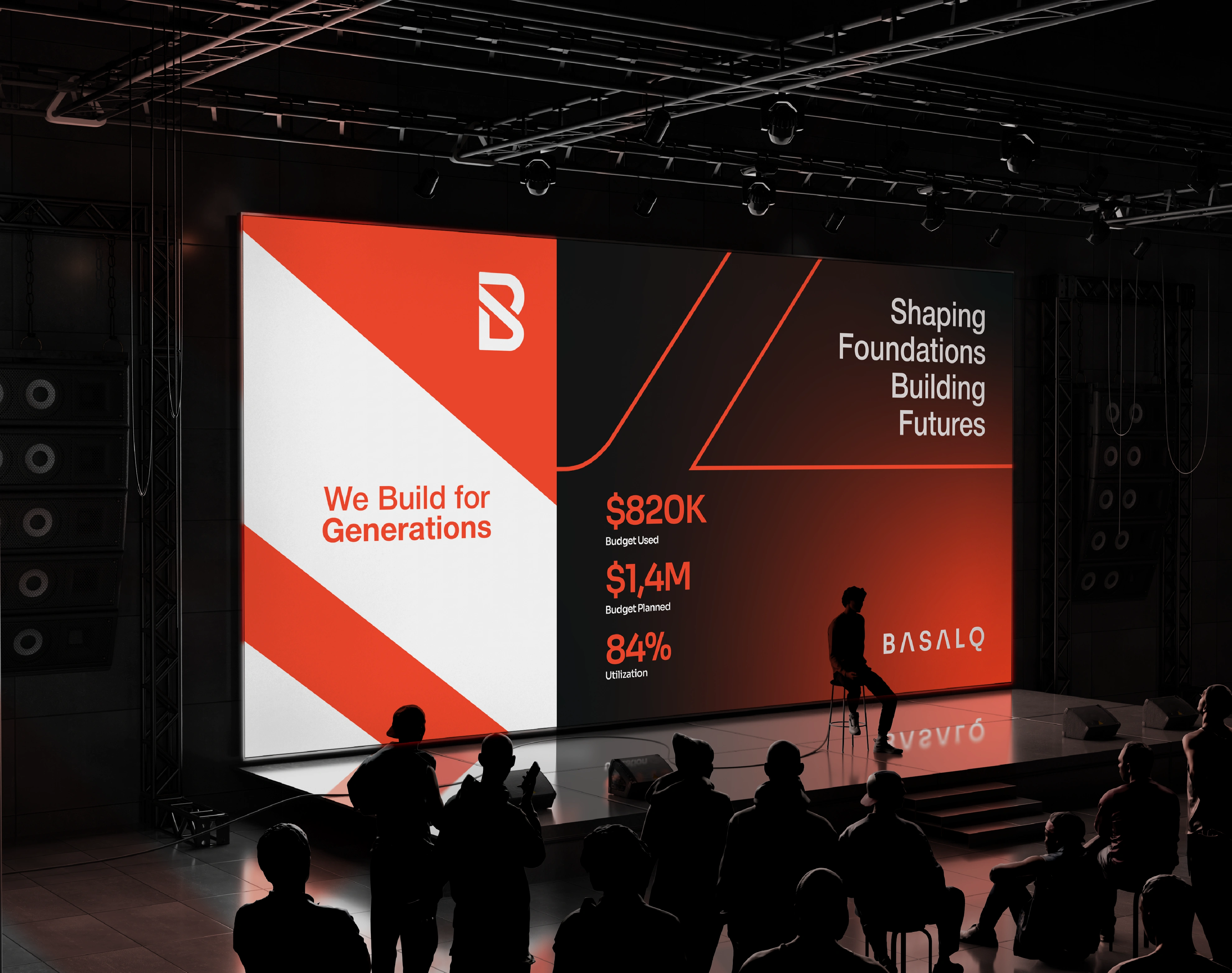
The identity system combines bold typography, engineered geometry, and a restrained corporate color palette to communicate authority, clarity, and confidence. Every visual element was designed with purpose from the sharp logo construction to the use of charcoal, slate, white, and bright coral as a controlled signal of progress and action.
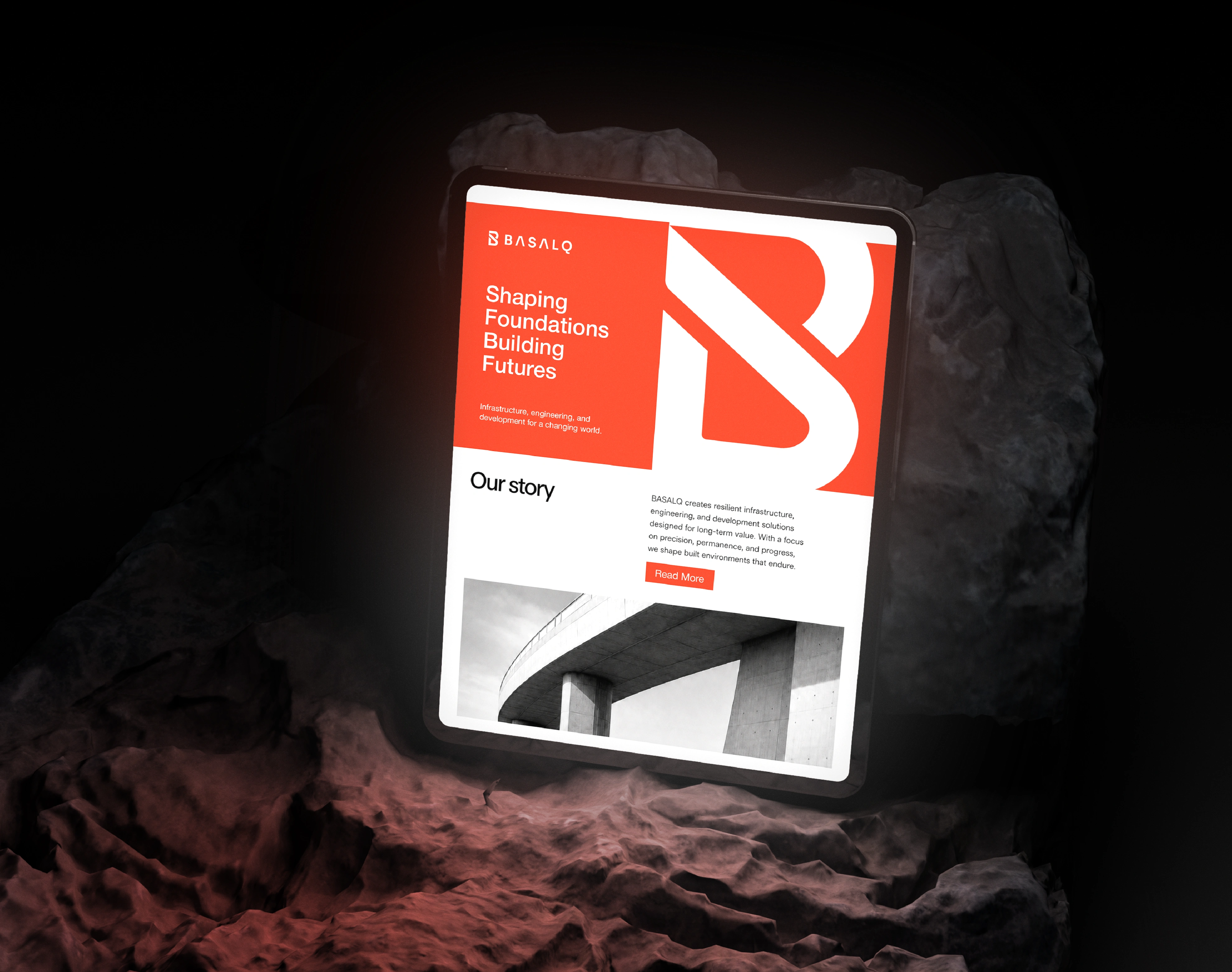
BASALQ’s brand direction focuses on modern infrastructure with a premium, world-class presence. The visual language avoids generic construction clichés and instead uses architectural compositions, clean layouts, strong contrast, and material-inspired imagery to create a brand that feels serious, dependable, and future-facing.
At its core, BASALQ represents more than building structures. It represents building systems, environments, and foundations that support progress for generations. The result is a corporate identity that feels minimal, powerful, and enduring design for a company committed to precision, responsibility, and lasting impact.
Problem
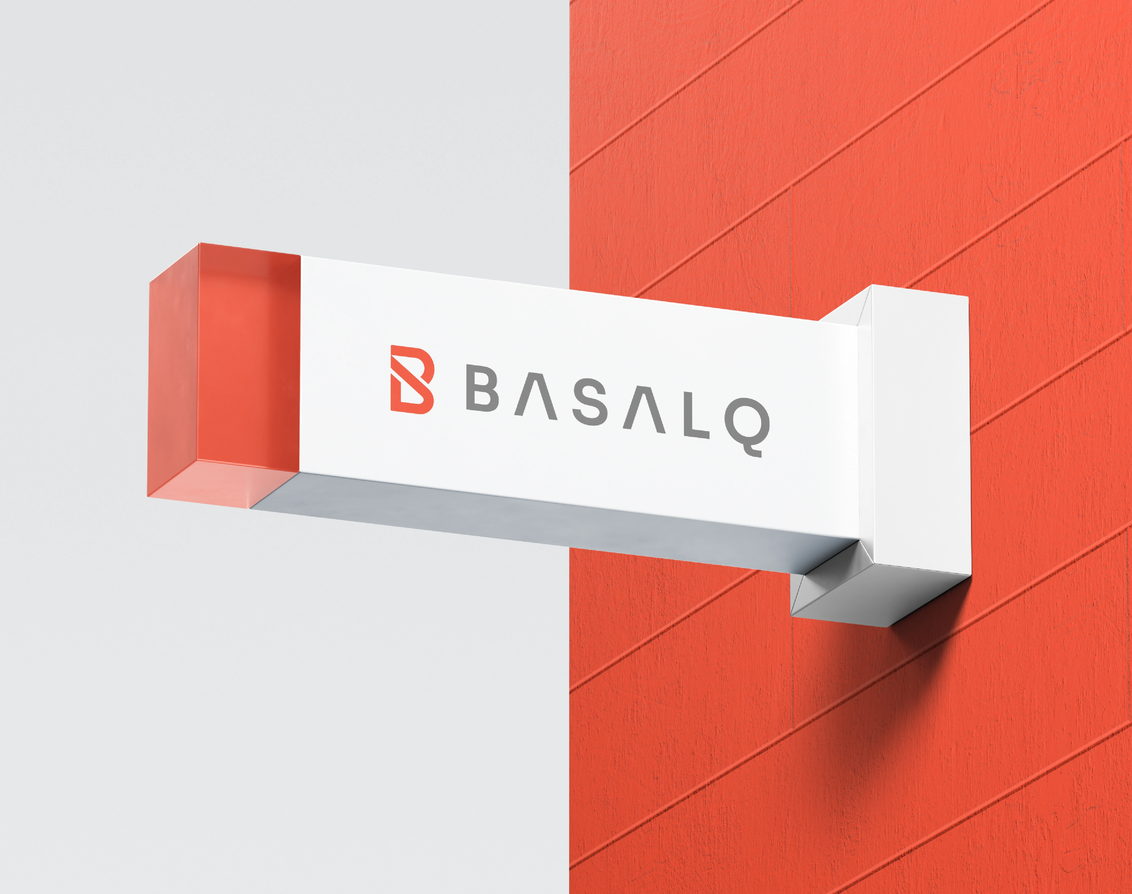
The challenge was to design a corporate brand identity that could position BASALQ beyond the visual language of a typical construction company. The brand needed to communicate infrastructure, engineering, urban development, and industrial scale without relying on generic symbols such as buildings, roads, cranes, helmets, or construction icons.
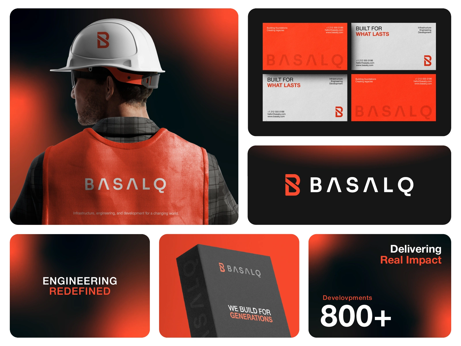
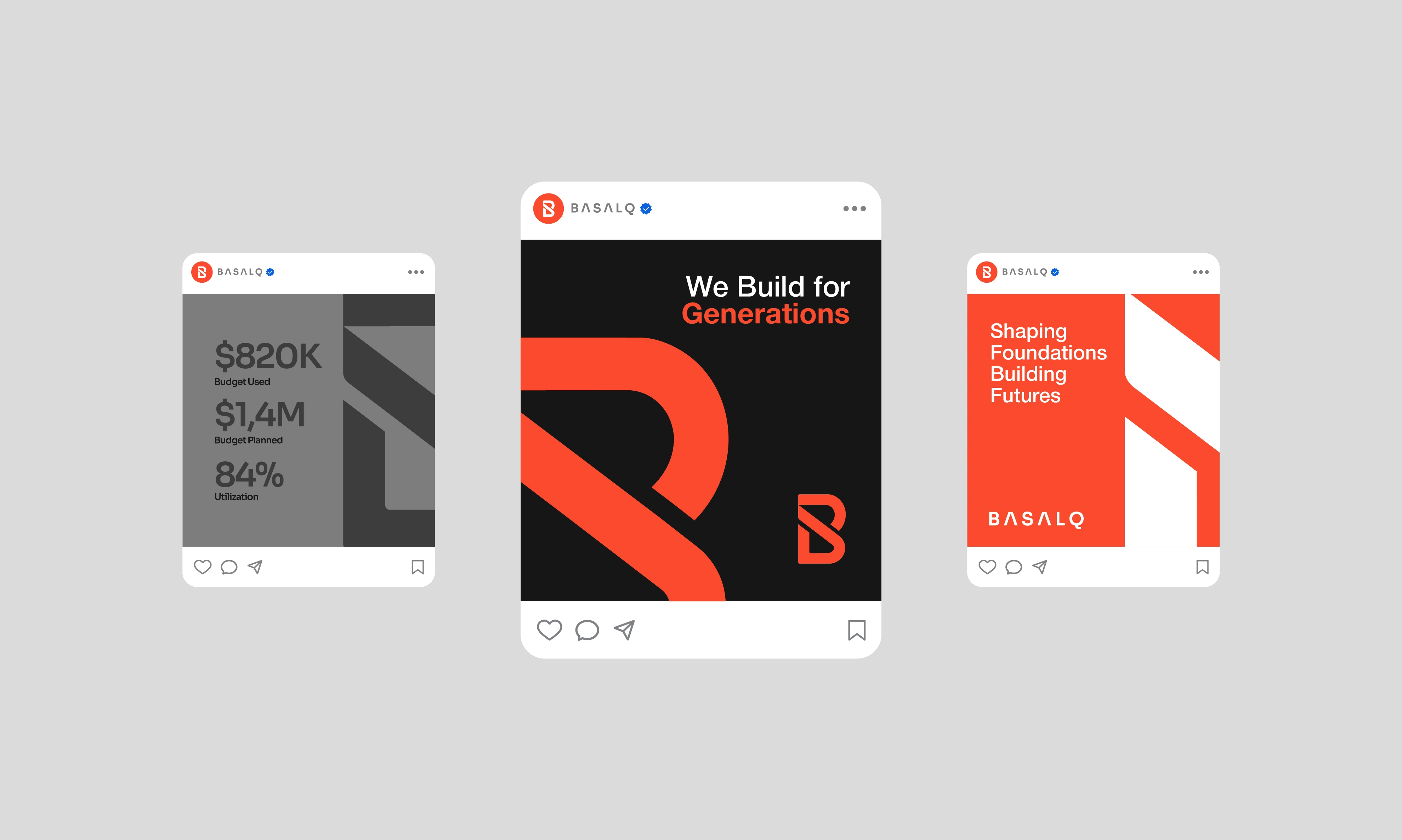
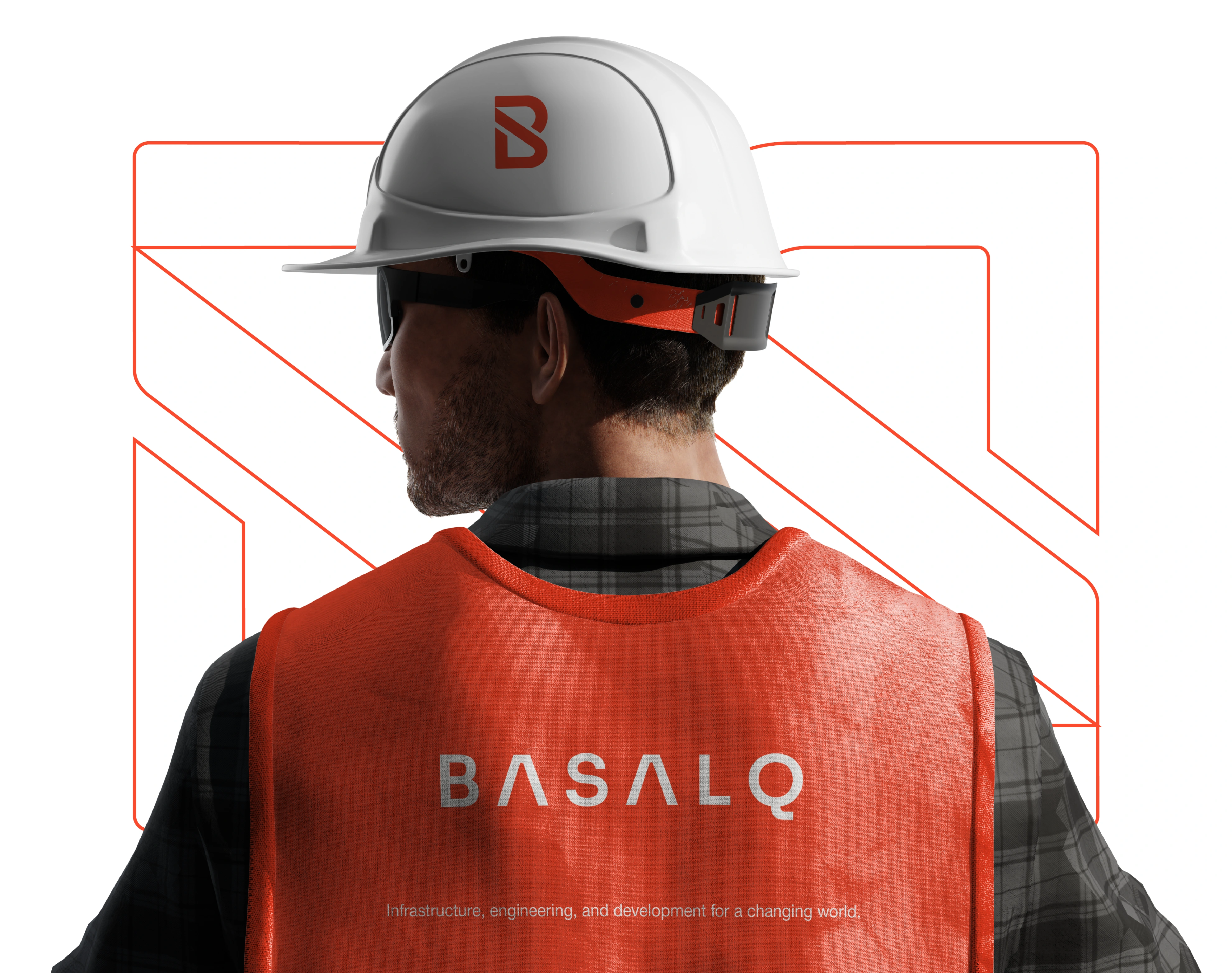
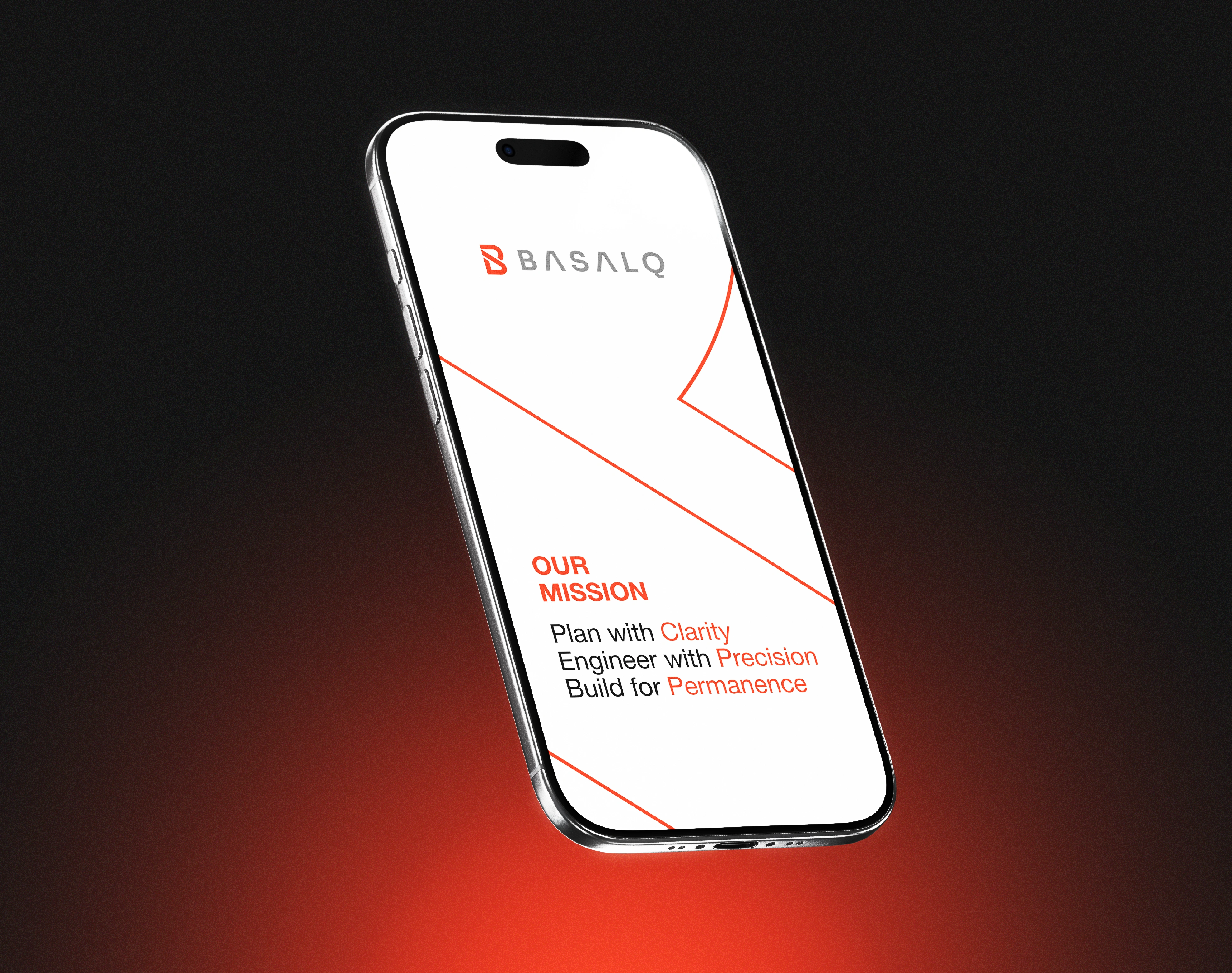
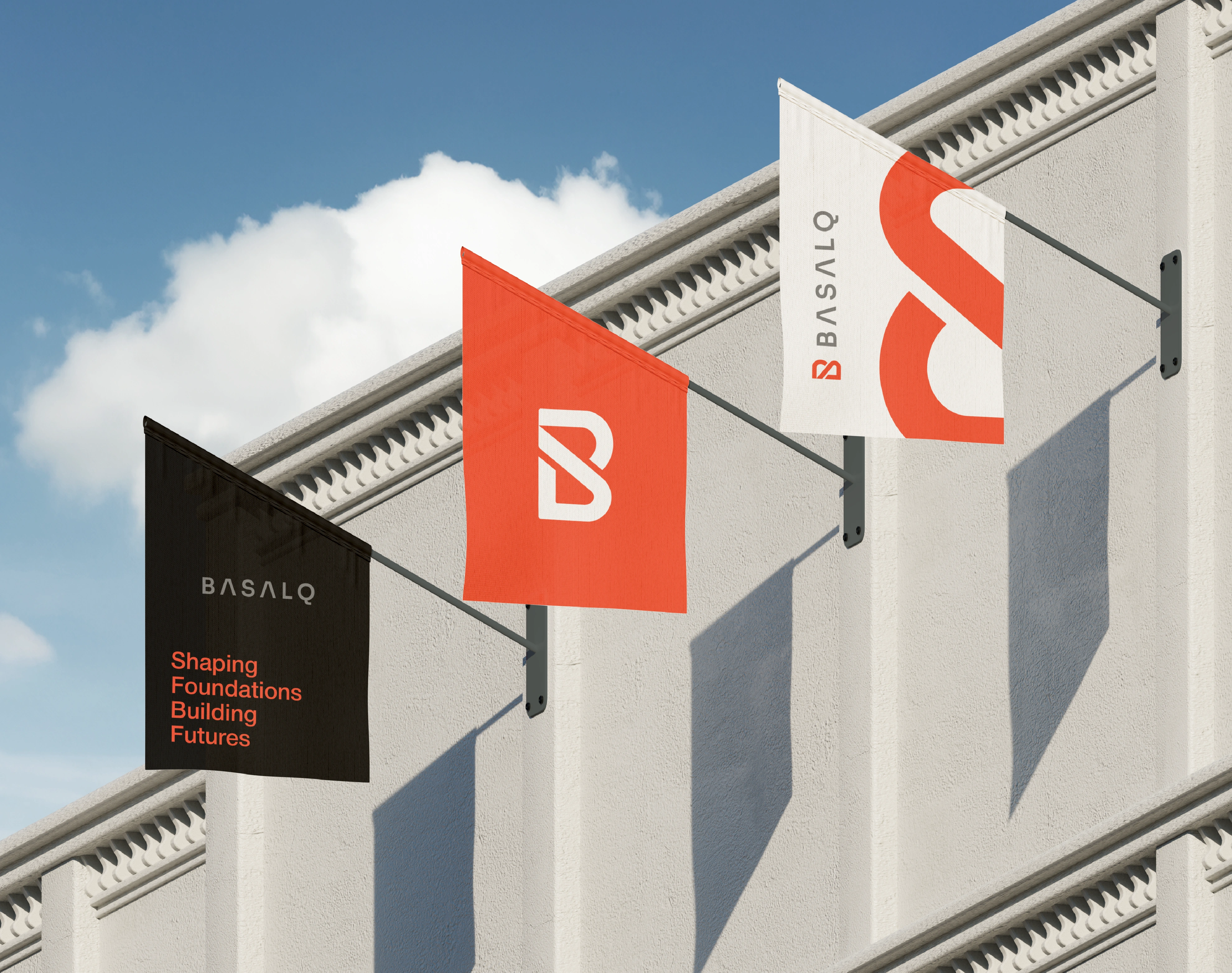
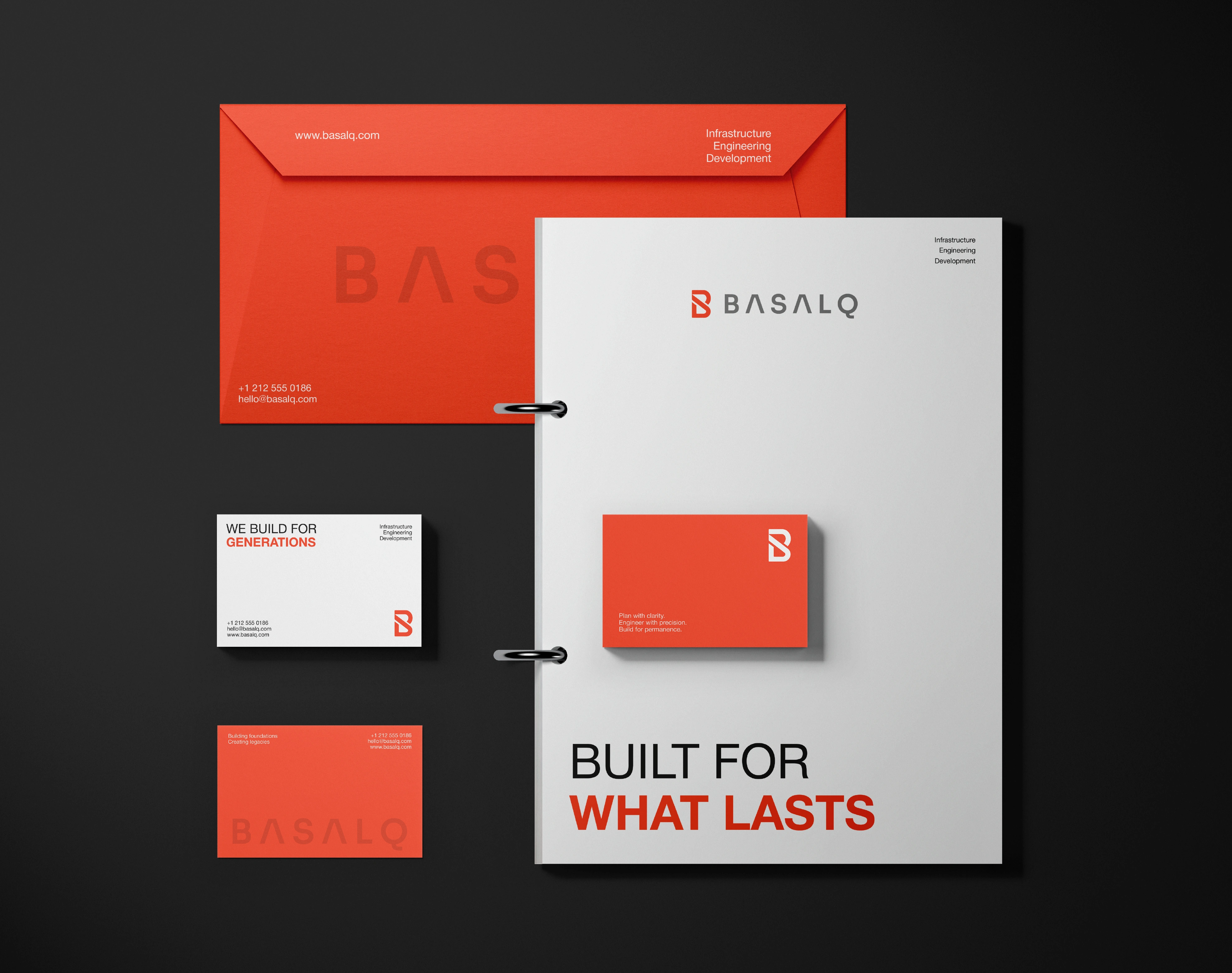
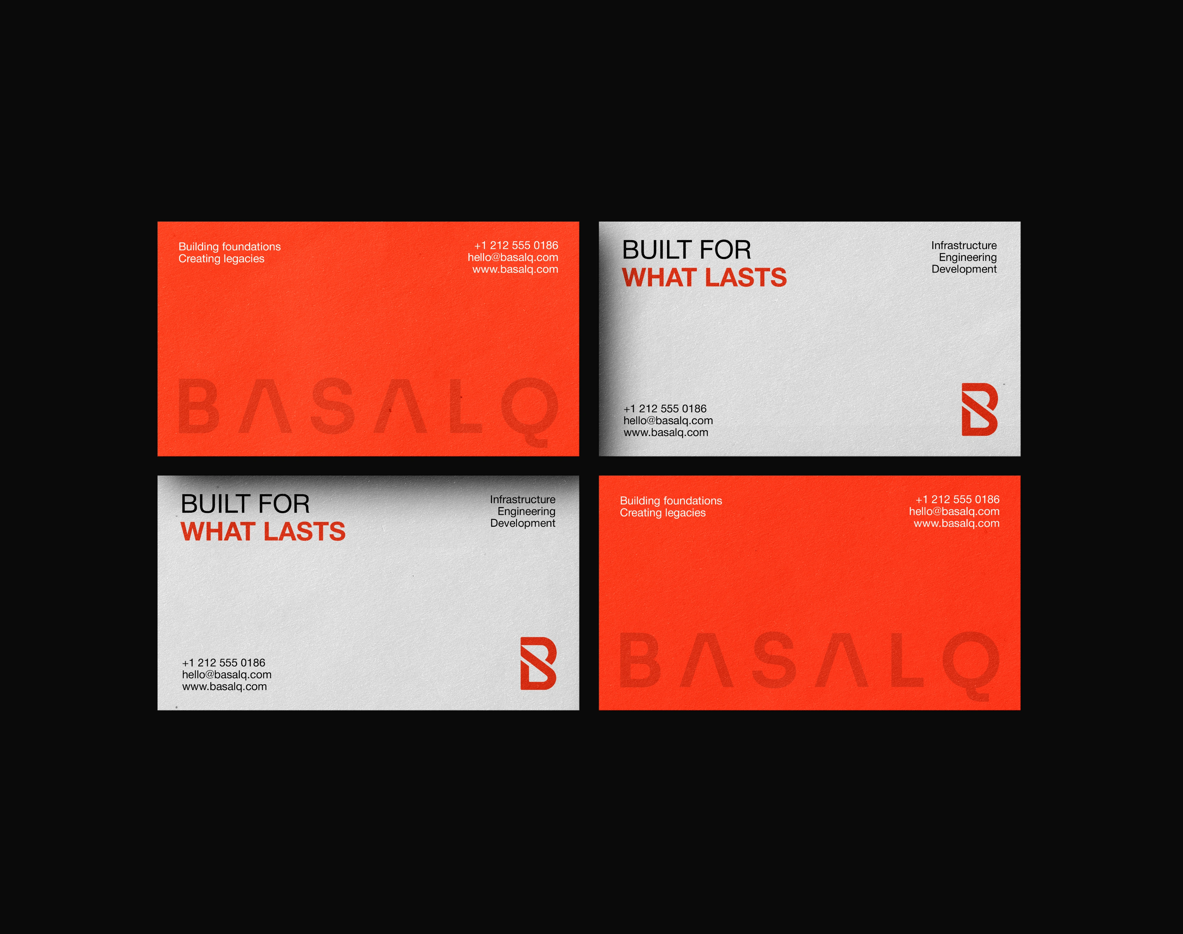
BASALQ required a premium visual identity system that could feel strong, technical, and internationally credible while remaining minimal, human, and timeless. The goal was to create a brand that expressed permanence, trust, precision, and engineered progress across corporate reports, construction signage, fleet branding, uniforms, stationery, digital platforms, and large-scale brand applications.
Solution
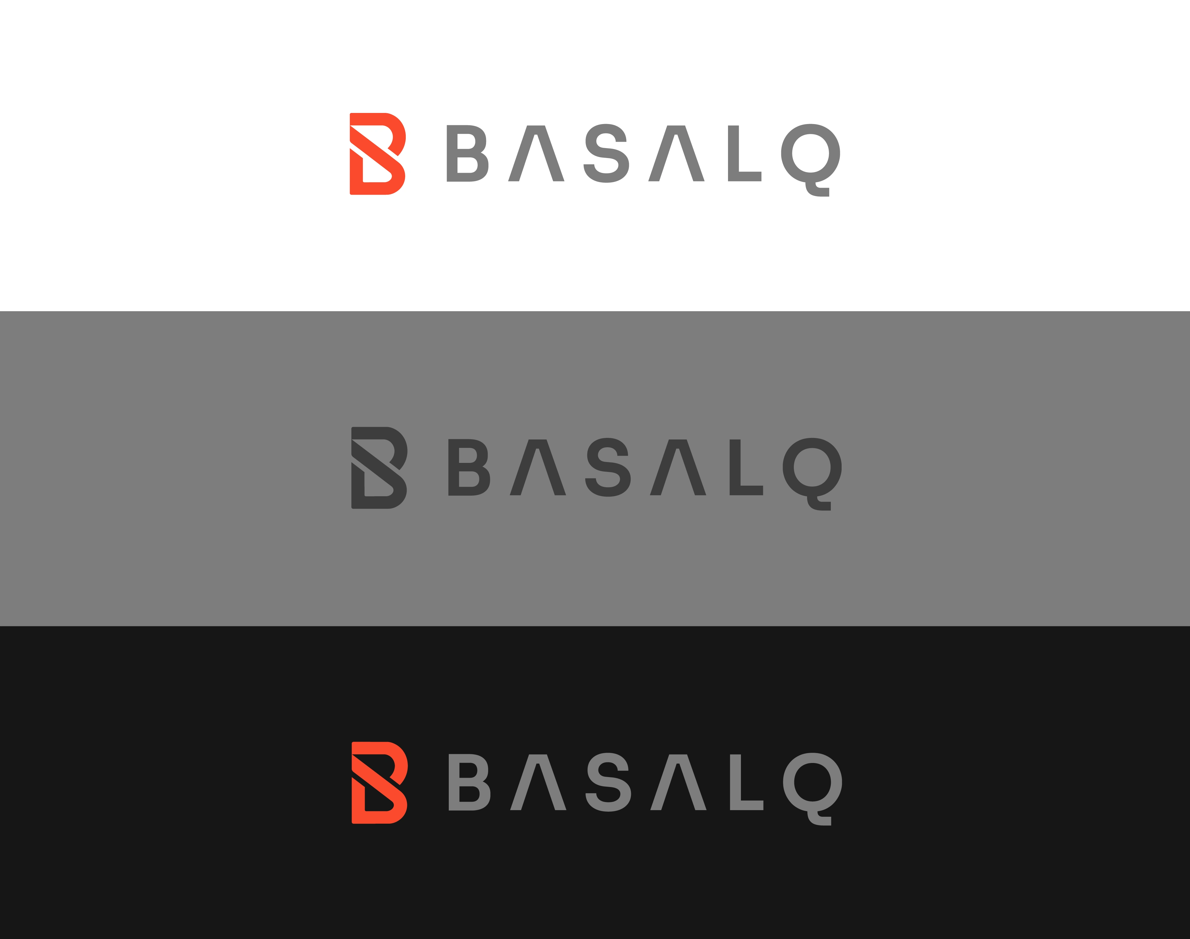
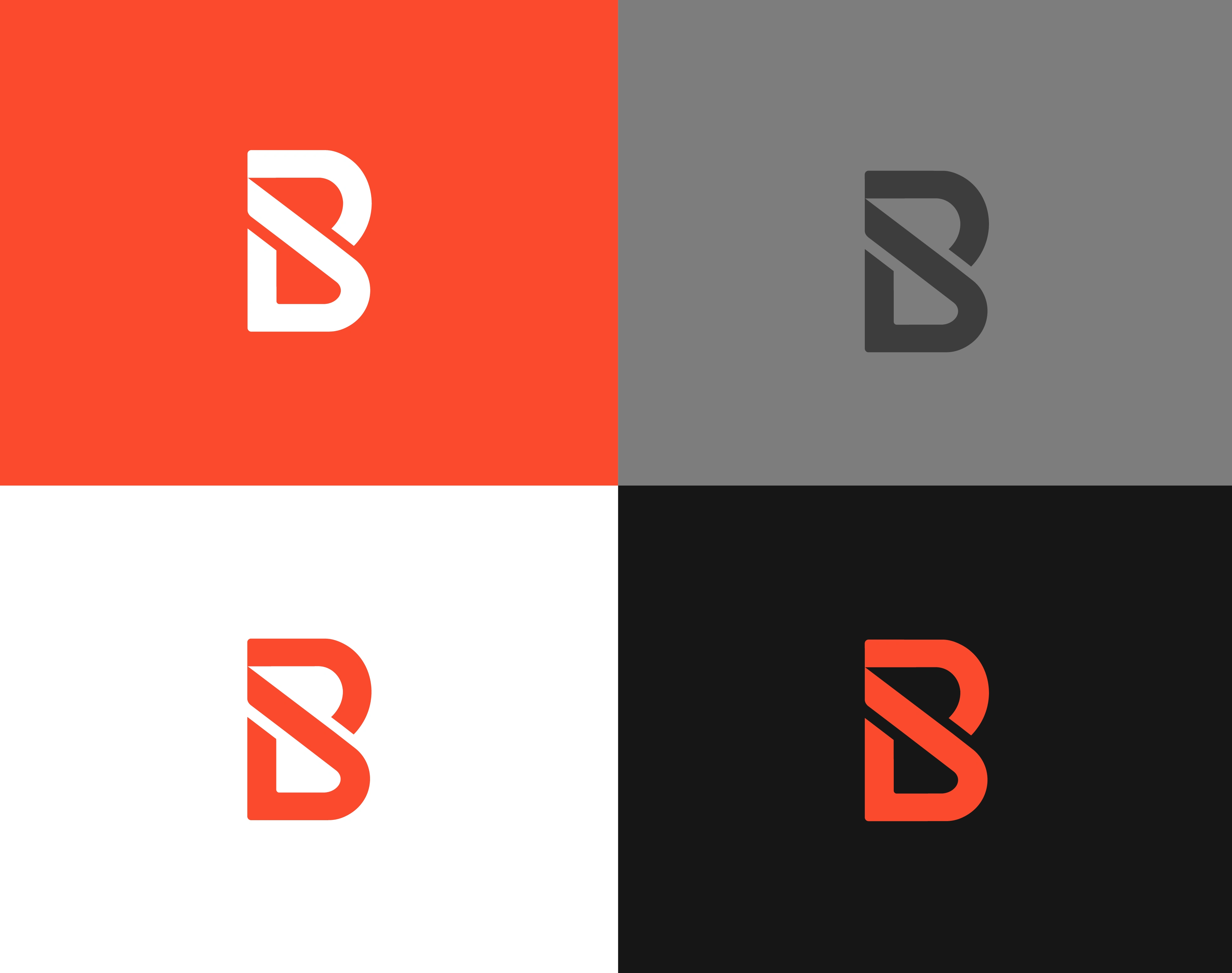
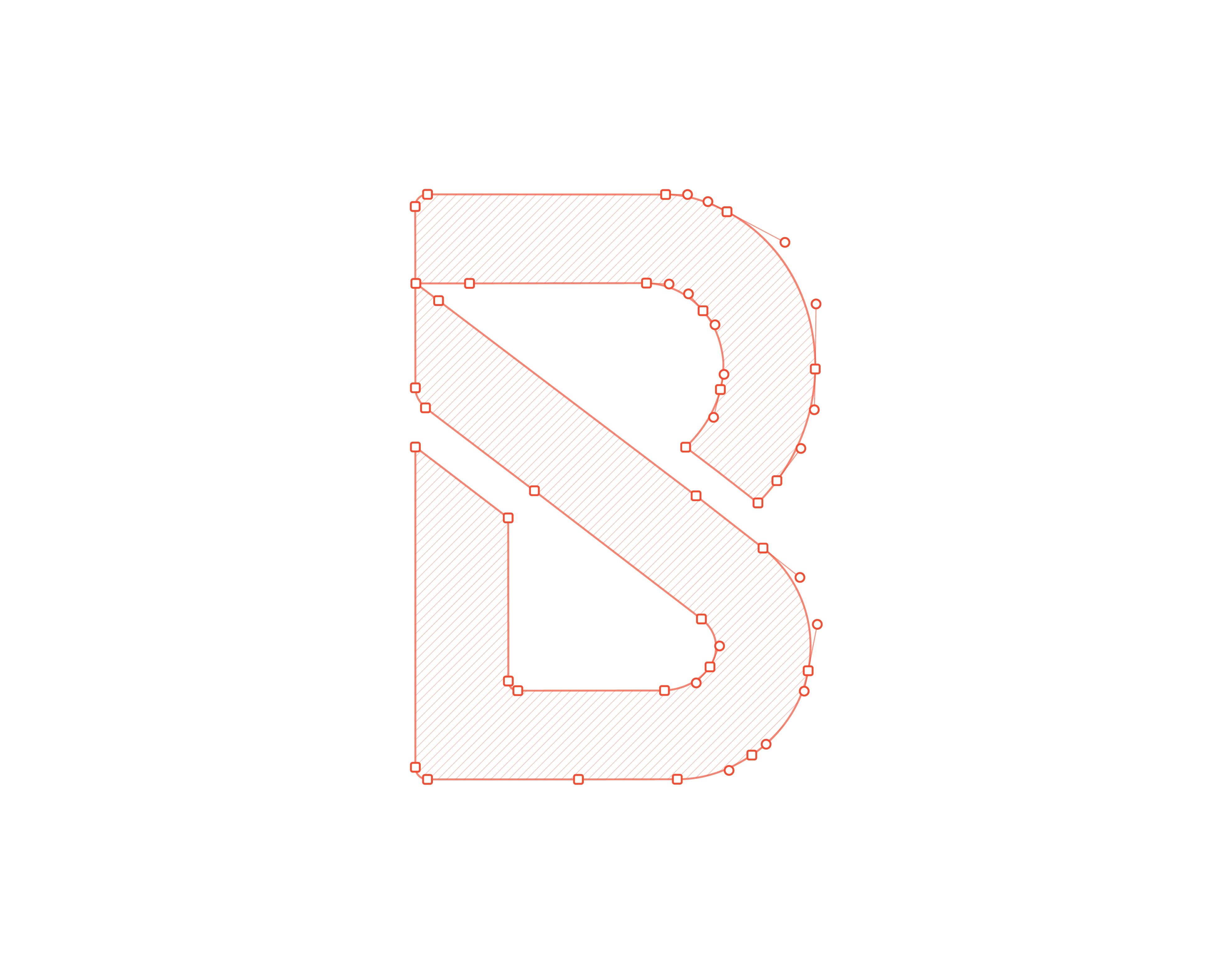
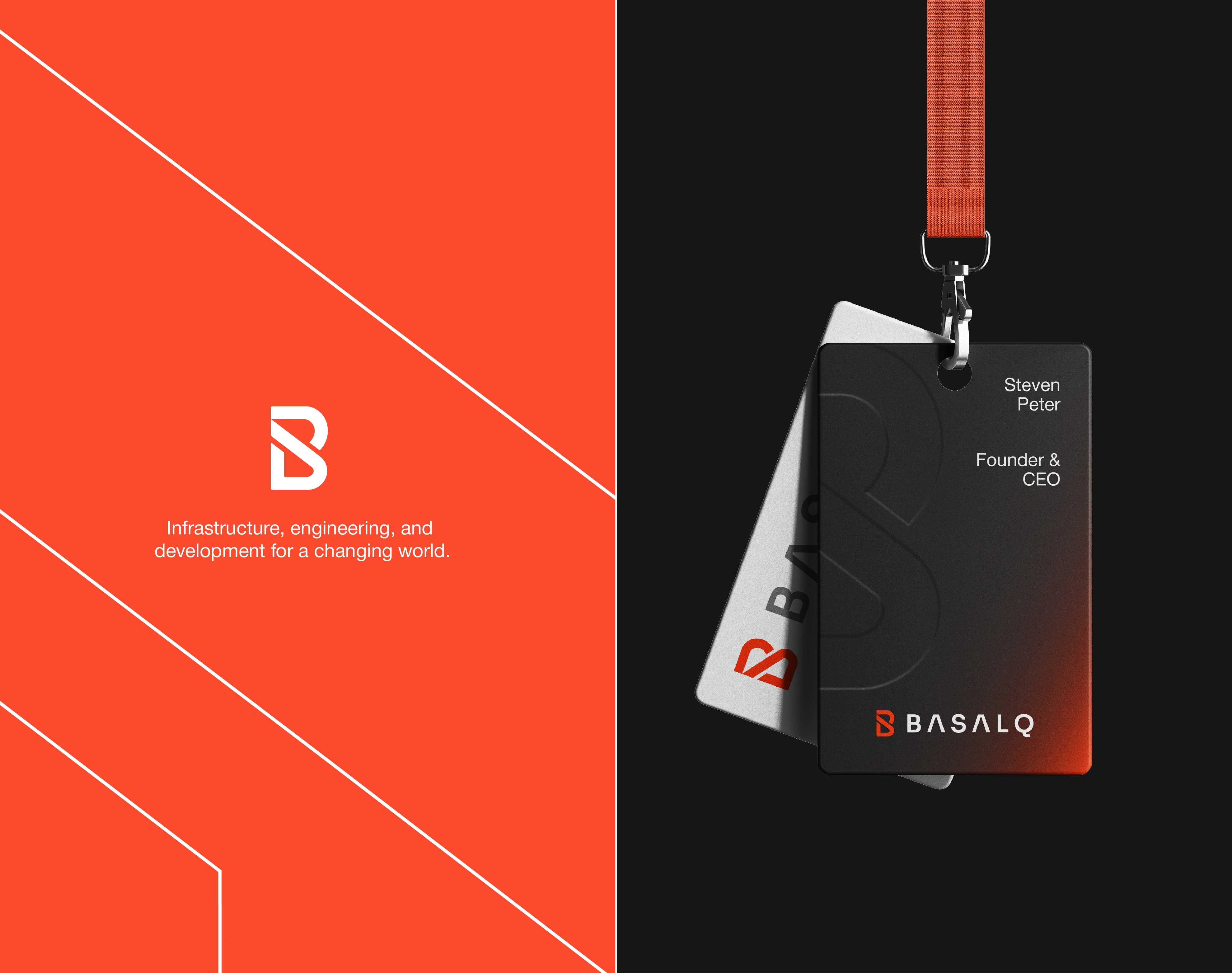
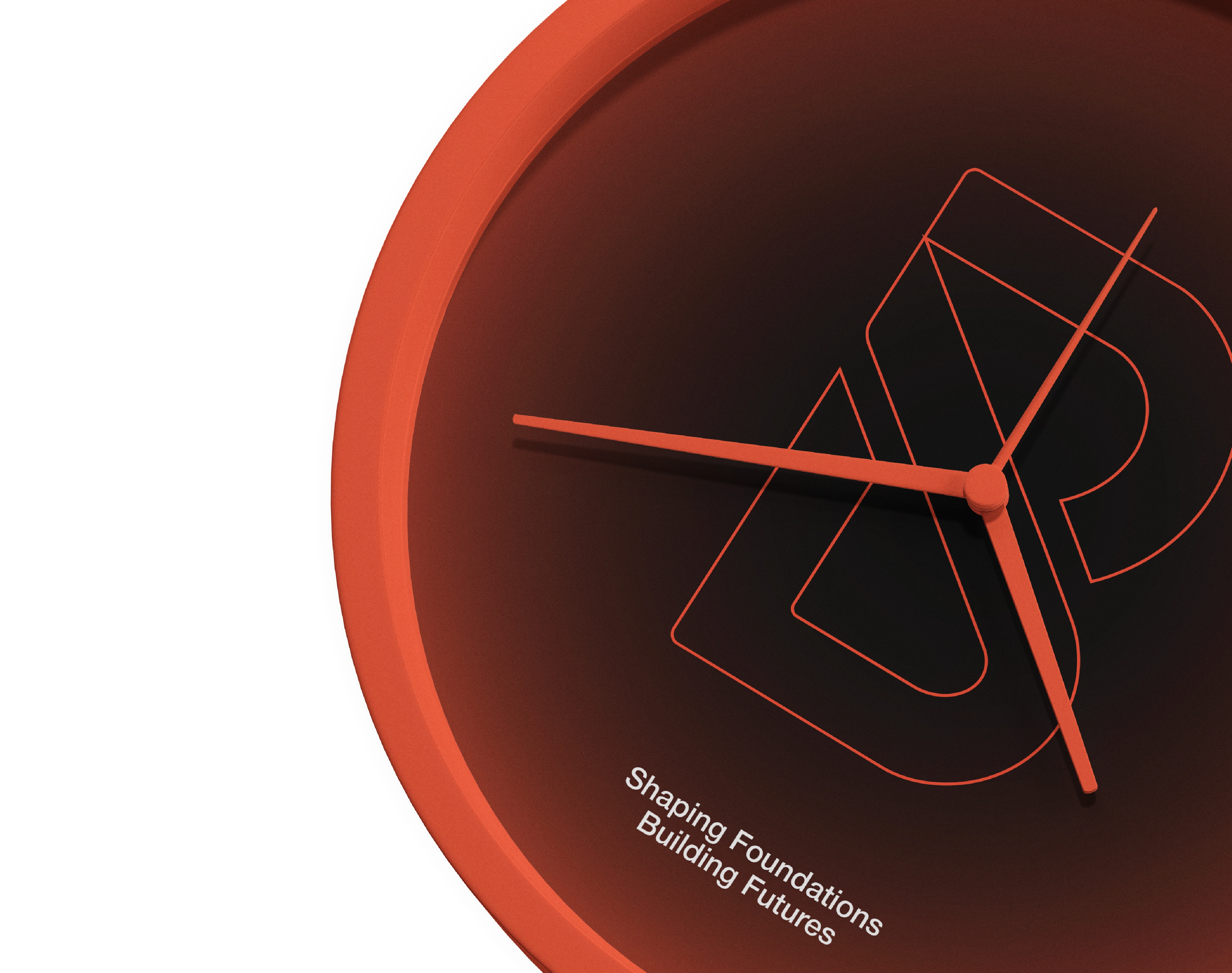
The solution was a refined brand identity system built on architectural minimalism, structural geometry, disciplined typography, and a restrained corporate color palette. At the center of the identity is a bold abstract B symbol designed to feel carved from one solid structural mass, using negative space, modular construction, balanced weight, and precise geometric cuts.
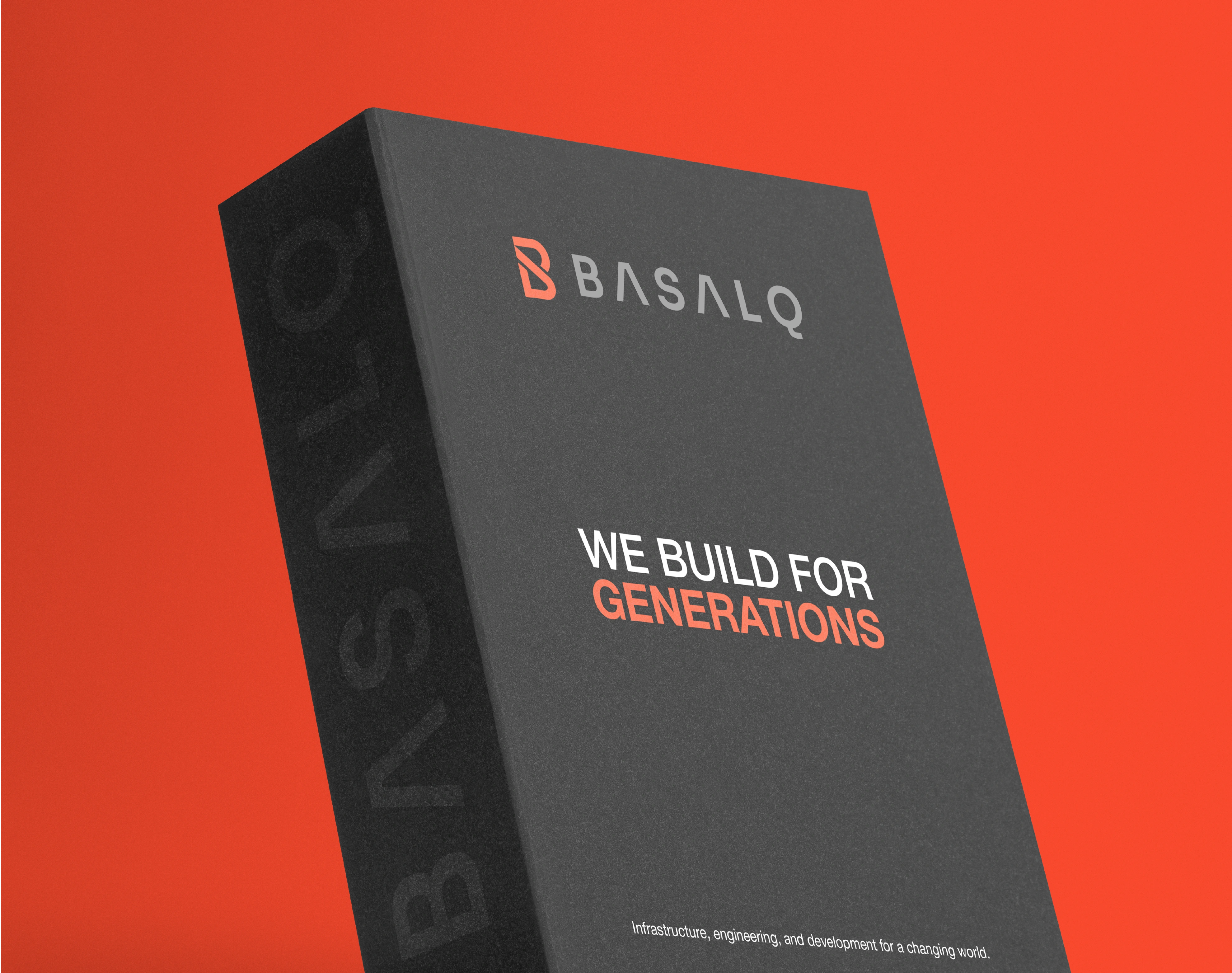
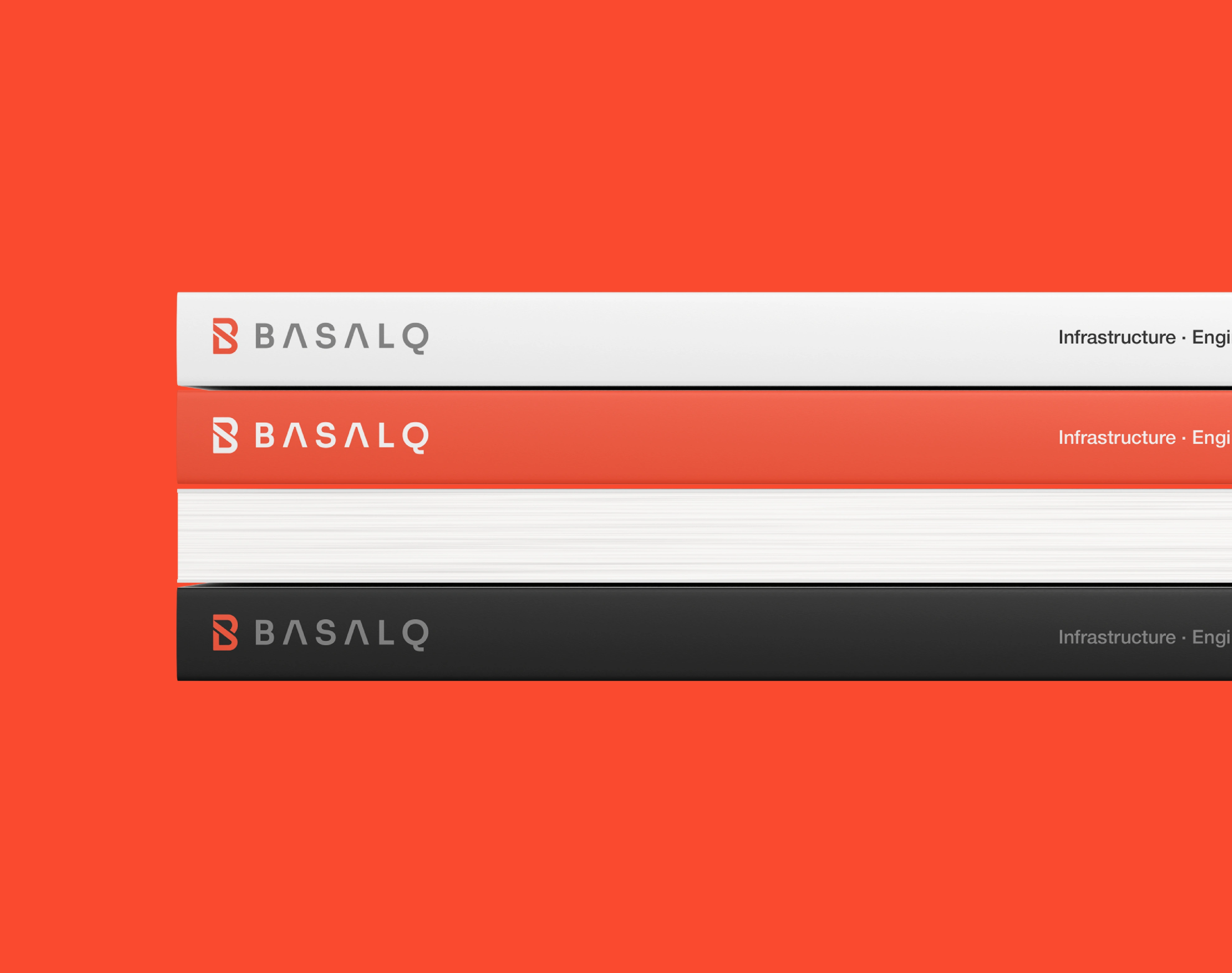
The wordmark was developed with clean uppercase typography and controlled spacing to create a stable, premium, and globally credible presence. The visual system uses charcoal black, grey slate, architectural white, and a controlled coral accent to balance strength, clarity, and distinction.
Every brand element was designed to support BASALQ’s core positioning: resilient infrastructure, engineered systems, and development built with long-term purpose. The final identity feels monolithic, precise, and quietly powerful, a corporate brand system designed not for short-term attention, but for lasting recognition.
BASALQ stands for strength without noise, progress with discipline, and infrastructure built for what lasts.
BASALQ Brand Identity
Logo Design | Brand Identity | Branding
By Arvonn
Let's transform your brand next!
E-mail:
hi@arvonn.com
Website:
arvonn.com
✦ All Rights Reserved ©
Thanks for Watching!
Like this project
Posted Oct 14, 2026
Logo design & brand identity for BASALQ, an infrastructure and engineering company. A bold, structural visual system for construction and development brands.