FITCO Brand Identity Design | Fitness Branding

Muhammad Abdullah


Fitco Brand Identity | Fitness Branding
FITCO is a fitness logo design and brand identity project for a performance-driven platform built for trainers, athletes, gyms, and fitness enthusiasts who demand structure, consistency, and measurable results.
The challenge was to build more than a logo. FITCO needed a complete gym branding system that could support future growth while standing out in a competitive fitness industry. The identity had to feel modern, energetic, and professional, while staying approachable to both fitness professionals and everyday users.
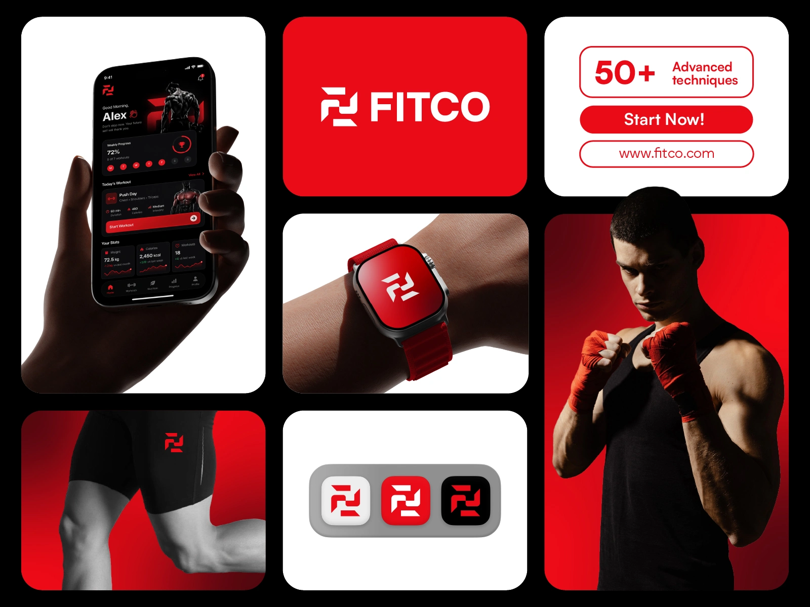
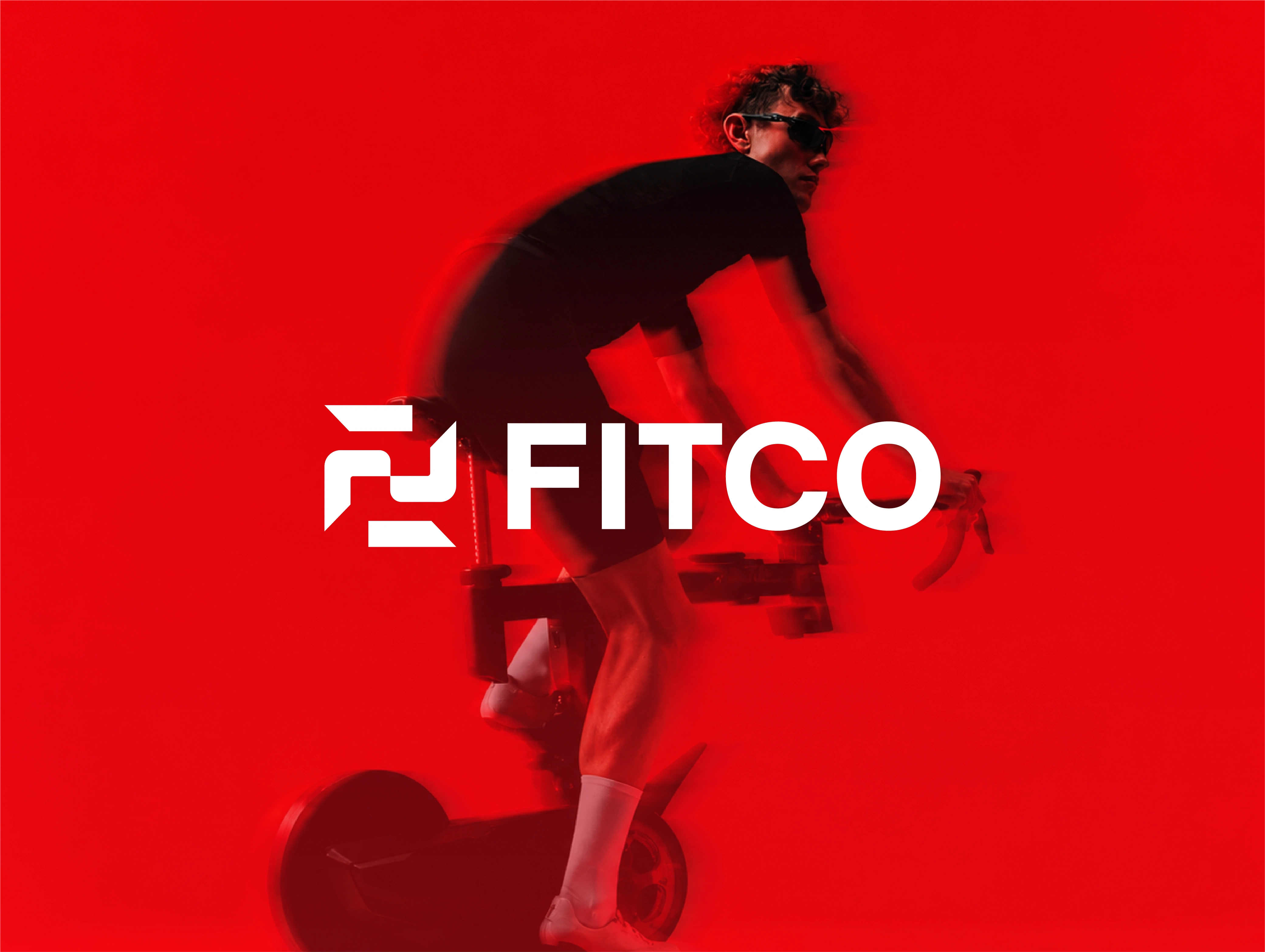
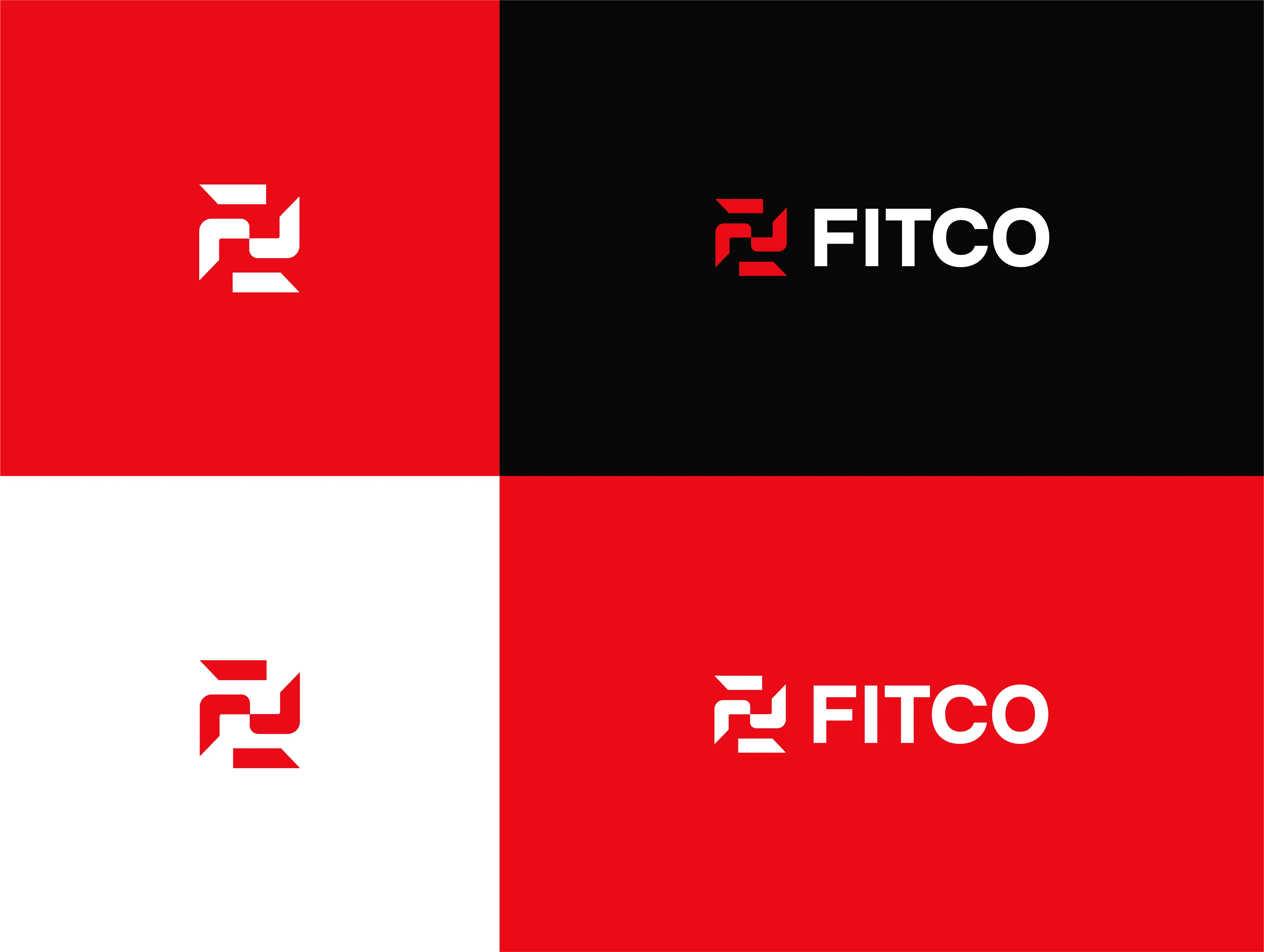
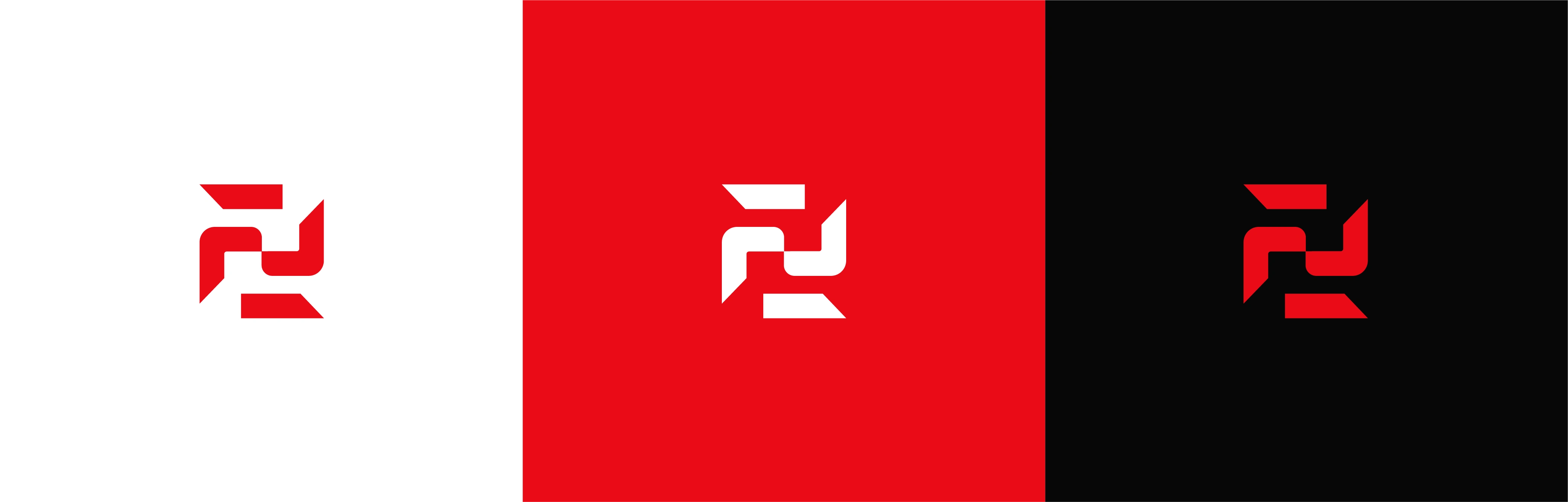
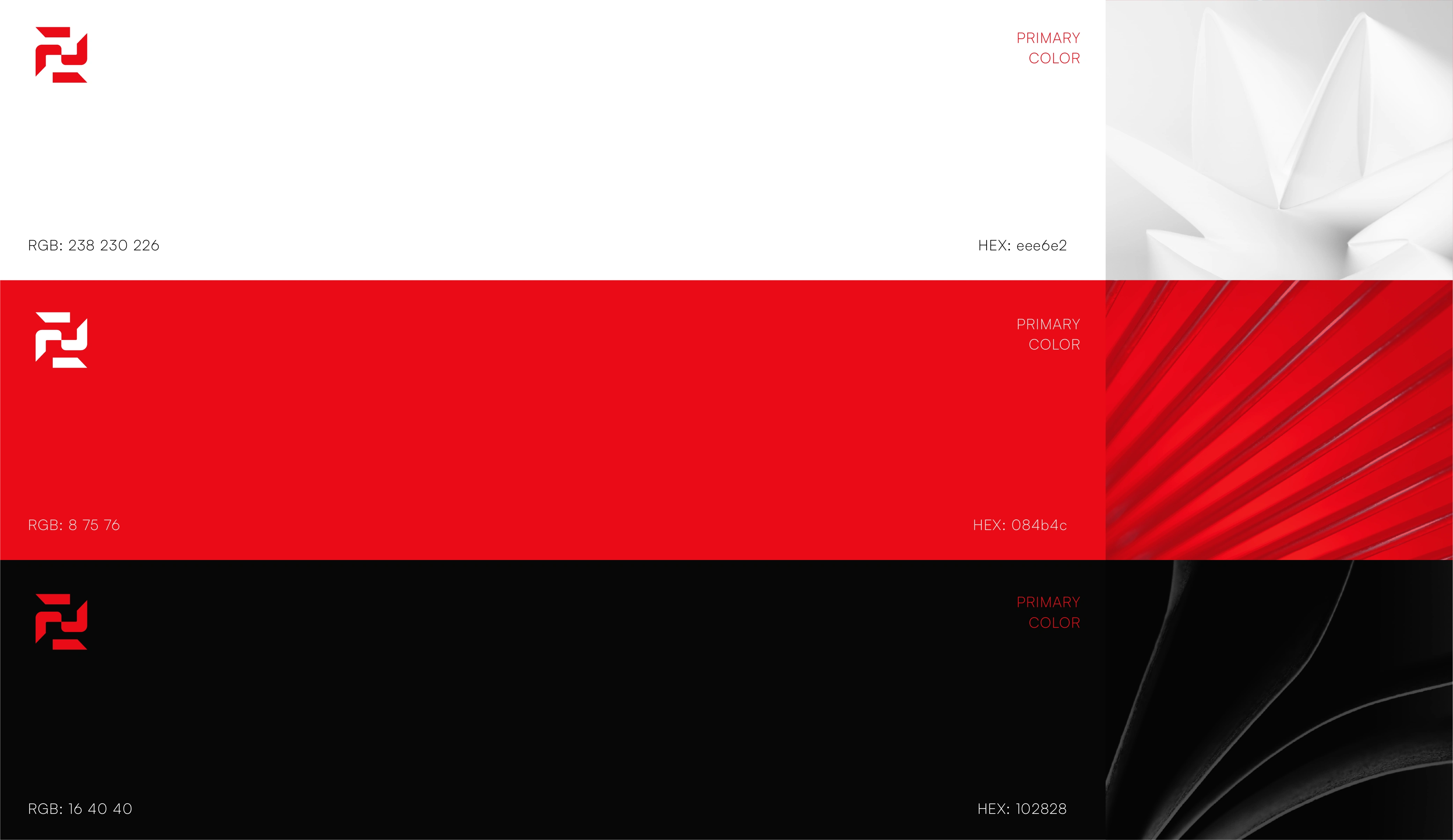
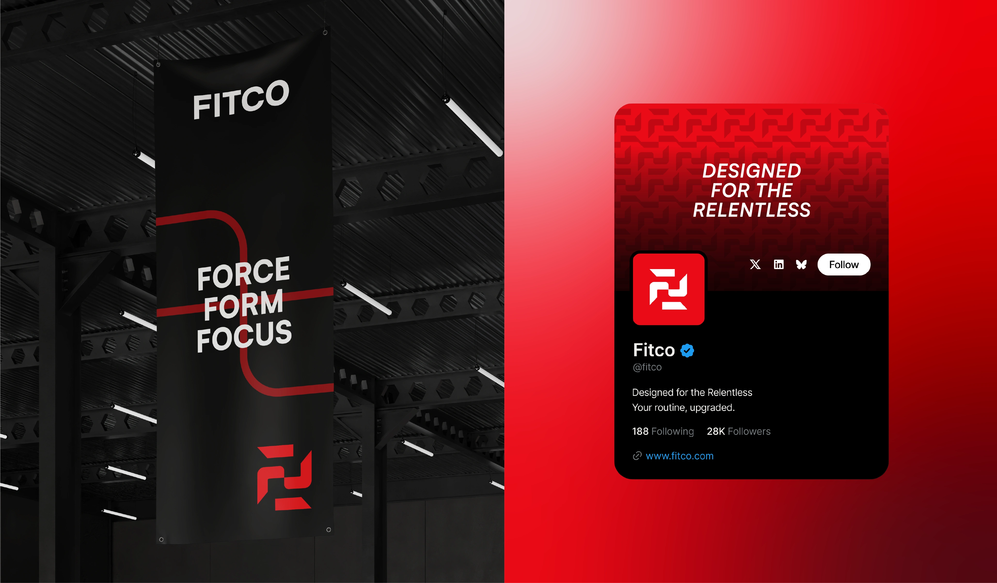
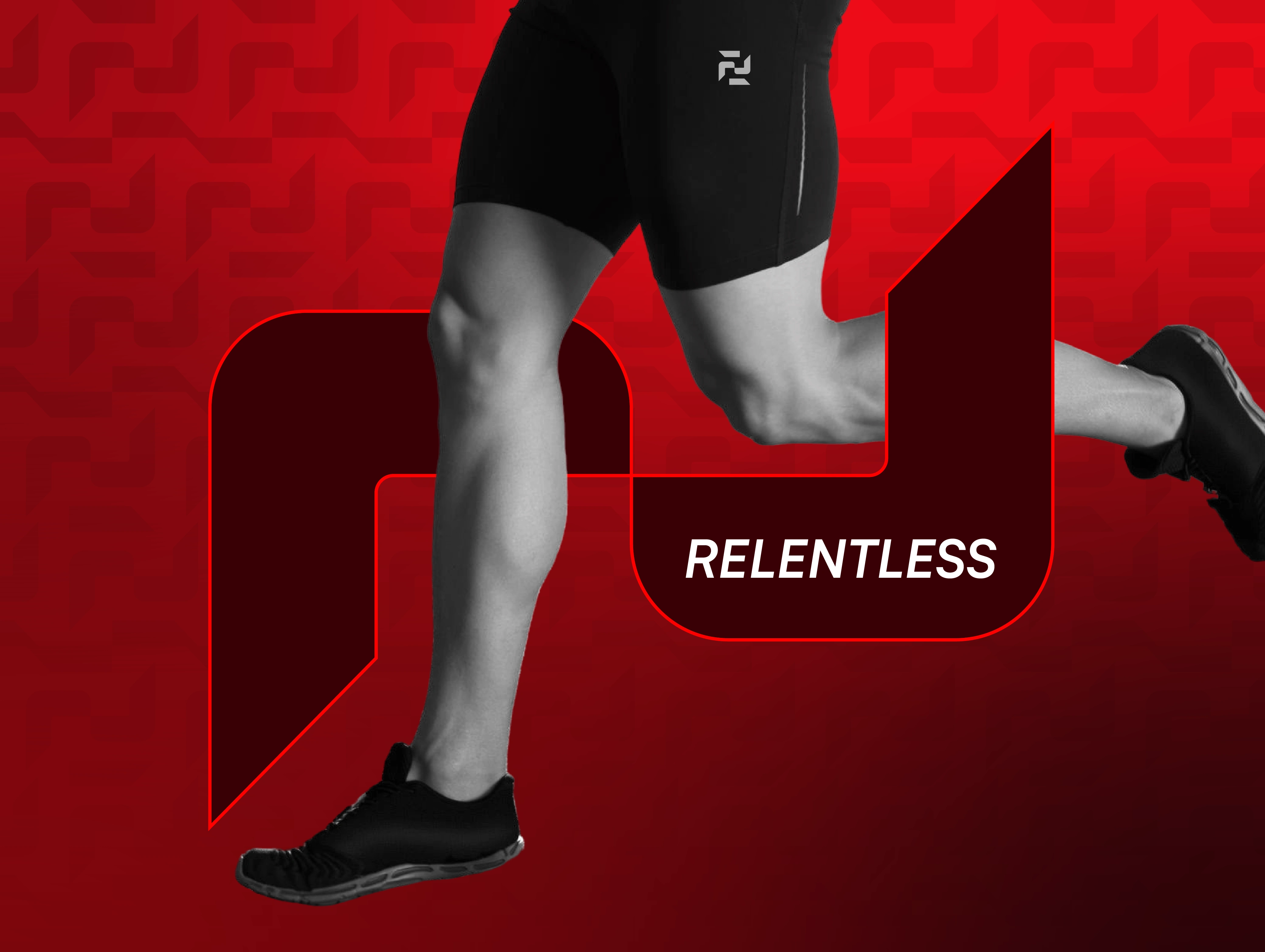
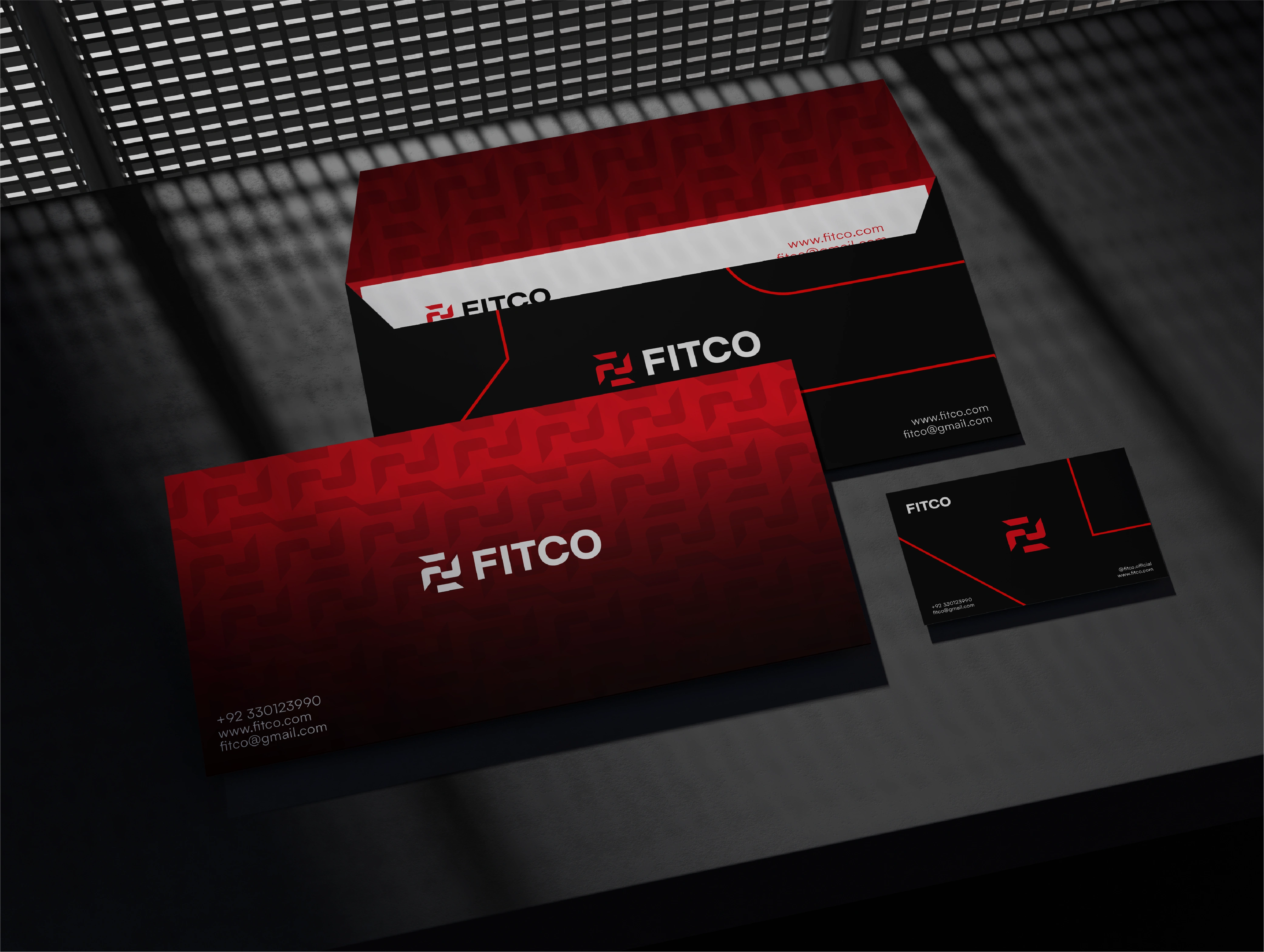
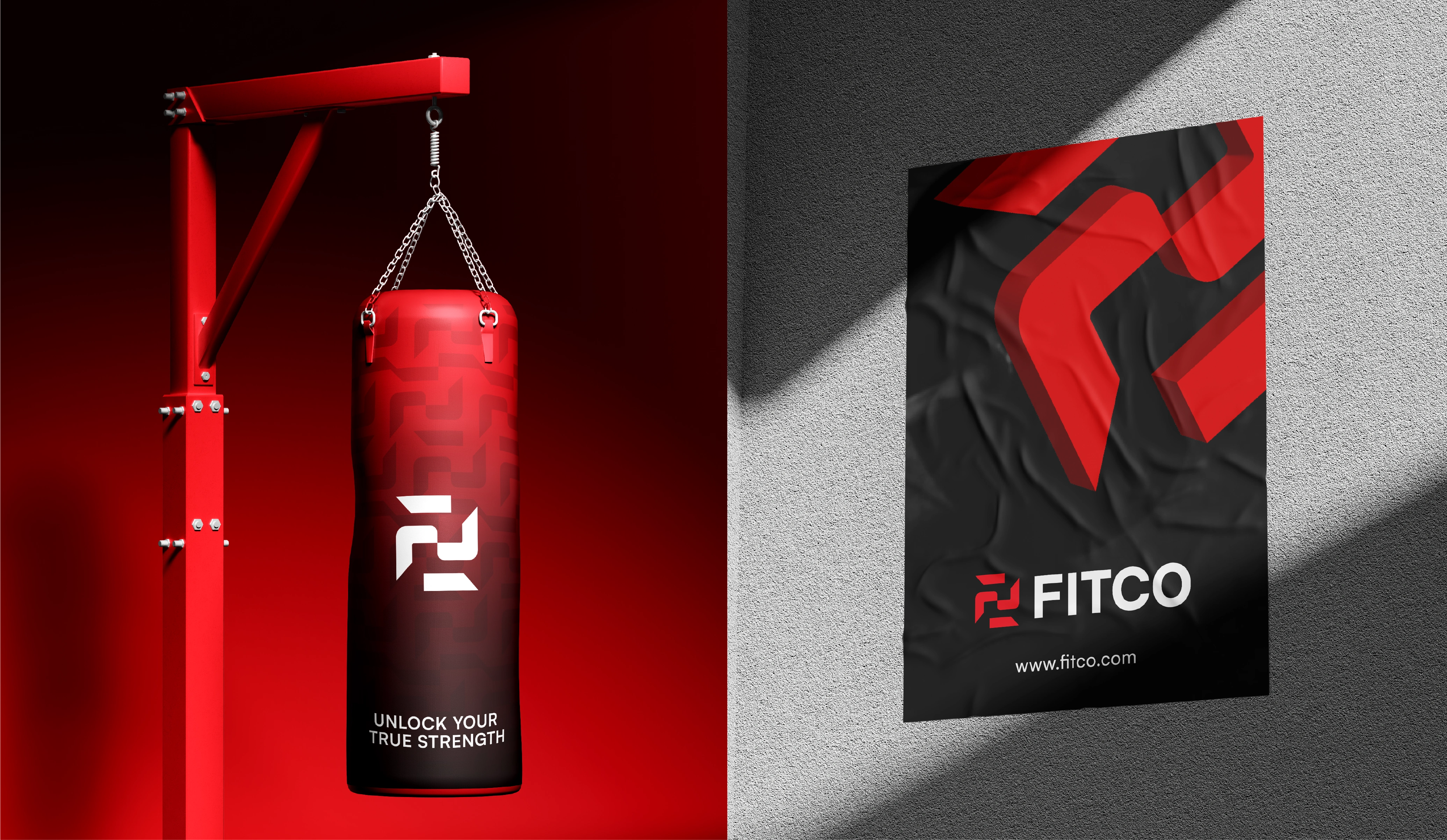
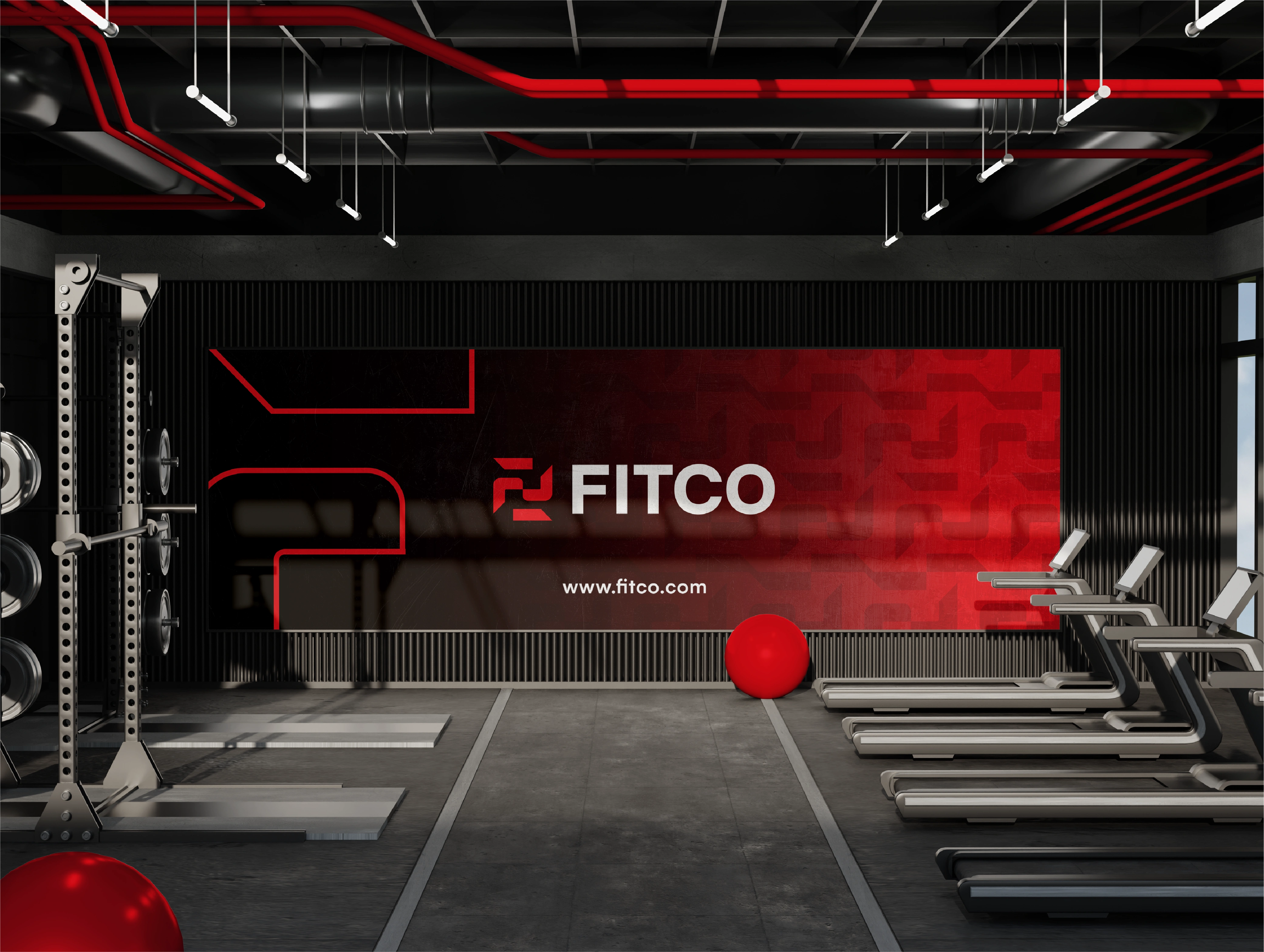
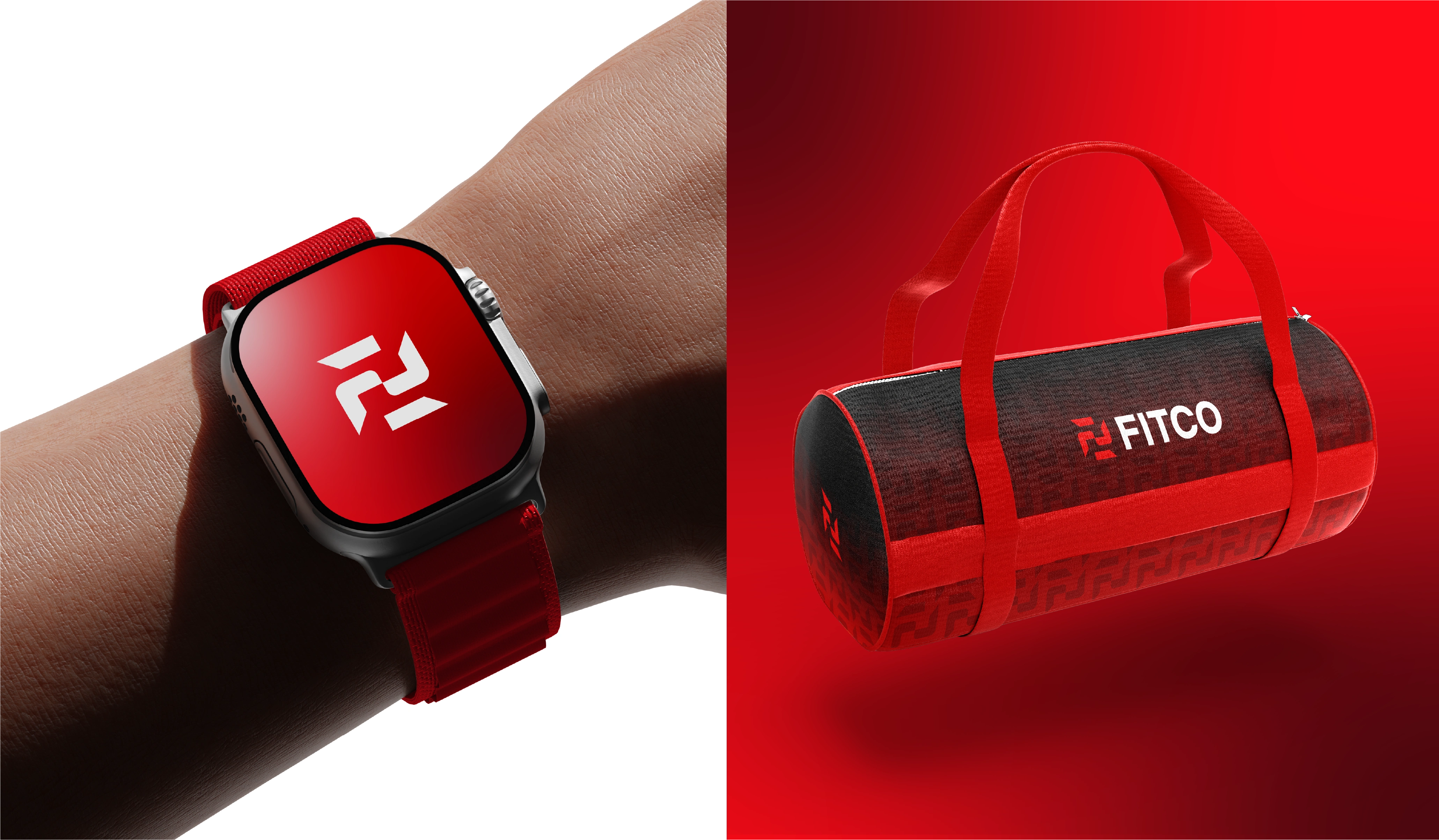
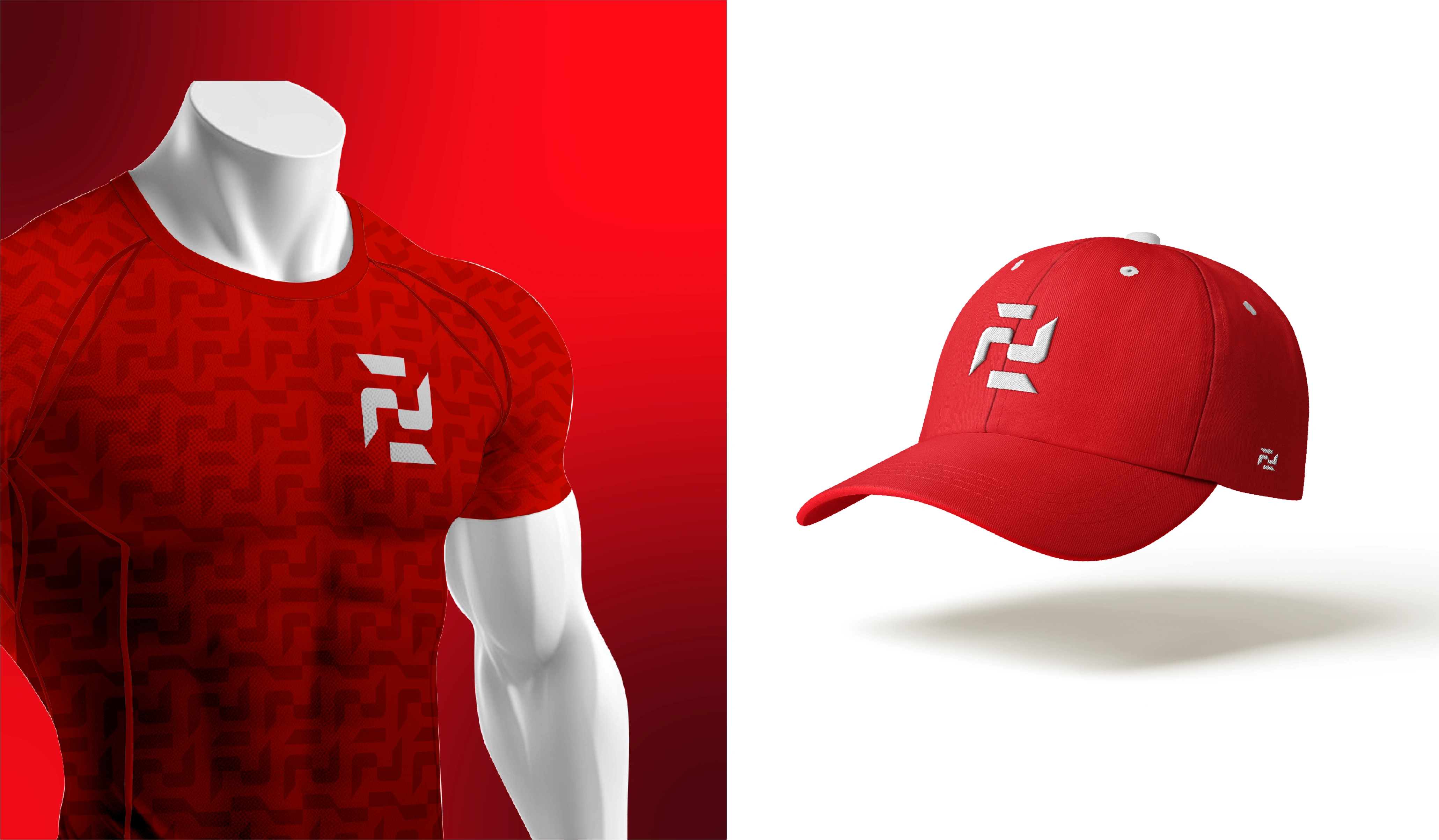
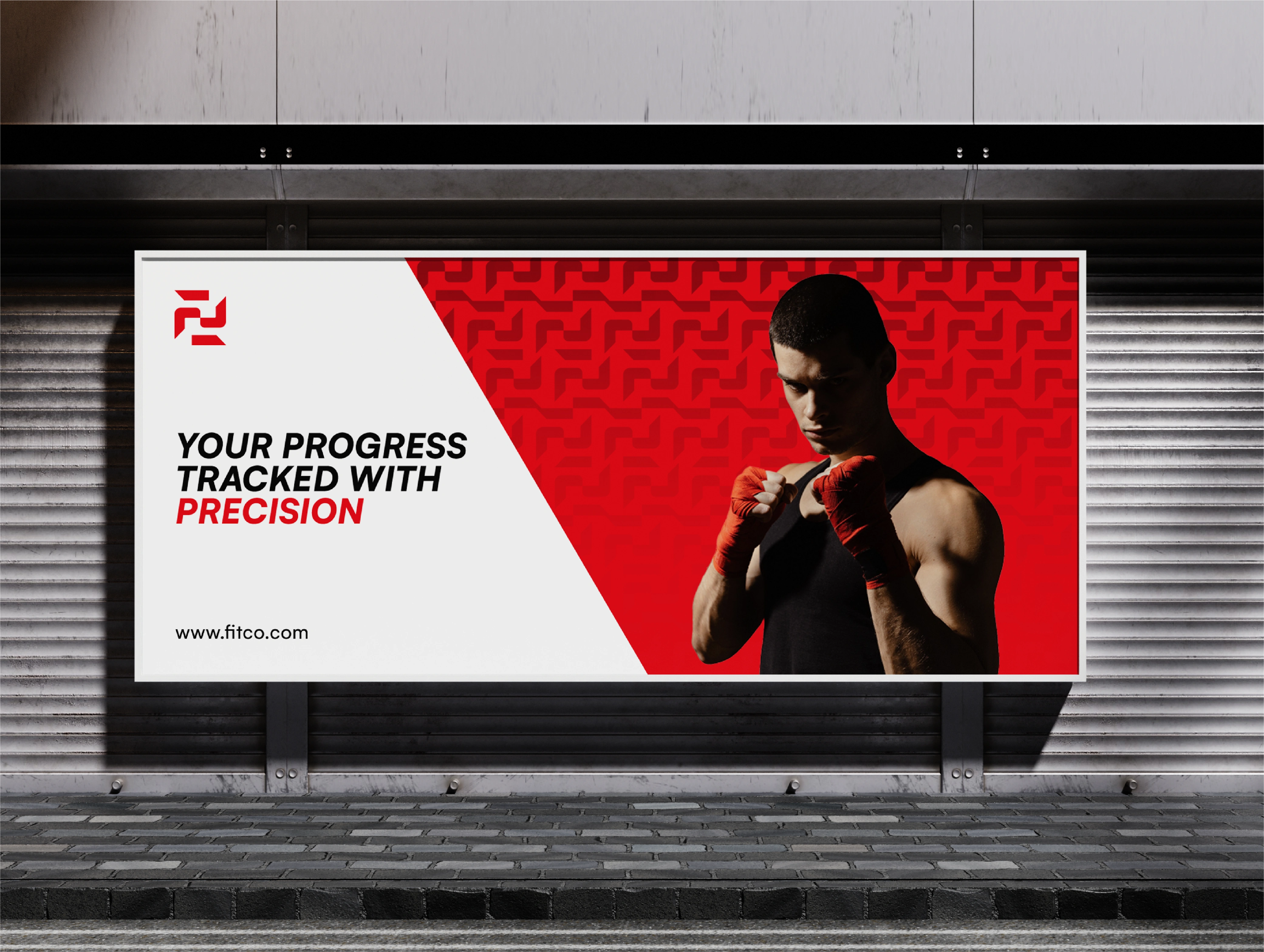
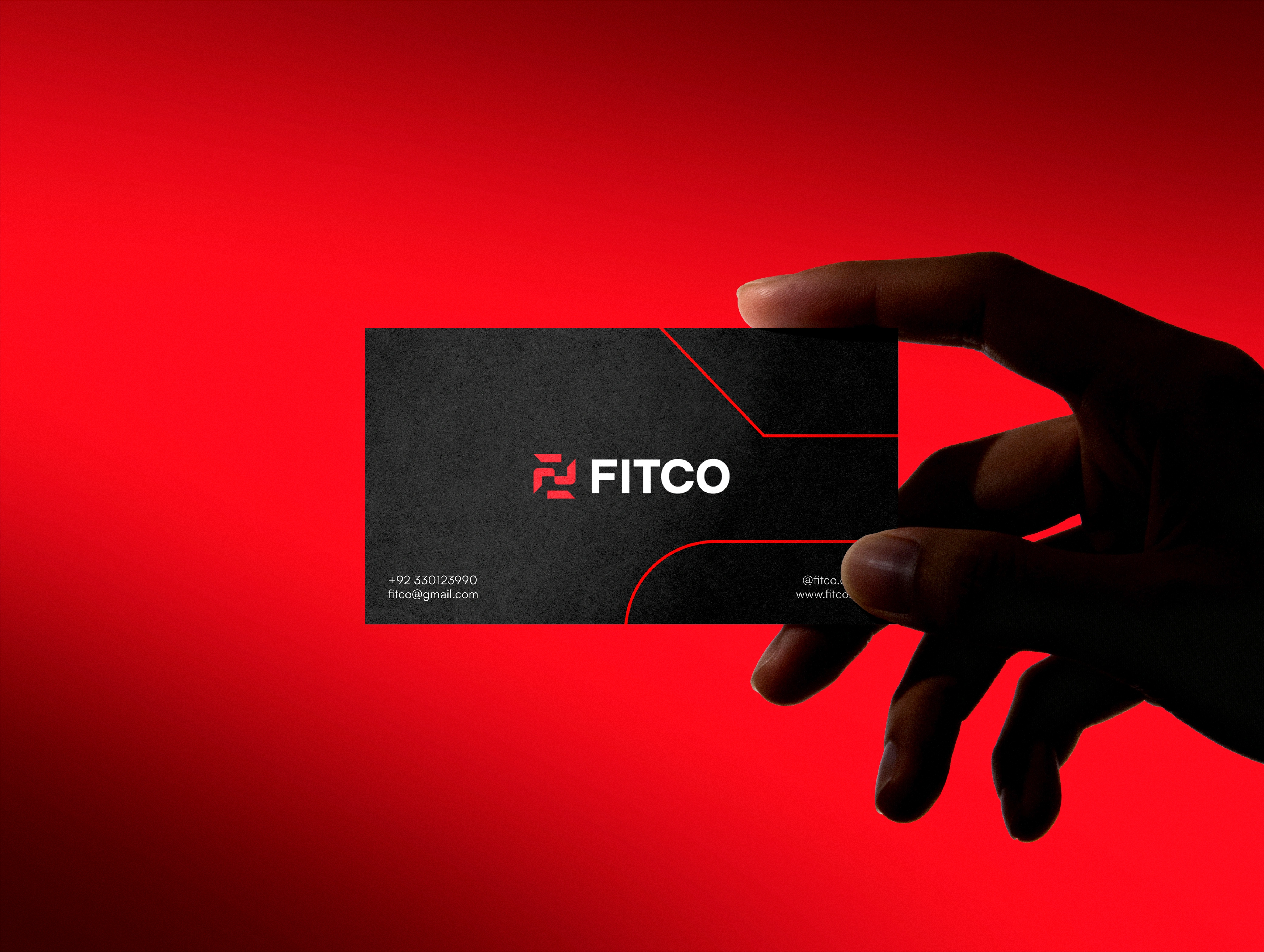
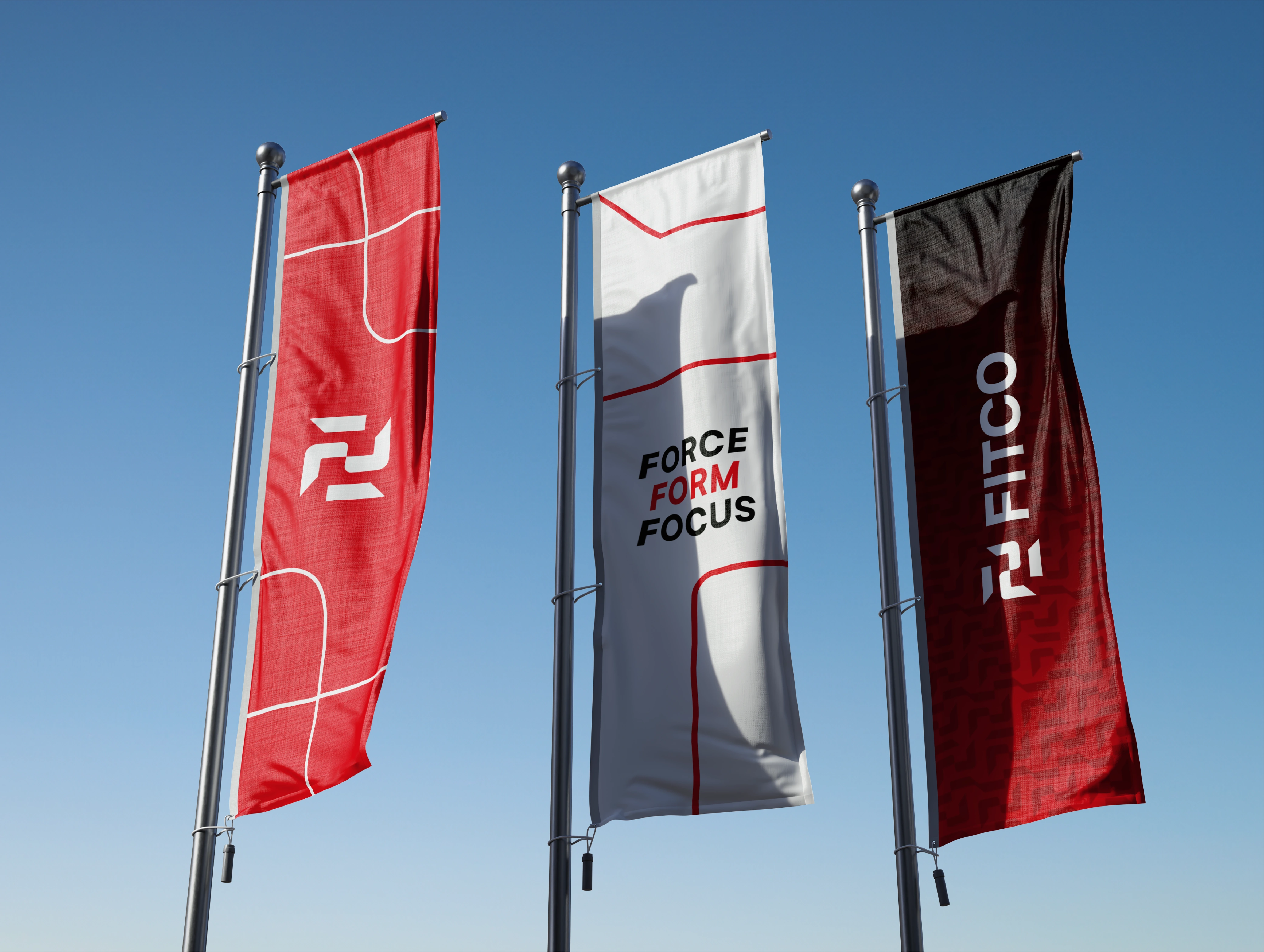
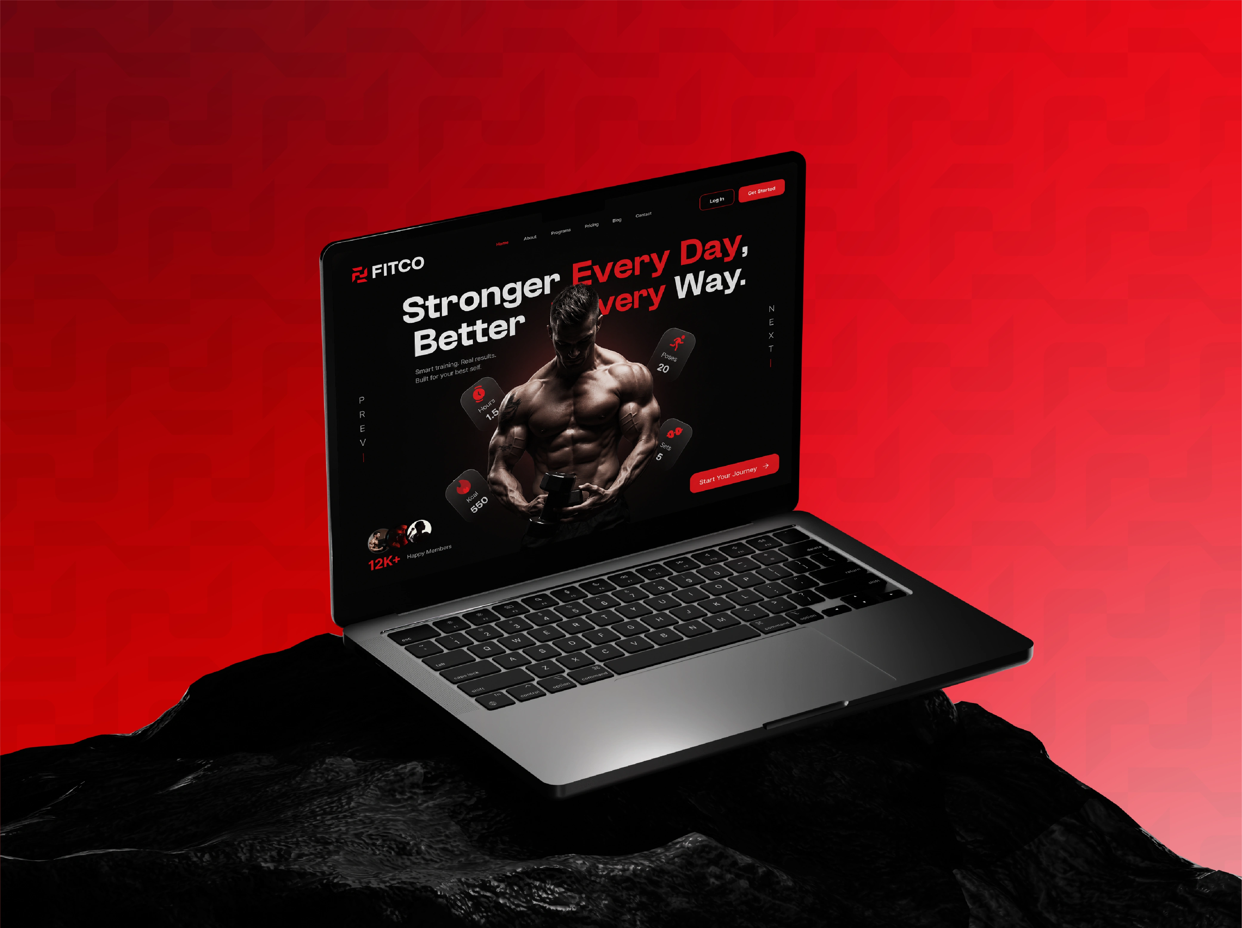
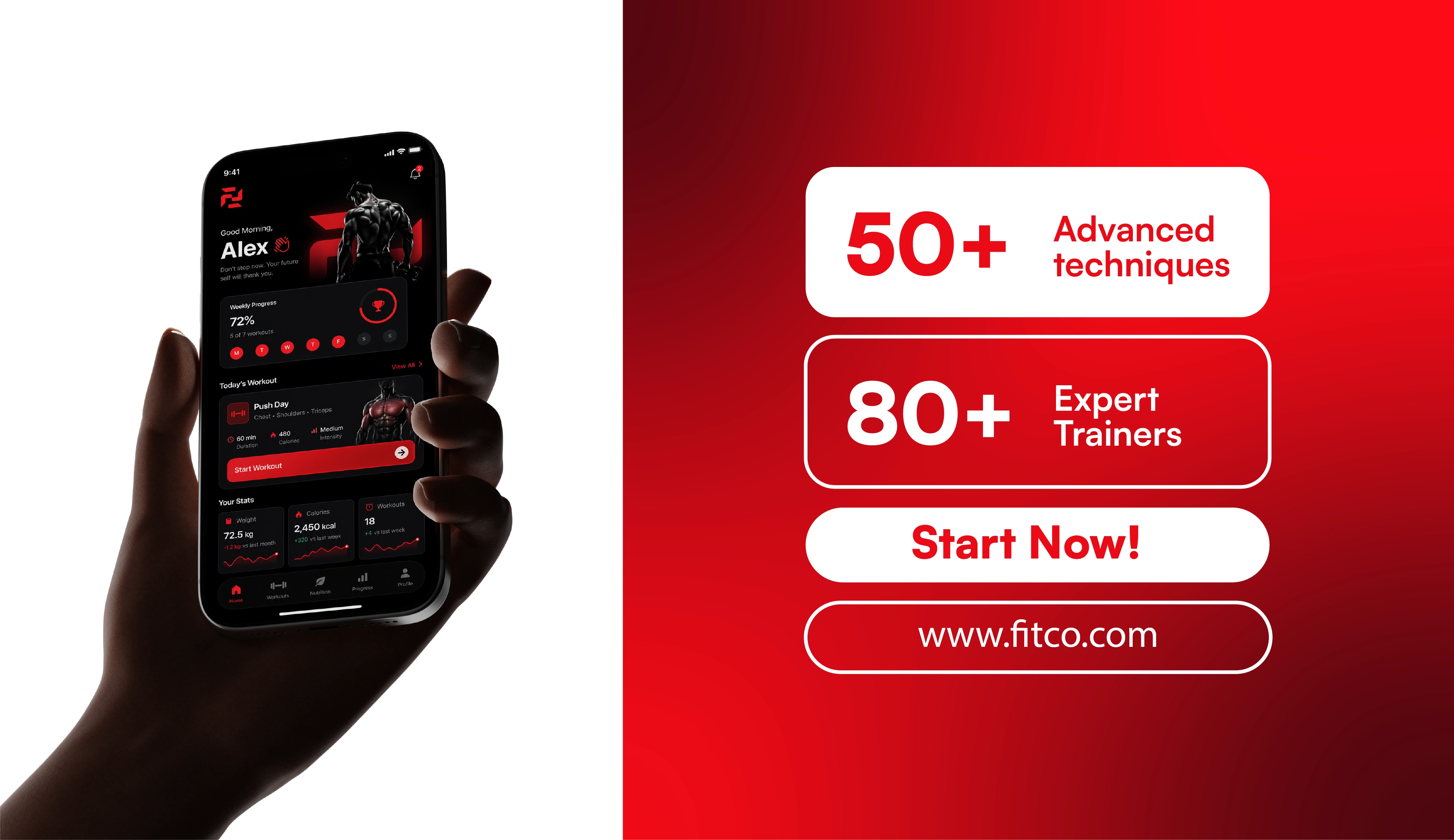
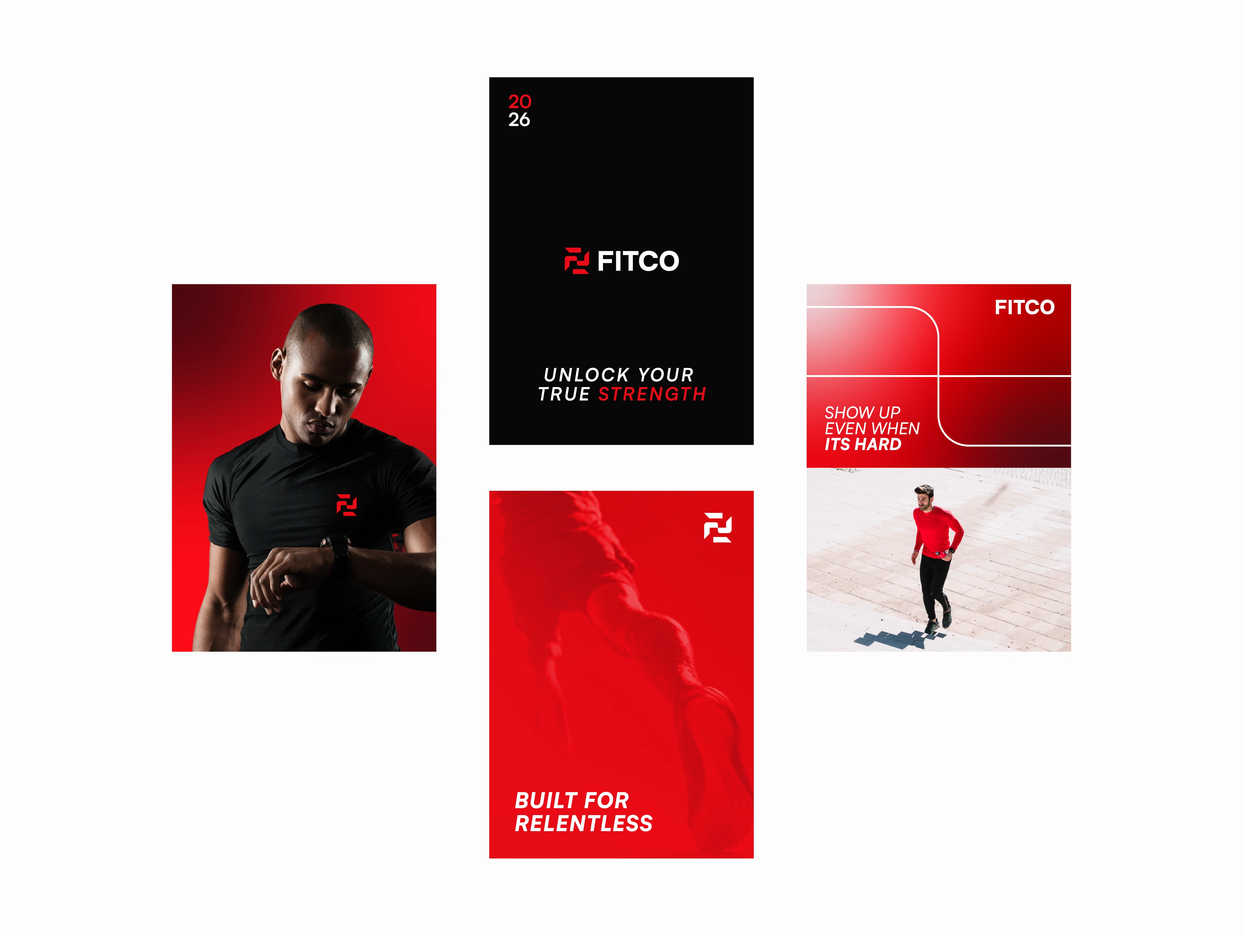
The visual identity is rooted in precision, movement, and forward momentum. The logo was designed to perform across gym signage, fitness apparel, sportswear, training equipment, mobile platforms, packaging, and marketing materials, keeping the brand consistent at every customer touchpoint.
FITCO sits at the intersection of technology and human performance. Through personalized training, performance tracking, coaching systems, and scalable fitness tools, the platform helps trainers and athletes optimize results and build lasting progress. The brand identity reflects these values and positions FITCO as a modern leader in fitness and wellness.
This project covers the full brand system: strategy, logo design, visual identity, merchandise design, packaging design, and creative direction.
Looking to build a brand like this?
Let's get connected.
Behind the Logo Concept:
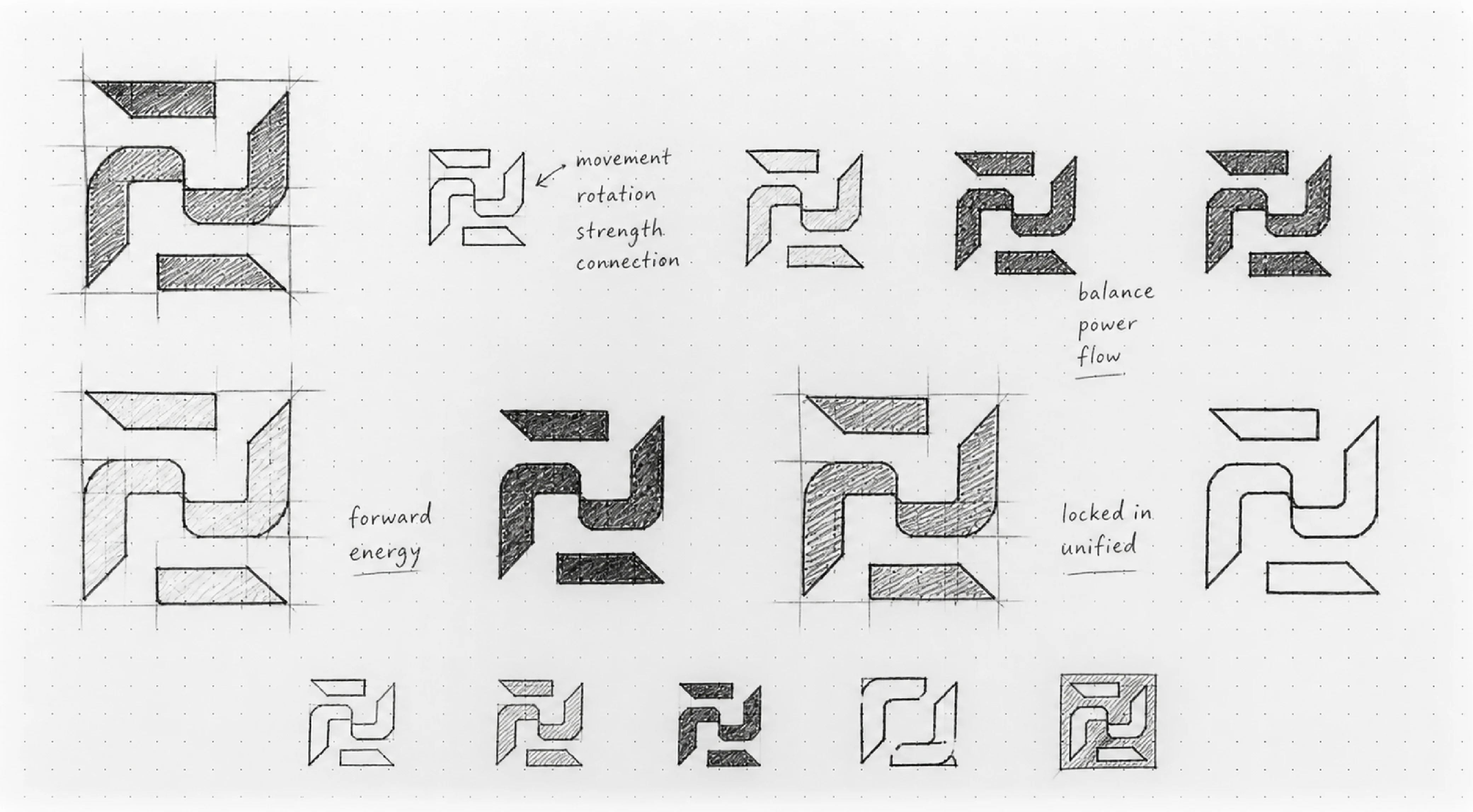
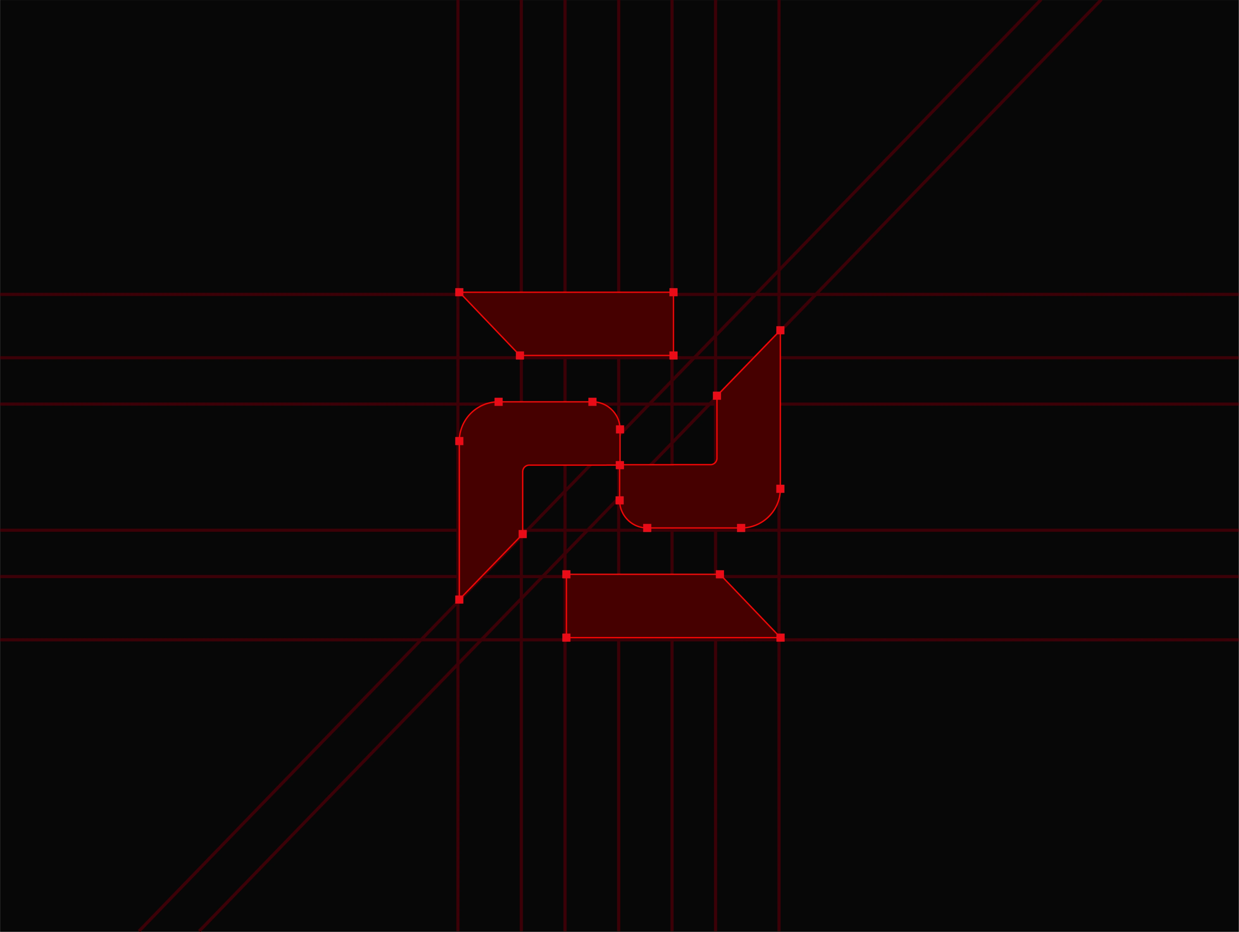
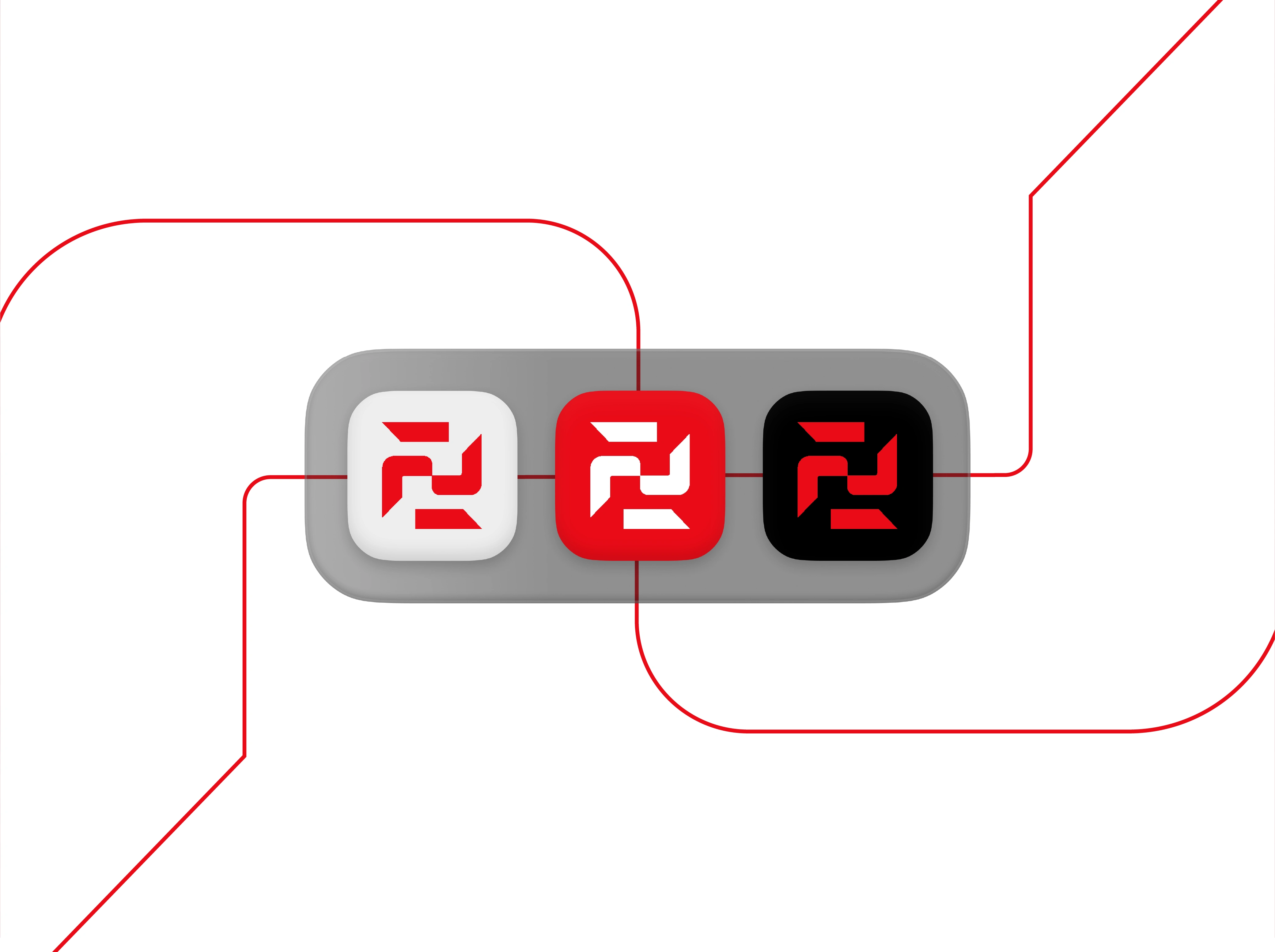
The Fitco logo was built around a custom geometric interpretation of the letter "F", transforming the brand's initial into a distinctive symbol that represents movement, strength, and performance. The design process began with grid-based sketching, exploring how the letterform could evolve beyond a traditional monogram and become a recognizable brand mark.
Through multiple iterations, the "F" was deconstructed and reconstructed using interconnected geometric shapes. This approach created a symbol that feels dynamic and forward-moving while maintaining structural balance and clarity. The flowing internal connections suggest continuous progress and development, while the sharp edges communicate power, discipline, and determination.
The final mark combines the familiarity of the letter F with abstract forms that symbolize momentum, unity, and growth. The interconnected elements create a sense of movement and rotation, reflecting the ongoing journey of training, improvement, and peak performance. At the same time, the geometric construction reinforces precision, consistency, and a system-driven approach—core principles behind the Fitco platform.
Key Concepts:
Movement & Progression
Strength & Performance
Balance & Structure
Connection & Community
Forward Momentum
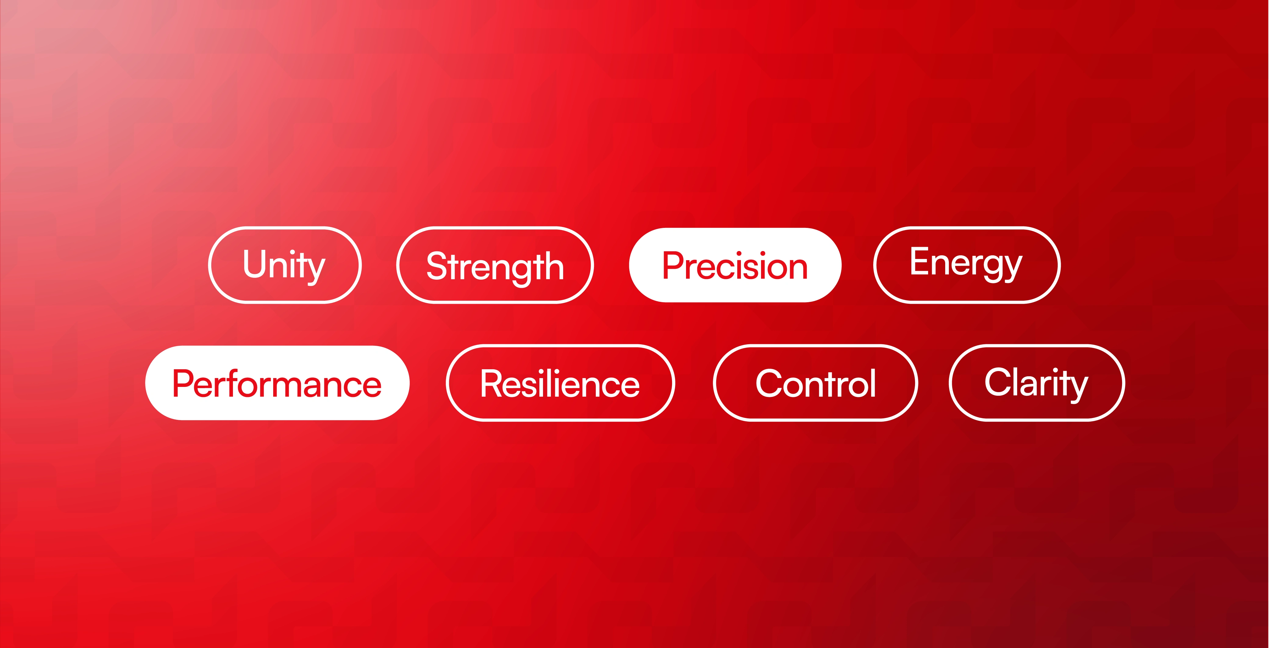
Precision & Consistency
This approach transformed a simple symbol into a distinctive brand asset that represents Fitco's mission of helping individuals and fitness professionals achieve measurable growth through structured performance systems.



Let's transform your brand next!
E-mail:
hi@arvonn.com
Website:
arvonn.com
All Rights Reserved ©
Like this project
Posted Oct 13, 2026
Fitness logo design & brand identity for FITCO, a performance platform for trainers and gyms. Geometric F mark, visual identity, merchandise, and packaging.
Likes
1
Views
7
Clients
FITCO