Xoto Brand Identity Design

Muhammad Abdullah


Logo Design and Brand Identity
XOTO Brand Identity | Data Intelligence Platform Branding
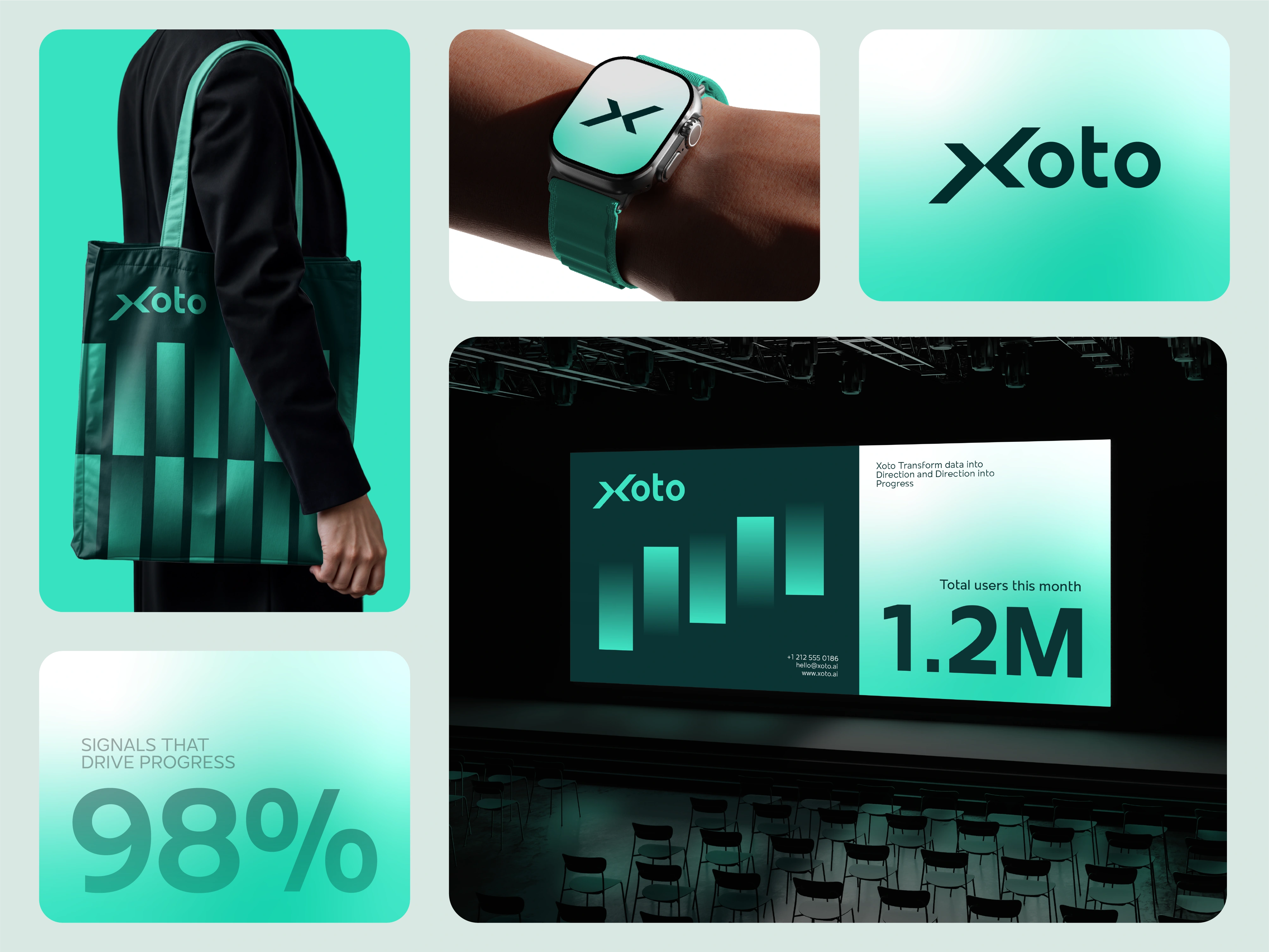
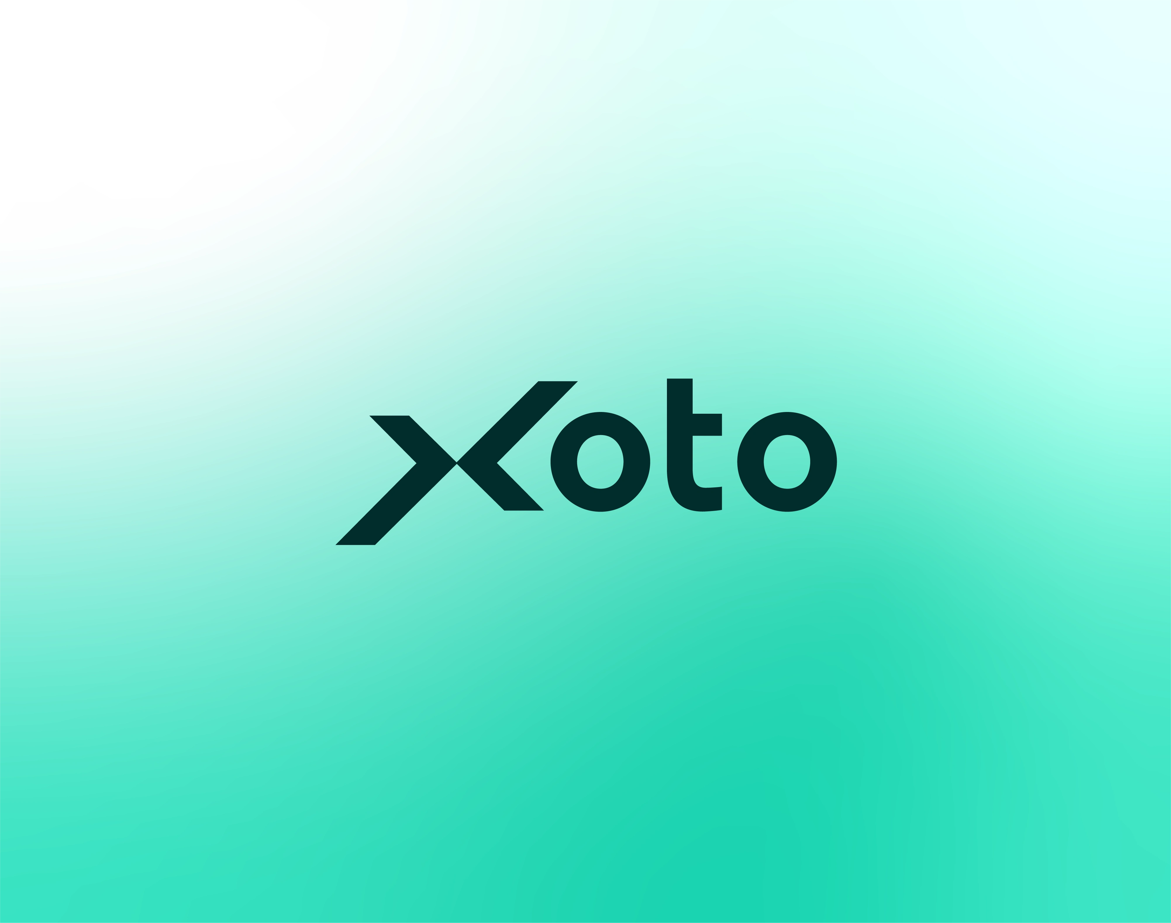
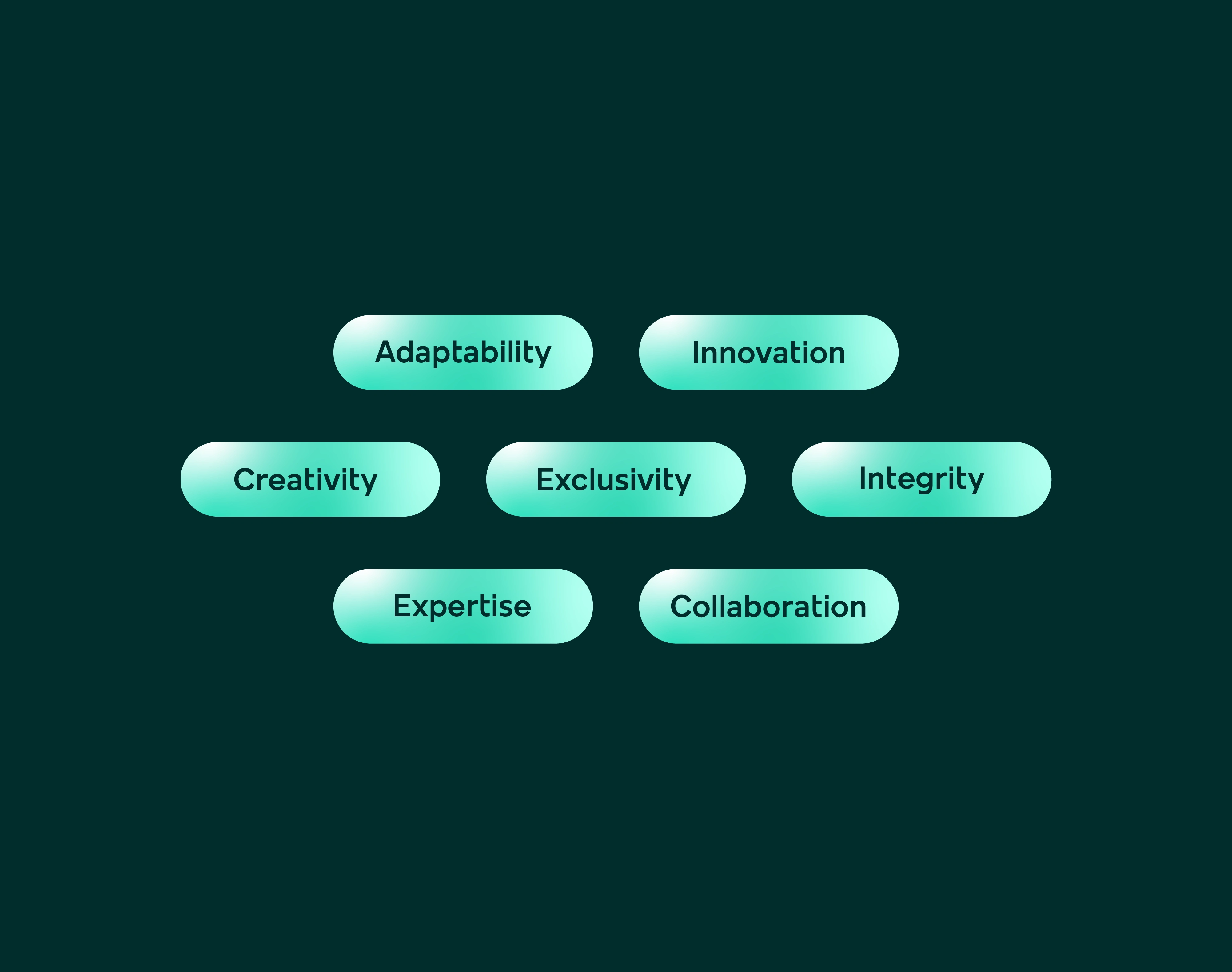
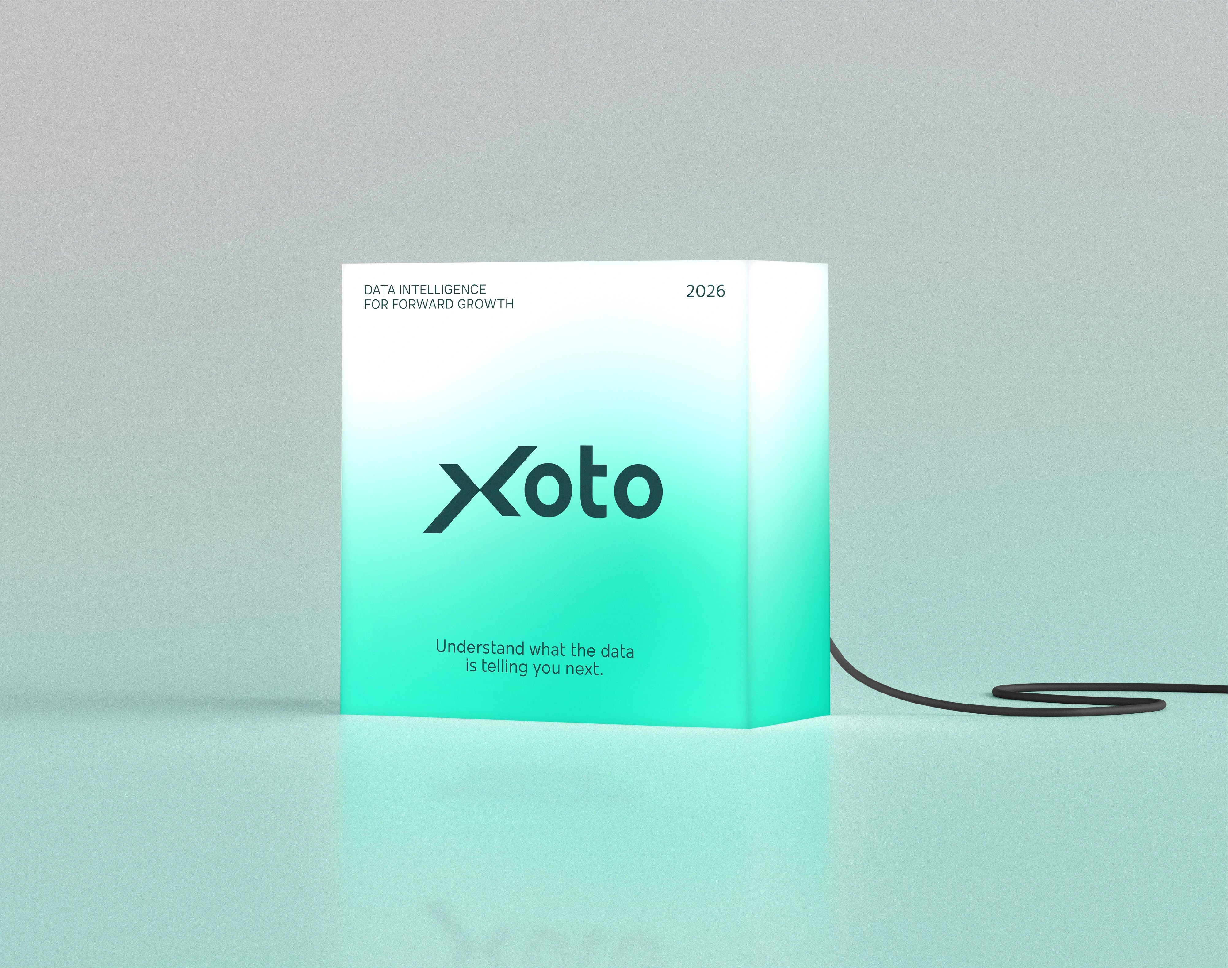
Xoto Brand Identity is a identity design for a data intelligence platform built for businesses that need to move forward with greater certainty. The brand identity was developed around a clear strategic idea: Intelligence in Motion. Rather than positioning data as something static to analyze, Xoto transforms business information into directional intelligence—helping organizations recognize change, understand opportunity, and know where to move next.
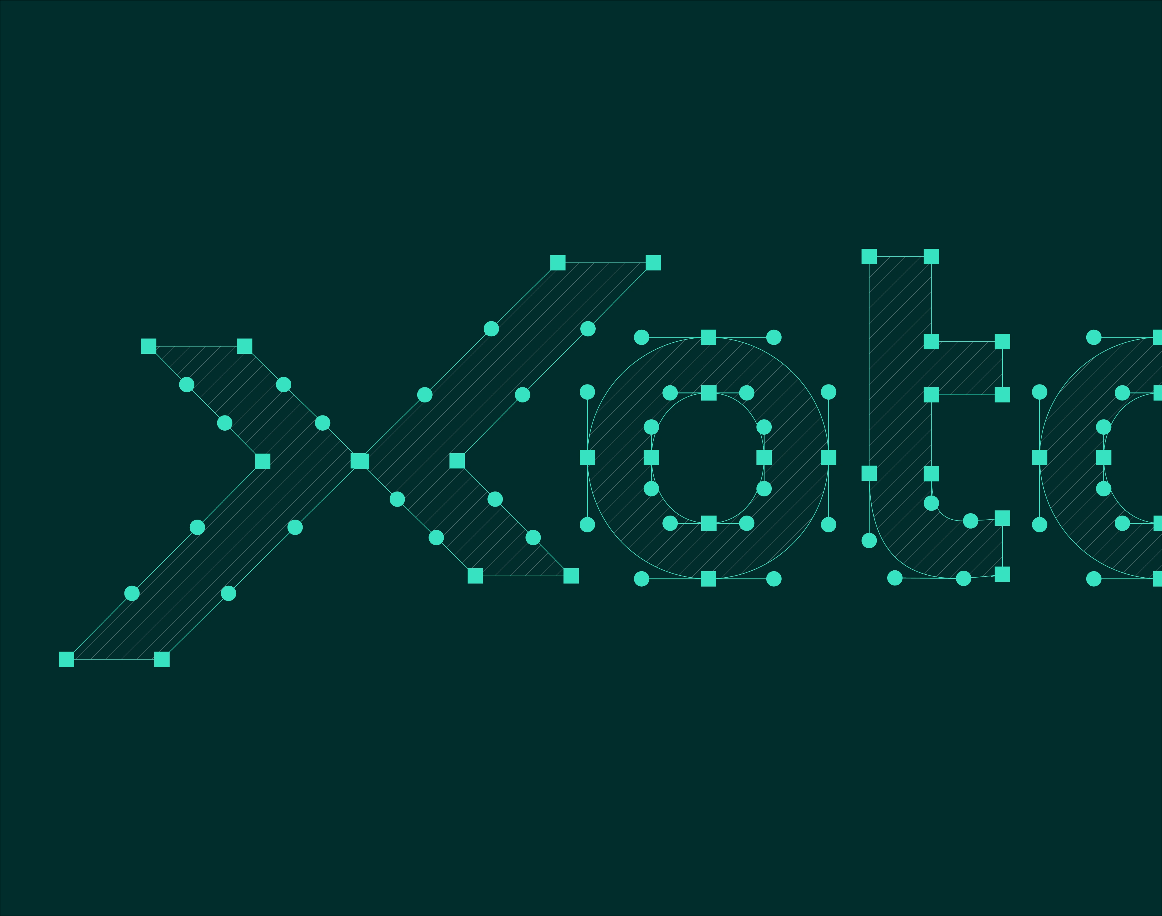
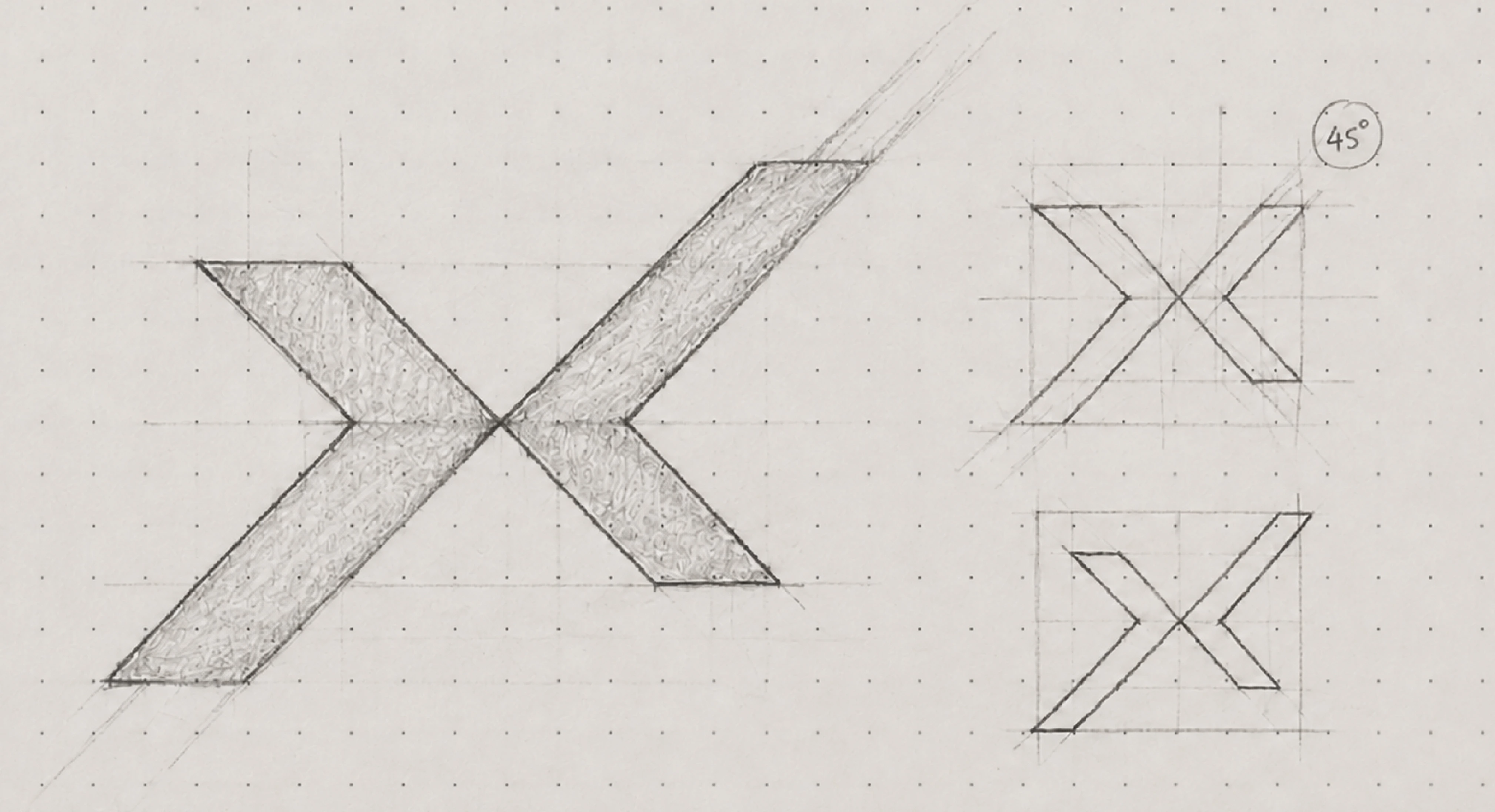
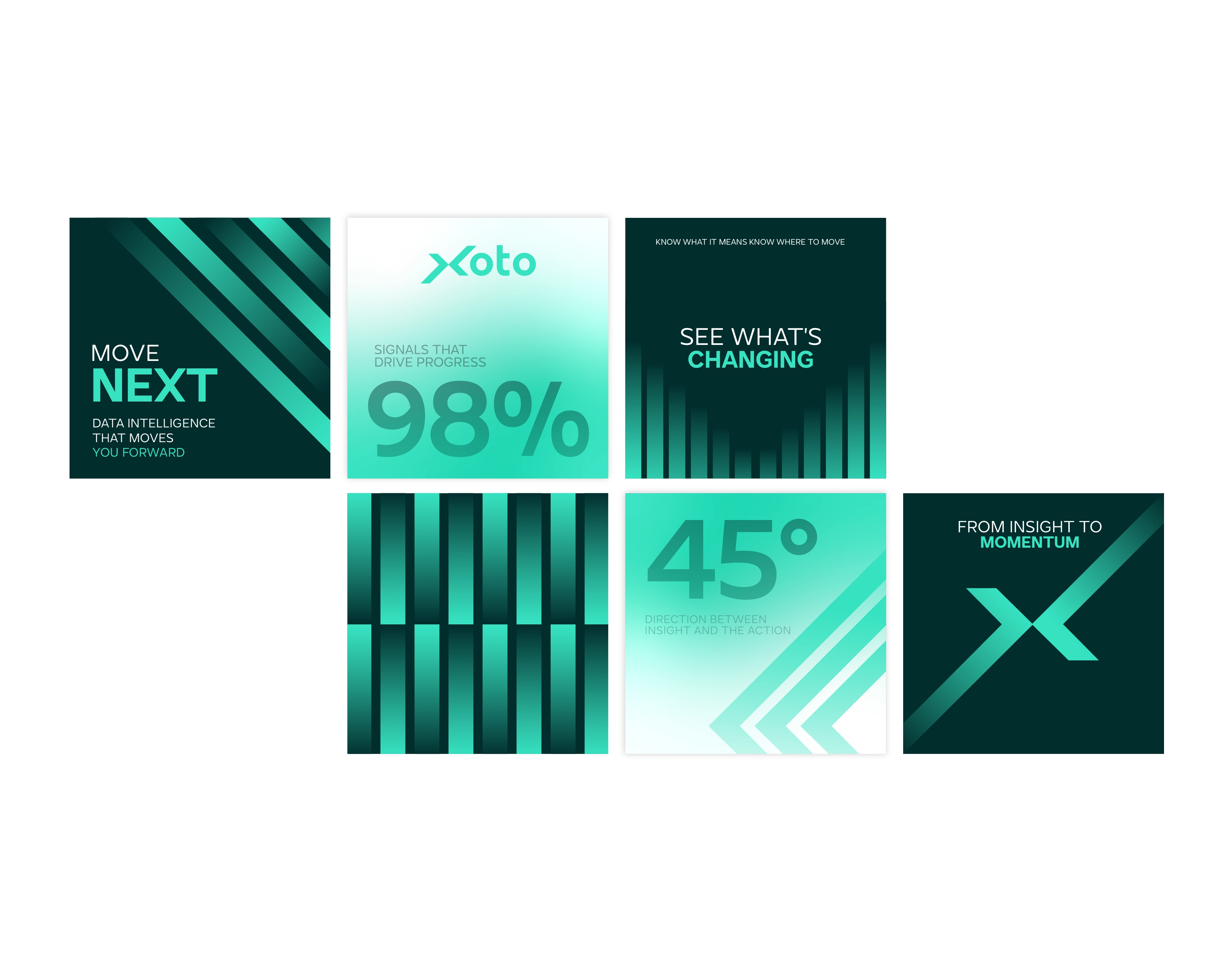
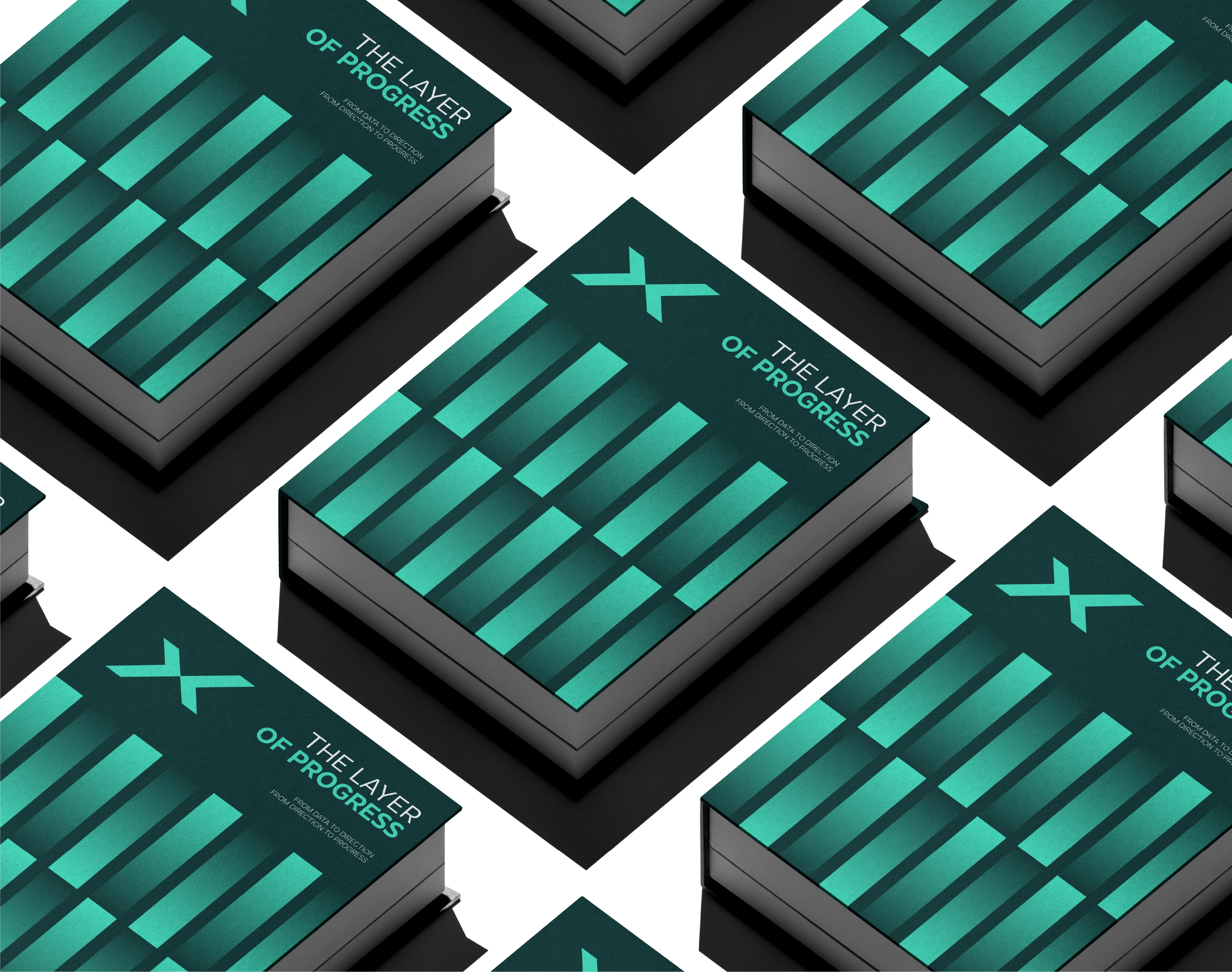
At the centre of the identity is the 45° angle, established as the visual expression of progress, movement, direction, growth, and momentum. The angle represents the moment information begins to move forward, while the X becomes the point where two directions meet and transformation occurs. Together, these principles create a distinctive visual language built around movement rather than conventional data and analytics symbolism.
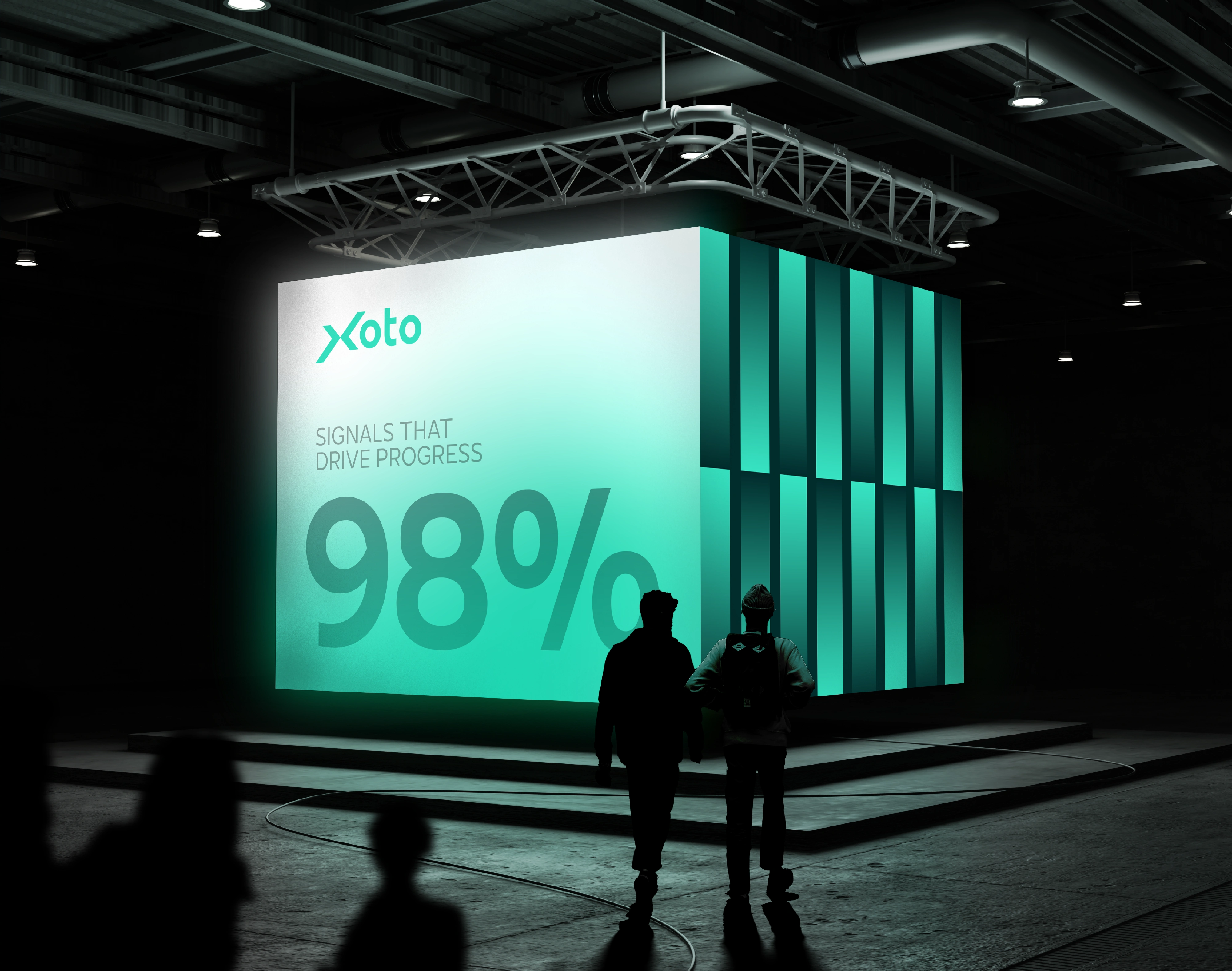
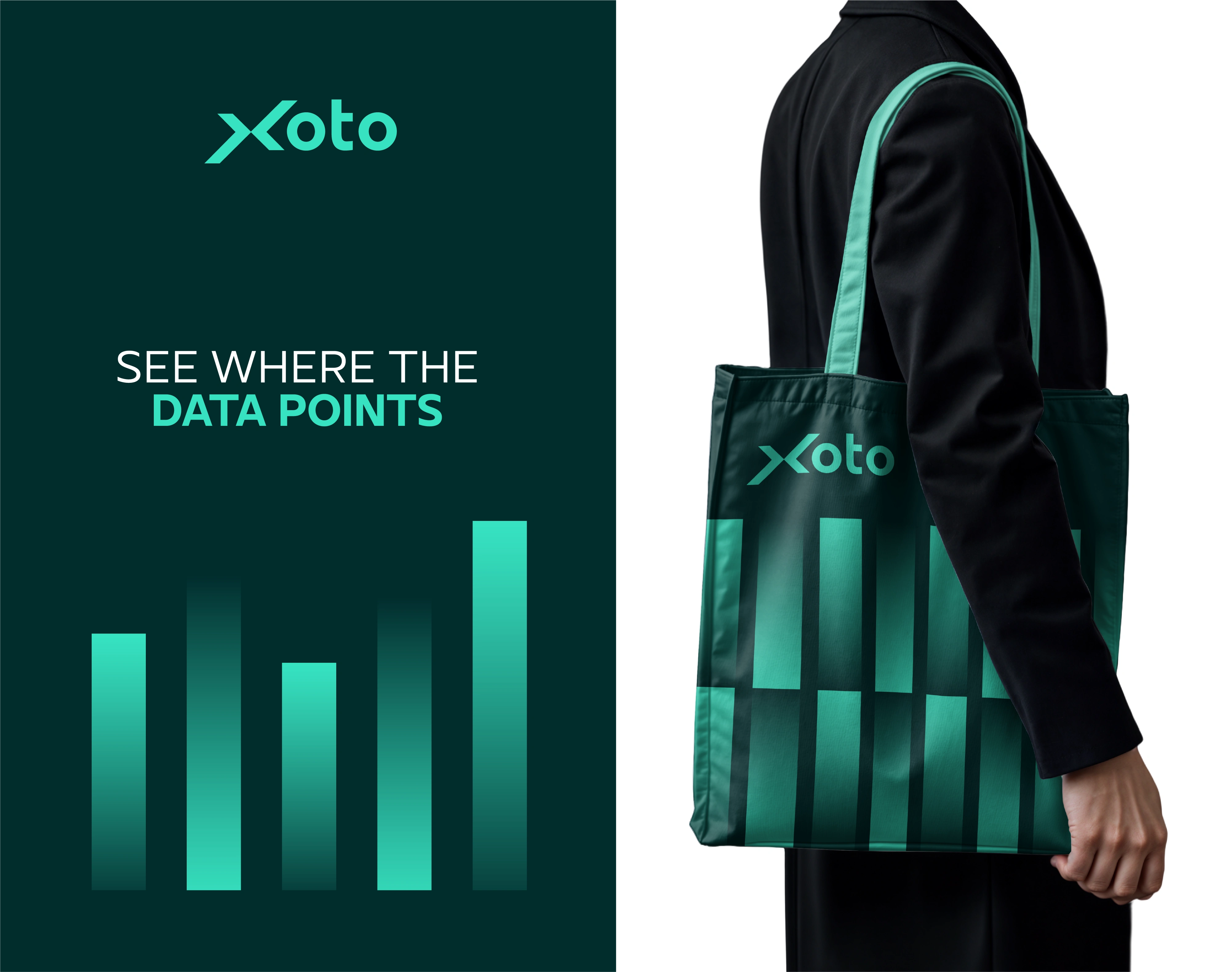
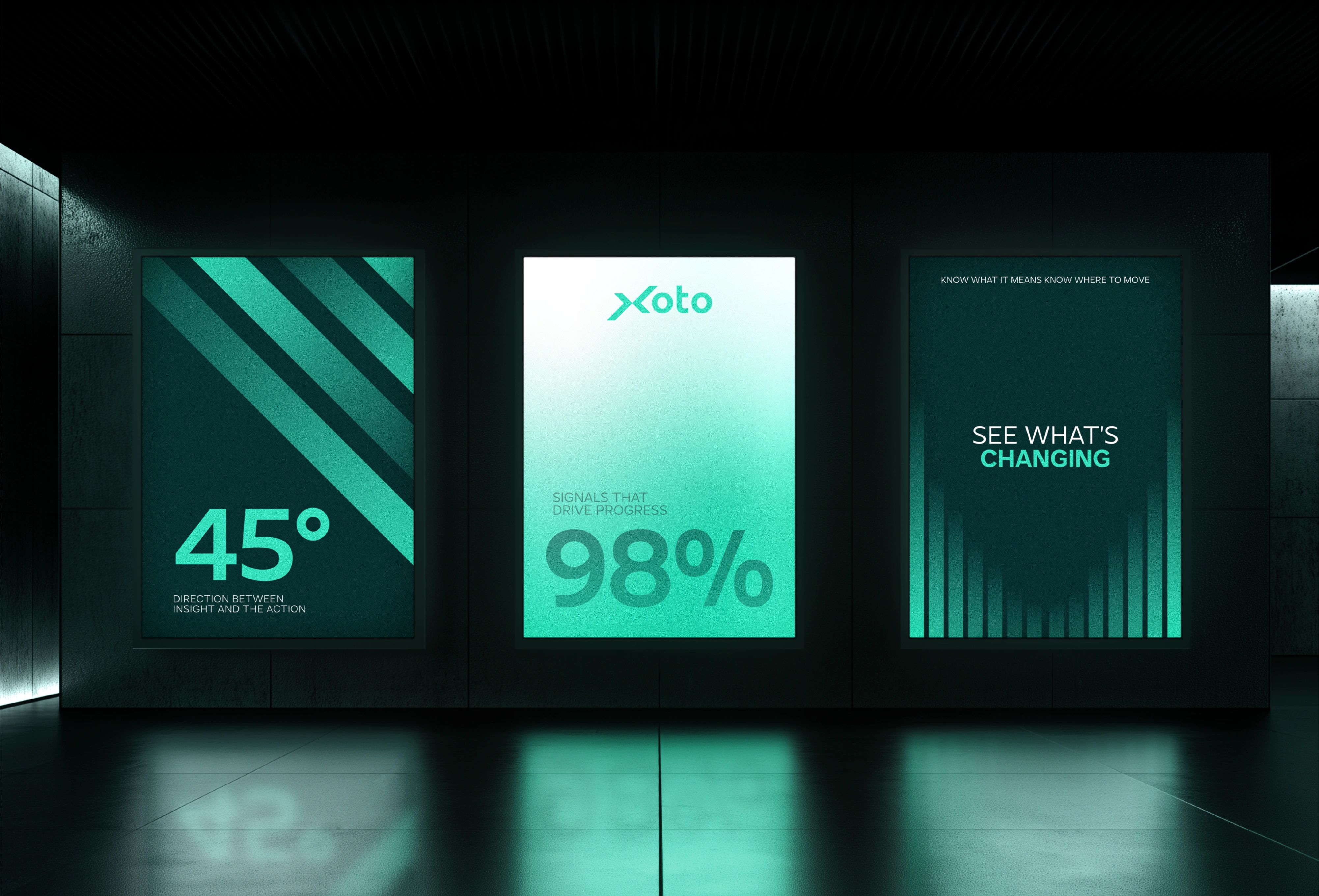
The wider visual identity extends this directional logic through 45° trajectories, data paths, geometric structures, signals, intersections, motion paths, and dynamic compositions. Instead of relying on static dashboards, charts, or generic technology imagery, the system visualizes the trajectory created by information. Elements rise, advance, intersect, accelerate, and continue beyond the frame, creating the feeling of a larger system already in motion.
The core visual grammar follows a simple progression: Point → Movement → Direction → Transformation → Progress. A point represents the current state, movement signals change, the 45° angle establishes direction, the X represents transformation, and momentum represents continued progress. This framework allows the identity to remain recognizable across brand applications even when the logo itself is absent.
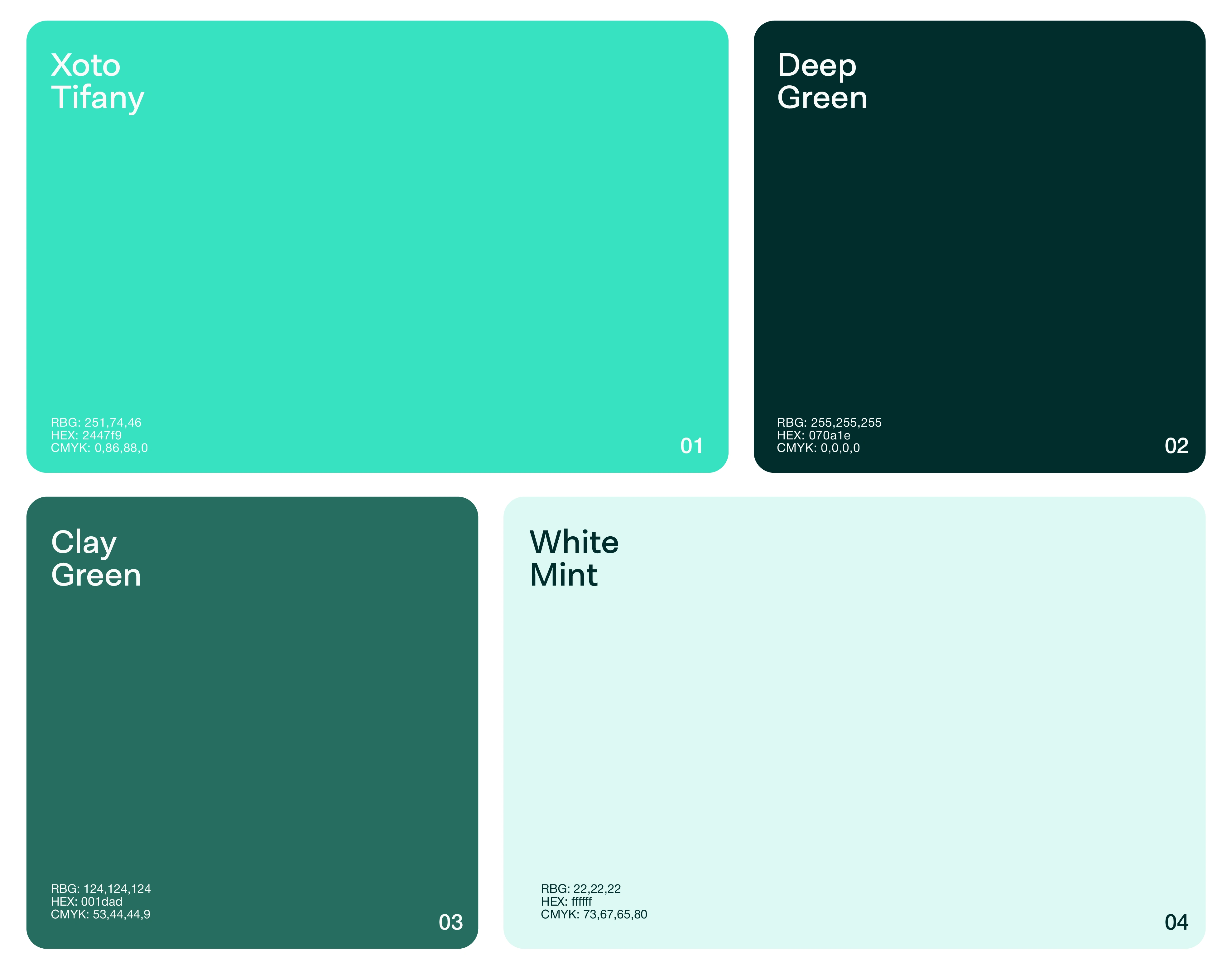
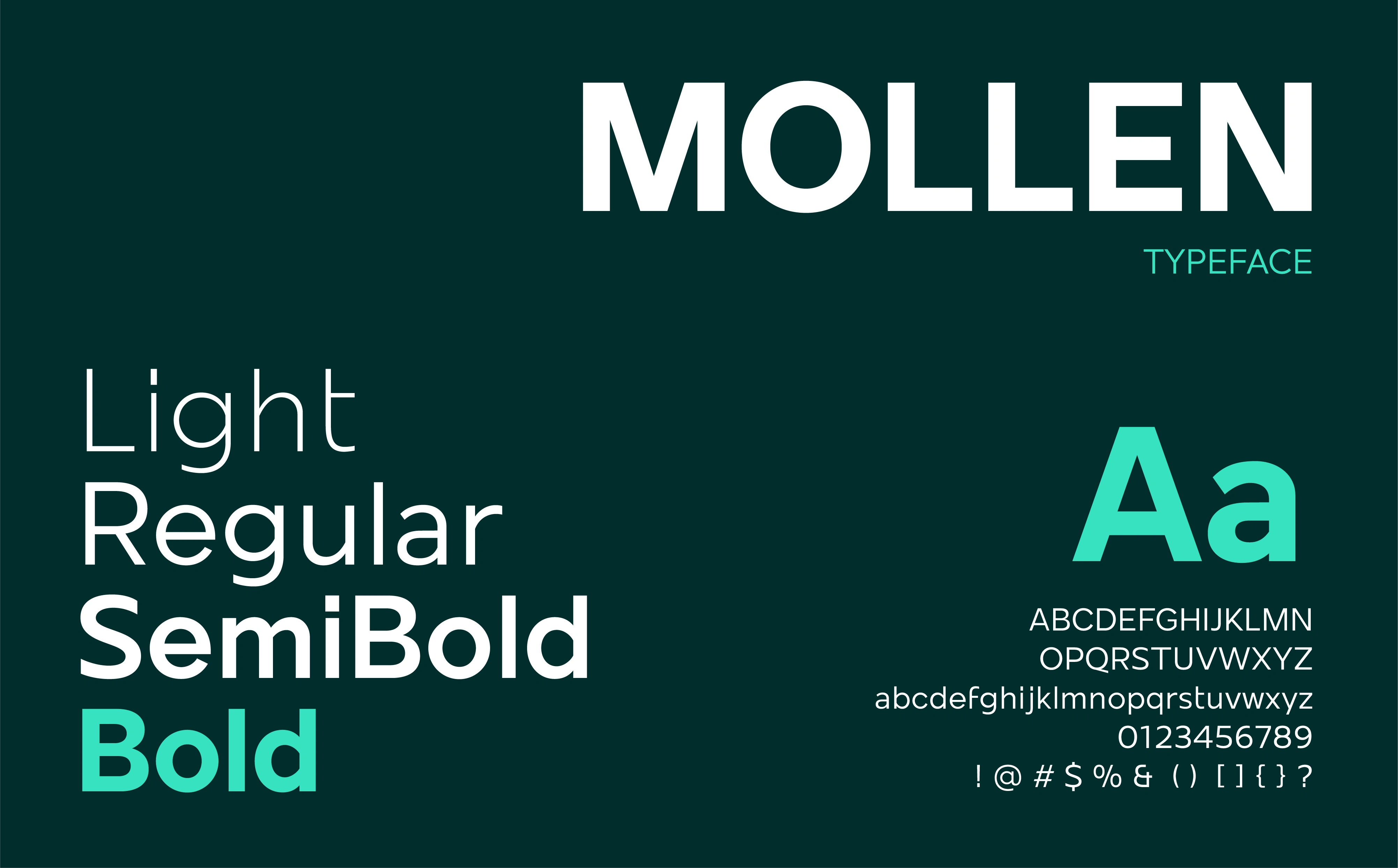
The colour system combines Deep Teal, Xoto Turquoise, Aqua/Mint, and White. Deep Teal provides intelligence, depth, stability, and infrastructure, while Xoto Turquoise acts as the active force representing movement, energy, discovery, and progress. Colour functions as information rather than decoration, with brighter signals communicating greater importance. Typography combines contemporary, confident headlines with analytical details such as metrics, percentages, coordinates, and directional annotations.
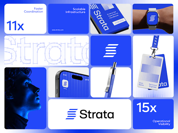
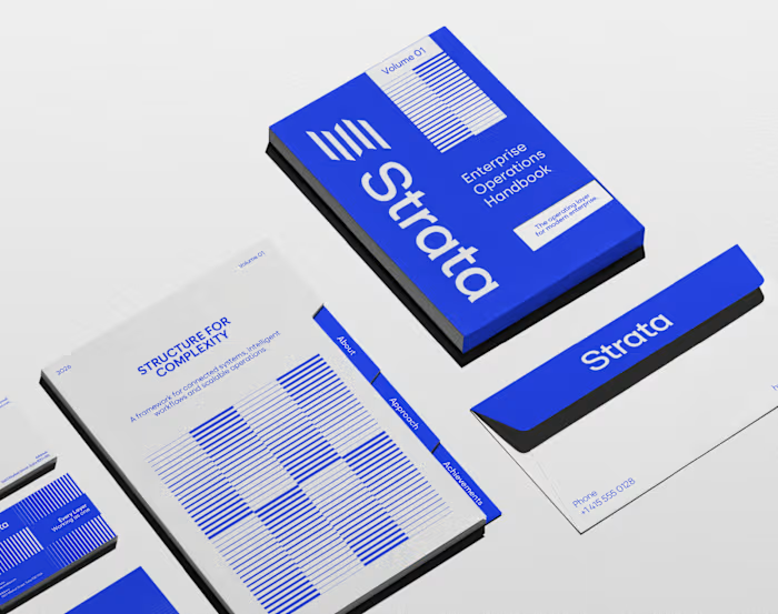
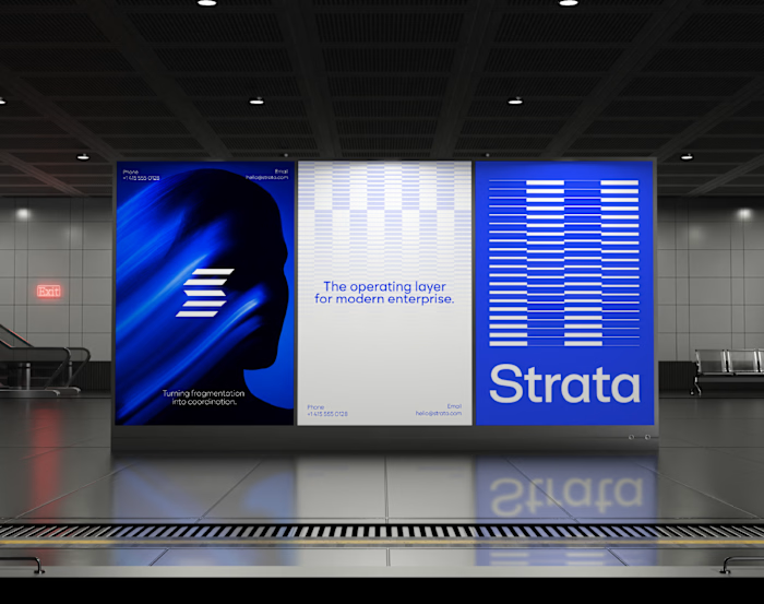
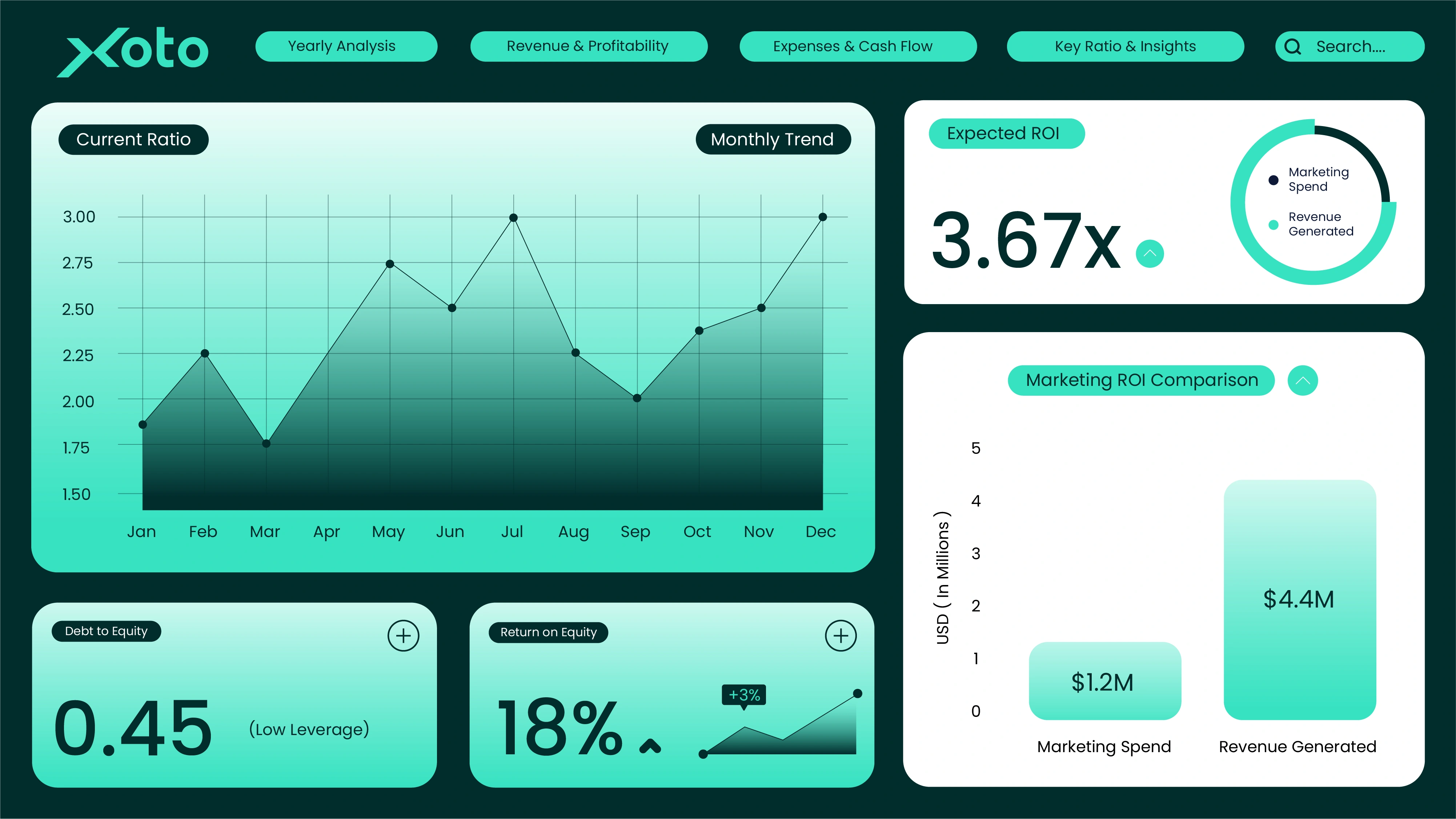
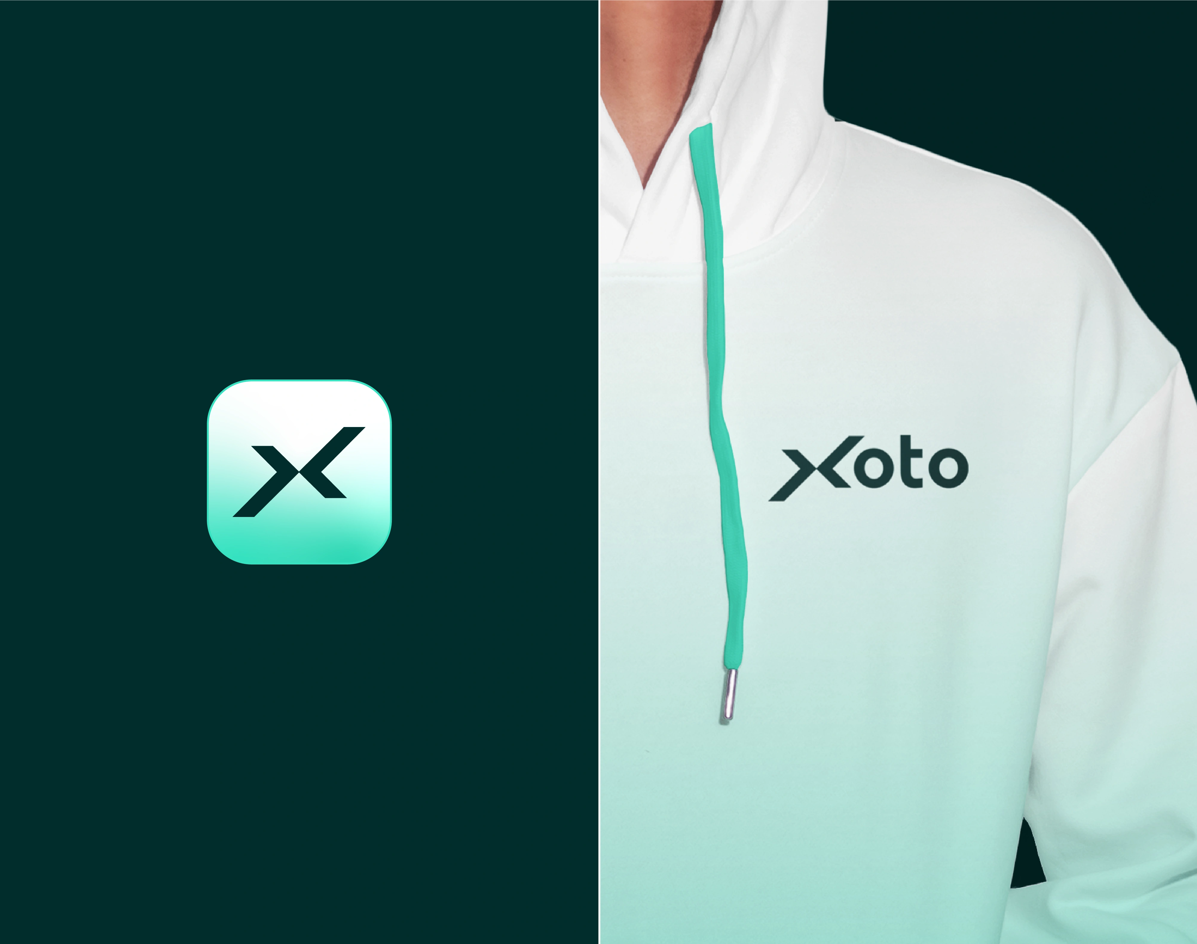
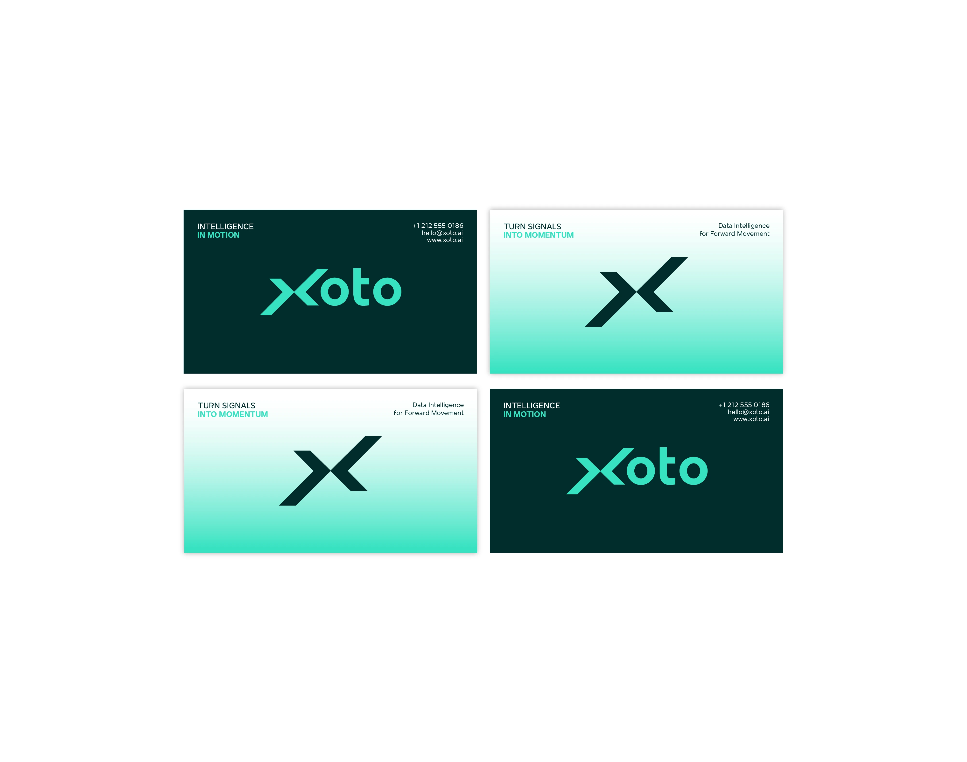
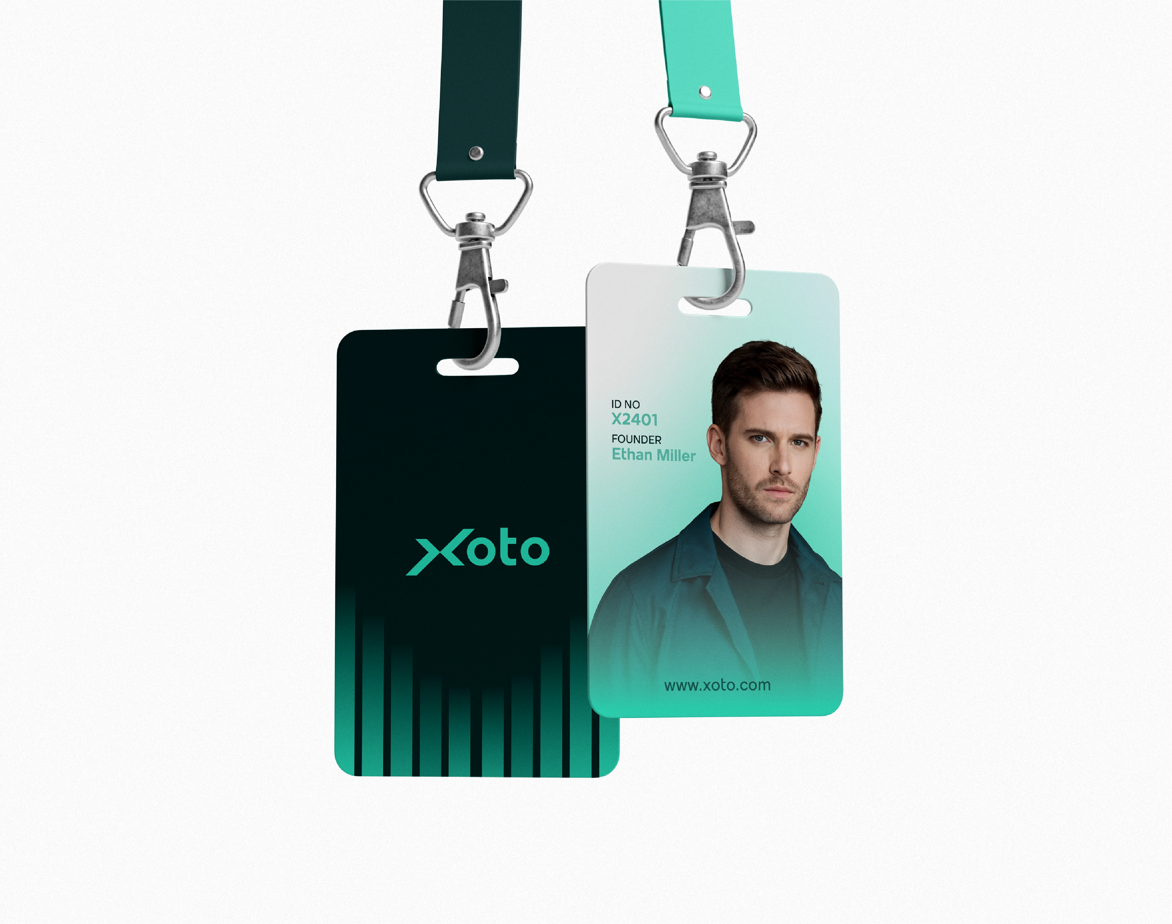
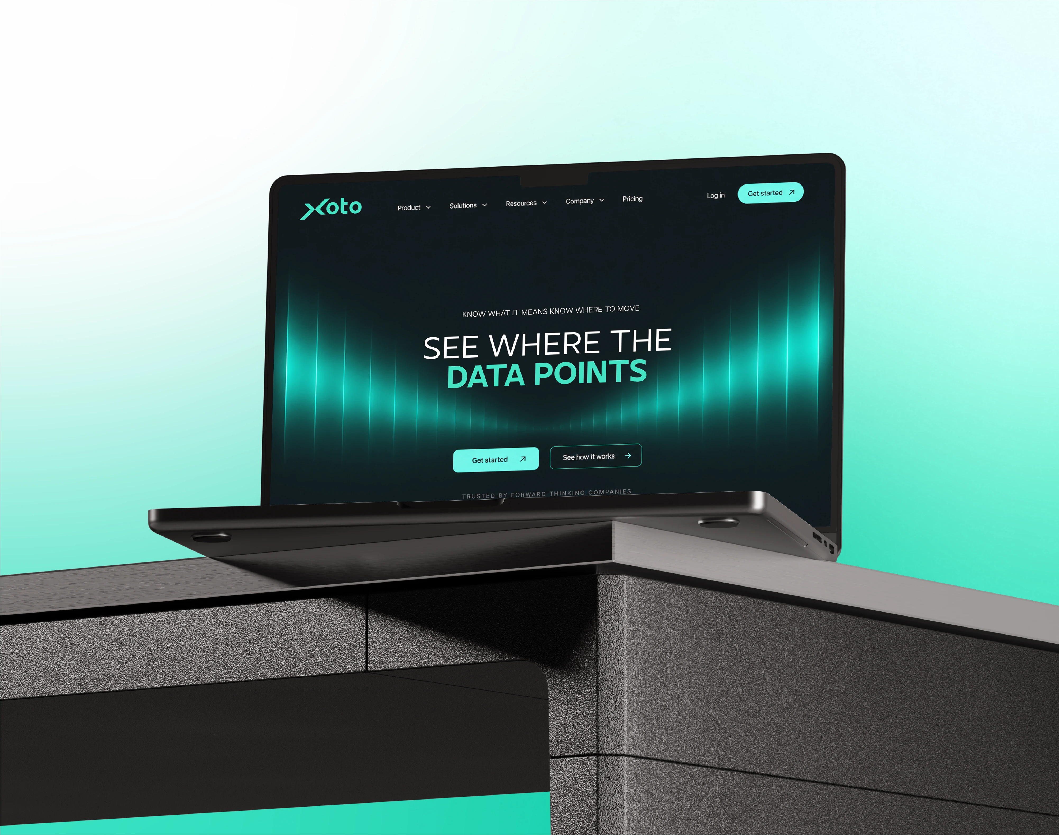
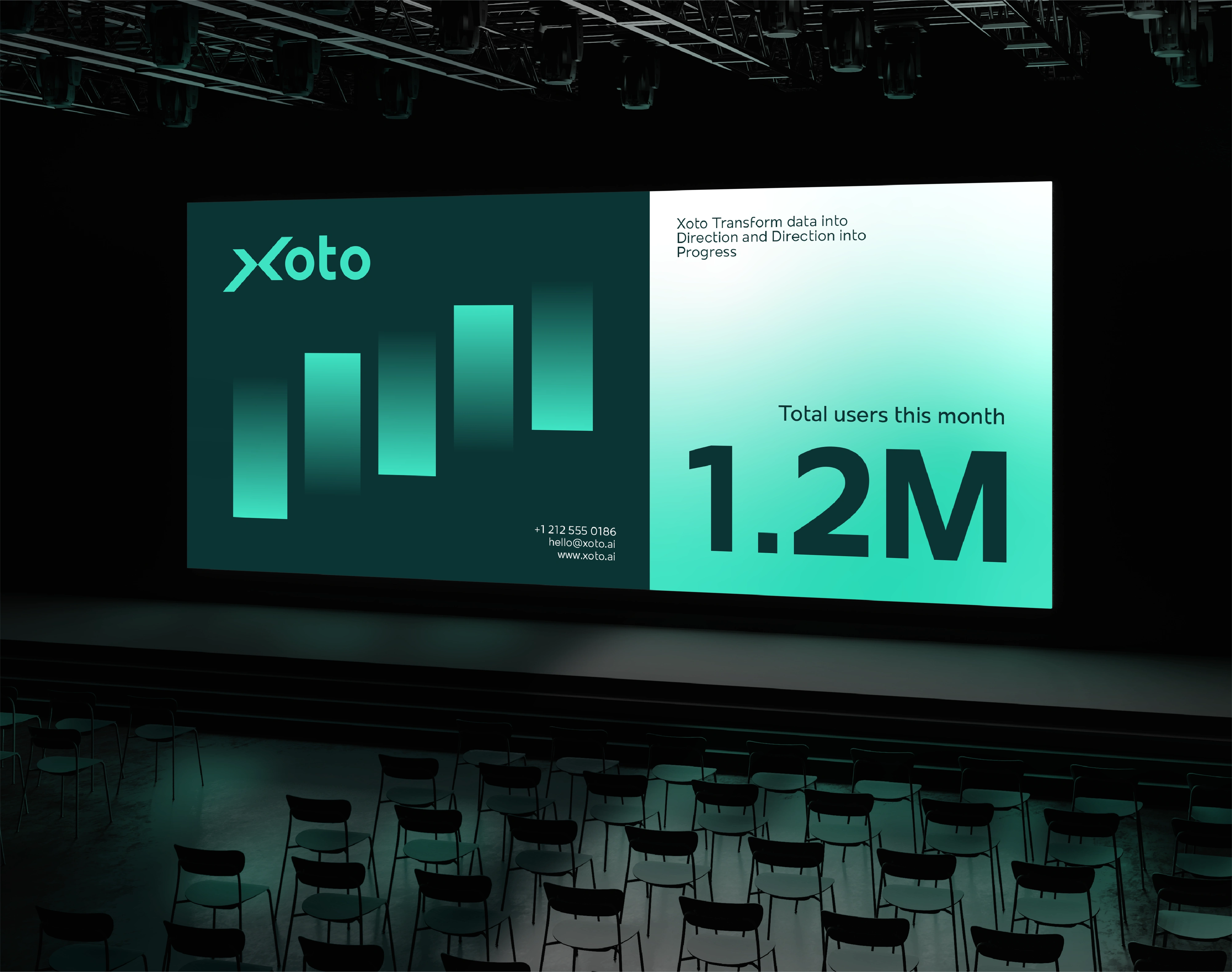
The identity is designed to extend naturally across product interfaces, analytics dashboards, data visualization, websites, reports, presentations, social media, advertising, motion, and 3D environments. Across every touchpoint, the recurring angle, directional compositions, turquoise signals, and sense of movement create a consistent visual signature for the brand.
The result is a distinctive B2B data intelligence and analytics brand identity that moves beyond simply visualizing information. Xoto occupies the space between data and business momentum, turning signals into direction and intelligence into forward motion. The identity ultimately makes one idea unmistakable: Xoto moves business forward.


Do you like what you see?
Let’s work together!
Feel free to send a DM
All Rights Reserved 2026 ©
Like this project
Posted Oct 13, 2026
Designed brand identity for data platform Xoto, focusing on movement, direction, and progress.