TITAN Cybersecurity Brand Identity

Muhammad Abdullah


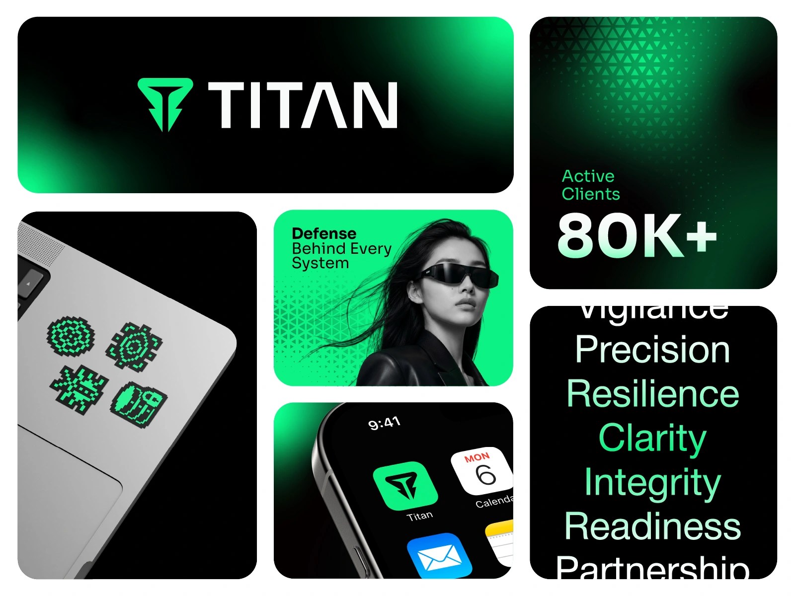
TITAN Logo & Brand Identity | Cybersecurity Branding
Enterprise Cyber Security and Digital Defense
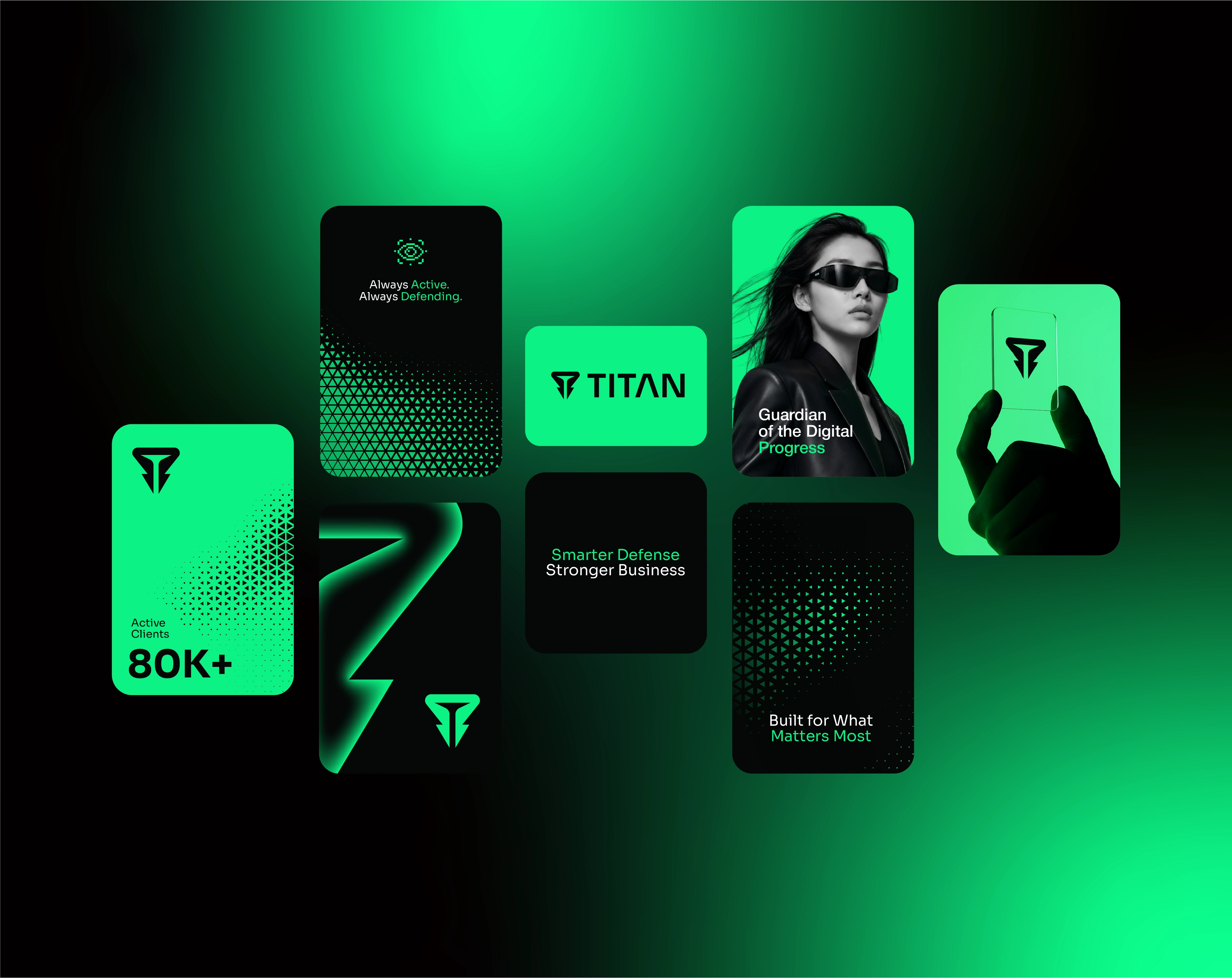
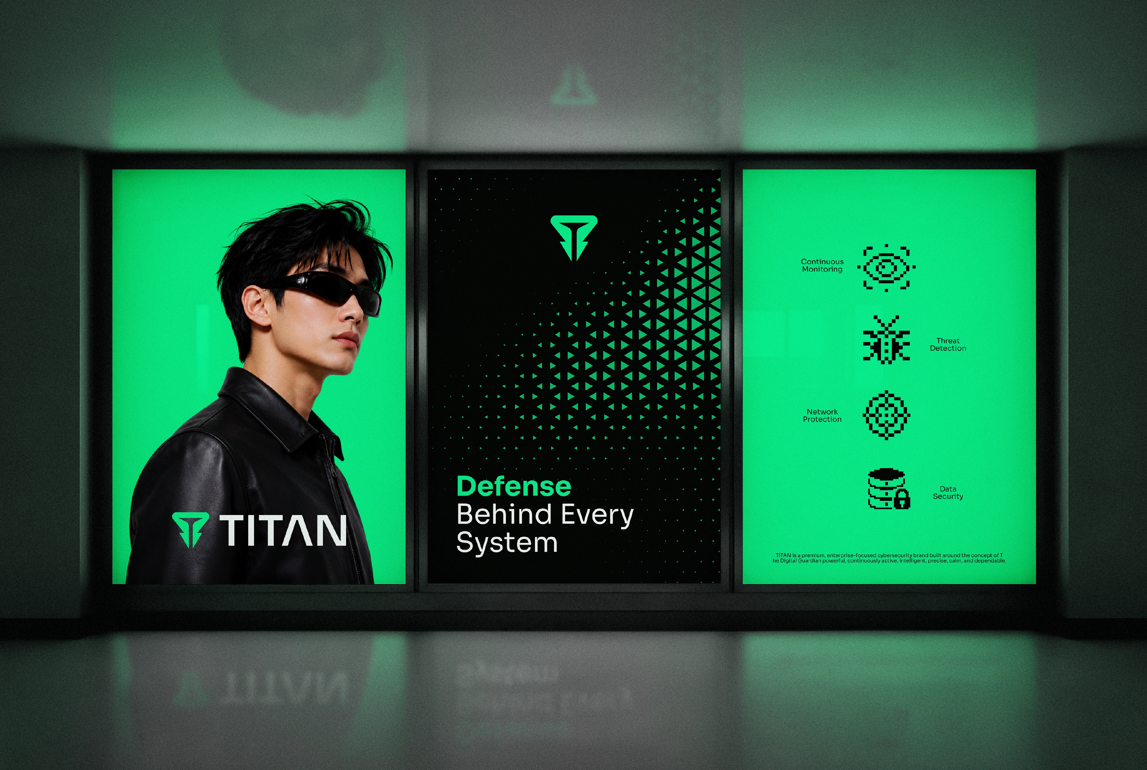
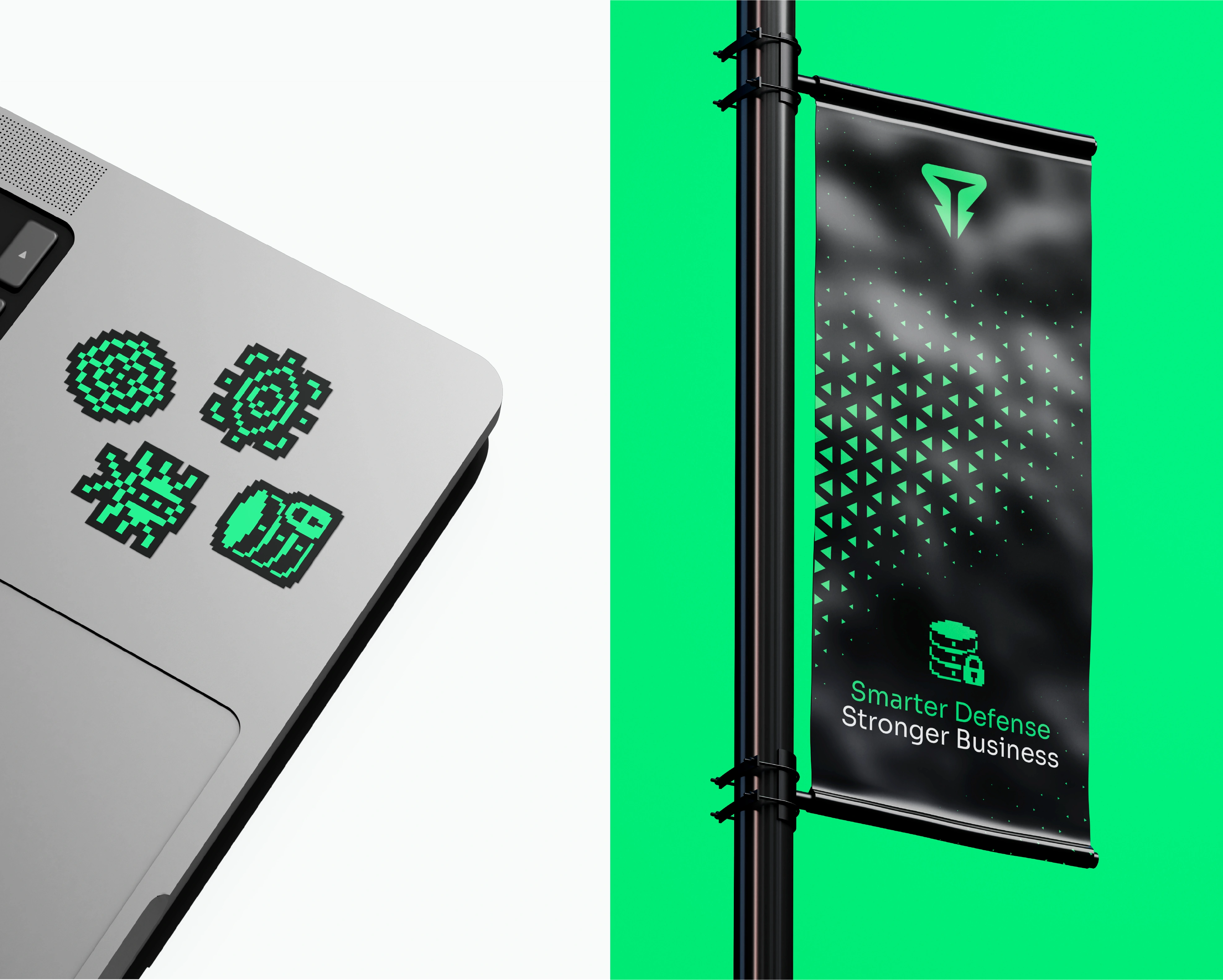
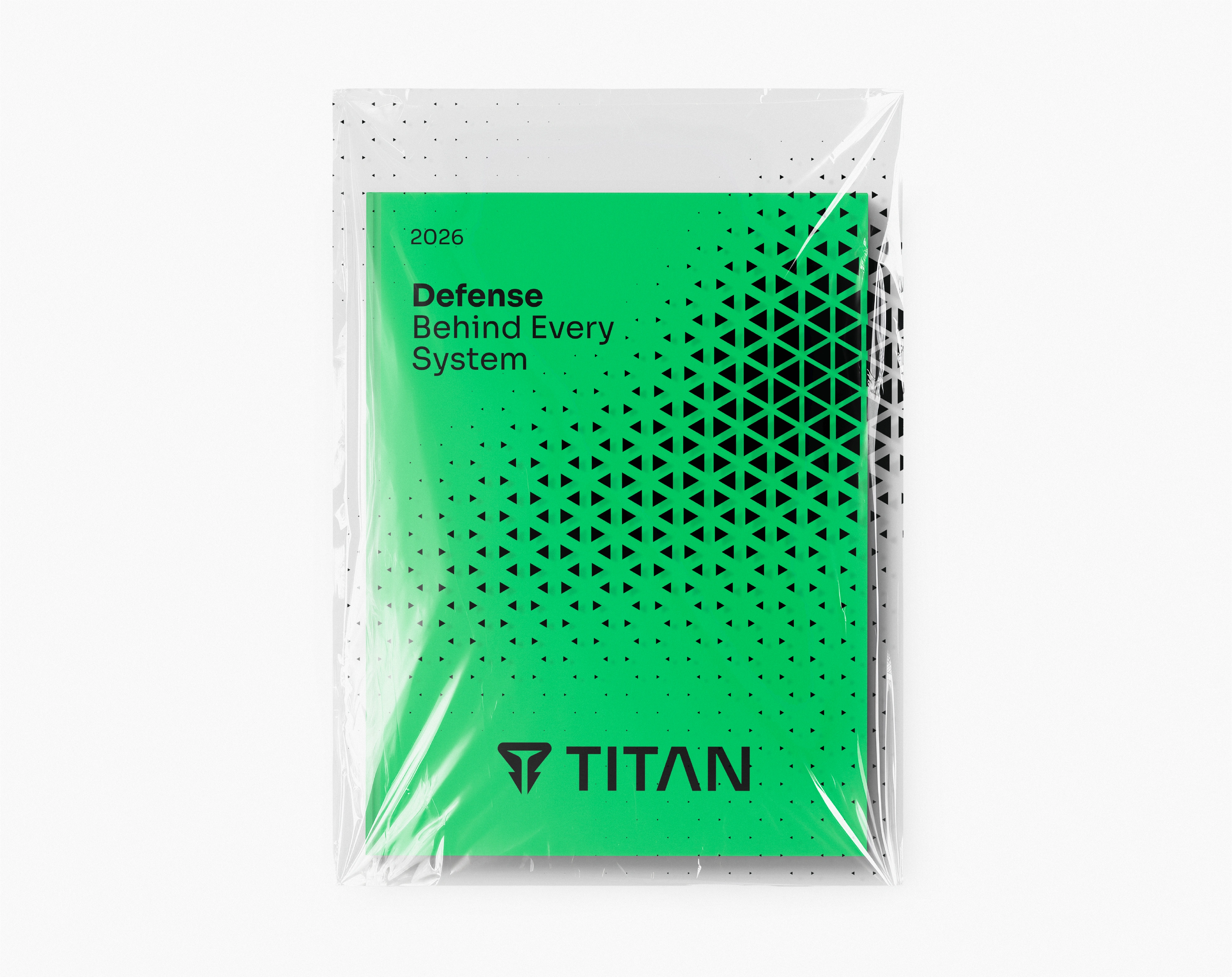
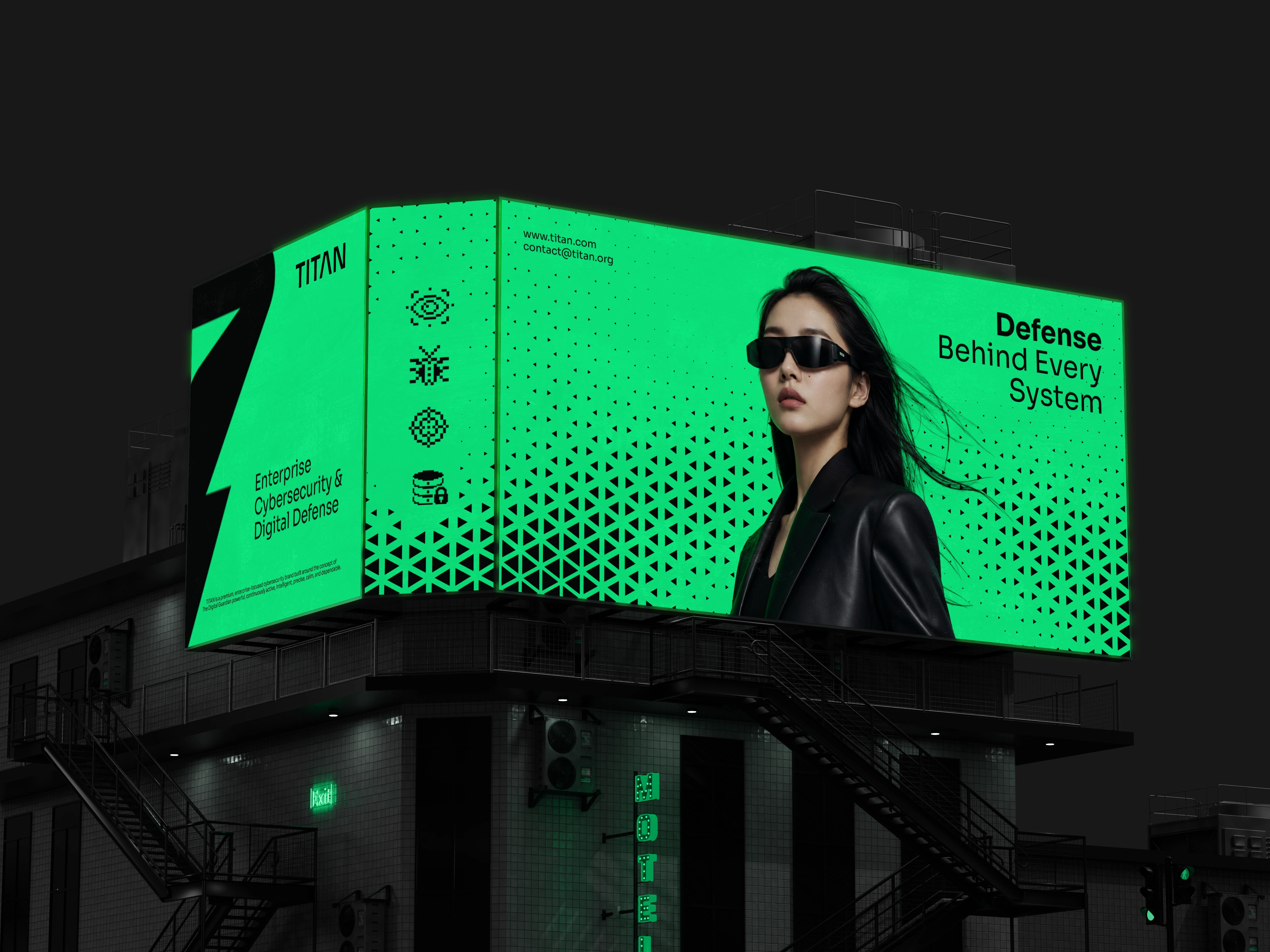
The goal was to build a powerful, intelligent, and dependable cybersecurity branding system without relying on the visual clichés that dominate the industry. Instead of hooded hackers, generic padlock icons, neon glitch effects, and binary-code overlays, this enterprise brand identity is built on controlled geometry, structured typography, precise grid-based layouts, and a distinctive digital visual language resulting in a security logo design and visual identity system built for CTOs, IT leaders, and enterprise decision-makers.
Brand Strategy
TITAN is positioned as a digital defense partner for organizations that require continuous, intelligent, and dependable cybersecurity protection. This brand strategy was built to make TITAN feel more strategic than a traditional security software provider, more advanced than a conventional IT company, and more dependable than a short-term cybersecurity consultant.
Its core mission is to protect the systems, networks, cloud environments, and information that modern organizations depend on allowing businesses to operate, innovate, and grow with confidence.
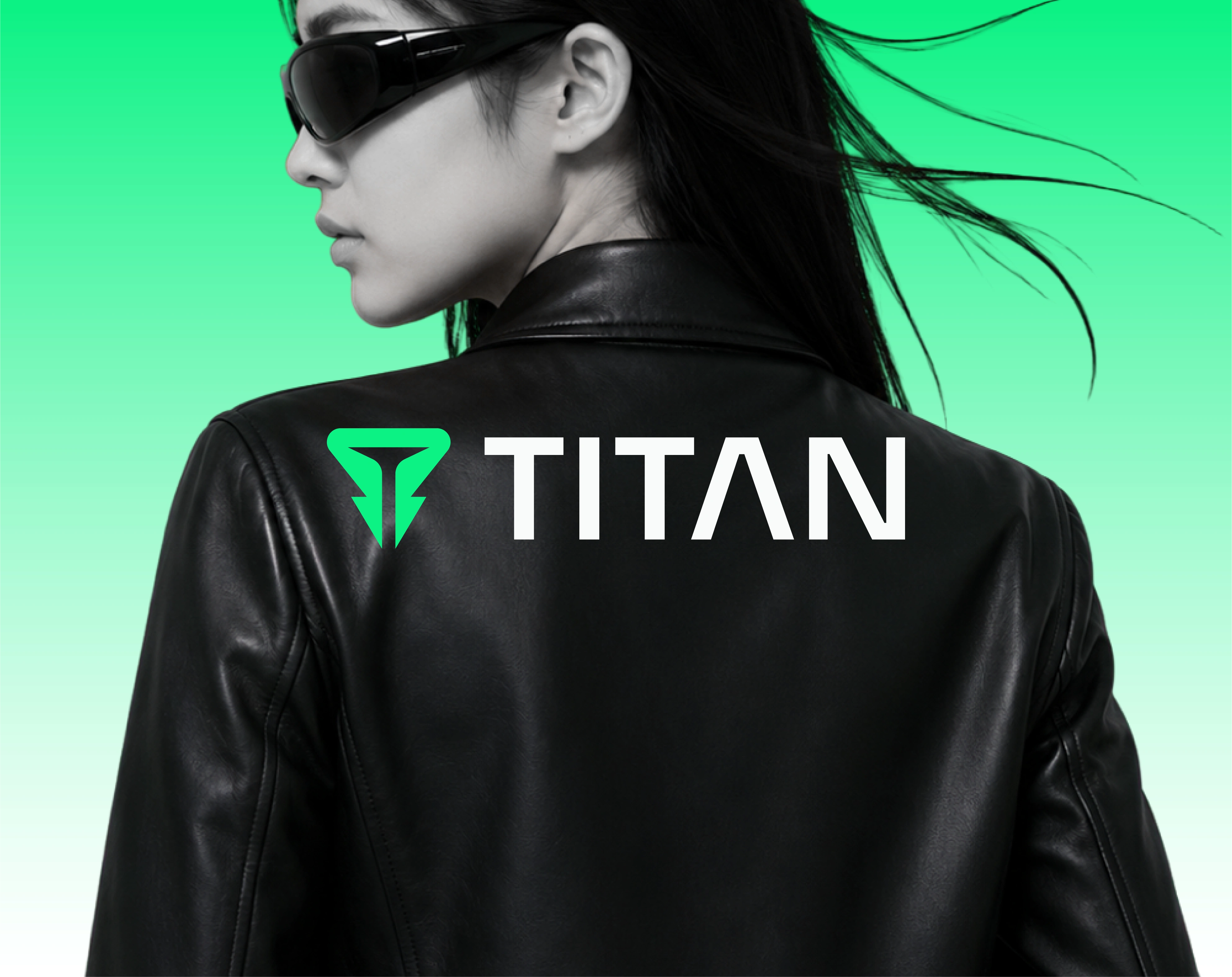
Brand Challenge
Cybersecurity branding often communicates fear, complexity, and technical aggression. This brand identity design needed to feel advanced enough for the modern tech industry while remaining credible, professional, and accessible to enterprise decision-makers.
The identity was designed to balance two essential qualities:
1) Strength and authority, to represent protection, resilience, and security
2) Intelligence and precision, to represent monitoring, threat detection, strategic thinking, and technological expertise
The result is a premium cybersecurity brand identity that feels powerful without becoming aggressive, futuristic without appearing fictional, and technical without losing clarity.
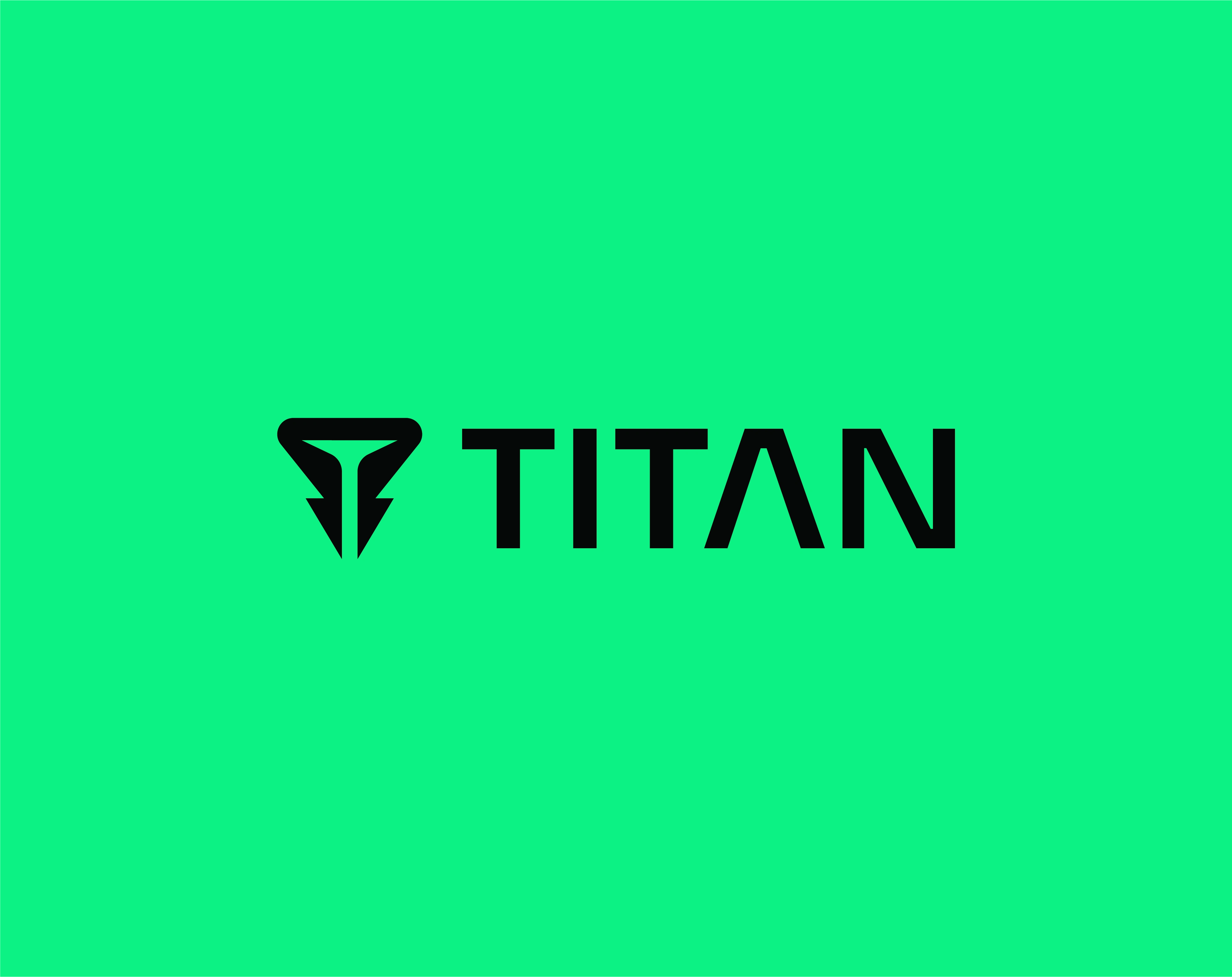
The Digital Guardian
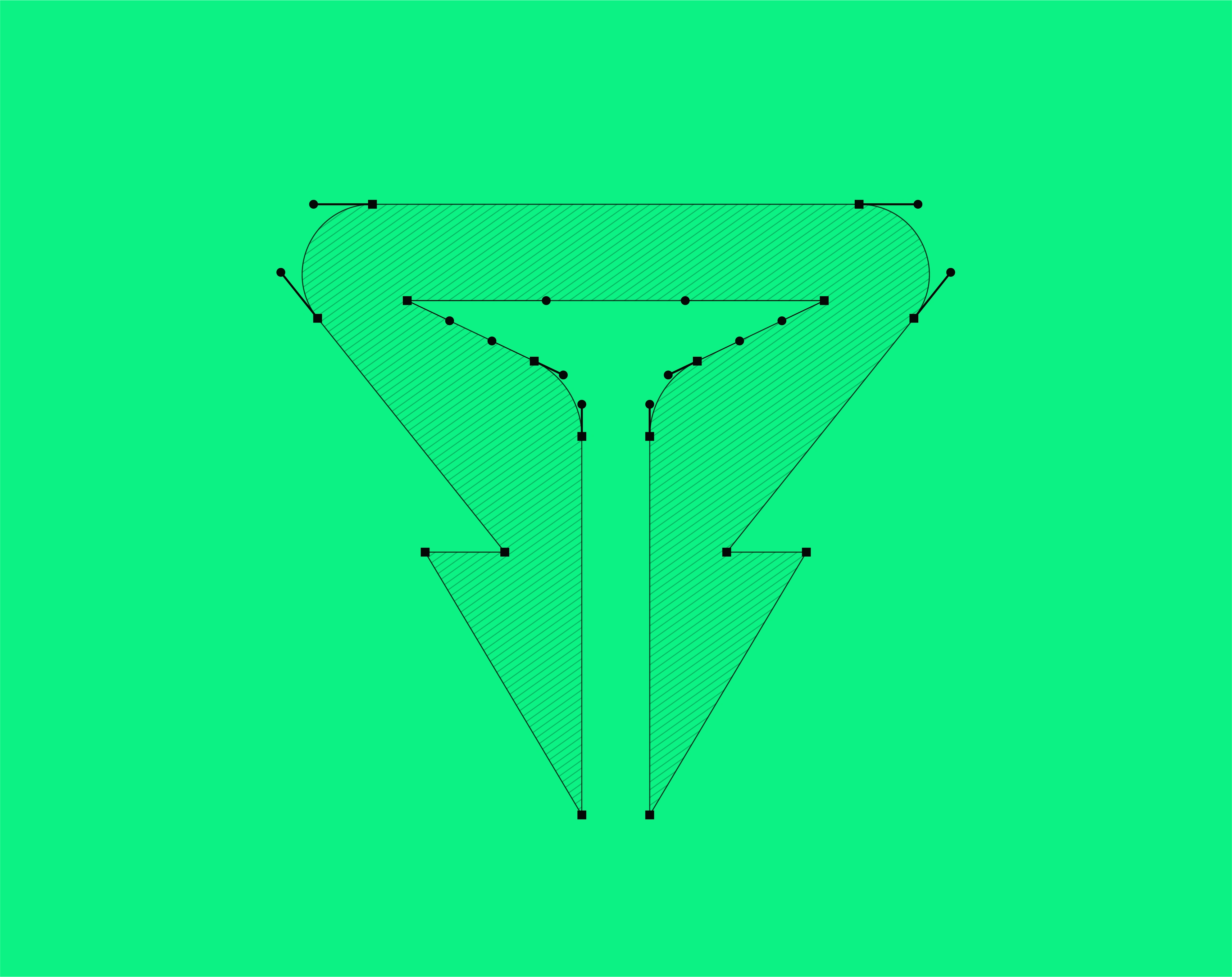
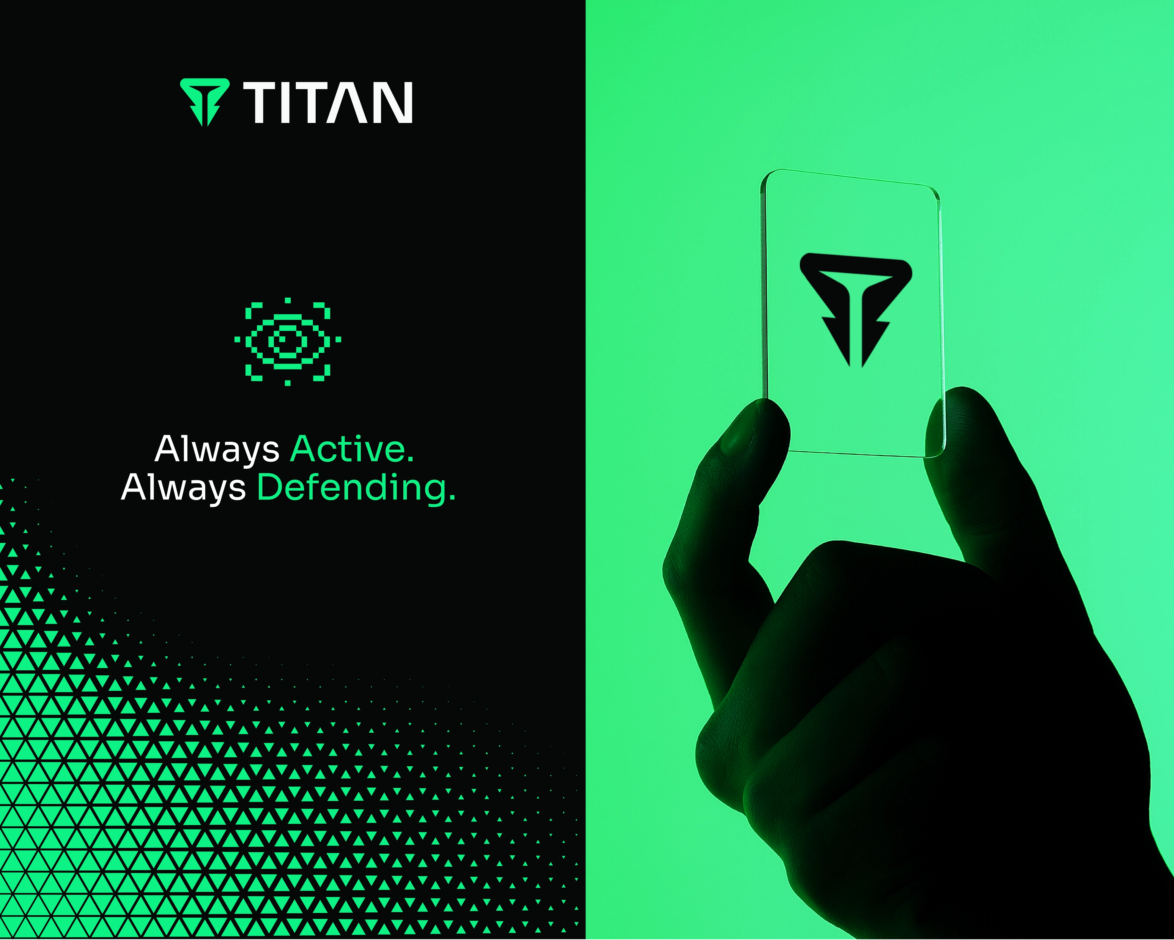
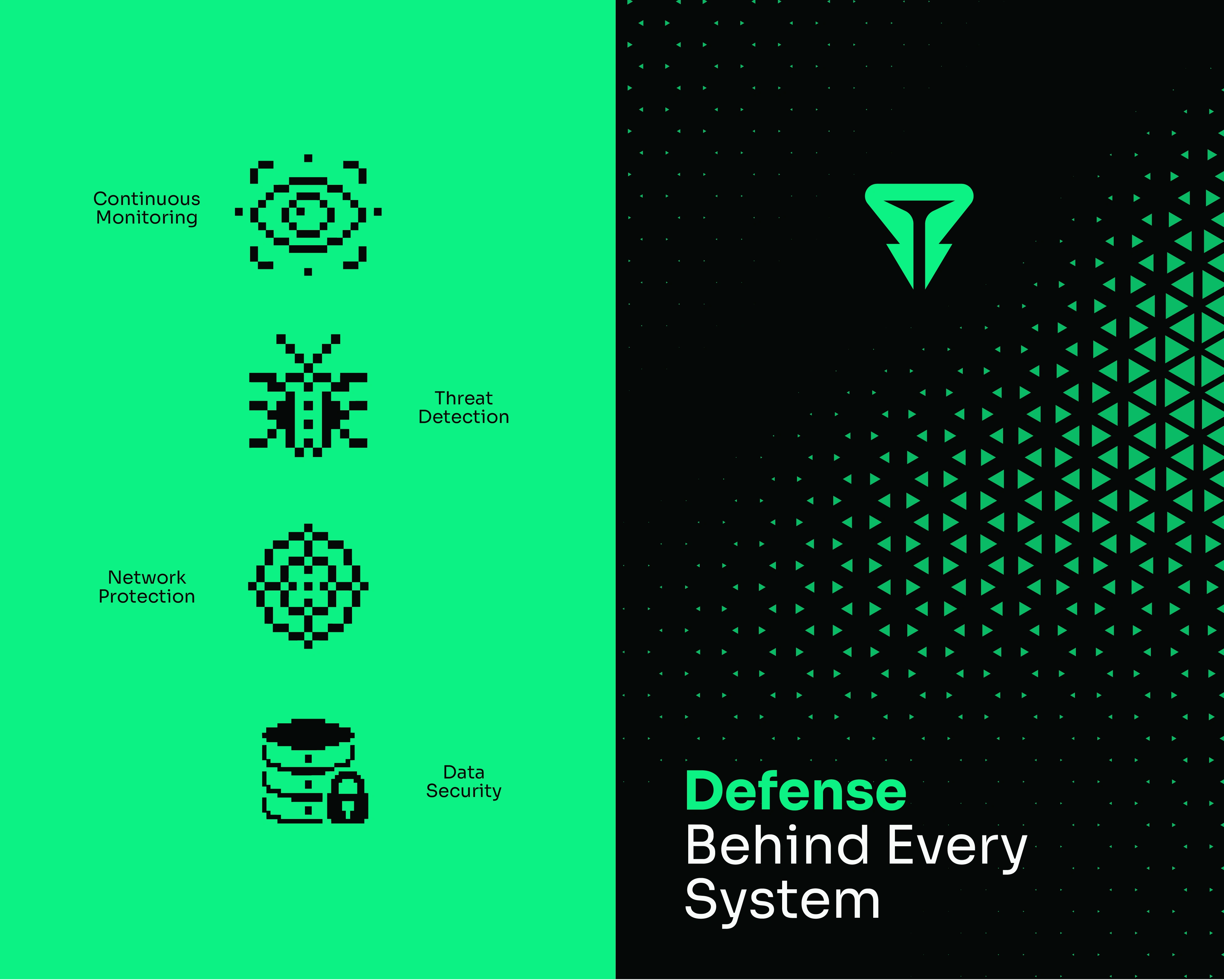
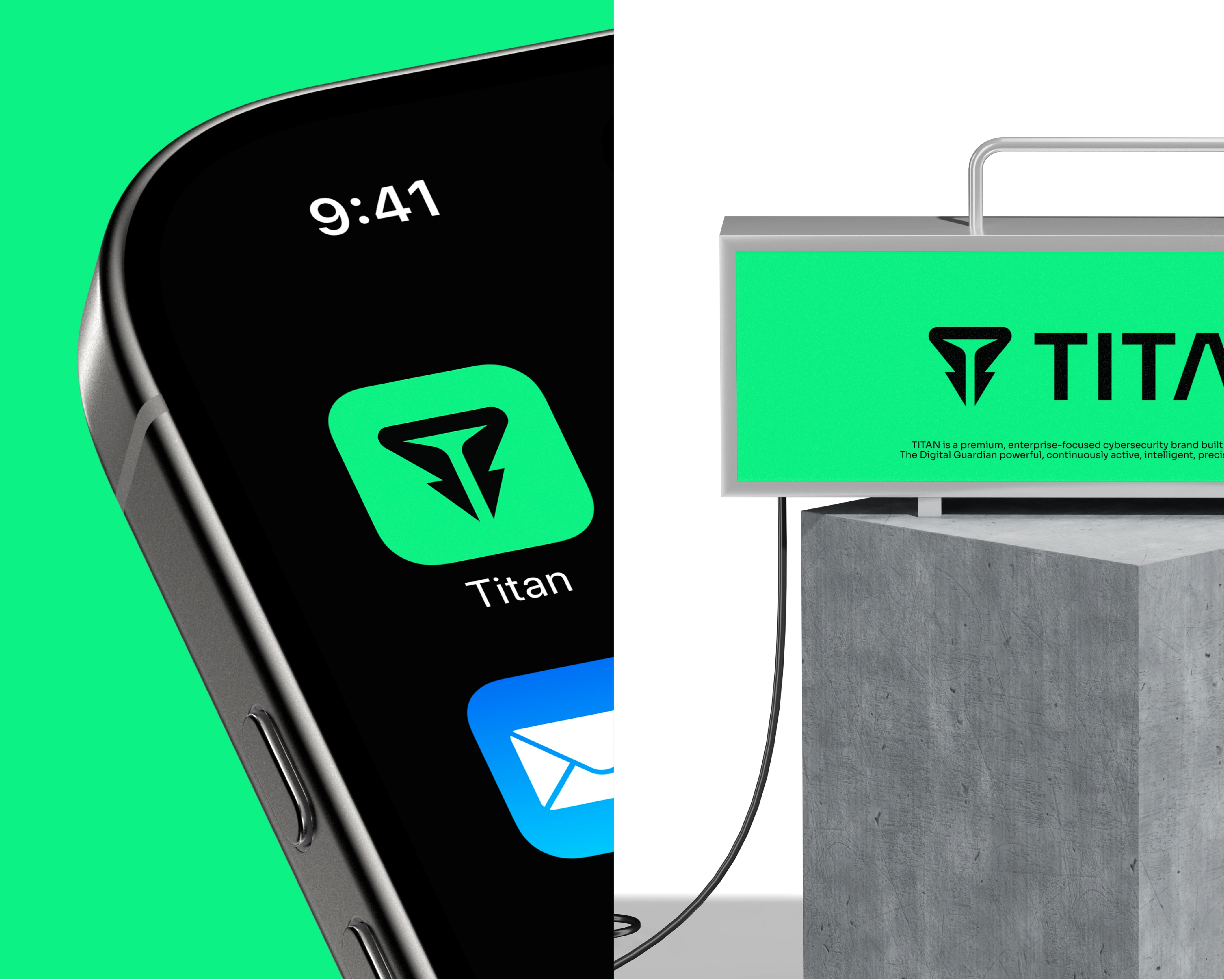
The central concept behind this logo design and visual identity system is the Digital Guardian, a powerful, always-active system built to monitor, protect, and respond. The mark itself reinforces this: a shield-like guardian form with a hidden "T" built into the negative space, connecting the symbol directly back to the TITAN name through subtle, deliberate logo design construction rather than an obvious literal letterform.
The TITAN name represents strength, endurance, resilience, and authority. But the brand doesn't communicate uncontrolled force. Its strength comes from intelligence, preparedness, precision, and continuous awareness.
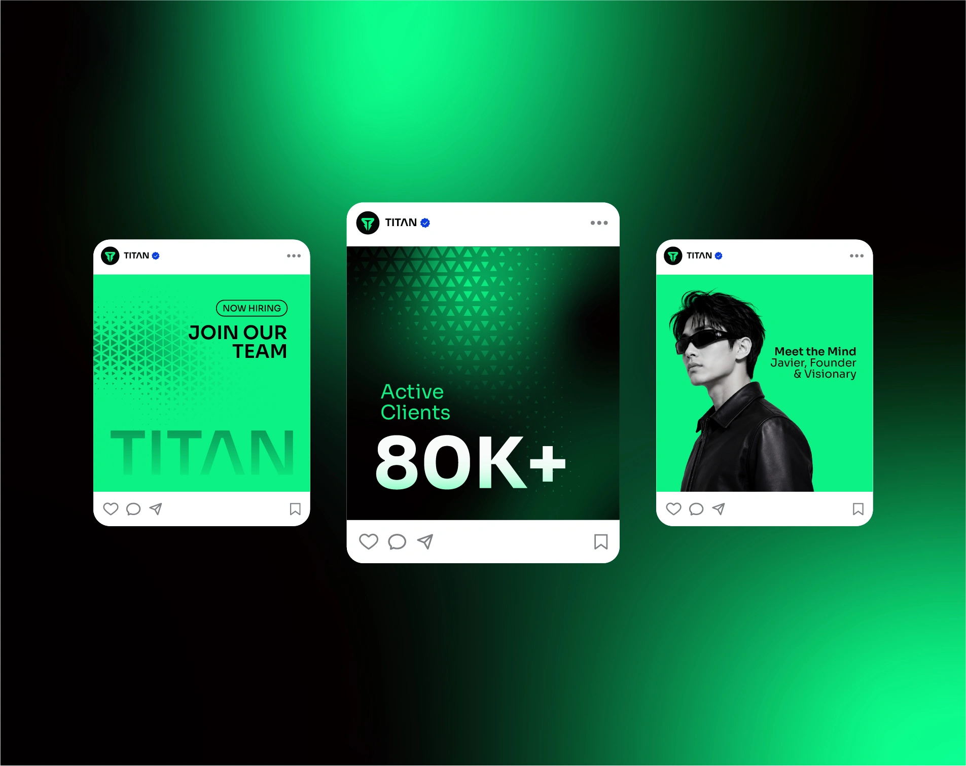
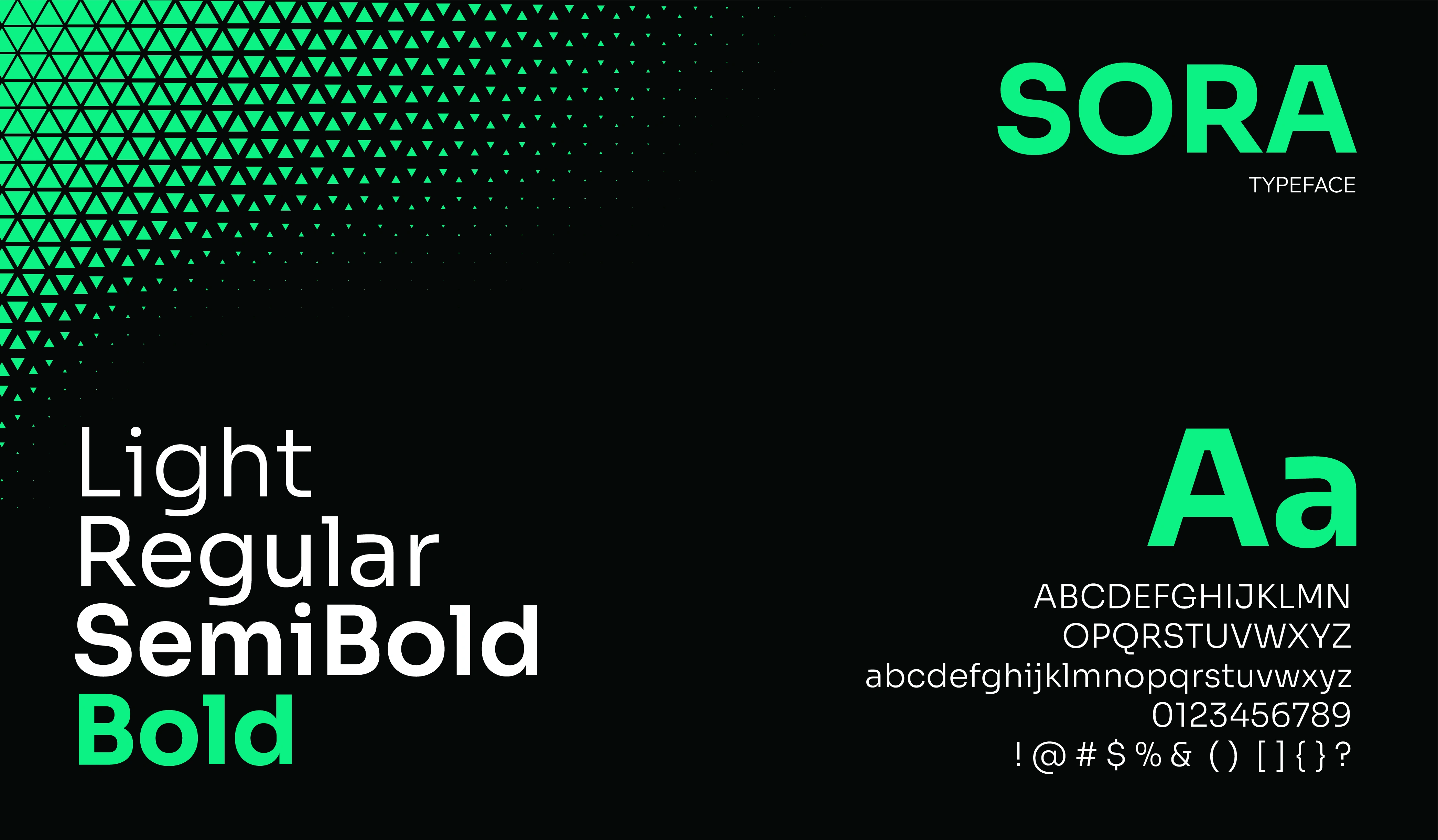
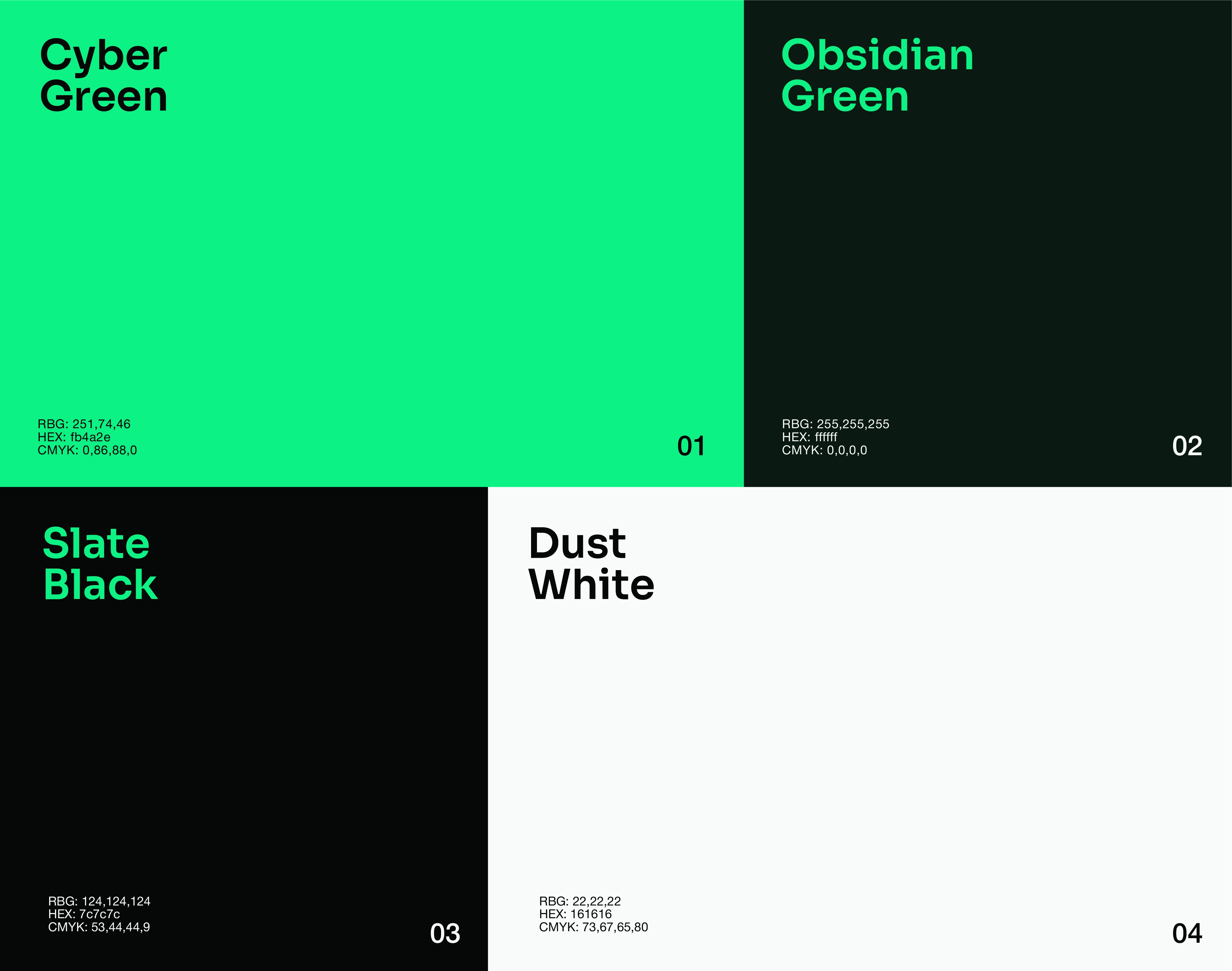
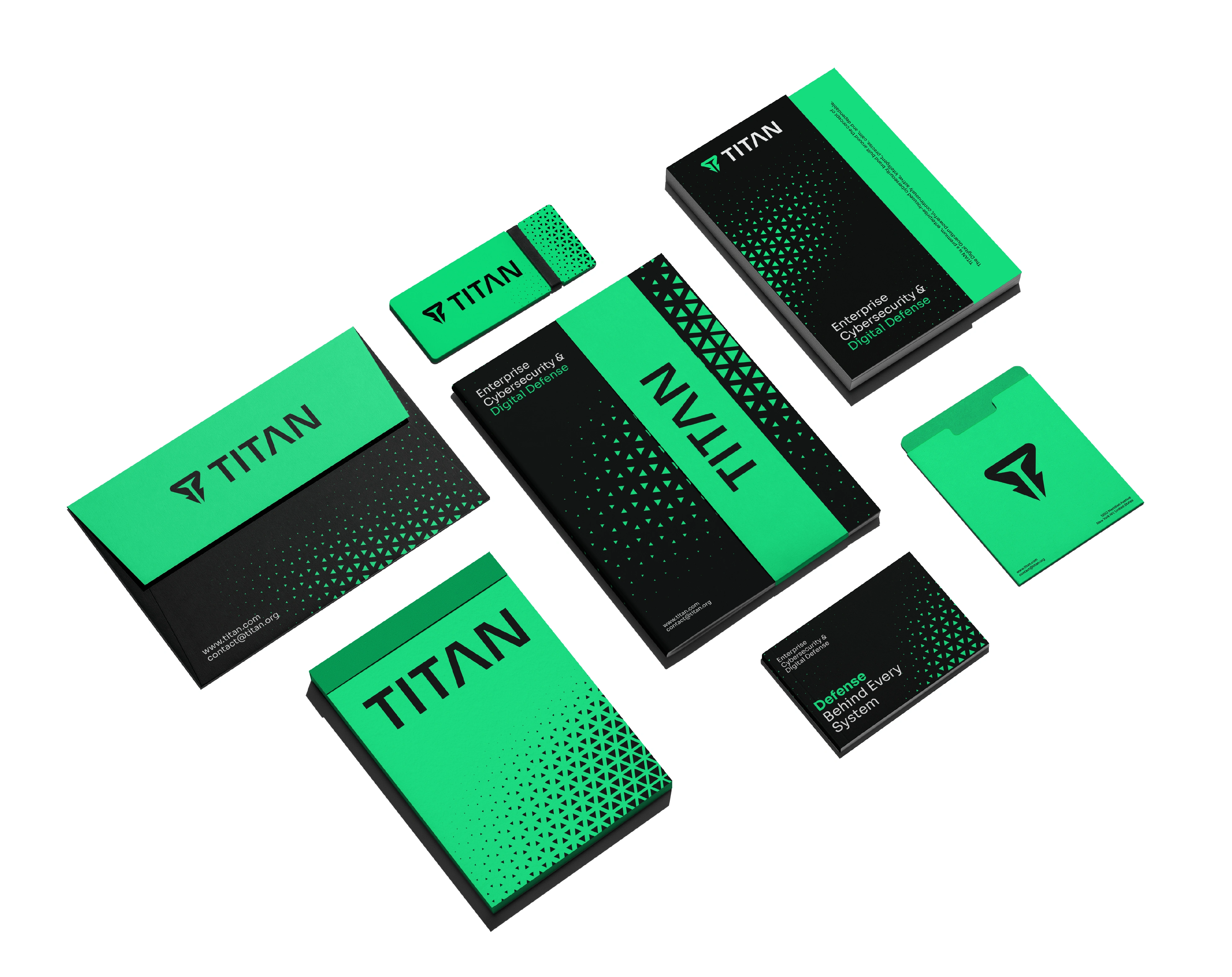
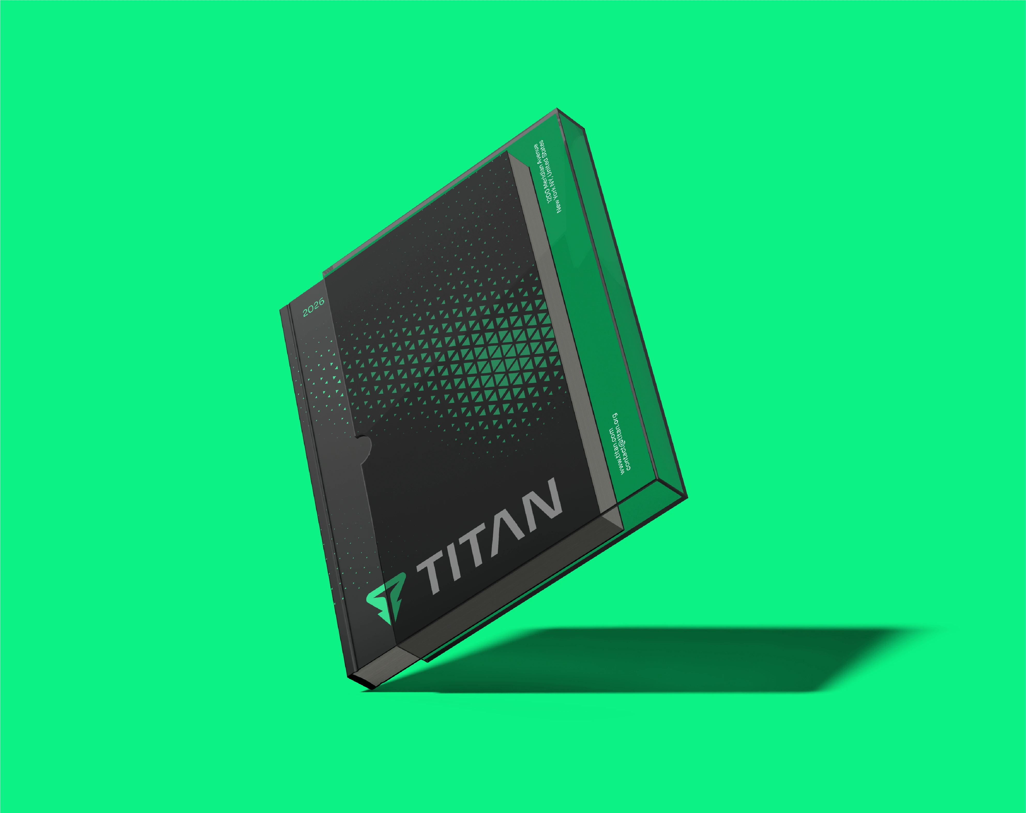
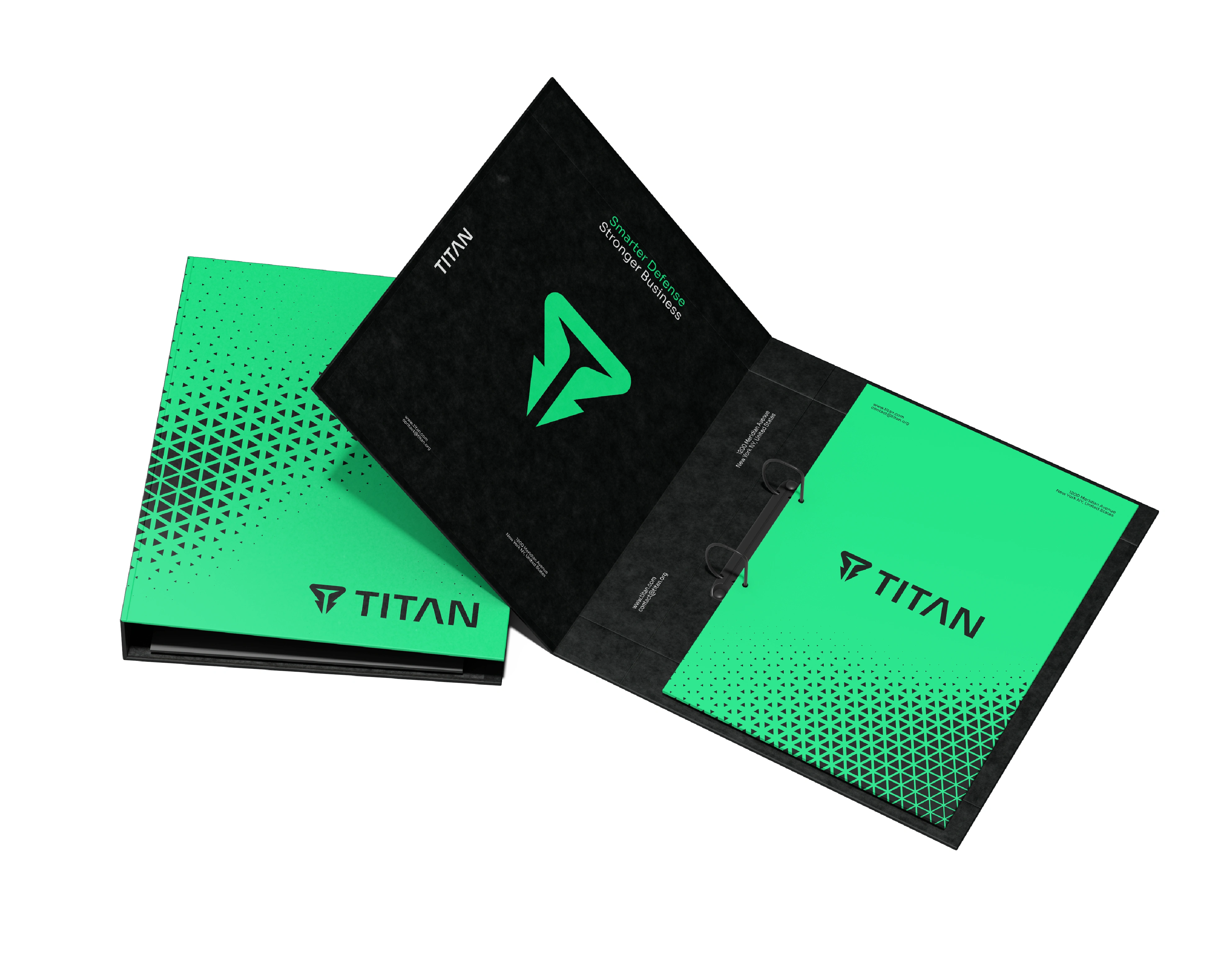
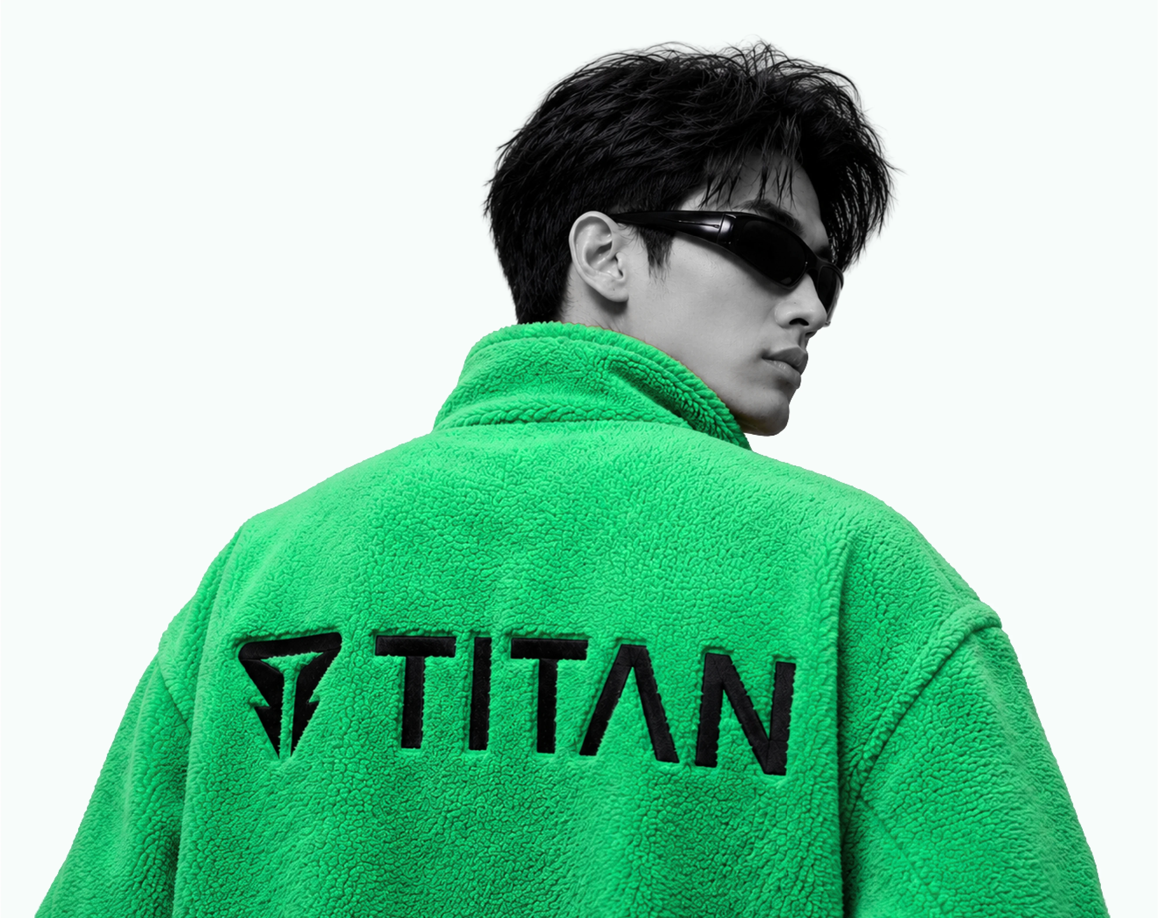
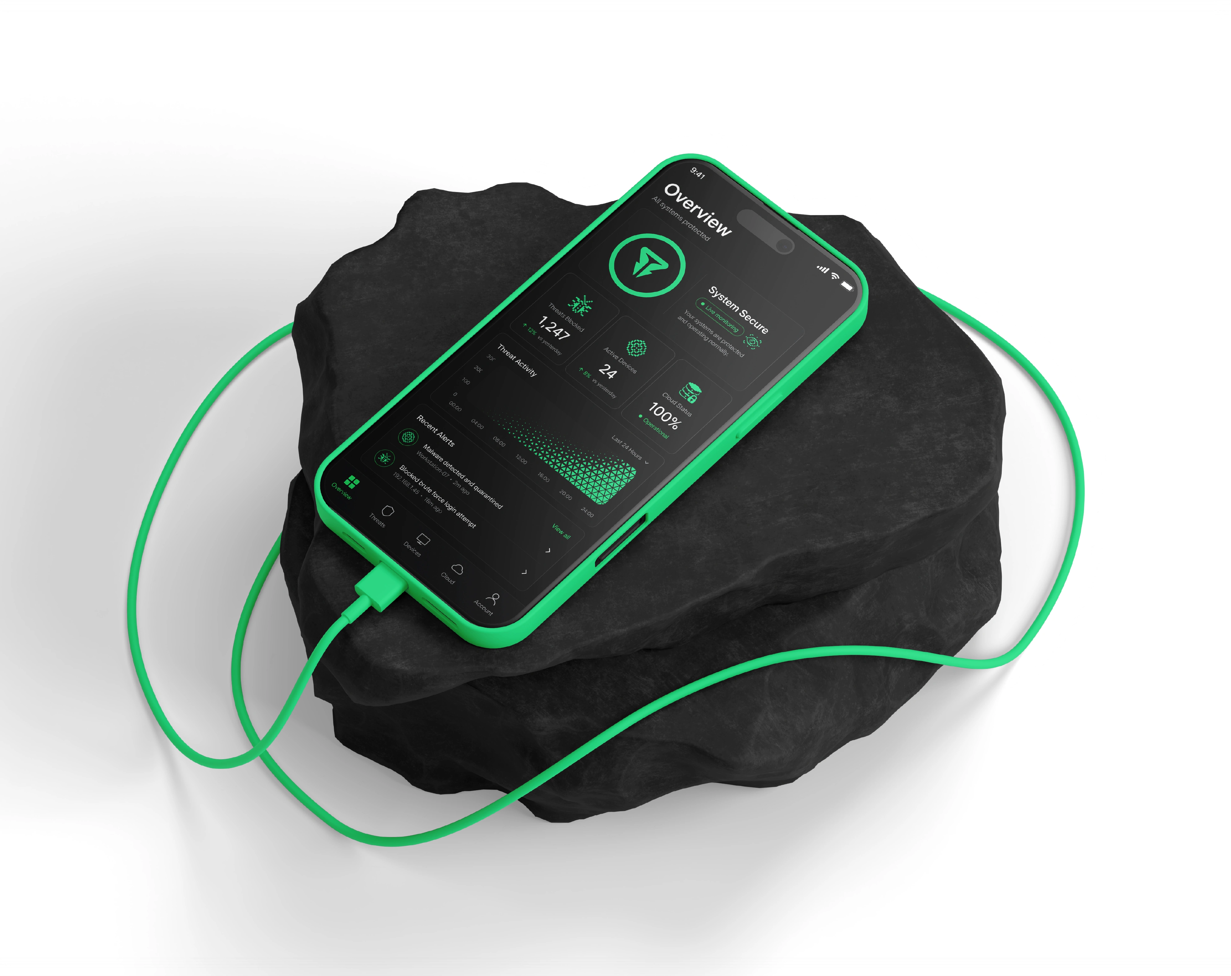
This concept shaped every part of the cybersecurity visual identity, from the logo mark and hidden symbol construction to the typography system, color palette, graphic language, digital interface design, motion identity, and brand applications.
Brand Personality
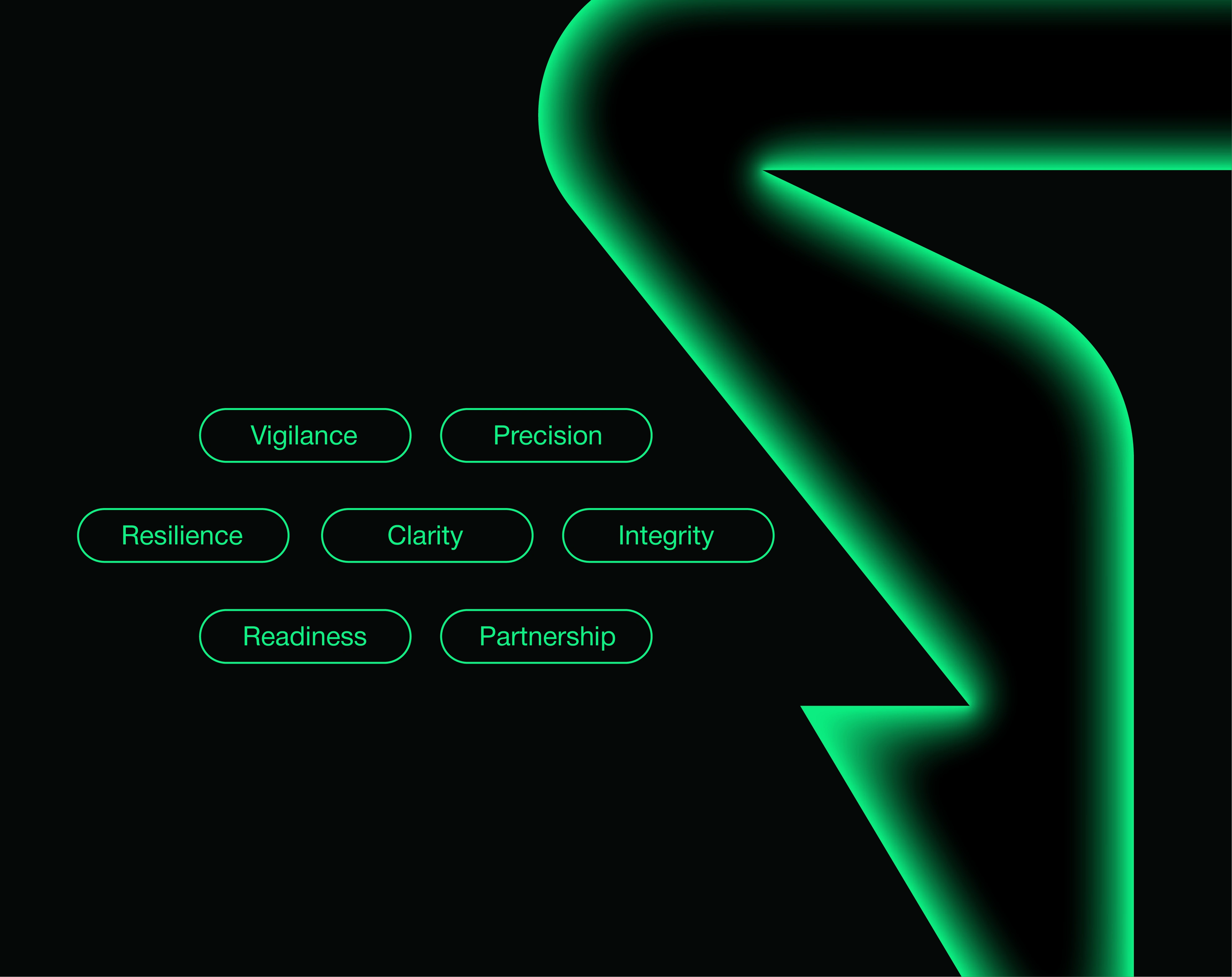
Powerful. Intelligent. Secure. Precise. Modern. Dependable.
TITAN communicates with confidence, clarity, and restraint. Its purpose isn't to create fear, but to build trust and demonstrate readiness, the brand personality of a cybersecurity company prepared to protect what modern organizations depend on most.
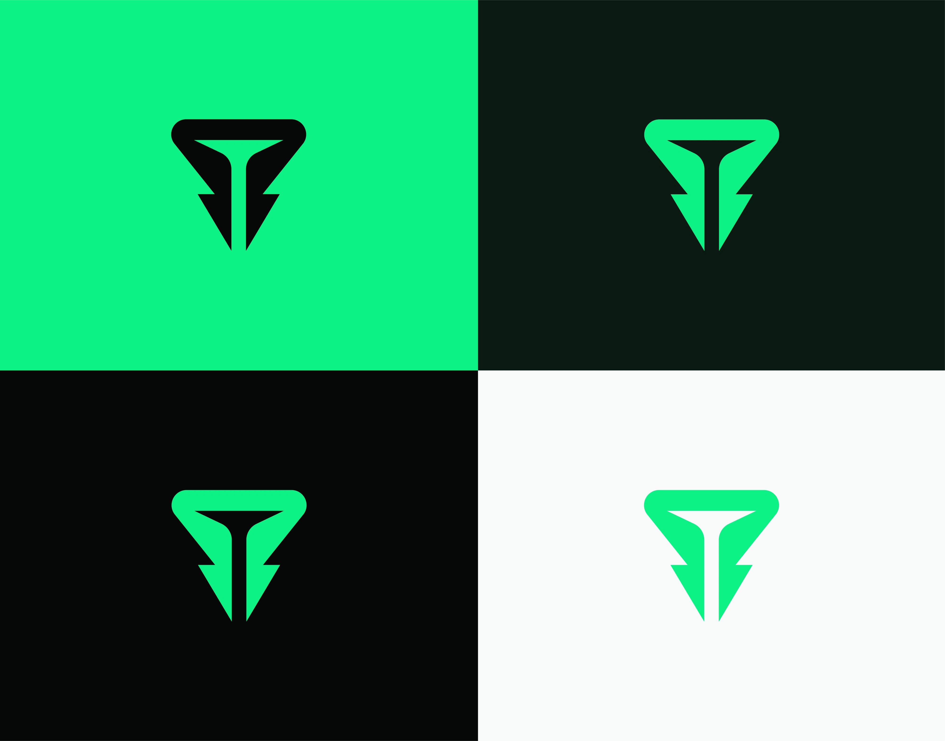





Titan Brand Identity
Logo Design - Brand Identity - Branding
By Arvonn | All Rights Reserved ©
Let's transform your brand next!
E-mail:
hi@arvonn.com
Website:
arvonn.com
Thanks for Watching!
Like this project
Posted Oct 14, 2026
Cybersecurity brand identity for TITAN. Shield logo with a hidden T, visual identity, and brand strategy for enterprise security, SaaS, and tech companies.
Likes
1
Views
8
Clients
TITAN