📓 Building Design system for India's largest student community
Overview 🔎
Bluelearn is India's largest community of students, with over 100k members. Its goal is to allow you to break free from traditional boundaries if you attend a Tier 2 or Tier 3 college or city. You can find like-minded, ambitious people here who want to upskill.
Index
✪ Team
✪ Why have a Design system
✪ Framework used
✪ Atomic Design System
✪ Figma File organizaton
Team:
Ajay Pawriya - Product Designer (Me)
Vinit Sarode - Product Designer
But Why even have a Design system?
Let's imagine that you've been designing a product for a year now. And suddenly, you or your manager decide to change the entire theme of the product. Wouldn't that be a nightmare to manually go through and update those 200-300 screens one-by-one?
It can be daunting🤯.
But if you had a design system in placewith all the color styles, Type Styles and components? Your efforts would go down instantly.
So this project is all about How I built a design system for Bluelearn that helps us and developers in our everyday job.
Framework Used
Bluelearn has a mission to impact the lives of all the students in every corner of India. And to do that, it needs a robust, beautiful, and scalable Design system.
For this task, there could be no better option than the "Atomic Design System" methodology. It enables you to easily update even the most complex components and styles.
On the tech front, we used Nativebase component library to quickly build out products.
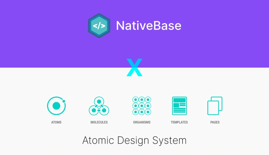
Atomic Design System
Atoms
Molecules
Organisms
I didn't go ahead with Templates and Pages, since we are still in the early days and need to experiment exrtensively to achieve PMF. We can't be rigid with our design layout at this stage.
Atoms
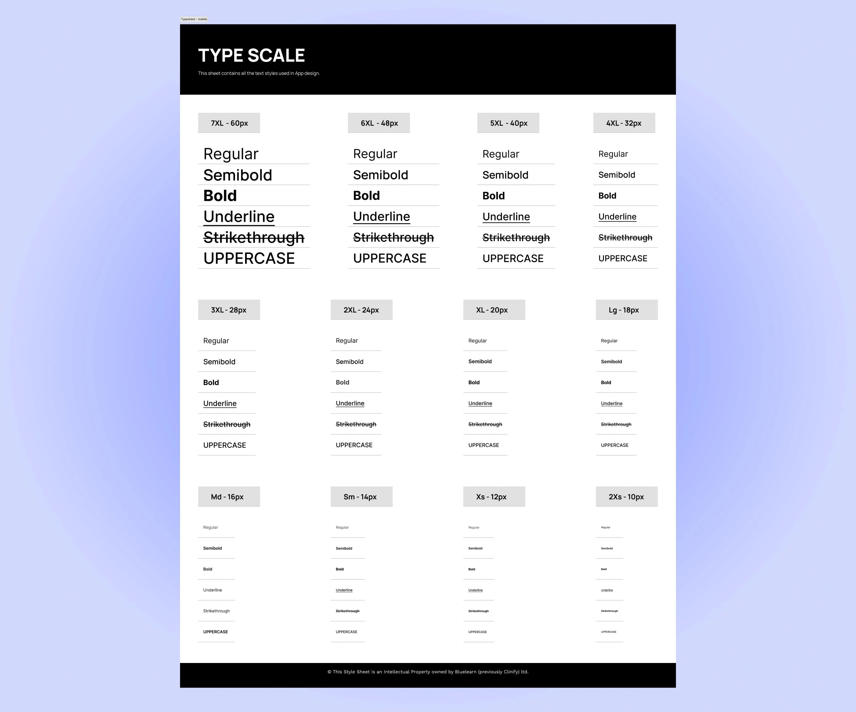
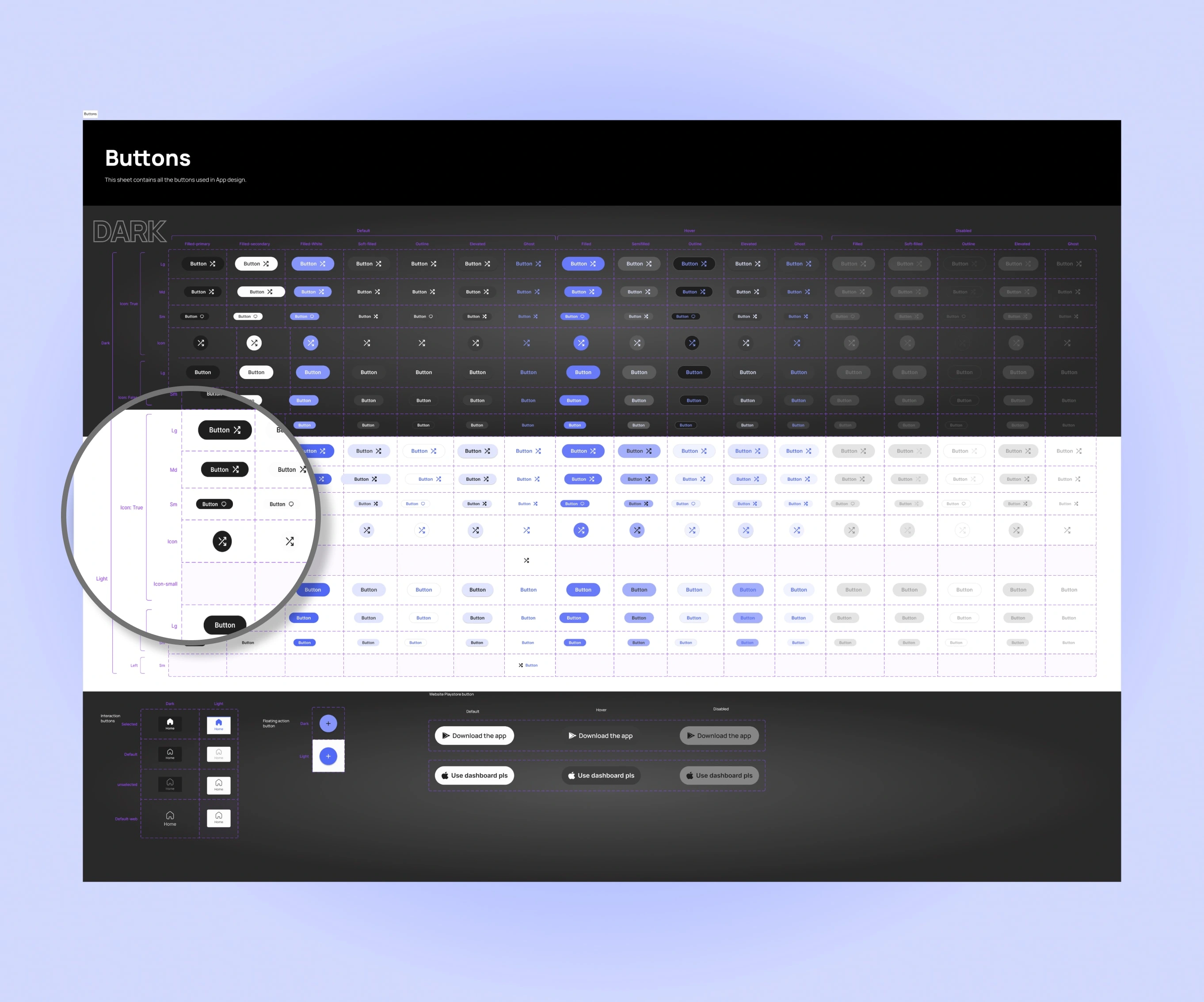
Styles Documentation
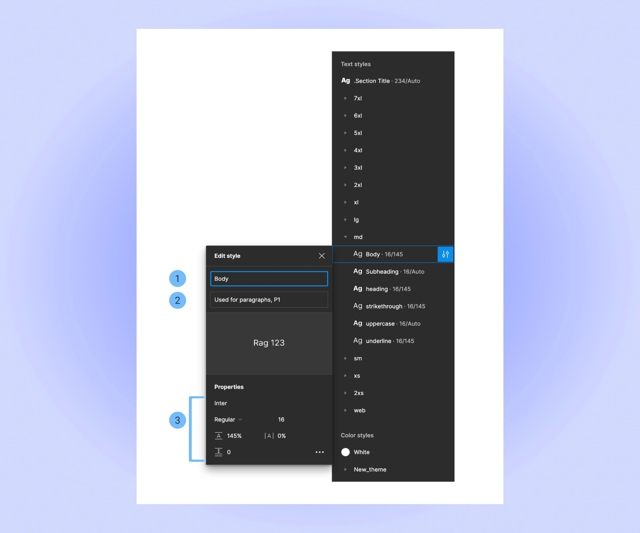
Point 1: Unique Style Identifier name. Decided along with Developers to match their naming convention.
Point 2: Extra Description for the style for the developers to refer to, to get more info.
Point 3: Style configuration
Molecules
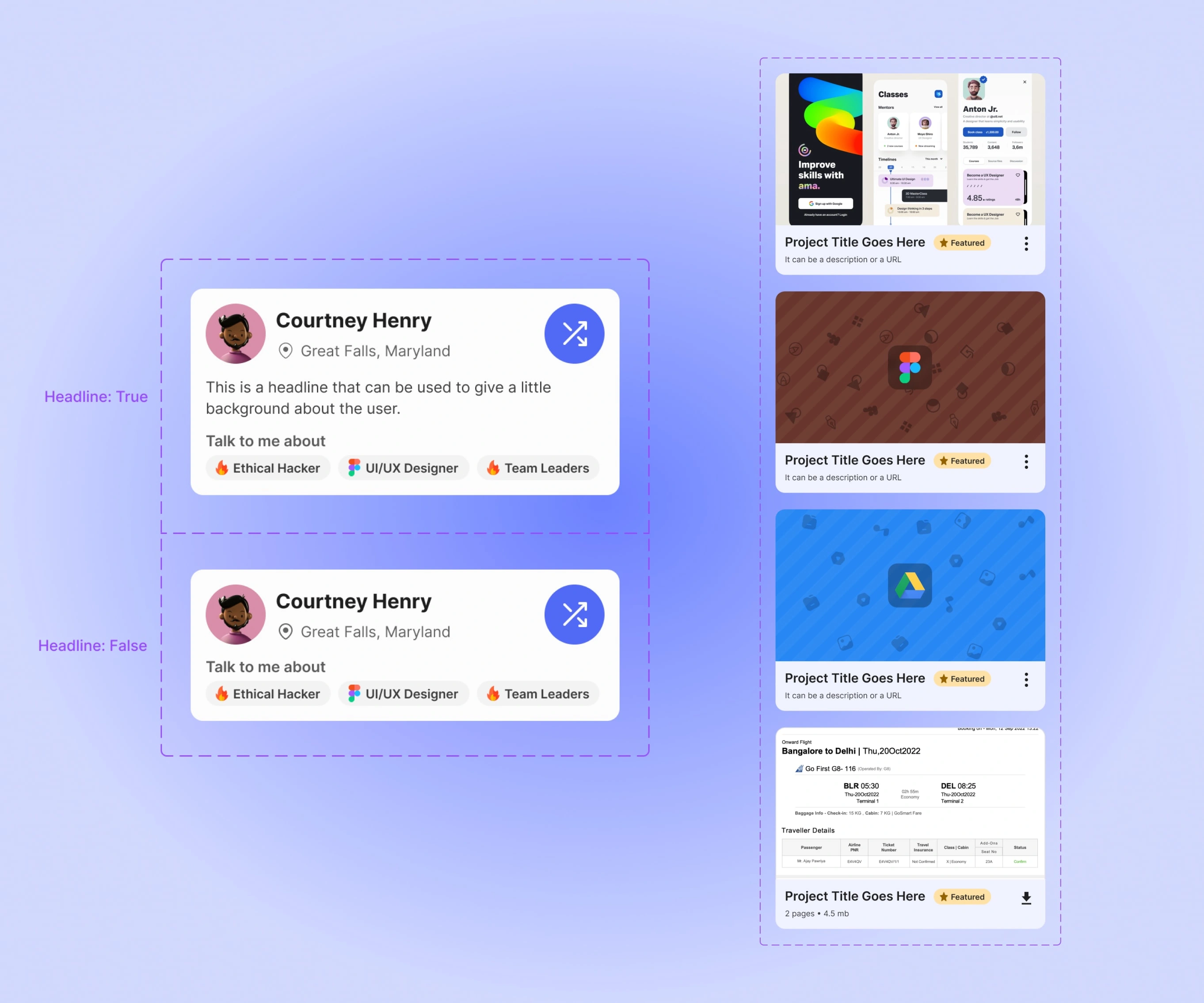
Organisms
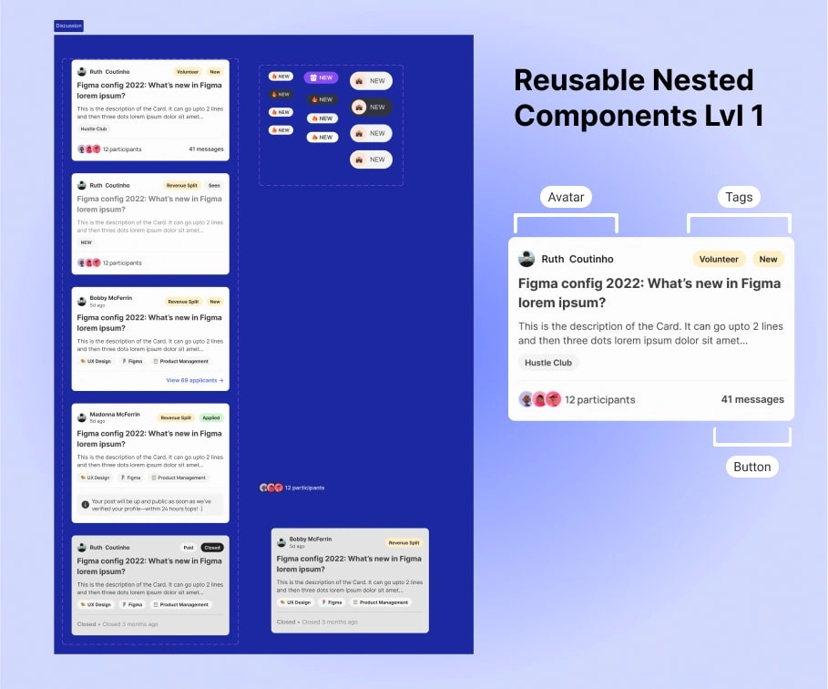
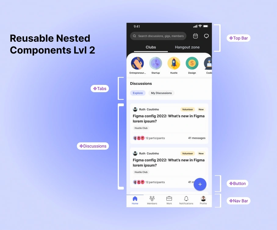
Organization of Design System in Figma
To ensure that everyone can find what they are looking for, we made a Miro board to draw out a tree map of which element lies where.
Anyone can simply Press Ctrl+F and type in their element name to see where it is in the entire structure.
Ofcourse, this is only as a backup option. We have made big efforts on making sure the Information Architecture was on point.
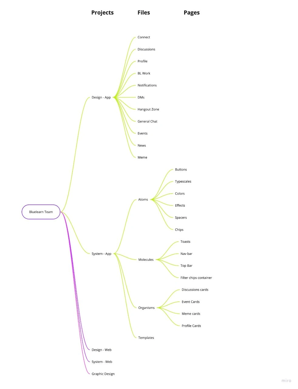
Design Files Hierarchy
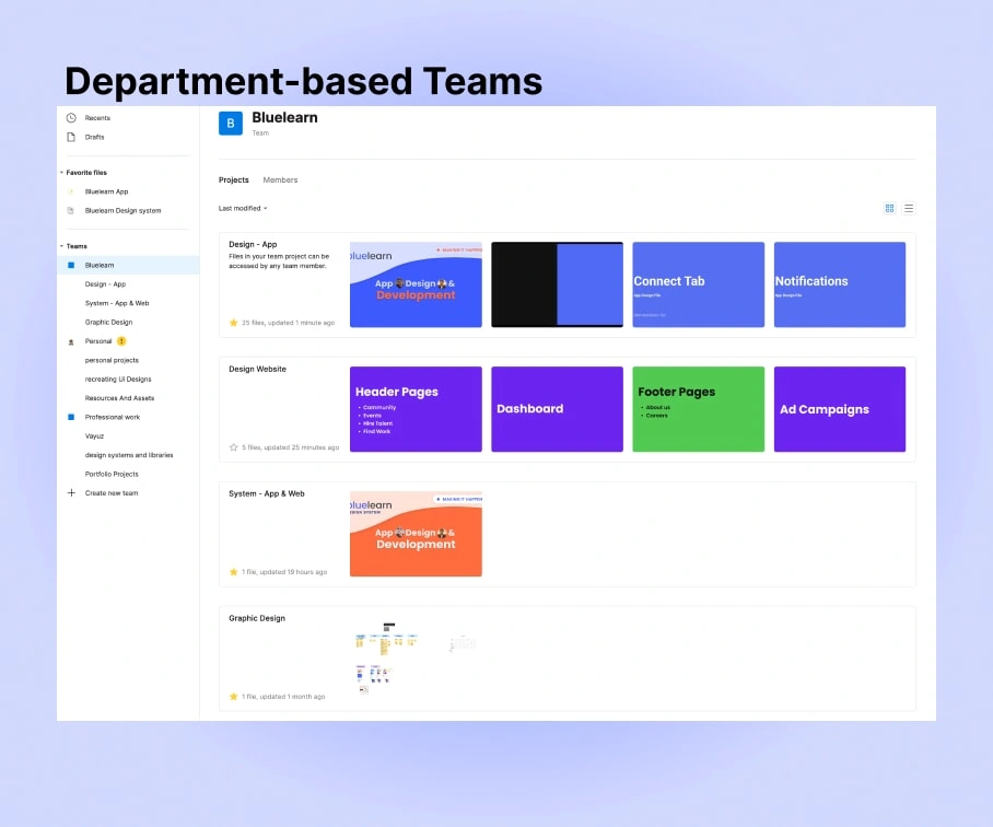
Level 1 : Different Departments under organization team
Feature Based Files:
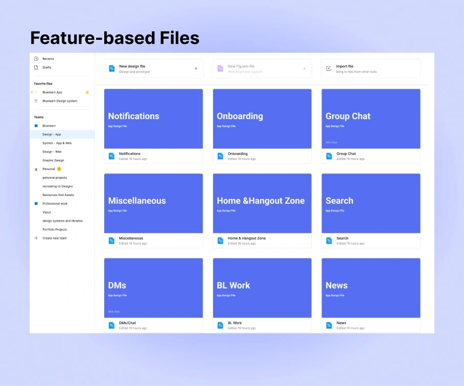
Level 2: Feature Based files
Initially, we used to use a single file to host all our Designs and previous version history. But, we realized that it was costing us a huge amount of RAM and speed loss.
Then, it was the obvious next move for us to divide the files in order to decrease down the size.
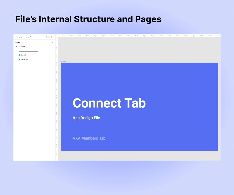
Level 3: Pages inside each file
Conclusion And Learnings
And that was NOT it. We are constantly on the lookout for new ways to optimize our Design system even more.
Some things that we learnt on the way:
We started using Descriptions in Components Documentations for Developers to refer to.
Like this project
Posted Nov 20, 2022
Building a Robust, Scalable and Beautiful Design System for Bluelearn. India's Largets student community.

