Landing pages for micro-learning startup
Brekkie Email is an Australian startup that provides e-mail and sms micro-learning platform for different purposes, from workforce micro-trainings to help parents start conversations with their children.
Challenge
Brekkie came to me looking for a website to launch their product to use as support material while they were trying to promote it to potential users.
Outcome
After understanding their goals and what they were expecting to achieve with this project, I came up with a solution that communicates clearly and directly with each type of user they have while also being ludic without losing its reliable feeling.
Services: Illustration, Web Design, Front-end development
First steps
On our first chat, the client said he wanted just a one-page site, without scrolling, with all the info being presented in multiple folds when necessary.
After looking at the content they had available (a single-page pdf pitch), I noticed they needed to talk to three different audiences with really different interests. The suggestion of a one-page wouldn't communicate clearly to each audience type, and it could affect how they would understand the service Brekkie offered.
Since all I had to work with was the pdf pitch, I started to separate all the info according to each type of user they wanted to talk to: a business owner, a parent, and the school.
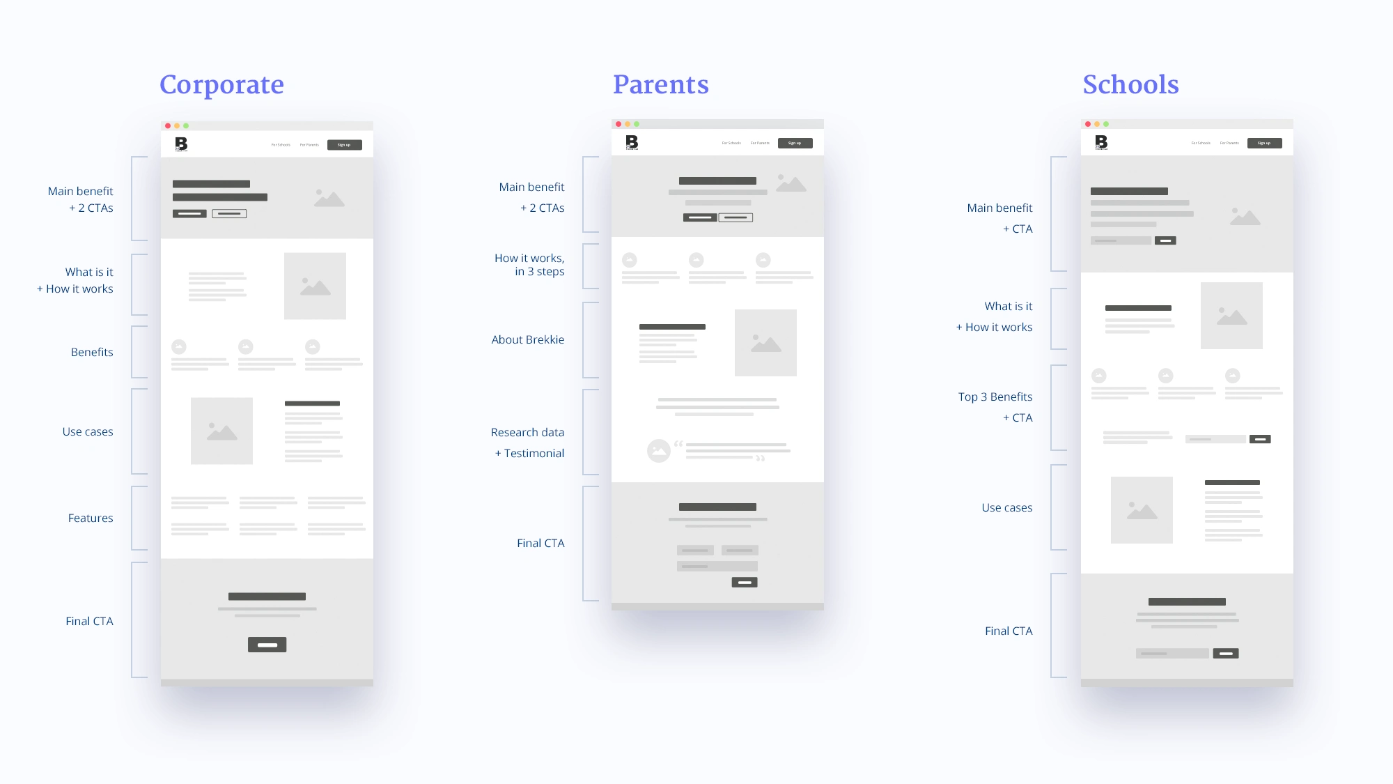
Wireframes organizing the information
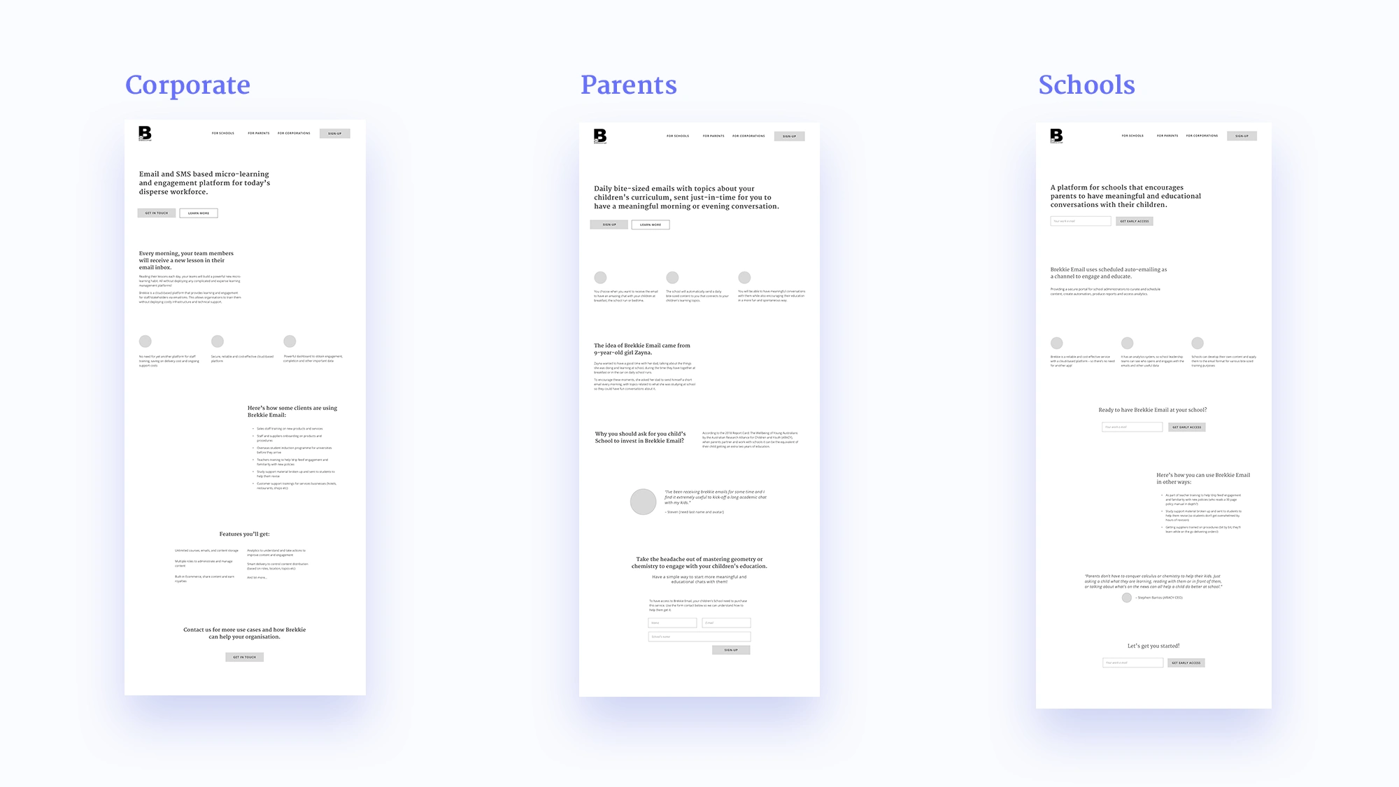
Hi-fi wireframes showing the previous structure with real content
Visual style direction
One of the things that concerned me about the page's digital branding was that they expressed a really big interest in having a playful look for the layout, but their brand wasn't as playful or ludic as they wanted the pages to be.
The pdf pitch palette was a grey monochrome, and their logo is a dark blue, making the brand look serious and corporate.
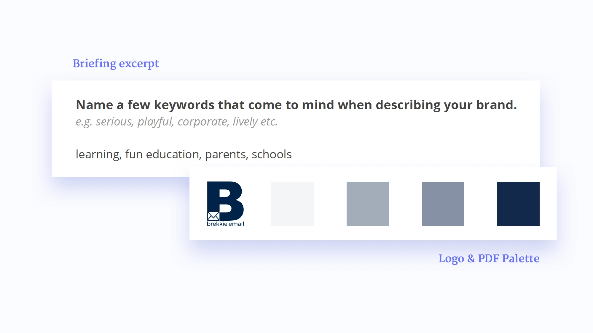
The pdf pitch palette was a grey monochrome, and their logo is a dark blue, making the brand look serious and corporate.
The other thing was that they also wanted to have a couple of illustrations along the page. Still, since we were dealing with a very different type of user, the choice of the illustration style would be tricky because it couldn't be too childish or too serious.
Outcome
To make the layout more playful and dynamic, I decided to brighten up the brand color into a more vibrant blue, and pair it up with an accent color, to make everything look more alive.
For the illustration style, I chose an isometric vector type that would bring seriousness to the message but also have a playful feel because of the ludic representations on each scene.

Updated color palette and illustrations
We ended up with three landing pages, each focusing on a specific type of user and having a specific Call to Action.
Like this project
Posted Sep 8, 2023
Strategic landing pages for an Australian startup that provides a micro-learning platform for different purposes.
Likes
0
Views
5


