Springsentia: Brand Identity Design
Chido Nmerole
Repositioning a natural cosmetics brand
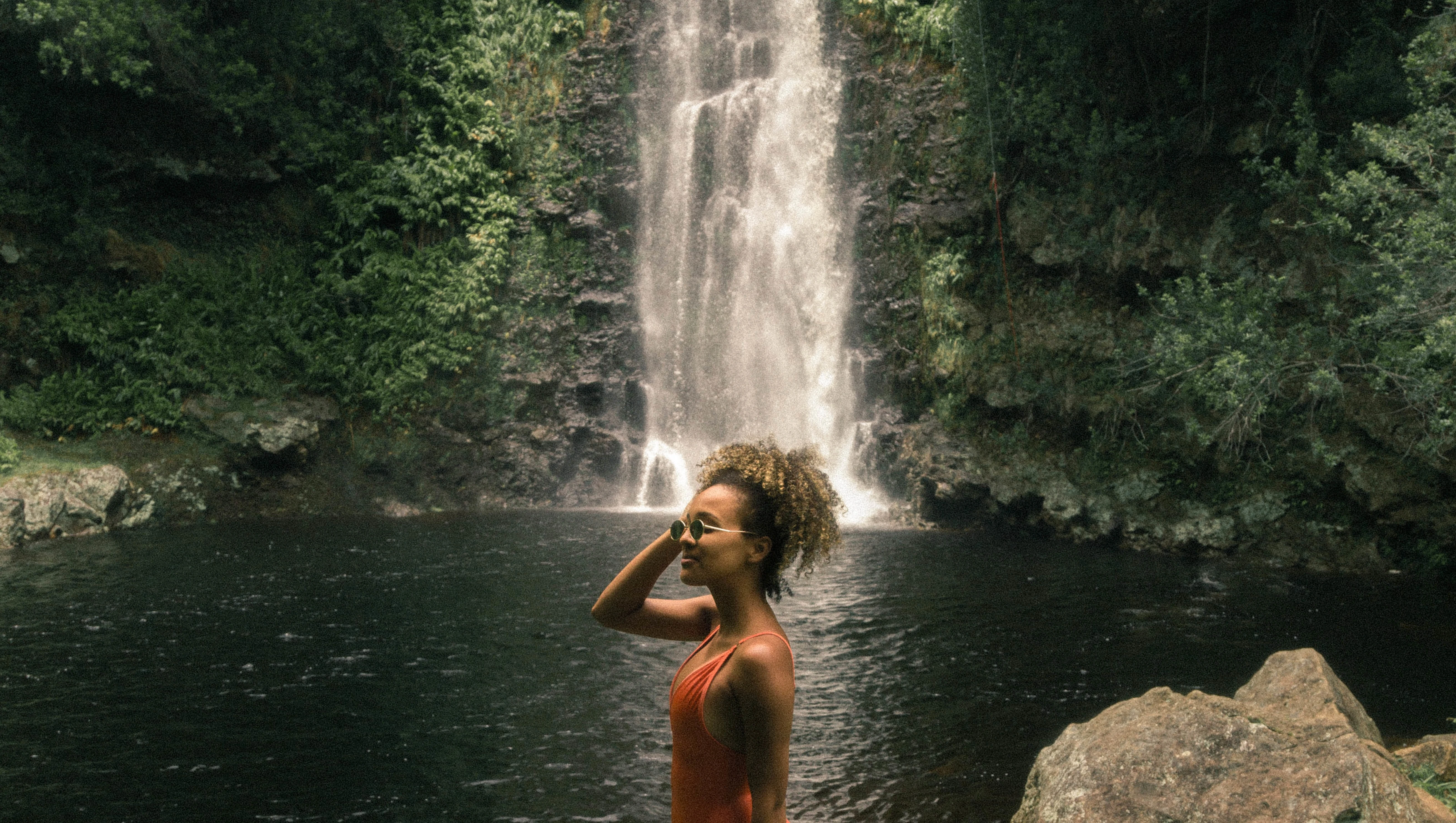
Springsentia is a cosmetics brand that specializes in hair and skin care products made from natural ingredients for women, men, and kids. Every product is vegan and cruelty-free. The products are not just made with natural ingredients, they are made with love, intent, and care for the black community who value healthy hair and skin.
Despite its efforts, the Springsentia brand was not being perceived the way the brand intended. From target market to brand positioning, it lacked a clear definition of its essence. The challenge was to crystalize the brand strategy and identity while seamlessly embracing new market segments.
My Role
I led brand audit and research, naming, and visual identity creation. I also supported brand strategy development.
Project Goal
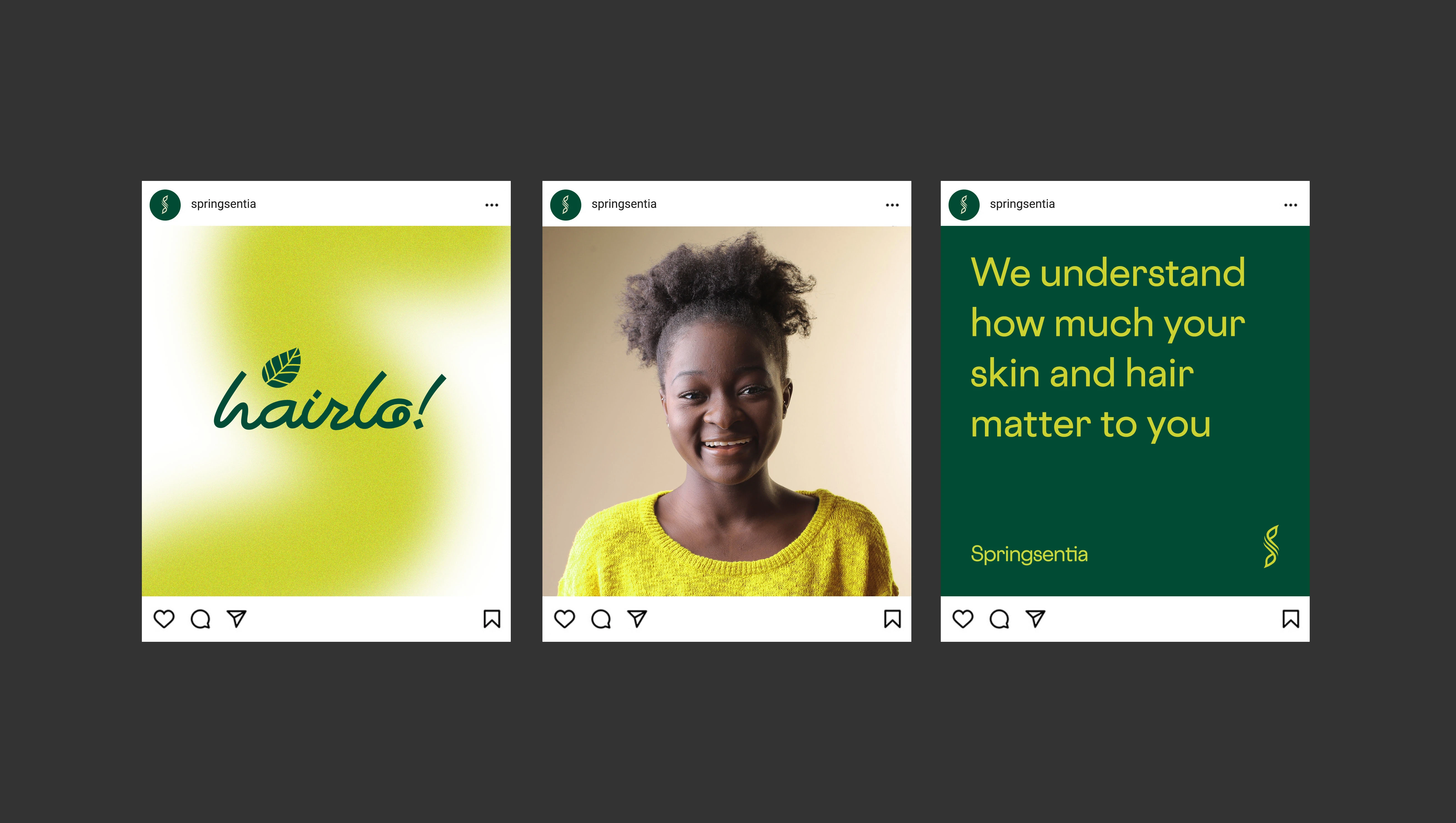
The goal was to redefine the Springsentia brand through the development of a gender-neutral strategy and visual identity that appeals to the target markets.
Team & Duration
1 brand designer, I content strategist. The project lasted 6 weeks.


My Approach
Springsentia was formerly an all-women beauty brand but was looking to expand its product offering to serve men and kids. This prompted a need to redefine not just its strategy, but to also rethink its brand identity to effortlessly accommodate the new market segments.
I commenced the project by auditing the Springsentia brand and its assets across online and offline channels. The purpose was to gain a good understanding of where Springsentia stood as a brand and how its standing was being communicated to customers. This was followed by competitor research into the cosmetics market in Nigeria and Africa. I supported the client in conducting research in the areas of brand positioning, visual identity, packaging, user experience, marketing, price points, and distribution channels. This put Springsentia side-by-side with top organic and natural beauty brands in Nigeria and Africa and helped bring the brand's Achilles heels into better focus.
From the research discoveries, the challenges weren’t one a quick logo update could fix. That would only be a skin-deep solution to a marrow-deep problem. Hence, the need to get more strategic in defining the brand values, mission, vision, unique selling proposition (USP), brand voice, target market, and brand name.
Brand & Visual Strategy
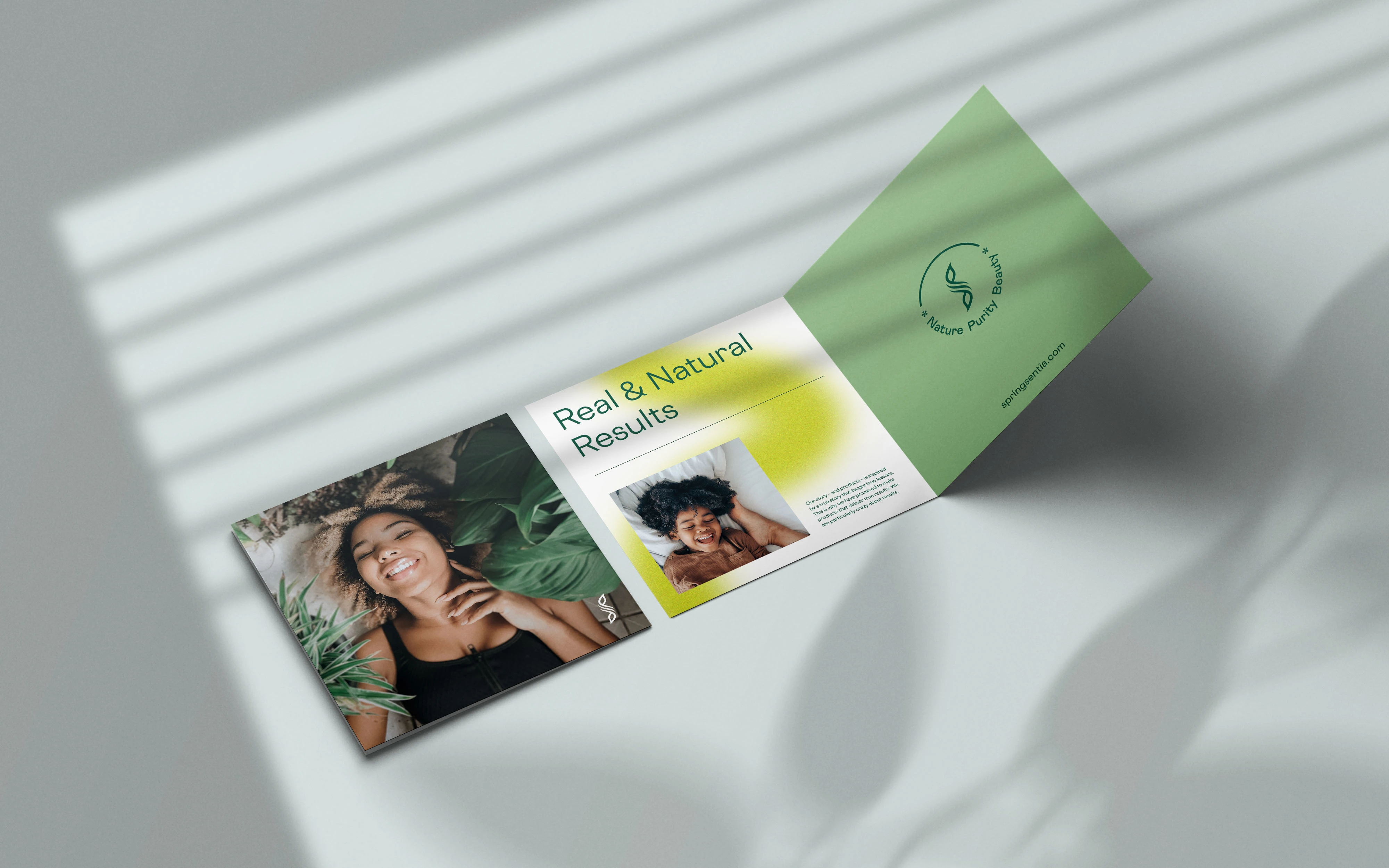
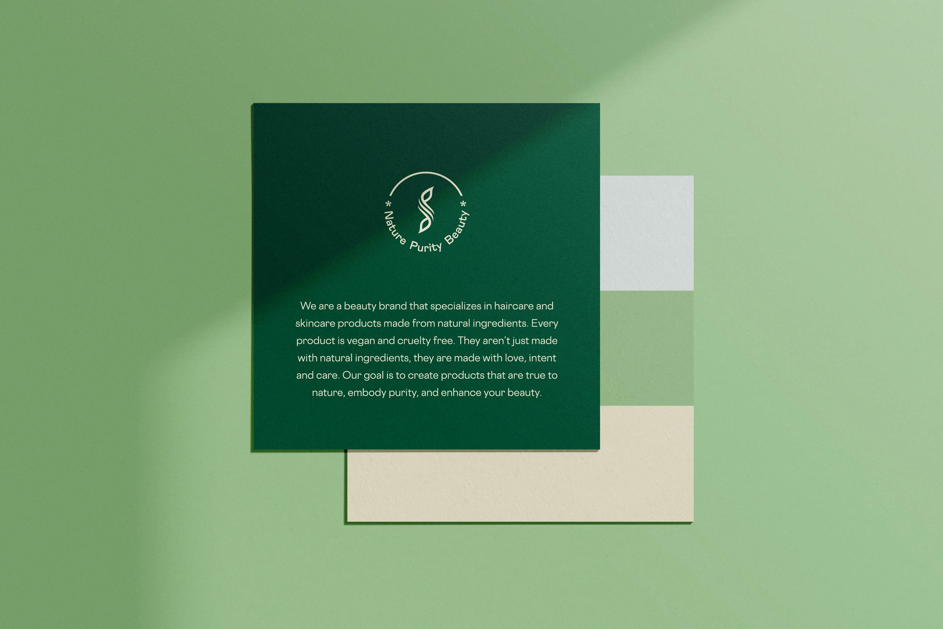
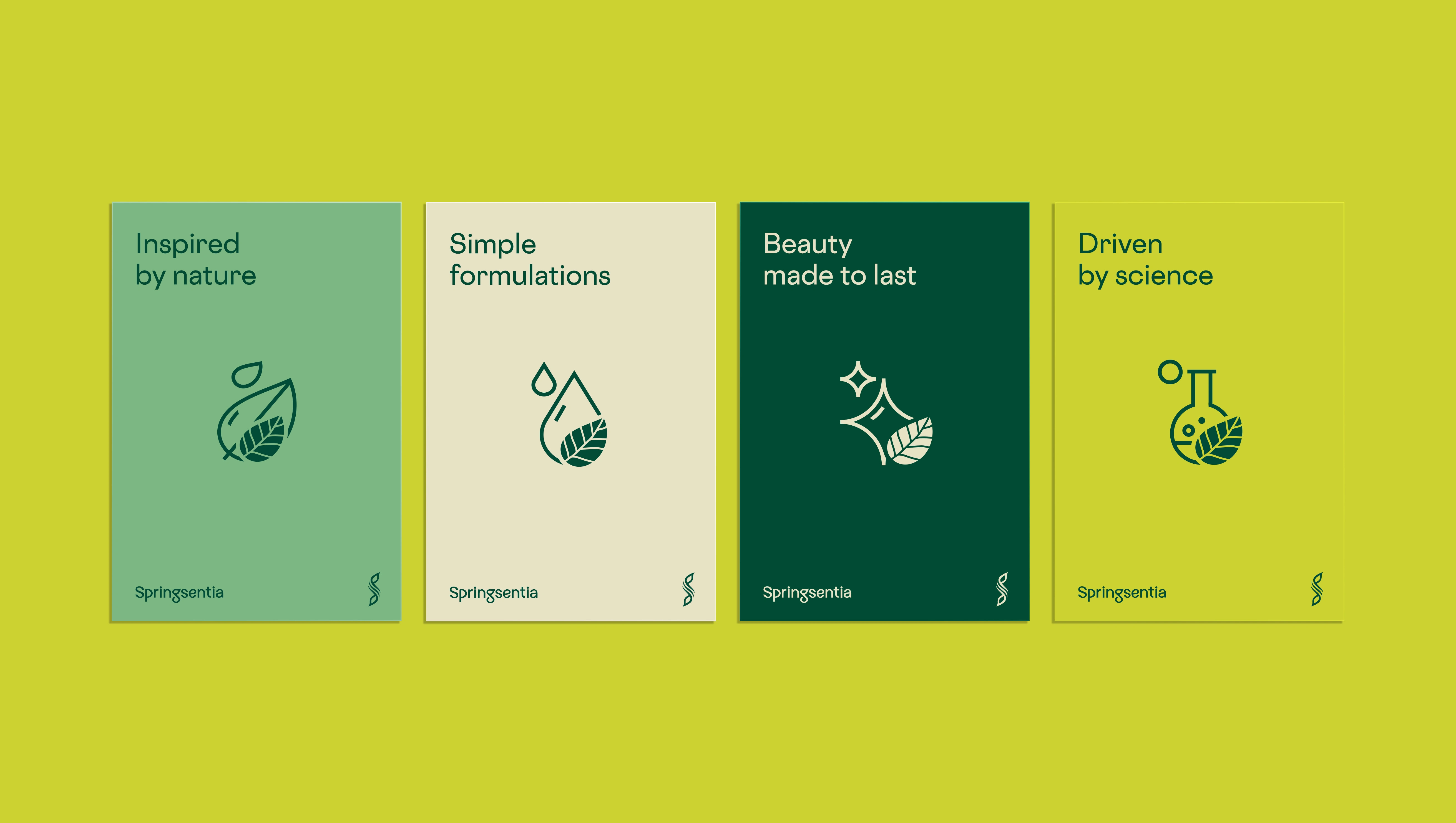
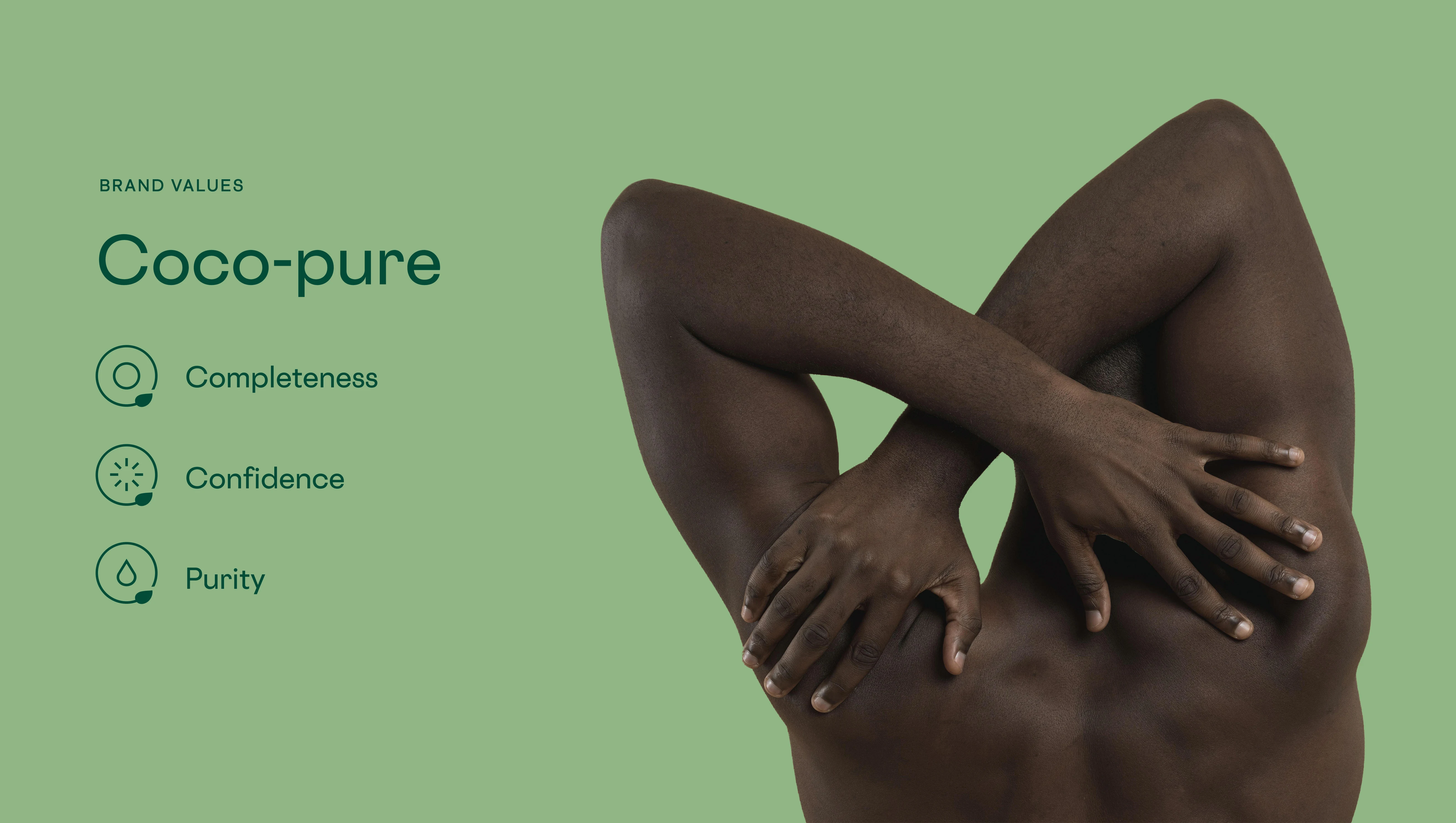
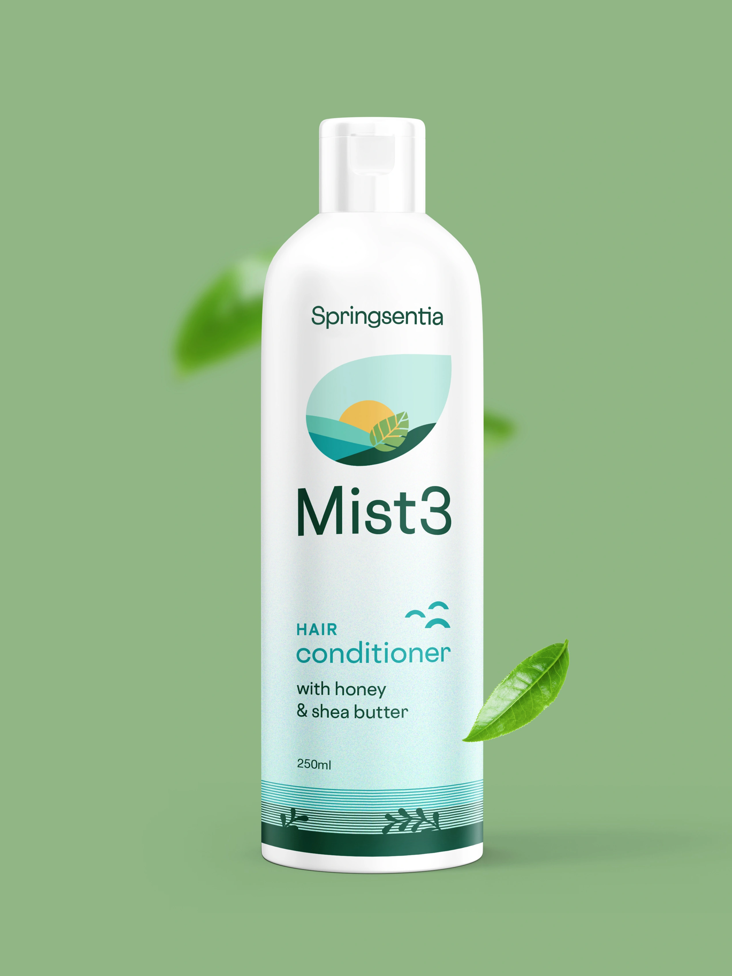
While developing the brand strategy, 3 brand pillars were established — Nature, Beauty, and Purity. Nature captures the source of the main ingredients used in making the products, Beauty focuses on the results from using Springsentia's skincare and haircare products, and Purity dwells on the pure science-driven process of making the products. Put together, they served as the anchors and slogan for the brand.
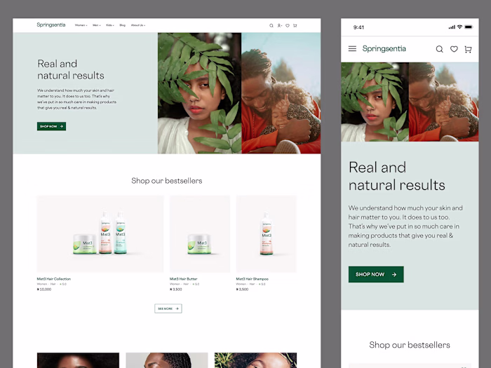
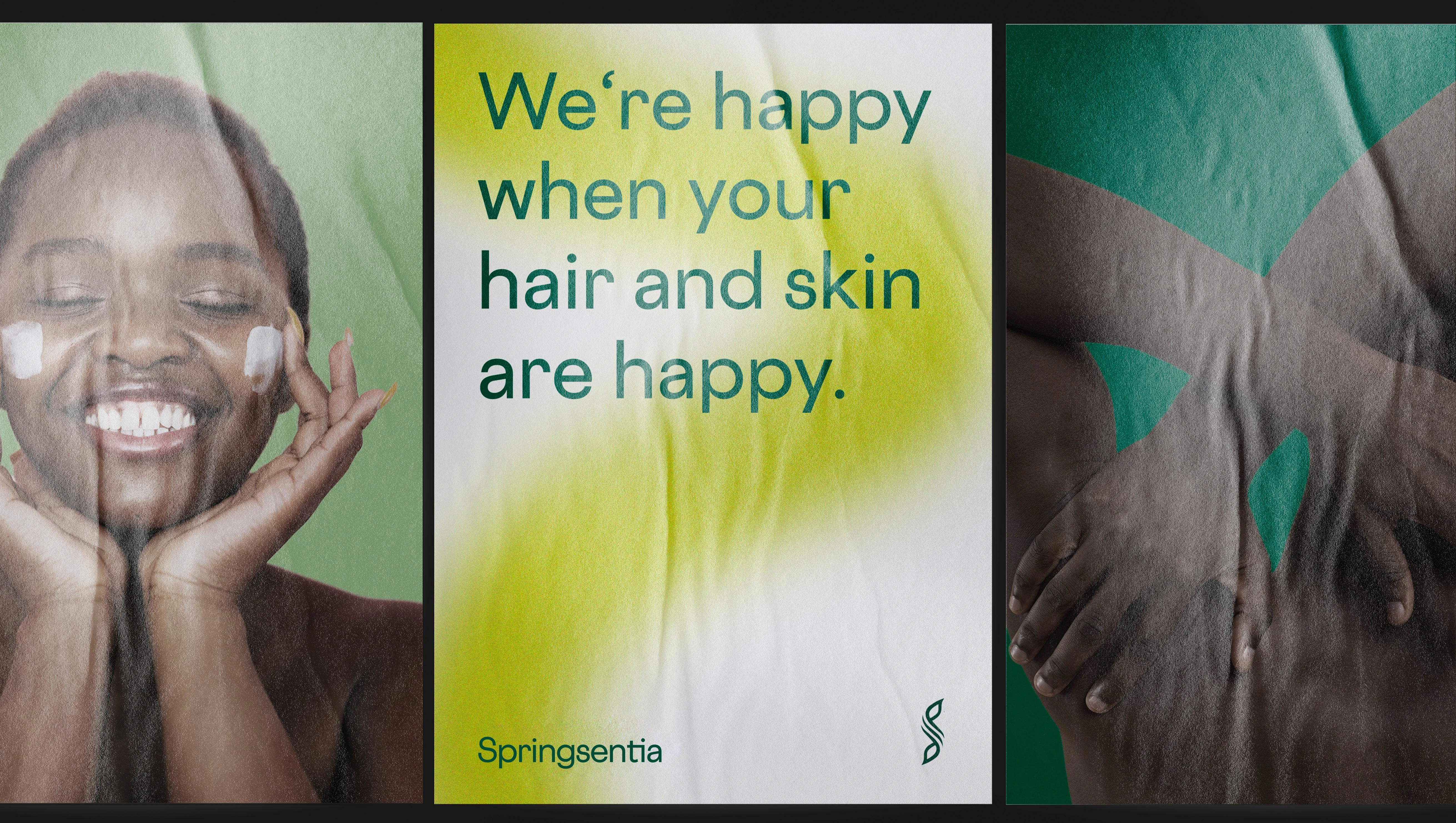
In all, the strategy was summed up to a single unique selling proposition — Real and Natural Results. This reinforced Springsentia's promise to not just make products with natural ingredients, but also make them with love, intent, and care. The goal was to create products that deliver real results to customers.
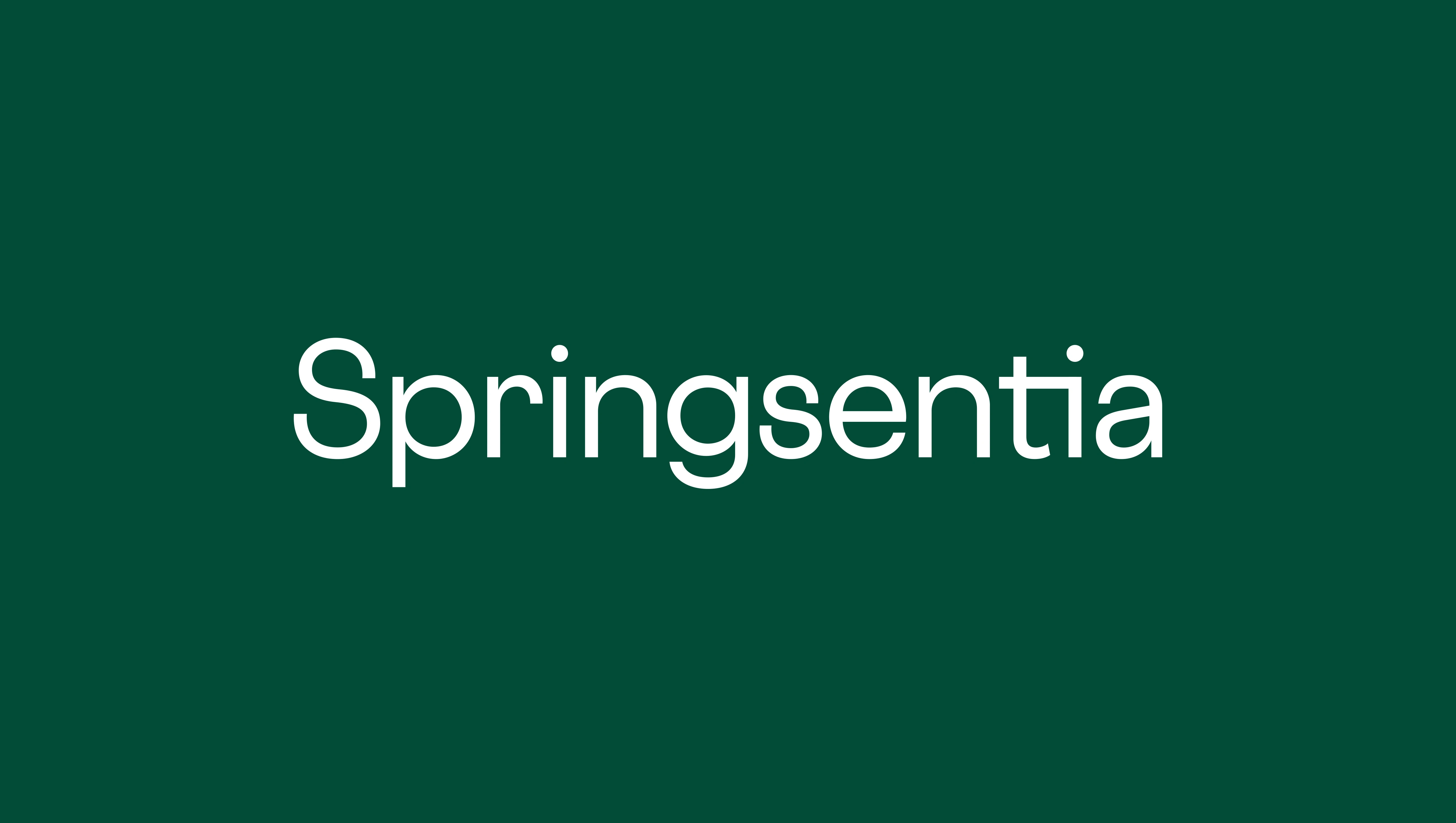
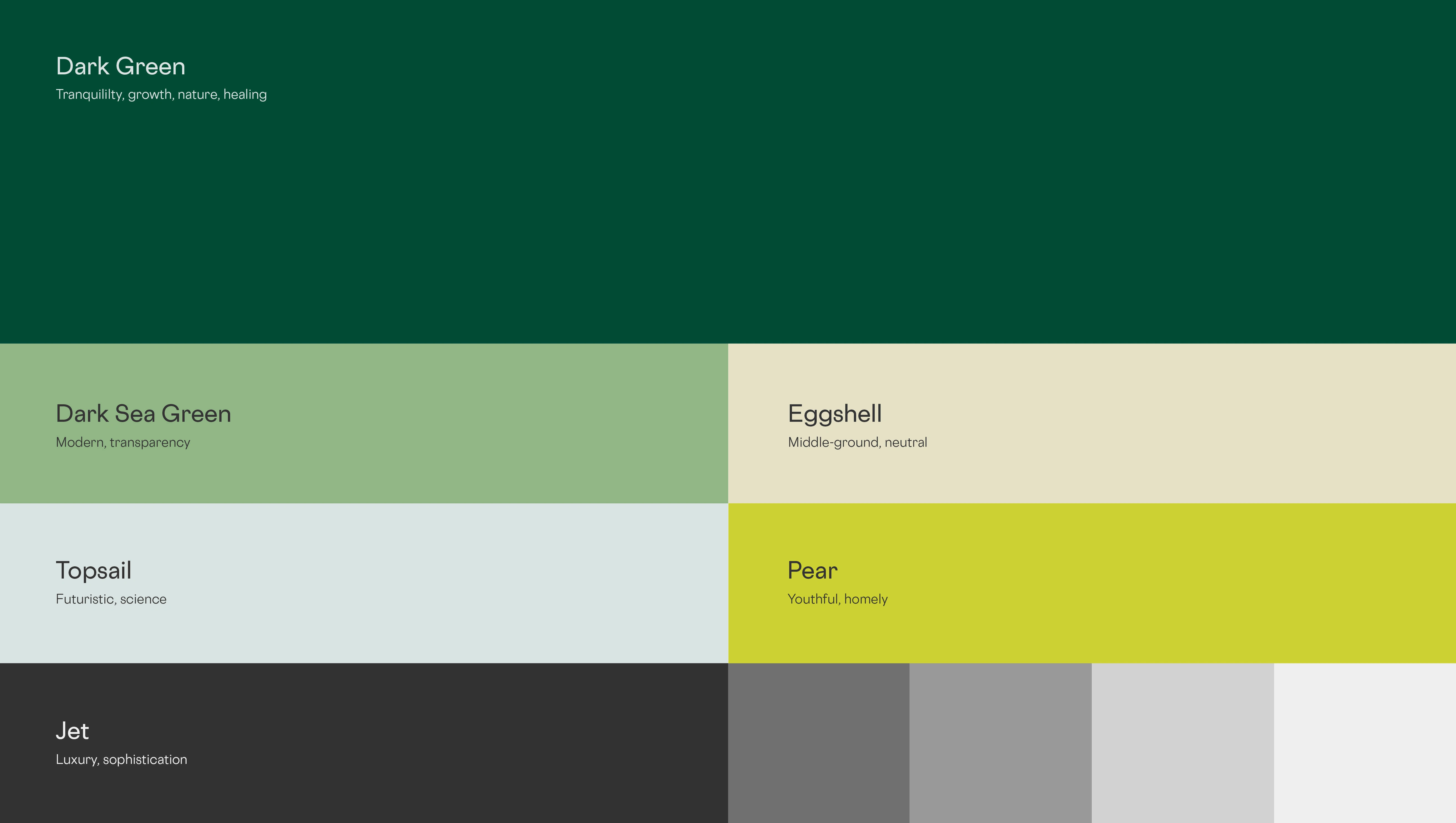
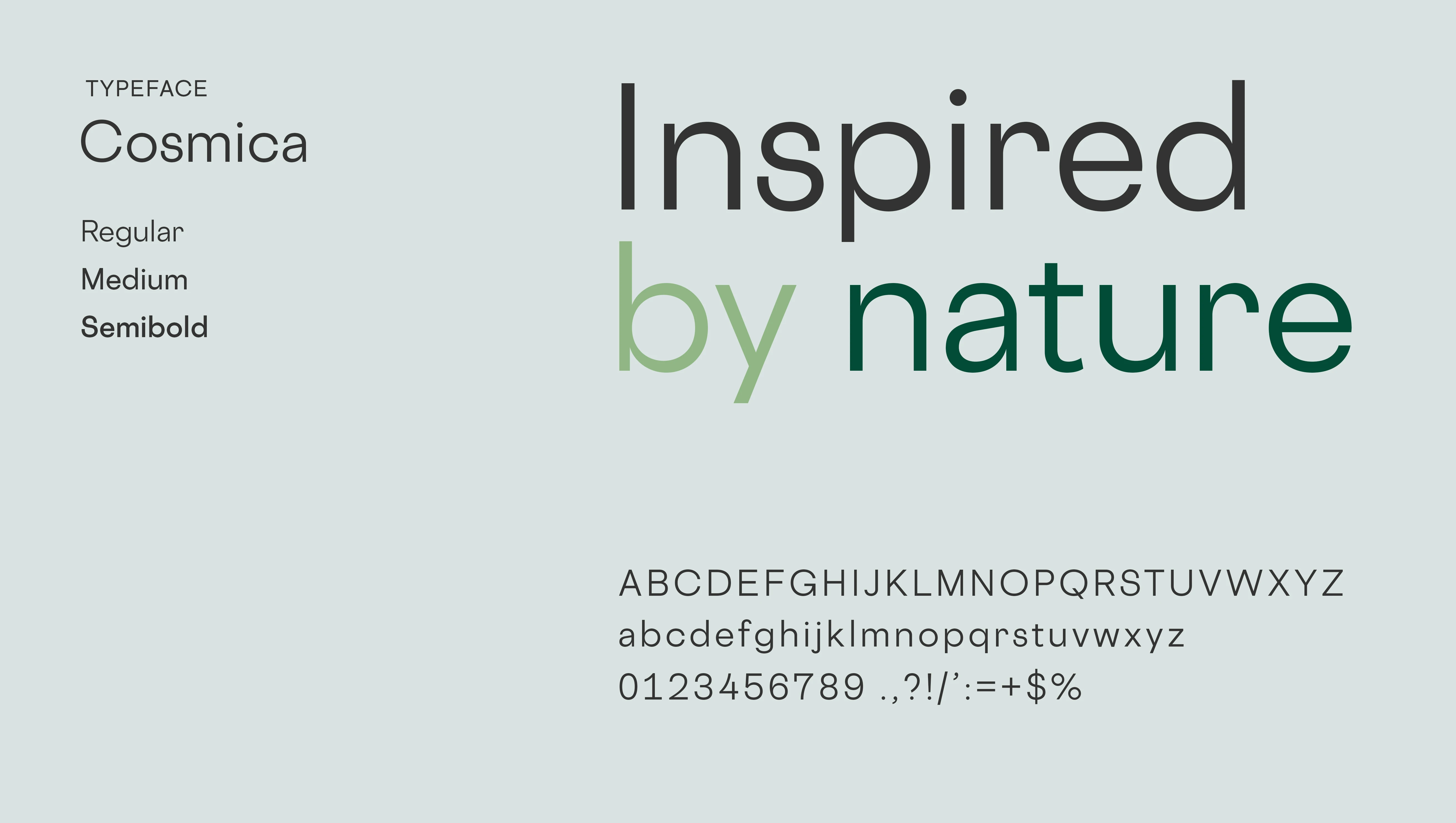
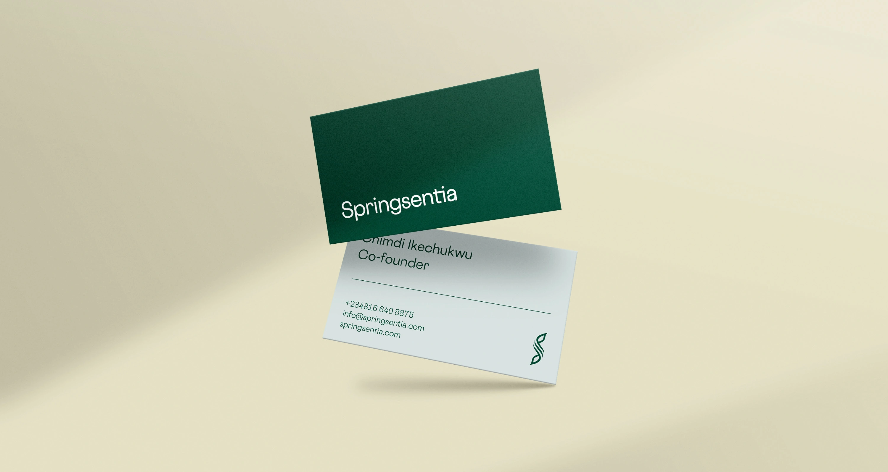
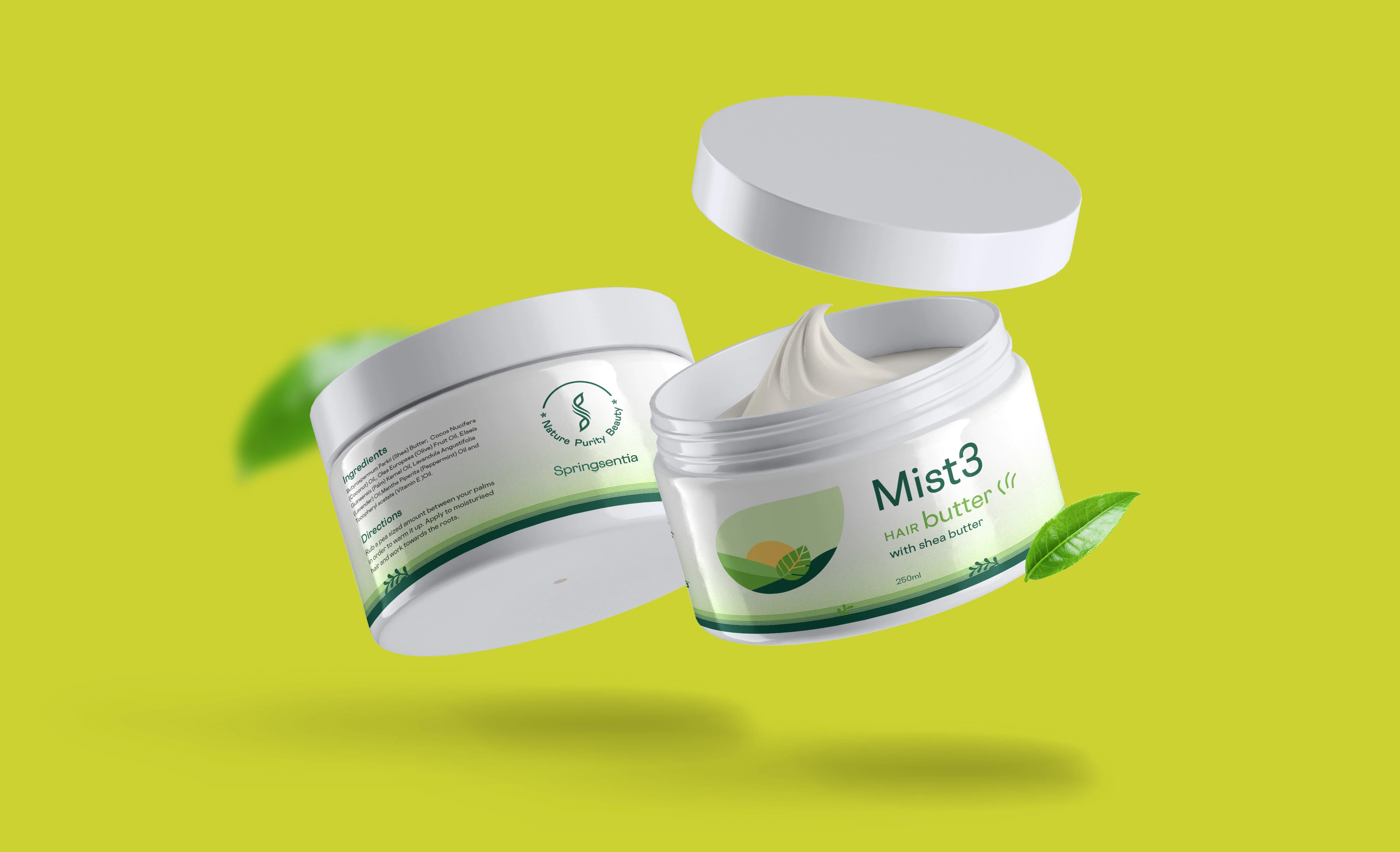
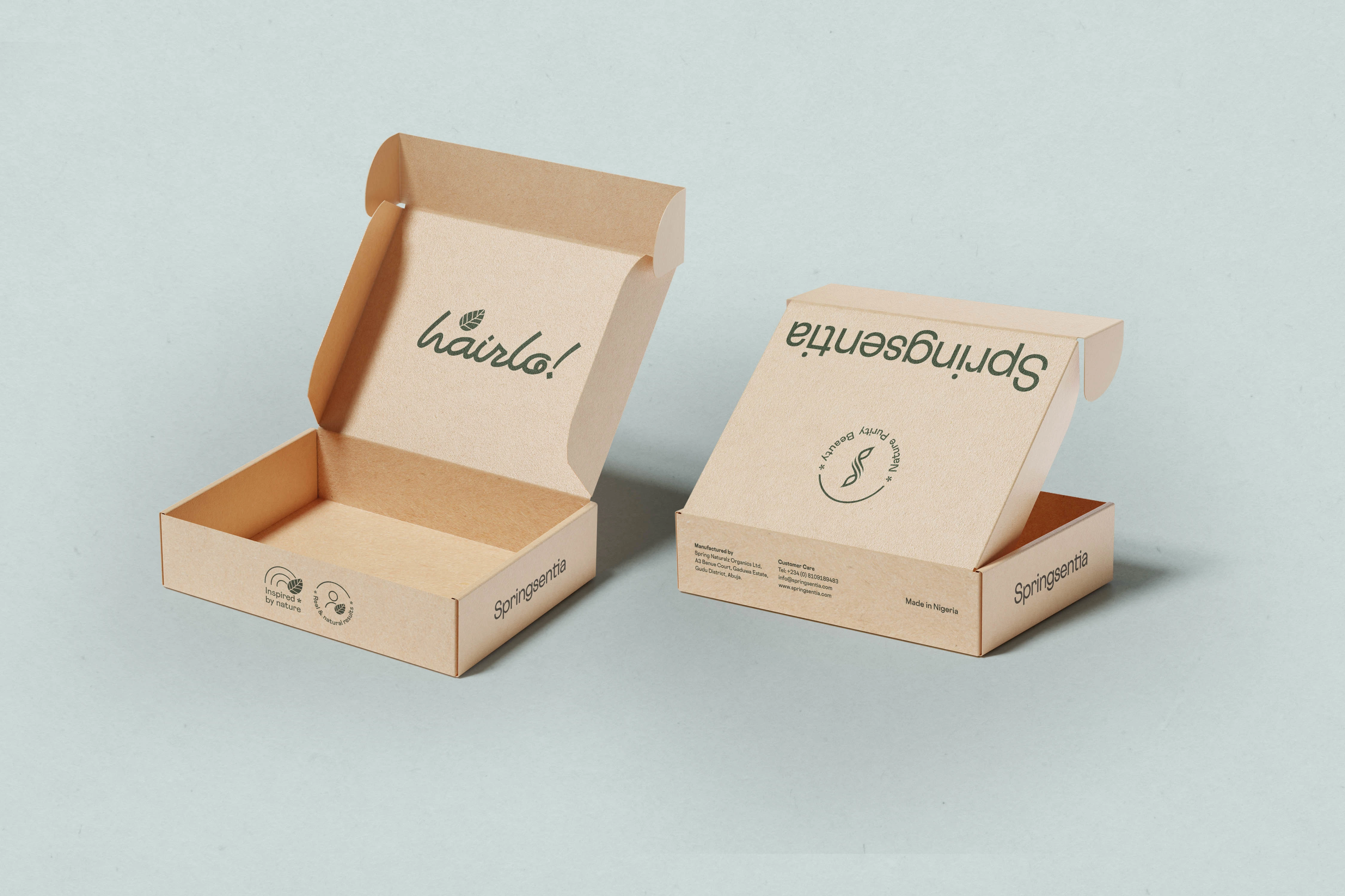
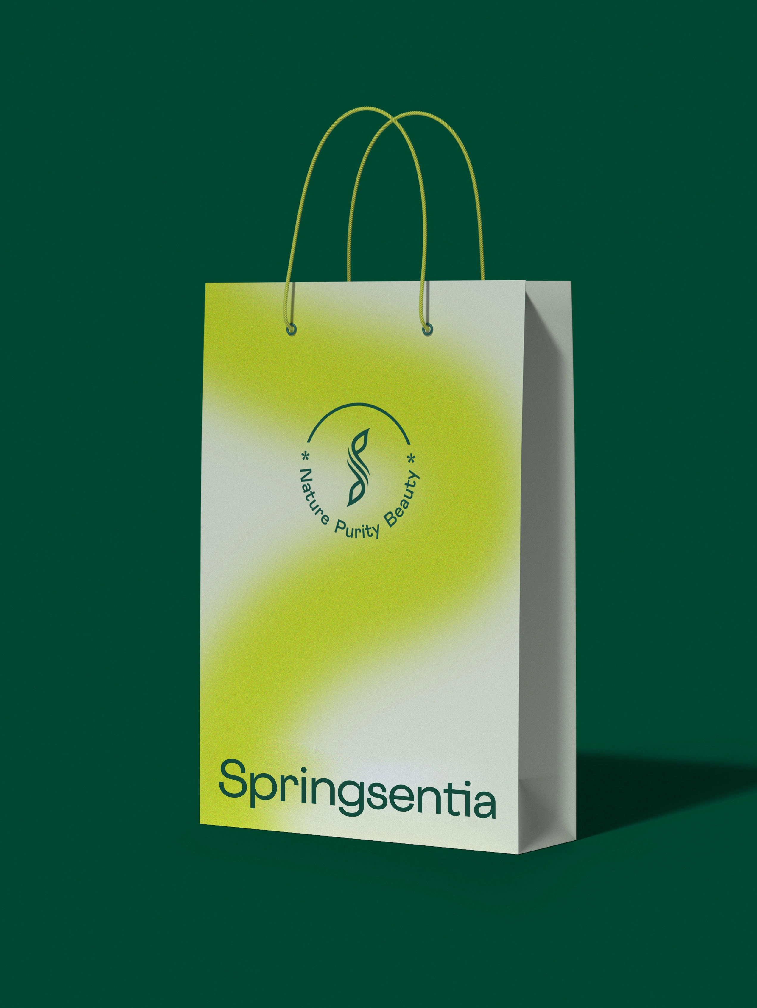
To visually reinforce the strategy, I created a wordmark logo with Cosmica Sans which also served as the brand's typeface. A wordmark logo was chosen because of its neutrality. However, a tweak was made to the letters "T" and "I" in order to make the wordmark unique, and in doing so, a brand device was also developed. For a gender-neutral color palette that strikes a balance between luxury and affordability while capturing the naturally sourced product ingredients, I meticulously put together an oriental palette. In the palette, pastels were countered with strong shades to achieve a gender-neutral look and feel.


Learnings
Retaining the former brand logomark and finding ways to integrate it into the new visual system was a bit of a challenge. It took lots of iterations to figure out how the new wordmark and old logomark would be applied across platforms. I overcame this by defining their roles more explicitly and arriving at a system where both could co-exist and work towards the goal of visually identifying and differentiating the brand.
I took home lessons on how to work with independent but visually dependent assets in creating a consistent layout and cohesive brand identity.
"I looooove the results! Chido understood both the brand needs and the customer needs. I really can't wait to relaunch the brand later this year (2022)" - Chimdi, Founder at Springsentia
Like this project
Posted Jan 4, 2025
I transformed Springsentia's brand identity by creating a visually cohesive and audience-focused identity that elevated the brand’s positioning.