Pacto Solutions Redesign
Cristy Calderon
Introduction
Pacto Solutions is a manufacturing production management app that provides a better way to view the information and maximize results, ensuring the sustainability of the performance of their clients.
Problem
Pacto Solutions asked for a redesign of their screens. In the current situation, Pacto finds the necessity to improve their user experience in the app. They want the following improvements:
Standardize the elements on the app, currently the app has diverse elements making it complicated to create and keep a record of the changes. Having diverse elements in the app makes its navigation complicated as well.
Redesign overall the experience through the app, the current flow is complicated.
Propose areas of opportunity that could be applied in future versions of the app.
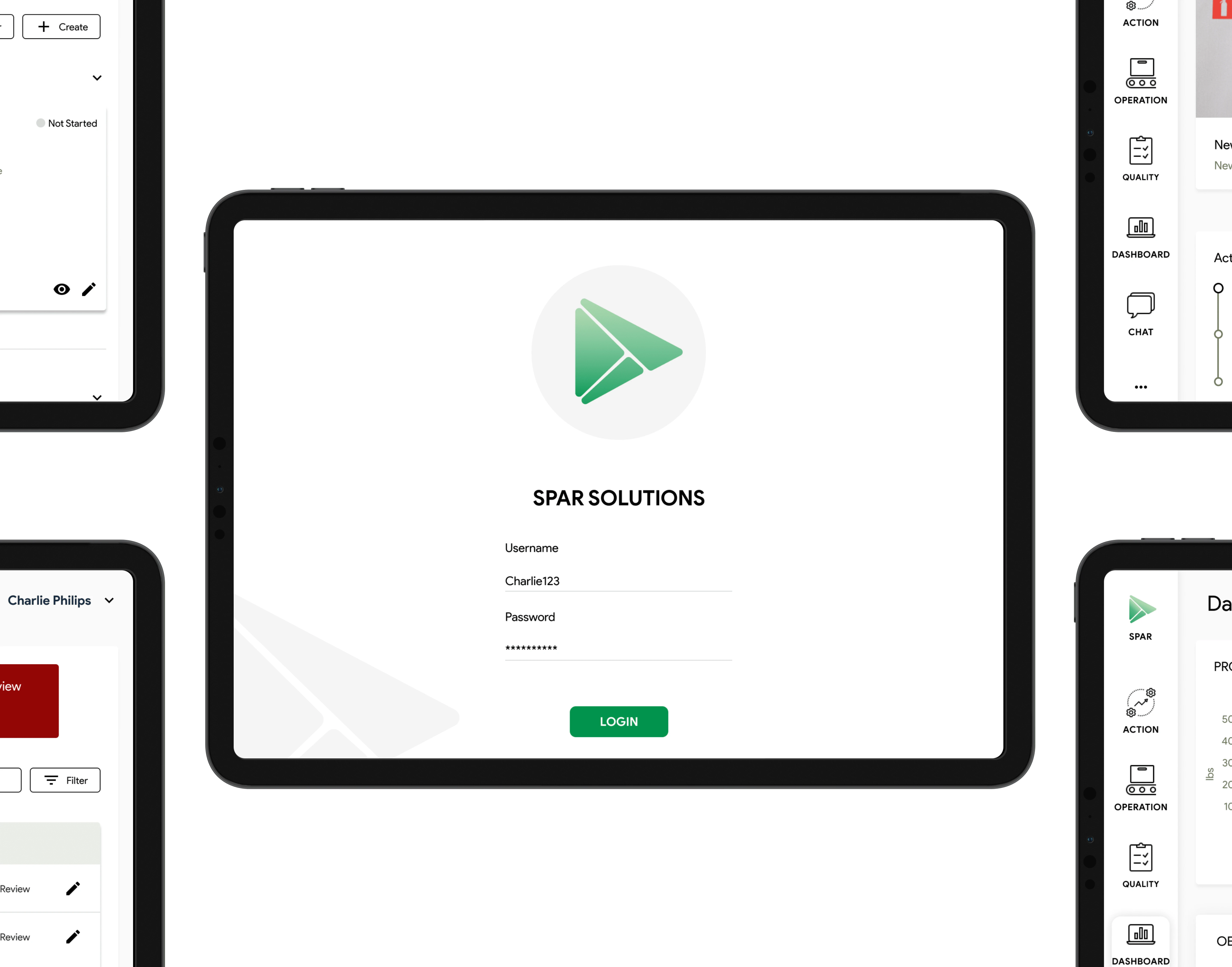
The Design
All the screens on each section of Login, Home, Quality, Actions, Operations, Dashboard, and Chat had been changing. Here we have some of the changes that I made.
Quality
For the quality screens, I made the following changes.
Keep consistency in the colors throughout the app.
Have a better view of all tasks, give the action a status to be more visible when is “Not started”, “Started” and “Delay”.
Have a cleaner screen so the user won’t get distracted.
Before
After
For the rest of the screens, the color was aligned to the brand, and we kept consistency on the space between the elements and their alignments, and all the icons now come from the same source.
View of some screens
View full case study ⤵️
Like this project
Posted Dec 3, 2024
Pacto Solutions asked for a redesign of their screens. In the current situation, Pacto finds the necessity to improve their user experience in the app.
Likes
0
Views
10