Velor Bank - Fintech /

Dmytro Zelinskyi

Velor Bank - Fintech / Digital Banking
Your card should look as good as your money moves.
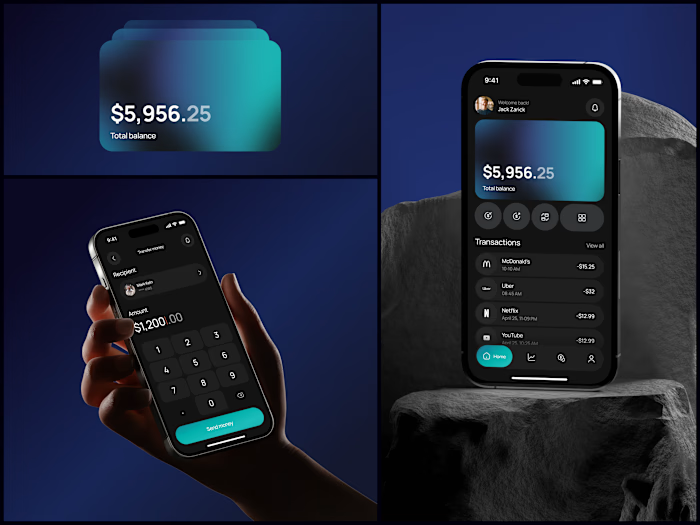
Fintech concept where the physical card and the digital experience share the same DNA. The frosted glass card with brushed metal texture was designed first, then the UI inherited that same transparency and depth. Not the other way around.
Small thing I like about how this turned out: the card numbers are readable without dominating the layout. In fintech that's a real tension. Security says hide it, usability says show it, and the design has to sit somewhere in between.
#Fintech #BankingApp #UIDesign #ProductDesign #CardDesign
Like this project
Posted Aug 19, 2026
Velor Bank - Fintech / Digital Banking Your card should look as good as your money moves. Fintech concept where the physical card and the digital experience ...
Likes
0
Views
4