ApexFlow SaaS Platform Redesign

Jerry Stark


ApexFlow: SaaS Platform Redesign & Mobile Experience Case Study
1. Executive Summary & Project Overview
ApexFlow is a B2B SaaS workflow automation and analytics platform designed to help operations and development teams streamline processes, monitor performance metrics, and manage system integrations. This case study details the complete end-to-end design refresh, covering the marketing landing page, responsive mobile breakpoints, SaaS pricing strategy interface, and web/mobile analytical dashboards.
Role: Lead Product & UI/UX Designer
Tools: Figma, Framer, Adobe Illustrator, React / Tailwind CSS System Design
Deliverables: Desktop Landing Page, Responsive Mobile Layouts, Pricing Matrix Architecture, Web Analytics Dashboard, Mobile Operational Alert Center

2. Problem Statement & User Experience Objectives
Prior to the redesign, ApexFlow struggled with poor onboarding conversion rates and low mobile engagement due to several critical friction points:
Unclear Value Proposition: Legacy marketing layouts failed to articulate complex automation features clearly across screen sizes.
Pricing Confusion: Users struggled to compare tier features, leading to high drop-offs on the checkout conversion path.
Fragmented Dashboard UX: Operational teams lacked a responsive, real-time interface to monitor workflow alerts and team throughput on mobile devices.
3. Visual Identity & Design System
A modern, high-contrast dark-mode theme was established to create a premium, enterprise-grade aesthetic while maintaining optimal legibility:
Color Palette: Deep Navy Slate (
#0B132B) for primary dark backgrounds, Off-White/Cream (#F7F4EA) for soft content containers, Warm Coral/Orange (#FF6B54) for primary calls-to-action (CTAs), and Gold (#E3A857) for high-priority alerts.Typography & Layout: Clean geometric sans-serif hierarchy paired with spacious padding to improve scannability across dense data matrices.
Component System: Reusable UI components including metric cards, alert feeds, pricing containers, and integration badges.
4. Interface Breakdown & Screen Architecture
Hero Landing Page (Desktop & Mobile)
Hero Messaging: Bold "Automate Workflows, Supercharge Teams" headline accompanied by custom 3D isometric gear and dashboard vector graphics.
Responsive Adaptation: Seamlessly collapses from a multi-column desktop hero to a stacked mobile view with an adaptive hamburger navigation menu.
Strategic Pricing Tier Matrix
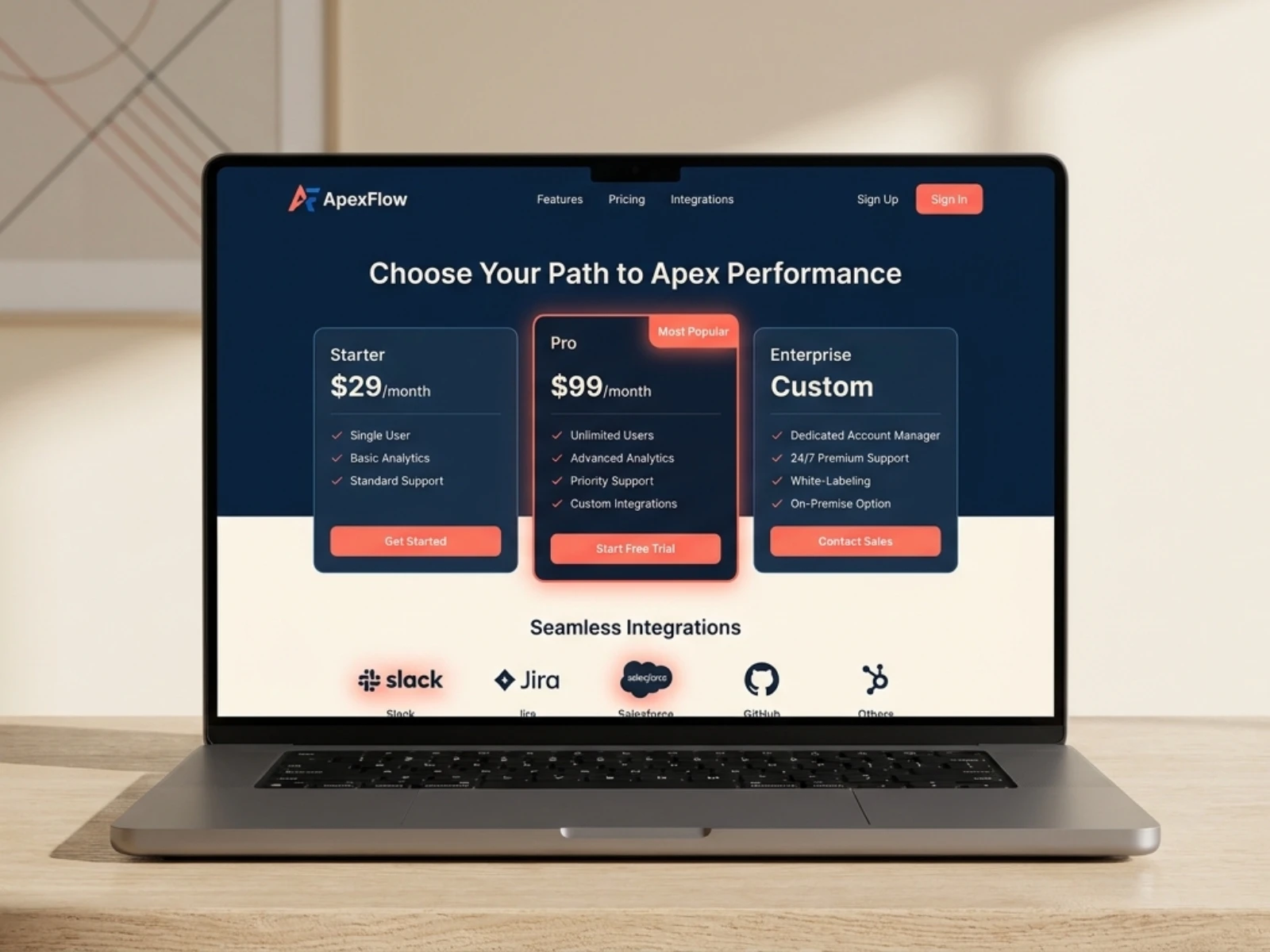
Tiered Architecture: Displays clear price anchor tiers—Starter ($29/mo), Pro ($99/mo) highlighted as Most Popular, and Enterprise Custom.
Integration Showcase: Highlights native integrations with core enterprise tools including Slack, Jira, Salesforce, and GitHub.
Analytics & Operations Dashboards
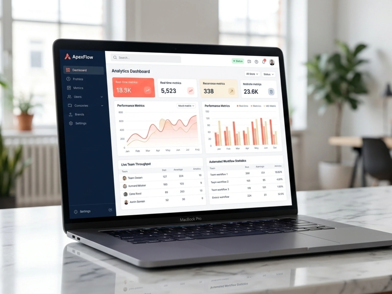
Web Dashboard: Features real-time metric cards (13.3K active metrics, 5,523 tasks), performance trend charts, live team throughput tables, and automated workflow statistics.
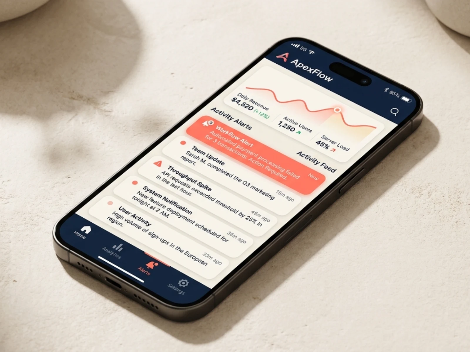
Mobile Alert Center: Mobile-optimized view prioritizing urgent operational updates (e.g., Workflow Alert, Throughput Spike, System Notifications) alongside quick metric sparklines.
5. Key Metrics & Impact
6. Key Takeaways & Design Conclusion
The ApexFlow redesign demonstrates how aligning a enterprise design system with responsive visual hierarchy directly drives user retention and subscription conversion. By pairing intuitive data visualization on desktop with an actionable alert feed on mobile, teams can maintain complete operational control from any device.

Like this project
Posted Sep 16, 2026
Redesigned ApexFlow's SaaS platform, enhancing UI/UX and conversion rates.