BharatRail
BHARATrail
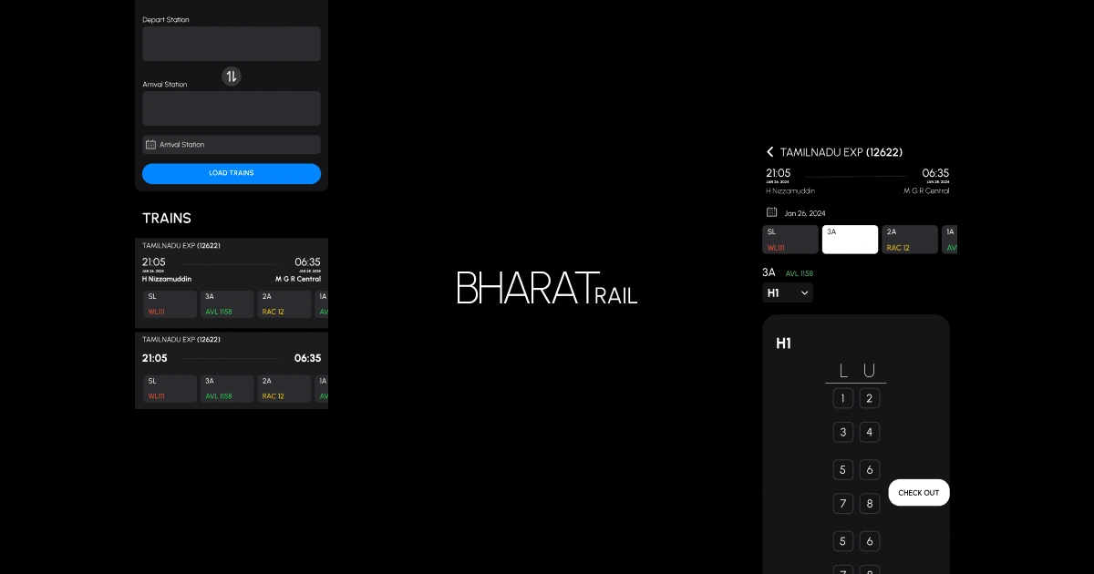
The user interface of the Indian train ticket booking website exhibits a notable degree of clutter, replete with superfluous elements that contribute to a lack of visual minimalism. Recognizing this deficiency, I embarked on a project to revamp the UI, for an assignment project I was given, introducing a more streamlined design and incorporating additional functionalities, notably the option to select specific seats — an enhancement conspicuously absent from the original website(though there’s a valid reason for that, which we’ll dwell in a later blog).
Choosing Fonts
The challenge of finding the perfect font to encapsulate the essence of a minimal, luxurious, and high-end user experience was a pivotal point in our design journey. Faced with the task of striking a delicate balance between sophistication and simplicity, the quest for the ideal typeface was both intricate and crucial. After a meticulous exploration of various fonts, the answer emerged in the form of Urbanist. This font, with its clean lines, modern aesthetics, and versatile weights, not only met the specific criteria of our design goals but also seamlessly embodied the essence of the application. The decision to settle on Urbanist was a conscious one, as its ability to convey a sense of luxury and minimalism aligned perfectly with the vision we aimed to achieve. In adhering to the principle that good design limits the number of fonts to a maximum of two, Urbanist emerged as the cornerstone, allowing us to create a visually harmonious and polished user interface that resonates with our commitment to delivering a high-end experience.
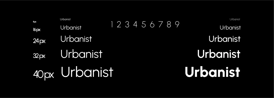
With Urbanist as our primary font, the design narrative of our application took on a refined and cohesive character. This choice not only reflected our commitment to a minimal and luxurious user experience but also facilitated a seamless visual flow throughout the interface. Urbanist’s versatility allowed us to emphasize key elements with varying weights, ensuring a dynamic yet harmonious design language. By adhering to the principle of employing a maximum of two fonts, we reinforced the notion that simplicity is the ultimate form of sophistication. Urbanist not only elevated the aesthetic appeal of the application but also contributed to an intuitive and user-friendly interface. The journey of font exploration, culminating in the selection of Urbanist, serves as a testament to the meticulous attention to detail that underlies our commitment to delivering a high-end user experience. In embracing the power of typography, we have crafted an interface that not only meets but surpasses the expectations of our users, inviting them into a world of luxury and simplicity with every interaction.
Color Palette
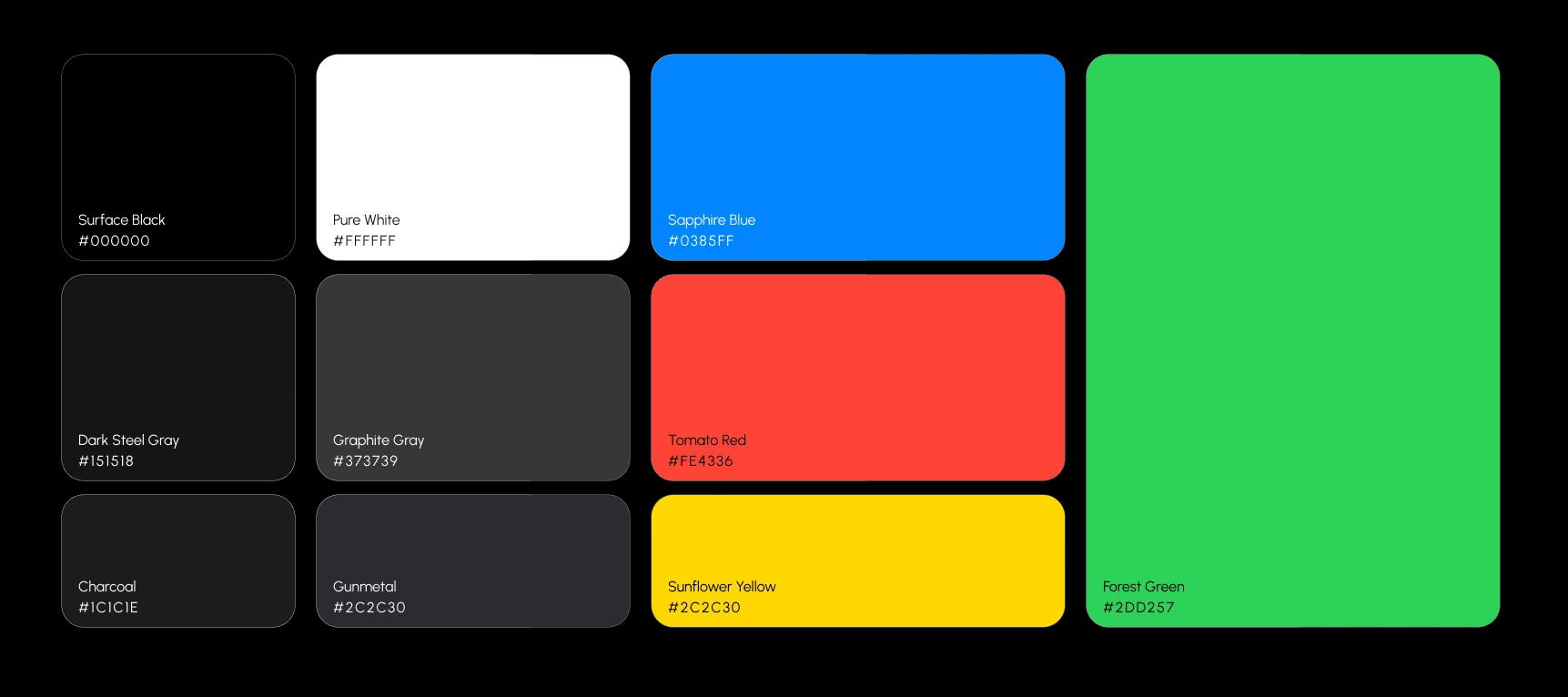
We use different colours for to show differnt elevation, application states and buttons. The meticulously crafted color palette for our application embodies a perfect union of sophistication and functionality. Rooted in a sleek monochromatic foundation of deep charcoal, granite gray, and smoky black, the interface emanates a sense of timeless elegance. The dominant use of Dark Steel Gray and Graphite Gray creates a visually striking contrast against a minimalist canvas, while the subtle tones of Charcoal and Gunmetal provide depth and nuance. The strategic infusion of Sapphire Blue for buttons injects a vibrant energy, offering a refreshing visual cue for user interactions. Meanwhile, the deliberate deployment of Tomato Red, Forest Green, and a subtle hint of Sunflower Yellow caters to different states of information within the app. The careful orchestration of these colors ensures not only a visually pleasing aesthetic but also serves a functional purpose, guiding users seamlessly through various states and actions. The result is an interface that balances the timeless allure of monochrome with the dynamic responsiveness needed for an intuitive user experience.
Design Components
Button Shapes

In our app, we didn’t just stop at picking colors — we also thought about the shapes of the buttons. We’ve got three different kinds: slightly, moderate, and completely. The slightly round ones have a nice softness to them, making things look modern and cozy. The sort of round ones strike a balance, keeping things sleek and smooth. Now, the fully round ones are the attention-grabbers, adding a fun touch to important stuff. These varied button shapes aren’t just for looks; they help guide you through the app smoothly. So, whether you’re tapping on something a bit round, sort of round, or fully round, we’ve made sure your experience is both stylish and easy.
Components
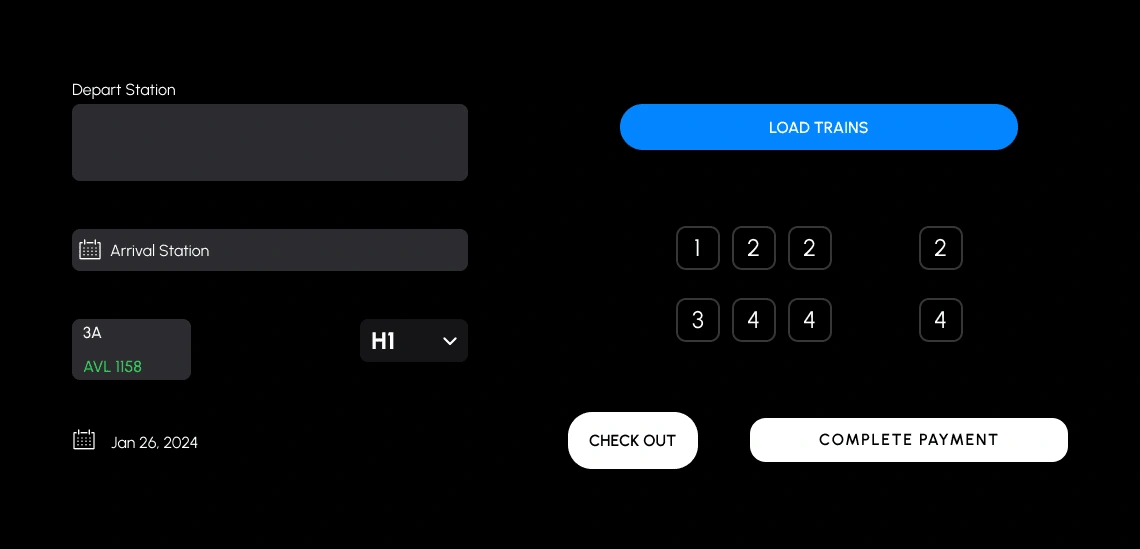
The app isn’t just about fancy fonts; we made sure everything, like buttons, dropdowns, and toggles, goes well together. The Urbanist font sets the style, and we kept that vibe in mind for other stuff. Buttons look sleek and cool, matching the font’s clean style. Dropdowns are smooth and easy to use, keeping that simple and stylish feel. Toggles follow suit, designed for convenience and looking good with the Urbanist font. We aimed for a design that’s not just good-looking but also easy for you to use, making sure everything fits together smoothly.
The checkout and complete payment buttons are especially themed in Pure White in contrast to the stark black background, to stand-out from the rest of the design. They are supposed to be call-to-action buttons for the app and hence required an enhanced appearance in relation to the rest of the app.
Conclusion
A lot of thought and vision went behind each aspect of the application design. You need to have a clear idea of the design attributes that the project should emanate at first glance. Go through tone of insiprations and works of other people to get inspired about the components and ideas that you wish to incorporate into your idea. I have completed the app front-end in Flutter and am working on the backend made in Golang right now.
Like this project
Posted Jan 30, 2024
Designed and developed a full-stack mobile application for ticket booking systems using Flutter + Go lang.
Likes
0
Views
5
