Making Goal Based Savings Easier - Pluto Money Redesign
Akash Deep Walia
Making Goal-Based Savings Easier - Pluto Money Redesign
Pluto’s original app was designed for a Gen Z audience - bold colors, playful visuals, and fragmented savings flows.
But as the product matured, our audience shifted to knowledge workers seeking clarity, trust, and efficiency. The UX now felt dated, overwhelming, and difficult to navigate for making real-money decisions.
Key pain points:
Disjointed navigation across savings, transactions, and insights
Overloaded bottom nav with unclear priorities
Inconsistent UI patterns and weak information hierarchy
Visual language no longer matched the new audience's mindset
Company
Pluto Money
Timeline
2 weeks
Role
Product Designer
The Challenges 🎯
Pluto’s original app was designed for a Gen Z audience — bold colors, playful visuals, and fragmented savings flows.
But as the product matured, our audience shifted to knowledge workers seeking clarity, trust, and efficiency. The UX now felt dated, overwhelming, and difficult to navigate for making real-money decisions.
Key pain points:
Disjointed navigation across savings, transactions, and insights
Overloaded bottom nav with unclear priorities
Inconsistent UI patterns and weak information hierarchy
Visual language no longer matched the new audience's mindset
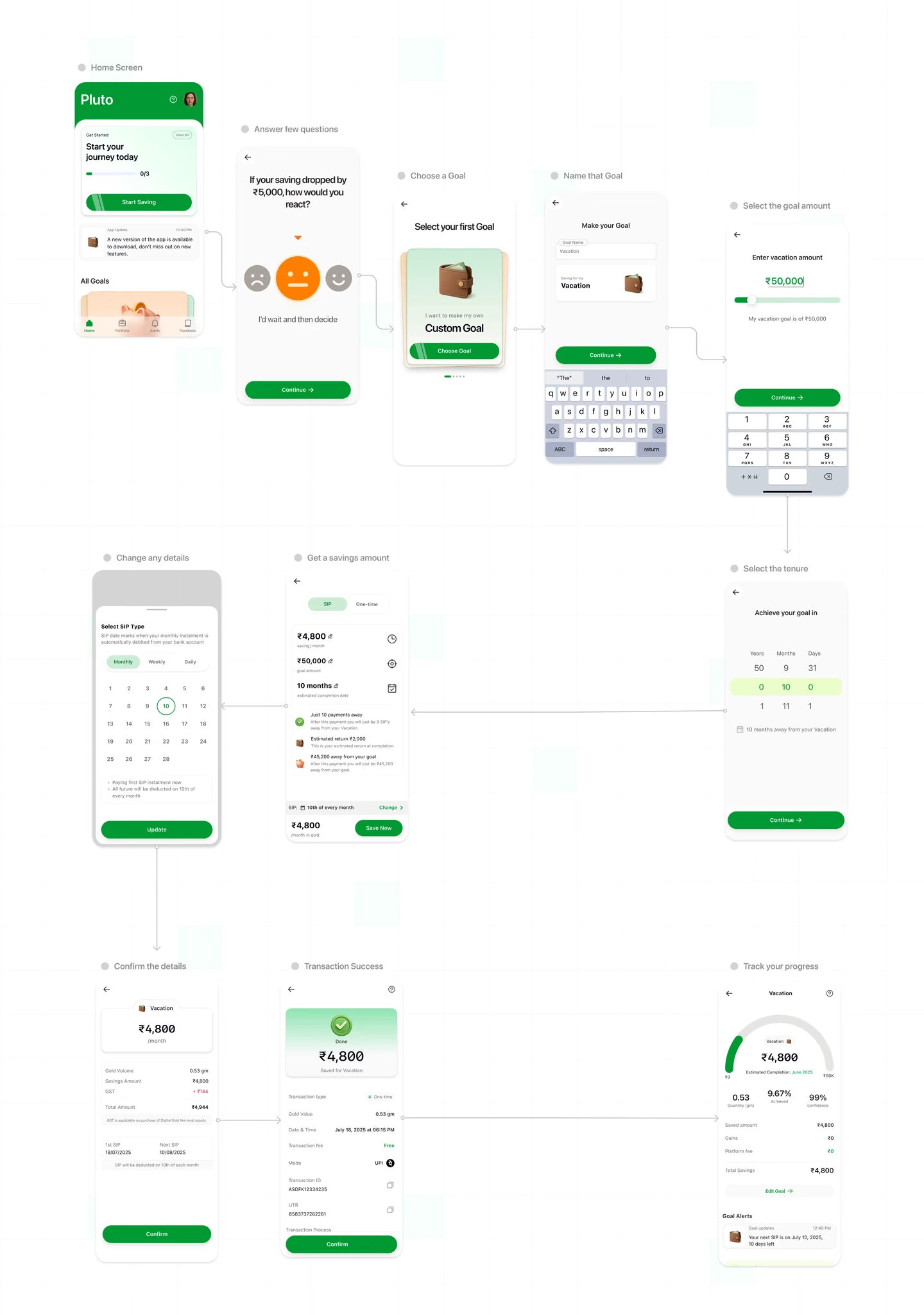
Navigation & Flow Restructuring
Rebuilt bottom nav structure with Alerts tab, transaction hub, and improved Discover page
Unified asset-based and goal-based savings into a single flow
Reduced taps and decision fatigue in key tasks
Visual Language & Design System
Introduced a fresh, modern aesthetic inspired by Airbnb and fintech trends
Built a flexible design system using Auto Layout 5.0, Variables, and Tokens
Created reusable components to support future features
Prototyping & Interaction Design
Used advanced Figma prototyping for smooth transitions and real interactions
Explored micro-interactions and gesture-first UX
Created a near-dev-ready prototype to align dev and product teams
Iteration & Stakeholder Feedback
Ran async design reviews with founders and early users
Tweaked visual weight, IA clarity, and onboarding UX
Added custom 3D icons and illustrations for brand alignment
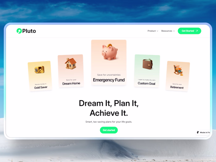
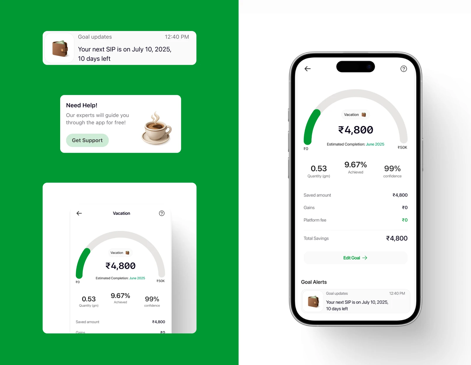
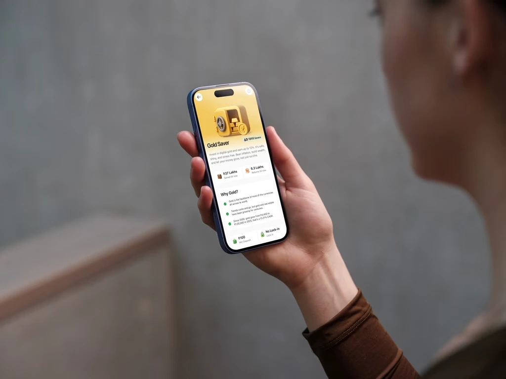
Key UX Improvements & Features ⭐
Redesigned navigation with Alerts, Discover, and a unified savings entry point
Simplified goal setup flow, now takes 60% fewer taps
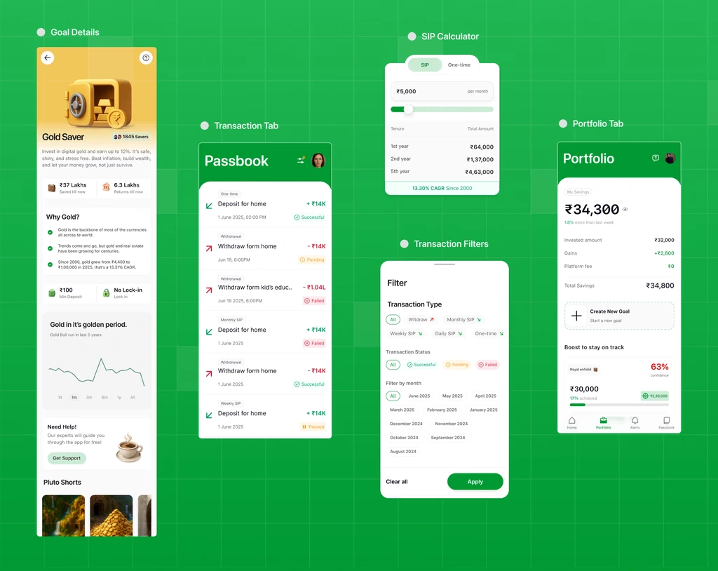
Transaction history restructured for clarity and faster lookup
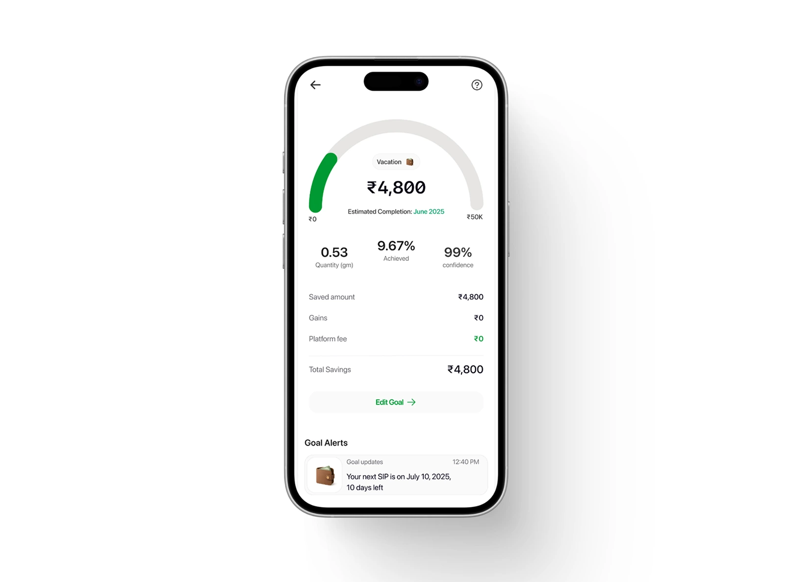
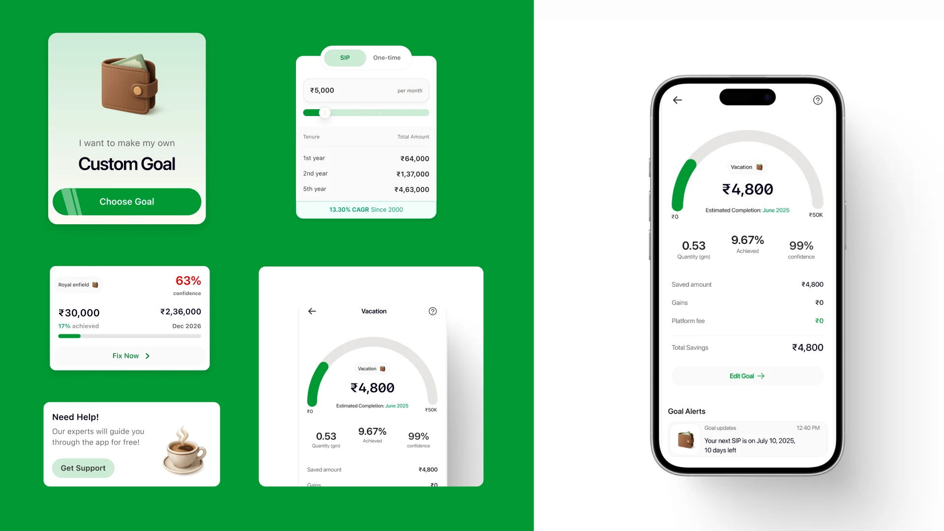
Better money visibility: users can now see asset allocation clearly
Created an Alerts tab for nudges, goal updates, and contextual actions
Introduced a modern design system to scale fast
Impact & Outcome ⭐
User Task Efficiency: Internal testing showed a 35% reduction in time-to-first-action (e.g., checking balances)
Developer Handoff: Design system adoption cut dev integration time by 25% in the first sprint
Next Steps: Rolling out A/B tests on Alerts engagement and tracking retention lift in Q3 2025
Like this project
Posted Aug 21, 2025
Redesigned Pluto Money's savings app experience as the audience shifted from Gen Z to knowledge workers, refocusing the UI on clarity, trust, and goal-based flows.