Investment Portfolio App UX/UI Design | FinTech
Yuliia Ishchenko
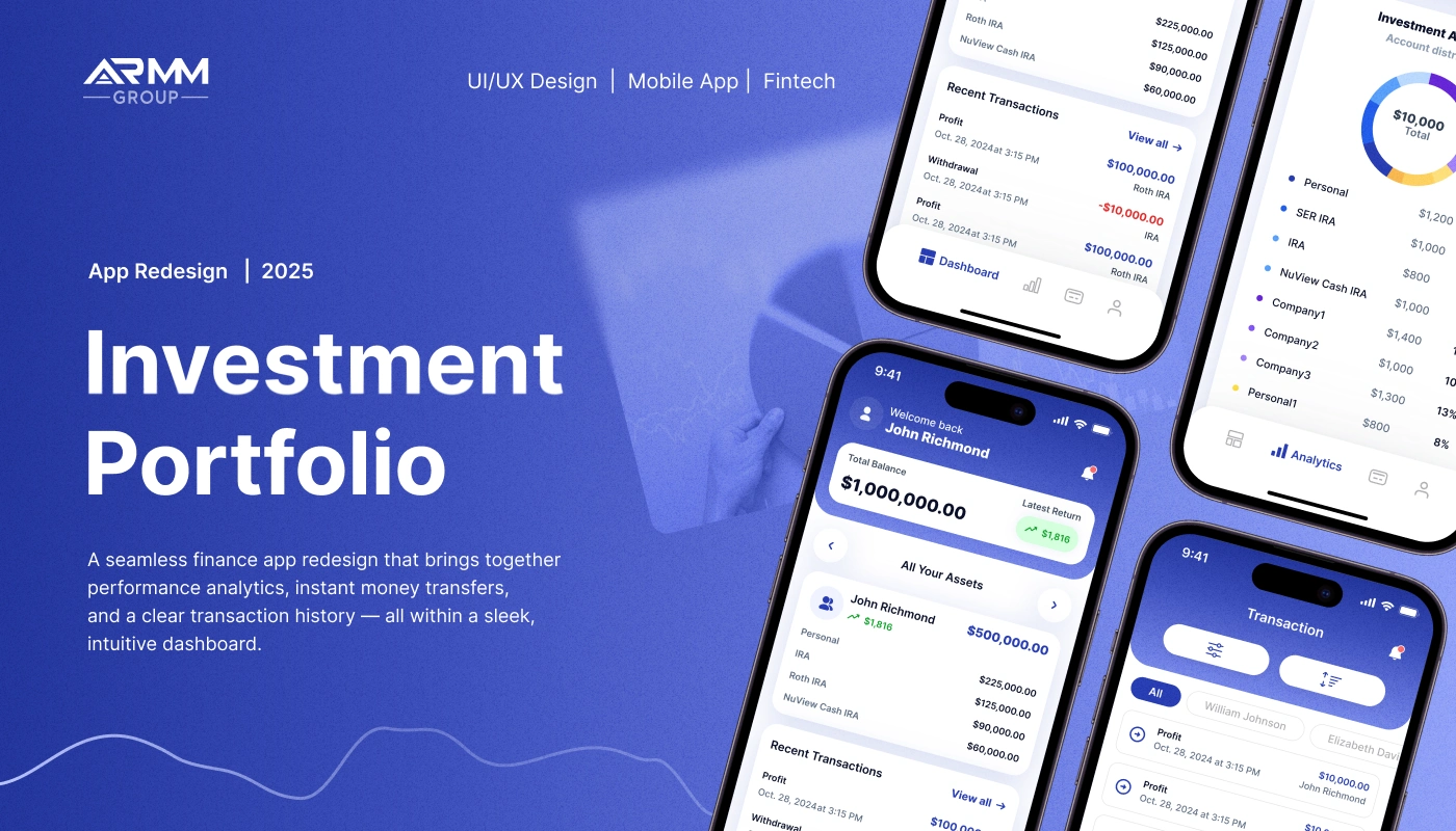
Investment Portfolio Mobile App Redesign
A fintech mobile app redesign that helps users track portfolio performance, review transactions, manage documents, and monitor investment analytics in one clear dashboard.
ARMM Group is a finance mobile app designed for investment portfolio management. The redesign focused on making complex financial data easier to understand by combining performance analytics, transaction history, portfolio allocation, documents, notifications, and profile settings into a clean and intuitive mobile experience.
Year: 2025
Industry: FinTech, Investment Management, Finance App, Portfolio Analytics
Project Type: Mobile App Redesign, UX/UI Design
Scope: App Audit, Competitive Research, User Flow Optimization, UI/UX Redesign, Dashboard, Analytics, Transactions, Profile, Settings, Notifications
Contribution: UX Audit, Product UX, UI Redesign, Mobile App Design, Data Visualization, Design System
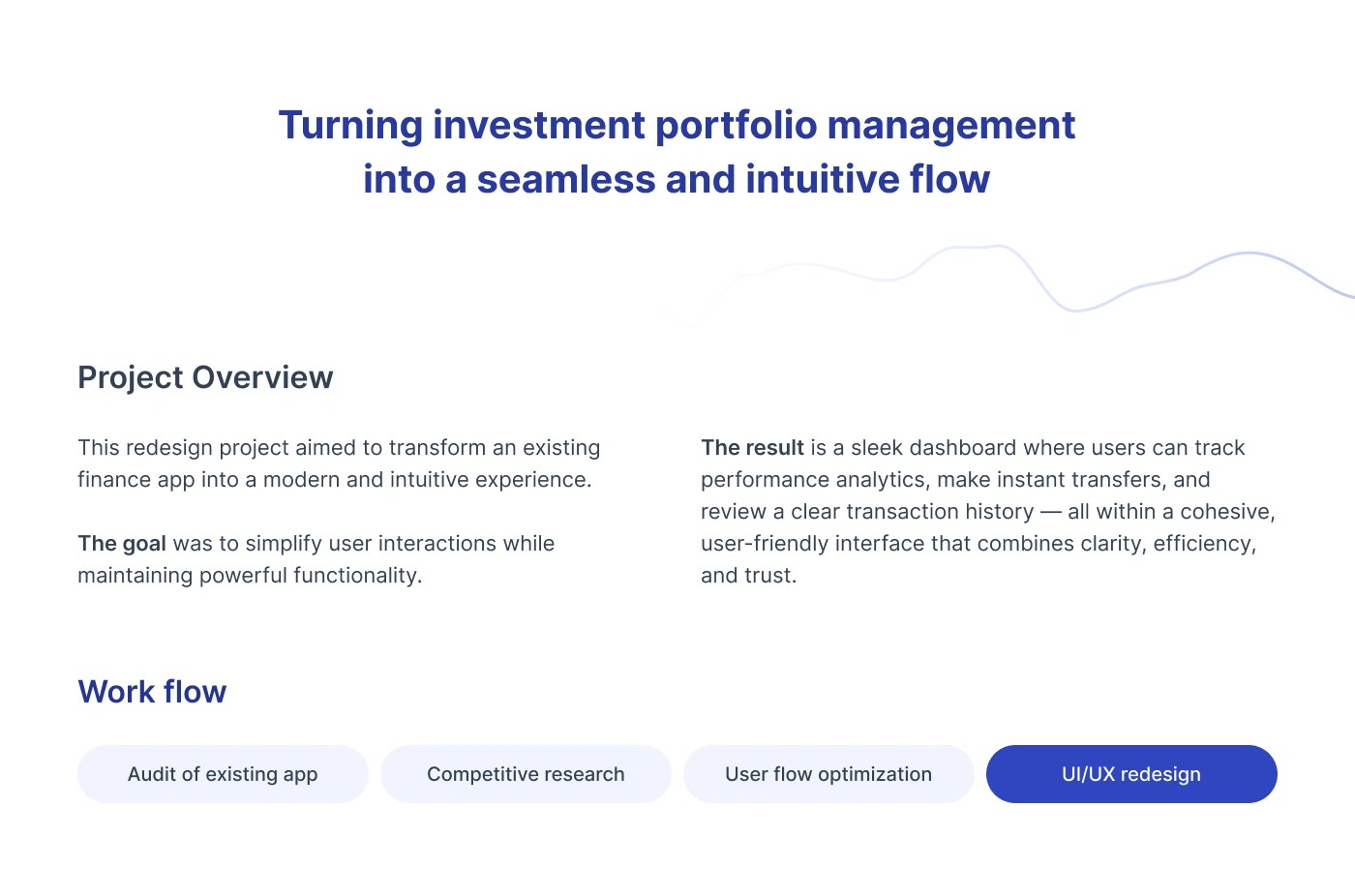
Project Overview
The project aimed to transform an existing finance app into a modern, intuitive, and trustworthy mobile experience.
The app helps users manage their investment portfolio from one place. Users can view account balances, track asset performance, analyze investment allocation, review transaction history, access documents, manage profile settings, and receive important notifications.
The main goal was to simplify user interactions while maintaining the powerful functionality expected from a finance and investment product.
The final result is a sleek dashboard where users can track performance analytics, make sense of financial activity, and review key portfolio information within a cohesive interface.
Problems
Investment data can feel overwhelming
Portfolio apps often include balances, account types, returns, transactions, allocation charts, documents, and dates. Without a clear structure, users can quickly feel lost.
Users needed a faster way to understand portfolio performance
The app had to show total balance, latest return, investment allocation, recent transactions, and account distribution without making users open too many screens.
Transaction history needed stronger filtering
Users needed to review profits, deposits, withdrawals, recipients, clients, and dates. The transaction flow had to make searching and filtering simple.
Analytics had to be clear on mobile screens
Charts, timelines, account filters, and allocation breakdowns needed to be readable and easy to interact with on a small screen.
Onboarding had to feel secure but simple
Because this is a finance product, the sign-up process needed to confirm identity and protect user data without creating too much friction.
Settings and documents needed to be easier to access
Users needed a clear way to find profile information, documents, support contacts, security settings, authentication, notifications, and downloaded statements.
Goals
Redesign the investment portfolio app into a modern and intuitive mobile experience.
Create a clear dashboard for balances, returns, assets, and recent transactions.
Improve analytics screens with readable charts, filters, and account breakdowns.
Simplify transaction history and transaction detail flows.
Create a secure but user-friendly onboarding and sign-up process.
Organize profile, settings, support, documents, and notifications in one accessible system.
Build a visual style that communicates trust, clarity, and financial confidence.
Make the app feel clean, professional, and easy to use for daily portfolio monitoring.
Workflow
The redesign process included four core stages:
1. Audit of Existing App
The first step was to review the existing app experience and identify where users could face confusion, friction, or unnecessary complexity.
The audit focused on navigation, information hierarchy, onboarding, dashboard clarity, transaction flows, analytics, and account-related screens.
2. Competitive Research
Competitive research helped define familiar patterns used in modern fintech and investment apps.
The goal was to understand how similar products present portfolio balances, investment allocation, transaction history, charts, filtering, documents, and security settings.
3. User Flow Optimization
The app structure was reorganized around key user actions:
Sign up
View dashboard
Review assets
Check analytics
Filter transactions
Open transaction details
Manage profile
Access documents
Update security settings
View notifications
Contact support
This helped simplify navigation and make the app feel more predictable.
4. UI/UX Redesign
The final stage focused on creating polished mobile screens with a clean visual system, strong contrast, clear cards, accessible controls, and readable financial data.
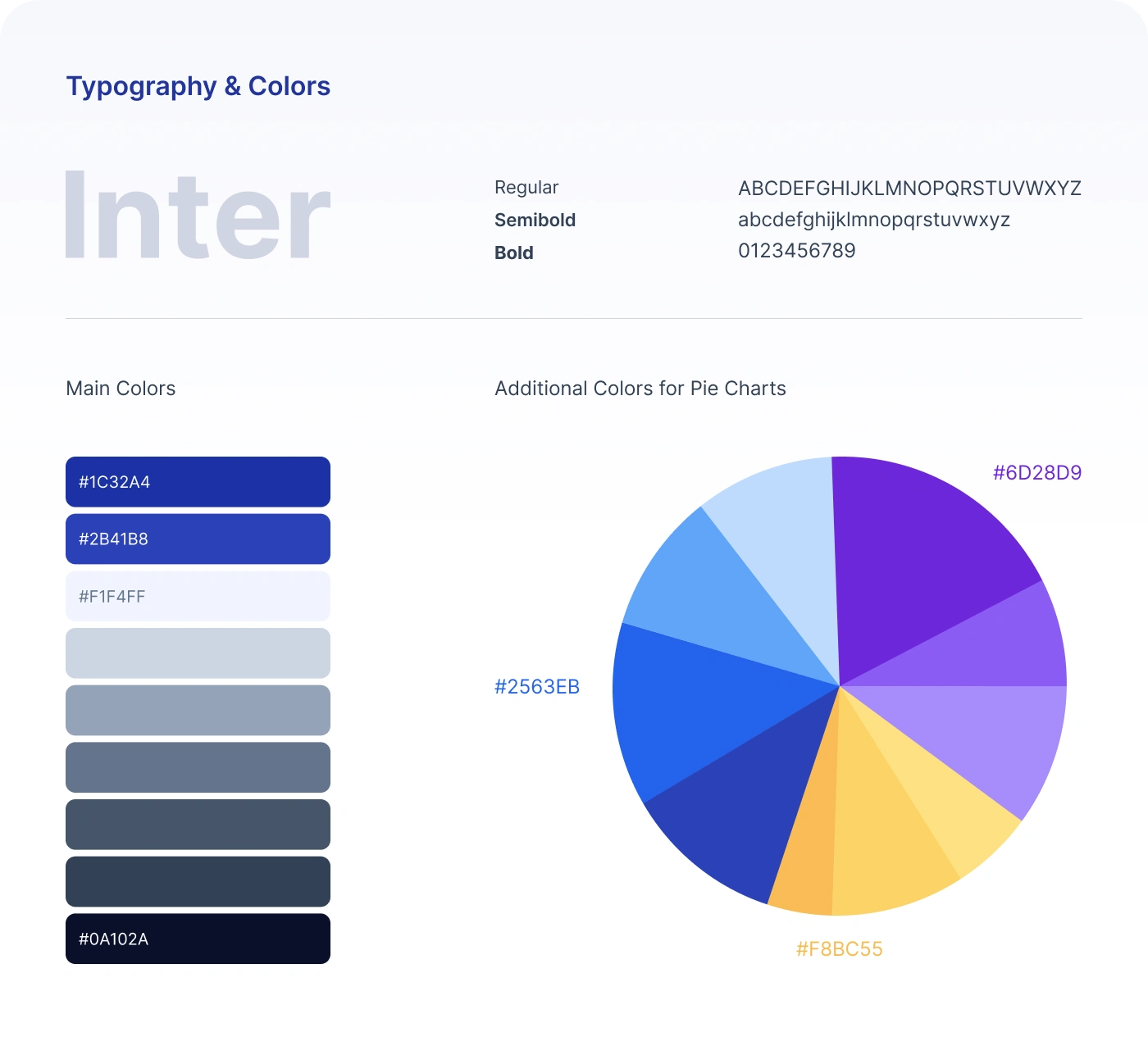
Visual Identity
The visual identity was designed to feel secure, professional, and modern.
The app uses a blue-based palette, clean white surfaces, soft gradients, rounded cards, and clear data visualization. This creates a calm and trustworthy finance experience while keeping key actions and numbers easy to scan.
Typography
Inter was selected as the main typeface.
Inter works well for fintech products because it is highly readable across small text, numbers, labels, charts, buttons, and mobile interface elements.
Main Colors
#1C32A4 — primary blue used for brand identity, navigation, and main actions.
#2B41B8 — secondary blue used for gradients, highlights, and active interface states.
#F1F4FF — soft background color used for cards, surfaces, and light sections.
#0A102A — deep navy used for strong contrast and financial data emphasis.
Additional Chart Colors
Additional colors were used for pie charts and investment allocation visuals, including violet, blue, light blue, and yellow tones. These help separate different account types and make portfolio distribution easier to understand.
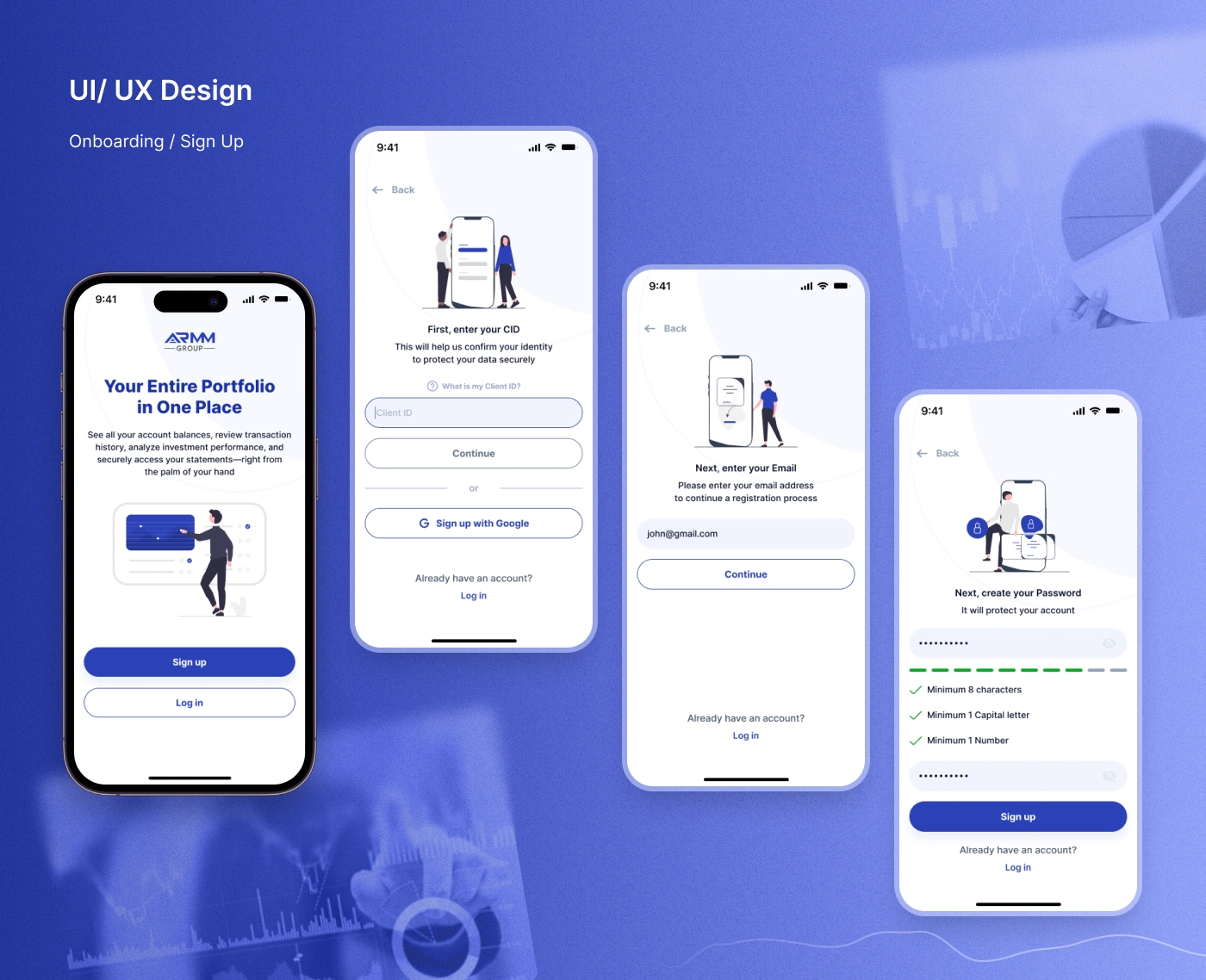
Onboarding & Sign Up
The onboarding flow introduces the app with a simple message:
Your entire portfolio in one place.
The sign-up process was designed to feel secure and guided. It includes:
Client ID entry
Email entry
Password creation
Password validation rules
Google sign-up option
Log-in access
Security-focused illustrations
The password screen includes validation requirements such as minimum characters, capital letter, and number checks, helping users understand how to create a secure password without guessing.
Dashboard
The dashboard is the main overview screen of the app.
It gives users quick access to the most important portfolio information:
Total balance
Latest return
All assets
Account list
Recent transactions
Profit and withdrawal activity
Investment allocation
Bottom navigation
The goal was to make the dashboard useful at a glance. Users can quickly understand their current financial position without opening multiple sections.
Investment Allocation
The investment allocation section shows how the user’s assets are distributed across different accounts.
The interface uses a donut chart and a clear account list to show portfolio structure.
Example account types include:
Personal
SER IRA
IRA
NuView Cash IRA
Company accounts
This makes it easier for users to understand where their money is allocated and how different accounts contribute to the total portfolio.
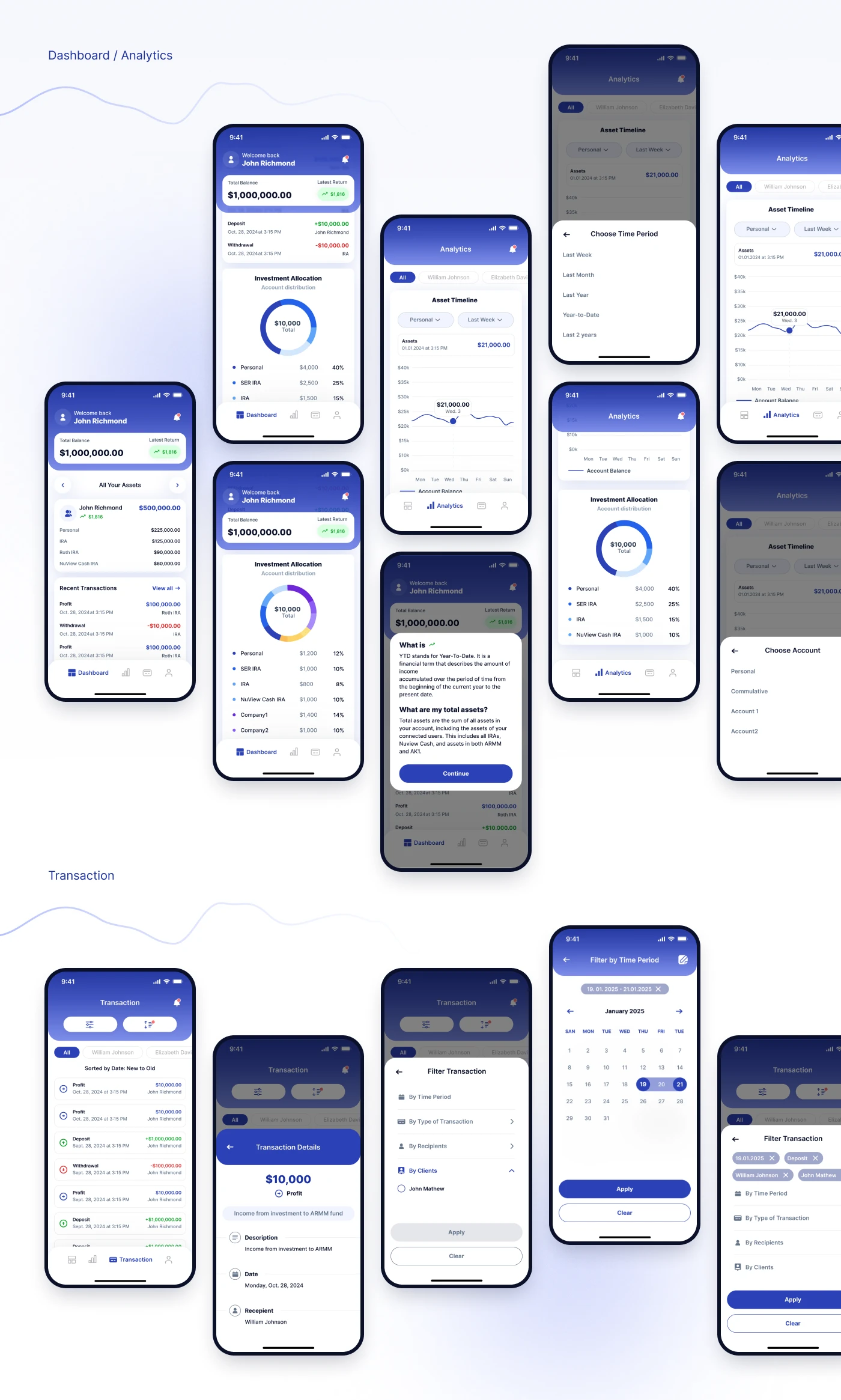
Analytics
The analytics section was designed to help users understand portfolio performance over time.
It includes:
Asset timeline
Account balance chart
Time period selector
Account selector
Investment allocation chart
Informational tooltip
Filter states
Bottom sheet controls
Users can choose a time period, switch between accounts, and review asset changes through a clean chart interface.
The analytics flow also includes educational support, such as a “What is YTD?” explanation, helping users understand financial terms directly inside the app.
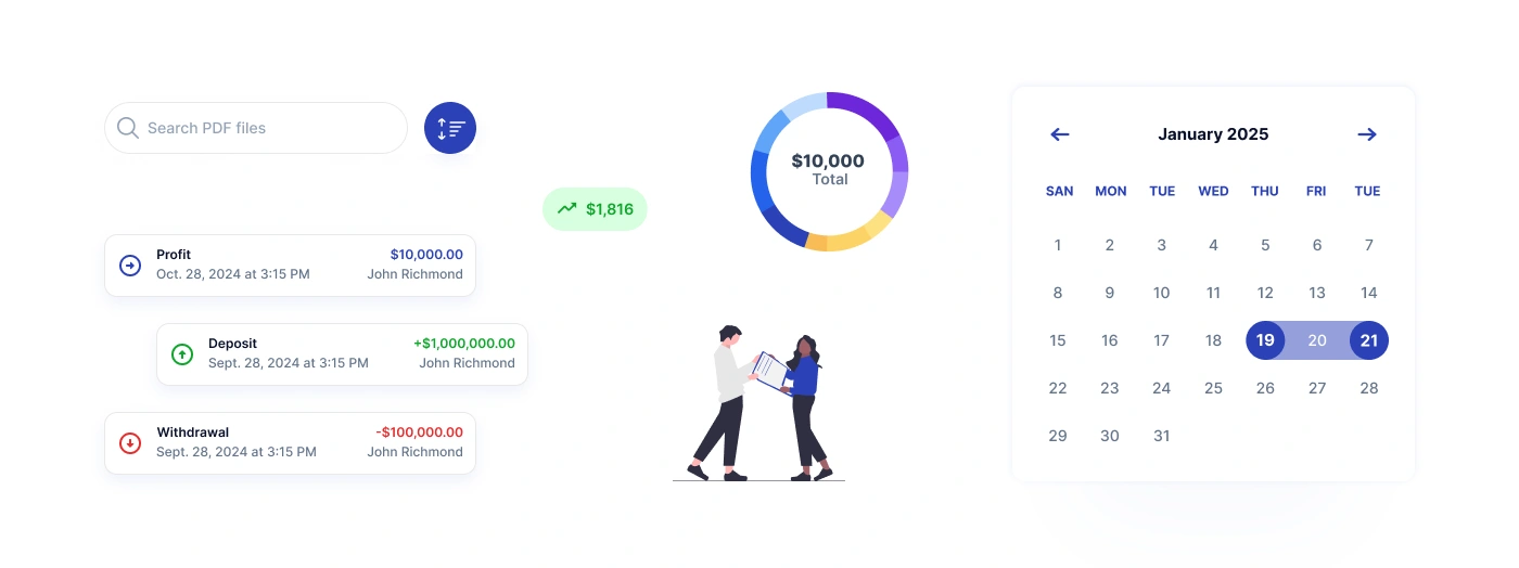
Transaction History
The transaction section allows users to review financial activity in a structured way.
Users can see:
Profit transactions
Deposits
Withdrawals
Transaction dates
Recipients
Client names
Amounts
Account labels
The redesign makes transaction items easy to scan by using clear color cues for positive and negative values.
Transaction Filters
A filtering system was created to help users find specific transactions faster.
The date filter includes a calendar selection screen, while selected filters appear as chips. This makes the filtering process transparent and easy to adjust.
Transaction Details
The transaction detail screen gives users a focused view of a selected transaction.
It includes: Transaction amount, Transaction type, Description, Date, Recipient, Supporting details.
This helps users understand the context of each financial activity without overloading the transaction list.
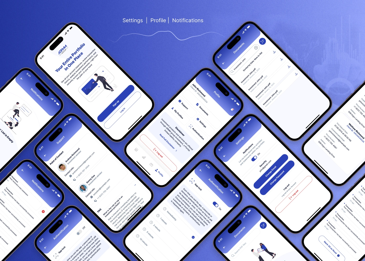
Documents
A document section was designed so users can access important investment-related files.
Users can search PDF files, view investment statements, and download documents directly from the app.
This supports a more complete portfolio management experience, where users do not need to leave the app to find financial records.
Profile
The profile section gives users access to account-related information and key actions.
This structure makes the profile area practical and easy to navigate.
Settings & Security
The settings flow includes important account and security controls.
Users can manage: Email, Password, Notifications, App lock, Authentication, Security preferences, Log out action.
Because finance apps require a high level of trust, these screens were designed to feel clear, controlled, and reassuring.
Notifications
The notifications section keeps users informed about account and transaction activity.
Notifications are displayed in a clean list with clear status indicators and a “mark all as read” action.
This helps users stay updated without feeling overwhelmed.
Support
The support screen includes points of contact, contact information, and FAQ content.
This gives users a direct way to get help, which is especially important in a finance product where users may need fast clarification about investments, transactions, or documents.
Data Visualization
The app uses several visualization patterns to make financial data easier to understand:
Donut charts for investment allocation
Line charts for asset timelines
Calendar views for transaction filtering
Color-coded transaction values
Cards for balances and returns
Tooltip explanations for finance terms
The goal was to make portfolio data feel understandable even when the underlying financial information is complex.
Results
The final redesign created a cleaner and more intuitive mobile experience for investment portfolio management.
Key Results
A redesigned onboarding flow with secure sign-up and password validation.
A clear portfolio dashboard showing balance, returns, assets, and recent transactions.
Improved analytics experience with charts, account filters, and time period selection.
Simplified transaction history with filters, date selection, and transaction details.
Organized profile and settings area for documents, support, security, and notifications.
Consistent visual system based on Inter typography, blue gradients, white cards, and clear financial data hierarchy.
Improved trust and usability through simple layouts, readable numbers, and secure account controls.
A complete mobile app redesign covering core investment management flows.
Project Scope
This case study covers the mobile app redesign for ARMM Group’s investment portfolio experience.
The scope included onboarding, sign-up, dashboard, asset overview, analytics, investment allocation, transaction history, transaction filters, transaction details, profile, documents, notifications, support, authentication, and settings screens.
The redesign was created as a scalable foundation for future fintech features, deeper reporting, transfers, account management, and portfolio insights.
Conclusion
ARMM Group’s investment portfolio app was redesigned to make finance management feel simpler, clearer, and more trustworthy.
The new mobile experience helps users understand their portfolio performance, review transaction history, access documents, and manage account settings from one intuitive app.
The final result is a modern fintech interface that combines financial clarity, secure flows, and clean mobile usability.
✍️ Contact me and I will provide you with an estimate for your project!
Like this project
Posted Apr 23, 2026
UX/UI redesign for a fintech mobile app for tracking investment portfolios, analytics, transactions, documents, and secure account settings.
Likes
1
Views
8
Timeline
Dec 1, 2025 - Dec 24, 2025