DocsChain: Landing Page & Admin Panel

Mohamed Gamal


DocsChain: Landing Page & Admin Panel
A landing page that earns a new visitor's trust in seconds, and an admin console that runs the entire platform behind it.
Disclaimer: Designed for an existing mobile application. The mobile app itself is not part of this case study.
One product, two impossible-sounding jobs
DocsChain certifies documents on the blockchain tamper-proof, verifiable in seconds by anyone via QR code or API. That's a genuinely hard product to design for, in two different ways at once. A first-time visitor has no existing mental model for "blockchain document certification" they can't evaluate the product on features because they don't yet trust the underlying premise. Internally, every certification, subscription change, and invoice traces back to an on-chain action that can't be quietly undone, which means the team running the platform can't afford any ambiguity about system state. Those two constraints became the brief for each surface.
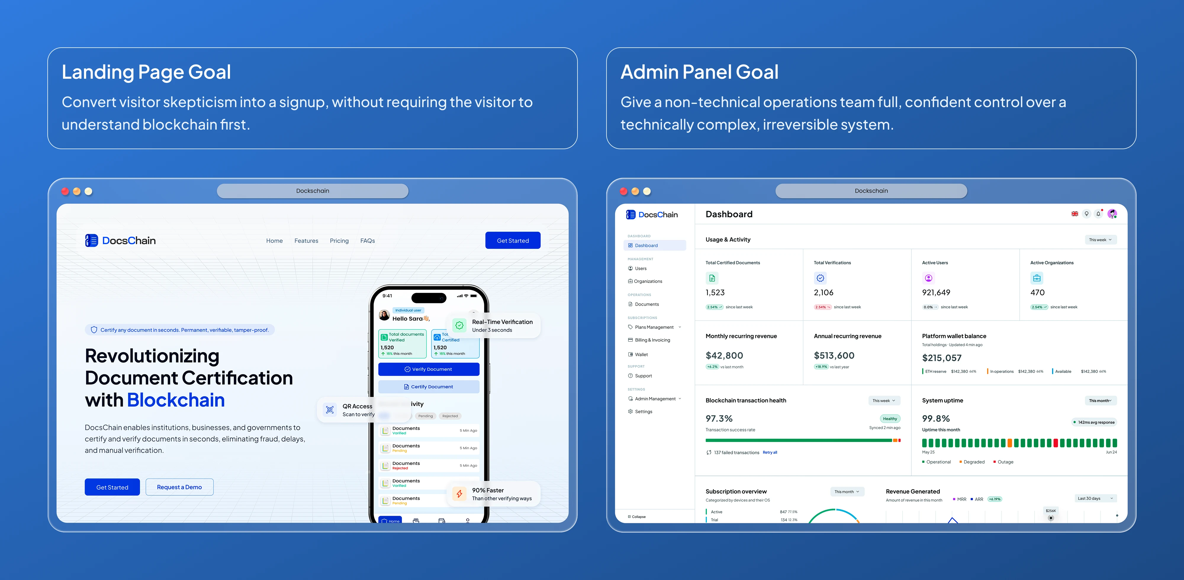
Landing page
Three principles drove every decision on the page — not a checklist of sections.
Trust before features
Every above-the-fold decision establishes credibility before explaining functionality.
Segment early, not late
A single pitch would undersell what verification means to five different buyers.
Pre-empt every objection
Pricing clarity and a full FAQ remove friction before it can stop a signup.
The page in one pass
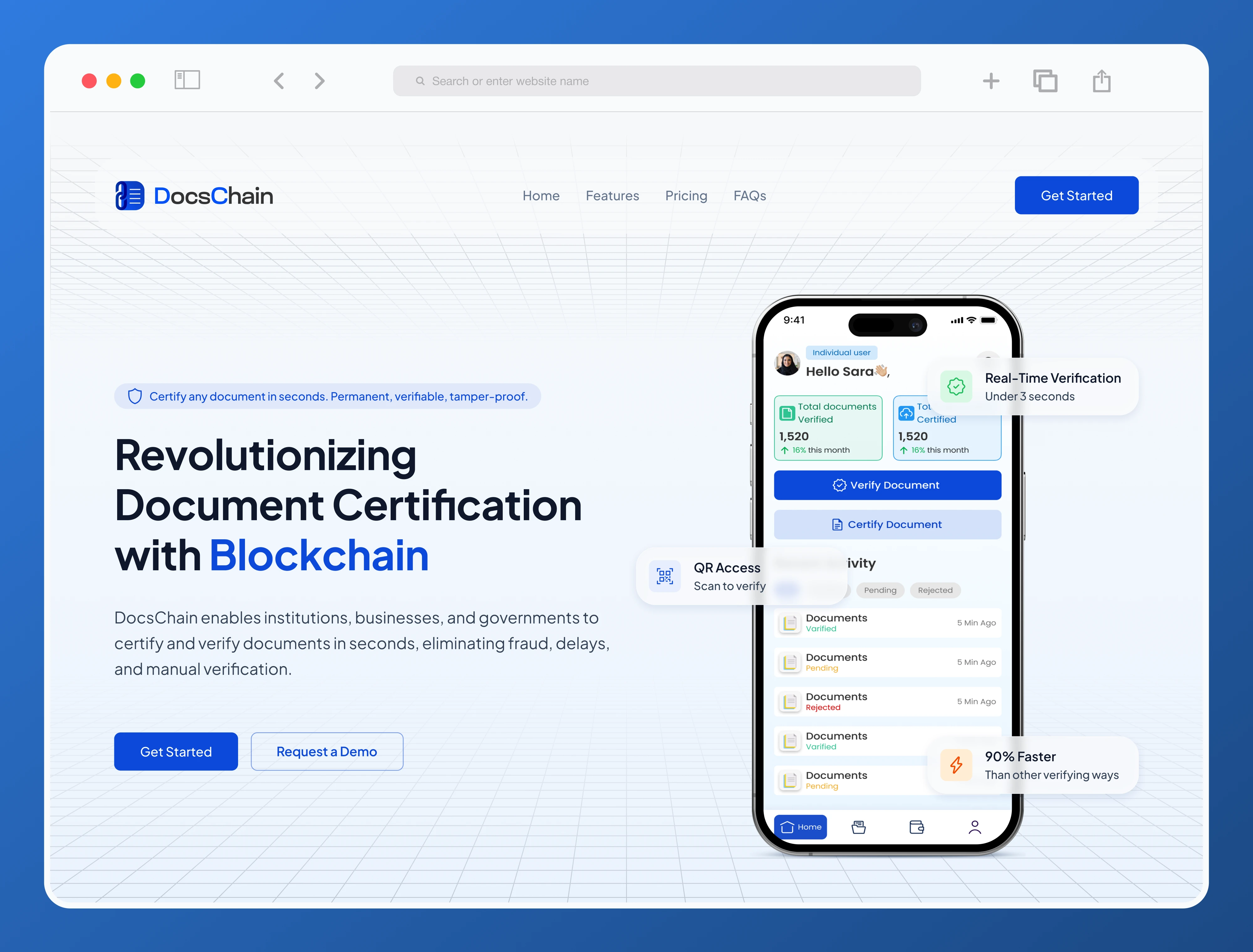
The page moves through eight sections, and each one earns its position by removing a specific kind of hesitation before the next section introduces the next one. The hero states the outcome in one line and proves speed with a concrete stat rather than an adjective, before asking for any trust. Three feature cards answer the single question every visitor has first, can this be trusted at all before anything about speed or scale. A benefit checklist gives a secondary, more technical reader something concrete to point to. Five audience cards let each buyer self-select their own reason to care, rather than inferring relevance from generic language. A tabbed "how it works" flow explains the mechanic only once credibility is already earned, so it reads as confirmation instead of a pitch. Three pricing tiers are anchored toward the lowest-commitment option instead of the subscription plan, because asking for a monthly commitment before trust is fully built is exactly the friction the rest of the page works to remove. An eight-question FAQ sits immediately before the final CTA, not in the footer, because objections peak at the exact moment someone decides whether to sign up. And the closing CTA reinforces low risk "no contracts, cancel any time" as the last thing standing between interest and conversion.

Admin Panel
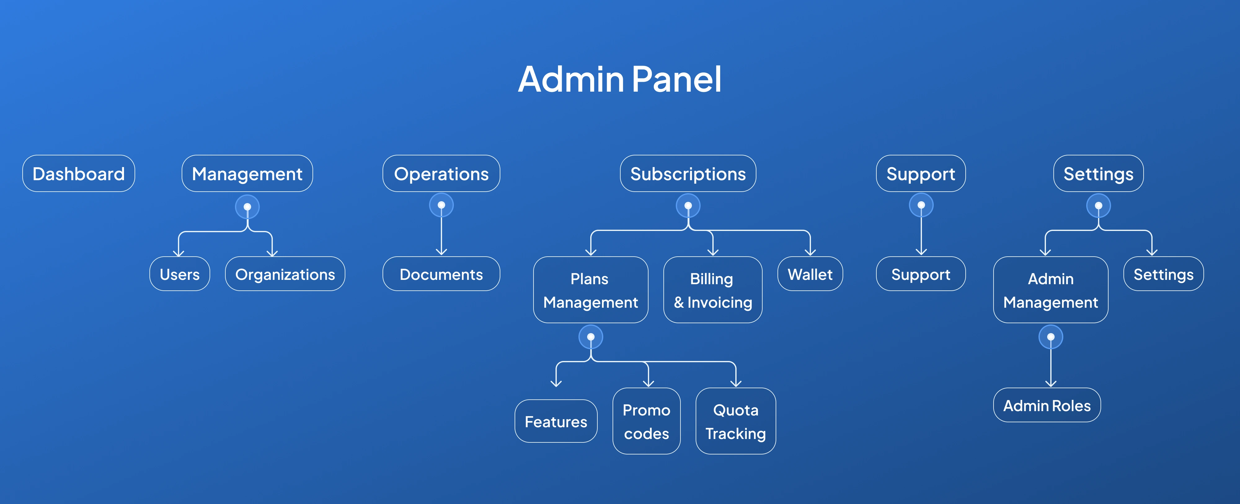
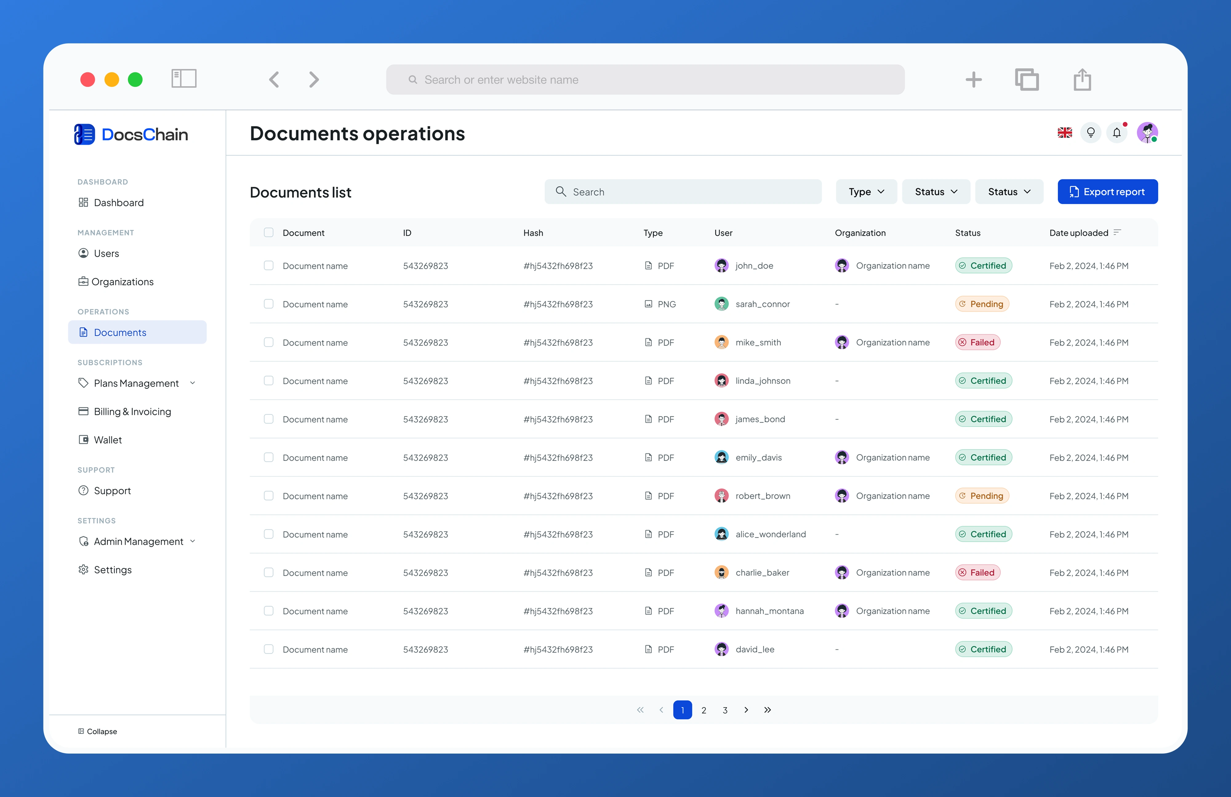
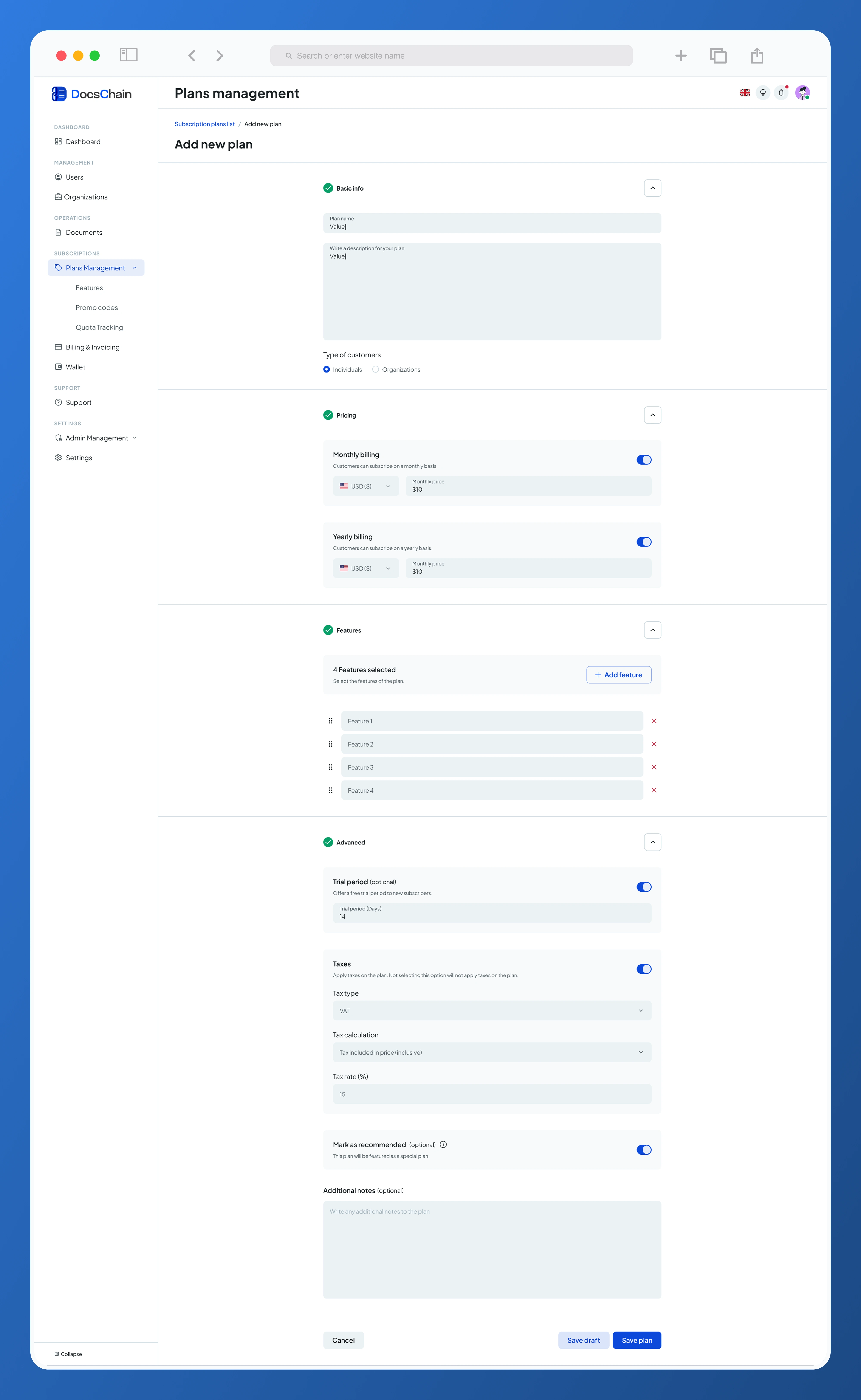
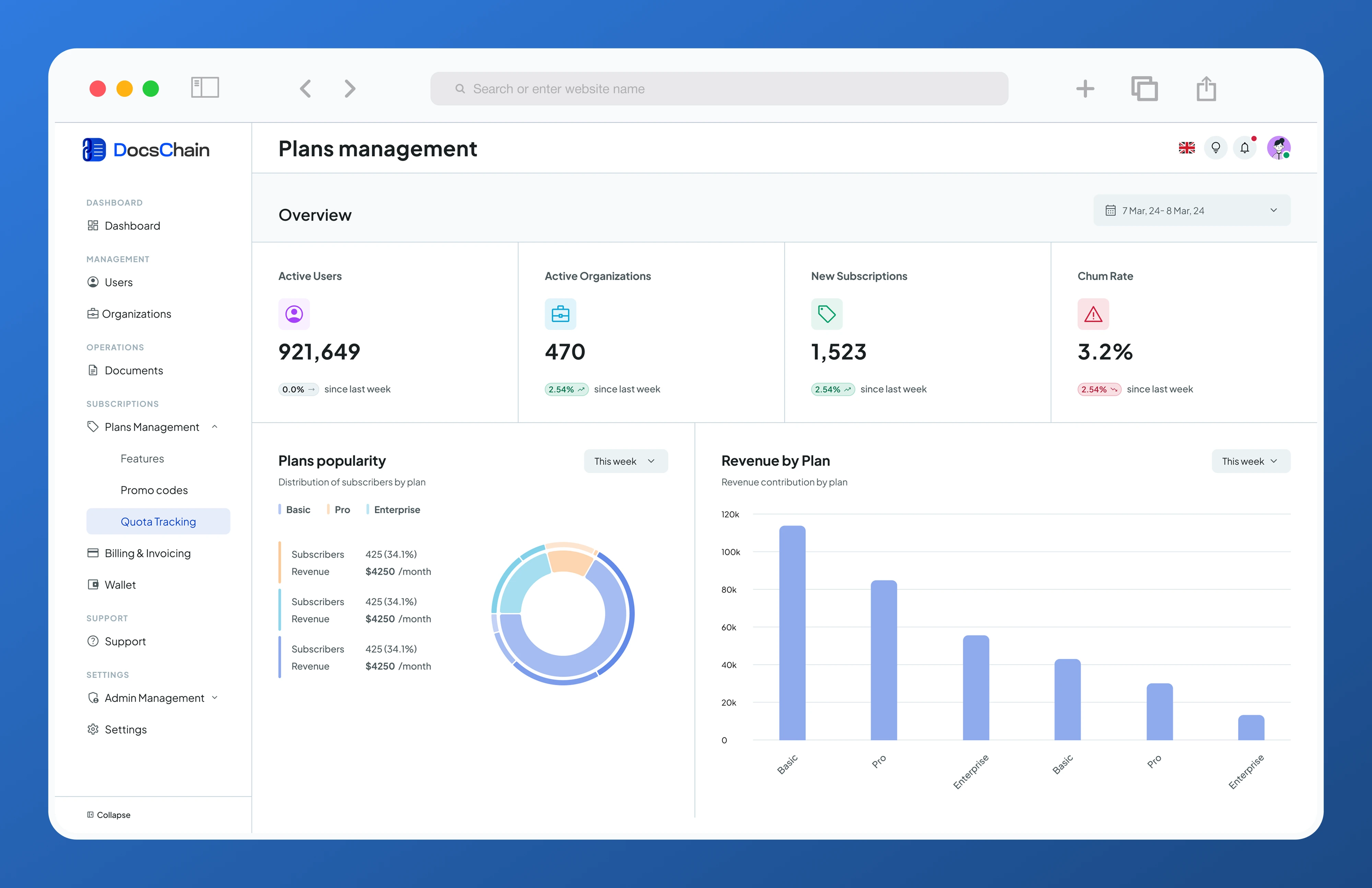
Five screens carry this admin panel a data-dense overview, a core operational flow, a complex multi-step builder, the platform's most distinctive detail, and the access-control system underneath everything else. The console covers 11 modules total; these five show the range of thinking behind all of them.
One status language, everywhere
The same status-pill system appears across users, organizations, documents, billing, and support.
Design the system before the screen
Where requirements left gaps, I defined the underlying model first, then built the interface around it.
Access is structural, not cosmetic
Roles shape what an admin actually sees, not just what they can click.
Admin Panel Information Architecture
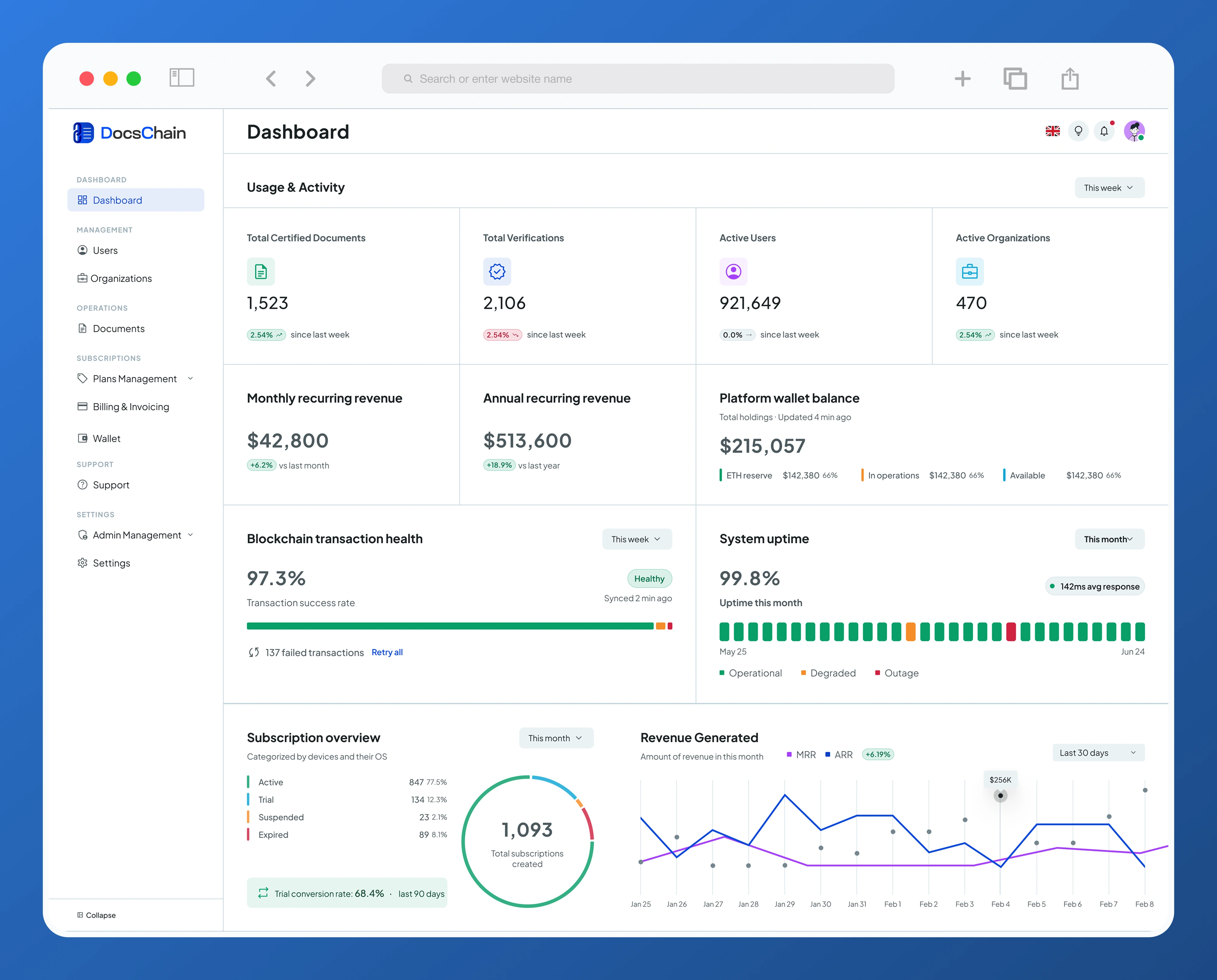
Dashboard
The dashboard bundles three genuinely different concerns onto one screen adoption metrics (certified documents, verifications, active users and organizations), financial metrics (MRR, ARR, platform wallet balance broken into reserve, operations, and available funds), and system health (blockchain transaction health, uptime, a subscription-status breakdown). They're grouped together because different roles glance at different rows of the same screen rather than visiting separate pages. Blockchain transaction health gets a one-click retry action placed directly on the dashboard rather than buried in a settings page, because a failed anchor is the one failure mode that's both rare and time-sensitive if it's not visible the moment an admin lands on this screen, it gets missed.
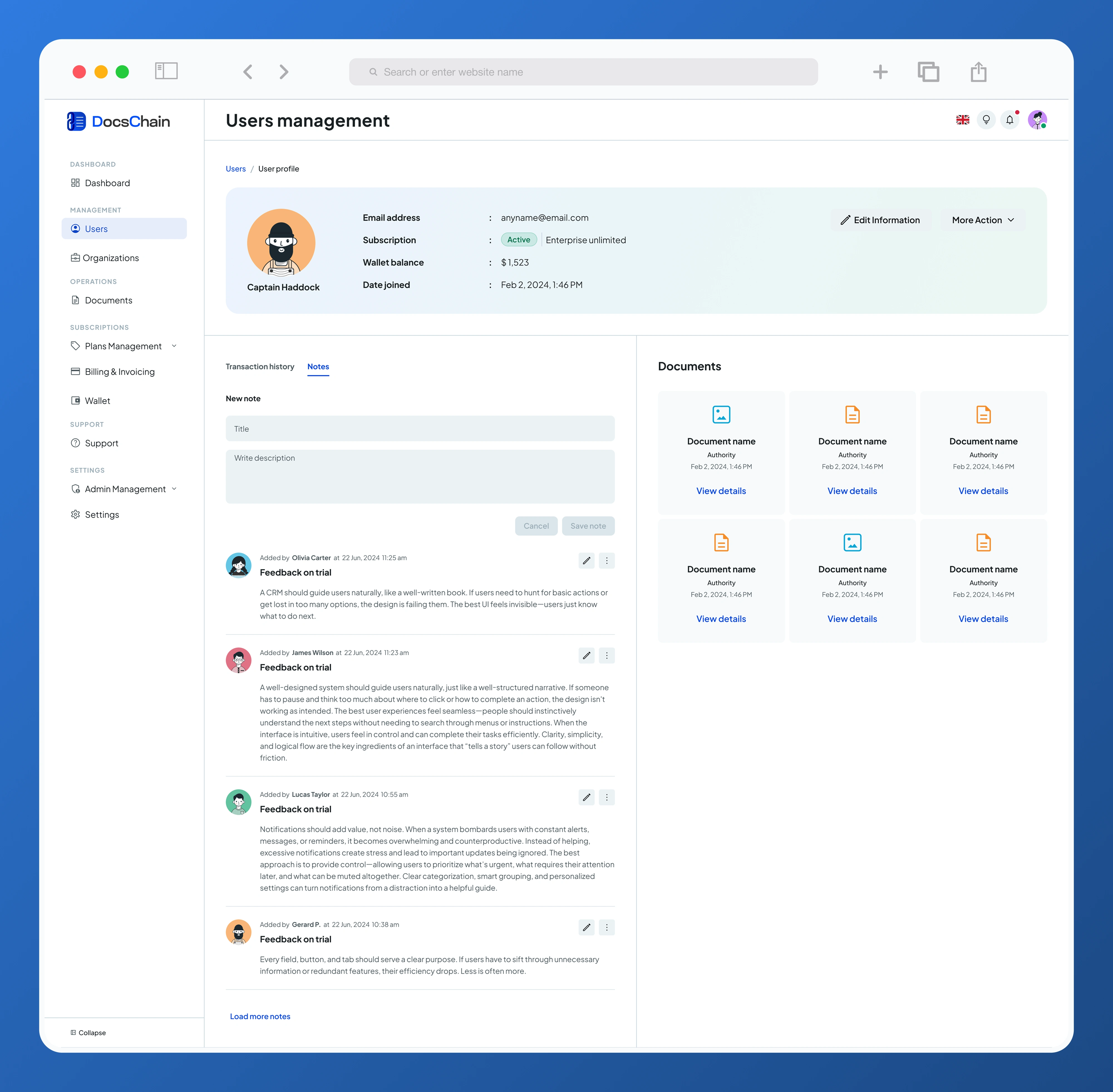
The admin panel in one pass
Users and organizations share one interface pattern on purpose. List, profile, edit so navigating one teaches you the other, with organization plan usage shown inline rather than tucked into a separate module, for the same reason failed transactions live on the dashboard: the number matters in the moment, not after a navigation away. Document operations centers on hash search, because the hash is the actual audit trail, with a detail panel that keeps an operator in context during triage instead of routing them to a separate page. Subscriptions and plans use a multi-step builder and a reusable feature catalog, trading a little speed for a lower error rate on an action that's infrequent but affects every organization subscribed to that plan. Billing and invoicing exists to make every number agree with every other number, down to an invoice that carries both a payment transaction ID and a blockchain anchor ID tying the least exciting part of any admin console back to the same trust model that makes the core product credible. And admin management ties it together with a roles-and-permissions system grouped by risk category rather than backend structure, so a Super Admin can actually reason about what a new hire can do before granting it.
Like this project
Posted Jul 16, 2026
A landing page that earns a new visitor's trust in seconds, and an admin console that runs the entire platform behind it.