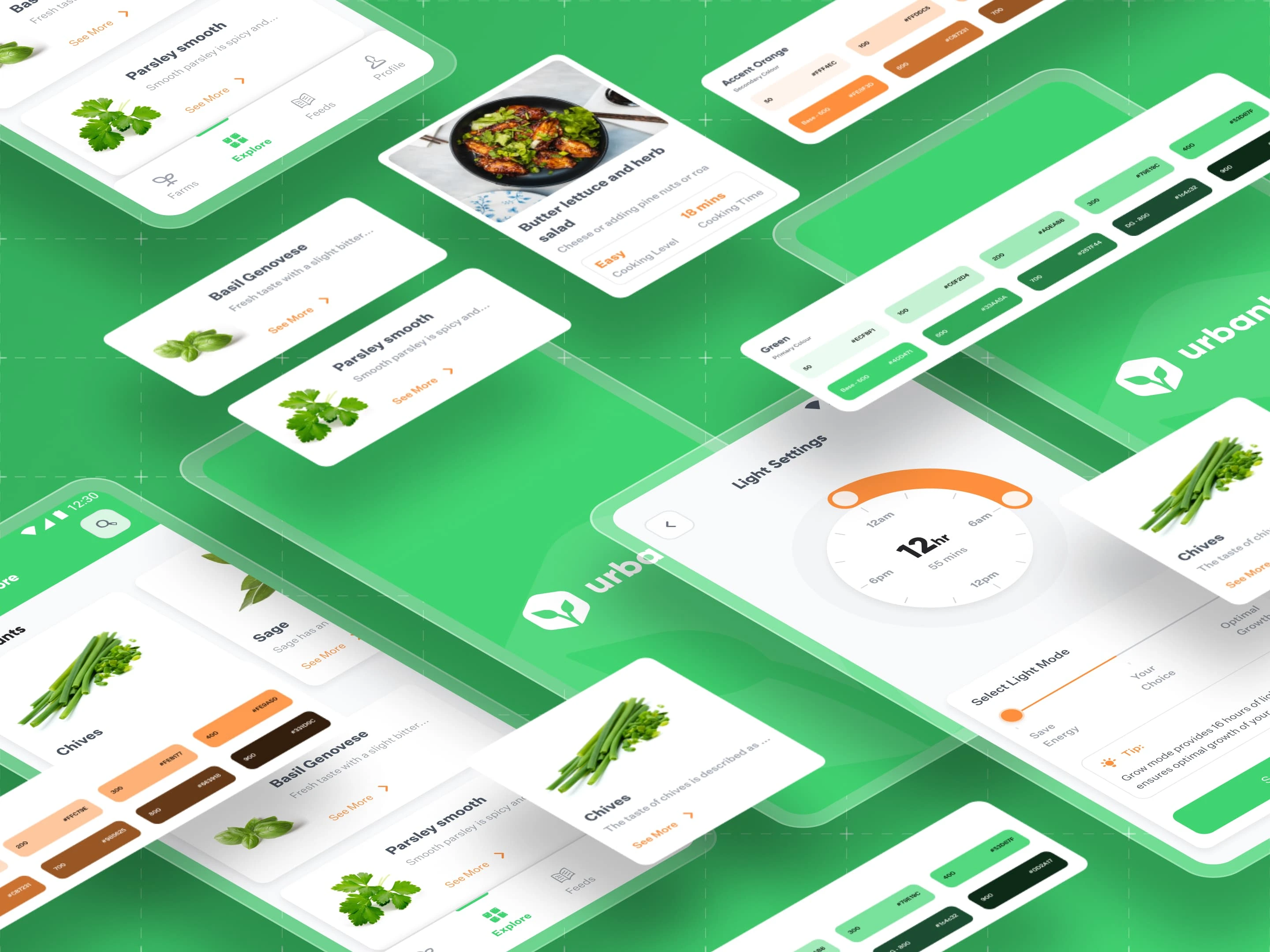
Design System for an App
Tanveer Singh
A Design System is a comprehensive set of standards, guidelines, and reusable components that ensure consistency, scalability, and coherence across digital products. It acts as a central repository for UI elements, patterns, and documentation, providing a unified approach for design and development teams to work collaboratively.
Why Design Systems Matter for UI/UX Projects
In the world of UI/UX design, consistency is key. A design system offers a single source of truth that streamlines processes and reduces the risk of design inconsistency. By using a design system, a design team can ensure that their work is cohesive, efficient, and of high quality.
iOS and Mobile App Design Guidelines
Ensuring a seamless experience across platforms is vital. I developed platform-specific guidelines, focusing on iOS and mobile apps.
Strategy:
Adhered to Apple’s Human Interface Guidelines (HIG) for iOS app design to ensure consistency with native behaviors.
Optimized the UI for mobile touch interactions and smaller screen sizes while maintaining brand identity.
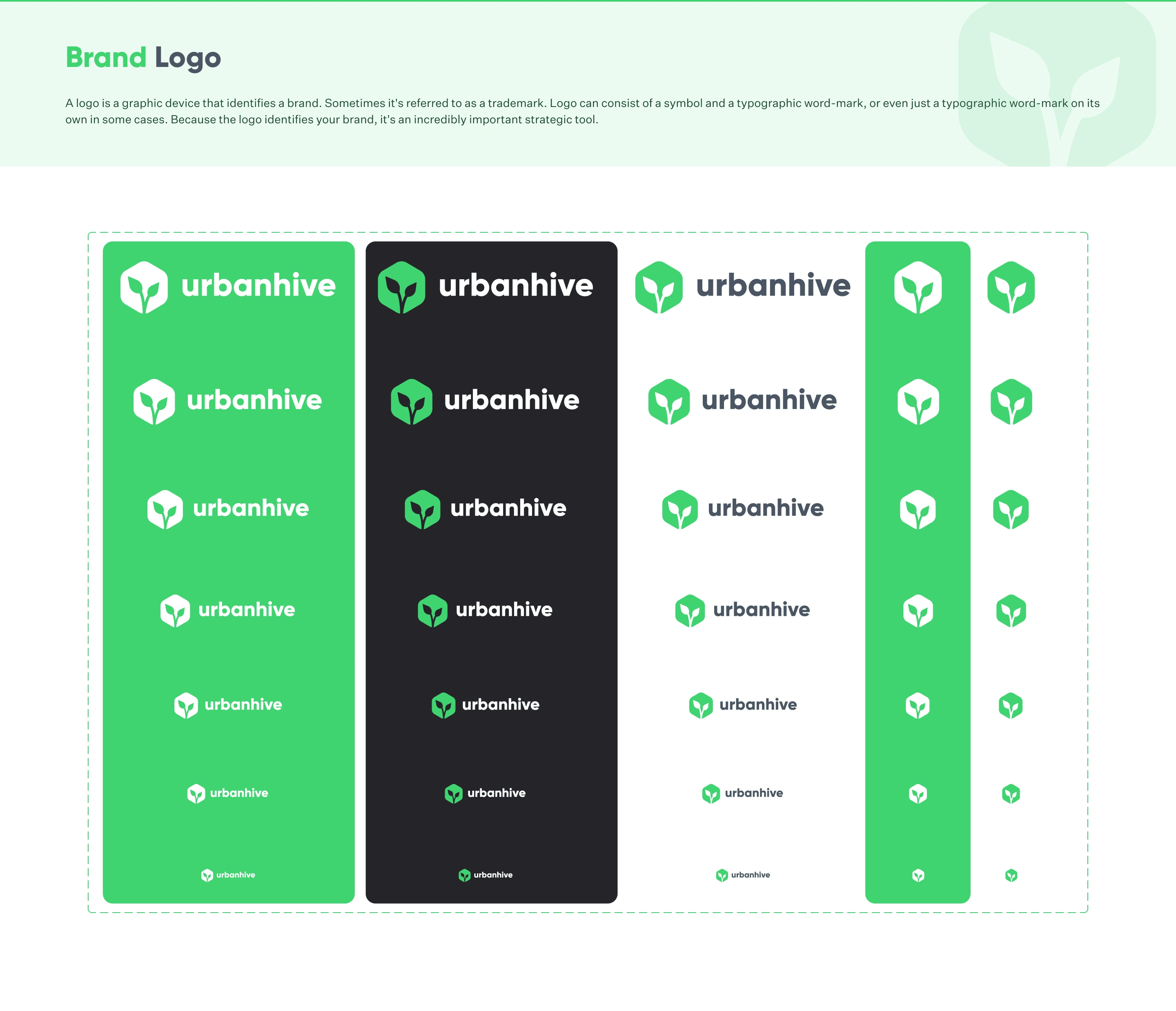
Logo Variants
A logo is a brand’s visual identity, and it is crucial to ensure its flexibility across different contexts. I created multiple logo variants, from large-scale headers to small icons, to cater to different use cases.
Strategy:
Developed scalable logo versions to ensure legibility and brand consistency across various platforms (iOS, web, mobile).
Ensured the logo could be used in both light and dark backgrounds.
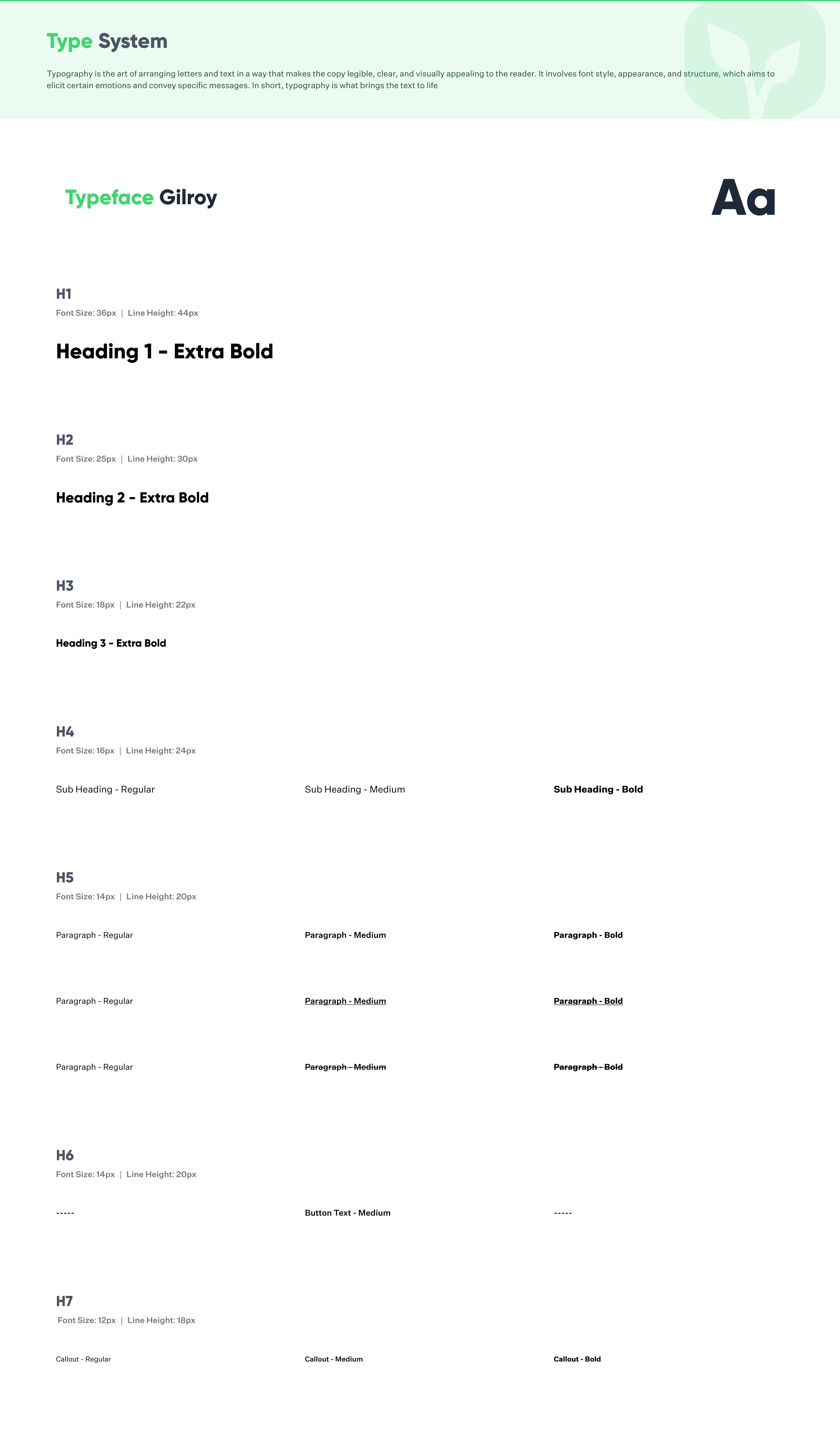
Typography
Typography plays a central role in user readability and overall aesthetics. I designed a flexible typography system to ensure clear communication across devices and sizes.
Strategy:
Defined primary and secondary fonts that are aligned with the brand tone.
Incorporated responsive typography for adaptive text sizes and line heights on mobile and desktop screens.
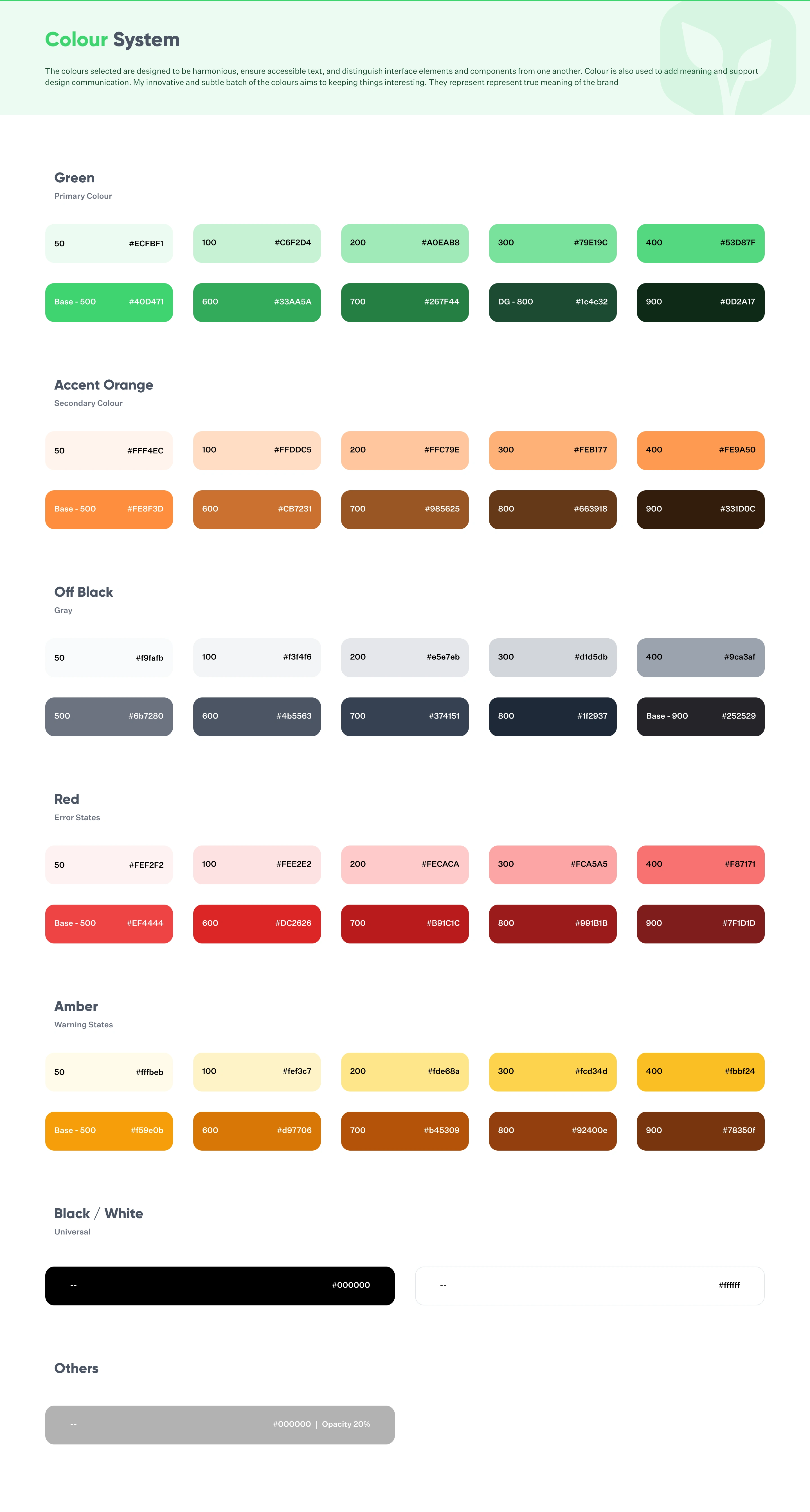
Colour System
A consistent color palette is fundamental to establishing brand identity and enhancing user experience. I created a balanced color system to ensure accessibility while maintaining visual appeal.
Strategy:
Chose primary, secondary, and accent colors to support various elements such as buttons, links, and background colors.
Ensured sufficient contrast ratios for accessibility.
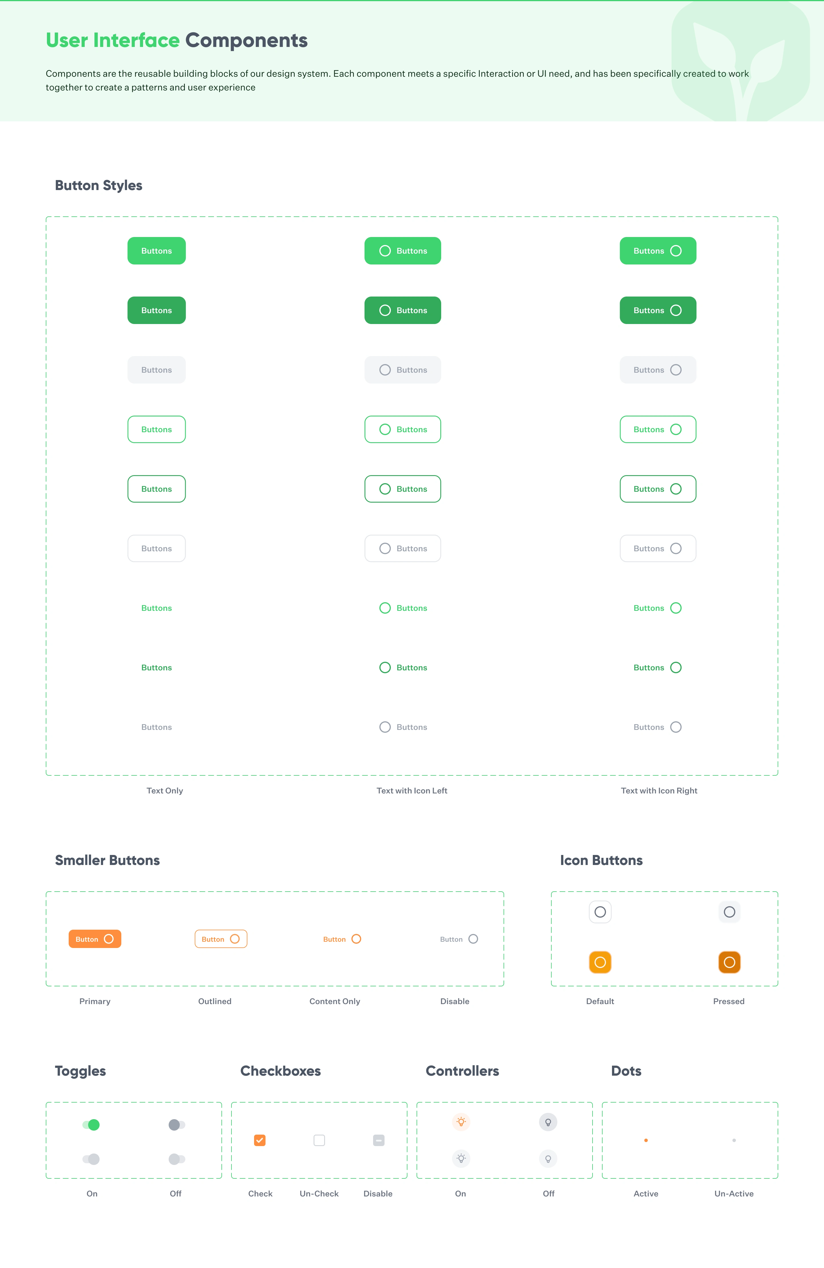
Button System
Buttons are essential for interaction in UI design. I built a button system that includes different states (default, hover, active, disabled) to ensure consistency across the app.
Strategy:
Designed primary, secondary, and tertiary buttons with distinct visual hierarchy.
Incorporated feedback loops (like colour changes and animations) to indicate active states and hover effects.
Iconography
Clear and intuitive icons are crucial for a smooth user experience. I curated a set of icons that complement the overall UI and are consistent in style.
Strategy:
Developed scalable icons that align with the design language.
Used a consistent stroke width and color to ensure visual harmony.
UI Components with Component Properties
Reusable components save significant design and development time. I structured UI components with adjustable properties, allowing them to be customized across different screens while keeping a unified design language.
Strategy:
Created modular components (e.g., card components, modals, tooltips) with component properties like size, colour, and text variations.
Leveraged Figma’s component system to easily maintain consistency and make updates across multiple screens.
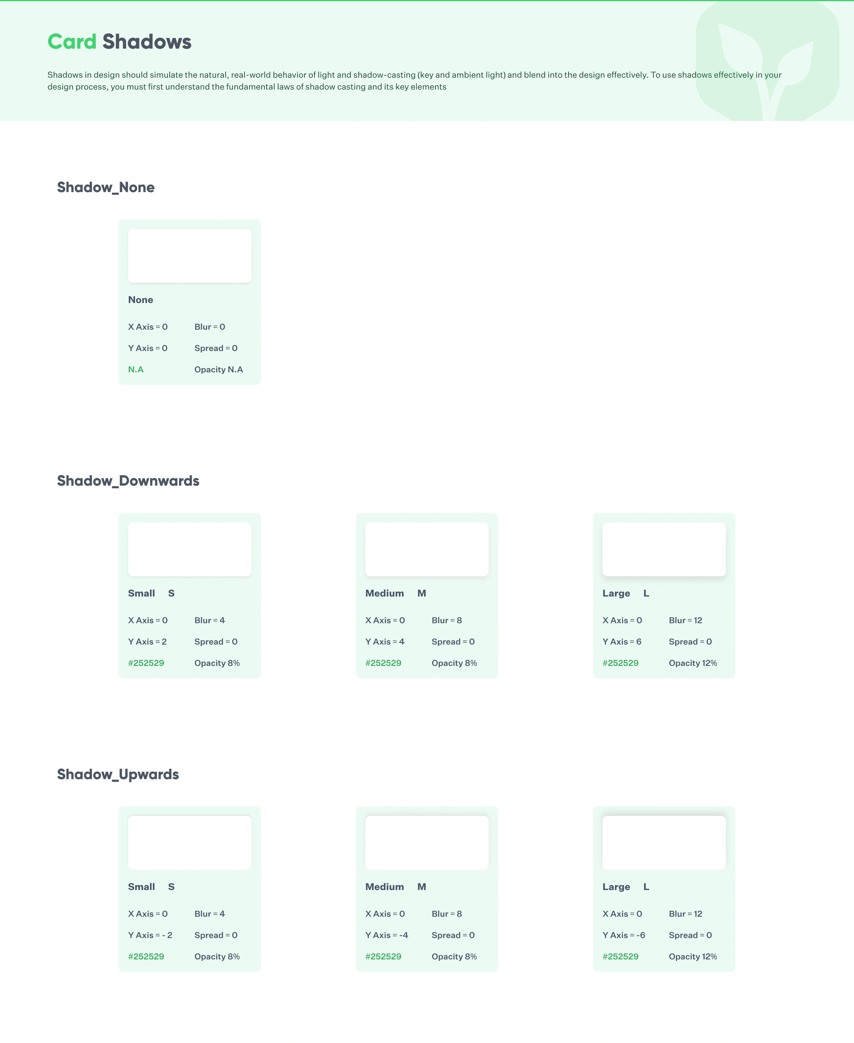
Shadows
Shadows are essential for creating depth and hierarchy in UI design. I created a set of shadow styles that allow for clear differentiation between primary and secondary elements.
Strategy:
Defined a range of shadows for different UI elements like buttons, cards, and modals.
Ensured shadows are subtle yet effective in enhancing the visual hierarchy and making interactions stand out.
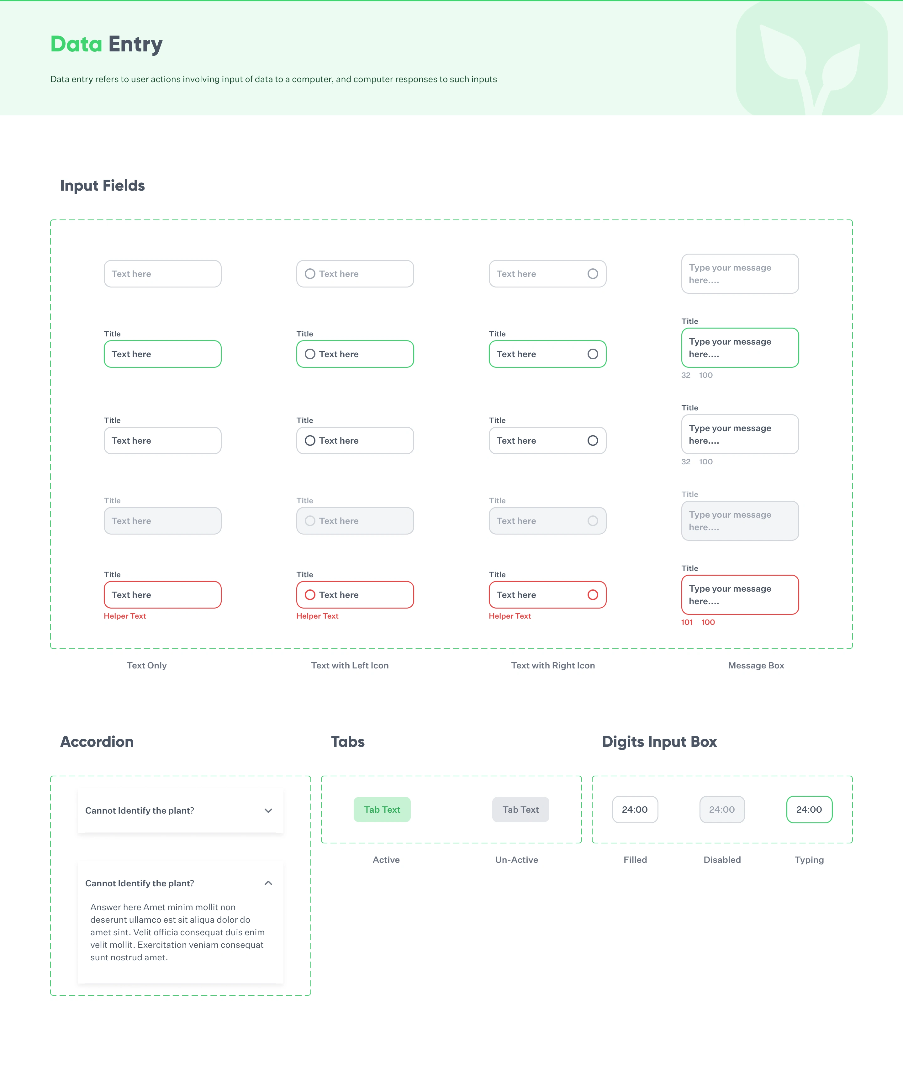
Input Fields
Input fields are integral for user interaction. I crafted a clean and consistent design for all input fields to facilitate usability and reduce friction.
Strategy:
Designed text fields with clear labels, consistent borders, and intuitive placeholder text.
Ensured responsive behaviour and clear visual feedback (error states, focus states) for the user.
How This Design System Benefits You:
Consistency Across Projects: A design system ensures that every part of your app is visually cohesive, saving time and ensuring your app feels unified across multiple screens and platforms.
Faster Design & Development: With reusable components and predefined guidelines, you can rapidly prototype and iterate on your designs, speeding up development and delivery time.
Scalable for Future Growth: As your product grows, a design system allows you to maintain consistency while easily adding new components and styles. It’s built to scale as your app evolves.
Collaboration & Communication: Designers and developers can work seamlessly together with a shared understanding of components, styles, and behaviours, reducing misunderstandings and rework.
Cost-Effective: By reusing design patterns and components, you reduce design and development time, which ultimately lowers costs.

Looking for designs that elevate your brand?
Feel free to connect with me by tapping on
View Services below.

Like this project
Posted Jan 1, 2025
I created a comprehensive design system in Figma, including logo variants, typography, color system, buttons, icons, UI components, iOS guidelines etc.
Likes
0
Views
43