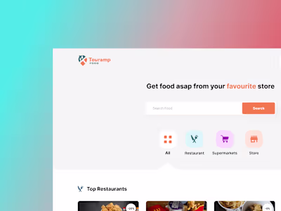
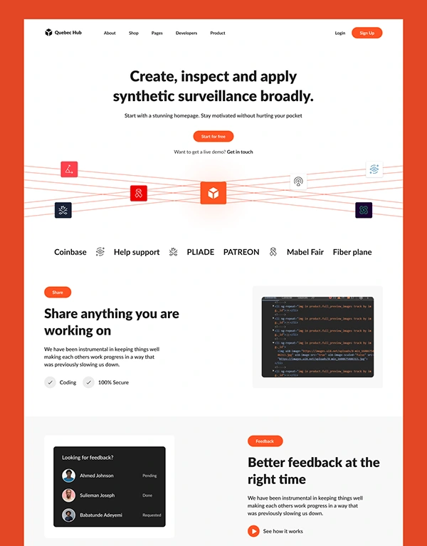
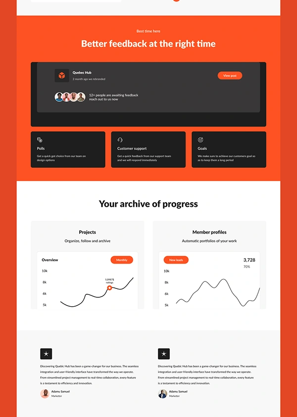
SaaS Landing Page Design

Emmanuel Amaechi


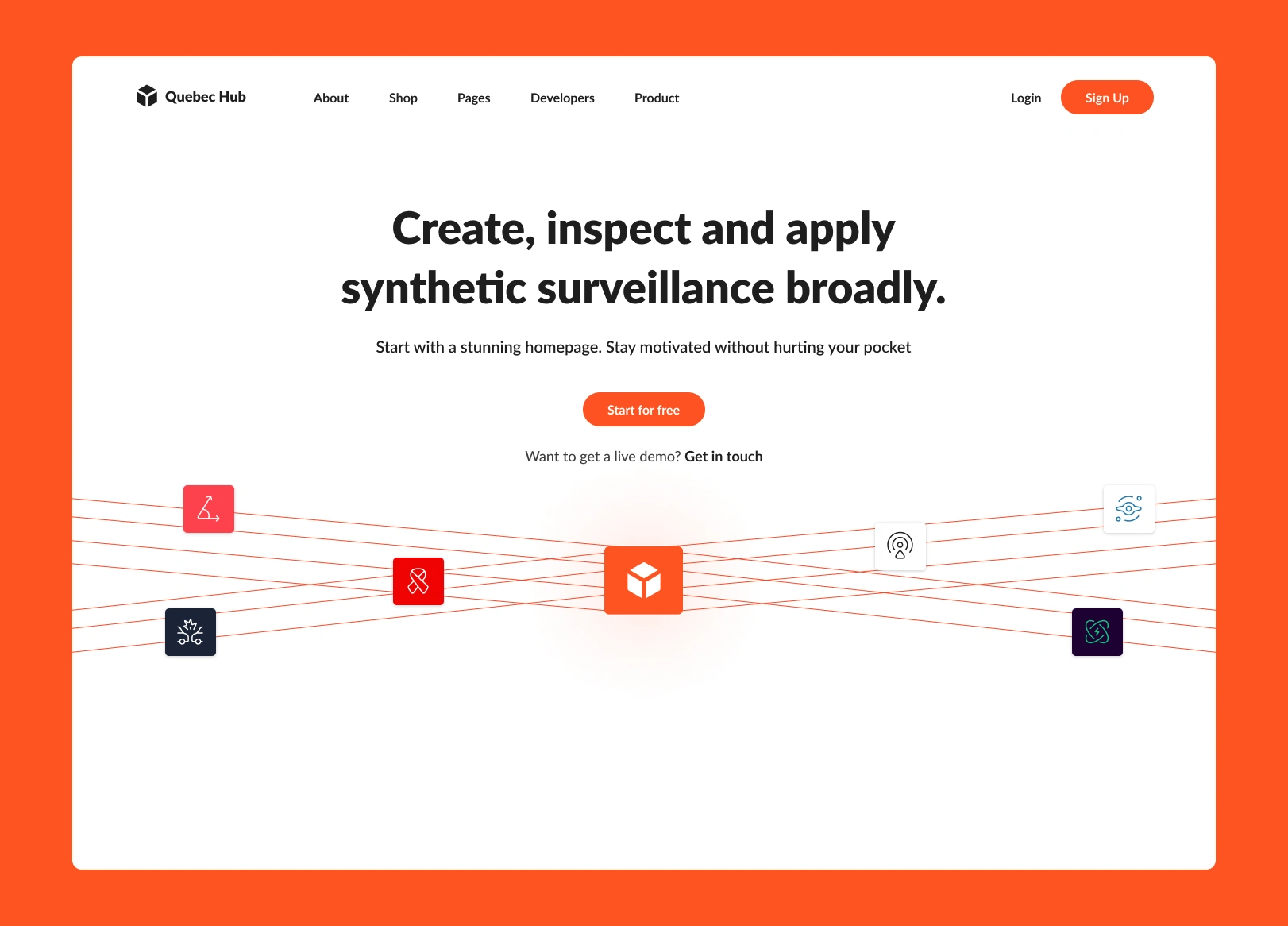
This project was about redesigning a landing page for a SaaS product. The old page was text heavy and didn’t clearly explain what the product did or why it mattered.
The Problem
Visitors were leaving quickly because the messaging wasn’t clear and the design felt outdated. There wasn’t a strong reason to stay, explore, or sign up.
The Solution
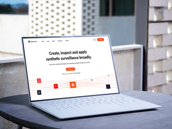
I created a modern, clean layout with a clear headline, short product benefits, and a strong call-to-action. I gave room for white spacings and icons to guide the eye and made sure the design worked just as well on mobile also.
Key Highlights
Clear, value-driven messaging
Visual hierarchy for easy scanning
Strong CTAs placed strategically
Clean and responsive design
Like this project
Posted May 2, 2025
I created a modern, clean layout with a clear headline, short product benefits, and a strong call-to-action.
Likes
0
Views
1