Minimalist Finance & Digital Wallet App

Emmanuel Amaechi


Penny Wise Mobile App Design
Role: Product Designer Project: Finance app design Tool: Figma
The Challenge
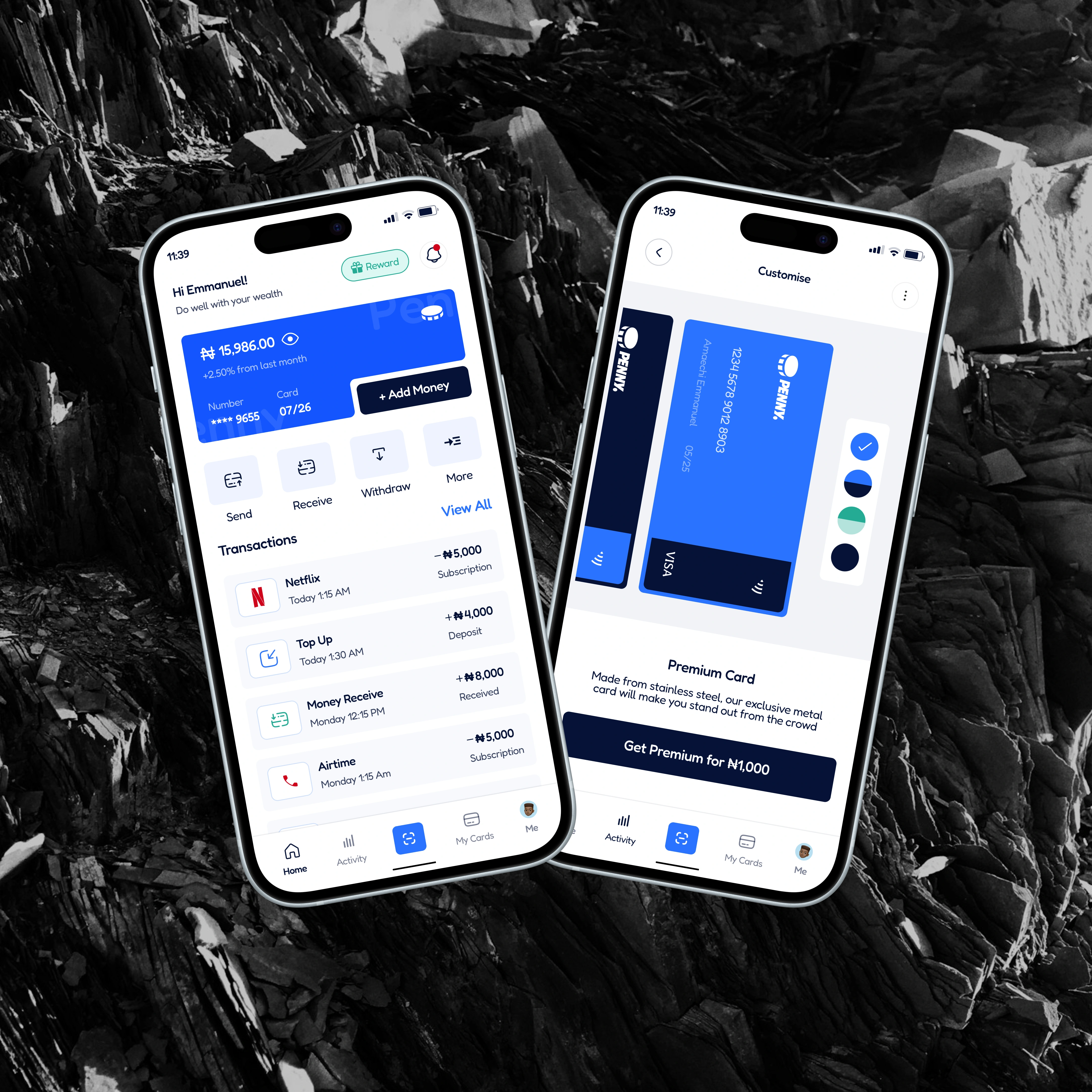
Penny Wise is a finance app that helps users track their money and manage transactions. The original app worked, but the experience felt clunky and outdated. It was hard to navigate, and the interface wasn’t as friendly or modern as it could be.
The Goal
The goal was to redesign the app to make it clean, easy to use, and more visually appealing. We wanted users to feel in control of their money from checking balances to sending and receiving funds without confusion or clutter.
My Role & Process
I led the redesign from start to finish. I started by reviewing the current app and identifying the pain points mainly around navigation, layout, and how information was presented. From there, I created a new structure, simplified the flow, and designed a fresh, modern interface.
I focused on keeping things simple and intuitive. The homepage now shows your balance clearly, with quick access to send, receive, and withdraw options. Transactions are easy to scan, and the overall layout feels clean and calm. I also designed a new onboarding screen to introduce the app’s value right away.
What I Delivered
A welcoming intro screen that quickly explains the app’s purpose
A redesigned dashboard with a clear view of balance and actions
Clean transaction list with icons and labels for easy scanning
Responsive layouts for different screen sizes
Organized Figma files ready for handoff
The Result
The redesign made the app feel easier to use and more trustworthy. Users found it simpler to track their money and loved the clean, modern look. The team was happy with how smooth the handoff was, and the new design gave developers a solid base to build on.
Why It Stands Out
This project was more than just a visual refresh it was about creating a better experience for real users. I treated it like a product I owned, making sure every design choice had a purpose. It’s a great example of how thoughtful design can make everyday tasks feel effortless.

Like this project
Posted Apr 27, 2025
The primary objective is to simplify complex financial interactions, enabling users to track their spending, save money, and access key features
Likes
1
Views
2
Timeline
Jan 10, 2024 - Aug 31, 2024
Clients
Pennywise