Blog News Mobile UI Concept

Emmanuel Amaechi


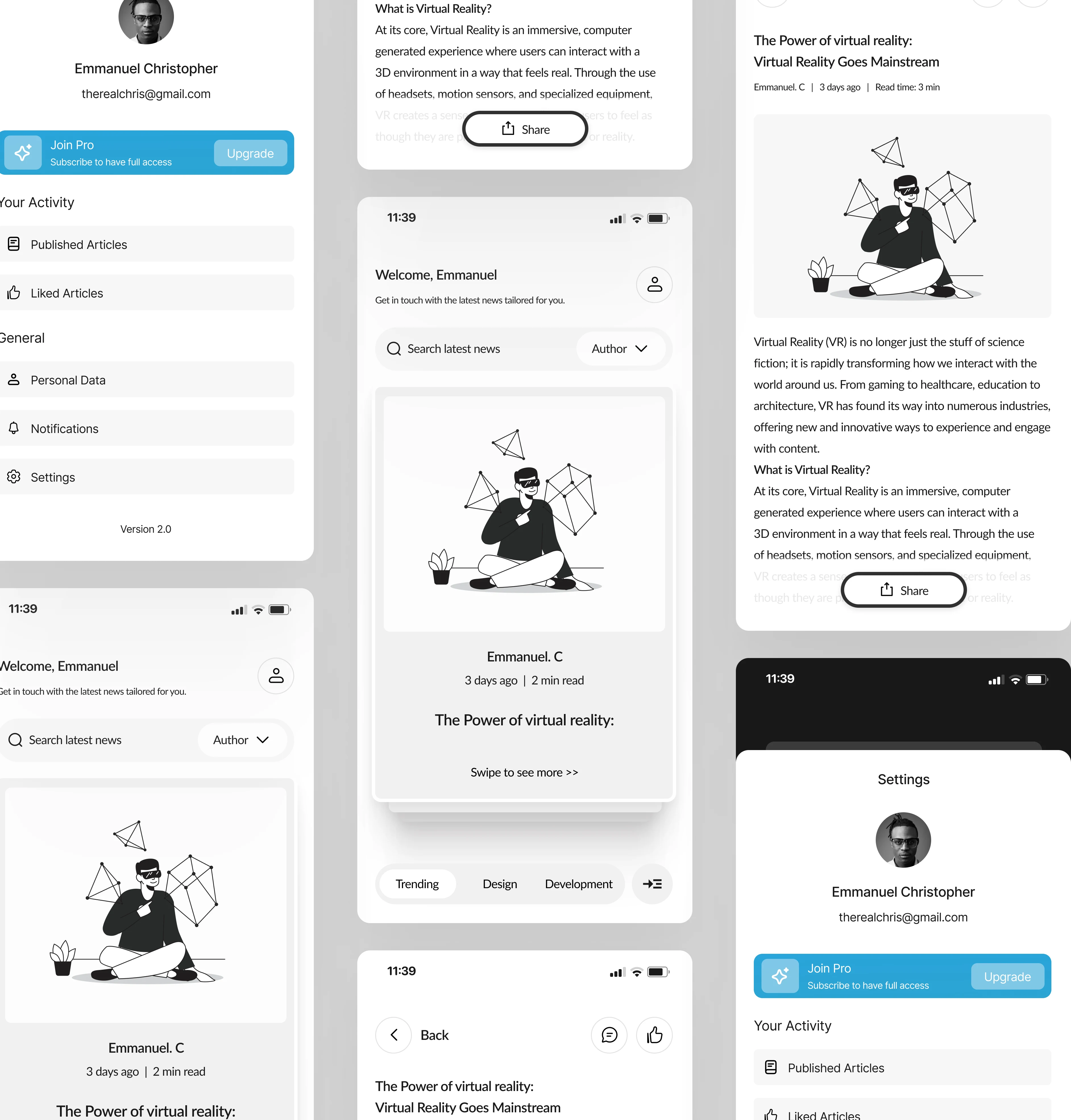
Virtual Reality News Reader Mobile UI Concept
Role: Product Designer Tools Used: Figma Project Type: UI/UX Concept Platform: Mobile App (iOS)
Overview
This was a personal project where I explored designing a clean, minimal mobile reading experience for people interested in virtual reality (VR), blog and tech news. I wanted something that felt calm, modern, and easy to read without all the clutter that news apps often have.
The Idea
I noticed that a lot of mobile news platforms don’t feel tailored to specific tech topics like VR. Either they’re too busy or not personalized enough. So, I thought: “What if I designed a simple, personalized news app focused on VR and similar topics?”
What I Focused On
Clean layout: A straightforward UI with large headings, subtle icons, and clear spacing.
Personalization: A greeting message (Welcome, Emmanuel), and a filter by author to help users see more of what they care about.
Readability: I kept the font sizes and spacing super readable and focused on a black-and-white theme to keep it calm.
Quick info: Each article shows author, date, read time, and a short preview with simple navigation.
Features
Personalized home screen
Swipe-through articles
Search + filter by author
Share, comment, and like buttons
Category tags (trending, design, dev, etc.)
What I Learned
This project helped me practice simplifying complex layouts into something more user-friendly and intentional. It was a fun challenge to balance techy content with a smooth, distraction-free reading experience.
Like this project
Posted Jun 8, 2025
The goal of this project was to design a clean, user friendly experience for a mobile news app. Focusing on readability, simple navigation, and minimal visuals.
Likes
0
Views
1
Timeline
May 1, 2025 - Jun 30, 2025