Dr. Med. Anna‑Lucia Koth

Alexandra Goldschmidt


FOR: Dr. med. Anna-Lucia Koth
Brand Identity
Web Design
Brand Guidelines
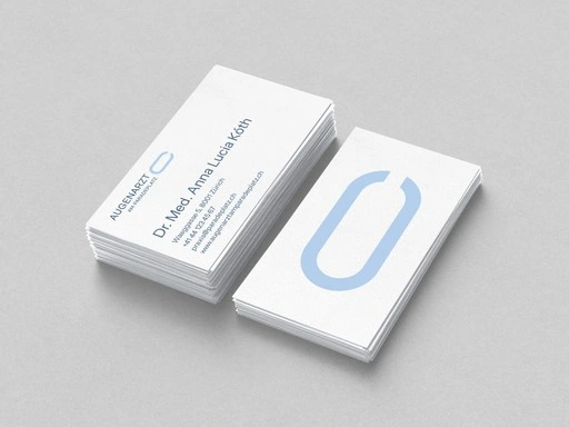
In the heart of Zurich, where the city's most famous tram lines converge, sits a practice that needed an identity as precise as the eyes it examines. The brief was clear: a brand confident enough to hold its own next to the heavyweights of the address, yet human enough not to feel like another cold façade in the financial district.
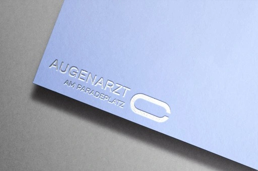
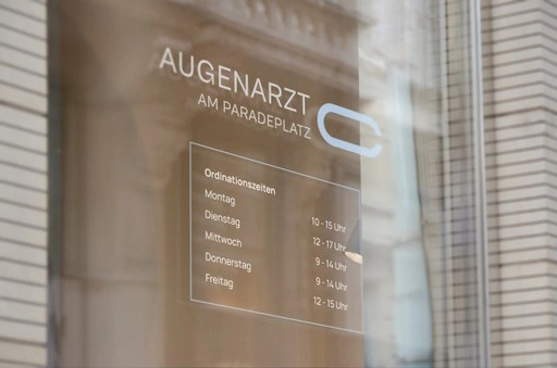
The mark draws on two unmistakable forms. The Landolt ring, the broken circle used worldwide to test visual acuity, gave the logo its core shape, a subtle nod to the precision of the practice itself. The same broken-circle geometry echoes the layout of the tram intersection at Paradeplatz seen from above, tying the brand literally to its address. Two visual languages, one form, each instantly recognisable to anyone who knows either reference. The result is a mark that works on both a clinical and an urban level: patients recognise the optical reference, locals recognise their own city square. Paired with a restrained, confident typography system and a web design built for clarity and quick orientation, fitting for a practice that is all about sharp vision, the identity gives this ophthalmology practice a presence as central as its location.
Like this project
Posted Oct 2, 2026
Brand identity and website for an ophthalmology practice, using a Landolt-ring inspired mark and precise typographic system.