pro
Alexandra Goldschmidt
Designer and Art Director


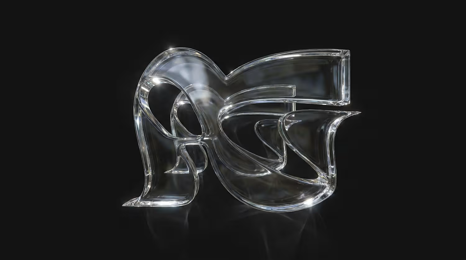
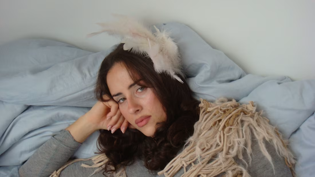
Did a shooting for a fashion brand by talented Feline Deilmann (https://felinedeilmann.com)
Styling, art direction and photography by me
I had so much fun and I love how my vision came out <3
2
3
198
Shot my first editorial for De Freitas Atelier (https://defreitasatelier.com) today, a Barcelona studio by Susana F. De Freitas making handmade knitwear in tiny numbers.
I did the art direction, photography and editorial layout. The whole idea came from the garments themselves: open, hand-worked knit with cutouts running down the spine, raw hems, dropped stitches left on purpose. Something that fragile needed a hard surface to push against, so we took it out of the white studio and into concrete stairwells and a steel elevator lobby.
What I love about working with independent designers like Susana is that the story is already in the piece. My job is to slow people down long enough to see it.
Full project on my Instagram (https://www.instagram.com/p/De1mwHnCM9w/?img_index=1). If you’re a small fashion or craft label and want imagery that feels as considered as the way you make things, my inbox is open.
0
140
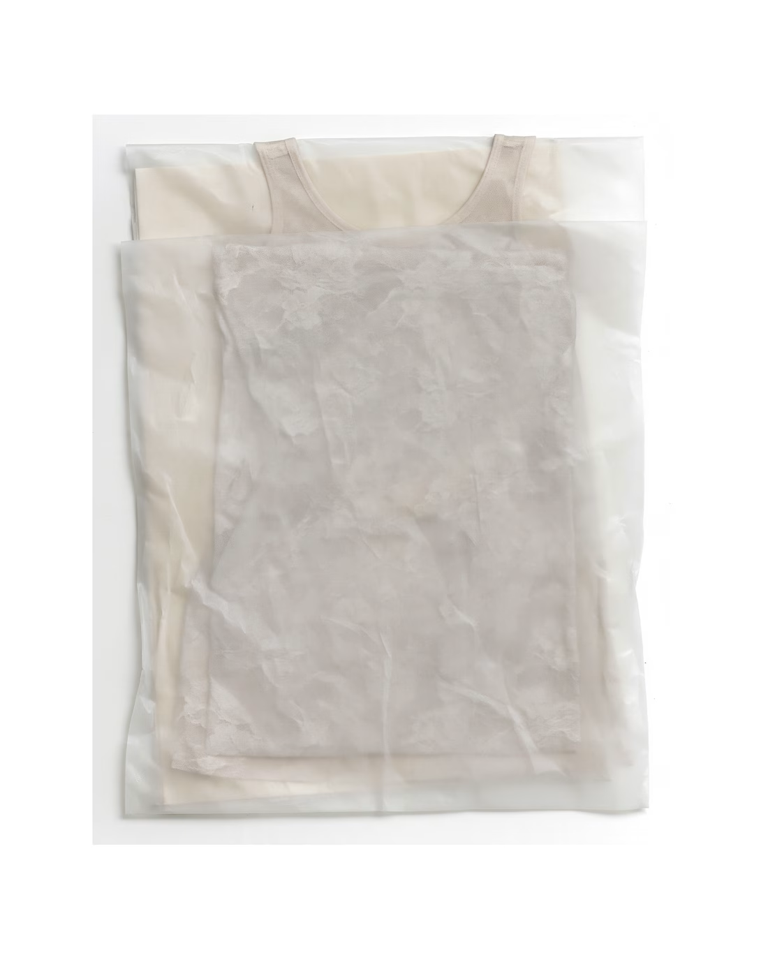
Leftovers: few visuals I left unposted, but those I love very much <3 These were part of the campaign creation for the Lätt Brand.
See more about the project here: https://www.instagram.com/p/DdtXGwqjFDz/?img_index=1
2
2
182
Title
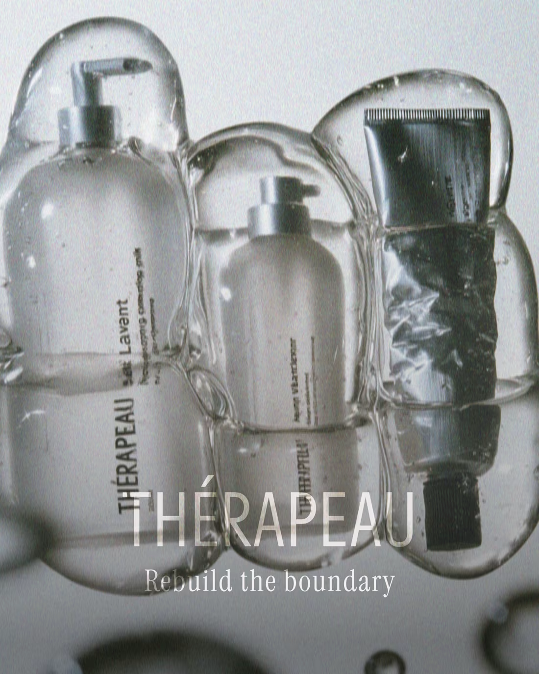
Thérapeau — Brand Identity & Packaging for Clinical Skincare
Description
A concept identity and packaging system for Thérapeau, a clinical skincare brand built on barrier-repair science. Created for Designer Briefs challenge #182.
The concept starts with how skin actually works. Dermatology describes the skin barrier as bricks and mortar: cells held together by lipids. Instead of the aggressive “transformation” language most clinical brands use, Thérapeau tells a quieter story: repair is the transformation.
That one idea shapes everything. A running-bond grid explains the science and structures every layout. A seal stroke taken from the accent in the name works as the brand mark. The packaging follows the same logic, with glass for what goes onto the skin and aluminium for what seals it, all printed directly onto the material with no paper labels. The campaign uses real skin and real ages, in calm, backlit photography.
What I did
Brand strategy and concept · Naming system and verbal identity · Visual identity · Packaging design for a five-product range · Carton design · Art direction and campaign imagery · Product copy
Tools
Adobe Illustrator, Photoshop, Midjourney (AI-augmented art direction)
Looking for
Skincare, beauty and wellness brands that need an identity with a clear idea behind it. Get in touch if you’re launching a range or rethinking your packaging.
📸 See it whole project on Instagram: https://www.instagram.com/p/DeXWNOpkejQ/?img_index=1
1
101