
pro
Alexandra Goldschmidt
Multidiciplinary Digital Designer and Art Director.


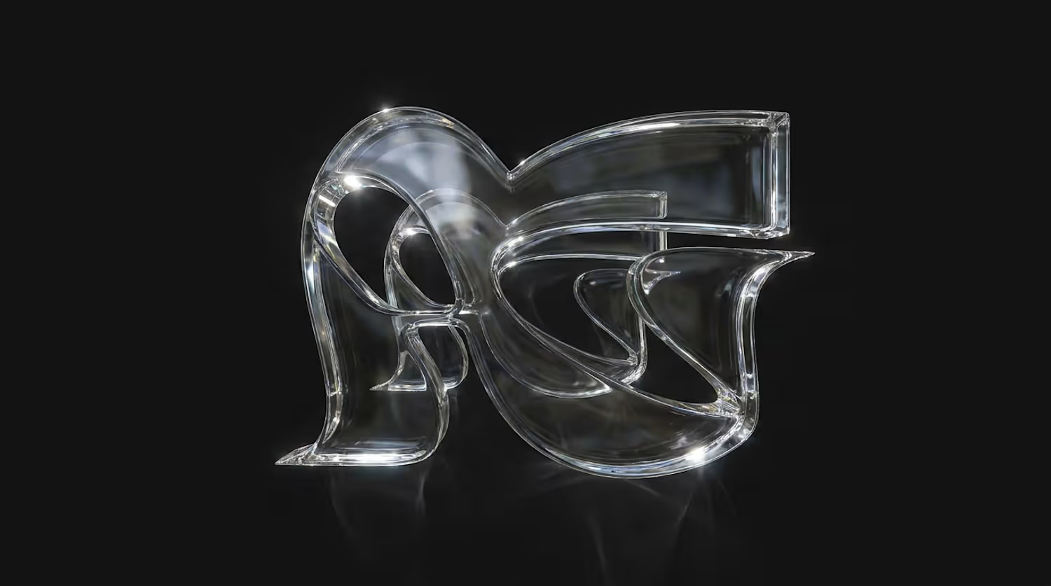
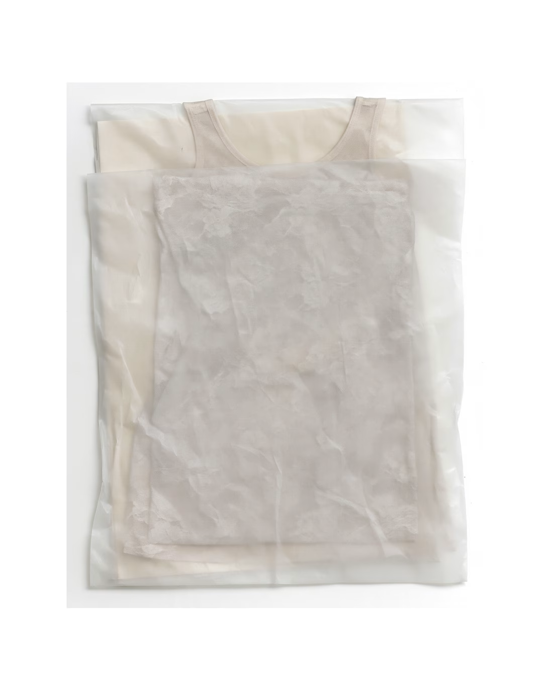
Leftovers: few visuals I left unposted, but those I love very much <3 These were part of the campaign creation for the Lätt Brand.
See more about the project here: https://www.instagram.com/p/DdtXGwqjFDz/?img_index=1
2
2
130
Title
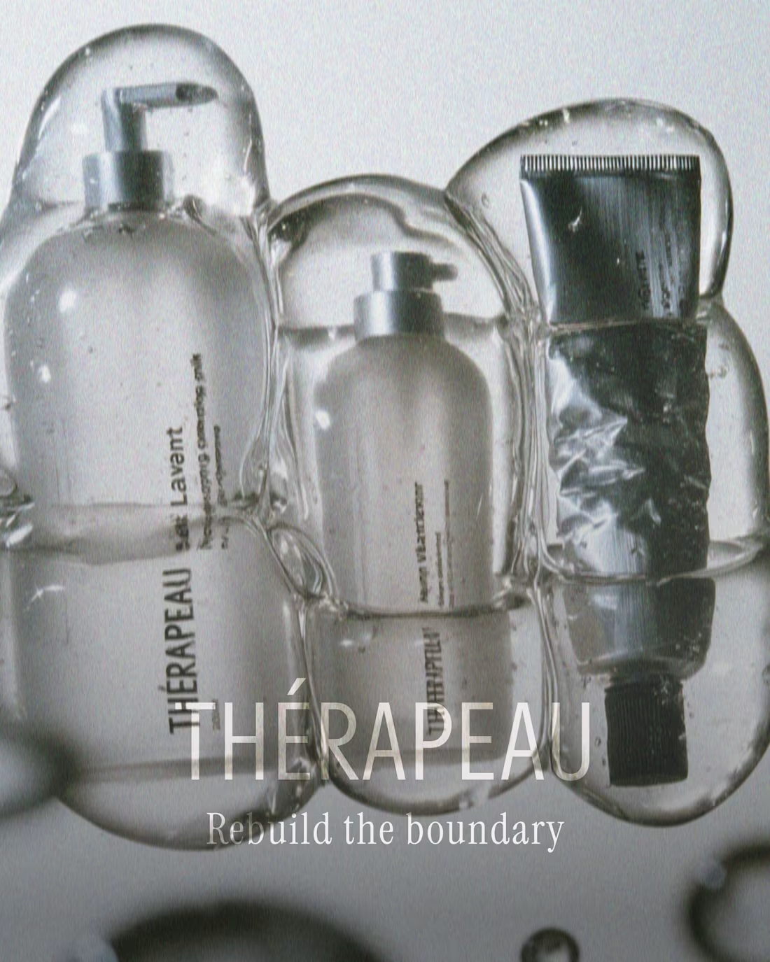
Thérapeau — Brand Identity & Packaging for Clinical Skincare
Description
A concept identity and packaging system for Thérapeau, a clinical skincare brand built on barrier-repair science. Created for Designer Briefs challenge #182.
The concept starts with how skin actually works. Dermatology describes the skin barrier as bricks and mortar: cells held together by lipids. Instead of the aggressive “transformation” language most clinical brands use, Thérapeau tells a quieter story: repair is the transformation.
That one idea shapes everything. A running-bond grid explains the science and structures every layout. A seal stroke taken from the accent in the name works as the brand mark. The packaging follows the same logic, with glass for what goes onto the skin and aluminium for what seals it, all printed directly onto the material with no paper labels. The campaign uses real skin and real ages, in calm, backlit photography.
What I did
Brand strategy and concept · Naming system and verbal identity · Visual identity · Packaging design for a five-product range · Carton design · Art direction and campaign imagery · Product copy
Tools
Adobe Illustrator, Photoshop, Midjourney (AI-augmented art direction)
Looking for
Skincare, beauty and wellness brands that need an identity with a clear idea behind it. Get in touch if you’re launching a range or rethinking your packaging.
📸 See it whole project on Instagram: https://www.instagram.com/p/DeXWNOpkejQ/?img_index=1
1
64
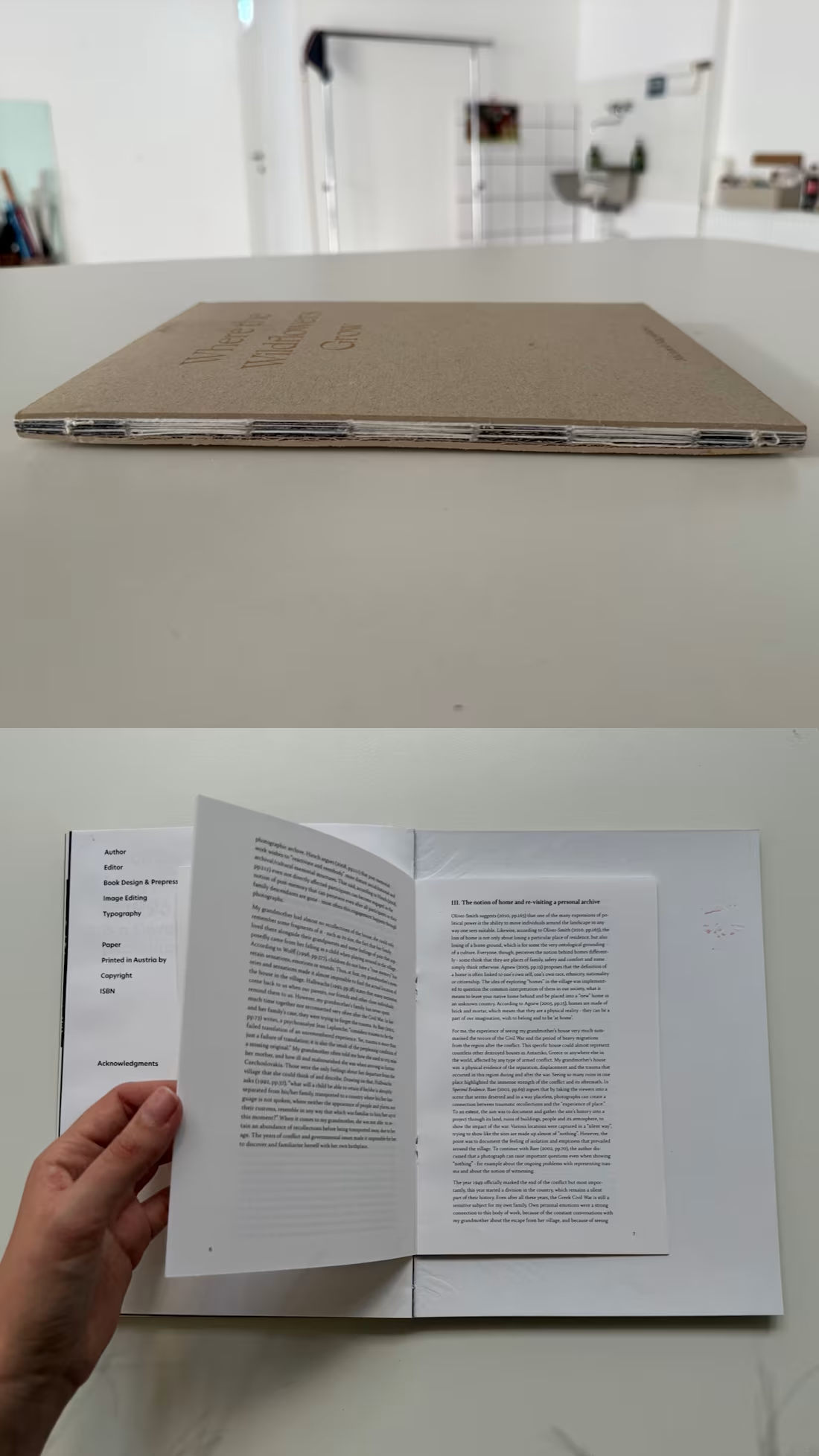
Only four copies of this book exist. I designed, printed and bound each one by hand.
Where the Wildflowers Grow is a photo publication by Michaela Nagyidaiová about her grandmother, who was sent away from Greece alone at four years old during the Greek Civil War.
Her story survived only in fragments: archive documents, handwritten letters, family photos, and the landscapes that still carry traces of it. My job was to weave those fragments into one quiet, coherent narrative, so that past and present could sit on the same page rather than being split into "history" and "now."
Making it by hand was a deliberate choice. For a story this fragile, a mass-produced object felt wrong. The small edition turns the book itself into a kind of archive: rare, physical and made with care.
Publication design is the reason I became a designer. If you have a story, an archive or a photo series that deserves more than a PDF, I'd love to hear about it.
Photography & concept: Michaela Nagyidaiová
Skills: Editorial Design, Book Design, Publication Design, Print Design, Bookbinding, Layout Design, Art Direction, Typography
Tools: Adobe InDesign
0
120
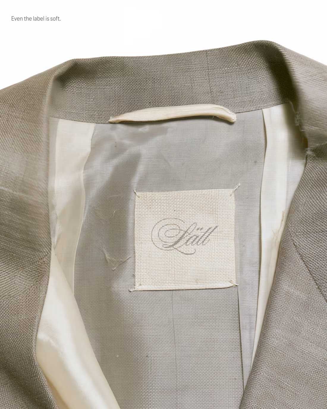
My entry for the Designer Briefs: a brand identity and label system for Lätt, a Stockholm label bringing a light, romantic touch to modern tailoring. Silk, sheer knits and suiting made to be worn lightly.
The idea is "Tailoring, softened," and it runs through every touchpoint. A script wordmark is embossed blind into the hang tag and the shopping bag. A woven neck label is sewn loosely into the lining, and a satin care tag carries bilingual Swedish/English care instructions in a typewriter-style mono. Packaging is tissue, lace and frayed silk ribbon: "Wrapped lightly. Opened slowly." The visual world is built from fabric scans and phone snapshots, so it feels tactile and real.
I loved this project so much, what do you think? I would love to hear the feedback of the community!
4
16
638