Revolution Athletics Logo System Design
Dan Blessing
Revolution Athletics
Revolution Athletics provides premium sporting goods and apparel that connects with the working class through American core principles.
– Brand Core Values
Toughness / Patriotic / Commitment
– Project Goals & Solution
Create a logo system centered around an iconic logomark that will resonate with competitive athletes. Weave in established American imagery / symbolism while making sure the logo would scale well and retain legibility when printed big or small.
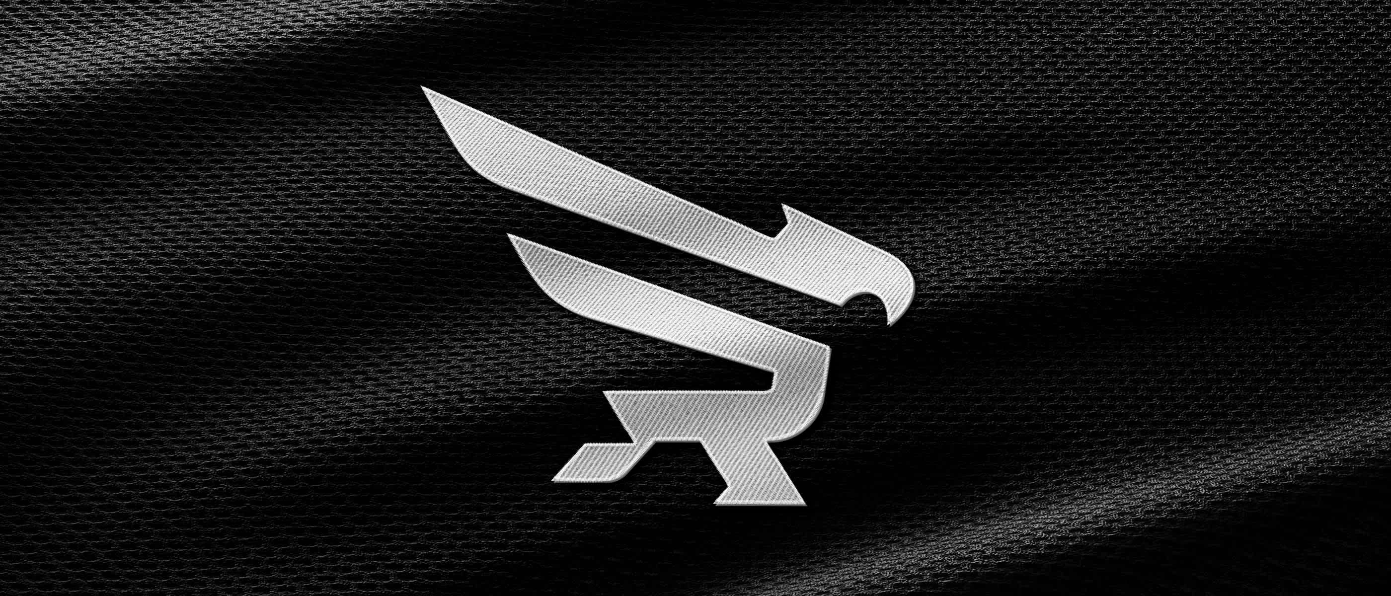
To achieve this, we first explored stars, stripes integrated into the letter “R” and when that wasn’t producing the results as we would of hoped, I started to explore an idea centered around an eagle (which also hits on two of Revolution’s brand traits: Toughness and Patriotic.) and the letter “R”. To ensure the logo remains legible and memorable, we wanted to stick to 2-3 elements max.
To ensure the wordmark wasn’t an afterthought, we wanted to take the time and create something custom that would work cohesively with the logo and display toughness and class.
Scope & Deliverables
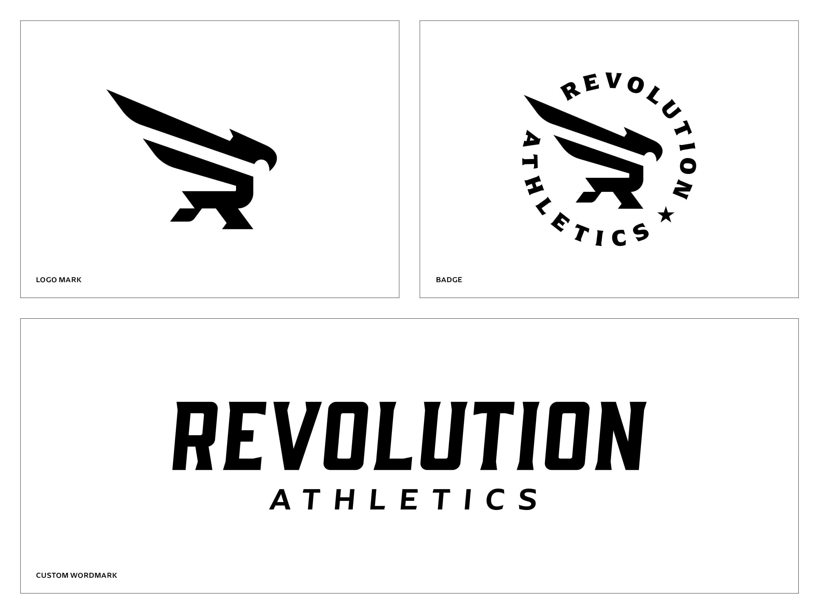
– Logomark / Icon
– Badge Design
– Custom Wordmark
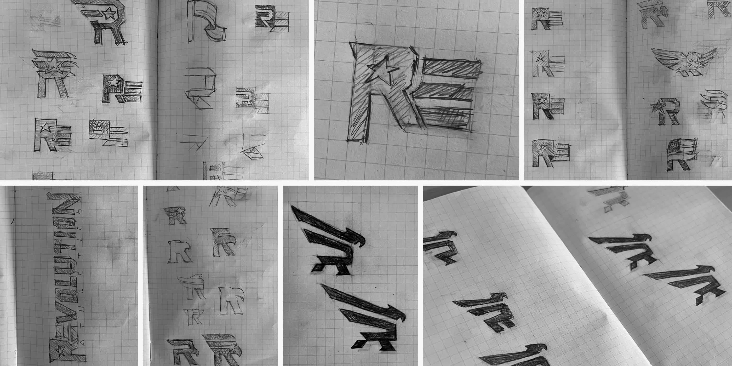
Sketching Process
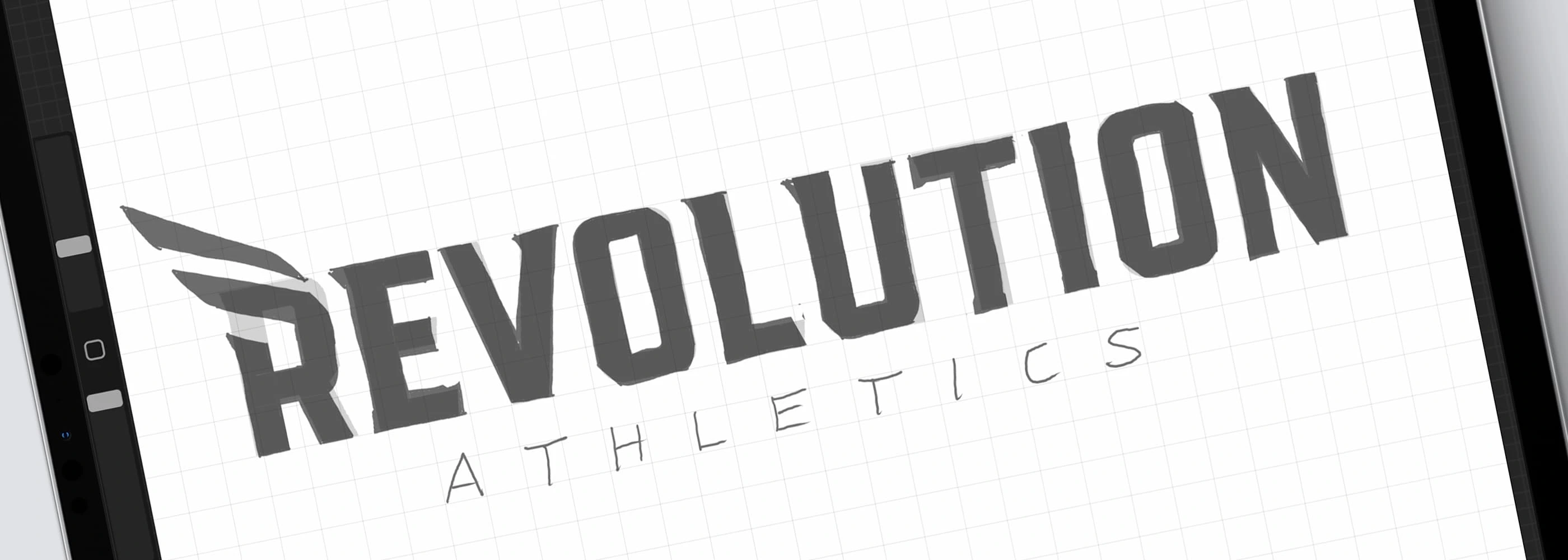
Wordmark Sketching

Concept Breakdown
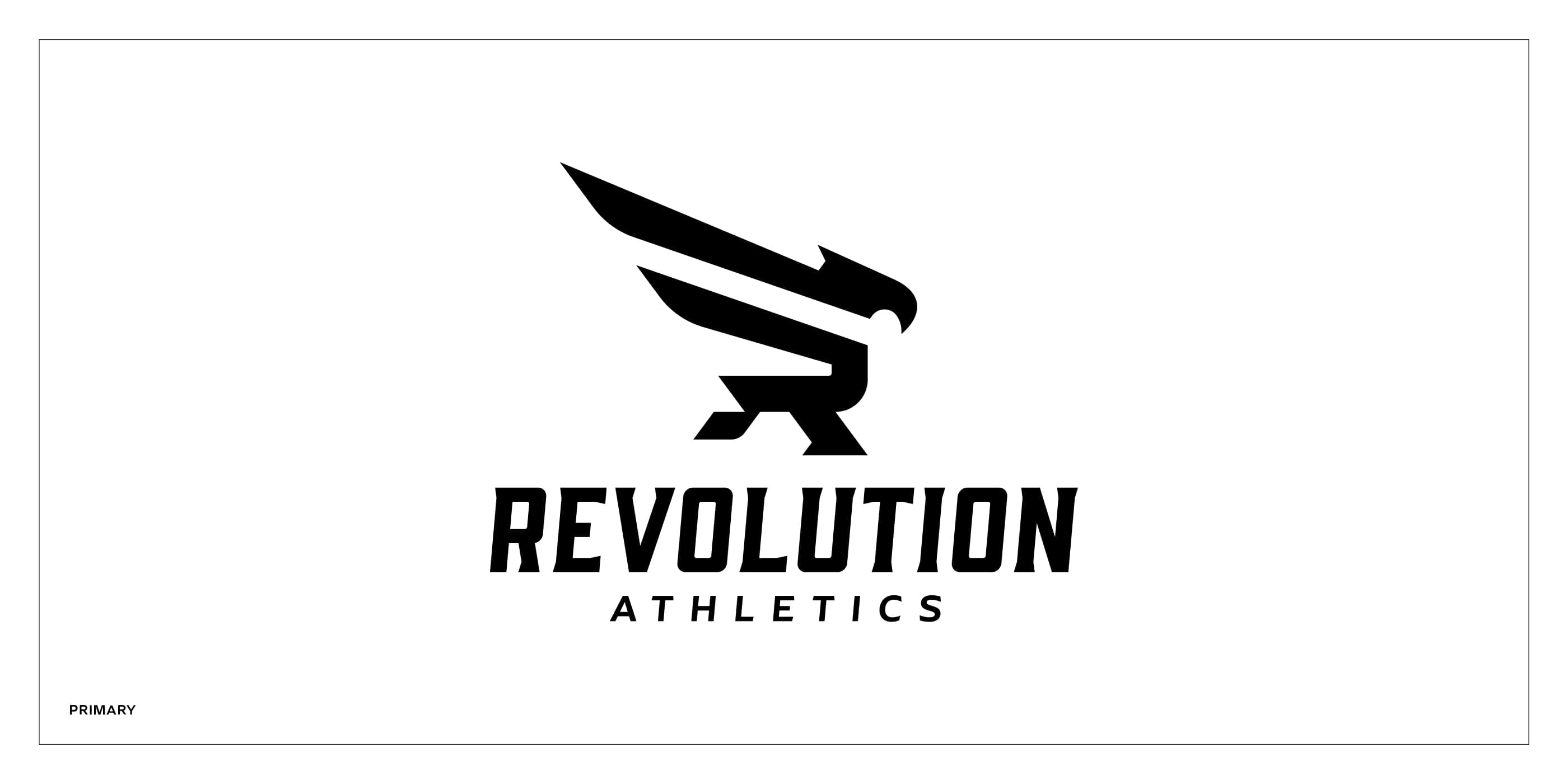
Primary Logo
Logo System
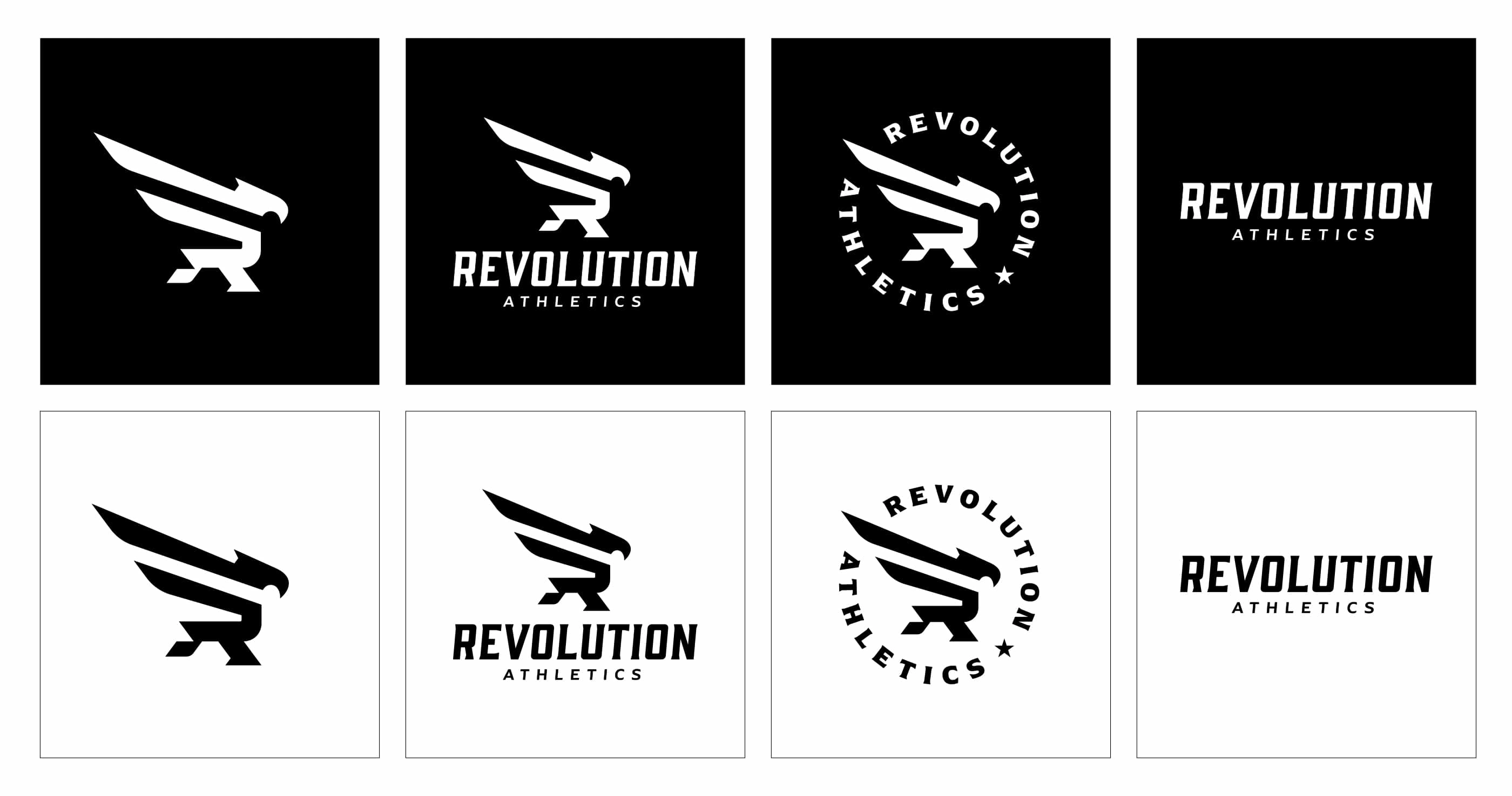
Logo System – Dark and Light
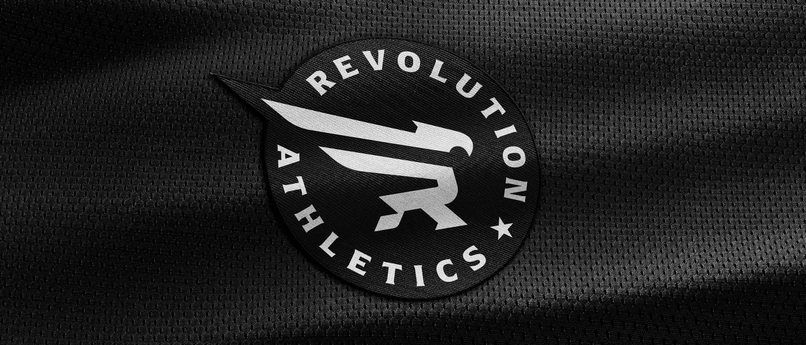
Badge Roundel Mesh
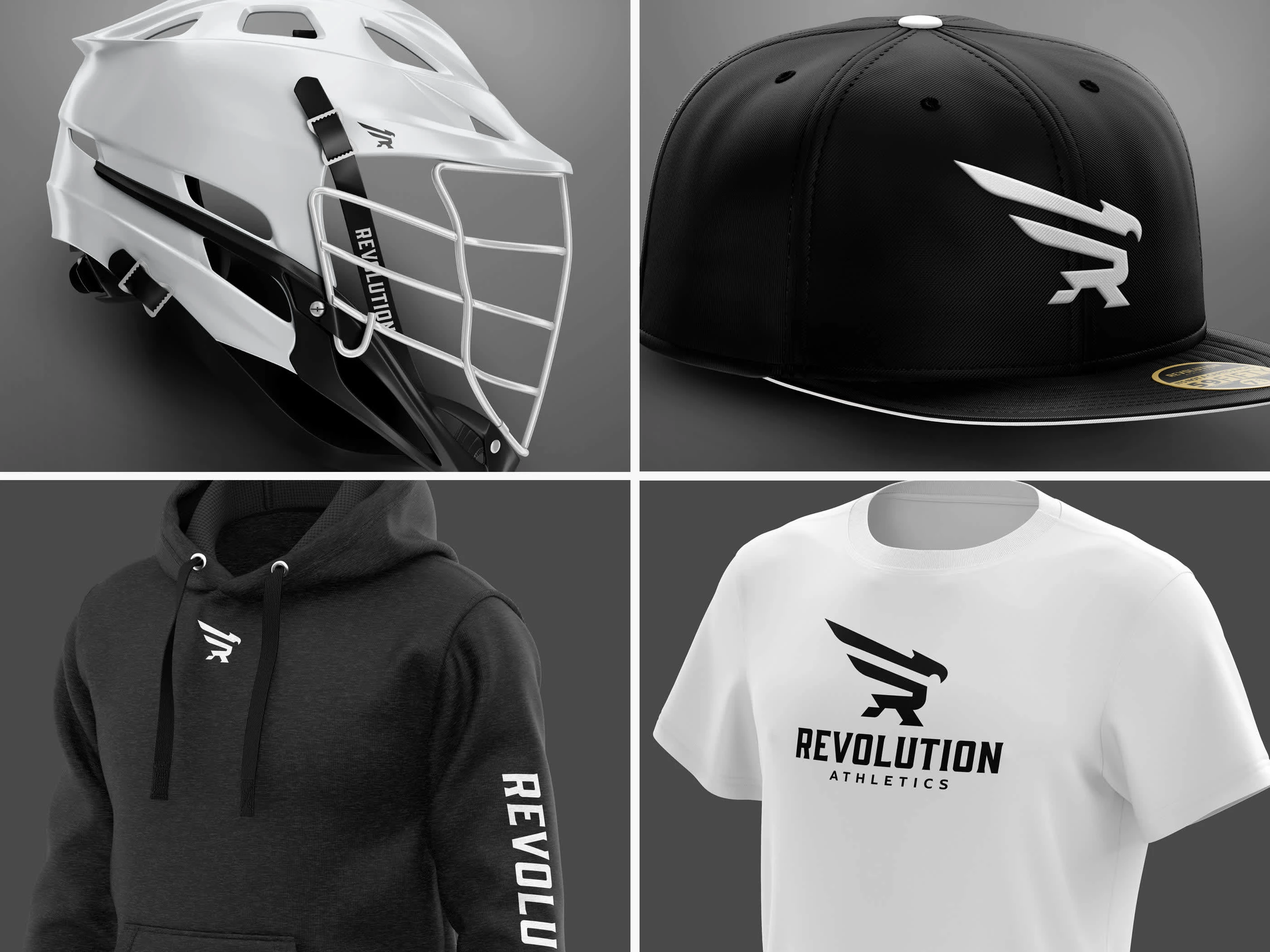
Apparel Mockup 01
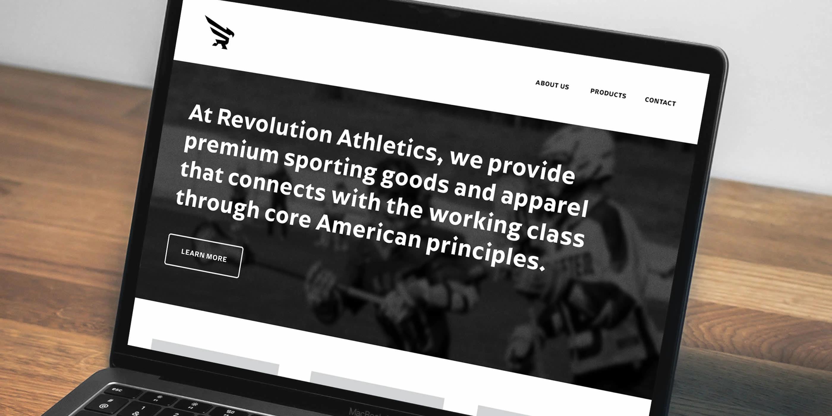
Web Mockup
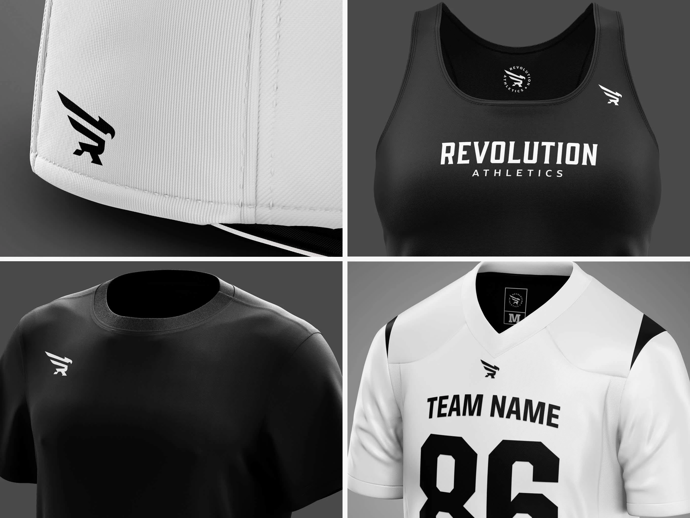
Apparel Mockup 02
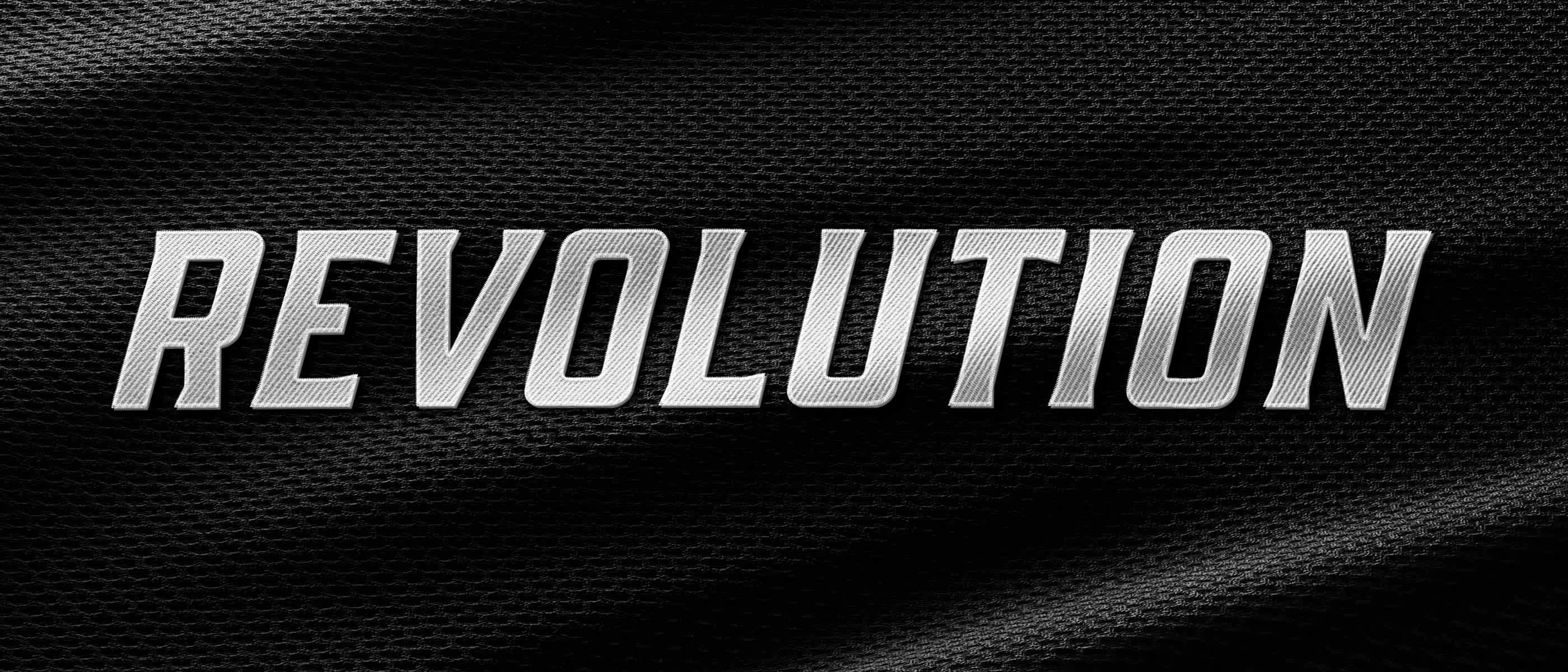
Wordmark Mesh
Like this project
Posted May 13, 2025
Designed a logo system for Revolution Athletics with iconic logomark––integrating an eagle, letter "R" and stripes from the Amercian Flag––and custom wordmark.